


Machine Learning Prior Part 1 & Data Visualization
Last Updated on January 8, 2023 by Editorial Team
Author(s): Gencay I.
Originally published on Towards AI the World’s Leading AI and Technology News and Media Company. If you are building an AI-related product or service, we invite you to consider becoming an AI sponsor. At Towards AI, we help scale AI and technology startups. Let us help you unleash your technology to the masses.
Machine Learning Prior Part 1 & DataVisualization
Matplotlib & Seaborn Briefly Explained and Compared
Content Table
· Introduction
· Line Graph
  ∘ Matplotlib
  ∘ Seaborn
  ∘ Animated Line Graph
· Histogram
  ∘ Matplotlib
  ∘ Seaborn
· Scatter Graph
  ∘ Matplotlib
  ∘ Seaborn
· Violin Graph
  ∘ Matplotlib
  ∘ Seaborn
· Conclusion
Introduction
Hi to all.
In my Machine learning series, I try to explain to you guys the logic behind Machine Learning.
As it is obvious and I always say, Machine Learning is the combination of different cultures.
Mainly ;
- Statistics
- Programming
- Calculus
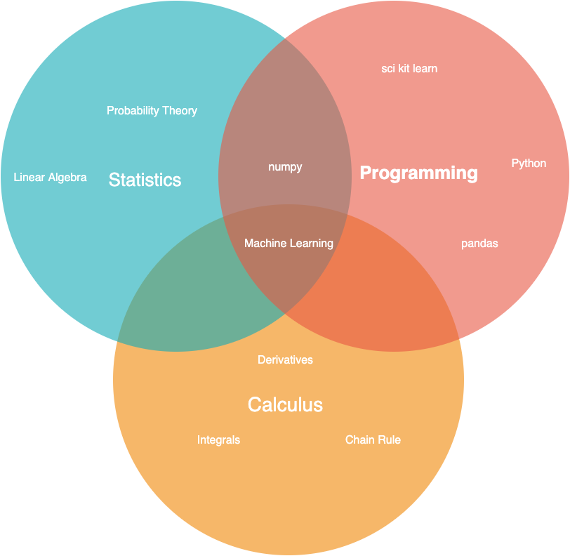
In the following articles, I explain most of the Statistical terms used in Machine Learning.
Now in that brief course, I try to explain to you guys the coding process of machine learning in Python.
In Python, I divide the process into four.
- Data Visualization- Matplotlib & Seaborn
- Data Analytics- Pandas
- Getting familiar with Data Types-Numpy
- Building Models- Scikit-learn
Also, I divide model types into three, which are ;
- Regression
- Classification
- Clustering
A clustering article is on the way*
Now, data visualization and chart types can really vary, but I decided to explain the most common ones to you because that is a brief explanation article.
And also I will code this graph in Matplotlib and Seaborn, which are the most common visualization tools in Python.
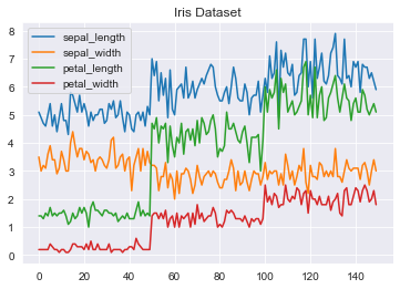
Line Graph
The line graph is used to observe changes, most commonly, in time.
Matplotlib
First, download the data by loading and seaborn and use the load_dataset method.
Then drop the categorical column and draw a graph accordingly.
Seaborn
Like in the latter code,
- Download the data by loading and seaborn
- Load_dataset method, drop the categorical column and
- Draw a line graph accordingly by selecting x and y.
- For more
Animated Line Graph
Also if you would like to see an animated graph;
- Load the libraries
- Sort the values
- Set the size of the number of png, that will create your animated line graph’s gif.
- Write a loop.
- Save your gif.
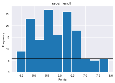
Histogram
The important graph to look density and distribution of data.
Matplotlib
Now let's explain step by step
- Download and load the data
- Define fig and ax.
- Define the histogram and the column.
- Set title, x and y label
- Define the threshold, and draw the line accordingly.
- For more arguments.
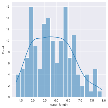
Seaborn
Here is the source of distplot.
- Import library.
- Load data set
- Define the column name
- kde- draw gaussian kernel density or not.
- bins- histogram bins width
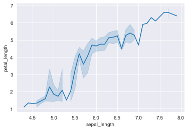
Scatter Graph
To see data points as a literal points, a scatter graph is a useful graph type.
Matplotlib
- Download necessary libraries and data set.
- Set a title and grid option
- For more about scatter plots in matplotlib.
Seaborn
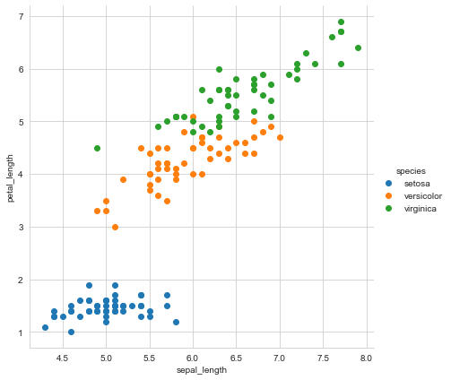
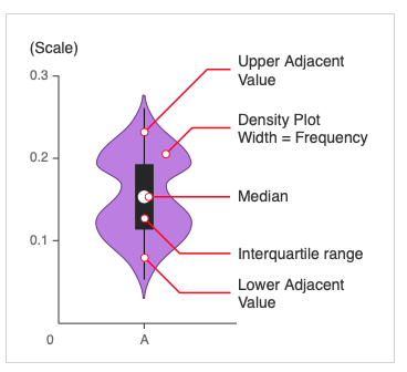
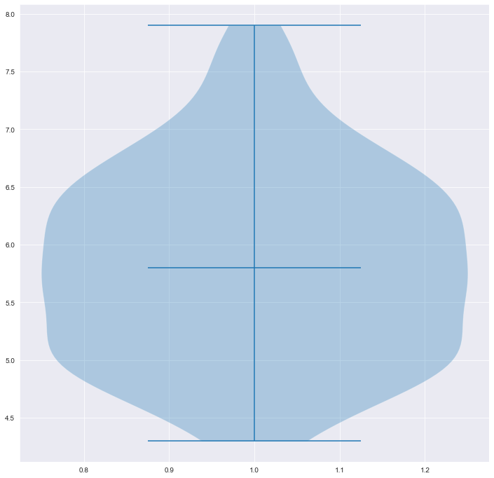
Violin Graph
Here is the quick sum of the violin graph.
Matplotlib
- Load libraries and download data
- Select the iris sepal length column and observe.
- For more.
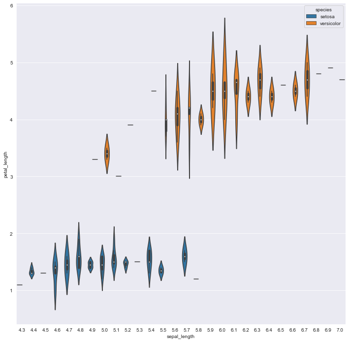
Seaborn
- Import Seaborn and data set.
- Select the first 100 columns to compare setosa and versicolor.
- Select sepal and petal length.
- For more.
Conclusion
Now as you can see there are a lot of different ways to visualize your data.
Data visualization is an important step of the ETL process in Machine Learning.
It helps you to see, sometimes the distribution of the data, and outliers and gives you insight into the data.
Actually, it speaks to you in a different language and knowing that language better, helps you to be a real machine in Machine Learning.
“Machine learning is the last invention that humanity will ever need to make.” Nick Bostrom
Machine Learning Prior Part 1 & Data Visualization was originally published in Towards AI on Medium, where people are continuing the conversation by highlighting and responding to this story.
Join thousands of data leaders on the AI newsletter. It’s free, we don’t spam, and we never share your email address. Keep up to date with the latest work in AI. From research to projects and ideas. If you are building an AI startup, an AI-related product, or a service, we invite you to consider becoming a sponsor.
Published via Towards AI
Towards AI Academy
We Build Enterprise-Grade AI. We'll Teach You to Master It Too.
15 engineers. 100,000+ students. Towards AI Academy teaches what actually survives production.
Start free — no commitment:
→ 6-Day Agentic AI Engineering Email Guide — one practical lesson per day
→ Agents Architecture Cheatsheet — 3 years of architecture decisions in 6 pages
Our courses:
→ AI Engineering Certification — 90+ lessons from project selection to deployed product. The most comprehensive practical LLM course out there.
→ Agent Engineering Course — Hands on with production agent architectures, memory, routing, and eval frameworks — built from real enterprise engagements.
→ AI for Work — Understand, evaluate, and apply AI for complex work tasks.
Note: Article content contains the views of the contributing authors and not Towards AI.
Related posts
Recent Posts

")


