A Unique Way Of Visualising Confusion Matrix — Sankey Chart
Last Updated on July 26, 2023 by Editorial Team
Author(s): Hrishikesh Patel
Originally published on Towards AI.
Go Sankey for Less Confusion!

This member-only story is on us. Upgrade to access all of Medium.
Image by the author
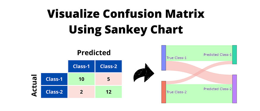
A confusion matrix in machine learning conveniently summarizes a model’s performance. However, when communicating with non-technical stakeholders, the confusion matrix might seem unintuitive U+1F914. So what’s the fix — create a Sankey diagram.
Sankey diagram representing a binary confusion matrix (image by the author
The above image illustrates the Sankey diagram for a typical binary confusion matrix. In the diagram,
The rectangle boxes on the left show True classes whereas the right counterparts show Predicted classes.The green color highlights correct classifications and the red color is for misclassifications.What’s a… Read the full blog for free on Medium.
Join thousands of data leaders on the AI newsletter. Join over 80,000 subscribers and keep up to date with the latest developments in AI. From research to projects and ideas. If you are building an AI startup, an AI-related product, or a service, we invite you to consider becoming a sponsor.
Published via Towards AI
Towards AI Academy
We Build Enterprise-Grade AI. We'll Teach You to Master It Too.
15 engineers. 100,000+ students. Towards AI Academy teaches what actually survives production.
Start free — no commitment:
→ 6-Day Agentic AI Engineering Email Guide — one practical lesson per day
→ Agents Architecture Cheatsheet — 3 years of architecture decisions in 6 pages
Our courses:
→ AI Engineering Certification — 90+ lessons from project selection to deployed product. The most comprehensive practical LLM course out there.
→ Agent Engineering Course — Hands on with production agent architectures, memory, routing, and eval frameworks — built from real enterprise engagements.
→ AI for Work — Understand, evaluate, and apply AI for complex work tasks.
Note: Article content contains the views of the contributing authors and not Towards AI.


