


Tableau: What it is?
Last Updated on March 24, 2022 by Editorial Team
Author(s): Daksh Trehan
Originally published on Towards AI the World’s Leading AI and Technology News and Media Company. If you are building an AI-related product or service, we invite you to consider becoming an AI sponsor. At Towards AI, we help scale AI and technology startups. Let us help you unleash your technology to the masses.
Tableau: What it is? Why it is the best?; A road to Tableau Desktop Specialist Certification (with Sample Questions)
Chapter 1: A comprehensive guide to Tableau, Business Intelligence, Data Visualization, and Tableau Certifications
It is hard to stay relevant in the data field and still not know about Tableau. It is one of the most powerful and emerging technologies the “data” world is experiencing.
This series focuses on helping everyone who is preparing for Tableau Desktop Specialist Certification, or everybody who is trying to learn how to use Tableau and discover all its power. This course is going to be divided into chapters, every chapter will provide detailed content on each Tableau functionality.
Here are the following articles that will be covered in this series:
- Chapter 1 → Tableau: What it is? Why it is the best?
- Chapter 2 → Tableau UI overview (Will be available on 14 Mar 2022)
- Chapter 3 → Data Types in Tableau: Using & Cleaning (Will be available on 21 Mar 2022)
- Chapter 4 → Live vs Extract Connections in Tableau (Will be available on 28 Mar 2022)
- Chapter 5 → Joining data in Tableau (Relationships, Union, Joins, Blend) (Will be available on 4 Apr 2022)
- Chapter 6 → Blue vs Green: Dimension, Measures, Continuous, Discrete (Will be available on 11 Apr 2022)
- Chapter 7 → Folders, Groups & Hierarchies (Will be available on 18 Apr 2022)
- Chapter 8 → Filtering data in Tableau (Will be available on 25 Apr 2022)
- Chapter 9 → Sets & Parameters in Tableau (Will be available on 2 May 2022)
- Chapter 10 → Calculations in Tableau (Will be available on 9 May 2022)
- Chapter 11 → Sorting & Analytics Pane in Tableau (Will be available on 16 May 2022)
- Chapter 12 → A comprehensive cheat sheet on Tableau Charts (Will be available on 23 May 2022)
- Chapter 13 → Dashboards & Stories in Tableau (Will be available on 30 May 2022)
- Chapter 14 → Saving Data in Tableau (Will be available on 6 June 2022)
If you want to directly go on Tableau Desktop Specialist notes, access them here → https://dakshtrehan.notion.site/Tableau-Notes-c13fceda97b94bda940edbf6751cf303
In this piece, let’s talk about it: What is it? and Why you must consider upskilling towards Tableau?
Table of Content:
- What is Tableau?
- What is Business Intelligence?
- What is Data Visualization?
- Why Tableau is best?
- Products offered by Tableau
- Certifications offered by Tableau
- Sample Exam Questions from this Topic
What is Tableau?
Tableau is a data visualization tool that was founded in 2003 as a result of a Computer Science project at Stanford which was aimed at easing the flow of analysis and helping non-technical people understand more about data using interactive and fascinating visuals. The market-leading tool was acquired by Salesforce in 2019.
With Tableau, users can organize/clean the raw data, and build dashboards & powerful visualizations to uncover hidden acumens. The capabilities of Tableau are not limited to an integrated analytics platform, but rather it can also help customers to deploy and scale a data-driven culture as per their needs.
To learn more about the functionality of Tableau, let us have a peek at the Data Science life cycle:
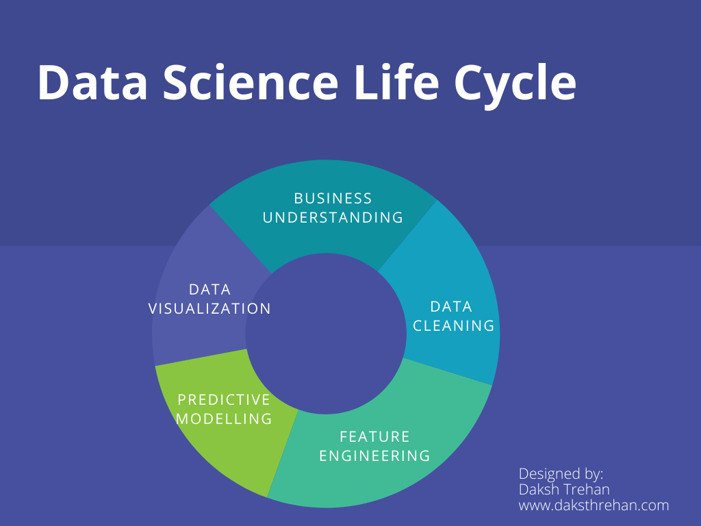
If we ponder over the Data Science pipeline, Tableau can help us in the first step i.e. Data Cleaning which involves amending the data according to our needs and experimenting with the attributes available that further define the scope of our results.
Once the data is cleaned, explored and the results are predicted. The result can be published/deployed/presented through powerful interactive Tableau Dashboards that are useful in understanding the gist of our whole Data Science Pipeline.
Thus, Tableau can be regarded as an eminent tool in the Business Intelligence industry.
But, What is Business Intelligence?
Business Intelligence (BI) helps the organization make data-driven decisions that are useful for driving changes, minimizing efficiencies, and adapting to the latest market trends.
For illustrations, let us consider there is a football team Richmond AFC that juggles between Championship and Premier League, the goal of every team is to stay in the Premier League as it is more profitable and draws more audience. Richmond AFC also wants to compete in Premier League, but for that, they need a strong team, and again they have very limited funds to buy new players. Now, Richmond AFC can’t experiment on buying multiple players as giants like ManC or ManU can do. So, they can take the help of data, they can analyze data of different players and based on the historical data, they can make decisions on which player could be more adaptable towards their team style and can make things work positively. There is no guarantee that the newly brought player could bring fortune for the club, yet the probably things could work based on the data is very high.
This is a simple example of how BI is changing industries and helping the organization make better decisions.
How does BI works?
BI works closely with Data Scientists and Data Analysts. The Data Scientist will draw the data, amend it to satisfy the needs of the customer, use predictive modeling to guess upon future scenarios, and forecast future patterns. The Data Analyst will take all those scenarios and patterns to create a centralized repository that will make it easier to understand the cores of the data and portrayed patterns. Business Intelligence will take all the data, it's modeling, the forecast and will convert it into an actionable language and help companies take better decisions.
The most common way to present Business Intelligence is through Data Visualization.
But, What is Data Visualization?
Data Visualization can be regarded as the most simple yet effective way of representing your data. It usually employs charts, graphs, and maps with a little punch of creativity.
Data Visualization is powerful because our eyes are susceptible to colors and shapes. We can easily recognize the difference between red and green, circle from a triangle and it helps us to keep an eye on the trends, outliers, and the message.
It is a way of storytelling, but not with words but with symbols, charts, shapes, and maps.
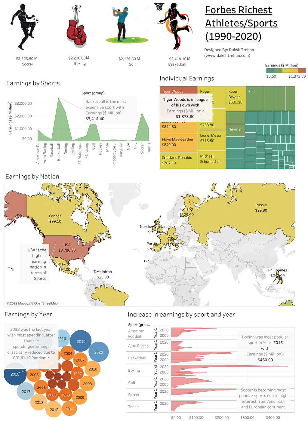
For illustrations, I designed the following vision for the Forbes Riches athletes dataset that included data from 1990–2020. The dashboard/presentation is easy enough to understand the gist of 301 rows and 8 columns. That’s the power of Data Visualization.
Data Visualization can include many types of graphs that are specialized in several use cases.
e.g. Box Plot can be best when we are trying to identify outliers and Inter-quartile regions.
Why Tableau is the Best?
- Support for different data sources → Tableau supports a wide range of storage mediums from where you can connect your data.
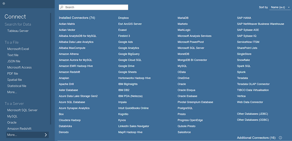
Tableau can connect files either from a cloud server or from the local directory.
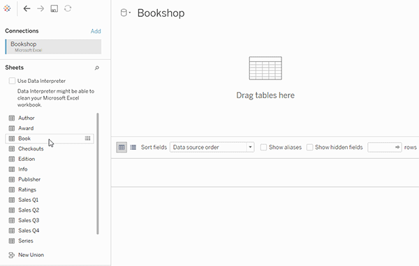
- The *noodle* factor → Probably, the most important and unique feature of Tableau. Forget about joins, relationships are here. Tableau will automatically create a contract between different tables based on the column you need. Though, we can still create manual joins and unions.
- Data Blending → It is another most powerful feature that is only available in Tableau. It enables joining data from multiple sources without having the same file format, the only catch is there must be the same column in both files. Data Blending is roughly a left outer join defined over a primary dataset.
- Real-Time Data Analysis → Tableau enables users to either connect live data or extract data. Live data is the real-time data coming directly from the cloud servers and following a routine to create dashboards. Extracts, on the other hand, are snapshots of live data, these can be used when we want to accelerate our progress and work.

- Mobile Support & Interactive Dashboards → The dashboards created using Tableau can be adjusted to various sizes as per needs, and users can tweak parameters to change data definition in dashboards according to the needs.
- Apt Visualizations → Tableau supports a lot of visualization, though a limited number based on the data can be shown on the home page. But, it allows you to tweak on already existing charts to create custom ones.
Products offered by Tableau
Tableau offers a wide variety of products, each is aimed at different types of consumers:
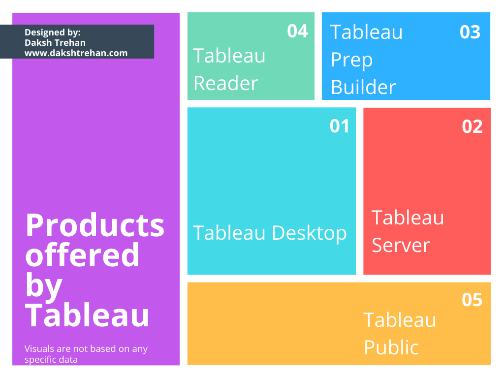
1. Tableau Desktop: It is the most common Tableau tool. It is mainly used by individual users and it also allows them to connect data directly from the warehouse for data analysis. The tool enables the user to export their interactive dashboards directly to Tableau Server or an online environment. This application requires Windows or Mac operating system.
2. Tableau Server: It can be considered as an enterprise-level Tableau offering. It is mainly used by organizations as it can leverage fast databases through live connections. The product can also send automated notifications when your data reaches a threshold or certain conditions are met.
3. Tableau Prep Builder: It is used to prepare the data more intuitively. Each process from joining, unioning, and creating a relationship involves a visual workflow. It also keeps track of changes made in the data, thus making users access to historical changes.
4. Tableau Reader: It’s a free desktop application that enables viewing the analysis and underlying patterns. However, there are no automated refreshes on live data or any security feature such as Password protection on packaged workbooks. This tool can’t be used on Mobiles as well. It limits the users to filter/drill down the data but they can’t contribute to any sheet/dashboard.
5. Tableau Public: This tool works similar to Tableau Reader, but the only difference is, it can be installed on Mobile as well and doesn’t require a local installation but can work on browsers. The motive of this tool is to share the data and visualization with the world.
Certifications offered by Tableau
- Tableau Desktop Specialist → This certification will enable you to enter into the Tableau ecosystem and explore more about it. It also certifies that you’re a fundamental user of Tableau and masters the foundational skills of Tableau.
60 minutes, 45 questions, 100$
In this series, we are going to focus on the Tableau Desktop Specialist exam
Know more about exam:
- Tableau Certified Data Analyst → This certification is still in beta mode and certifies that the user is capable of exploring and presenting data in Tableau.
150 minutes, 60 questions, 199$
- Tableau Server Certified Associate → This certification judges users which are proficient in Tableau Server functionality. The target audience is either a Consultant or System Admin.
90 minutes, 55 questions, 250$
- Tableau Certified Associate Consultant → Only for Tableau Partners.
- Tableau Certified Associate Architect → Only for Tableau Partners.
Sample Exam Questions from this Topic:
____ lets you create workbooks and views, dashboards, and data sources in Tableau Desktop, and then publish this content to a personal server.
- Tableau Public
- Tableau Server
- Tableau Reader
- Tableau Prep
Solution: Tableau Server
____ is the minimum RAM recommended for production use of Tableau Server.
- 32GB
- 128GB
- 16GB
- 8GB
Solution: 32GB
Which Tableau tool provide the lowest entry barrier?
- Tableau Prep
- Tableau Public
- Tableau Reader
- Tableau Server
Solution: Tableau Public
Explanation: Tableau Public could be accessed through browsers and even on mobile phones without any explicit installation.
Is it possible to create a data visualization in Tableau without a dataset?
- True
- False
Solution: True
Explanation: We can create visualizations using calculated fields.
How many maximum tables can we join in Tableau?
- 16
- 64
- 128
- 32
Solution: 32
References:
[1] Tableau Help | Tableau Software
[2] Personal Notes
[3]Tableau Desktop Specialist Exam (New Pattern — 2021) — Apisero
Thanks for Reading!
Feel free to give claps so I know how helpful this post was for you, and share it on your social networks, this would be very helpful for me.
If you like this article and want to learn more about Machine Learning, Data Science, Python, BI. Please consider subscribing to my newsletter:
Find me on Web: www.dakshtrehan.com
Connect with me at LinkedIn: www.linkedin.com/in/dakshtrehan
Read my Tech blogs: www.dakshtrehan.medium.com
Connect with me at Instagram: www.instagram.com/_daksh_trehan_
Want to learn more?
How is YouTube using AI to recommend videos?
Detecting COVID-19 Using Deep Learning
The Inescapable AI Algorithm: TikTok
GPT-3 Explained to a 5-year old.
Tinder+AI: A perfect Matchmaking?
An insider’s guide to Cartoonization using Machine Learning
How Google made “Hum to Search?”
One-line Magical code to perform EDA!
Give me 5-minutes, I’ll give you a DeepFake!
Cheers
Tableau: What it is? was originally published in Towards AI on Medium, where people are continuing the conversation by highlighting and responding to this story.
Join thousands of data leaders on the AI newsletter. It’s free, we don’t spam, and we never share your email address. Keep up to date with the latest work in AI. From research to projects and ideas. If you are building an AI startup, an AI-related product, or a service, we invite you to consider becoming a sponsor.
Published via Towards AI
Towards AI Academy
We Build Enterprise-Grade AI. We'll Teach You to Master It Too.
15 engineers. 100,000+ students. Towards AI Academy teaches what actually survives production.
Start free — no commitment:
→ 6-Day Agentic AI Engineering Email Guide — one practical lesson per day
→ Agents Architecture Cheatsheet — 3 years of architecture decisions in 6 pages
Our courses:
→ AI Engineering Certification — 90+ lessons from project selection to deployed product. The most comprehensive practical LLM course out there.
→ Agent Engineering Course — Hands on with production agent architectures, memory, routing, and eval frameworks — built from real enterprise engagements.
→ AI for Work — Understand, evaluate, and apply AI for complex work tasks.
Note: Article content contains the views of the contributing authors and not Towards AI.
Related posts


Recent Posts


")

