


Solar Power Prediction Using SARIMA, XGBoost, and CNN-LSTM
Last Updated on January 22, 2023 by Editorial Team
Author(s): Amit Bharadwa
Originally published on Towards AI.
Analyzing and forecasting solar power performance using statistical tests and machine learning
Table of Contents
5. Conclusion
The purpose of this post is to show how the application of data science methodologies can be used to solve problems within the renewable energy sector. I will discuss techniques to gain tangible value from a dataset by using hypothesis testing, feature engineering, time-series modeling methods, and much more. I will also address issues such as data leakage and data preparation for different time series models and how they can be managed.
1. Introduction
The energy sector has seen a rise in harnessing renewable energy to provide homes with electricity. However, whether it be on a large scale or for domestic use, the problems remain the same. Power plants that provide electricity sourced from renewable sources face the difficulty of intermittency and need constant maintenance. It can become difficult for the power grid to maintain stability due to intermittency. However, with forecasting methods, grid operators can predict increases and decreases in power generation, which can help manage load accordingly and plan operations better.
Using data on two solar power plants, I will solve these problems by first summarising them into two questions:
1 . Is it possible to identify sub-optimally performing solar modules?
2. Is it possible to forecast two days of solar power?
Before moving on to answering these questions, let’s make sure we have an understanding of how a solar plant generates electricity.
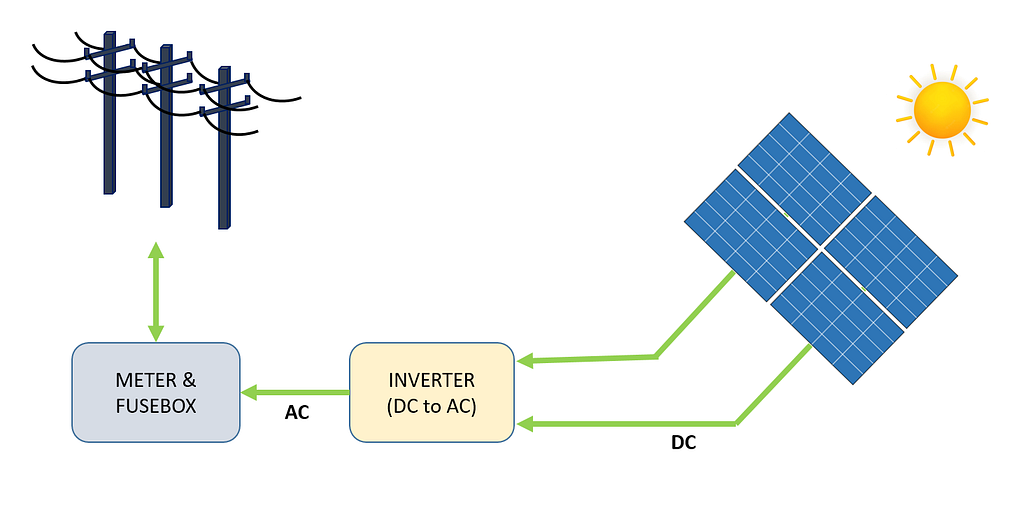
Figure 1 depicts a high-level view of the process of electricity generation, from a module of solar panels to the power grid. Solar energy is converted directly into electricity through the photoelectric effect. When materials such as Silicon (the most common semiconductor material used in solar panels) are exposed to light, photons (subatomic particles of electromagnetic energy) are absorbed and release free electrons, which create a Direct Current (DC). Using an inverter, DC is converted into Alternating Current (AC) and fed into the power grid, where it can be distributed to homes.
There are different types of solar power systems, such as off-grid systems and direct photovoltaic systems, but in this case, we will analyze a grid-connected system.
Without further ado, let’s move on to the analysis.
2. The Data
The raw data consists of two comma-separated-values (CSV) files for each solar plant. One file shows the power generation, and the other file shows the recorded measurements from the sensor located in the solar plant. Both datasets for each solar plant are collated into a single dataframe.
Data for Solar Plant 1 (SP1) and Solar Plant 2 (SP2) were collected every 15 minutes for every module and ranged from 15th May 2020 to 18th June 2020. Both datasets, SP1, and SP2, contain the same variables.
- Date Time -15 minute intervals
- Ambient temperature –temperature of the air surrounding the modules
- Module temperature -temperature of the modules
- Irradiation –high-energy radiation on the modules
- DC Power (kW) -direct current
- AC Power (kW) -alternating current
- Daily Yield -the daily sum of power generated
- Total Yield -cumulative yield of inverter
- Plant ID -unique identification of the solar plant
- Module ID -unique identification for each module
A weather sensor was used to record the ambient temperature, module temperature, and irradiation for each solar plant.
The original data can be found here.
In this case, DC power is going to be the dependent (target) variable. Before moving on to modeling, it’s always a great idea to analyze the data in-depth and, in our case, try to find sub-optimally performing solar modules.
Two separate data frames are used for analysis and predictions. The only difference being the dataframe used for predictions is resampled into hourly intervals and the dataframe used for analysis contains 15-minute intervals.
Plant ID is dropped from both data frames as it does not add any value to trying to answer the questions above. Module ID is also dropped from the predictions dataset. Table 1 and Table 2 show a sample of the data.


Before moving on to analyzing the data, a few assumptions are made about the solar plants, which include :
- Data capturing instruments are not faulty
- The modules are regularly cleaned
- There are no issues with shading around both solar plants
3. Exploratory Data Analysis (EDA)
For those of you who are new to data science, EDA is a crucial step in understanding your data through plotting visualisation and performing statistical tests. Code for this section is not included however, code for all visualisations can be found on my Github page which is linked at the bottom of the post.
Firstly by plotting DC and AC for SP1 and SP2, the performance of each solar plant can be observed.
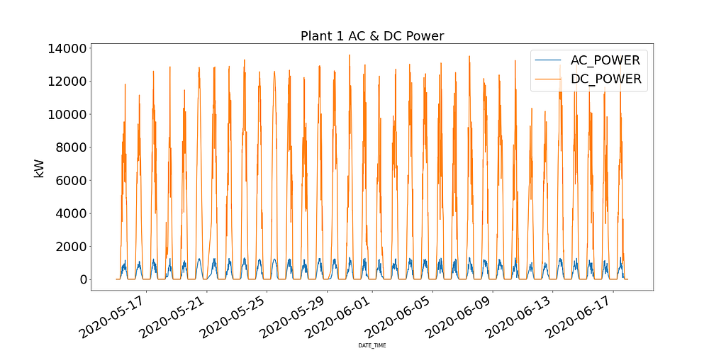
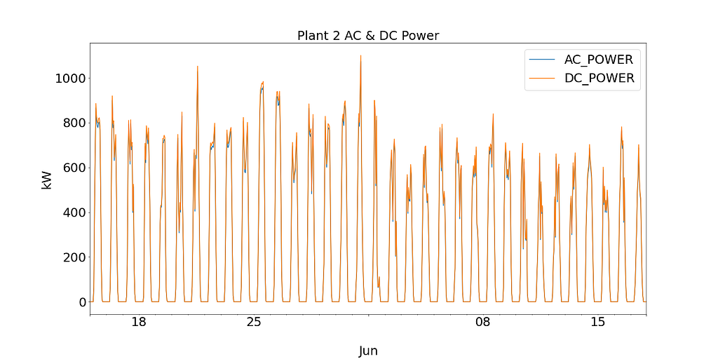
Plant 1 shows DC Power an order of magnitude higher than Plant 2. Based on the assumption that the data collected for SP1 is correct and the instruments used to record the data are not faulty, this leads to investigating the efficiency of the inverter in SP1.
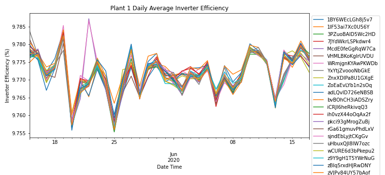
By aggregating AC & DC power by the daily frequency for each module, Figure 3 shows the efficiency of the inverter for all modules in SP1. According to energy saving trust, the efficiency of a solar inverter should range between 93-96%. As the efficiency ranges from 9.76% — 9.79% across all modules, the solar plant operators can further investigate the performance of the inverter and if it needs to be replaced.
Due to SP1 showing issues with the inverter, further analysis is only done on SP2.
Even though this short bit of analysis has led to investigating the inverter, it does not answer the primary question of identifying solar modules performing sub-optimally.
As the inverter for SP2 is functioning as expected, by digging deeper into the data, we’ll try to identify and investigate any abnormalities.
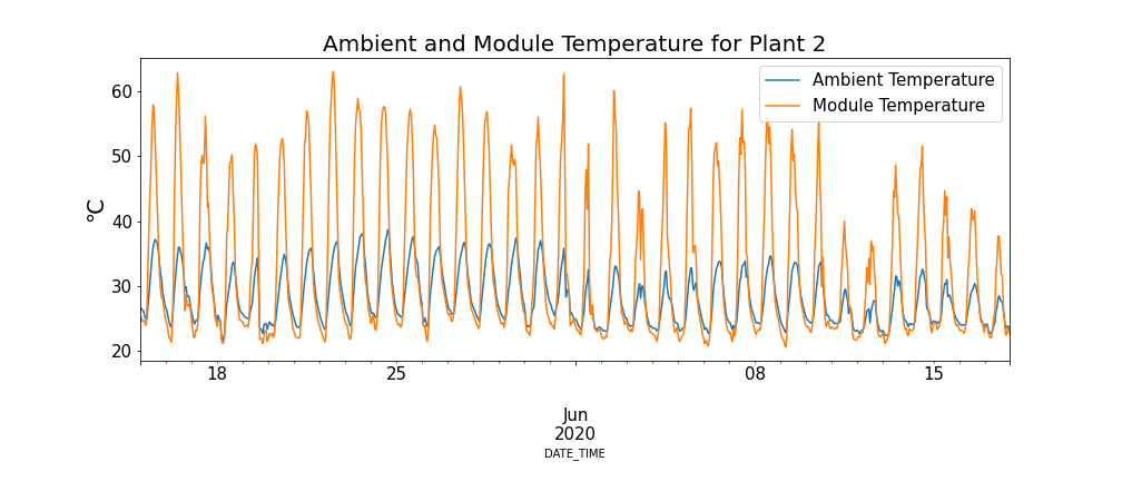
Examining the relationship between module temperature and ambient temperature in Figure 4, there are periods where the module temperature is extremely high.
Keeping this phenomenon in mind, Figure 5 below shows the module temperature and DC power for SP2 (Data points where the ambient temperature is lower than the module temperature and times of the day where a low number of modules are operating have been filtered to prevent skewed data).
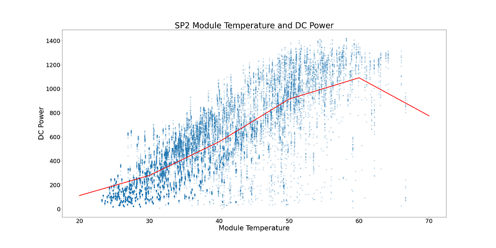
In Figure 5, the red line shows the mean temperature. There is a clear tipping point and signs of DC power plateauing. DC power starts to plateau at ~52°C. To find solar modules performing sub-optimally, all rows showing module temperatures over 52°C are removed.
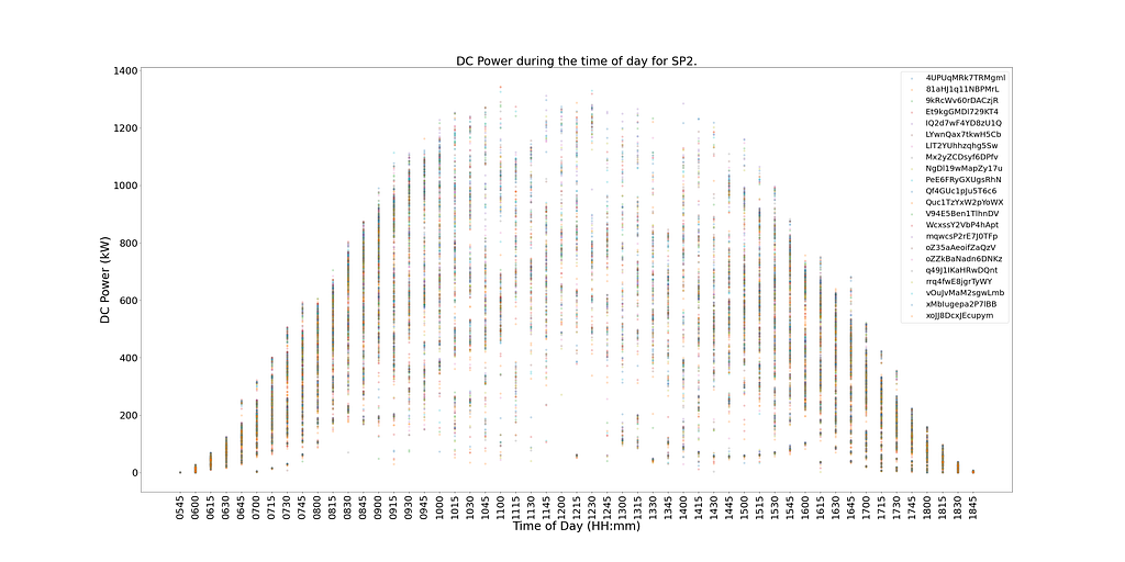
Figure 6 below shows the DC Power for each module in SP2 during the time of day. DC power is distributed as expected, with greater power generation at midday. However, there are signs of low power generation during peak-performing times. It’s difficult to depict the cause of this as weather conditions could have been poor on the day, or SP2 could have been coming to the end of its regular cleaning cycle.
There are also signs of low-performing modules within Figure 6. They can be identified as modules (single data points) on the graph, straying away from their closest cluster.
To determine which modules are underperforming and not affected by poor weather conditions or end-of-cleaning cycles, a statistical test that shows the performance of each module compared to others at the same time will identify sub-optimal performance.
As the distribution of different modules of DC power at the same time per 15-minute interval is normally distributed, a hypothesis test can determine which modules are underperforming. A count is taken on the number of times a module falls outside a 99.9% confidence interval with a p-value < 0.001.
Figure 7 shows, in descending order, the number of times each module was statistically significantly underperforming compared to the other modules at the same time.
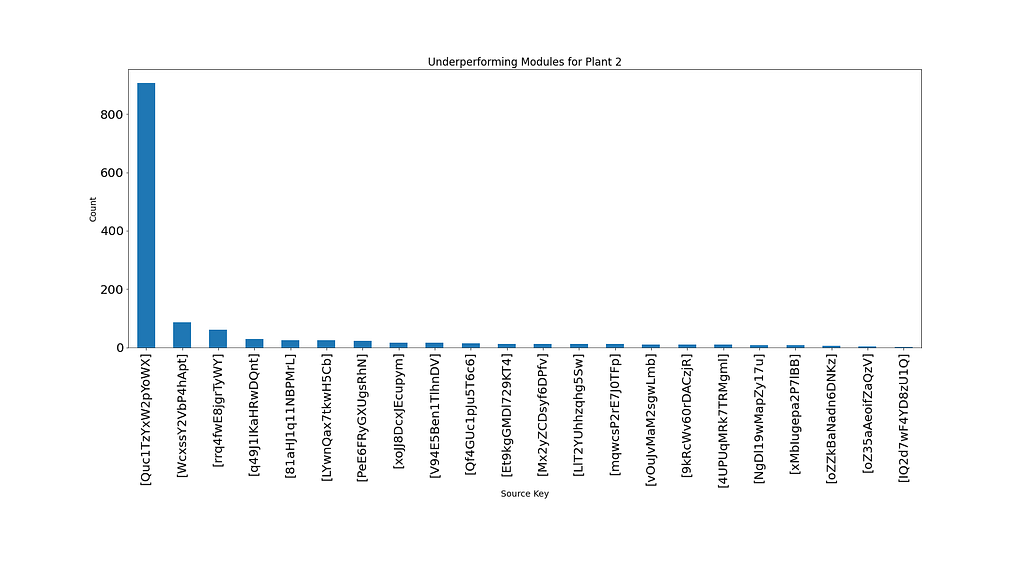
A clear deduction can be made from figure 7, which shows module ‘Quc1TzYxW2pYoWX’ sub-optimally performing ~850 times. This information can be given to the operational managers at SP2 to investigate the cause.
4. Modelling
In this section, we will look at three different time series algorithms: SARIMA, XGBoost, and CNN-LSTM, and their setup to predict 2 days of DC power for SP2.
For all three models, a walk-forward validation is used to predict the next data point. Walk-forward validation is a technique used for time series modeling as predictions become less accurate over time and so a more pragmatic approach is to retrain the model with actual data as and when it becomes available.
More on this technique and how it can be used on a Long Short Term Memory (LSTM) model can be found in the post below.
Using Deep Learning to Forecast a Wind Turbines Power Output
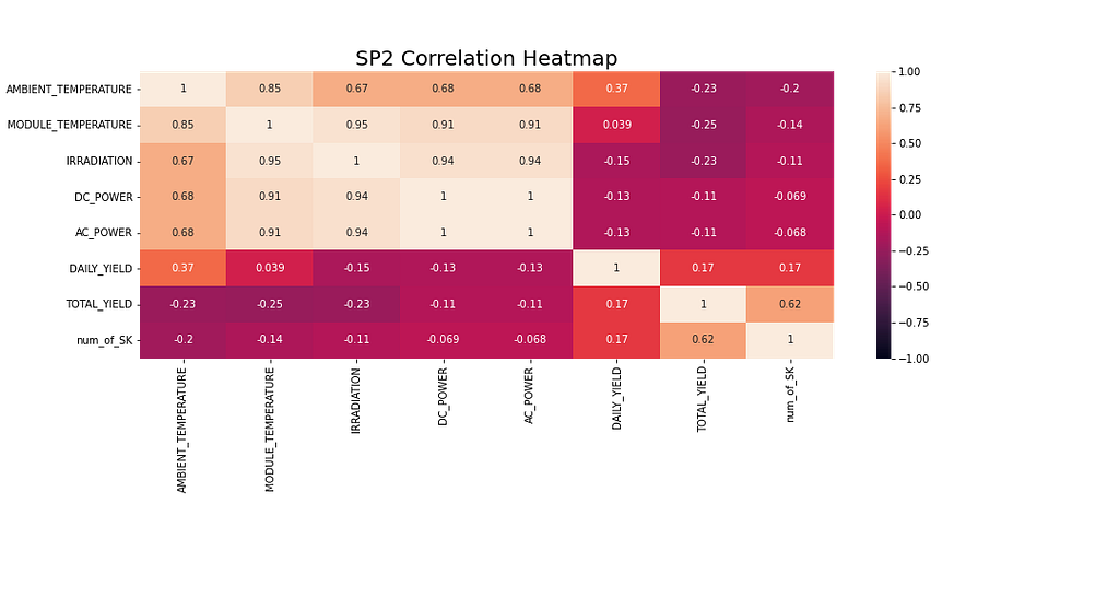
Before modeling, it’s always worth exploring the data in more detail. Figure 8 shows the correlation heatmap of all the features in the SP2 dataset. The heatmap shows the dependent variable, DC Power, displaying a strong correlation with Module temperature, Irradiation, and Ambient temperature. These features can likely play an important part in forecasting.
AC power is showing a pearson correlation coefficient of 1 in the heatmap below. To prevent data leakage problems, AC Power is removed from the dataframe as the model can not be given access to this information before any of the other variables are recorded.
For the SARIMA and XGBoost models, the python library ‘multiprocessing’ was used to leverage the use of multiple processors to find optimum hyperparameters through grid searching.
SARIMA
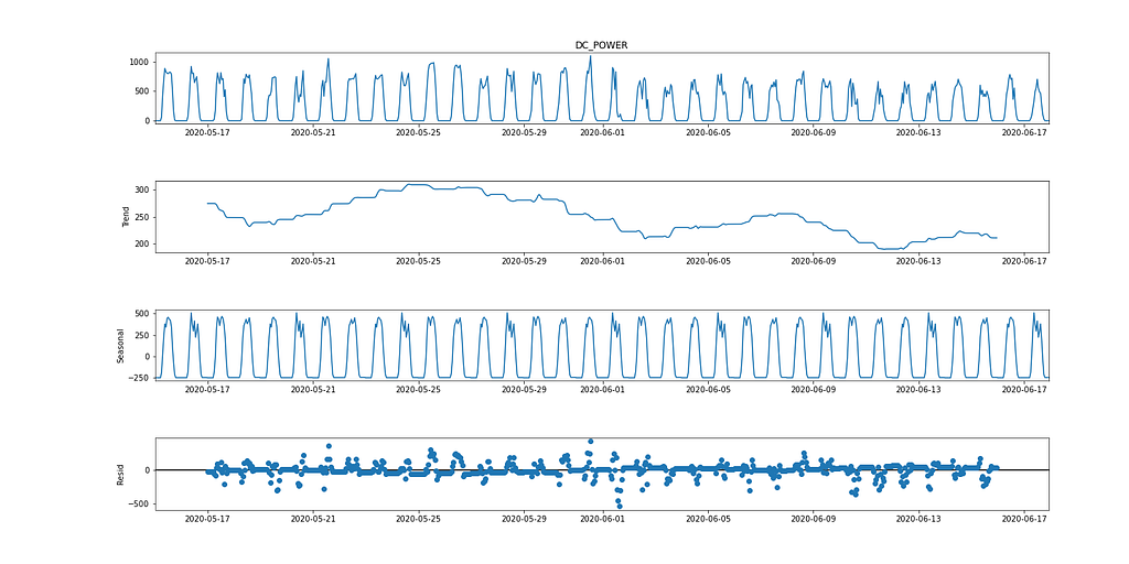
SARIMA (Seasonal Autoregressive Integrated Moving Average) is a univariate time series forecasting method. As the target variable shows signs of a 24-hour cyclic cycle, SARIMA is a valid modeling option as it considers seasonal effects. This can be observed in the seasonal decomposition graph below.
The SARIMA algorithm requires the data to be stationary. There are multiple ways of testing if the data is stationary, e.g., Statistical tests (the Augmented Dickey fuller test), summary statistics (comparing mean/variance of separate parts of the data), and visually analyzing the data. It is important to try out multiple tests before modeling.
The Augmented Dickey-Fuller (ADF) test is a ‘unit root test’ used to determine if a time series is stationary. It’s fundamentally a statistical significance test with a null and alternative hypothesis, and a conclusion is reached based on the resulting p-value.
Null Hypothesis: The time series data is non-stationary.
Alternative Hypothesis: The time series data is stationary.
In our case, if the p-value ≤ 0.05, we can reject the null hypothesis and confirm the data does not have a unit root.
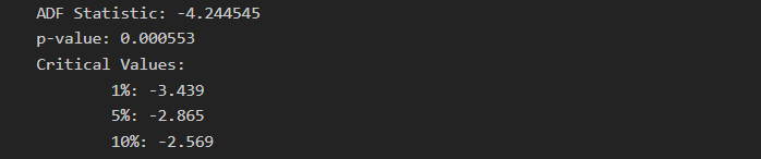
From the ADF test, the p-value is 0.000553, which is < 0.05. From this statistic, the data can be considered stationary. However, looking at Figure 2, there are clear signs of seasonality (for time series data to be considered stationary, there should be no signs of seasonality and trend), resulting in non-stationary data. Hence the importance of running multiple tests.
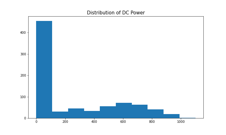
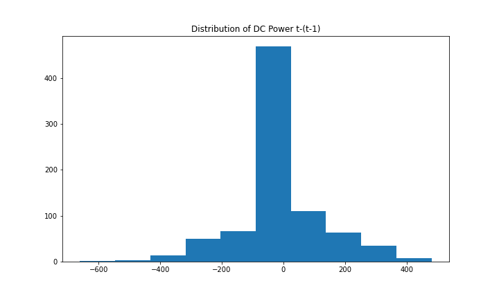
To model the dependent variable using SARIMA, the time series needs to be stationary. Figure 9 (1st and 3rd graph) shows clear signs of seasonality for DC power. Taking the first difference [t-(t-1)] removes the seasonality component, which can be seen in Figure 10, as it looks similar to a normal distribution. The data is now stationary and suitable for the SARIMA algorithm.
The hyperparameters for SARIMA include p(autoregression order), d(difference order), q(moving average), P(seasonal autoregression order), D(seasonal difference order), Q(seasonal moving average order), m(time steps for a seasonal period), trend(deterministic trend). More information on SARIMA hyperparameters and forecasting can be found here.
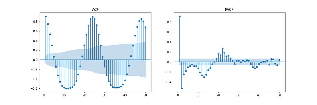
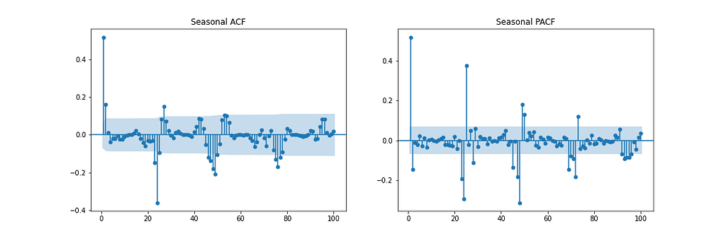
Figure 11 shows the Autocorrelation (ACF), Partial Autocorrelation (PACF), and Seasonal ACF/PACF plots. The ACF plot shows the correlation between a time series and a delayed version of itself. The PACF shows a direct correlation between a time series and a lagged version of itself. The shaded blue region represents the confidence interval. The SACF and SPACF can be computed by taking the seasonal difference(m) from the original data, in this case, 24, as there is a clear seasonal effect of 24 hours, as shown in the ACF plot.
With intuition, a starting point for the hyperparameters can be deduced from the ACF and PACF plots. For instance, the ACF and PACF both show a gradual decline which means the autoregression order(p) and moving average order(q) are greater than 0. p and P can be determined by observing the PCF and SPCF plots, respectively, and counting the number of lags which are statistically significant before a lag value is insignificant. Similarly, q and Q can be found in the ACF and SACF plots.
The difference order(d) can be determined by the number of differences taken to make the data stationary. The seasonal difference order(D) is estimated from the number of differences it takes to remove the seasonality component from the time series.
This method serves as a starting point to begin modeling. Grid searching over a range of values around this starting point should increase model performance. More information on estimating these parameters can be found here.
Through hyperparameter optimization using a grid search approach, the optimum hyperparameters are chosen based on the lowest Mean Squared Error (MSE), which include p = 2, d = 0, q = 4, P = 2, D = 1, Q = 6, m = 24, trend = ’n’ (no trend).
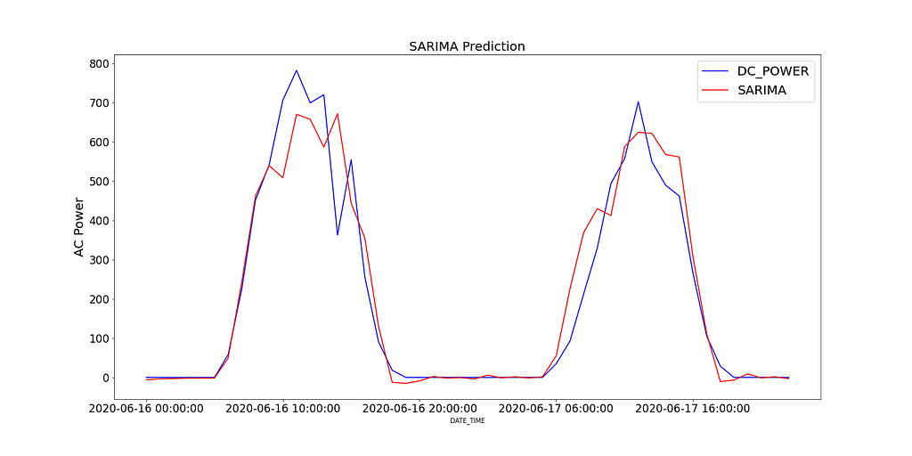
Figure 12 shows the predicted values of the SARIMA model compared to the recorded DC power for SP2 over 2 days.
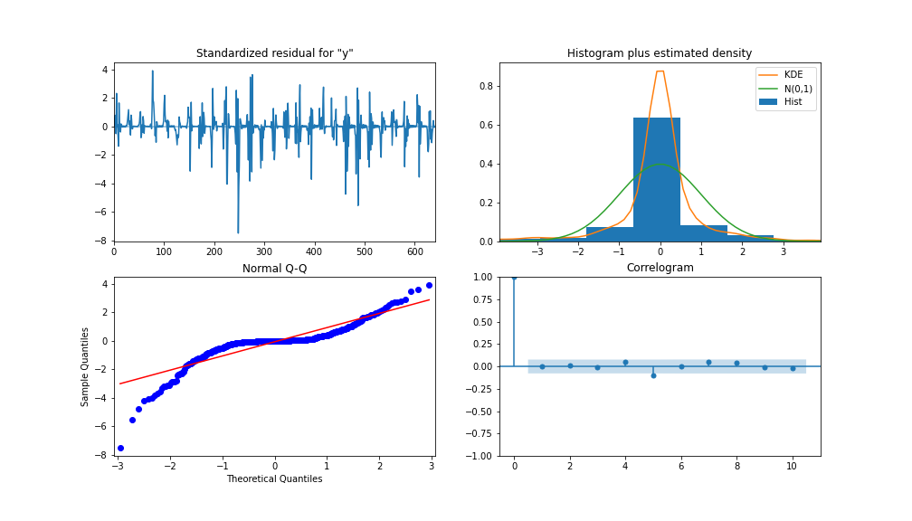
To analyze the performance of the model, Figure 13 shows the model diagnostics. With the correlogram shows almost no correlation after the first lag, and the histogram below shows a normal distribution around a mean zero. From this, we can say there is no further information the model can congregate from the data.
XGBoost
XGBoost (eXtreme Gradient Boosting) is a gradient-boosting decision tree algorithm. It uses an ensemble approach where new decision tree models are added to amend existing decision tree scores. Unlike SARIMA, XGBoost is a multivariate machine learning algorithm which means the model can take multiple features to boost model performance.
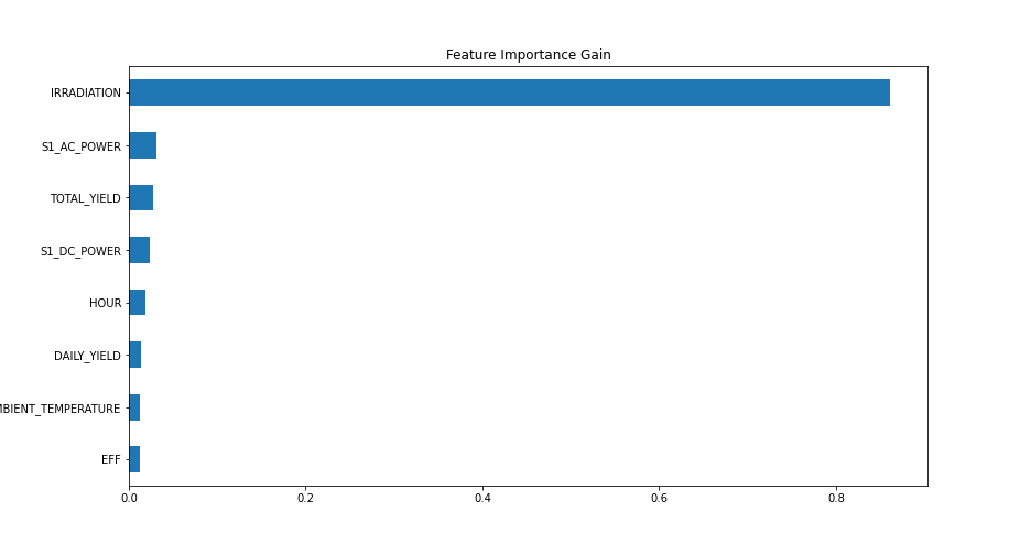
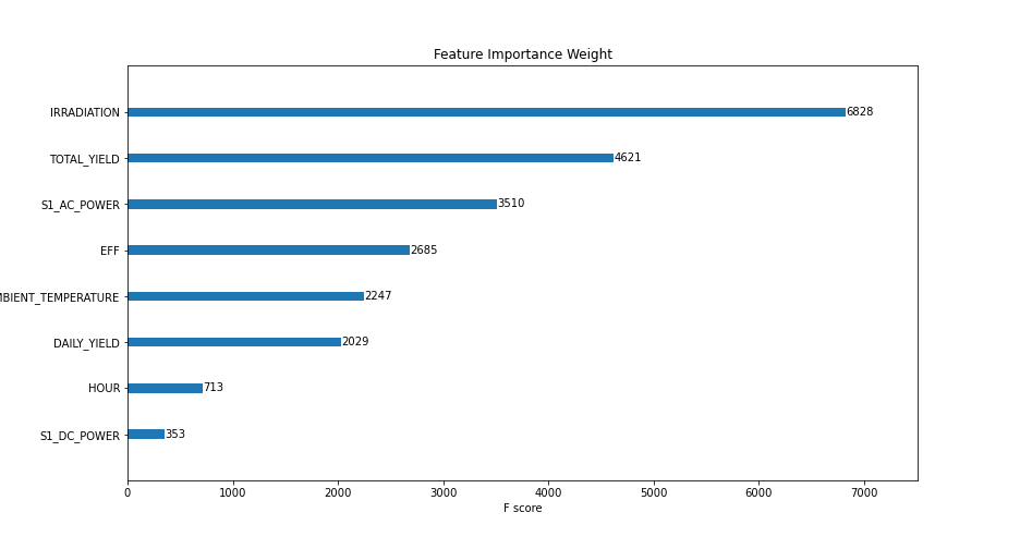
Feature engineering steps were taken to improve model accuracy. 3 additional features were created, which included a lag version of AC and DC power, S1_AC_POWER and S1_DC_POWER, respectively, and overall efficiency, EFF by dividing AC Power by DC Power. AC_POWER and MODULE_TEMPERATURE were dropped from the data. Figure 14 shows the importance level by the gain (the average gain of splits that use a feature) and weight (the number of times a feature appears in a tree).
Hyperparameters used for modeling were determined by grid searching and resulted in: learning rate = 0.01, number of estimators = 1200, subsample = 0.8, colsample by tree = 1, colsample by level = 1, min child weight = 20 and max depth = 10.
As previously mentioned, a walk-forward validation approach is used, and a MinMaxScaler is used to scale the training data between 0 and 1 (I highly recommend experimenting with other scalers, such as log-transform and standard-scaler, depending on the distribution of your data). The data is transformed into a supervised learning dataset by shifting all the independent variables back by a period.
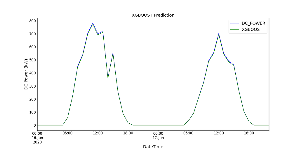
Figure 15 shows the predicted values of the XGBoost model compared to the recorded DC power for SP2 over 2 days.
CNN-LSTM
CNN-LSTM (convolutional Neural Network Long Short-Term Memory) is a hybrid model of two neural network models. CNN is a feed-forward neural network that has shown good performance in image processing and natural language processing. It can also be effectively applied to forecasting time series data. LSTM is a sequence-to-sequence neural network model designed to solve the longstanding problem of gradient explosion/disappearance with the use of an internal memory system that allows it to accumulate state over the input sequence. More information on these models can be found here and here.
In this instance, CNN-LSTM is used as an encoder-decoder architecture. As CNN does not directly support sequence input, a 1D CNN reads across the sequence input and automatically learns the important features. These can then be interpreted by LSTM. Similar to the XGBoost model, the same data is used and scaled using scikitlearn’s MinMaxScaler, but between a range of -1 and 1. For CNN-LSTM, the data needs to be reshaped into the required structure: [samples, subsequences, timesteps, features], so that it can be passed in as input to the model.
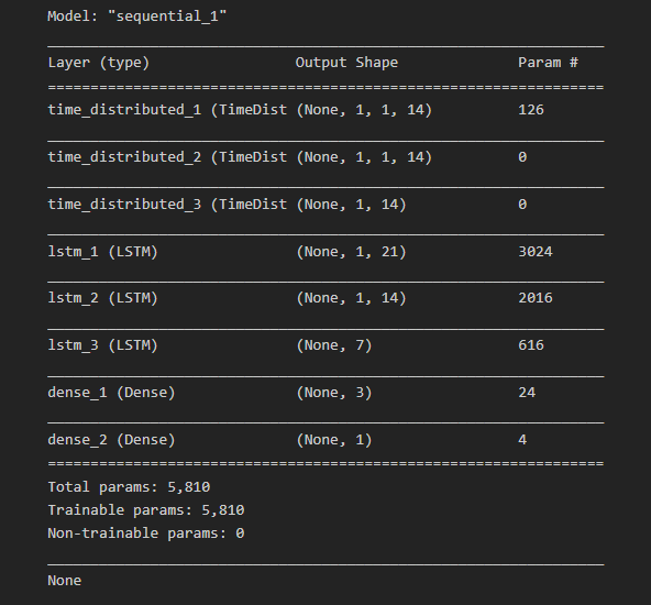
As we want to reuse the same CNN model for each subsequence, a TimeDistributed wrapper is used to apply the entire model once per input subsequence. A model summary of the different layers used in the final model can be seen in Figure 16 below.
Further to splitting the data into training and testing data, the training data is split into a training and validation dataset. This can further be used by the model to assess model performance after each iteration of all of the training data (including the validation data). This is referred to as an epoch.
A Learning curve is a great diagnostic tool used in deep learning which shows the performance of the model after each epoch. Figure 17 below shows how the model can learn from the data and shows the validation data converging with the training data. This is a sign of good model training.
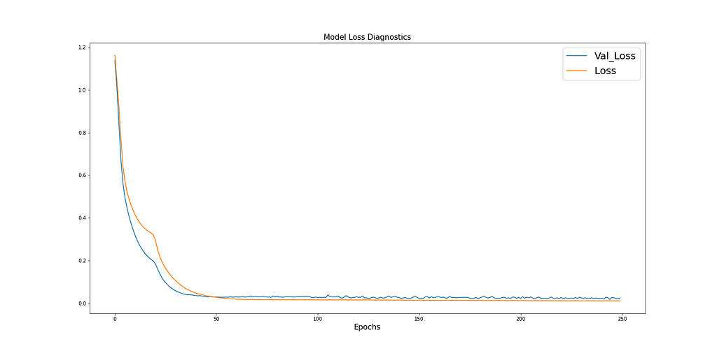
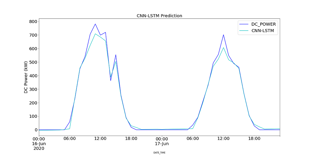
Figure 18 shows the predicted values of the CNN-LSTM model compared to the recorded DC power for SP2 over 2 days.
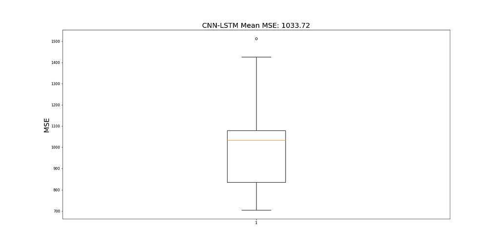
Due to the stochastic nature of CNN-LSTM, the model is run 10 times and a mean MSE value is recorded as the final value to judge the performance of the model. Figure 19 shows the range of MSEs recorded for all model runs.
Results
Before modeling, a persistence model is computed to provide a maximum MSE value and to assess the performance of other models. The results of the persistence model are calculated by computing the MSE of DC Power and a lagged version of 1 period of the same time series. Table 3 highlights the MSE for each model (mean MSE for CNN-LSTM) and the runtime in minutes for each model.
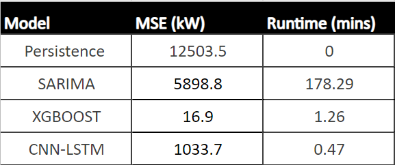
From Table 3, XGBoost shows the best performance compared to all other models, with the lowest MSE and second fastest runtime. As this model shows a runtime that is acceptable for hourly predictions, it can be a powerful tool to aid operational managers' decision-making process.
5. Conclusion
To summarise, SP1 and SP2 were analyzed to identify areas of low performance. SP1 showed low performance due to low inverter efficiency. Investigating SP2 further showed signs of sub-optimally performing solar modules. Using a hypothesis test to count the number of times each module was statistically significantly underperforming, compared to other modules at the same time, raised concern with the module ‘Quc1TzYxW2pYoWX’, which showed ~850 counts of low performance.
Predicting future solar power production resulted in resampling SP2 into hourly intervals and splitting the data into 48 periods (2 days) for testing data and the remaining for training the three models. These models included SARIMA, XGBoost, and CNN-LSTM. SARIMA showed the poorest performance, and XGBOOST showed the best result with an MSE of 16.9 and a runtime of 1.43 mins. XGBoost is recommended out of all three models and to deploy into production.
Thank you for reading, and happy learning.
Data reference
Kannal, A. (2020, August). Solar Power Generation Data. License : Data files © Original Authors, Retrieved 25th September 2020 from https://www.kaggle.com/datasets/anikannal/solar-power-generation-data
To accesss the code used throughout this post, visit my GitHub page. The link can be found here.
To Get in Touch
Linkedin: https://www.linkedin.com/in/amit-bharadwa123/
Interested in starting your own data science project? Check out the link below to help you on your journey.
7 Steps to a Successful Data Science Project
Solar Power Prediction Using SARIMA, XGBoost, and CNN-LSTM was originally published in Towards AI on Medium, where people are continuing the conversation by highlighting and responding to this story.
Join thousands of data leaders on the AI newsletter. Join over 80,000 subscribers and keep up to date with the latest developments in AI. From research to projects and ideas. If you are building an AI startup, an AI-related product, or a service, we invite you to consider becoming a sponsor.
Published via Towards AI
Towards AI Academy
We Build Enterprise-Grade AI. We'll Teach You to Master It Too.
15 engineers. 100,000+ students. Towards AI Academy teaches what actually survives production.
Start free — no commitment:
→ 6-Day Agentic AI Engineering Email Guide — one practical lesson per day
→ Agents Architecture Cheatsheet — 3 years of architecture decisions in 6 pages
Our courses:
→ AI Engineering Certification — 90+ lessons from project selection to deployed product. The most comprehensive practical LLM course out there.
→ Agent Engineering Course — Hands on with production agent architectures, memory, routing, and eval frameworks — built from real enterprise engagements.
→ AI for Work — Understand, evaluate, and apply AI for complex work tasks.
Note: Article content contains the views of the contributing authors and not Towards AI.
Related posts
Recent Posts


")

