


 Fostering Social Impacts with Data Science")
(Part Final) Fostering Social Impacts with Data Science
Last Updated on November 1, 2022 by Editorial Team
Author(s): Vincent Liu
Originally published on Towards AI the World’s Leading AI and Technology News and Media Company. If you are building an AI-related product or service, we invite you to consider becoming an AI sponsor. At Towards AI, we help scale AI and technology startups. Let us help you unleash your technology to the masses.
A Data-driven Analysis of the Uniform Crime Report 2021 DC Arrest Data
The last piece of our picture: Wrapping Up
In the last two posts of this series, we walked through the processes of cleaning a public dataset, understanding the nitty-gritty of data, and narrating a story about who was arrested in DC in the passing year. Today in this final part, we will complete our storytelling by talking about what people did that led to their arrests: what crimes did they commit? Did they use a weapon? These questions are central to a variety of policy and legal discussions, which makes acquiring a deeper understanding of them important. As the ending post of this trilogy, I will compose the ending note of this orchestra by modeling our data to draw some inferences and sharing how to do data science in a non-harmful way: data science shall be ethical and used to promote social and criminal justice and equity, but it’s easy to go wrong.
Still, we load our data and libraries first.
library(tidyverse) # use the tidyverse universe
library(ggtext) # format texts/annotations in ggplots
library(GGally) # for more visualization options
library(ggpubr) # dot chart and plot arrangement
library(gt) # for goog looking table
library(sjPlot) # for beautiful looking regresison table
library(sjmisc)
library(sjlabelled)
load("data/final_data.rda")
Are They Criminals?: The ‘How’ Piece
By Offense
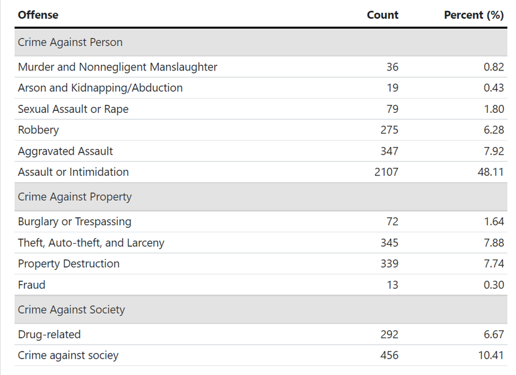
There is more than one way to classify a crime. We are often familiar with words such as index crimes, violent crimes, and drug crimes, but few know that they represent different classification systems used by different law enforcement agencies. For example, violent crimes are often related to force and imply the infliction of great bodily harm. Property crimes, on the other hand, usually imply the loss or damage of properties. However, property crimes are not necessarily nonviolent, and vice versa. Different from the violent vs. non-violent dialogue, index crime is the term used by the FBI that represents a few most important categories, some of which are of the most heinous and gruesome in nature (e.g., murder) while some are really minors (eg, theft), but all of them endangers our liberties. FBI’s coding system is not used by every law enforcement agency in the nation. As an example, the Chicago Police Department coded over 50 crime types in their CLEAR (Citizen Law Enforcement Analysis and Reporting) system (they weirdly combined aggravated assaults and simple assaults as one category — assault).
Here, consistent with how I wrangled the data in part 1 of the series, I applied the legal framework to classify these 12 crime types into three groups: crimes against the person, crimes against property, and crimes against society. This structure, which is also widely adopted, emphasizes who bears the burden of crimes — a person, property, or the entire society. Similar to this classification approach, we also have the misdemeanor vs felony divide, which is based on the sentenced time in jail.
As we can tell from the table below, simple assault or intimidation accounted for nearly half of all crimes that led to an arrest in DC in 2021 and is almost five times in number the second highest category, crime against society, which in literal words, stands for crimes like prostitution! If we exclude this category (as distinct from aggravated assaults, simple assaults are usually of low level, without a gun/weapon, and without great bodily harm), the number of arrests caused by violent crimes is roughly equal to the size of the other two categories, which is weird in the sense that violent crimes are usually the rarest of all crimes. Is there a reason for the crazy number of assaults and violent crimes? We are not able to answer this question with our data, but this is a great idea for research.
dc21 %>%
  group_by(offense) %>%
  summarise(count = n()) %>%
  mutate(`Percent (%)` = round(count/sum(count)*100,2)) %>%
  gt() %>%
  cols_align(
    align = "left",
    columns = offense
  ) %>%
   cols_label(
    offense = "Offense",
    count = "Count"
  ) %>%
  tab_row_group(
    label = "Other Crimes",
    rows = 11:12
  )  %>%
  tab_row_group(
    label = "Peoperty Crime/ Crime Against Property",
    rows = 7:10
  )  %>%
   tab_row_group(
    label = "Violent Crime/ Crime Against Person",
    rows = 1:6
  ) %>%
    tab_options(
      column_labels.border.top.width = px(3),
      column_labels.border.top.color = "transparent",
      table.border.top.color = "transparent",
      table.border.bottom.color = "transparent",
      data_row.padding = px(3),
      source_notes.font.size = 12,
      heading.align = "left",
      #Adjust grouped rows to make them stand out
      row_group.background.color = "#e3e3e3") %>%
  tab_style(
     locations = cells_column_labels(columns = everything()),
     style  = list(
       cell_borders(sides = "bottom", weight = px(3)),
       cell_text(weight = "bold")
     )
   )
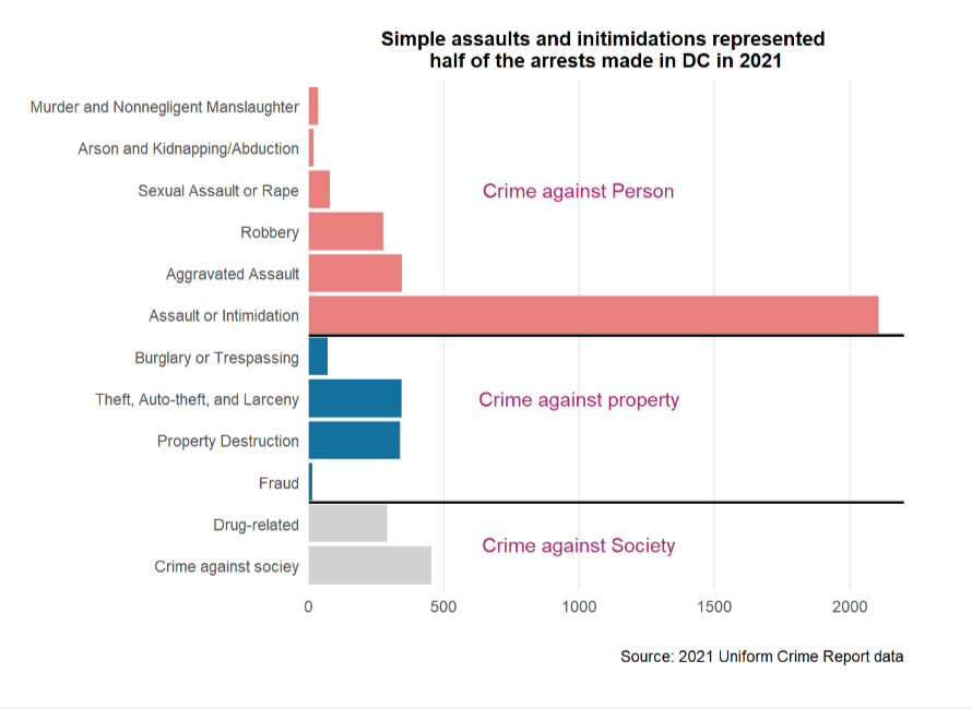
The chart below tells the same story in a more visually appealing way. I colored the bars according to the offense group they belong to and removed redundant gridlines.
dc21 %>%
  group_by(offense) %>%
  summarise(count = n()) %>%
  ggplot(aes(x = offense, y = count)) +
  geom_col(fill = "#12719e") +
  coord_flip() +
  scale_x_discrete(limits=rev) +
  theme_classic() +
  scale_y_continuous(expand = c(0, 0),
                     limits = c(0, 2200),
                     breaks = c(0,100,
                                seq(250, 2000, 250), 4500)) +
  theme(
 #   text = element_text(family = "sans"), #other default fonts aren't good for web
    title =element_text(size=11, face='bold'),
    panel.grid.major.y = element_blank(),
    panel.grid.minor.y = element_blank(),
    panel.grid.major.x = element_line(),
    axis.line.y = element_line(),
    axis.line.x = element_blank()
  ) +
  labs(x = "", y = "",
       caption = "Source: 2021 Uniform Crime Report data") +
  geom_vline(xintercept = 2.5,
             colour = "red", size = 1.5) +
  annotate("text", y = 1000, x = 1.5,
           label = "Other Crimes", color = "#af1f6b") +
  geom_vline(xintercept = 6.6,
             colour = "red", size = 1.5) +
  annotate("text", y = 1000, x = 10,
           label = "Violent Crimes", color = "#af1f6b") +
  annotate("text", y = 1000, x = 5,
           label = "(Violent) Property Crimes",
           color = "#af1f6b") +
  ggtitle("Arrests in DC Area by Offense Type in 2021")
By Weapon
The problem of guns is a salient problem the nation is facing, but not all crimes involve a gun. As a crime policy student and researcher, I often see this issue twisted and manipulated by politicians to serve their agenda and disseminate their ideas. The fact is that the majority of crimes do not have a gun or weapon involved. Although according to a recent Pew Research Center poll, gun-triggered homicide has been rising in recent years, gun-involved crimes still represent a small percentage of all crimes committed, and over half of these gun-related casualties were suicides. Even beyond that, very little research suggests the existence of a causal relationship between gun possession and crimes.
Nevertheless, it is important for us to know how many cases were weapon-related, who used a weapon, and what weapon offenders used to fill our curiosity, formulate more targeted and effective crime prevention policies, and avoid the passing of more innocent lives and valuable community members. This is also what research is for: to build a better future where people’s lives are valued.
From our data, we see an absolute majority of arrests (80ish%) were not caused by the use of weapons by offenders. This is true for offenders of all races, sexes, and ages.
dc21 %>%
  count(race_new, weapon) %>%
  gt() %>%
  cols_align(
    align = "left",
    columns = race_new
  ) %>%
  cols_align(
    align = "left",
    columns = weapon
  ) %>%
   cols_label(
    n = "Count",
    weapon = "Weapon",
    race_new = "Race"
  )
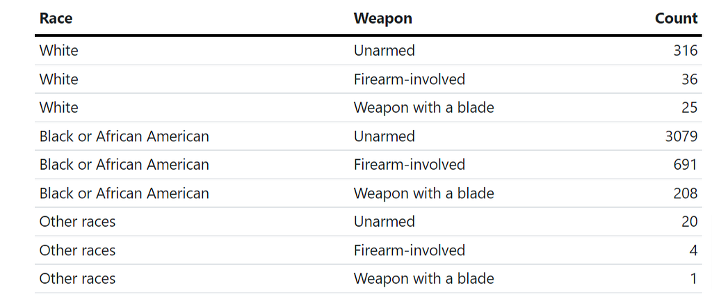
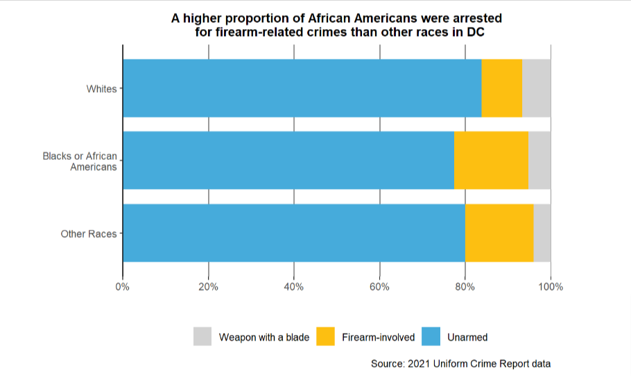
According to the horizontal stacked bar chart, Whites had the lowest proportion of arrests (8ish%) where firearms, such as guns or rifles, were involved. On the other hand, Blacks had the highest proportion (15%ish) of weapon-triggered arrests. This may be related to the existence of Black gangs in the notorious Southeast region of the city in which gang fights and shootings are routinized and issues of harmful gang regulation and under-policing in certain streets prevail.
Still, regardless of the racial group, arrests were predominately associated with individuals who are unweaponized (this is not equivalent to saying the same amount of cases are nonviolent).
dc21 %>%
  mutate(weapon = fct_rev(weapon)) %>%
  group_by(race_new, weapon) %>%
  summarise(count = n()) %>%
  ggplot(aes(x = race_new, y = count, fill = weapon)) +
  geom_col(position = "fill", width = .8) +
  coord_flip() +
  labs(title = "A higher proportion of African Americans were arrested\n  for firearm-related crimes than other races in DC",
       caption = "Source: 2021 Uniform Crime Report data",
      y = "",
       x = "") +
  theme_classic() +
  theme(
    title =element_text(size=10, face='bold'),
    axis.line.x = element_blank(),
    panel.grid.major.x = element_line(color = "gray60",
                                            size = 0.6,
                                            linetype = "solid")) +
  scale_x_discrete(limits = rev,
                   labels = c("Other Races",
                              "Blacks or African\nAmericans",
                              "Whites")) +
  scale_y_continuous(expand = c(0,0),
                     breaks = seq(0,1,.2),
                     labels = scales::percent)  +
  guides(fill = guide_legend(title = NULL)) +
  scale_fill_manual(values=c("#e46aa7", "#46abdb", "#d2d2d2"))
From EDA to Statistical Modeling
In a lot of projects, the analysis stopped with the explorative data analysis, like the one we did in the last section. In many others, we need to do more modeling to draw inferences. The question of whether we do data modeling or not depends on the objective of our research. Should we be interested in going beyond knowing the “what” and understanding the “how” — the inner mechanisms of data -, running some models on the data is a must. Graphics and tables can tell you the numbers, but they can’t tell you the “how”: we can’t say two things are related or causally related without doing some statistical tests. If you want to say something like A increased/decreased B by xxx (a number/level), you need to do modeling.
There are tons of statistical models that fit different types of data, ranging from regression, and multilevel modeling, to randomized controlled trials, difference-in-difference (for causal inference), machine learning, and deep learning. Using which is a question of what the data looks like and what questions the team wishes to answer. Most of the time, doing a regression will solve the problem, but sometimes the thing gets trickier. This is especially because most models presume the holding of certain assumptions, and any violation will lead to the unreliability of our results. Therefore, a common practice is checking assumptions once the model is written.
Because our data only includes people who are arrested, it’s not easy to do a regression. Rather, one good question would be what is related to the use of firearms in a crime. Are certain socioeconomic groups in DC more likely to use firearms? We answer this question with a generalized linear model (GLM).
Generalized Linear Regression
A general linear model is used to model any data that doesn’t follow a normal distribution so that the OLS assumption is not supported. In the most classic case, these models have a categorical variable as the dependent variable (y) and follow a binomial distribution (with 0/1 or two groups as the values). However there are many exceptions to this rule, but those are out of the scope of this discussion. The distribution that the data follows is frequently called the “link function”. A generalized linear model with a binomial link function follows the equation
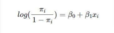
, where pi is the link function and x is the independent variable. GLM does not assume many assumptions, so we usually can skip this step so long as we can make sure observations in the data are independent, which is the question of research design (data collection).
My research question 2 asks if the use of force makes one more likely to be arrested. This question is addressed in the last section. Here, I want to expand on this question and ask: are certain groups more likely to use force? To answer that, I created a dummy variable (a dummy variable is a variable with 0 or 1/ True or False) that characterized if the arrestee deployed any force. By force, I am referring to the involvement of guns or other firearms like rifles. On the x-axis side, I put three variables race, sex, and age.
In a GLM model, the estimates refer to the log odds of the coefficients so we can’t interpret them in the way we interpret these statistics in a linear regression model. A common approach is to exponentiate the coefficients, with which we get the odds ratios, and interpret them in the convention of “the odd of group A vs. the odd of group B”.
P-value is another statistic we look at. A p-value smaller than .001/.05 suggests a robust statistical correlation, while a p-value smaller than .01 represents some correlations. A p-value larger than .01 suggests no statistical relationship (usually, a p-value larger than .05 is good enough for us to say the same).
Like linear regressions, we can get all the statistics with the summary function in base R. We can also do an ANOVA test to look at the variance.
dc21_mod <-dc21 %>%
  mutate(use_force = if_else(weapon == "Firearm-involved", 1, 0))
mod <- glm(use_force ~ race_new + sex + age,
           family = "binomial",
           data = dc21_mod)
summary(mod)
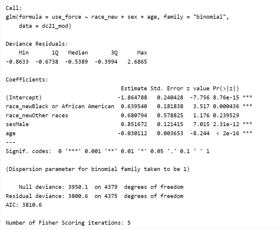
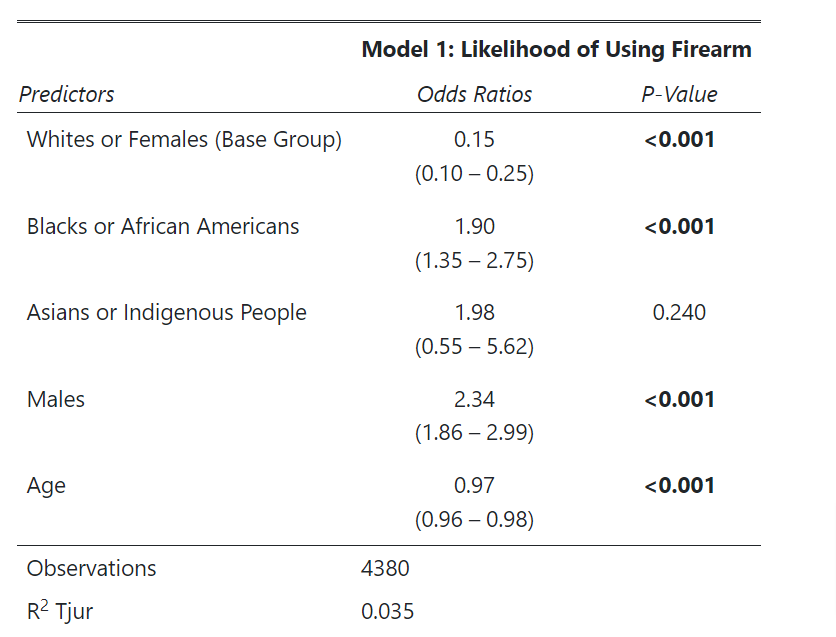
I love the summary function, but its output is not beautiful enough to put on paper. Luckily, the sjPlot package provides some utility functions that make our generalized regression table of publication quality. The function automatically converts log odds to odds ratios for us, so we don’t need to do this transformation manually.
From the table, we are able to tell a few things. First, the odds of using a firearm vs. not using a firearm is 1.90 factor higher for Blacks than Whites. Sex-wide, the odds of using a firearm increase by 2.34 factor if the person is a male. Lastly, age has a somehow negative association with using a firearm, but such an effect is minor. With one unit increase in age, we see the odd decrease by .03. Being an Asian or Pacific Islander is no more likely to use a weapon than White (p is insignificant).
Does it surprise you that sex has stronger effects than race? It would be interesting to know if the strong effect of sex is induced by males’ hormones or some other social factors (eg, gang involvement, housing segregation level, drop-out rate).
sjPlot::tab_model(mod, collapse.ci = TRUE,
          pred.labels = c("Whites or Females (Base Group)",
                          "Blacks or African Americans",
                          "Asians or Indigenous People",
                          "Males",
                          "Age"),
          dv.labels = "Model 1: Likelihood of Using Firearm",
          string.p = "P-Value")
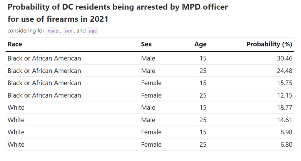
With the model, we are able to calculate the probability of people being arrested for firearm-related reasons given their race, age, and sex are told. I am explicitly interested in knowing about the probability of people who are Black males/females, White males/females, and at two age points: 15 and 25 years old.
According to the table below, Black male arrestees who were 15ish in 2021 had a probability of 30.4% of being arrested for using firearms. The chance cuts down to half should the young Black person be a female. For whites, the probability ranges from 6.8% to 18.8%. In short, the probability of being arrested for the use of firearms is low (< 15ish%) for females regardless of their race and age.
sample_pop <- data.frame(
  race_new = c(rep("Black or African American", 4),
                 rep("White", 4)),
  sex = c(rep(c("Male","Male", "Female", "Female"), 2)),
  age = rep(c(15, 25), 4))
sample_pop$prob = round(predict(mod,
                                newdata = sample_pop,
                                type = "response"),
                        4)
sample_pop <-
  sample_pop %>%
  mutate(prob = prob *100) %>%
  rename(race = race_new ,
         `probability (%)` = prob) %>%
     rename_with(str_to_title) # convert all to title case
sample_pop %>%
  gt() %>%
    tab_options(
      column_labels.border.top.width = px(3),
      column_labels.border.top.color = "transparent",
      table.border.top.color = "transparent",
      table.border.bottom.color = "transparent",
      data_row.padding = px(3),
      source_notes.font.size = 12,
      heading.align = "left",
      #Adjust grouped rows to make them stand out
      row_group.background.color = "#e3e3e3") %>%
  tab_style(
     locations = cells_column_labels(columns = everything()),
     style  = list(
       cell_borders(sides = "bottom", weight = px(3)),
       cell_text(weight = "bold")
     )
   ) %>%
  tab_header(
    title = md("**Probability of DC residents being arrested by MPD officer <br>for use of firearms in 2021**"),
    subtitle = md("considering for `race`, `sex`, and `age`")
  )
Note: For a more comprehensive understanding of binomial logistic regression or GLM in R, I have always found this guide formulated by UCLA helpful.
At the End
Data doesn’t imply objectivity. Statistics are commonly misused by politicians to support their propaganda. For example, people may rationalize the fact that officers arrested more Black people than any other racial groups for violent crimes in DC as Black people are more violent in nature. However, people who say that often fail to grasp the broader picture behind those numbers: Compared to Whites and Asians, Black people are more likely to live in segregated and low-income areas, experience violence on a daily basis, receive less support from the government, go to under-resourced schools, and be harmed by systematic racism. Crime is complex. A lot of factors could drive the up and down of crimes. Behind those crime statistics are stories, people’s stories, many of which are tragedies. Data science does not always bring cures to problems. It could be, but the prerequisite of that is we treat data with an objective eye and interpret our results with the maximum extent of cautiousness. It’s easy to make conclusions, but words can harm you. The real purpose of data science is that it helps us recognize the “what”, which is the basis of any policy change.
(Part Final) Fostering Social Impacts with Data Science was originally published in Towards AI on Medium, where people are continuing the conversation by highlighting and responding to this story.
Join thousands of data leaders on the AI newsletter. It’s free, we don’t spam, and we never share your email address. Keep up to date with the latest work in AI. From research to projects and ideas. If you are building an AI startup, an AI-related product, or a service, we invite you to consider becoming a sponsor.
Published via Towards AI
Towards AI Academy
We Build Enterprise-Grade AI. We'll Teach You to Master It Too.
15 engineers. 100,000+ students. Towards AI Academy teaches what actually survives production.
Start free — no commitment:
→ 6-Day Agentic AI Engineering Email Guide — one practical lesson per day
→ Agents Architecture Cheatsheet — 3 years of architecture decisions in 6 pages
Our courses:
→ AI Engineering Certification — 90+ lessons from project selection to deployed product. The most comprehensive practical LLM course out there.
→ Agent Engineering Course — Hands on with production agent architectures, memory, routing, and eval frameworks — built from real enterprise engagements.
→ AI for Work — Understand, evaluate, and apply AI for complex work tasks.
Note: Article content contains the views of the contributing authors and not Towards AI.
Related posts
Recent Posts


")

