


Python Statistical Analysis: Measures of central tendency and dispersion
Last Updated on March 21, 2023 by Editorial Team
Author(s): MicroBioscopicData
Originally published on Towards AI.
Welcome to this tutorial on measures of central tendency and spread with Python. In this tutorial, we will explore the different measures of central tendency, including mean, median, and mode, and how to calculate them using Python. We will also discuss measures of spread, such as range, variance, and standard deviation, and how to calculate them using Python. Throughout the tutorial, we will use practical examples and fictitious and real-world datasets to illustrate the concepts and techniques. By the end of this tutorial, you will have a good understanding of how to use Python to calculate measures of central tendency and dispersion. You will also learn where it is appropriate to use each measure and how to interpret these measures to gain insights into your data.
Table of Contents
· Data types
· Measures of central tendency
∘ Mean
∘ Median
∘ Mode
· Calculate and visualize Mean, Median and Mode in Python
· Measures of dispersion
∘ Range
∘ Variance
∘ Standard deviation
· References
Data types
The choice of measure of central tendency depends on the type of data being analyzed. Data types refer to the classification of data based on the nature of the values it represents. There are several types of data, including nominal, ordinal, interval, and ratio data (Mishra et al., 2018).
· Nominal data refers to categorical data where each value represents a separate category with no intrinsic order or ranking, such as gender, nationality, or religion (Figure 1).
· Ordinal data represents categories with an inherent ranking or order, such as educational level or income bracket.
· Interval data represents numerical data with equal intervals between values (values cannot be expressed or presented in the form of a decimal), but without a true zero point, such as temperature measured in Celsius or Fahrenheit.
· And finally, Ratio data represent numerical data with equal intervals between values and a true zero point, such as weight or height.
The type of data being analyzed determines the appropriate measure of central tendency to use. Let’s dive into the three measures of central tendency, mean, median, and mode (Publishing, 2020).
Measures of central tendency
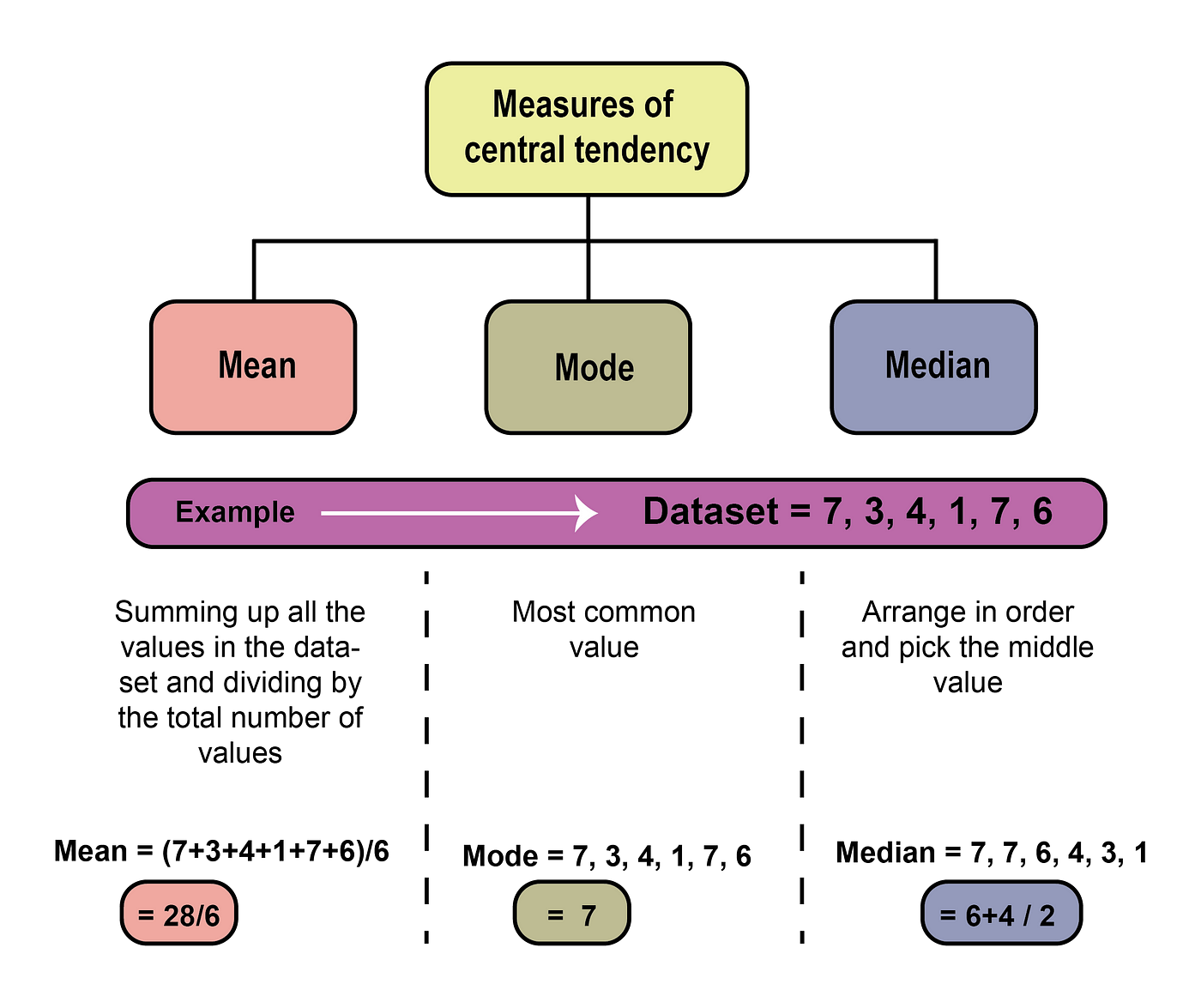
Mean
For interval and ratio data, the mean is usually the best measure of central tendency since it takes into account all values in the dataset. The mean is the most widely used measure of central tendency (Jankowski & Flannelly, 2015). The formula for calculating the mean is simple, and it is easy to understand what the mean represents in a given dataset. It is calculated by summing up all the values in the dataset and dividing by the total number of values (Figure 2). The mean is a commonly used measure of central tendency because it is easy to calculate and provides a useful summary of the data. The main advantage of using the mean is that it is a good representation of the central value of a dataset when the data is normally distributed or symmetrically distributed around the center. In such cases, the mean provides an accurate picture of the typical value of the dataset, and it can be used to make predictions and to estimate probabilities. However, there are also some disadvantages to using the mean as a measure of central tendency. One major disadvantage is that the mean is sensitive to outliers (extreme values) in the dataset (for more information about outliers, visit this post ). Another disadvantage of using the mean is that it may not accurately reflect the central value of a dataset that is not normally distributed or symmetrically distributed. In such cases, other measures of central tendency, such as the mode or median, may be more appropriate.
Median
The median is a measure of central tendency that represents the middle value of a dataset when it is sorted in ascending or descending order. It is often used as an alternative to the mean when the data is skewed or contains outliers (Figure 2). One of the main advantages of using the median is its robustness. The median is less affected by outliers than the mean, making it a more robust measure of central tendency. Additionally, the median is easy to calculate and interpret, especially for datasets with a large number of observations. Furthermore, the median can be used with any type of data, including nominal, ordinal, interval, and ratio data. However, one of the main disadvantages is that it is less precise than the mean, especially for datasets with a small number of observations.
Mode
The mode is a measure of central tendency that represents the value or category that occurs most frequently in a dataset (Figure 2). It is a simple and easy-to-calculate measure that provides information about the most typical value or category in the dataset. One of the advantages of using the mode is its applicability to any type of data, including nominal, ordinal, interval, and ratio data. Additionally, the model is easy to calculate and interpret, especially for datasets with a large number of observations. However, the mode has some disadvantages as well (Twycross & Shields, 2004b). One of the main disadvantages is that the mode may not exist or may not be unique if multiple values or categories occur with the same frequency. The mode is especially useful for categorical data, such as colors, names, or types, that cannot be analyzed using the mean or median. It can also be used as a supplement to the mean or median for datasets that are skewed or have extreme values. Furthermore, the model can help identify unusual values or categories that occur less frequently in the dataset.
Calculate and visualize Mean, Median, and Mode in Python.
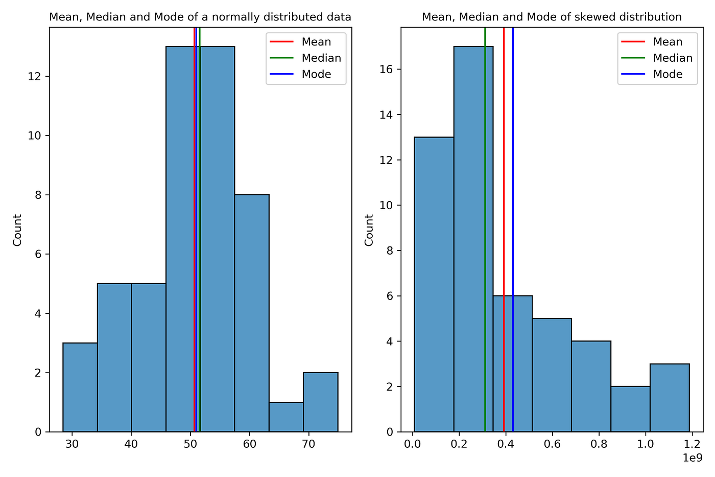
The code below is a Python script that shows the calculation of measures of central tendency (mean, median, and mode) for a normally distributed dataset and a skewed dataset (not symmetrical around its mean). The code uses the numpy, matplotlib, pandas, and seaborn libraries. We use histograms to visualize Mean, Median, and Mode in Python. In the histogram on the left, the mean, median, and mode are close to each other because the data is symmetrically distributed around the center. However, in the histogram on the right, which represents a skewed dataset, the mean is significantly influenced by extreme values in the tails of the distribution, while the median and mode are less affected.
# Import libraries
import numpy as np
import matplotlib.pyplot as plt
import pandas as pd
import seaborn as sns
# Generate a normally distributed dataset with mean=50 and standard deviation=10
data = np.random.normal(50, 10, 50)
# Generate a skewed dataset with mean=50 and standard deviation=10
data_skewed = np.random.normal(50, 10, 50)**5
# Calculate the mean, median, and mode of the dataset
mean = np.mean(data)
median = np.median(data)
mode = np.round(np.mean(data))
# Calculate the mean, median, and mode of the skewed dataset
mean_skewed = np.mean(data_skewed)
median_skewed = np.median(data_skewed)
mode_skewed = np.round(np.mean(data_skewed))
# Print the results
print(“For the normally distributed dataset:”)
print(“Mean: “, mean)
print(“Median: “, median)
print(“Mode: “, mode)
print(“——————————————————————–“)
print(“For the skewed dataset:”)
print(“Mean: “, mean_skewed)
print(“Median: “, median_skewed)
print(“Mode: “, mode_skewed)
fig, ax= plt.subplots(1,2, figsize = (9,6))
# Plot a histogram of the dataset using the seabron library
sns.histplot(data, ax=ax[0])
ax[0].axvline(x=mean, color=’r’, label=’Mean’)
ax[0].axvline(x=median, color=’g’, label=’Median’)
ax[0].axvline(x=mode, color=’b’, label=’Mode’)
ax[0].legend()
ax[0].set_title(“Mean, Median and Mode of a normally distributed data”, fontsize=10)
sns.histplot(data_skewed, ax=ax[1])
ax[1].axvline(x=mean_skewed, color=’r’, label=’Mean’)
ax[1].axvline(x=median_skewed, color=’g’, label=’Median’)
ax[1].axvline(x= mode_skewed, color=’b’, label=’Mode’)
ax[1].set_title(“Mean, Median and Mode of skewed distribution”, fontsize=10)
ax[1].legend()
plt.tight_layout()
output:
Measures of dispersion
Measures of dispersion are statistical measures that describe how to spread out or scattered a set of data is. They provide information about the variability or diversity of the data points in a dataset. The most common measures of dispersion (Figure 5) are the range, variance, and standard deviation (Twycross & Shields, 2004a).

Range
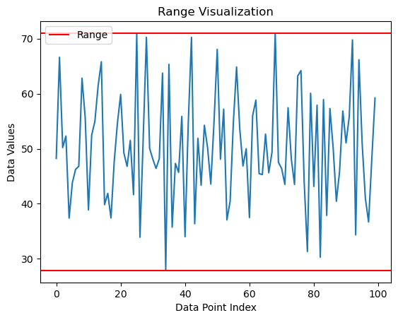
The range is the simplest measure of dispersion, which calculates the difference between the largest and smallest values in a dataset. The range is easy to understand and calculate, requiring only two values to be determined (Figure 6). The range can be useful in situations where a quick and rough estimate of variability is needed, and it can provide some insight into the spread of the data. However, the range also has some disadvantages. One major disadvantage of the range is that it is highly sensitive to outliers or extreme values in the dataset. Since range is only based on the largest and smallest values, outliers can have a significant impact on the range, leading to an inaccurate representation of the spread of the data.
To visualize the range of a dataset in Python, one approach is to create a simple line plot with two horizontal lines representing the minimum and maximum values of the dataset.
# Calculate the range
range_min = np.min(data)
range_max = np.max(data)
# Create a line plot with the range represented by two horizontal lines
fig, ax = plt.subplots()
ax.plot(data)
ax.axhline(y=range_min, color=’r’, label=’Range’)
ax.axhline(y=range_max, color=’r’)
ax.legend()
ax.set_title(“Range Visualization”)
ax.set_xlabel(“Data Point Index”)
ax.set_ylabel(“Data Values”)
plt.show()
print(f”The minimum value is {range_min}”)
print(f”The maximum value is {range_max}”)
print(f”The range is {range_max-range_min}”)
Output:
Variance
Variance is a statistical measure that provides a quantitative measure of how much variation there is in a set of data. It is a widely used measure in statistical analyses and provides important input for many statistical tests and models. The advantage of using variance is that it helps in understanding the distribution of data and making meaningful comparisons between different sets of data. Additionally, variance can be easily calculated for large datasets using statistical software, which makes it a convenient measure to use in many applications. Moreover, variance can be used to identify outliers or extreme values in the data, which can be important in detecting errors or anomalies. However, one disadvantage of using variance is that it is sensitive to outliers or extreme values and can be influenced by them. Another disadvantage is that variance is expressed in squared units (Figure 7) of the original data, which may not be easily interpretable or meaningful for some applications.
Standard deviation
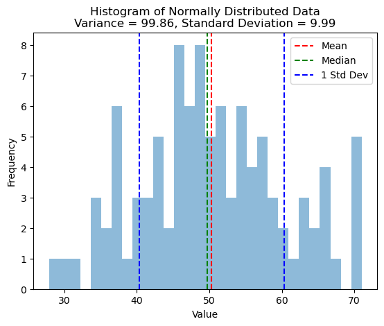
The standard deviation is the square root of the variance, which represents the spread of the data around the mean. Like variance, the standard deviation can be easily calculated using statistical software and can be used to identify outliers or extreme values in the data. Moreover, standard deviation has a clear interpretation in the same units as the original data, which can make it more interpretable and meaningful in certain applications. However, one disadvantage of using standard deviation is that, like variance, it is sensitive to outliers or extreme values and can be influenced by them. Additionally, standard deviation assumes that the data is normally distributed, which may not always be the case, and in such cases, it may not provide an accurate representation of the dispersion in the data.
To standard deviation with Python, we can use histograms. Below is an example code snippet to create a histogram with the standard deviation values displayed on the plot:
# Calculate the variance and standard deviation of the dataset
variance = np.var(data)
std_dev = np.std(data)
# Create a histogram
plt.hist(data, bins=30, alpha=0.5)
plt.axvline(x=np.mean(data), color=’r’, linestyle=’–‘, label=’Mean’)
plt.axvline(x=np.median(data), color=’g’, linestyle=’–‘, label=’Median’)
plt.axvline(x=np.mean(data) + std_dev, color=’b’, linestyle=’–‘, label=’1 Std Dev’)
plt.axvline(x=np.mean(data) – std_dev, color=’b’, linestyle=’–‘)
plt.legend()
plt.title(‘Histogram of Normally Distributed Data\nVariance = {:.2f}, Standard Deviation = {:.2f}’.format(variance, std_dev))
plt.xlabel(‘Value’)
plt.ylabel(‘Frequency’)
Output:
In conclusion, measures of central tendency and spread are essential statistical concepts used to describe and analyze datasets. Measures of central tendency, such as mean, median, and mode, help us identify the typical or representative value of a dataset, while measures of spread, such as range, variance, and standard deviation, provide information about the variability or dispersion of the data points. In this tutorial, we learned how to calculate and plot measures of central tendency and spread using Python. By mastering these statistical concepts and techniques, we can gain valuable insights into our data and make informed decisions in a wide range of fields, from finance and economics to healthcare, and social and biological sciences.
I have prepared a code review to accompany this blog post, which can be viewed in my GitHub.
References
Jankowski, K. R. B., & Flannelly, K. J. (2015). Measures of central tendency in chaplaincy, health care, and related research. Journal of Health Care Chaplaincy, 21(1), 39–49. https://doi.org/10.1080/08854726.2014.989799
Mishra, P., Pandey, C., Singh, U., & Gupta, A. (2018). Scales of Measurement and Presentation of Statistical Data. Annals of Cardiac Anaesthesia, 21(4), 419–422. https://doi.org/10.4103/aca.ACA_131_18
Publishing, A. I. (2020). Statistics Crash Course for Beginners: Theory and Applications of Frequentist and Bayesian Statistics Using Python. AI Publishing LLC.
Twycross, A., & Shields, L. (2004a). Statistics are made simple. Part 2. Standard deviation, variance, and range. Paediatric Nursing, 16(5), 24. https://doi.org/10.7748/paed2004.06.16.5.24.c922
Twycross, A., & Shields, L. (2004b). Statistics are made simple. Part 1. Mean, medians, and modes. Paediatric Nursing, 16(4), 32. https://doi.org/10.7748/paed2004.05.16.4.32.c916

Join thousands of data leaders on the AI newsletter. Join over 80,000 subscribers and keep up to date with the latest developments in AI. From research to projects and ideas. If you are building an AI startup, an AI-related product, or a service, we invite you to consider becoming a sponsor.
Published via Towards AI
Related posts


Popular posts

 for 2021")


Updates

Recent Posts


