


Helping Bloom E-Commerce Business Using Linear Regression — Python
Last Updated on July 24, 2023 by Editorial Team
Author(s): Jayashree domala
Originally published on Towards AI.
Data Science
A guide to understanding and implementing linear regression.
What is the history of linear regression?
In the 1800s, a person named Francis Galton was studying the relationship between parents and children by looking into the correlation between the heights of the fathers and their sons. He identified that a father’s son is likely to be as tall as his father. But the main discovery was that the son's height is likely to be close to the overall average height of all people.
So for example, if there is a father of height 7 feet then there are chances that his son will be pretty fall too. But since being 7 feet is very rare and is an anomaly there is a chance that the son will not be as tall. This is called regression wherein a son’s height tends to go towards (regress) the average height.
What is the goal of linear regression?
The goal is to determine the best line which minimizes the vertical distance between all the data points and the line.
How to implement linear regression using Python?
The dataset used to perform linear regression is an Ecommerce dataset of a clothing store company. The goal is to help the company decide if they should concentrate on their mobile app service or website based on the yearly amount spent by the customers to grow the business.
→ Import packages
The basic packages are imported like NumPy and pandas to deal with the data. For data visualization, matplotlib and seaborn are imported.
>>> import pandas as pd
>>> import numpy as np
>>> import matplotlib.pyplot as plt
>>> import seaborn as sns
>>> %matplotlib inline
→ Data
The data has the following columns:
1) Customer info — Email
2) Customer info — Address
3) Customer info — color Avatar
4) Avg. Session Length: Average session of in-store style advice sessions
5) Time on App: Average time spent on App in minutes
6) Time on Website: Average time spent on Website in minutes
7) Length of Membership: How many years the customer has been a member.
>>> df = pd.read_csv('dataset.csv')
>>> df.head()

By using the “info()” function, the information of the columns and entries are known. The datatype of the columns are also known from this.
>>> df.info()
<class 'pandas.core.frame.DataFrame'>
RangeIndex: 500 entries, 0 to 499
Data columns (total 8 columns):
 # Column Non-Null Count Dtype
--- ------ -------------- -----
 0 Email 500 non-null object
 1 Address 500 non-null object
 2 Avatar 500 non-null object
 3 Avg. Session Length 500 non-null float64
 4 Time on App 500 non-null float64
 5 Time on Website 500 non-null float64
 6 Length of Membership 500 non-null float64
 7 Yearly Amount Spent 500 non-null float64
dtypes: float64(5), object(3)
memory usage: 31.4+ KB
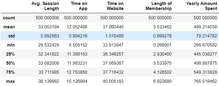
By using the describe() function, we can get the statistical information of numerical columns.
>>> df.describe()
→ Data visualization
Using the seaborn package, a pairplot can be plotted for the entire dataframe which takes into consideration only the numerical columns. It creates histograms of all columns along with the correlation scatter plots.
>>> sns.set_style('whitegrid')
>>> sns.pairplot(df)
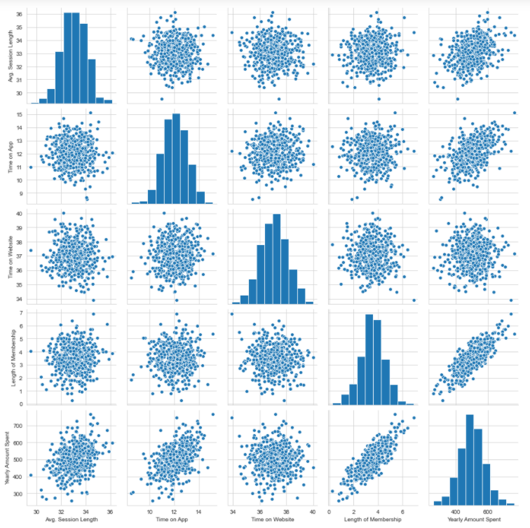
Based on the above plot, it can be said that there is a linear relationship between the ‘length of membership’ and ‘yearly amount spent’.
Using the seaborn package a distribution plot can also be created for the target column we are predicting which in this case is ‘yearly amount spent’. The distribution of vlues can be seen using this plot.
>>> sns.distplot(df['Yearly Amount Spent'])

Based on the plot, it can be ascertained that the average lies somewhere near 500.
Next, a correlation plot can be generated which shows the correlation between the columns. 1 denotes a very high correlation and 0 denotes no correlation.
>>> sns.heatmap(df.corr(),annot=True)

→ Separating the predictor and the target variable
Here the target variable is ‘Yearly amount spent’. The predictor variables are the rest of the numerical columns since the linear regression model does not work on categorical columns.
>>> x = df[['Avg. Session Length', 'Time on App','Time on Website', 'Length of Membership']]
>>> x.head()

>>> y = df['Yearly Amount Spent']
>>> y.head()
0 587.951054
1 392.204933
2 487.547505
3 581.852344
4 599.406092
Name: Yearly Amount Spent, dtype: float64
→ Splitting into training and testing data
The scikit learn package helps in the splitting of data into train and test data. It is the most useful library for machine learning in Python. The sklearn library contains a lot of efficient tools for machine learning and statistical modeling. The splitting function is imported from sklearn. The ‘x’ and ‘y’ data is passed to the function which generates the split training and testing data. The test size determines how much proportion of data should be in the test. The value is between 0 to 1.
>>> from sklearn.model_selection import train_test_split
>>> x_train, x_test, y_train, y_test = train_test_split(x, y, test_size=0.3)
→ Training the model
The linear regression model is imported from the sklearn package. This model is available in the linear model family of sklearn. After importing the model, an instance of the model is created. Then this model is fit to the training dataset.
>>> from sklearn.linear_model import LinearRegression>>> lr = LinearRegression()>>> lr.fit(x_train,y_train)
LinearRegression()
→ Predictions
The predictions can be found using the ‘predict’ method on the testing data of predictor variables. Then these predictions are compared with the actual testing data prediction to ascertain the accuracy of the model.
>>> pred = lr.predict(x_test)
>>> pred
array([577.87553409, 435.27155928, 546.5858502 , 391.51629942,
 607.95417641, 509.87240751, 619.18792019, 449.34481128,
 499.72263686, 456.3743405 ,...........................,
 591.25542691, 486.27032699, 474.25589187, 451.54855685,
 494.85641921, 554.82684019])
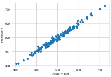
By creating a scatter plot, we can visualize how far the predicted values are from the actual values.
>>> plt.scatter(y_test,pred)
>>> plt.xlabel('Actual Y Test')
>>> plt.ylabel('Predicted Y')
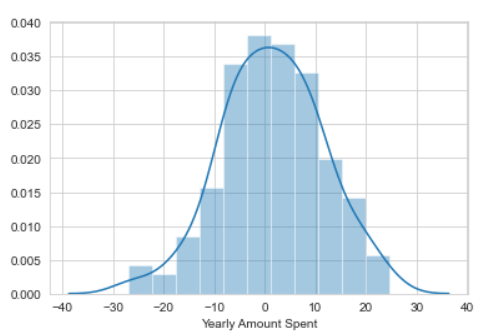
By creating the residuals, a clear picture will be known of the data. The residual is the difference between the actual and predicted values. If the residual plot is normally distributed then it means that the choice of model was right.
>>> sns.distplot((y_test-pred))
→ Evaluation metric
For regression, there are 3 most important evaluation metrics.
1) Mean absolute error(MAE): It is the mean of the absolute value of the errors. It is the easiest to understand being just the average error.
2) Mean squared error(MSE): It is the mean of the squared errors. It punishes larger errors being more useful in the real world.
3) Root mean squared error (RMSE): It is the square root of the mean of the squared errors. It is directly interpretable in the “y” units.
All these are considered loss functions because the goal is to minimize them.
>>> from sklearn import metrics>>> print('MAE:', metrics.mean_absolute_error(y_test, pred))
>>> print('MSE:', metrics.mean_squared_error(y_test, pred))
>>> print('RMSE:', np.sqrt(metrics.mean_squared_error(y_test, pred)))
MAE: 8.078480566145505
MSE: 102.44872696972094
RMSE: 10.121695854436693
The intercepts and coefficients can be found. The coefficients relate to the respective columns.
>>> lr.intercept_
-1048.1193023639814>>> lr.coef_
array([25.56507478, 39.11289398, 0.36517849, 61.42380206])>>> coef_col = pd.DataFrame(lr.coef_,x.columns,columns=['Coefficients'])
>>> coef_col
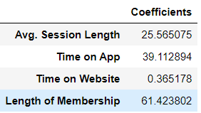
The meaning of these coefficients is as follows:
1) If all the columns are held fixed and there is a unit increase in the ‘time on app’ then there will be an increase of 38 dollars in price (yearly amount spent).
2) If all the columns are held fixed and there is a unit increase in the ‘time on website’ then there will be an increase of 0.7 dollars in price (yearly amount spent).
Conclusion
A conclusion can be drawn from the coefficient interpretations that it will be fruitful to continue the E-commerce business on the app and not the website.
Refer to the dataset and notebook here.
Beginner-level machine learning books to refer to:
Python Machine Learning: A Beginner's Guide to Python Programming for Machine Learning and Deep…
The Hundred-Page Machine Learning Book
Advanced-level machine learning books to refer to:
Hands-On Machine Learning with Scikit-Learn, Keras and Tensor Flow: Concepts, Tools and Techniques…
Pattern Recognition and Machine Learning (Information Science and Statistics)
Reach out to me: LinkedIn
Check out my other work: GitHub
Join thousands of data leaders on the AI newsletter. Join over 80,000 subscribers and keep up to date with the latest developments in AI. From research to projects and ideas. If you are building an AI startup, an AI-related product, or a service, we invite you to consider becoming a sponsor.
Published via Towards AI
Related posts


Popular posts

 for 2021")


Updates

Recent Posts


