


Data Visualization using Pandas, NumPy, and Matplotlib Python Libraries
Last Updated on July 24, 2023 by Editorial Team
Author(s): Likhitha kakanuru
Originally published on Towards AI.
Data Visualization
To analyze which students secured the highest percentage in subjects like mathematics, physics, and chemistry we require a bar graph to display it. There are many ways to explore datasets. But in my point of view, Python plays a major role. It can be understandable with ease and requires fewer lines of code.
Why Build Visuals?
__ To communicate Data clearly and for exploratory data analysis
__ To share unbiased representation of data
__ Can use them to support recommendations to different stakeholders.
When creating a visual, always remember:
__ Any feature or design you include in your plot to make it more appealing and should hold up the message that the plot is meant to get across and not distract from it. It should be effective.
Before going to explore datasets, let us know about Pandas, NumPy, and Matplotlib.
Pandas is an essential data analysis toolkit for Python. It is a Python package providing fast, flexible, and expressive data structures designed to make working with relational or labeled data. It aims to be the fundamental high-level building block for doing practical, real-world data analysis in python.
NumPy:
Numpy is a library for scientific computing in Python and also a basis for pandas. It provides a high-performance multidimensional array object and tools for working with these arrays. A numpy array is similar to the list. It is usually fixed in size and each element is of the same type. we can cast a list to a numpy array by first importing it. Numpy arrays contain data of the same type, we can use attribute “dtype” to obtain the data type of the array’s elements.
Matplotlib:
Matplotlib is one of the most widely used, if not the most popular data visualization library in Python. It produces quality figures in a variety of hard copy formats and interactive environments across platforms. Matplotlib can be used in Python scripts, IPython shell, jupyter notebook, web application servers, and for GUI toolkits. If you are aspiring to create impactful visualization with python, matplotlib is an essential tool to have at your disposal.
Let’s start exploring medium.com datasets.
Datasets: https://www.kaggle.com/dorianlazar/medium-articles-dataset
Import required resources:
Next, read the CSV(Comma Separated Values) file by using pd.read_CSV and df.head (10) function to display the first 10 rows.
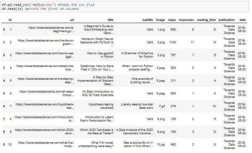
Note: If we want to display all the rows of the data set you can use df function and if you want to display last rows you can use df.tail().
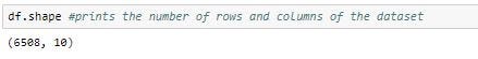
To view the dimensions of the dataframe, .shape parameter is deployed:
Next, we will remove columns which are not necessary using the drop method:
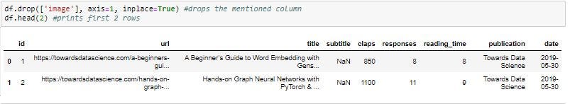
In Pandas, axis=0 represents rows and axis=1 represents columns
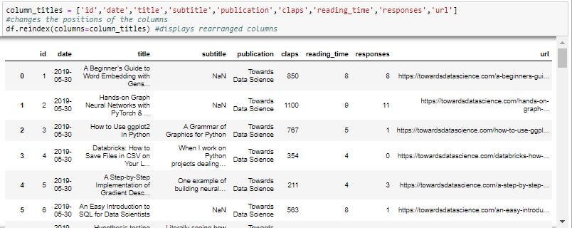
To rearrange the columns we can use re-index method:
We will also add ‘Total’ column that sums up the columns as follows:

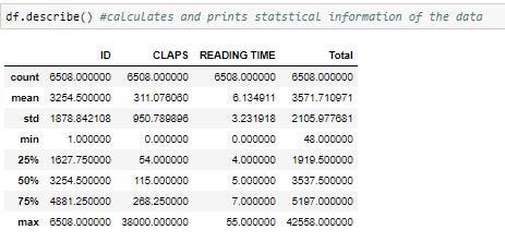
To know about statistical information, we can use the describe() method:
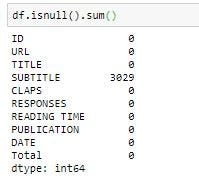
To check how many null objects we have in the dataset as follows:
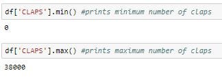
To know the minimum and the maximum number of claps, min() and max() functions are used:
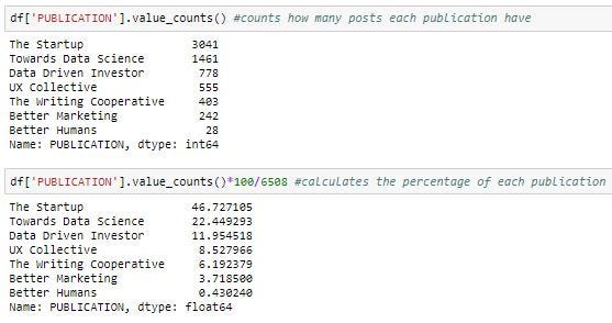
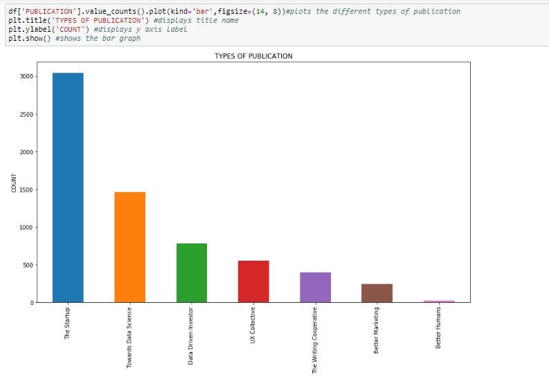
To return a Series containing a count of unique values, we can use value_counts() function to know which publication has occurred more frequently and can calculate its percentage, bar plot as follows:
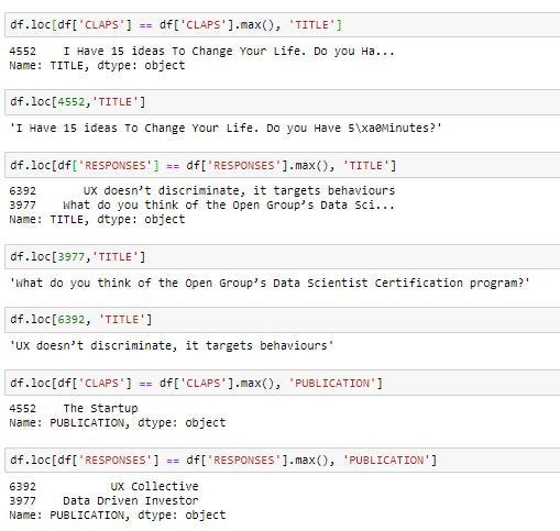
To know which title and publication got more number of claps and responses we can use the max() function and df.loc attribute which accesses rows and columns in the given dataframe:
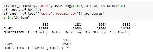
Finally, to know the top 5 publications with the number of claps for that, we can sort the column by using sort_values() method and transpose() function as follows:
You can refer to the code mentioned in the below link:
medium article.md
Edit description
drive.google.com
Join thousands of data leaders on the AI newsletter. Join over 80,000 subscribers and keep up to date with the latest developments in AI. From research to projects and ideas. If you are building an AI startup, an AI-related product, or a service, we invite you to consider becoming a sponsor.
Published via Towards AI
Related posts


Popular posts

 for 2021")


Updates

Recent Posts


