


Time-series analysis in SAS
Last Updated on January 6, 2023 by Editorial Team
Last Updated on February 27, 2022 by Editorial Team
Author(s): Dr. Marc Jacobs
Originally published on Towards AI the World’s Leading AI and Technology News and Media Company. If you are building an AI-related product or service, we invite you to consider becoming an AI sponsor. At Towards AI, we help scale AI and technology startups. Let us help you unleash your technology to the masses.
Predictive Analytics
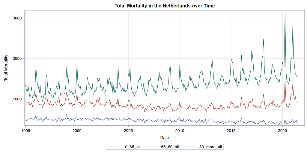
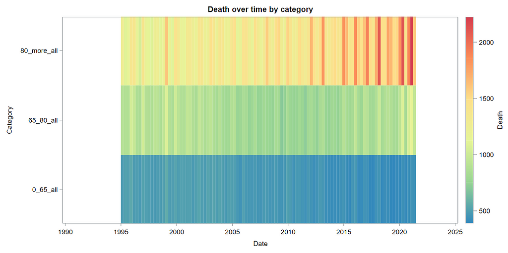
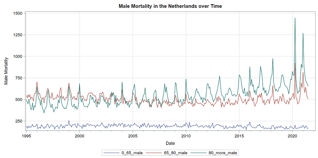
Analyzing Dutch mortality data
Prediction — or forecasting — has a natural appeal as it provides us with the belief that we can control the future by knowing what will happen.
Luckily, most of us know that we cannot actually control what will happen, but perhaps we can act on what might happen. We could also go as far as to the reason that acting on what might happen might even influence what can happen, but that is not the aim of this post.
No, today, I just want to use some good old time-series analysis — using SAS and the Econometrics and Time Series Analysis (ETS) package — to forecast death in the Netherlands.
Since Covid-19, the metric of excess death has been revived. Not that it was ever gone, but it became more important than ever. For the majority of countries, excess death is established by comparing current numbers of death to a 5-year average spanning 2015–2019.
In time-series or econometrics terms, this is called a moving-average.
I wanted to take a different approach and use the open data coming from Statistics Netherlands (CBS).
The data itself is not directly ready for analysis and thus needs to be augmented. This is because the analysis of time-series data follows strict rules about the structure of the data. Not only do you need a date or DateTime variable, but the data also needs to be evenly spaced. Days, months, weeks, years. Luckily, the ETS package has some pretty straightforward tools to do so, like PROC EXPAND. Below, you can see the code snippet to import, wrangle, and straighten out the data to make it ready for visualization and time-series analysis.
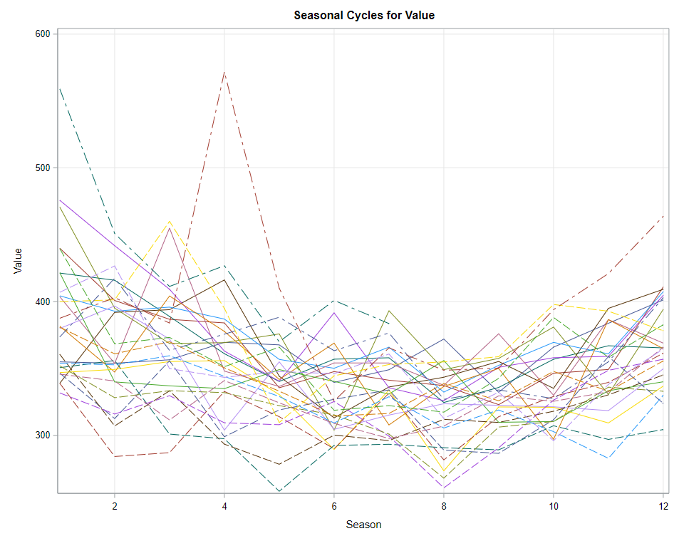
Next up is the code for visualizing the data. Although we can check tables and do numerical analysis, it is much more straightforward to plot the data and see if it makes sense. Anything wrong in the data wrangling process should show up immediately.

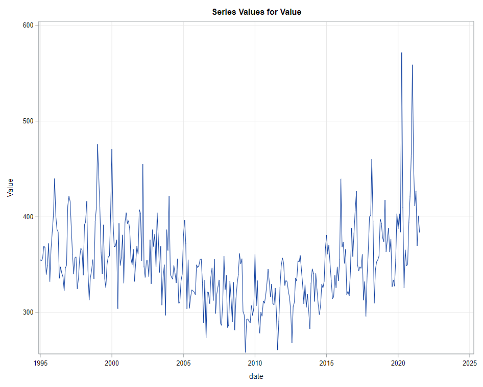
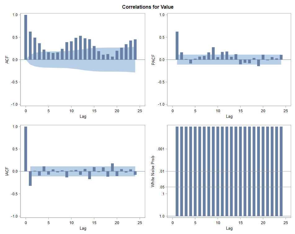
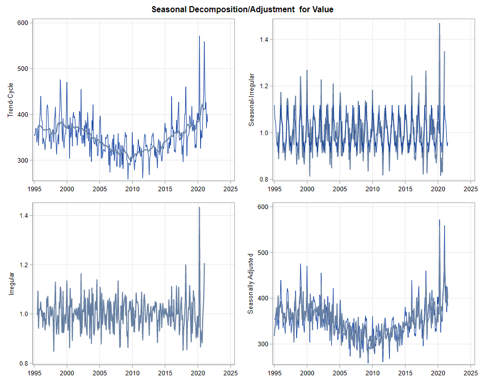
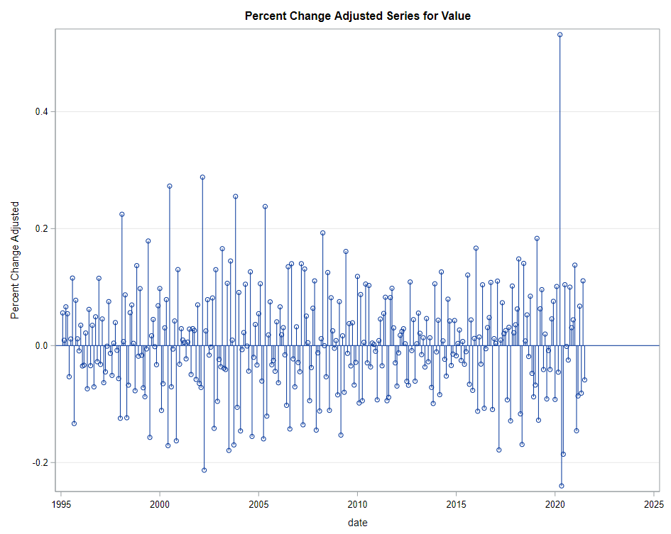
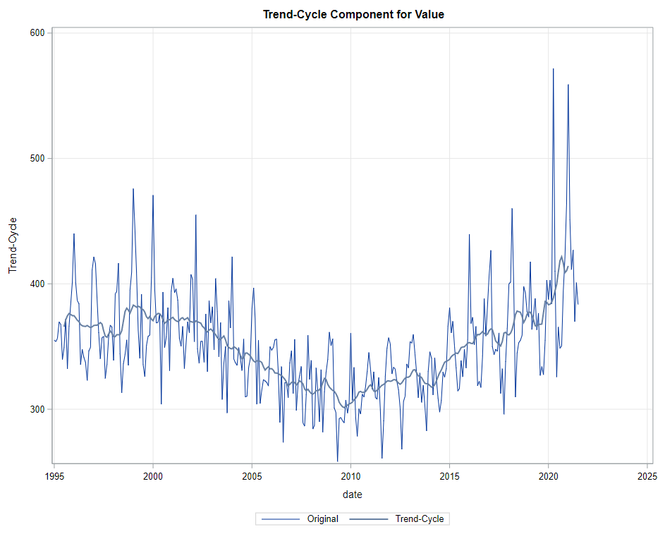
The next best step is to use decomposition analysis (PROC TIMESERIES) to take a closer look at the data. Most software packages, like R and Python, have time-series libraries that also provide decomposition analysis as it is a standardized procedure. By asking SAS for decomposition, the data is split into trends, cycles, seasons, or irregularities. Here, I chose to not do any of the data preparation necessary for other time-series models, like PROC ARIMA, because I wanted to look at the raw data.
Then comes the moment where we analyze the data, creating a model. I was none too impressed by the model used by Statistics Netherlands, but that does not mean that their model has no merit. It just means that I want to create a different model that might identify and include more parts of the time series useful for forecasting.
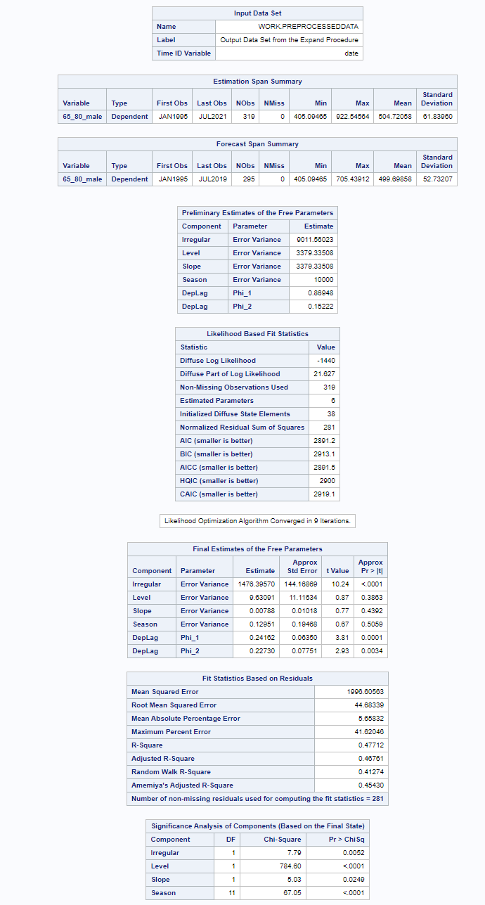
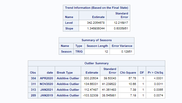
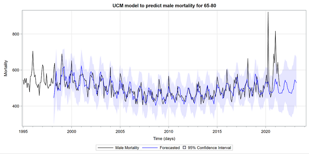
I chose to use PROC UCM which stands for Unobserved Components Model. Libraries are available for both Python and R. This model is actually one of my favorites because, just like the decomposition analysis, it builds up the model by using unobserved components — level, slope, cycle, season, irregularity, lags, etc. It is a heavy statistical model, and SAS, Python, and R make it almost seem too easy to create such a model given its underlying statistical theory.
What you see below is the code of the final model, not the intermittent process of choosing a model. To create the model of choice, you are offered a lot of output revealing the added effect of each chosen component on the model. There is of course a plethora of metrics that you can use to compare models, but I believe that the best way is to deep dive into the many plots that are offered to you.
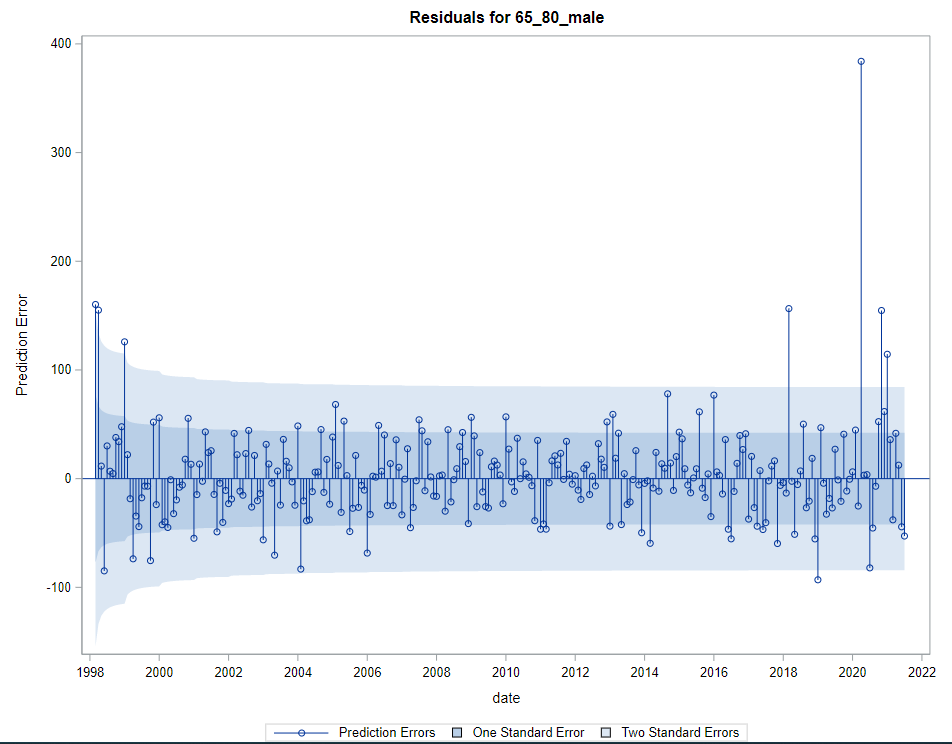
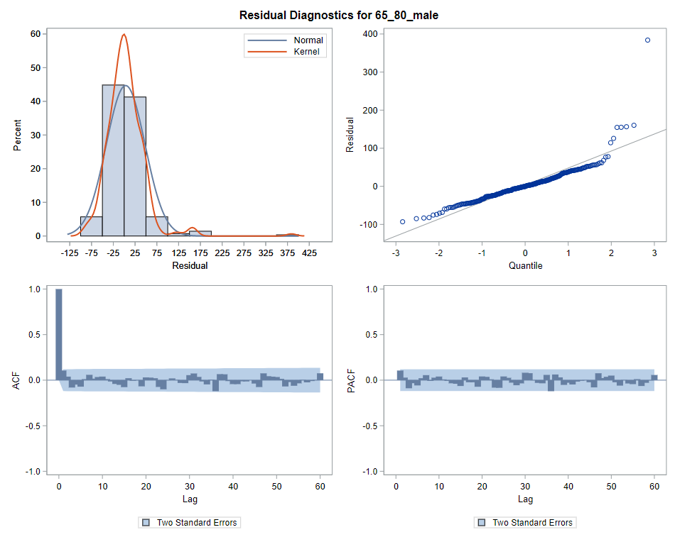
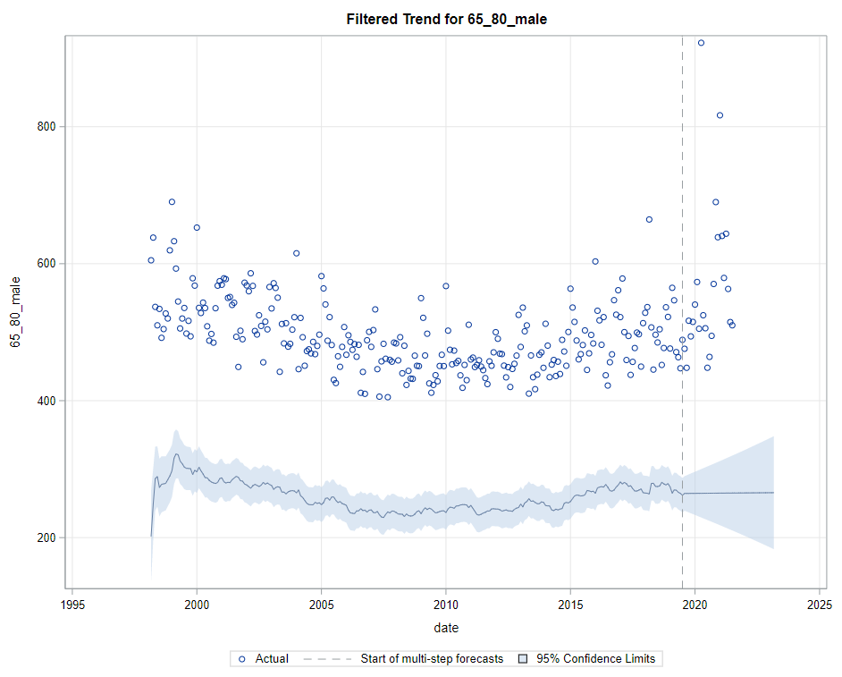
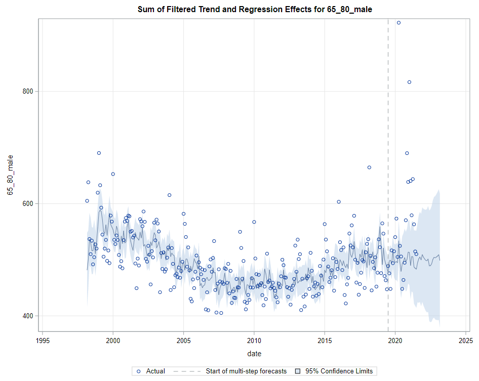
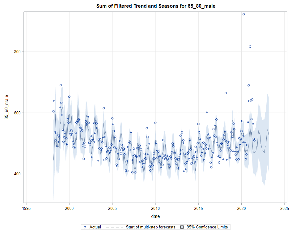
Next up are the plots that show the different components of the model and how they act on the model itself. As always, the confidence intervals are more interesting than the actual values.
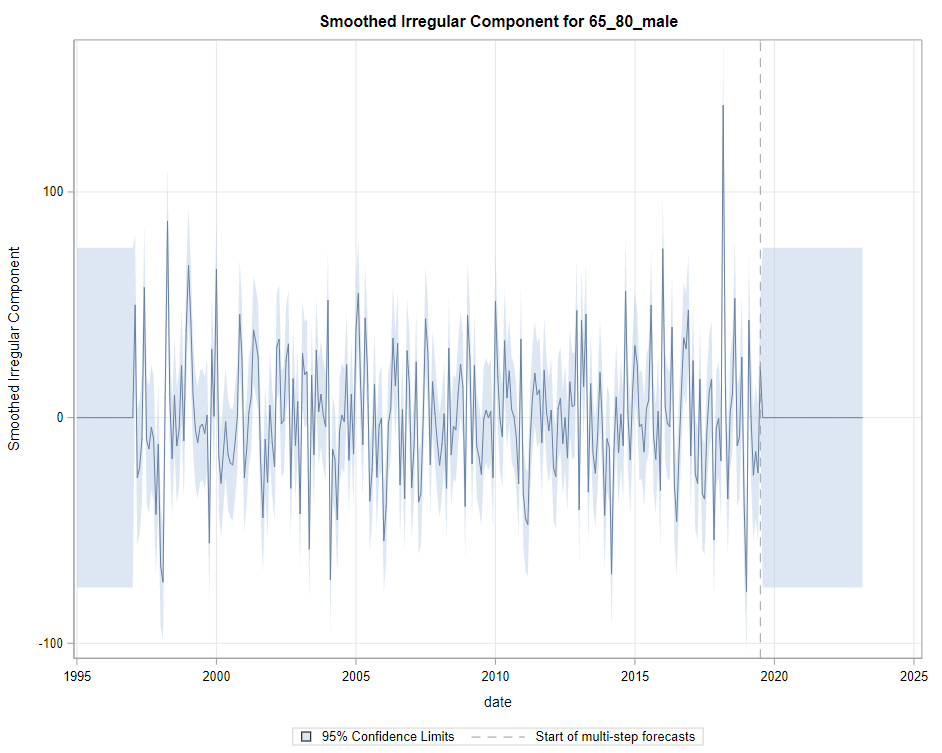
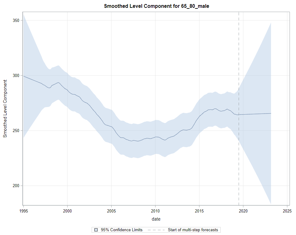
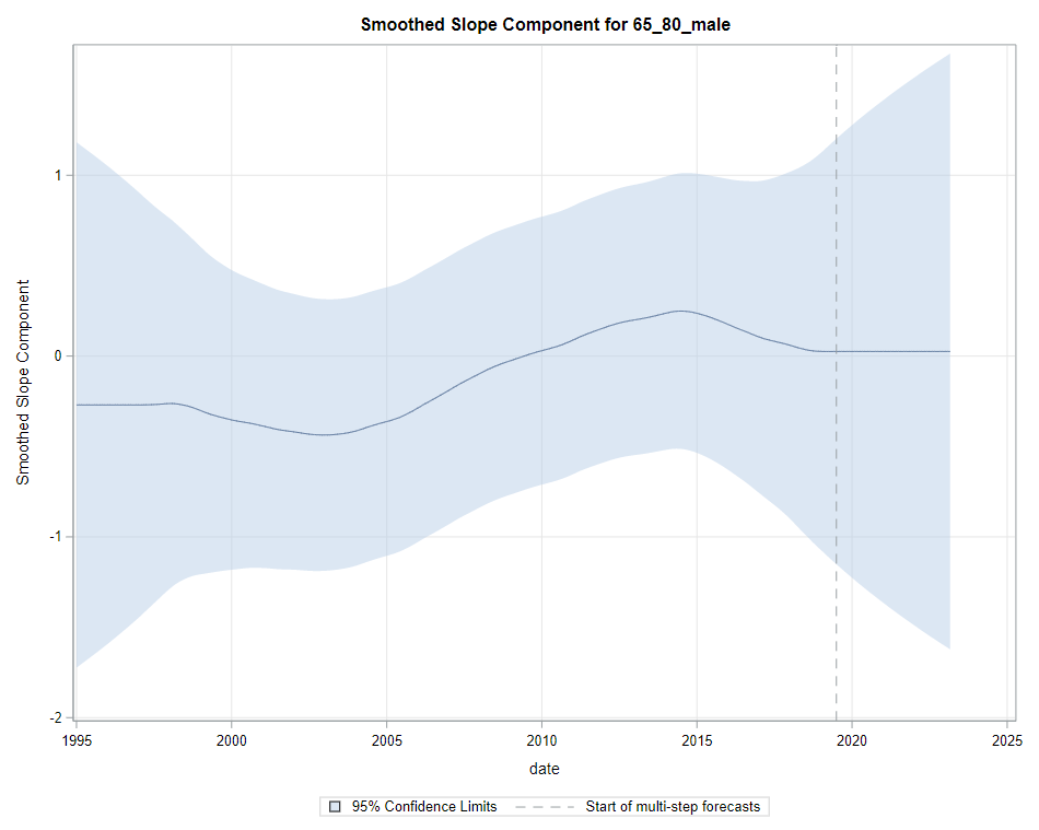
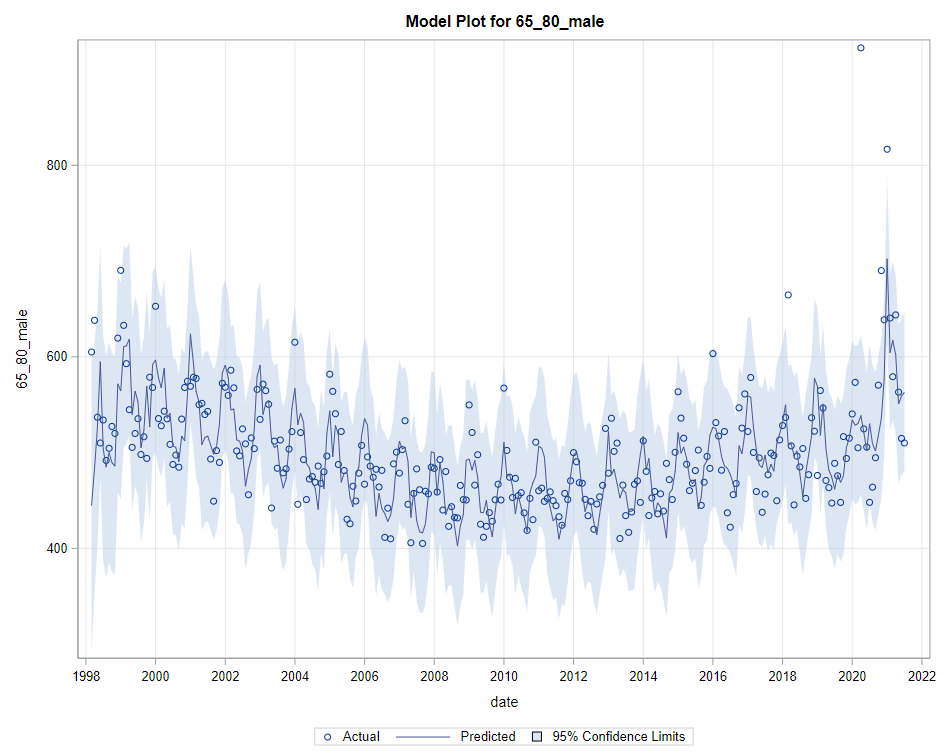
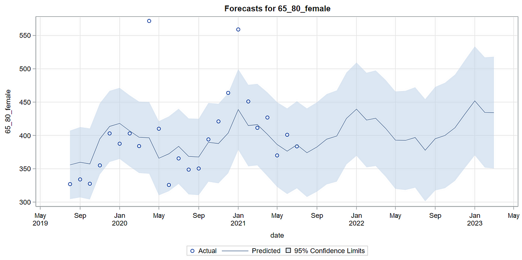
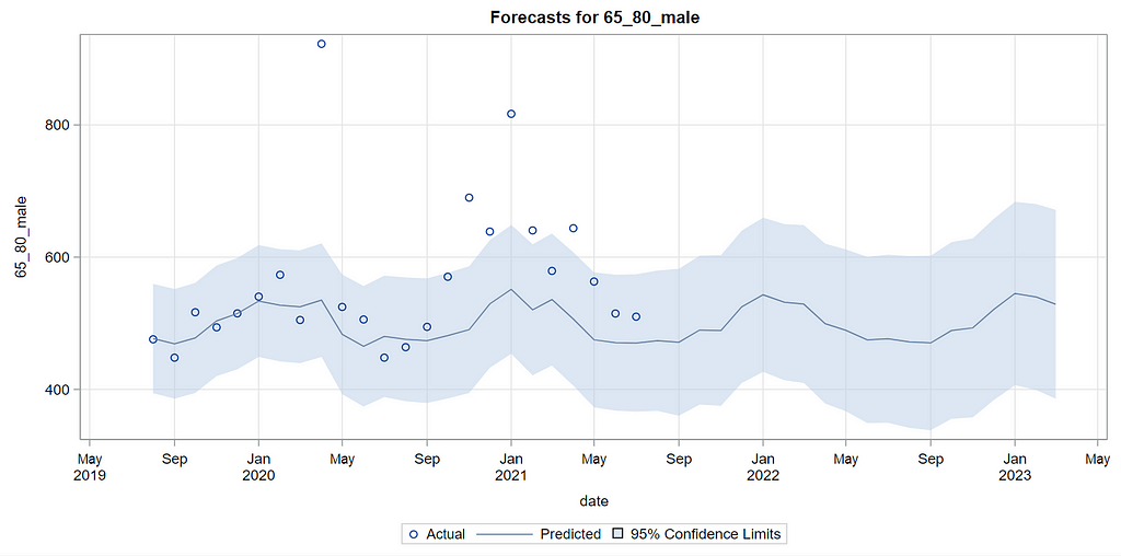
Then, PROC UCM provides us with a wealth — or overwhelming — array of pictures on how the forecasts of the final UCM model came to be. Adding components together definitely changes the prediction which is what you want to see. Also here, look at the confidence interval of the forecasts. They can reveal a lot, especially in a multi-step setting in which previous forecasts also influence future forecasts. If forecasts become unyielding at a fast rate, you better not look too far into the future, and at least acknowledge the underlying process is volatile in the absence of more useful predictors.
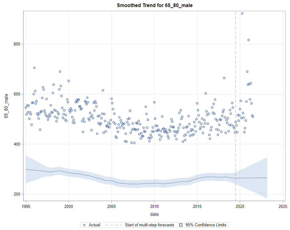
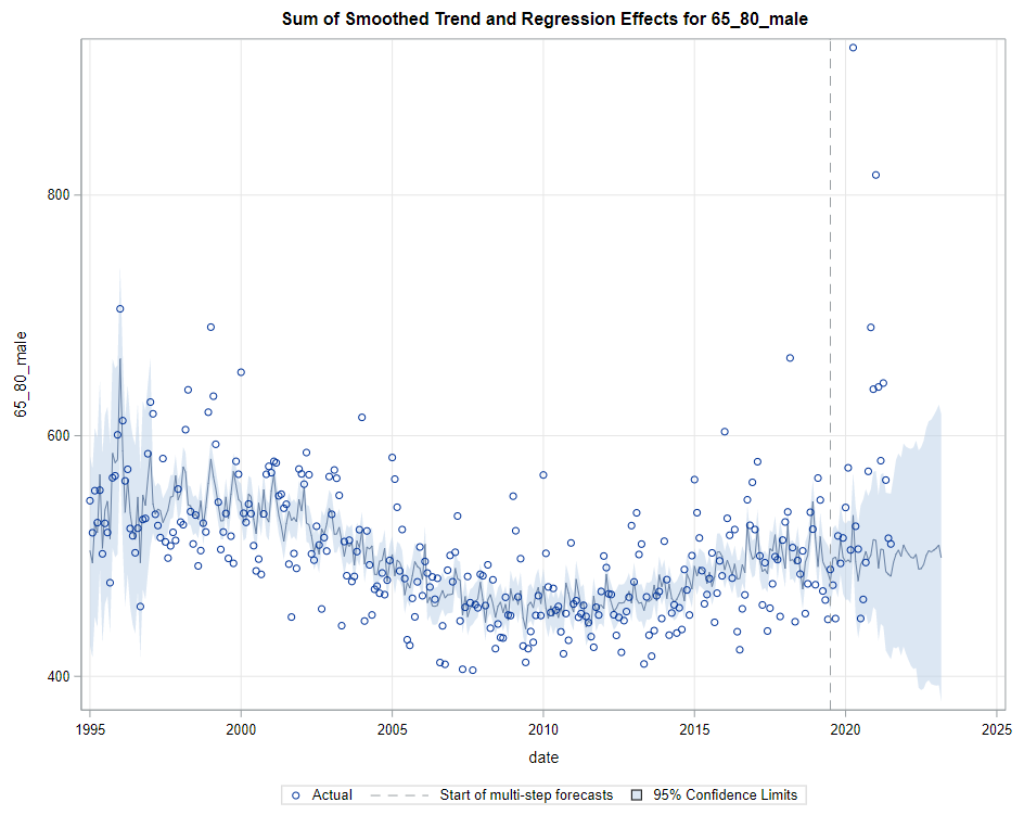
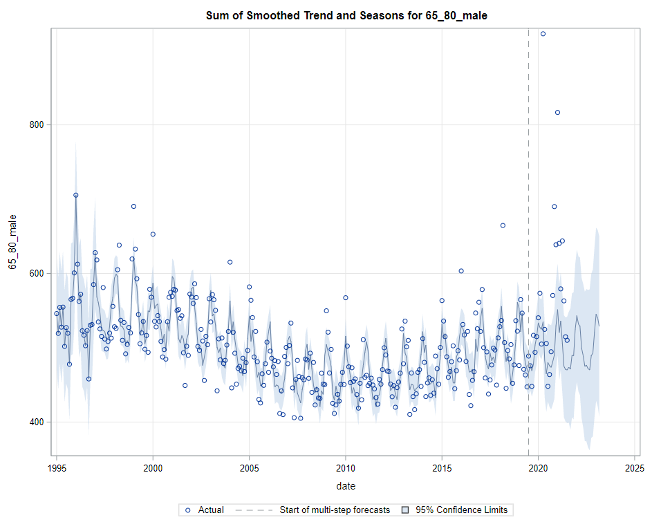
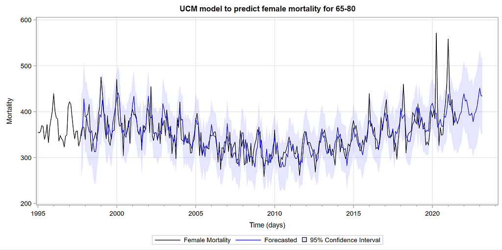
Last, but not least, it is good to include the final plots and forecasts. These forecasts don’t come out of the blue. The time period of the dataset ranges approximately 20 years. Because I wanted to see if this model could ‘forecast’ death in the era of Covid-19, I let the model start producing forecasts from September 2019 onwards. This means that the model does not use any data after that time-point, except for checking forecast error. As such, it can be used to assess the ability of the model to forecast death in the Covid-19 era.
The performance assessment I leave up to the reader.
As always, these posts are just an example, not a complete assessment of what PROC UCM or SAS ETS can do.
Have fun!
Time-series analysis in SAS was originally published in Towards AI on Medium, where people are continuing the conversation by highlighting and responding to this story.
Join thousands of data leaders on the AI newsletter. It’s free, we don’t spam, and we never share your email address. Keep up to date with the latest work in AI. From research to projects and ideas. If you are building an AI startup, an AI-related product, or a service, we invite you to consider becoming a sponsor.
Published via Towards AI
Towards AI Academy
We Build Enterprise-Grade AI. We'll Teach You to Master It Too.
15 engineers. 100,000+ students. Towards AI Academy teaches what actually survives production.
Start free — no commitment:
→ 6-Day Agentic AI Engineering Email Guide — one practical lesson per day
→ Agents Architecture Cheatsheet — 3 years of architecture decisions in 6 pages
Our courses:
→ AI Engineering Certification — 90+ lessons from project selection to deployed product. The most comprehensive practical LLM course out there.
→ Agent Engineering Course — Hands on with production agent architectures, memory, routing, and eval frameworks — built from real enterprise engagements.
→ AI for Work — Understand, evaluate, and apply AI for complex work tasks.
Note: Article content contains the views of the contributing authors and not Towards AI.
Related posts
Recent Posts


")

