


Start using this Interactive Data Visualization Library: Python Bokeh Tutorial
Last Updated on September 1, 2022 by Editorial Team
Author(s): Muttineni Sai Rohith
Originally published on Towards AI the World’s Leading AI and Technology News and Media Company. If you are building an AI-related product or service, we invite you to consider becoming an AI sponsor. At Towards AI, we help scale AI and technology startups. Let us help you unleash your technology to the masses.
Data visualization is a key to Data Analysis. Whether to understand the hidden patterns or layers in Data or analyze the metrics or insights of a product or Expo our Analysis to Nontechnical Clients, Data Visualization is a must. There are various tools available to visualize data, today we will go through one such tool, which is used in Python and provides interactive features.
Bokeh is a data visualization library in Python which provides interactive and sophisticated features for data scientists to analyze the data. Unlike other plotting libraries, Bokeh makes the plots interactive, and we can export the plots into HTML files as Bokeh renders data using Python and Javascript.
The advantage over other libraries —
- For web developers who use Python Django or Flask, as plots are exported into HTML Files, they can easily embed them in Web pages.
- For Data Scientists, who want to analyze data, Bokeh helps them by creating interactive plots, using which they can zoom in and pan the charts and realize the patterns.
Let’s start creating a line plot using Bokeh; Dataset used can be found here.
Installing Bokeh using Python —
pip install bokeh
Importing libraries
from bokeh.plotting import figure, show, output_notebook
we need to import figures from Bokeh to create the figure. To show the figure, the show function is used, and output_notebook is used explicitly when we want to Visualize the plot in the notebook.
from bokeh.plotting import figure, show, output_notebook
x = df["x"].values[:20]
y = df["y"].values[:20]
# create a new plot with a title and axis labels
p = figure(title="Line Plot x VS y", x_axis_label="X Values", y_axis_label="Y Values")
# add a line renderer with legend and line thickness
p.line(x, y, legend_label="y", line_width=2)
# show the results
output_notebook()
show(p)
In the above code, after importing the data —
- The figure is created using the figure() method. We can add additional options such as title, x_axis_label and y_axis_label for figure().
- The line() method is used to create the line plot. The parameters which we passed are x, y — Data, Legened_label — representing the label for y data, line_width — width of the line plot.
The output will look like this —
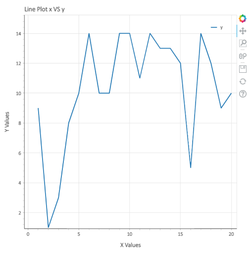
To visualize the plots and make them interactive, Bokeh provides a few tools, as shown in the above plot — Pan, Box Zoom, Wheel Zoom, Save, and Reset. To Explore interactiveness, download the plot above in HTML Format from here.
Combining multiple plots with different renders:
#Combining mutliple plots with different renders
from bokeh.plotting import figure, show
x = df["x"].values[:10]
y1 = df["y"].values[:10]
y2 = df["y1"].values[:10]
y3 = df["y2"].values[:10]
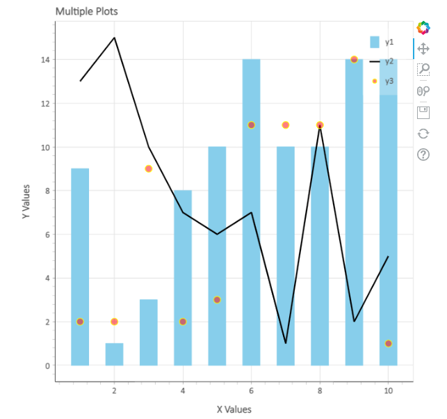
p = figure(title="Multiple Plots", x_axis_label="X Values", y_axis_label="Y Values")
p.vbar(x=x, top=y1, legend_label="y1", color="skyblue", width=0.5, bottom=0)
p.line(x, y2, legend_label="y2", color="black", line_width=2)
p.circle(x,y3,legend_label="y3",fill_color="red",fill_alpha=0.5,line_color="yellow",size=10)
# show the results
show(p)
Here, In the above code, we have used three different renders — vbar, line, and circle. In the circle plot, I tried to show a few additional parameters which we can use, such as fill_color — to fill the circle, fill_alpha — opacity of color, line_color — Border color for the circle, and size — radius of the circle.
The output will be like this —
Subplots using Bokeh:
from bokeh.layouts import row
from bokeh.plotting import figure, show
x = df["x"].values[30:40]
y1 = df["y"].values[30:40]
y2 = df["y1"].values[30:40]
y3 = df["y2"].values[30:40]
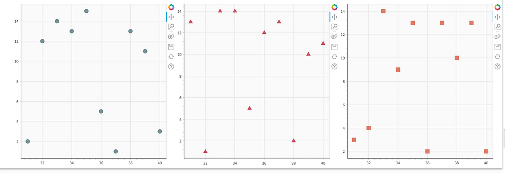
# create three plots with one renderer each
s1 = figure(width=250, height=250, background_fill_color="#fafafa")
s1.circle(x, y1, size=12, color="#53777a", alpha=0.8)
s2 = figure(width=250, height=250, background_fill_color="#fafafa")
s2.triangle(x, y2, size=12, color="#c02942", alpha=0.8)
s3 = figure(width=250, height=250, background_fill_color="#fafafa")
s3.square(x, y3, size=12, color="#d95b43", alpha=0.8)
# put the results in a row that adjusts accordingly
show(row(children=[s1, s2, s3], sizing_mode="scale_width"))
In the above code, as we can see, we used three renders — circle, triangle, and Square to plot three plots. we combined these plots using the row function. Parameter — scale_width is used, so that width of plots is adjusted accordingly to the width of the window.
The output will look like this —
Saving plots and setting themes in Bokeh —
from bokeh.io import curdoc
from bokeh.plotting import figure, show, save, output_file
x = df["x"].values[20:30]
y = df["y"].values[20:30]
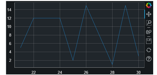
# apply theme to current document
curdoc().theme = "dark_minimal"
output_file(filename="custom_filename.html", title="Static HTML file")
# create a plot
p = figure(sizing_mode="stretch_width", max_width=500, height=250)
# add a renderer
p.line(x, y)
# show the results
save(p)
To save the plot into an HTML file above code is used. Here output_file parameter is used to log the filename and title of the file. Once the plot is created save() method is used to save the plot in the specified HTML file.
curdoc().theme method is used to set the theme for a bokeh plot. The following themes are available in Bokeh — caliber, dark_minimal, light_minimal, night_sky, and contrast.
We can customize the width and height of the plot by specifying them in the figure method.
The output will look like this —
We can also add the background color in Bokeh plots using the Box Annotation method —
from bokeh.models import BoxAnnotation
low_box = BoxAnnotation(top=10, fill_alpha=0.2, fill_color="blue")
mid_box = BoxAnnotation(top=10, bottom=5, fill_alpha=0.2, fill_color="green")
high_box = BoxAnnotation(bottom=5, fill_alpha=0.2, fill_color="red")
As we see, three boxes are created with three different colors; let’s integrate them with a plot.
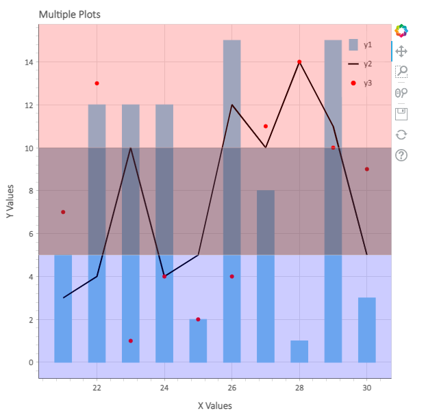
from bokeh.plotting import figure, show
curdoc().theme = "light_minimal"
x = df["x"].values[20:30]
y1 = df["y"].values[20:30]
y2 = df["y1"].values[20:30]
y3 = df["y2"].values[20:30]
p = figure(title="Multiple Plots", x_axis_label="X Values", y_axis_label="Y Values")
p.vbar(x=x, top=y1, legend_label="y1", color="skyblue", width=0.5, bottom=0)
p.line(x, y2, legend_label="y2", color="black", line_width=2)
p.circle(x, y3, legend_label="y3", color="red", size = 5)
p.add_layout(low_box)
p.add_layout(mid_box)
p.add_layout(high_box)
# show the results
show(p)
As we can see, we have created the plots and added the layouts to the plots.
Output:
We can also add many customizations in Bokeh, such as — legend customization, title customization, figure customization, etc.; we also have many types of renders in Bokeh which can be used according to the requirement. We can also add hover functionality in Bokeh.
So, What else? Next time when you are visualizing some data, make sure to use this interactive data visualization library.
Ending Note — Learning is my daily activity, and I Blog all my learnings here So that I can refer to them whenever I want and I can share my learnings with whoever is interested.
To Explore data visualization using Seaborn, follow this article —
Medium Reader and Author Behavioural Analysis using Spacy and Seaborn in Python
Happy Learning ….
Start using this Interactive Data Visualization Library: Python Bokeh Tutorial was originally published in Towards AI on Medium, where people are continuing the conversation by highlighting and responding to this story.
Join thousands of data leaders on the AI newsletter. It’s free, we don’t spam, and we never share your email address. Keep up to date with the latest work in AI. From research to projects and ideas. If you are building an AI startup, an AI-related product, or a service, we invite you to consider becoming a sponsor.
Published via Towards AI
Take our 90+ lesson From Beginner to Advanced LLM Developer Certification: From choosing a project to deploying a working product this is the most comprehensive and practical LLM course out there!
Towards AI has published Building LLMs for Production—our 470+ page guide to mastering LLMs with practical projects and expert insights!

Discover Your Dream AI Career at Towards AI Jobs
Towards AI has built a jobs board tailored specifically to Machine Learning and Data Science Jobs and Skills. Our software searches for live AI jobs each hour, labels and categorises them and makes them easily searchable. Explore over 40,000 live jobs today with Towards AI Jobs!
Note: Content contains the views of the contributing authors and not Towards AI.
Related posts


Popular posts

 for 2021")


Updates

Recent Posts


