


![Sound and Acoustic patterns to diagnose COVID [Part 2]](https://cdn-images-1.medium.com/max/1024/1*u2DWEHFFVdC1QeHvA0b8pw.jpeg "Sound and Acoustic patterns to diagnose COVID [Part 2]")
Sound and Acoustic patterns to diagnose COVID [Part 2]
Last Updated on January 6, 2023 by Editorial Team
Last Updated on April 10, 2022 by Editorial Team
Author(s): Himanshu Pareek
Originally published on Towards AI the World’s Leading AI and Technology News and Media Company. If you are building an AI-related product or service, we invite you to consider becoming an AI sponsor. At Towards AI, we help scale AI and technology startups. Let us help you unleash your technology to the masses.
Link to Part 1 of this case study
Link to Part 3 of this case study
Exploring our features
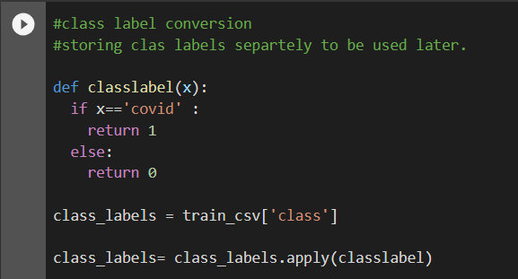
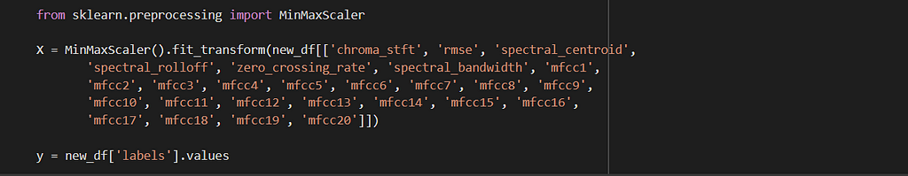
First, we will convert our class labels to integers and store them.
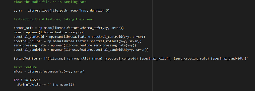
We will extract all the features discussed in the previous part for all our audio files and store them in a pandas data frame.
All the features explained were extracted from our dataset. The audio files were consumed in a monaural or monophonic form. The audio was also truncated to a duration of 5 seconds, to leave out less significant and outlier sounds. 20 MFCCs were extracted and the mean was taken on each of them. Mean was also taken over other features.
I have used the library Librosa to extract all these features from the spectrogram and store them in the data frame. All the features extracted are numeric, and thus would not require any encoding strategies.

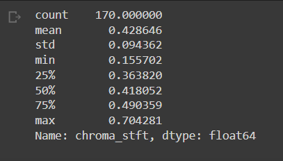
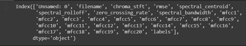
Basic stats of some features. You can observe the stats for “chroma_stft” below. You can also see the list of our final features.
#stats of features and final column list
new_df['chroma_stft'].describe()
new_df.columns
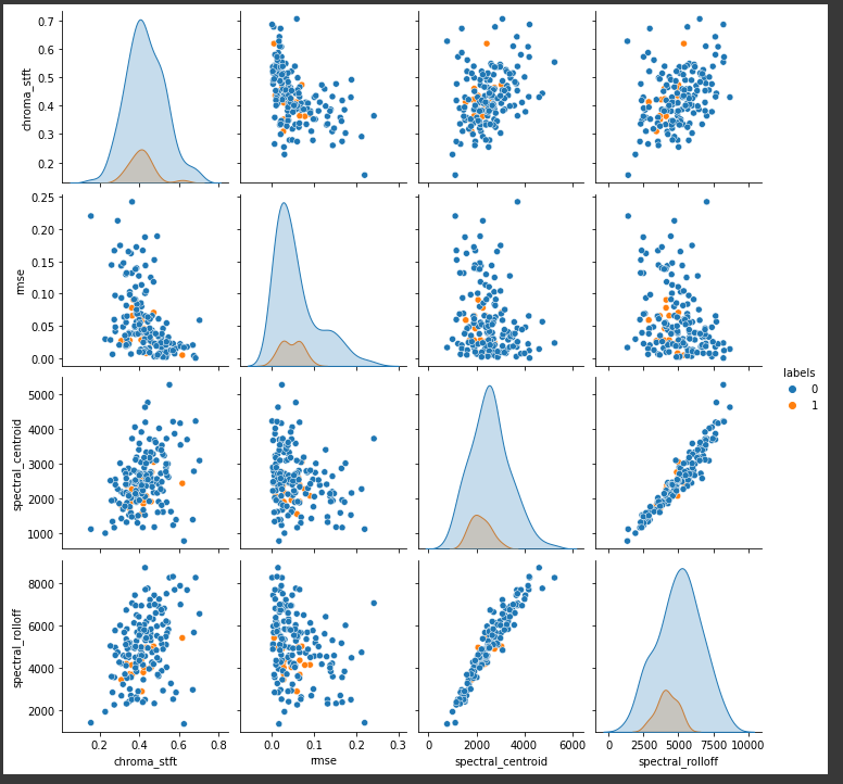
Pair plots to understand separability using some features
#pair plots of features
#There is not much information in the pair plots.
#there is no clear boundary that separates positives from negatives
import seaborn as sns
a = new_df.shape[0]
sns.pairplot(new_df[['chroma_stft', 'rmse', 'spectral_centroid', 'spectral_rolloff', 'labels']][0:a], hue='labels', vars=['chroma_stft', 'rmse', 'spectral_centroid', 'spectral_rolloff'])
plt.show()
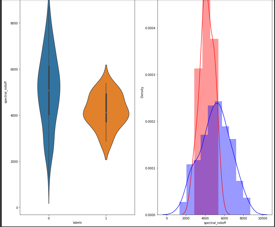
Below we will plot and see the distribution of the “spectral_rolloff” feature.
# Distribution of the spectral_rolloff feature
plt.figure(figsize=(15, 15))
plt.subplot(1,2,1)
sns.violinplot(x = 'labels', y = 'spectral_rolloff', data = new_df[0:] , )
plt.subplot(1,2,2)
sns.distplot(new_df[new_df['labels'] == 1.0]['spectral_rolloff'][0:] , label = "1", color = 'red')
sns.distplot(new_df[new_df['labels'] == 0.0]['spectral_rolloff'][0:] , label = "0" , color = 'blue' )
plt.show()
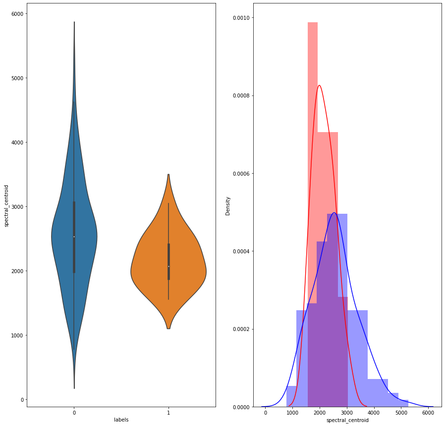
# Distribution of the spectral_centroid feature
plt.figure(figsize=(15, 15))
plt.subplot(1,2,1)
sns.violinplot(x = 'labels', y = 'spectral_centroid', data = new_df[0:] , )
plt.subplot(1,2,2)
sns.distplot(new_df[new_df['labels'] == 1.0]['spectral_centroid'][0:] , label = "1", color = 'red')
sns.distplot(new_df[new_df['labels'] == 0.0]['spectral_centroid'][0:] , label = "0" , color = 'blue' )
plt.show()
TSNE Plot:
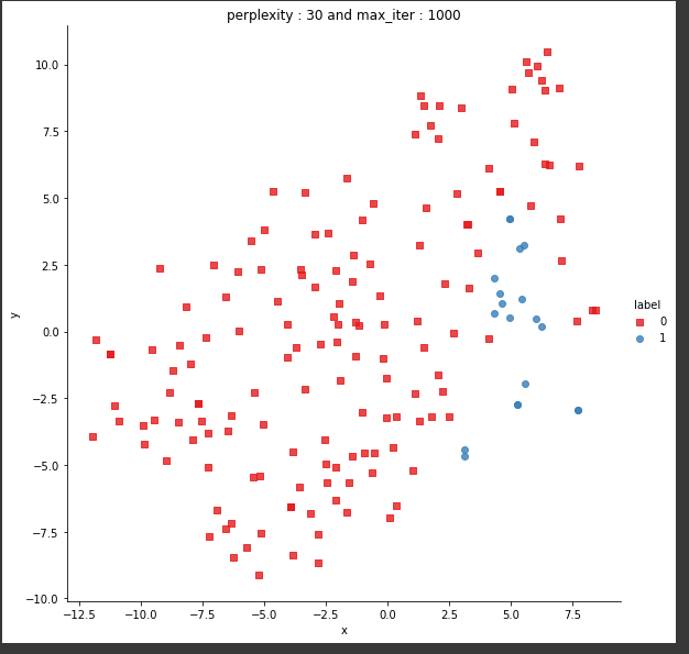
Univariate analysis of a few features suggests that there is not enough separation available to use single features for classification. In the distribution plot, there is a lot of overlap between a positive class distribution and negative class distribution. In the pair plot, you can observe that there is no clear decision boundary or clustering visible between our classes. In the TSNE plot, we do see some clustering happening, which is a good sign.
Modeling and performance analysis
In the previous section, we extracted features, such as chroma STFT, rmse etc, and stored them in a tabular format. The labels were also stored in text format, which we converted to binary for modeling. 0 will refer to as “not covid”, while 1 will refer to as “covid”. A custom function is created to plot the confusion matrix, precision matrix, and recall matrix.
When dealing with imbalanced data such as ours, it is important to supplement the accuracy metric with the above-mentioned metrics. Confusion matrix, recall, precision, and F1 score give a better understanding of our prediction results. F1 score is just a metric constructed from recall and precision, so we will not be using it for evaluating and analyzing our results.
Confusion matrix:
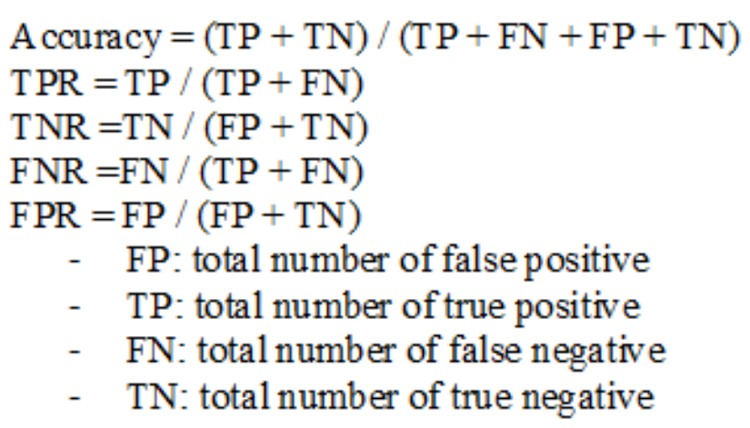
In a binary classification setting such as ours, it is a 2×2 matrix with actual values (Y) on one axis and predicted values (Y_hat) on the other axis. The confusion matrix is composed of 4 components — True positives (TP), False Positives (FP), True Negatives (TN), and False Negatives (FN).
True Positive: The model correctly predicted the positive class (have covid). For example, 6 people who actually had covid is predicted as such by the model. This count is referred to as the true positive.
False-positive: The model incorrectly predicted the positive class. For example, the model predicted 4 people to have covid, who in fact did not have it. The actual class was negative in this case.
True Negative: The model correctly predicted the negative class. For example, 50 people who did not have covid were predicted as such by the model. The actual class was also negative in this case.
False Negative: The model incorrectly predicted the negative class. The actual class was positive. For example, the model predicted that 5 people did not have covid, who in fact did have it.
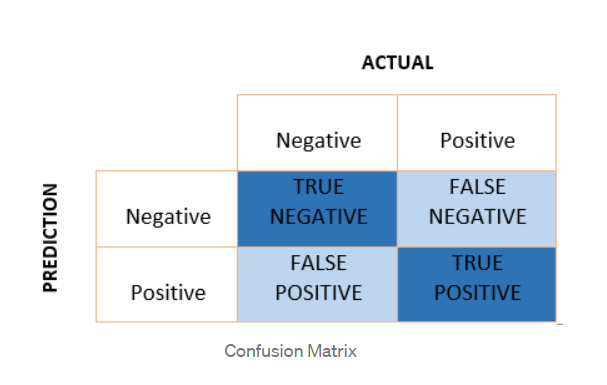
Using the above values, it is possible to calculate — TPR (true positive rate), FPR(false positive rate), TNR(true negative rate), and FNR(false-negative rate). Formulas for all of these are captured in the diagram below.
In general, it is desired to have high TPR, TNR, and low FPR and FNR. However, in the medical diagnosis domain, it often makes sense to focus more on TPR and FNR. in our project as well, it is more important that we increase the true positive rate and decrease the false-negative rate as much as possible, to create maximum business impact.
Precision:
It describes the quality of our positive predictions. It is the percentage or ratio that tells us how many of our predicted positive points are actually positive. The value always lies between 0 and 1. To get the percentage, we can multiple the ratio with 100.
Precision = TP/(TP + FP)
Recall:
It is the ratio that tells us how many positives were predicted out of the total actual positives. For instance, if the model predicted 5 covid positives out of 10 actual positive subjects, the recall would be 5/10 or 50 percent.
Recall = TP/(TP + FN)
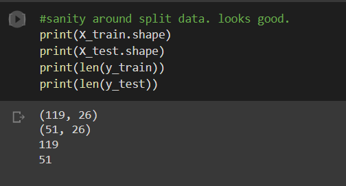
We will split our data into test and train subsets. The train set has 119 points with 26 features, and the test set has 51 points and the same features. The data is also saved to a pickle file for easy access in the future. Also, it is important to standardize the data.
#Train test split
X_train,X_test, y_train, y_test = train_test_split(new_df_1, y_true, stratify=y_true, test_size=0.3)
#save our objects to pickle
import pickle
with open('/SplitData.pickle', 'wb') as handle:
pickle.dump([X_train,X_test, y_train, y_test], handle)
#load the objects from pickle
import pickle
with open('/SplitData.pickle', 'rb') as handle:
X_train,X_test, y_train, y_test = pickle.load(handle)
Now we are ready to train models on our data.
Logistic Regression:
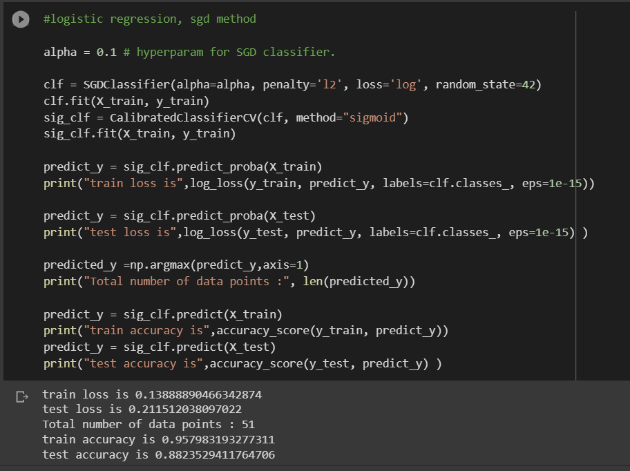
In logistic regression, the purpose is to find a place that can separate our two classes. Log loss is used for optimization. L2 regularization is used as a regularization method to avoid overfitting. Alpha is used as a hyperparameter that drives the regularization. A value of 0.1 is used as alpha. Stochastic gradient descent is used to find the minima/maxima.
Calibration using sigmoid is also used to get the accurate probabilities for the outputs.
In Logistic Regression, the model produced a train loss of 0.138 and a test loss of 0.21. The training accuracy was 95 percent, while the test accuracy was 88 percent. It is noteworthy that high test accuracy here does not give a true picture of the results, as our data set is imbalanced. There are chances that the high accuracy is only coming from the imbalanced class, which is the negative class in our data.
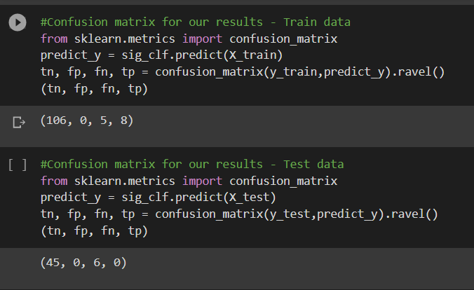
From the confusion matrix, it can be observed that the model was able to predict 8 positives correctly out of 13 positives. The true negatives were predicted correctly. This is for the train data.
In the test data, it can be observed that the model could not predict any positive points correctly.
#Plotting the matrices for Test data
plot_confusion_matrix(y_test, sig_clf.predict(X_test))
From the above precision plot, it can be inferred that for the positive class, we have 0 or no precision, and for the negative class, the precision is 0.882, which means, out of all negative predictions, 88.2 percent were correct negative predictions.
From the above recall plot, it can be inferred that, the recall for the positive class is 0 and that for the negative class is 1, which means, out of all negative points, 100 percent were predicted correctly. Similarly, out of all positive points, none were predicted correctly.
In conclusion, a simple model like logistic regression is not able to perform well, or be able to identify differences between the positive class and the negative class. It is highly biased towards the imbalanced class — the negative class.
Using the below code, save your results in a file, that can be used to store other results later.

The next model that was implemented was a random forest. It is an ensemble model based on decision trees. As linear models could not separate data, it makes sense to try a nonlinear, more complex model.
The number of base learners used is 50, and the max depth of each base learner tree is limited to 4. Both of these are hyperparameters and can be tuned using a cross-validation set.
Calibration using sigmoid is also used to get the accurate probabilities for the outputs.
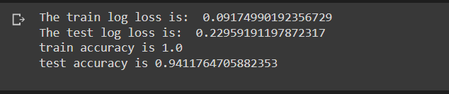
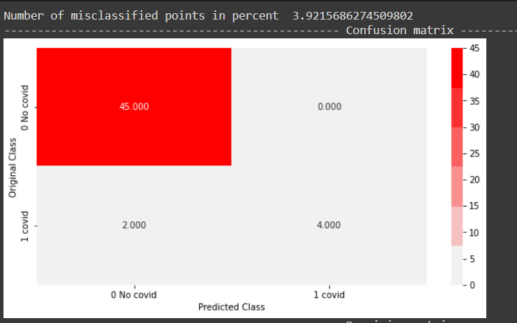
In the random forest model, a train log loss of 0.091 and a test log loss of 0.0229 were observed. Train accuracy of 100 percent and test accuracy of 94 percent was observed. From the confusion matrix, all negative points in the test data set were classified correctly and half of the positive points were classified correctly as well.
In conclusion, a more complex model like Random forest did a better job than a simple linear model and was able to differentiate between the classes sensibly.
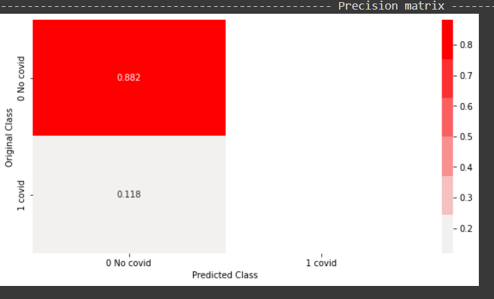
From the above precision plot, it can be inferred that for the positive class, we have a 100 percent precision, and for the positive class, which means, out of all positive predictions,100 percent of them were correct. Similarly out of all negative predictions, 92 percent were correct negative predictions.

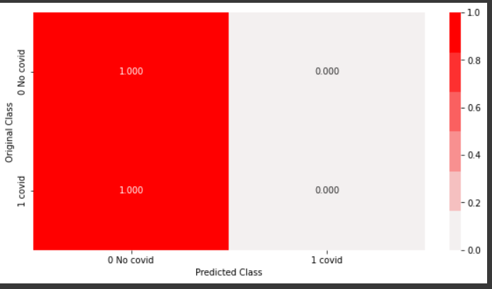
From the above recall plot, it can be inferred that recall for the positive class is 50 percent, which means out of all positive points, 50 percent were predicted correctly by the model. Similarly, recall for the negative class is 100 percent, which means out of all true negative points in the test data, all were predicted correctly by the model.
The results were saved in the performance file.
Gradient Boosting Decision Tree
The next model that was implemented was a gradient boosting decision tree. This is also an ensemble-based complex model that iteratively reduces the error from decision trees. A number of base learners used was 500, which are decision trees. Calibration is used using sigmoid to tune the probabilities of the outputs.
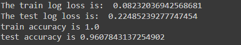
The training loss was around 0.08, while the test loss was around 0.22. An accuracy of 100 percent was observed on the train set, while accuracy of 96 percent was observed on the test set. This is an improvement on the random forest model.
All negative points were correctly classified. 4 out of 6 positive points were correctly classified as well, an improvement on the random forest model.
In conclusion, GBDT performed slightly better than the Random forest model and was able to classify positive points sensibly.
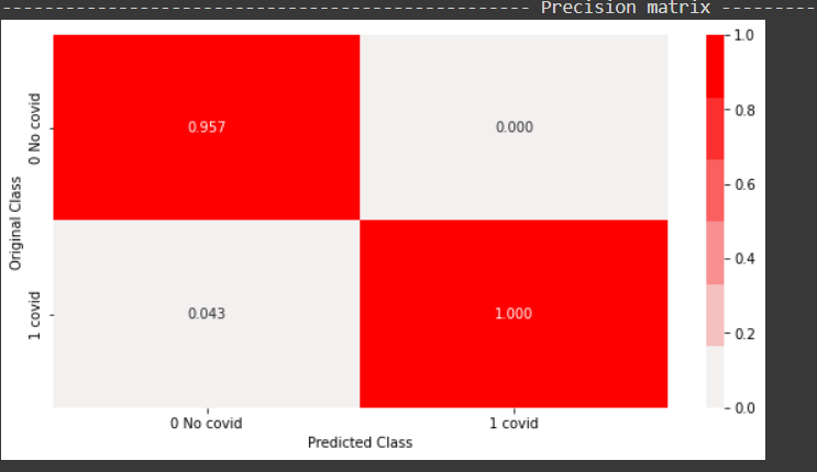
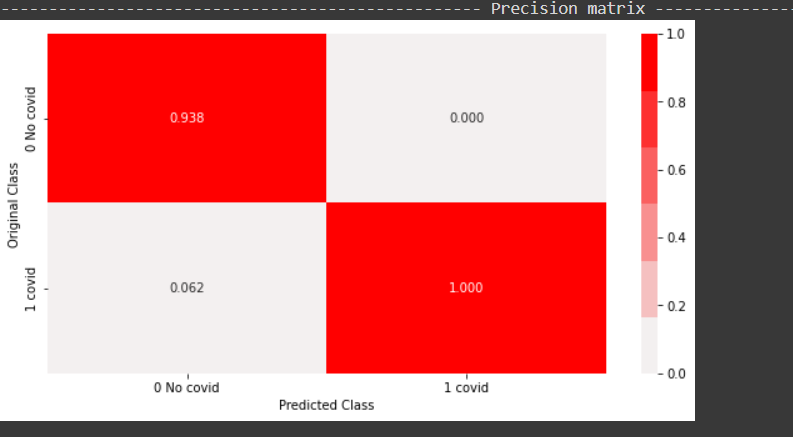
From the above plot, it can be inferred that all the positive points predicted by the model were correct. 95 percent of the negative points predicted were in fact negative and the rest 5 percent were actually positive.
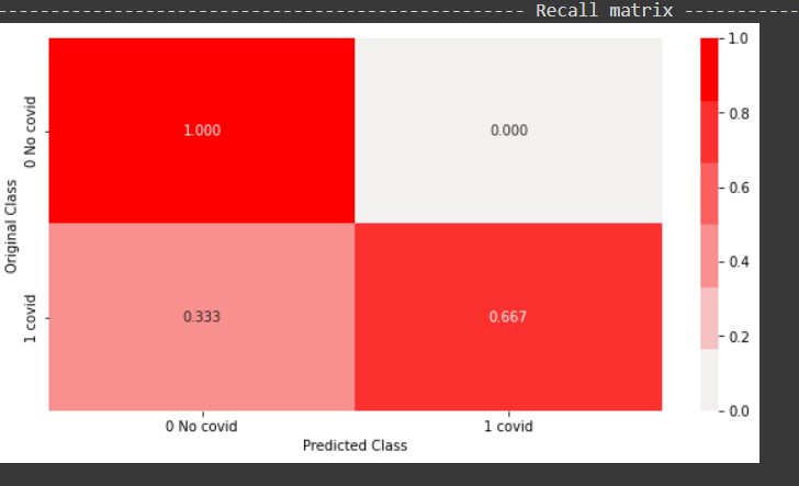
From the above recall plot, it can be inferred the model was able to predict 66 percent of the positive points out of all positive points. The model was able to predict 100 percent of the negative points out of all negative points.
It is noteworthy that we trained the above models on a single train-test split of the data. In case of smaller dataset, always train and calculate metrics on multiple splits of train-test data, to get a holistic picture of the results.
Conclusion:
In this part, we saw our features, did some EDA on them, and built some classical machine learning models.
In the next part:
- we will try Bayesian optimization to find the best model
- build deep learning models
- productionize one of the deep learning models
Sound and Acoustic patterns to diagnose COVID [Part 2] was originally published in Towards AI on Medium, where people are continuing the conversation by highlighting and responding to this story.
Join thousands of data leaders on the AI newsletter. It’s free, we don’t spam, and we never share your email address. Keep up to date with the latest work in AI. From research to projects and ideas. If you are building an AI startup, an AI-related product, or a service, we invite you to consider becoming a sponsor.
Published via Towards AI
Take our 90+ lesson From Beginner to Advanced LLM Developer Certification: From choosing a project to deploying a working product this is the most comprehensive and practical LLM course out there!
Towards AI has published Building LLMs for Production—our 470+ page guide to mastering LLMs with practical projects and expert insights!

Discover Your Dream AI Career at Towards AI Jobs
Towards AI has built a jobs board tailored specifically to Machine Learning and Data Science Jobs and Skills. Our software searches for live AI jobs each hour, labels and categorises them and makes them easily searchable. Explore over 40,000 live jobs today with Towards AI Jobs!
Note: Content contains the views of the contributing authors and not Towards AI.
Related posts


Popular posts

 for 2021")


Updates

Recent Posts


