


Sorting & Analytics Pane in Tableau: A Road to Tableau Desktop Specialist Certification
Last Updated on May 9, 2022 by Editorial Team
Author(s): Daksh Trehan
Originally published on Towards AI the World’s Leading AI and Technology News and Media Company. If you are building an AI-related product or service, we invite you to consider becoming an AI sponsor. At Towards AI, we help scale AI and technology startups. Let us help you unleash your technology to the masses.
Tableau, Data Science, BI, Data Analytics
Chapter 10: A comprehensive guide on Sorting & Analytics Pane in Tableau with Sample Certification questions and free Udemy dumps.
Welcome to the tenth chapter, In this piece, we are going to learn about Sorting and Analytics Pane in Tableau.
If you want to navigate through other chapters, visit: Tableau: What it is? Why it is the best?; A road to Tableau Desktop Specialist Certification.
If you want to directly go on Tableau Desktop Specialist notes, access them here → https://dakshtrehan.notion.site/Tableau-Notes-c13fceda97b94bda940edbf6751cf30
Use the link to get access to free Tableau certification dumps (Valid till 20 May 2022):
Table of Content
- Sorting
– Quick Sort(From Axis, Header, or Field Label)
– Authoring Sort(From Toolbar, Drag & Drop)
– Clearing Sort - Analytics Pane
– Constant Line
– Average Line
– Median with Quartiles
– Box Plots
– Totals
– Average with 95% CL
– Median with 95% CL
– Trend Line
– Forecast
– Reference Line
– Reference Band
– Distribution Band - Sample Certification Questions from this Topic
Sorting
Sorting is done on dimensions only.
Nested Sorting → A nested sort will assume each pane acts independently and sorts the row per pane. It is useful when we want to sort within a category of items. They don’t convey the aggregated information about how the values compare overall.
Quick Sort
- From an Axis
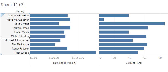
To sort the data from an axis, simply hover over the axis and choose the sort option.
Sorting from an axis gives a nested sort by default.
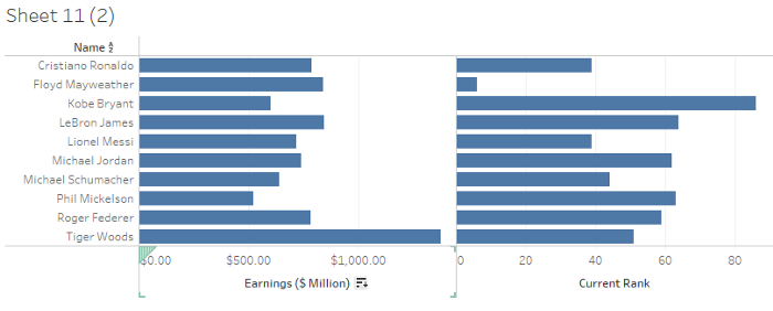
Observe the sort option near axis Earnings($ Million) and click on that to sort the view.
Single-click to sort in ascending order, double-click to sort in descending order and triple-click to get the default order.
- From Header
To sort the data by header, simply hover on the header and choose the sort option.
- From Field Label
To sort from the field label, simply hover on the field label and choose the field on which you want to sort the view.
Sorting from Field Label gives us non-nested sorting by default.
Authoring Sort
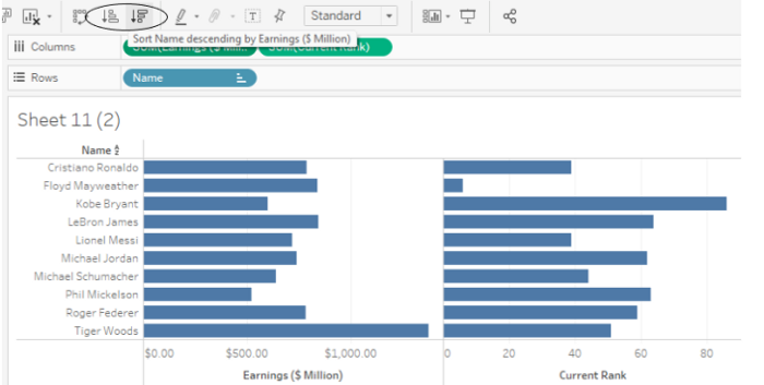
- From the toolbar
We can either sort in ascending or descending order from the toolbar.
Sorting from a Toolbar gives a nested sort by default
- By Dragging & Dropping
To manually sort, we can drag the field and drop it anywhere we want.
The heavy black line will indicate where the dragged field would be.
Once we manually sort the data, the order won’t change even if we refresh our data.
Enabling any other type of sort (Field, alphabetic, or Nested) clears the manual sort we create.
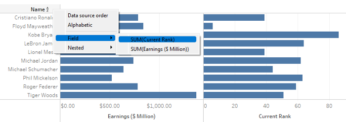
- Specified Field Sort
To sort the field by specified field, simply right-click on the field label.
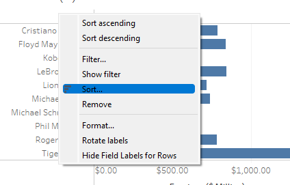
We can choose to sort in the following ways.
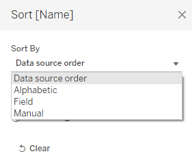
- Data Source Order — It will sort the data in the way, the data is originally sorted in our dataset.
- Alphabetic — It will alphabetically sort the fields, either A-Z or Z-A.
- Field — It will let you sort the data on basis of a particular field. The field doesn’t need to be present in the view/viz.
- Manual — It will let you create a custom sorting order.
Clearing Sorts
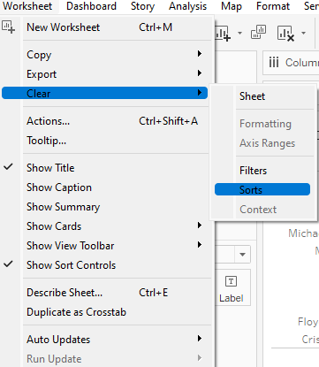
To clear the sorts, we have two options:
- Worksheet > Clear >Sorts
2. To clear specified sorts on the field, right-click on the field and choose “Clear Sort”.
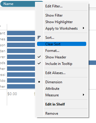
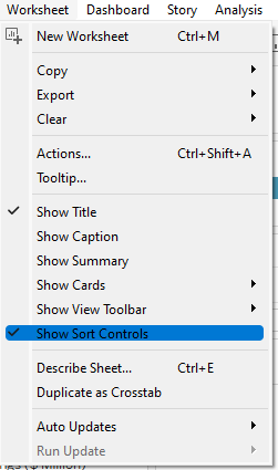
We can also disable all the sorts, Worksheet>Show Sort Controls.
Analytics Pane
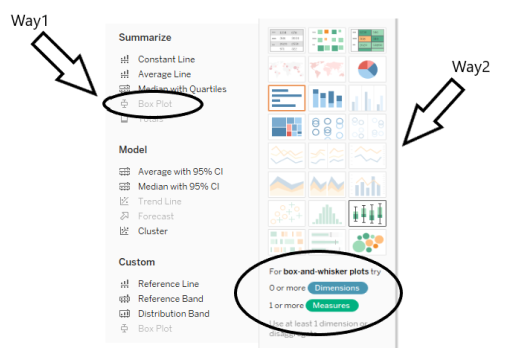
We can add Analytics objects from Analytics Pane that could be availed from the view.
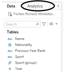
Analytics Pane offers drag-and-drop functionality to add analytics objects such as box plots, constant lines, and average lines in the view.
The scope of Analytics objects could be defined for either Table, pane, or a cell.
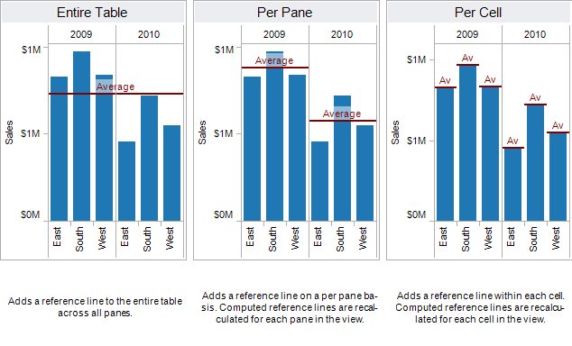
Tableau offers the following Analytics objects:
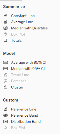
We can edit any Analytics object by right-clicking and choosing “Format”.
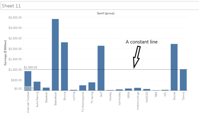
Constant Line
It lets you add a constant line to the viz. A constant line can be added for some specific measures, all measures, or only date dimensions. When we try to add a constant line, Tableau lets you enter a constant value.
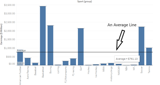
Average Line
Tableau lets you create an Average line either for the entire table, pane or cell. The average line could only be created for some specific measure or all measures.
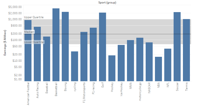
Median with Quartiles
A quartile segregates data into: Upper Quartile, Median, Lower Quartile. In Tableau, Median with Quartiles can be either added to Entire Table, Pane, or Cell. We can add Median with Quartiles either for some specific measures or all measures.
The lower quartile is the region that contains 25% of total data points. The upper quartile contains 75% of the total data points. Median depicts the middle value of data points when sorted in ascending/descending order.
The dark black line depicts the median and two shaded blocks representing Upper Quartile and Lower Quartile respectively.
Box Plot
Box Plots are also known as Box-and-Whisker Plots.
The scope of the box plot is always cell.
Box plots are required to check if data have any outliers.
The Box plot can be created for some specific measures or all measures.
Box Plots can either be made through Analytics Pane or Show Me Pane.
A box plot requires a Dimension on the Column shelf and a Measure on the Row shelf.
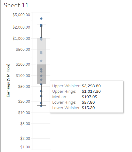
Upper Whisker and Lower Whisker denote Maximum and Minimum Value respectively.
Upper Hinge and Lower Hinge denote Upper Quartile(75% of data points lie here) and Lower Quartile(25% of data points lie here) respectively.
Median denotes the middle value of data when sorted in ascending/descending order.
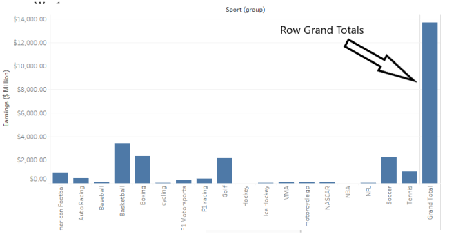
Totals
This option allows us to add totals to the view, depending on the data points we can choose from Subtotals, Column Grand Totals, and Row Grand Totals.
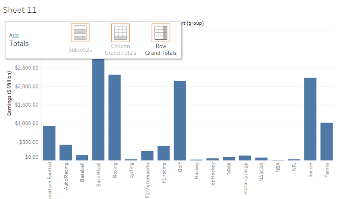
After choosing the required view, we get results like this.
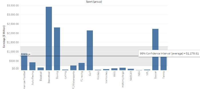
Average with 95% CLI
This adds an average line with a distribution band in the view. The distribution bands are configured to show a 95% confidence interval i.e. the average population will lie in this band 95% of the time.
This could be either added for a specific measure or all the measures.
The scope could be defined either for the table, pane, or a cell.
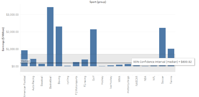
Median with 95% CLI
This adds a median line with a distribution band in the view. The distribution bands are configured to show a 95% confidence interval i.e. the median population will lie in this band 95% of the time.
This could be either added for a specific measure or all the measures.
The scope could be defined either for the table, pane, or a cell.
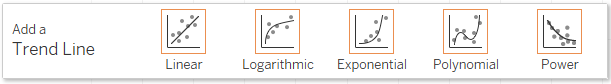
Trend Lines
To add a trend line, both row and column shelves must contain continuous data.
A trend line requires 2 measures on opposing axes, or a date and a measure on opposing axes.
We can add a trend line to the scatter plot.
There are 5 types of trend lines in Tableau:
Linear Trend Line
Y = b0 + b1*x
where b0 is slope, b1 is intercept.
Logarithmic Trend Line
Y = b0 + b1*ln(x)
Exponential Trend Line
Y = exp(b0) * exp(b1*x)
Power Trend Line
Y = b0 * (x^b1)
Polynomial Trend Line
Y = b0 + b1*x + b2*x²
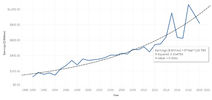
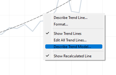
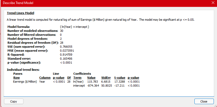
Right-click on the trend line to either edit or describe it.
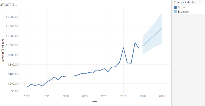
Forecast
Forecasting can be done for at least one date dimension and one measure in the view.
Forecasting is only supported on Tableau Desktop and is not valid on multidimensional data.
We can’t use Forecasting in the view if it contains any of them:
- Table calculations
- Disaggregated measures
- Percent calculations
- Grand Totals or Subtotals
- Date values with aggregation set to Exact Date
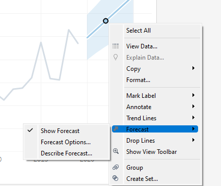
We can edit the forecast or ask for its description, by right-clicking on the forecasted line.
When we increase our precision in forecasting, the range is increased.
Reference Line, Reference Band, Distribution Band, Box Plot
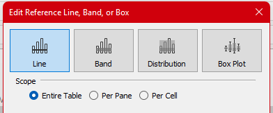
We can create custom Reference Line, Reference bands, Distribution bands, and Box Plots.
We can add a reference line to the scatter plot.
A Reference Band can be based on two fixed points.
A Reference Distribution plot can be along a continuous axis.
The scope for Reference Line, Reference Band, Distribution Plot is either the Table, Pane, or a cell.
The Box plot can only be defined on a cell.
Sample Certification Questions from this Topic
Sorting from field label gives ______ sort by default.
a. Nested
b. Non-Nested
c. Manual
d. Data Source order
Solution: Non-nested
Percentile is available both in aggregation and calculation?
a. True
b. False
Solution: True
Totals can be done either through? [Choose 2]
a. Analytics Pane
b. Worksheet Menu
c. Analysis Menu
d. Right-clicking in the view.
Solution: Analytics Pane, Analysis Menu
Which is not a valid Table Calculation?
a. Difference From
b. Rank
c. Percentile
d. Difference of Total
Solution: Difference in Total
Sorting can only be done on dimensions?
a. True
b. False
Solution: True
Use the link to get access to free Tableau certification dumps (Valid till 20 May 2022):
References:
[1] Tableau Help | Tableau Software
[2] Personal Notes
[3]Tableau Desktop Specialist Exam (New Pattern — 2021) — Apisero
Thanks for Reading!
Feel free to give claps so I know how helpful this post was for you, and share it on your social networks, this would be very helpful for me.
If you like this article and want to learn more about Machine Learning, Data Science, Python, BI. Please consider subscribing to my newsletter:
Find me on Web: www.dakshtrehan.com
Connect with me at LinkedIn: www.linkedin.com/in/dakshtrehan
Read my Tech blogs: www.dakshtrehan.medium.com
Connect with me at Instagram: www.instagram.com/_daksh_trehan_
Want to learn more?
How is YouTube using AI to recommend videos?
Detecting COVID-19 Using Deep Learning
The Inescapable AI Algorithm: TikTok
GPT-3 Explained to a 5-year-old.
Tinder+AI: A perfect Matchmaking?
An insider’s guide to Cartoonization using Machine Learning
How Google made “Hum to Search?”
One-line Magical code to perform EDA!
Give me 5-minutes, I’ll give you a DeepFake!
Cheers
Sorting & Analytics Pane in Tableau: A Road to Tableau Desktop Specialist Certification was originally published in Towards AI on Medium, where people are continuing the conversation by highlighting and responding to this story.
Join thousands of data leaders on the AI newsletter. It’s free, we don’t spam, and we never share your email address. Keep up to date with the latest work in AI. From research to projects and ideas. If you are building an AI startup, an AI-related product, or a service, we invite you to consider becoming a sponsor.
Published via Towards AI
Towards AI Academy
We Build Enterprise-Grade AI. We'll Teach You to Master It Too.
15 engineers. 100,000+ students. Towards AI Academy teaches what actually survives production.
Start free — no commitment:
→ 6-Day Agentic AI Engineering Email Guide — one practical lesson per day
→ Agents Architecture Cheatsheet — 3 years of architecture decisions in 6 pages
Our courses:
→ AI Engineering Certification — 90+ lessons from project selection to deployed product. The most comprehensive practical LLM course out there.
→ Agent Engineering Course — Hands on with production agent architectures, memory, routing, and eval frameworks — built from real enterprise engagements.
→ AI for Work — Understand, evaluate, and apply AI for complex work tasks.
Note: Article content contains the views of the contributing authors and not Towards AI.
Related posts
Recent Posts


")


