
Sales Prediction| Using Time Series| End-to-End Understanding| Part -2
Last Updated on July 25, 2023 by Editorial Team
Author(s): Yashashri Shiral
Originally published on Towards AI.
Sales PredictionU+007C Using Time SeriesU+007C End-to-End UnderstandingU+007C Part -2
Sales Forecasting determines how the company invests and grows to create a massive impact on company valuation. This is part 2, and you will learn how to do sales prediction using Time Series.
Please refer to Part 1– to understand what is Sales Prediction/Forecasting, the Basic concepts of Time series modeling, and EDA
I’m working on Part 3 where I will be implementing Deep Learning and Part 4 where I will be implementing a supervised ML model.
In this part, we will deep dive into the Time Series model implementation
Time-Series forecasting
Now let’s look at the moving average, as it gives you an overall idea of the trends in the dataset, it’s useful in long-term forecasting.
Steps to implement the Time-Series model and its importance:

1. Data Preparation —
Collect data, Understand features
2. Visualize Data —
Rolling mean/ Standard Deviation— helps in understanding short-term trends in data and outliers.
The rolling mean is an average of the last ’n’ data points and the rolling standard deviation is the standard deviation of the last ’n’ points.
3. Time Series Decomposition —
Helps you understand historical data by deconstructing time series into Trend, Seasonal, and Residual (anything that is not captured by Trend & Seasonality).
Choose an additive model when seasonal variation is relatively constant over time. And choose the multiplicative model if seasonal variation increases over time.
4. Make Data Stationary —
In a previous article I explained what is stationary, but now understand why it’s important to have stationary data. If our data is not stationary then inferences drawn from such data will not be reliable as it will keep on changing with time. And statistical procedure applied in time series analysis makes an assumption that the underlying time-series data is stationary.
Generally, real-life data is not stationary, and Augment-Dickey Fuller (ADF) test or Kwiatkowski- Phillips-Schmidt-Shin(KPSS) test helps in understanding if data is stationary or not.
So, you can make data stationary by taking a rolling average or difference in the data.
5. Autocorrelation —
Autocorrelation is when data points are correlated with each other, which can be misleading while performing statistical analysis. If the dataset is autocorrelated, it will appear to have a stronger correlation between two variables than it actually does. Data is positively correlated i.e. when one data point increases the other also increases. Data is negatively correlated i.e. when one data increases then another data point decreases
One can apply an autoregressive model to remove autocorrelation.
6. Time Series Model implementation —
I have explained a couple of models in the previous article. But if you want a basic understanding of more time series models refer to this article by Davide Burba.
7. Time Series model evaluation —
You can’t use general evaluation metrics such as RMSE scores for time series models. Use the following methods-
- Validate/compare the predictions of your model against actual data
- Compare the results of your model with a simple moving average
- Use k-fold cross-validation to test the generalized accuracy of your model
- Use rolling windows to test how well the model performs on the data that is one step or several steps ahead of the current time point
Time-Series model in python
In this article, we will start with the second step as we already have a basic understanding of data(refer to Part 1)
Step 2 — Visualize Data
Rolling Mean and standard deviation —
Low Standard Deviation — Data is closely clustered around mean
High Standard Deviation — Data is scattered over a range of values
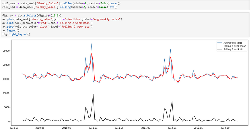
As you can see in the above figure standard deviation value is lower which means Data is closely clustered around mean
Step 3 — Time Series Decomposition
From previous visualizations and understanding, I’m choosing the ‘Multiplicative’ model as data have some seasonal component. (I would have used the additive model if the data would have had an upward or downward trend)
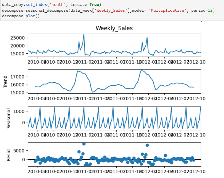
As you can see in the above figure During Nov and December Weekly sales go high that’s the trend and have cyclic seasonality.
Step 4 — Make data stationary
In simple words, stationary data means, mean and covariance don’t change over time.
ADF– is a unit root test and does not always have a trend component.
Hypothesis for ADF—
Null Hypothesis: Series is non-stationary or series has a unit root
Alternative Hypothesis: Series is stationary or series has no unit root
If the Null hypothesis cannot be rejected (and p-value >0.05) then the data is non-stationary.
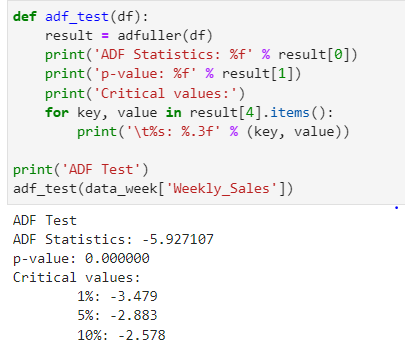
As you can see above p-value is less than 0.05 i.e. we can reject the Null hypothesis and the data is stationary.
Now before I move on to KPSS just a note, KPSS cannot be used interchangeably with ADF.
KPSS Test —
A major difference between KPSS and ADF is the capability of the KPSS test to check for stationary in the ‘presence of the deterministic trend’ i.e. slope of the trend in the series does not change permanently.
Hypothesis for KPSS —
Null Hypothesis: Series is trend stationary or series has no unit root.
Alternative Hypothesis: The series is non-stationary or the series has a unit root.
If the Null hypothesis cannot be rejected (and p-value >0.05) means the time series does not have a unit root, meaning it is trend stationary.

As you can see p-value is greater than 0.05 i.e. Data is trend stationary as well. Our data is stationary in both tests.
It is always better to apply both tests so that it can be ensured that the series is truly stationary. Possible outcomes of applying these stationary tests are as follows:
Case 1: Both tests conclude that the series is not stationary — The series is not stationary
Case 2: Both tests conclude that the series is stationary — The series is stationary
Case 3: KPSS indicates stationarity and ADF indicates non-stationarity — The series is trend stationary. The trend needs to be removed to make the series strictly stationary. The detrended series is checked for stationarity.
Case 4: KPSS indicates non-stationarity and ADF indicates stationarity — The series is difference stationary. Differencing is to be used to make series stationary. The differenced series is checked for stationarity.
Step 5 — Autocorrelation
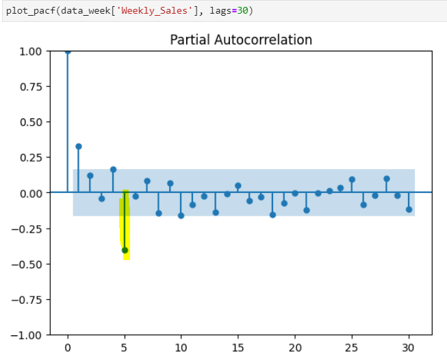
ACF measures the correlation between a lagged version of the variable while PACF measures the correlation between a lagged version of the variable after accounting for any correlations due to previous lags.

As you see in the graph above and below ACF and PACF both are declining gradually with every 5th lag. The figure shows Seasonal ARMA with a 5-period cycle. Usually, Seasonal-AR(1) and Seasonal-MA(1) lags are enough to account for such behavior.
Step 6 — Time Series model implementation
Now as we understand from the autocorrelation plots we know the best model will be SARIMA.
SARIMA (p, d, q) -non-seasonal (P, D, Q)m seasonal components
You can see that we add P, D, and Q for the seasonal portion of the time series. They are the same terms as the non-seasonal components, as they involve backshifts of the seasonal period. And ‘m’ is the number of observations.
Even though we know from ACF and PACF which components to use it’s always better to test multiple scenarios to get the lowest value of AIC. AIC is a mathematical method for evaluating how well the model fits the data it was generated from.
There are 3 different packages that you can use — statsmodels, statespace, and pmdarima(which automates the search model order)

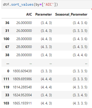
As you can (3,4,3) and (3,4,3,6) gives us the lowest AIC. Let’s go ahead and apply this in the SARIMA model.

The components we choose from the lowest AIC value aren’t giving the best results. The lowest value of AIC does not necessarily give the best prediction for SARIMA models. AIC is used to measure the relative quality of a model based on the amount of information it contains. In addition, the AIC value alone does not take into account any other factors that may affect the quality of the predictions, such as the data used to train the model.
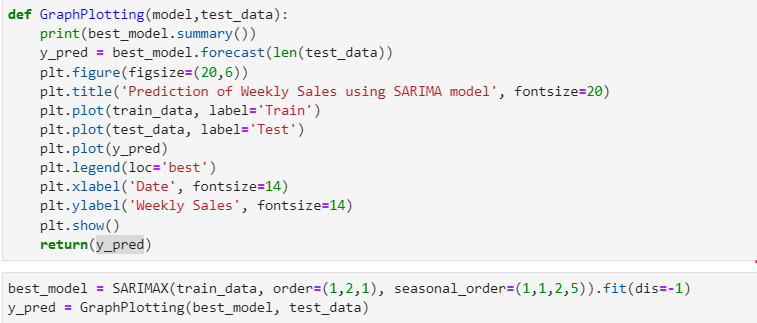
Now I’m selecting orders by trial and error method depending on how it’s generating results. And using SARIMAX model
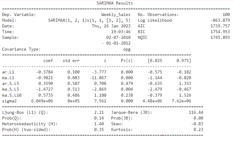
Now let’s understand this summary, we can evaluate residual test statistics to evaluate model performance
Ljung-Box: Null Hypothesis — There is no correlation in the residuals
Jarque-Bera: Null Hypothesis — Residuals are normally distributed
Prob(Q) is 0.14>0.05, we can’t reject the null hypothesis i.e. so residuals are correlated. Correlated residuals indicate that the model is not accurately predicting future values based on past data.
Prob(JB) is 0.00<0.05, we reject the null hypothesis i.e. residuals are not normally distributed. Now this means that the errors that model makes are not consistent across variables and observations. This is the indicator that it’s not a better-performing model. If the residuals are not normally distributed, it may indicate that the model is overfitting the data or that it is not capturing all of the relevant patterns in the data.

As you can see even though the AIC value is 1739 SARIMAX model is predicting better results with order -(1,2,1) and seasonal order(1,1,2,5) than when AIC was the lowest but as we saw in test statistics still not the best model.
Let’s plot diagnostics. To understand model performance in detail

Standardize Residual — We do see some sort of residual pattern, indicating that the model is not accurately predicting the observed values.
Histogram plus estimated density — The histogram shows the measured distribution of the residuals while the orange line shows the KDE curve (smoothed version of the histogram). The green line shows a normal distribution. For a good model, the orange line should be similar to the green line. The orange curve is not very similar to the green one.

Normal QQ — Most of the data points should lie in a straight line, indicating a normal distribution of the residuals. Which is not the case in our scenario.
Correlogram — If the points or lines are close together, this indicates a strong correlation between the variables. If the points or lines are spread out, this indicates a weak correlation.
Step 7 — Model Evaluation
Let’s calculate the mean absolute error.

MAE is 2256 which is a really high value.
To conclude, the time series model isn’t predicting sales with a lower MAE value. You can take a difference in sales and use that in the SARIMA model and follow the same steps. I tried doing that but that reduced the MAE value but still, it isn’t the best.


Now as we implemented the time series approach let’s build a Deep learning model and a supervised model to see if it performs better than this or not.
Please give it a clap if you find it informative and mention in the comment if I should improve anything.
Join thousands of data leaders on the AI newsletter. Join over 80,000 subscribers and keep up to date with the latest developments in AI. From research to projects and ideas. If you are building an AI startup, an AI-related product, or a service, we invite you to consider becoming a sponsor.
Published via Towards AI
Towards AI Academy
We Build Enterprise-Grade AI. We'll Teach You to Master It Too.
15 engineers. 100,000+ students. Towards AI Academy teaches what actually survives production.
Start free — no commitment:
→ 6-Day Agentic AI Engineering Email Guide — one practical lesson per day
→ Agents Architecture Cheatsheet — 3 years of architecture decisions in 6 pages
Our courses:
→ AI Engineering Certification — 90+ lessons from project selection to deployed product. The most comprehensive practical LLM course out there.
→ Agent Engineering Course — Hands on with production agent architectures, memory, routing, and eval frameworks — built from real enterprise engagements.
→ AI for Work — Understand, evaluate, and apply AI for complex work tasks.
Note: Article content contains the views of the contributing authors and not Towards AI.


