


Multivariate Analysis using SAS
Last Updated on February 23, 2022 by Editorial Team
Author(s): Dr. Marc Jacobs
Originally published on Towards AI the World’s Leading AI and Technology News and Media Company. If you are building an AI-related product or service, we invite you to consider becoming an AI sponsor. At Towards AI, we help scale AI and technology startups. Let us help you unleash your technology to the masses.
Machine Learning
The difference between univariate, multivariate, and multivariable is often overlooked. As such, multivariate and multivariable are used interchangeably although they mean completely different things.
There is no such thing as a univariate, multivariate model, but you can have:
- Univariate, multivariable
- Multivariate, multivariable
- Univariate, univariable
- Multivariate, univariable
Multivariate means multiple dependent variables (Y’s), multivariable means multiple independent variables (X’s). The difference between multivariable and univariable is probably known to most since the majority of the models that you run have more than one independent variable. This means you have a single outcome and multiple predictors.
The difference between univariate and multivariate will have a steeper learning curve since multivariate analysis often leads to a reduction or reframing of the original data to handle the multiple outcomes you are trying to model.
A multivariable model can be thought of as a model in which multiple independent variables are found on the right side of the model equation. This type of statistical model can be used to attempt to assess the relationship between a number of variables; one can assess independent relationships while adjusting for potential confounders.
Multivariate Modeling refers to the modeling of data that are often derived from longitudinal studies, wherein an outcome is measured for the same individual at multiple time points (repeated measures), or the modeling of nested/clustered data, wherein there are multiple individuals in each cluster
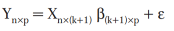
A multivariate linear regression model is a model where the relationships between multiple dependent variables (i.e., Ys) — measures of multiple outcomes — and a single set of predictor variables (i.e., Xs) are assessed.
Multivariate analysis refers to a broad category of statistical methods used when more than one dependable variable at a time is analyzed for a subject.
Although many physical and virtual systems studied in scientific and business research are multivariate most analyses are univariate in practice. What often happens is that these relationships are merged in a new variable (e.g., Feed Conversion Rate). Often, some dimension reduction is possible, enabling you to see patterns in complex data using graphical techniques.
In univariate statistics, performing separate analyses on each variable provides only a limited view of what is happening in the data as means and standard deviations are computed only one variable at a time.
If a model has more than one dependent variable, analyzing each dependent variable separately also increases the probability of type-I error in the set of analyses (which is normally set at 5% or 0.05).
And, if you did not realize it yet, longitudinal data can be analyzed both in an univariate and multivariate way — it depends on where you want to place the variance-covariance matrix.
Examples of multivariate analysis are:
- Factor Analysis can examine complex intercorrelations among many variables to identify a small number of latent factors.
- A Discriminant Function Analysis maximizes the separation among groups on a set of correlated predictor variables, and classifies observations based on their similarity to the overall group means.
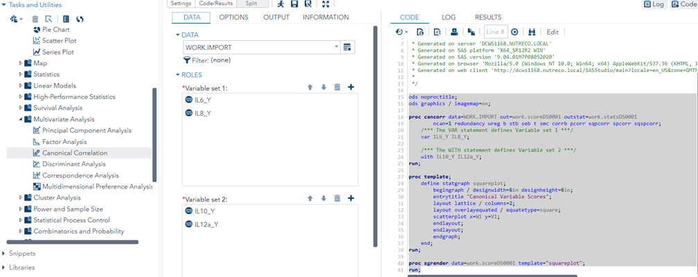
- Canonical Correlation Analysis examines associations among two sets of variables and maximizes the between-set correlation in a small number of canonical variables (to be discussed later on).
So, start thinking about unseen or latent variables.
Multivariate analyses are amongst the most dangerous analyses you can conduct as they are capable of dealing with situations that are rare:
- Large column N — datasets that have >100 columns
- N<P — datasets that have less rows (N) than columns (P)
- Multicollinearity — datasets containing highly correlated data
However, before just applying multivariate analysis on any dataset you see, you must make sure that you know your data first. The model could not care less if it does not make sense biologically.
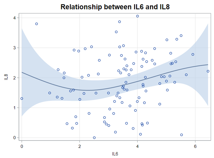
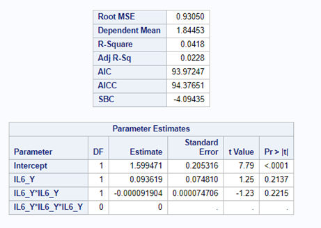
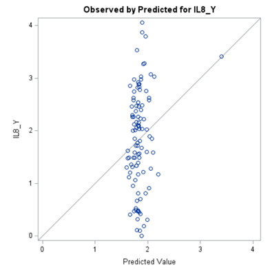
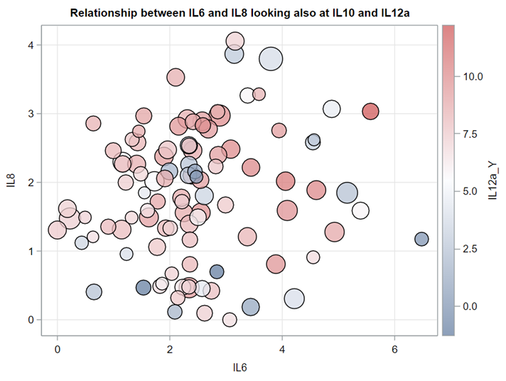
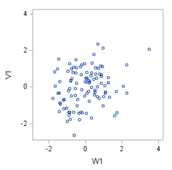
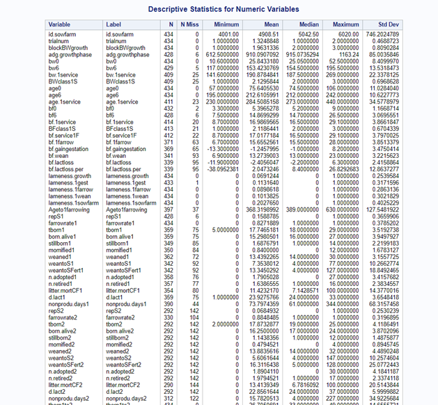
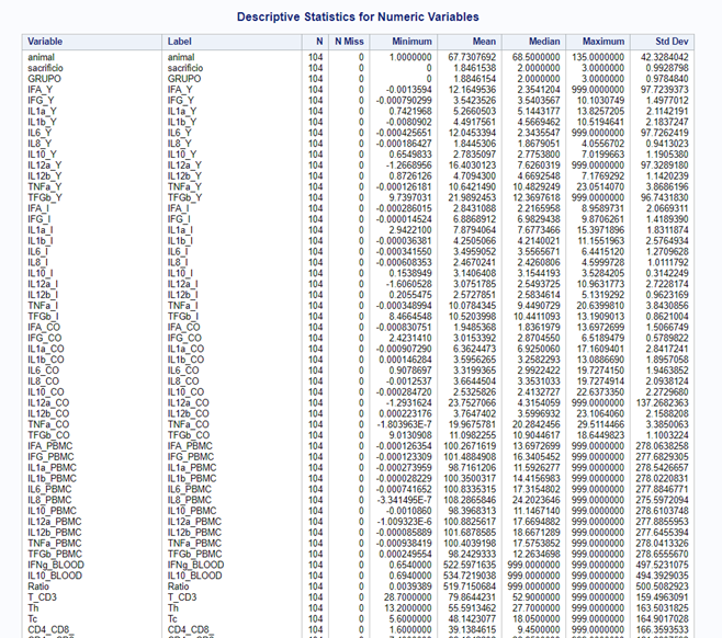
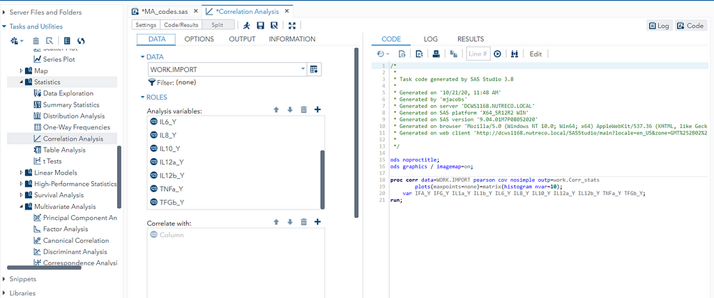
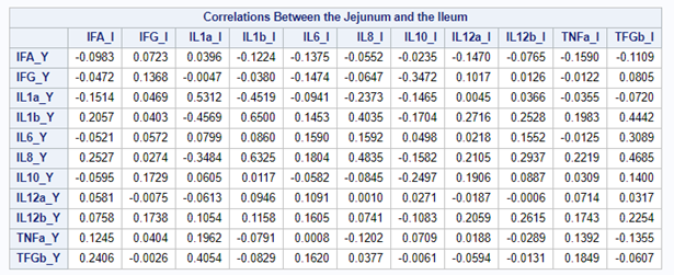
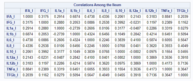
Just look at the datasets below and see if you can spot issues that will make analyzing the data difficult. I promise you there are definitely issues to be found.
In SAS there are many tools you can use to explore the data, summarize it, tabulate it, and create associations.
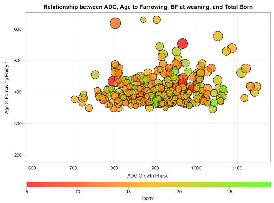
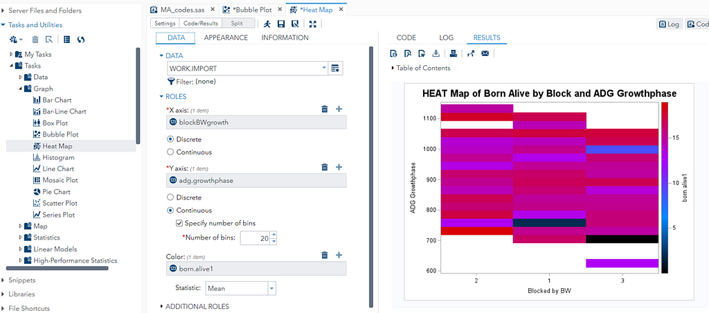
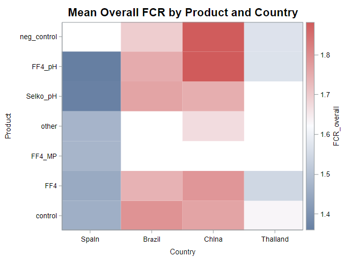

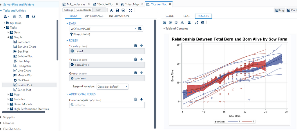
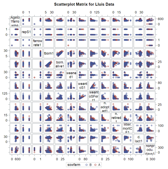
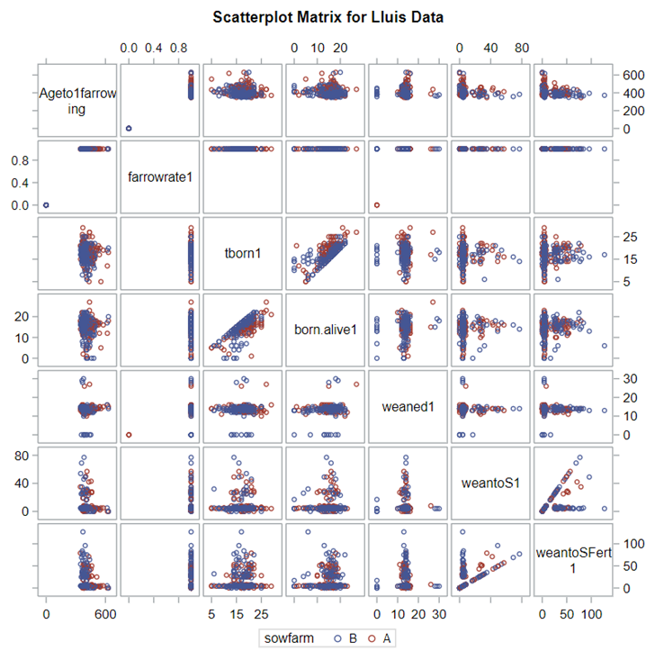
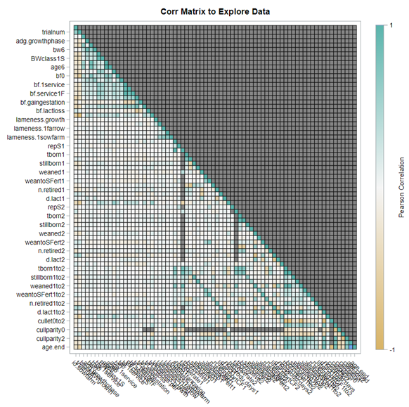
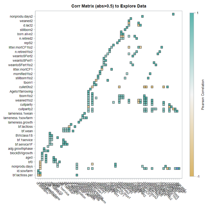
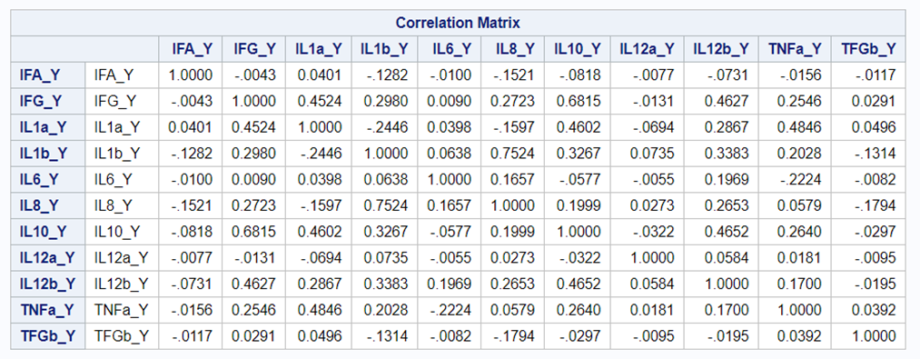
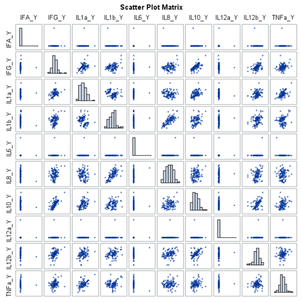
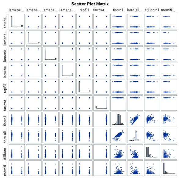
A good first step is to create several correlational matrices to identify the largest correlations. Heat maps will help as well. Once you have identified places for zooming in, use scatter matrices and bubble plots to look closer.
So, yes, you will create a lot of graphs and so it is best to think about which graphs you would like to make before actually making them so you do not get lost! Since graphing your data is the first step to gaining insights, a multifold of variables means that you need to graph smart. Start by graphing biologically connected data. Then look at the more unknown data.
Paradox: many of the analytical methods that will be introduced actually require interconnected data. So, if you find a lot of multicollinearities, do not worry. Actually, embrace it! This is where multivariate models are at their best.
So, let's start with correlations first, since they are the de facto measurement of association. Remember, we WANT to find the correlation. However, in this post, I will discuss more than just good old Pearson correlations. I will also discuss:
- good old Pearson correlations — Can variable 1 predict variable 2?
- canonical Correlations — Can set 1 predict set 2?
- discriminant Analysis — Can a combination of variables be used to predict group membership?


When dealing with correlations, you will also have to deal with outliers since outliers can make a correlation’s life very difficult. Outliers add noise to the signal.
There are two possible ways to deal with outliers:
- winsorizing— replacing a value with another value based on the range of values in the dataset. A value at the 4th percentile is replaced by a value on the 5th percentile; a value on the 97th percentile is replaced by a value on the 95th percentile.
- trimming — deleting the value outside of the boundary.
Both winsorizing & trimming are done by variable.


In summary, correlation analysis is probably not new to you and despite its drawbacks, it offers a good start to explore large quantities of variables. Especially to see if:
- relationships exist
- known relationships are confirmed
- clusters exist
- there are unknown relationships
Next-up is is the Canonical Correlation Analysis (CCA) which is used to identify and measure the associations among two sets of variables. These sets are defined by the analyst. No strings attached.
Canonical correlation is especially appropriate when there is a high level of multicollinearity. This is because CCA determines a set of canonical variates which are orthogonal linear combinations of the variables within each set that best explains the variability — both within and between sets.
In short Canonical Correlations allow you to:
- interpret how the predictors are related to the responses.
- interpret how the responses are related to the predictors.
- examine how many dimensions the variable sets share in common.
Coefficient interpretation can be tricky:
- Standardized coefficients address the scaling issue, but they do not address the problem of dependencies among variables.
- Coefficients are useful for scoring but not for interpretation — the analysis method is aimed at prediction!
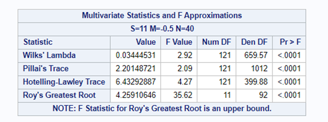
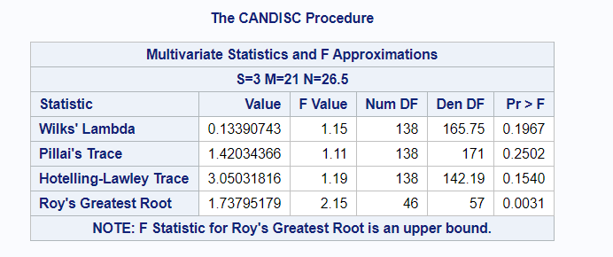
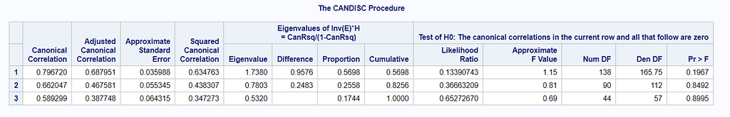
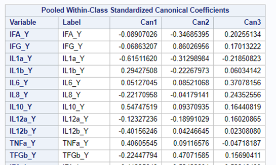
The CCA created 11 canonical dimensions because 11 variables are included. This is because canonical variates are similar to latent variables that are found in factor analysis, except that the canonical variates also maximize the correlation between the two sets of variables. They are linear functions of the variables included. And thus, automatically, an equal amount of canonicals are made as there are variables included
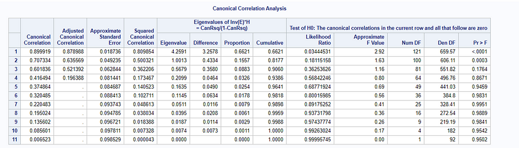
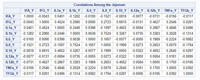
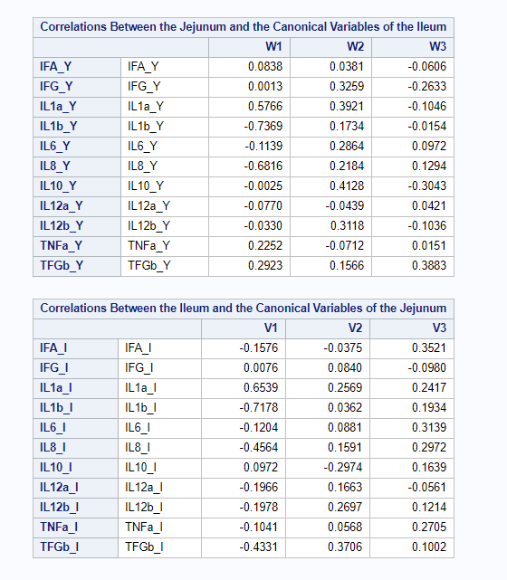
However, a more useful way to interpret the canonical correlation in terms of the input variables is to look at simple correlation statistics. For each pair of variates, look at the canonical structure tables.
Below, is the correlation between each variable and its canonical variate.
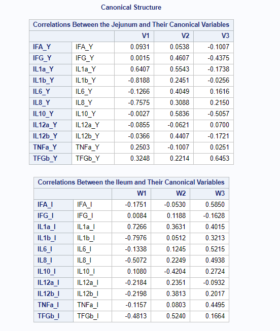
Below, is the correlation between each variable and the canonical variate for the other set of variables.
We can even go further and apply the canonical redundancy statistics which indicate the amount of shared variance explained by each canonical variate. It provides you with:
- the proportion of variance in each variable is explained by the variable’s own variates.
- the proportion of variance in each variable explained by the other variables’ variates.
- R² for predicting each variable from the first M variates in the other set.
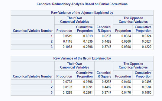
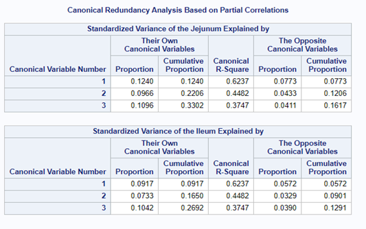
The output for redundancy analysis enables you to investigate the variance in each variable explained by the canonical variates. In this way, you can determine not only whether highly correlated linear combinations of the variables exist, but whether those linear combinations are actually explaining a sizable portion of the variance in the original variables. This is not the case here!
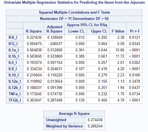
You can also perform Canonical Regression Analysis by which one set regresses on a second set. Together with the Redundancy Statistics, Regression Analysis will provide you with more insight into the predictive ability of the sets specified.

In summary, Canonical Correlation Analysis is a descriptive method trying to relate one set of variables to another set of variables by using:
- correlation
- regression
- redundancy Analysis
As a first method, it gives you a good idea about the level of multicollinearity involved and how much the two specified sets relate to themselves and each other. Do not forget — CCA is mainly used for prediction, not interpretation.
And the last of the trio is the Discriminant Function Analysis (DFA) which is used to answer the question: Can a combination of variables be used to predict group membership? Because, if a set of variables predicts group membership, it is also connected to that group.
DFA is a dimension-reduction technique related to Principal Component Analysis (PCA) and Canonical Correlation Analysis (CCA).
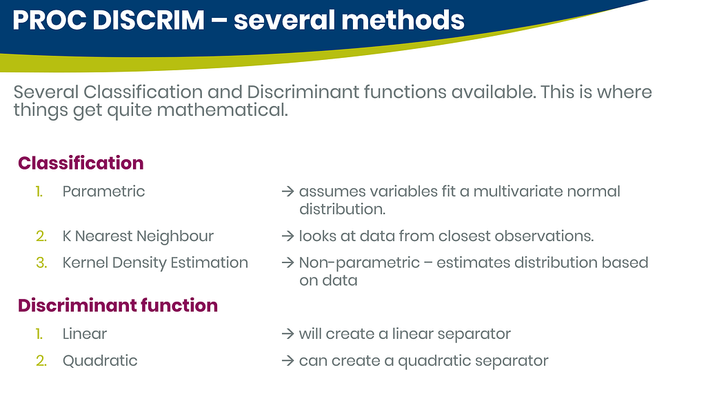
In SAS, there are three procedures for conducting Discriminant Function Analysis:
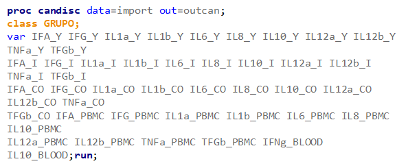
- PROC CANDISC — canonical discriminant analysis.
- PROC DISCRIM — develops a discriminant criterion to classify each observation into one of the groups.
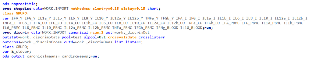
- PROC STEPDISC — performs a stepwise discriminant analysis to select a subset of the quantitative variables for use in discriminating among the classes.
PROC STEPDISC and PROC DISCRIM can be used together to enable selection methods on top of Discriminant Analysis.

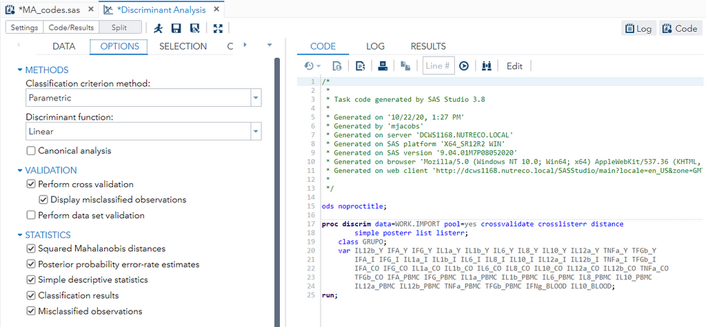

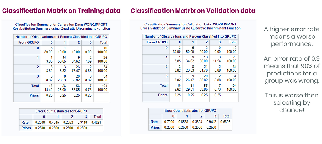
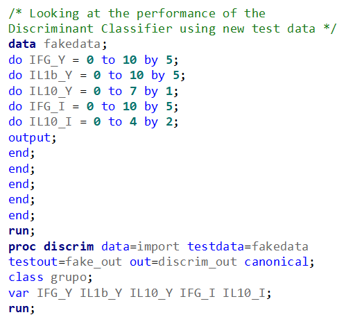
The option ‘Validation’ seems to be a small request, but it is not. It is actually an introduction to the topic of overfitting. Overfitting occurs when the model is ‘overfitted’ on the data that it’s using to come to a solution. It mistakes noise for signal. An over-fitted model will predict nicely on the trained dataset but horribly on new test data. Hence, as a prediction model, it is limited. REMEMBER: DFA is a prediction method. Hence, safeguarding from overfitting makes a lot of sense!
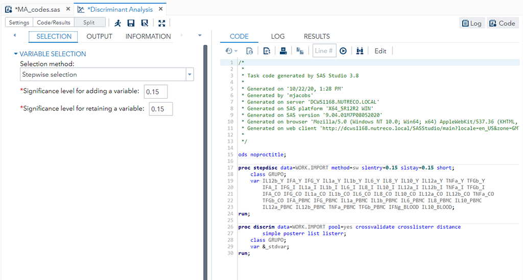
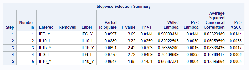
You can augment PROC DISCRIM by first using PROC STEPDISC which includes algorithms for variable selection. These are mostly traditional methods:
- Backward Elimination: Begins with the full model and at each step deletes the effect that shows the smallest contribution to the model.
- Forward Selection: Begins with just the intercept and at each step adds the effect that shows the largest contribution to the model.
- Stepwise Selection: Modification of the forward selection technique that differs in that effects already in the model do not necessarily stay there.
I am asking SAS to include variables that meet a certain threshold for adding or retaining a variable.
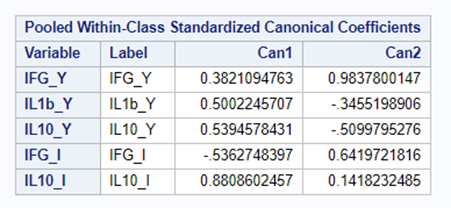
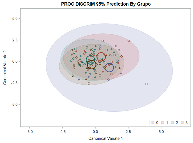
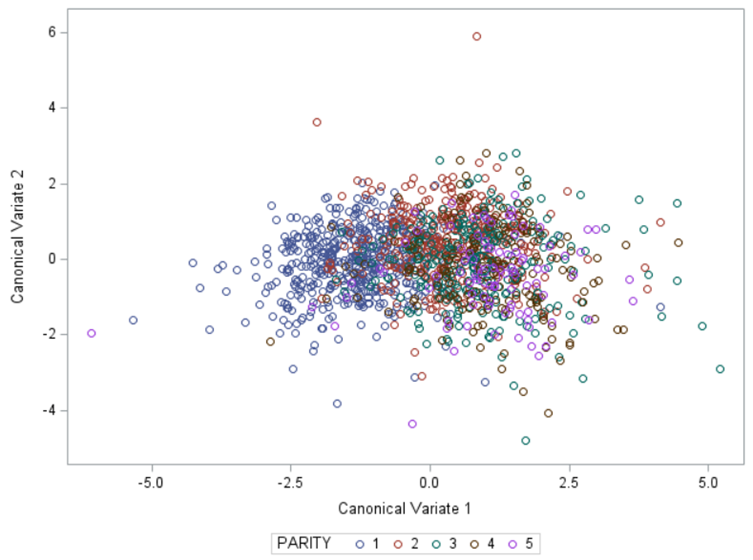
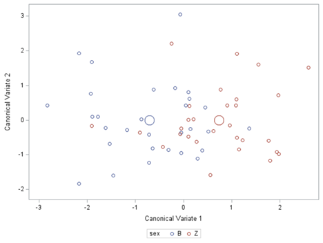
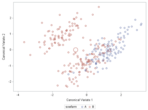
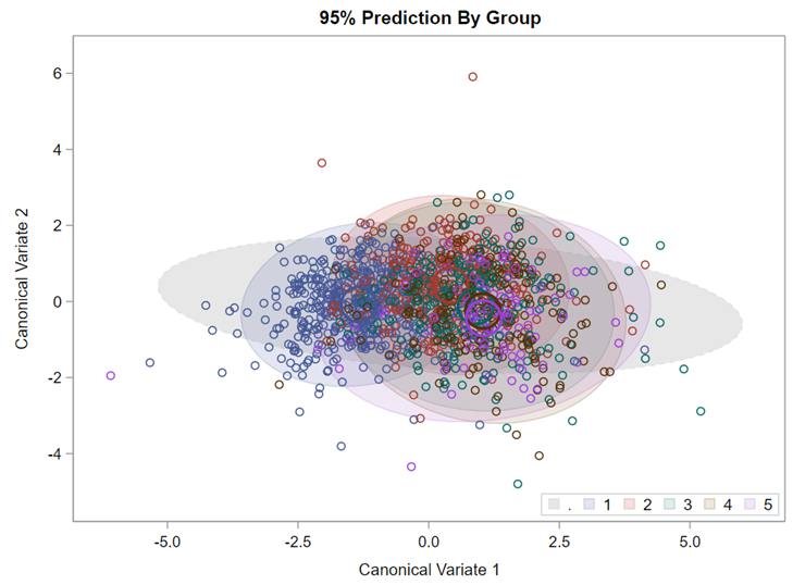
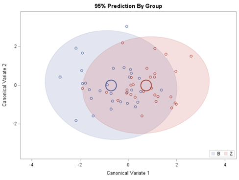
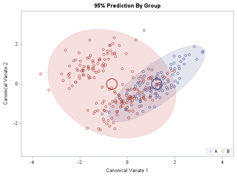
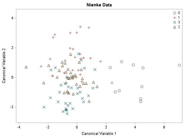
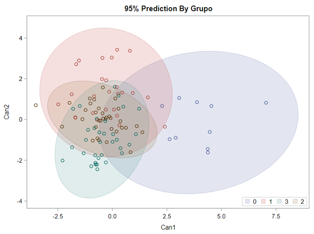
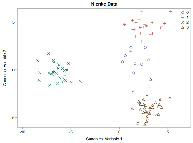
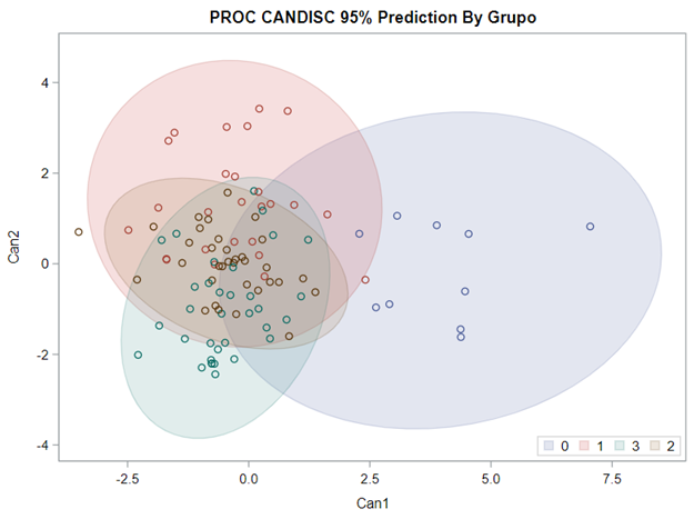
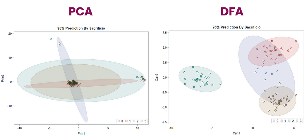
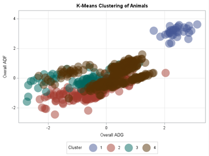
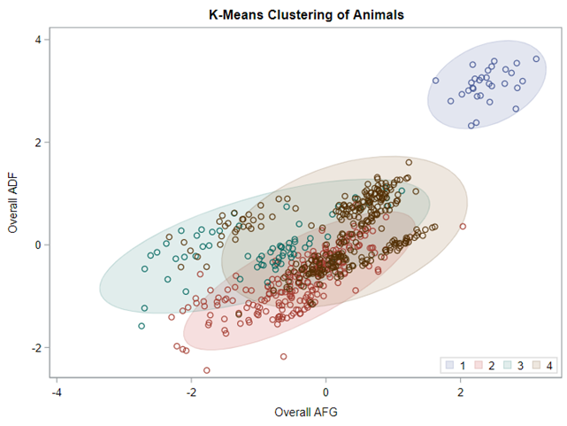
Hence, what this graph shows is how much these canonical variables are able to predict group assignment based on the models included. Good predictive power would show that animals in a certain group would cluster at the group mean canonical loading. This is not the case.
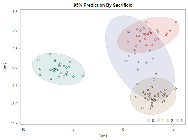
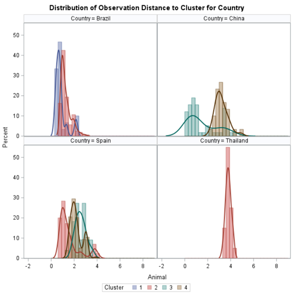
A better way to show the discriminant power of the model is to create a new dataset containing all the variables included and add ranges to them so you can do a grid search. You can then ask each DFA model, using different algorithms, to show you how they perform.
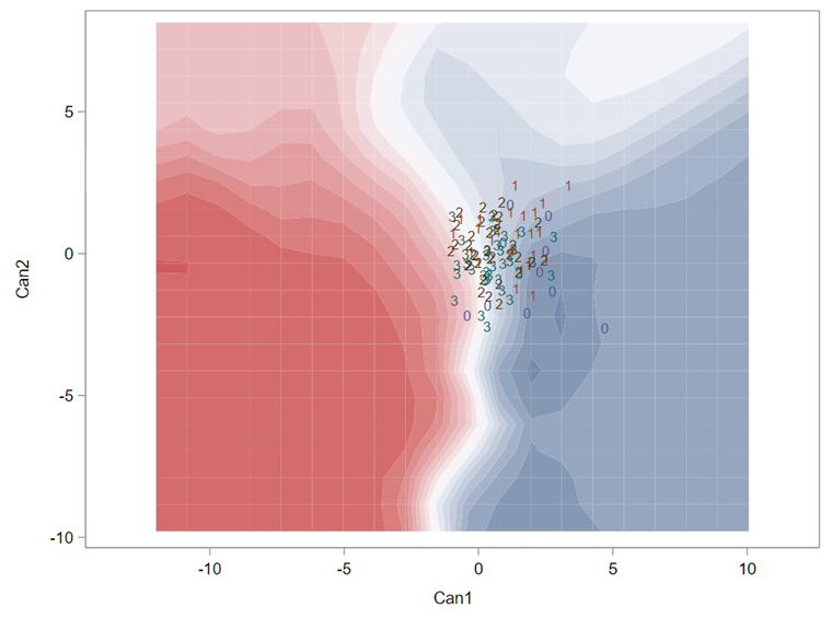
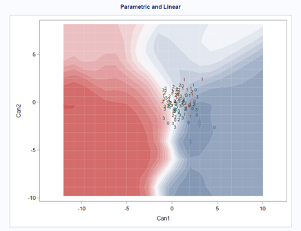
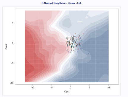
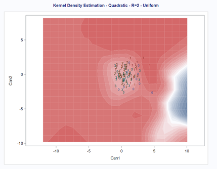
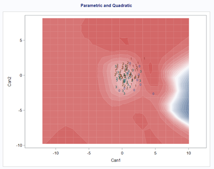
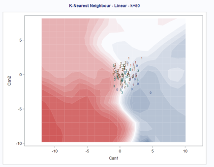
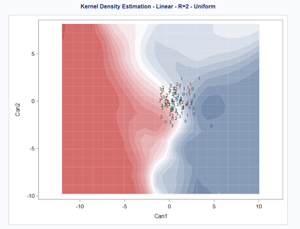
As you can see above, there is no universal best method. It all depends on the data since the non-parametric methods estimate normality and the parametric methods assume it. The most important distinction is the use of a linear or quadratic discriminant function. This clearly changes the prediction model and thus the classification matrices. As in many things in life, try different flavors, but never forget to check your assumptions, the model, and its performance.
In summary, Discriminant function analysis is usually used to predict membership in naturally occurring groups. It answers the question: “Can a combination of variables be used to predict group membership?” In SAS, there are two procedures for conducting Discriminant Function Analysis:
- PROC STEPDISC — select a subset of variables for discriminating among the classes.
- PROC CANDISC — perform canonical discriminant analysis.
- PROC DISCRIM — develop a discriminant criterion to classify each observation into one of the groups.
Lets venture further into the world of dimension reduction and ask ourselves the following questions:
- Can I reduce what I have seen to variables that are invisible?
- Can I establish an underlying taxonomy?

There are carious PROCS available in SAS to conduct dimension reduction. Of course, the examples shown before in this post are also examples of dimension reduction.
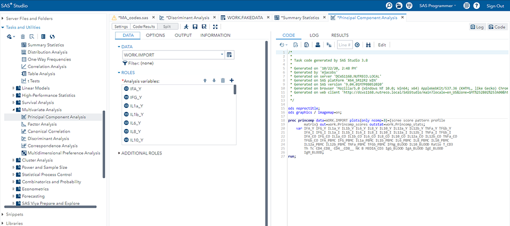
- PROC PRINCOMP performs principal component analysis on continuous data and outputs standardized or unstandardized principal component scores.
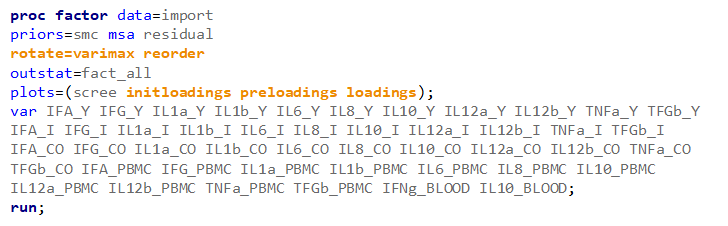
- PROC FACTOR performs principal component analysis and various forms of exploratory factor analyses with rotation and outputs estimates of common factor scores (or principal component scores).
- PROC PRINQUAL performs principal component analysis of qualitative data and multidimensional preference analysis. This procedure performs one of three transformation methods for a nominal, ordinal, interval, or ratio scale data. It can also be used for missing data estimation with and without constraints.
- PROC CORRESP performs simple and multiple correspondence analyses, using a contingency table, Burt table, binary table, or raw categorical data as input. Correspondence analysis is a weighted form of principal component analysis that is appropriate for frequency data.
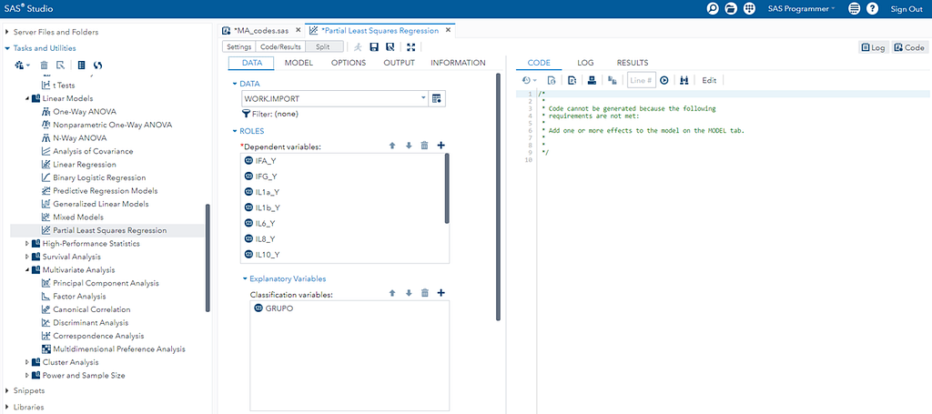
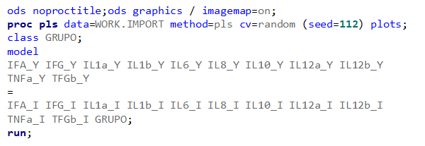
- PROC PLS fits models using any one of a number of linear predictive methods, including partial least squares(PLS). Although it is used for a much broader variety of analyses, PLS can perform principal components regression analysis, although the regression output is intended for prediction and does not include inferential hypothesis testing information.
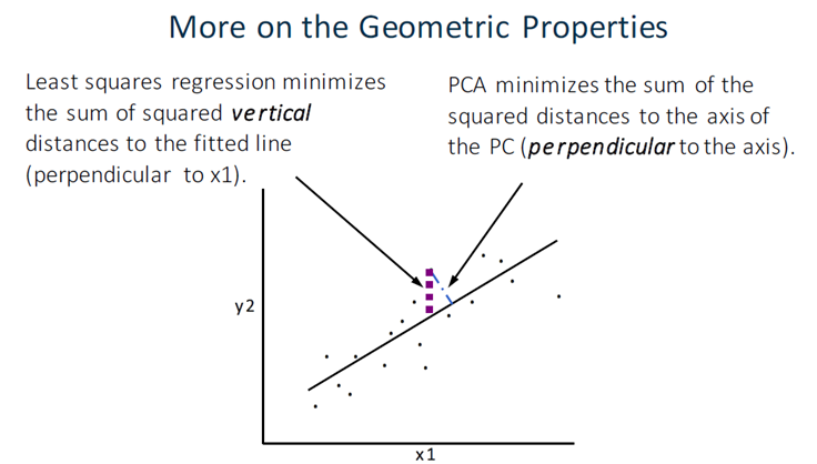
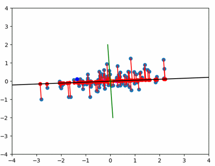
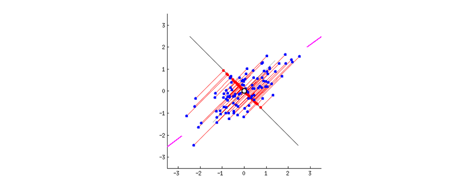
Probably the most widely known clustering technique is Principal Components Analysis (PCA) and as you saw before, there is a heavy relationship with Canonical Correlation Analysis. A PCA tries to answer a practical question: “How can I reduce a set of many correlated variables to a more manageable number of uncorrelated variables?”
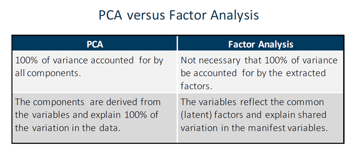
PCA is a dimension reduction technique that creates new variables that are weighted linear combinations of a set of correlated variables → principal components. It does not assume an underlying latent factor structure.
PCA’s work with components which are orthogonal regression lines, created to minimize the errors.

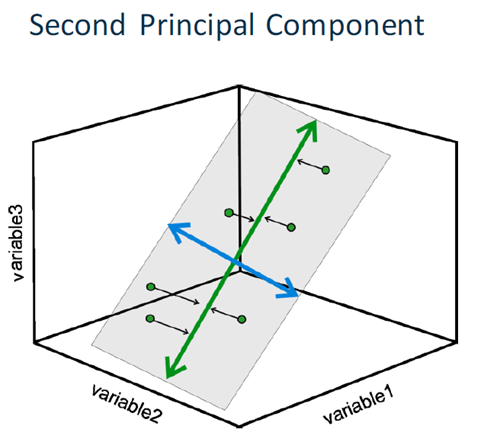
PCA creates as many components as there are input variables by performing an eigenvalue decomposition of a correlation or covariance matrix. It creates components that consolidate more of the explained variance into the first few PCs than in any variable in the original data. They are mutually orthogonal and therefore mutually independent. They are generated so that the first component accounts for the most variation in the variables, followed by the second component, and so on.
As with many multivariate techniques, PCA is typically a preliminary step in a larger data analytics plan. For example, PCA could be used to:
- explore data and detect patterns among observations.
- find multivariate outliers.
- determine the overall extent of collinearity in a data set.
Partial Least Squares also uses PCA as an underlying engine.
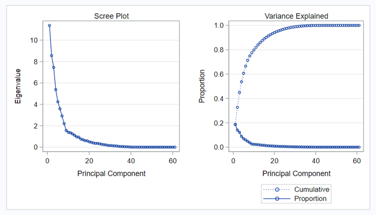
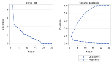
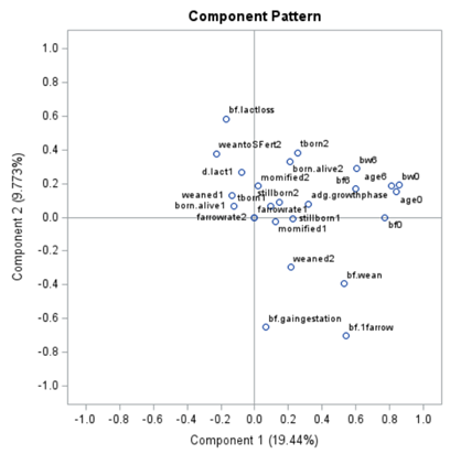
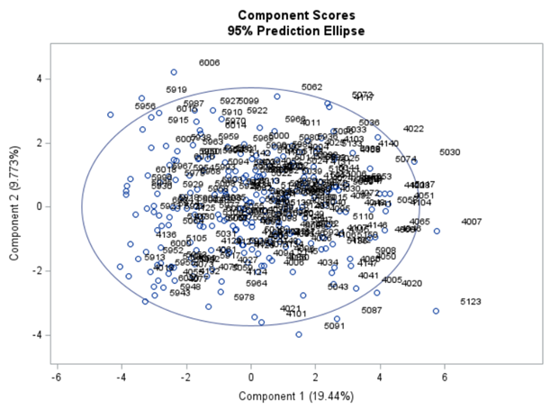
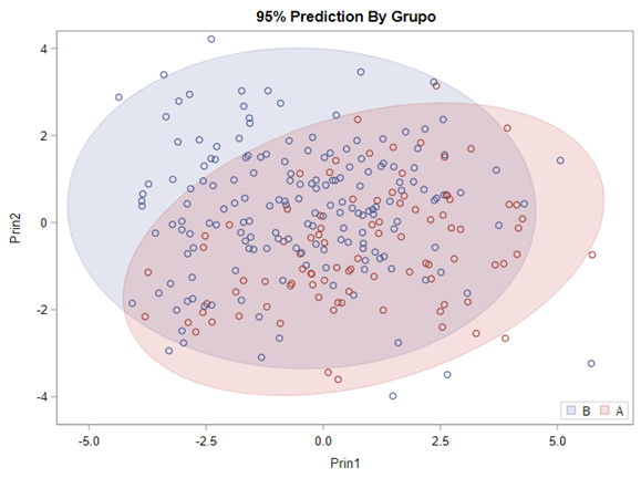
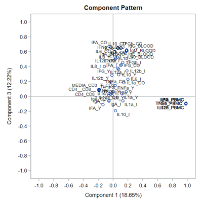
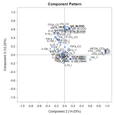
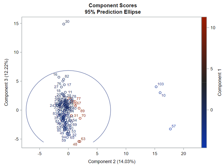
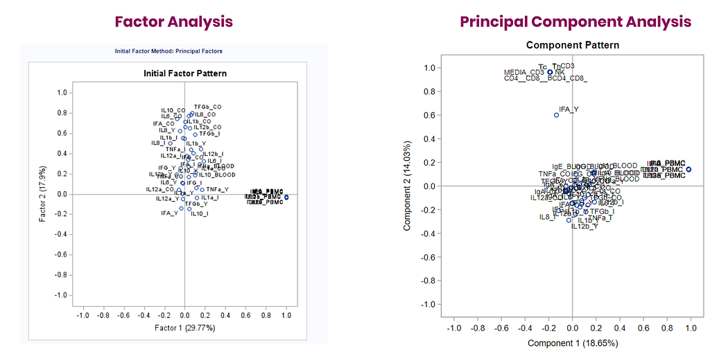
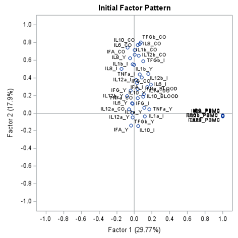
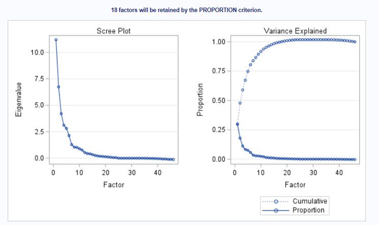
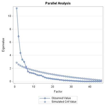
The Scree plot shows how many principal components you need to reach a decent level of the variance explained. The trick is to look at the Scree plot and see when the drop levels off. Here, this is after eight components. Let's plot those eight components.
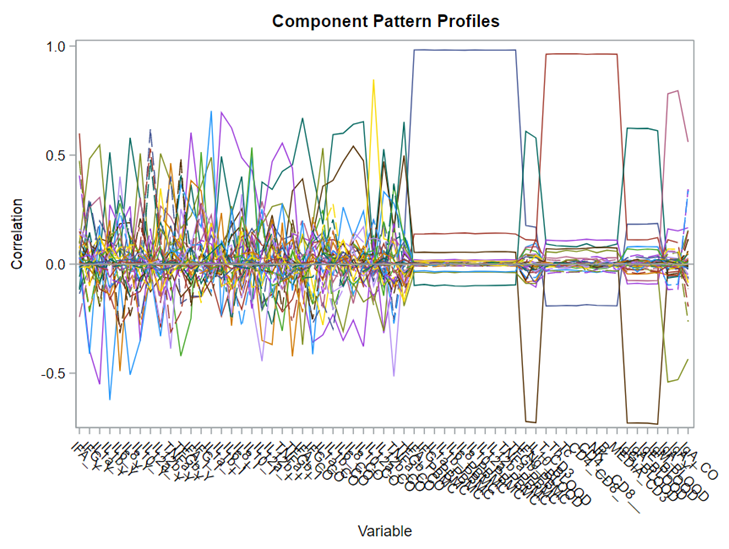
This Component Pattern Profiles plot shows how each component is loading on the variables included. Hence, it shows what each component represents. What you can immediately see is that it is quite a mess. Many variables load on many components to some degree. So you must, for interpretation’s sake, limit the number of components to use.
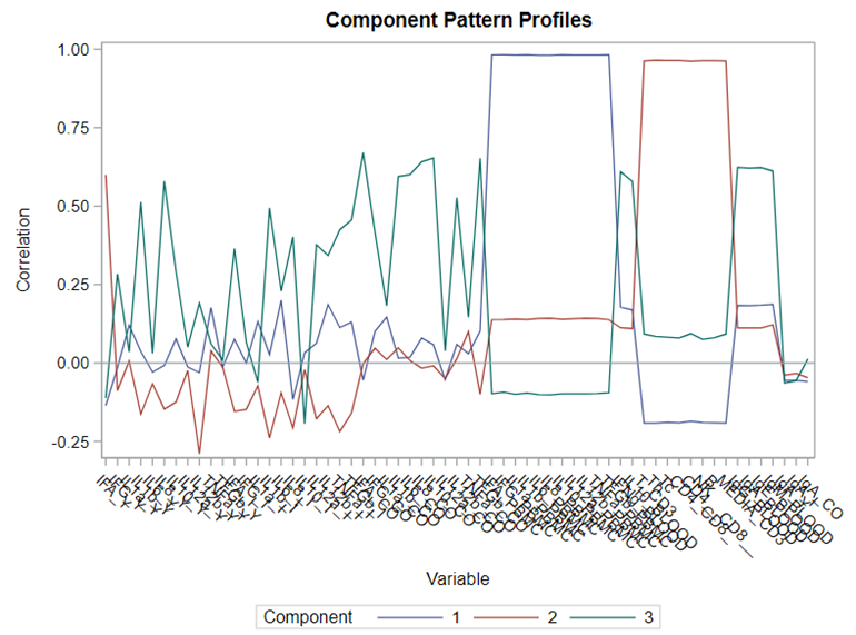
Hence, observations that load highly on those components are probably also distinctly different on those variables. Component 3 looks like a bit of a garbage component.

In summary, PCA is a dimension reduction technique that creates new variables that are weighted linear combinations of a set of correlated variables à principal components. PCA tries to answer a practical question: “How can I reduce a set of many correlated variables to a more manageable number of uncorrelated variables?” PCA is typically a preliminary step in a larger data analytics plan, and a part of many regression techniques to ease analysis.
From PCA, it is quite straightforward to move further towards Principal Factor Analysis (PFA). The difference is that, in PCA, the unique factors are uncorrelated with each other. They are linear combinations of the data. In PFA, the unique factors are uncorrelated with the common (latent — Yx) factors. They are estimates of latent variables that are partially measured by the data.
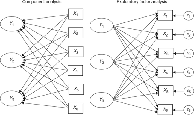
Factor Analysis is used when you suspect that the variables that you observe (manifest variables) are functions of variables that you cannot observe directly (latent variables). Hence, factor analysis is used to:
- Identify the latent variables to learn something interesting about the behavior of your population.
- Identify relationships between different latent variables.
- Show that a small number of latent variables underlies the process or behavior that you have measured to simplify your theory.
- Explain inter-correlations among observed variables.
The initial factor loadings are just the first step, and rotation methods need to be used to interpret the results ad they will help you a lot in understanding the results coming from factor analysis.
There are two general classifications of rotation methods
- Assume orthogonal factors.
- Relax orthogonality assumption.

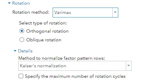
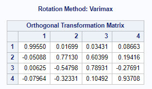
Orthogonal rotation maintains mutually uncorrelated factors that fall on perpendicular axes. For this, the Varimax-Orthogonal method is often used which maximizes the variance of columns of the factor pattern matrix. The axes are rotated, but the distance between the axes remains orthogonal.
Then we also have Oblique rotation which allows factors to be correlated with each other. Because factors might be theoretically correlated, using an oblique rotation method can make it much easier to interpret the factors. For this, the Promax-Oblique is often used, which performs:
- varimax rotation
- relaxes orthogonality constraints and rotates further
- rotate axes that can converge/diverge
But as you can see below, there are a lot of combinations possible. The major part is in relaxing or not relaxing the orthogonal assumption, meaning factors can have a covariance matrix or not.
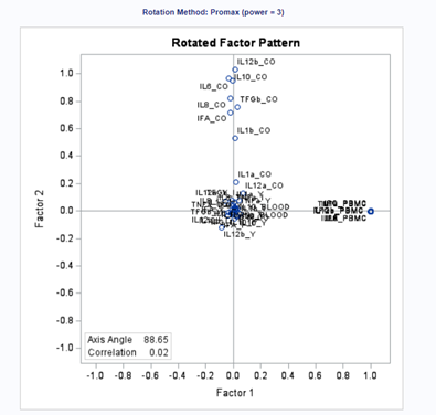

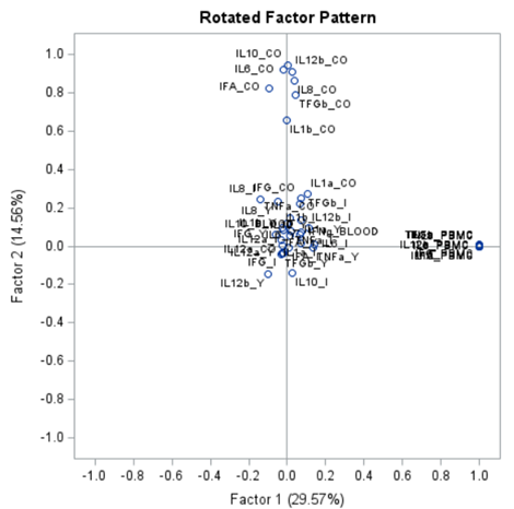
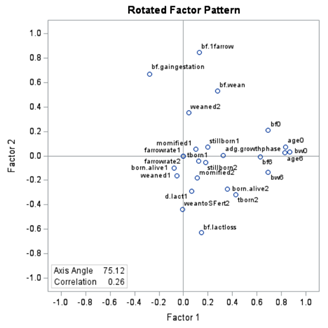
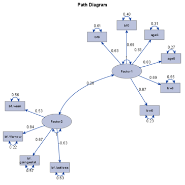
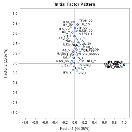
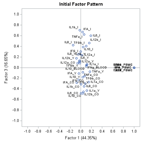
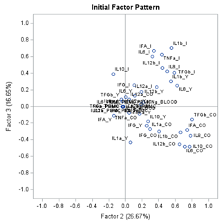
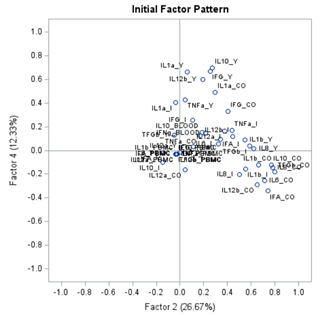
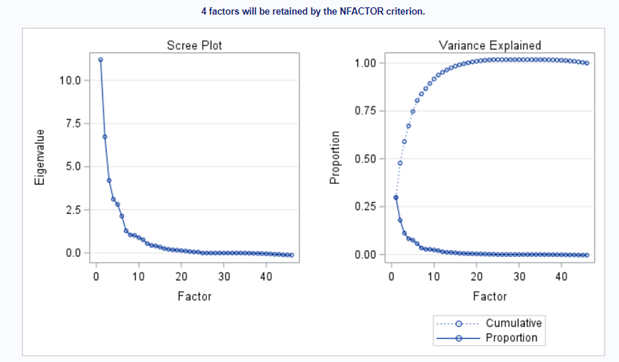
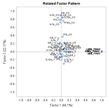
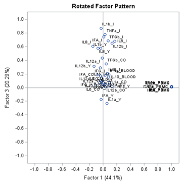
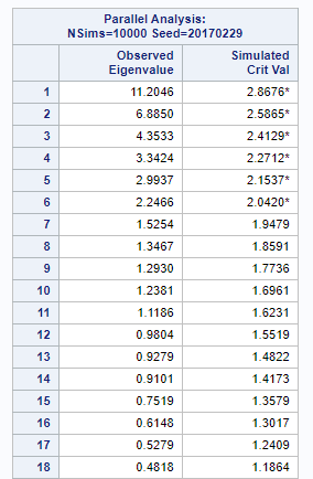
Having 18 factors will make this PFA quite the challenge. It also tells you that these variables will not be so easy to load on an underlying latent variable. To counteract this a bit, we could also limit the number of factors.
The results will be the same, I just cut it off at 4.

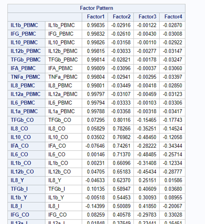
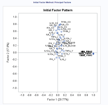
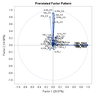
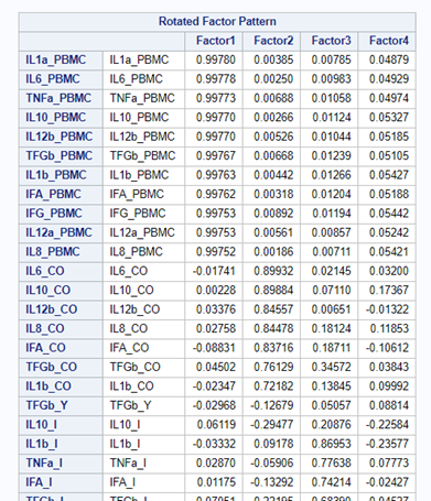
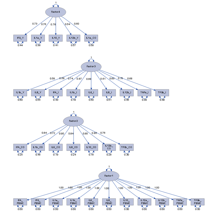
To check for Orthogonality, the factors should not correlate highly with the others. The loading table to the right clearly shows what the factors stand for, eat least factor 1 (PBMC) and factor 2 (CO). Then, it becomes blurry.
In the previous example, I just decided out of the blue to downsize the number of factors from 18 to 4. Selecting the numbers of factors can be done more elegantly using parallel analysis which is a form of simulation.

In summary, exploratory factor analysis (EFA) is a variable identification technique. Factor analytic methods are used when an underlying factor structure is presumed to exist but cannot be represented easily with a single (observed) variable. In EFA, the unique factors are uncorrelated with the latent — factors. They are estimates of latent variables that are partially measured by the data. Hence, not 100% of the variance is explained in EFA.
EFA is an exploratory step towards full-fledged causal modeling.
Clustering is all about measuring the distance between variables and observations, between themselves, and the clusters that are made. A lot of methods for clustering data are available in SAS. The various clustering methods differ in how the distance between two clusters is computed.
In general, clustering works like this:
- Each observation begins in a cluster by itself.
- The two closest clusters are merged to form a new cluster that replaces the two old clusters.
- The merging of the two closest clusters is repeated until only one cluster is left.

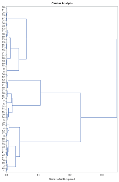
SAS offers a variety of procedures to help you cluster data:
- PROC CLUSTER performs hierarchical clustering of observations.
- PROC VARCLUS performs clustering of variables and divides a set of variables by hierarchical clustering.
- PROC TREE draws tree diagrams using output from the CLUSTER or VARCLUS procedures.
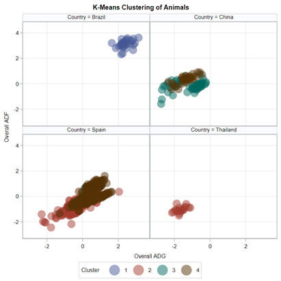
- PROC FASTCLUS performs k-means clustering on the basis of distances computed from one or more variables.
- PROC DISTANCE computes various measures of distance, dissimilarity, or similarity between the rows (observations).
- PROC ACECLUS is useful for processing data prior to the actual cluster analysis by estimating the pooled within-cluster covariance matrix.
- PROC MODECLUS performs clustering by implementing several clustering methods instead of one.
Although I have labeled a lot of possibilities for clustering methods, the most powerful procedure is by far the Partial Least Squares (PLS) method — a multivariate multivariable algorithm. The PLS balances between principal components regression (explain total variance) and canonical correlation analysis (explain shared variance). It extracts components from both the dependent and independent variables, and searches for explained variance within sets, and shared variance between sets.

PLS is a great regression technique when N < P as it extracts factors / components / latent vectors to:
- explain response variation.
- explain predictor variation.
Hence, partial least squares balance two objectives:
- seeking factors that explain response variation.
- seeking factors that explain predictor variation.
The PLS procedure is used to fit models and to account for any variation in the dependent variables. The techniques used by the Partial Least Squares Procedure are:
- Principal component regression (PCR) technique, in which factors are extracted to explain the variation of predictor sample.
- Reduced rank regression (RRR) technique, in which factors are extracted to explain response variation.
- Partial least squares (PLS) regression technique, where both response variation and predictor variation are accounted for.
PCR, RRR, and PLS regression are all examples of biased regression techniques. This means using information from k variables but reducing them to <k dimensions in the regression model, making the error DF larger than would be the case if Ordinary least Squares (OLS) regression were used on all the variables. PLS is commonly confused with PCR and RRR, although there are the following key differences:
- PCR and RRR only consider the proportion of variance within a set explained by PCs. The linear combinations are formed without regard to association among the predictors and responses.
- PLS seeks to maximize association between the sets while considering the explained variance in each set of variables.
The PLS procedure is used to fit models and to account for any variation in the dependent variables.
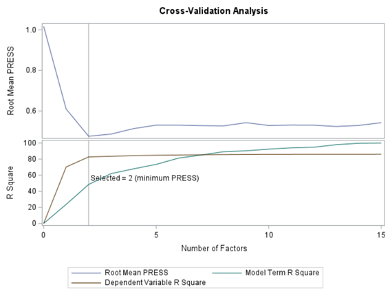
However, PLS does not fit the sample data better than OLS— it can only fit worse or as well. As the number of extracted factors increases, PLS approaches OLS. However, OLS over fits sample data, where PLS with fewer factors often performs better than OLS in predicting future data. PLS uses cross-validation as a technique for determining how many factors should be retained to prevent overfitting.
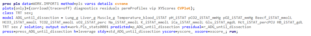
So let's start a bit simpler:
- One dependent variable
- More independent variables
- No cross-validation to ensure I have all the data to train a model.
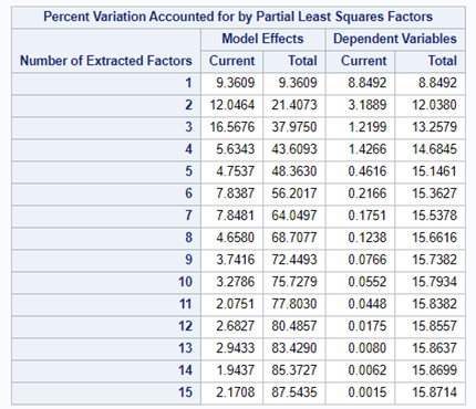
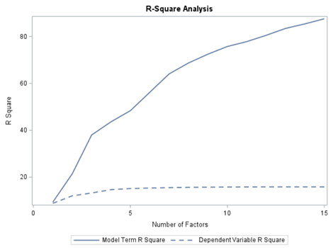
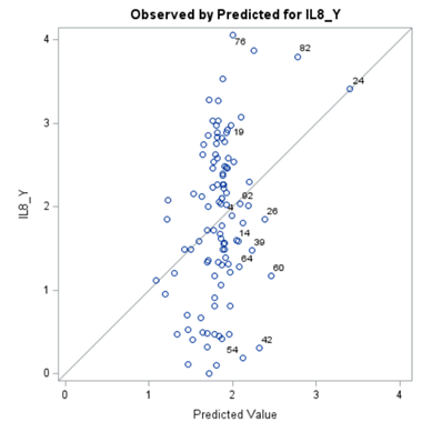
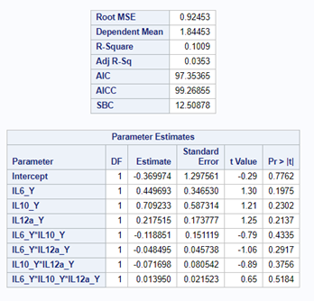
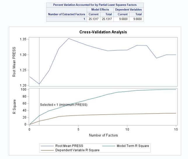
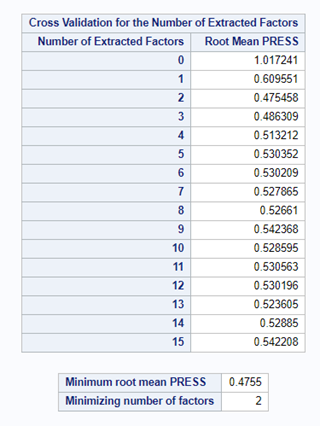
At least we have a result. However, it is not a result you would like to have — 15 factors explain 87% of the variance of the independent variables and 16% of the dependent variables. Preferably, you would like a small number of extracted factors to be able to predict at a solid level. R² is not the best method for assessing this though.
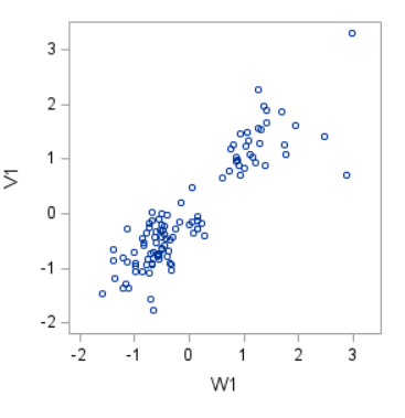
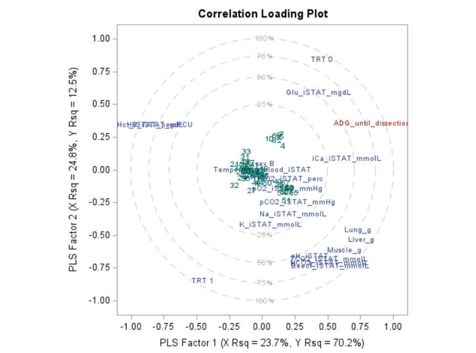
Below are some slides on how to interpret the most interesting plot ever provided — the correlation loading plot. It is quite a handful to look at but wonderfully simple once you get it.
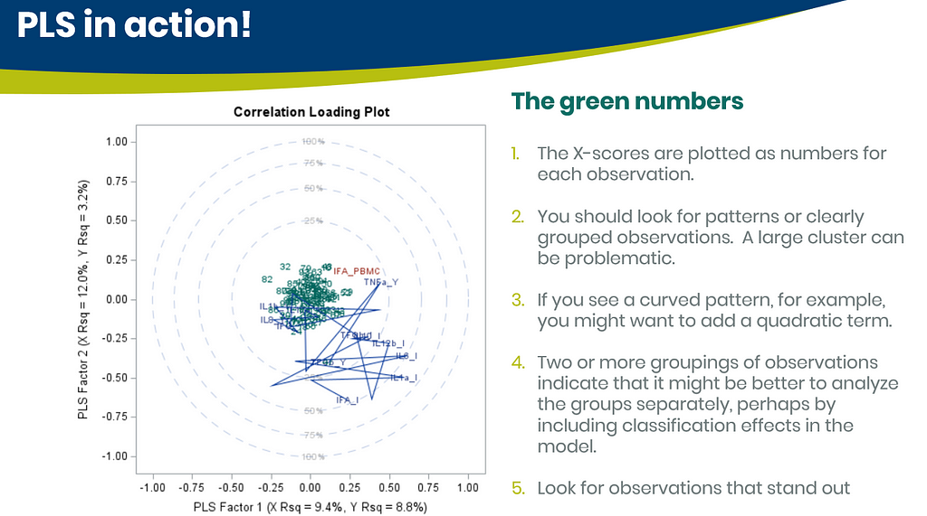
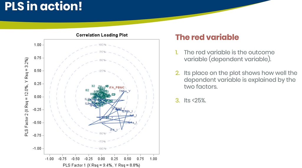
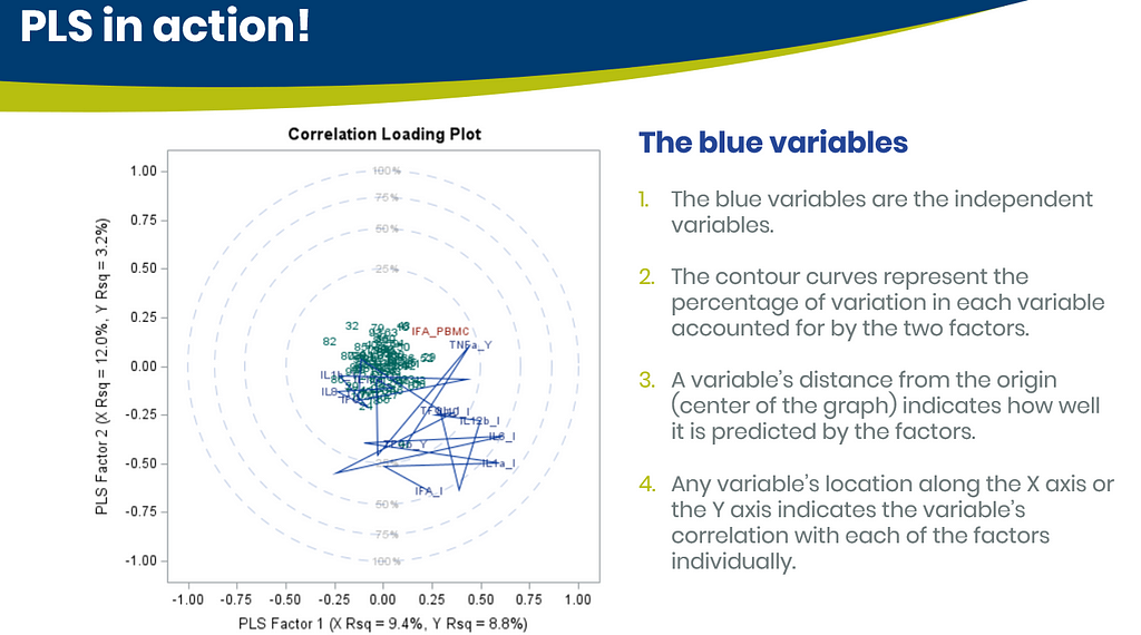
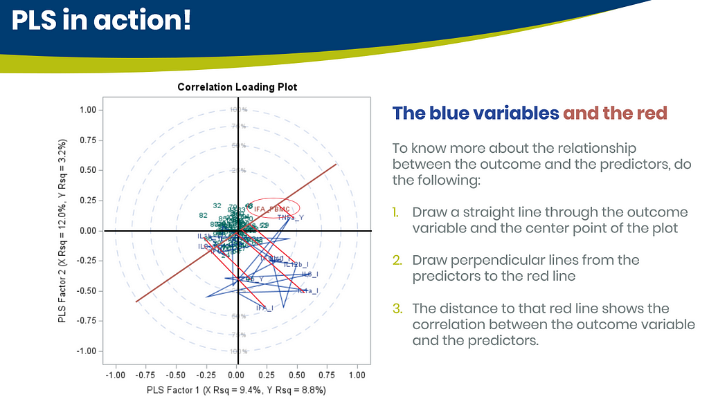
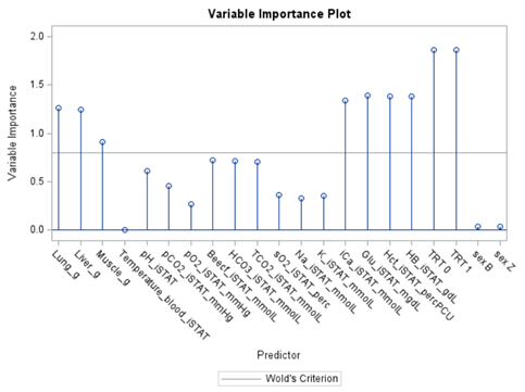
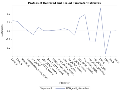
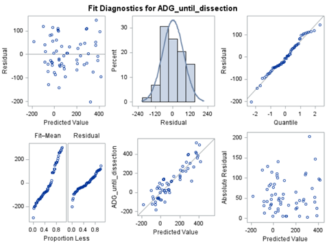
PLS provides you with a long list of results and plots if you want them. Some of the most important ones you will find here. First and foremost, look at the fit diagnostics of the model. Then look at the Variable importance plots. Do they make biological sense? Additionally, you can use the results to create diagnostic plots of your own.
Here, we have another correlation loading plot. They are quite heavy to digest First, look at the factors and the percentage variance explained in the model (X R²) and the prediction (Y R²). The outcome variable variance is 75% explained by the two factors. As you can see, many variables load very highly (range of 75% — 100%). All in all, the observations show 3 clusters which indicate that a classification variable might help explain even more variance.
In summary, the PLS procedure is a statistically advanced, output-heavy procedure. Know what you are doing before you start! PLS strikes a balance between principal components regression and canonical correlation analysis. It extracts components from the predictors/responses that account for explained variance within the sets and shared variation between sets. PLS is a great regression technique when N < P, unlike multivariate multiple regression or predictive regression methods.
I hope you enjoyed this post. Let me know if something is amiss!
Multivariate Analysis using SAS was originally published in Towards AI on Medium, where people are continuing the conversation by highlighting and responding to this story.
Join thousands of data leaders on the AI newsletter. It’s free, we don’t spam, and we never share your email address. Keep up to date with the latest work in AI. From research to projects and ideas. If you are building an AI startup, an AI-related product, or a service, we invite you to consider becoming a sponsor.
Published via Towards AI
Towards AI Academy
We Build Enterprise-Grade AI. We'll Teach You to Master It Too.
15 engineers. 100,000+ students. Towards AI Academy teaches what actually survives production.
Start free — no commitment:
→ 6-Day Agentic AI Engineering Email Guide — one practical lesson per day
→ Agents Architecture Cheatsheet — 3 years of architecture decisions in 6 pages
Our courses:
→ AI Engineering Certification — 90+ lessons from project selection to deployed product. The most comprehensive practical LLM course out there.
→ Agent Engineering Course — Hands on with production agent architectures, memory, routing, and eval frameworks — built from real enterprise engagements.
→ AI for Work — Understand, evaluate, and apply AI for complex work tasks.
Note: Article content contains the views of the contributing authors and not Towards AI.
Related posts
Recent Posts
")


