


Animating Covid-19 progress and variants over time
Last Updated on February 23, 2022 by Editorial Team
Author(s): Dr. Marc Jacobs
Originally published on Towards AI the World’s Leading AI and Technology News and Media Company. If you are building an AI-related product or service, we invite you to consider becoming an AI sponsor. At Towards AI, we help scale AI and technology startups. Let us help you unleash your technology to the masses.
Data Visualization
Using R and GGanimate
I love the GGanimate function of GGPlot which allows you to add a fourth dimension to whatever plot you are making. Hence, this is not the first post I am attributing to building GIFs using R. But, when something is fun, you tend to repeat it. So let's make this short and sweet.
rm(list = ls())
library(tidyverse)
library(readr)
library(ggthemes)
library(lubridate)
library(zoo)
library(gganimate)
library(cowplot)
I downloaded the Covid data from OWID and some data from the Dutch National Institute for Public Health and the Environment. I have posted on this particular technical piece before on LinkedIN.
getwd()
data_folder <- file.path("C:/Covid/")
url <- "https://covid.ourworldindata.org/data/owid-covid-data.csv"
name <- "owid-covid-data.csv"
download.file(url = url, destfile = paste0(data_folder,name))
setwd(data_folder)
Covidowid_covid_data <- read_csv(paste0(data_folder,name))
data_folder <- file.path("C:/Covid/")
url <- "https://data.rivm.nl/covid-19/COVID-19_varianten.csv"
name <- "COVID-19_varianten.csv"
download.file(url = url, destfile = paste0(data_folder,name))
setwd(data_folder)
variants  <- read_delim(paste0(data_folder,name),
                        delim = ";", escape_double = FALSE, trim_ws = TRUE)
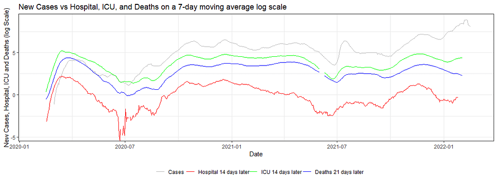
Then, I transformed the data to mimic the article from the New York Times stating that Omikron may have some underlying threats. So what I did was connect infections, admissions, and deaths by using moving averages, log values, and lags.
df<-Covidowid_covid_data
countries <- c(unique(df_owid$iso_code))
dfNLD <- df%>%
  dplyr::filter(iso_code == "NLD")%>%
  dplyr::select(date,iso_code,date,new_cases_per_million, new_deaths_per_million)%>%
  dplyr::mutate(cases_07da       = zoo::rollmean(new_cases_per_million, k = 7, fill = NA),
                deaths_07da      = zoo::rollmean(new_deaths_per_million, k = 7, fill = NA),
                deathdate_21plus = date - 21)
head(dfNLD)
ggplot(dfNLD)+
  geom_line(aes(x=date, y=log(cases_07da), colour="New Cases"))+
  geom_line(aes(x=deathdate_21plus, y=log(deaths_07da), colour="New Deaths"))+
  scale_colour_manual(name="",
                      values=c('red', 'grey'),
                      labels = c("Cases", "Deaths 21 days later"))+
  theme_bw()+
  theme(legend.position="bottom")+
  labs(x="Date",
        y="New Cases and New Deaths (log Scale)",
        title="New Cases vs New Deaths on a 7-day moving average log scale")
dfNLD <- df%>%
dplyr::filter(iso_code == "NLD")%>%
dplyr::select(date,iso_code,date,new_cases_per_million, icu_patients_per_million)%>%
dplyr::mutate(cases_07da = zoo::rollmean(new_cases_per_million, k = 7, fill = NA),
ICU_07da = zoo::rollmean(icu_patients_per_million, k = 7, fill = NA),
ICUdate_14plus = date - 14)
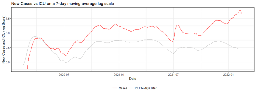
ggplot(dfNLD)+
geom_line(aes(x=date, y=log(cases_07da), colour="New Cases"))+
geom_line(aes(x=ICUdate_14plus , y=log(ICU_07da), colour="New ICU"))+
scale_colour_manual(name="",
values=c('red', 'grey'),
labels = c("Cases", "ICU 14 days later"))+
theme_bw()+
theme(legend.position="bottom")+
labs(x="Date",
y="New Cases and ICU (log Scale)",
title="New Cases vs ICU on a 7-day moving average log scale")
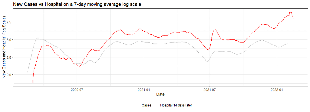
dfNLD <- df%>%
  dplyr::filter(iso_code == "NLD")%>%
  dplyr::select(date,iso_code,date,new_cases_per_million, hosp_patients_per_million)%>%
  dplyr::mutate(cases_07da       = zoo::rollmean(new_cases_per_million, k = 7, fill = NA),
                hosp_07da      = zoo::rollmean(hosp_patients_per_million, k = 7, fill = NA),
                HOSPdate_14plus = date - 14)
ggplot(dfNLD)+
  geom_line(aes(x=date, y=log(cases_07da), colour="New Cases"))+
  geom_line(aes(x=HOSPdate_14plus , y=log(hosp_07da), colour="New Hospital"))+
  scale_colour_manual(name="",
                      values=c('red', 'grey'),
                      labels = c("Cases", "Hospital 14 days later"))+
  theme_bw()+
  theme(legend.position="bottom")+
  labs(x="Date",
       y="New Cases and Hospital (log Scale)",
       title="New Cases vs Hospital on a 7-day moving average log scale")
dfNLD <- df%>%
  dplyr::filter(iso_code == "NLD")%>%
  dplyr::select(date,iso_code,date,new_cases_per_million, hosp_patients_per_million,icu_patients_per_million,new_deaths_per_million)%>%
  dplyr::mutate(cases_07da       = zoo::rollmean(new_cases_per_million, k = 7, fill = NA),
                hosp_07da        = zoo::rollmean(hosp_patients_per_million, k = 7, fill = NA),
                HOSPdate_14plus  = date - 14,
                deaths_07da      = zoo::rollmean(new_deaths_per_million, k = 7, fill = NA),
                deathdate_21plus = date - 21,
                ICU_07da         = zoo::rollmean(icu_patients_per_million, k = 7, fill = NA),
                ICUdate_14plus   = date - 14)
ggplot(dfNLD)+
  geom_line(aes(x=date, y=log(cases_07da), colour="New Cases"))+
  geom_line(aes(x=HOSPdate_14plus , y=log(hosp_07da), colour="New Hosp"))+
  geom_line(aes(x=ICUdate_14plus , y=log(ICU_07da), colour="New ICU"))+
  geom_line(aes(x=deathdate_21plus, y=log(deaths_07da), colour="New Deaths"))+
  scale_colour_manual(name="",
                      values=c('grey', 'red','green','blue'),
                      labels = c("Cases", "Hospital 14 days later", "ICU 14 days later","Deaths 21 days later"))+
  theme_bw()+
  theme(legend.position="bottom")+
  labs(x="Date",
       y="New Cases, Hospital, ICU and Deaths (log Scale)",
       title="New Cases vs Hospital, ICU, and Deaths on a 7-day moving average log scale")
knitr::opts_chunk$set(fig.width=unit(25,"cm"), fig.height=unit(11,"cm"))
dfNLD<-df%>%
  dplyr::filter(iso_code == "NLD")%>%
  dplyr::select(date,iso_code,date,new_cases_per_million, hosp_patients_per_million,icu_patients_per_million,new_deaths_per_million)%>%
  dplyr::mutate(cases_07da       = zoo::rollmean(new_cases_per_million, k = 7, fill = NA),
                hosp_07da        = zoo::rollmean(hosp_patients_per_million, k = 7, fill = NA),
                HOSPdate_14plus  = date - 14,
                deaths_07da      = zoo::rollmean(new_deaths_per_million, k = 7, fill = NA),
                deathdate_21plus = date - 21,
                ICU_07da         = zoo::rollmean(icu_patients_per_million, k = 7, fill = NA),
                ICUdate_14plus   = date - 14)
my.animation<-ggplot(dfNLD)+
  geom_line(aes(x=date, y=log(cases_07da), colour="New Cases"))+
  geom_line(aes(x=HOSPdate_14plus , y=log(hosp_07da), colour="New Hosp"))+
  geom_line(aes(x=ICUdate_14plus , y=log(ICU_07da), colour="New ICU"))+
  geom_line(aes(x=deathdate_21plus, y=log(deaths_07da), colour="New Deaths"))+
  scale_colour_manual(name="",
                      values=c('grey', 'red','green','blue'),
                      labels = c("Cases", "Hospital 14 days later", "ICU 14 days later","Deaths 21 days later"))+
  theme_bw()+
  theme(legend.position="bottom")+
  labs(x="Date",
       y="New Cases, Hospital, ICU and Deaths (log Scale)",
       title="New Cases vs Hospital, ICU, and Deaths on a 7-day moving average log scale")+
  transition_reveal(date)
animate(my.animation, width=2000, height=1000,
        res=150,
        end_pause = 60,
        nframes=300);anim_save("Covid.gif")
As you can see, it takes only a simple line on the GGplot code to animate the previous figure. But it gives it a completely different dimension.
Now, what I want to add to the figure is the evolution of the variants. Luckily, we do have that data as well, so let's load it, plot it, and connect it. I did not animate that data as well, although I could have. I will leave that exercise up to you.
variants_sum<-variants%>%
  group_by(Date_of_statistics_week_start,Variant_name)%>%
  summarize(ss=sum(Sample_size),
            vc=sum(Variant_cases),
            perc=(vc/ss)*100)
variants_sum$date<-variants_sum$Date_of_statistics_week_start
combined<-merge(dfNLD,variants_sum, by=c("date"))
g1<-ggplot(combined)+
  geom_line(aes(x=date, y=log(cases_07da), colour="New Cases"))+
  geom_line(aes(x=HOSPdate_14plus , y=log(hosp_07da), colour="New Hosp"))+
  geom_line(aes(x=ICUdate_14plus , y=log(ICU_07da), colour="New ICU"))+
  geom_line(aes(x=deathdate_21plus, y=log(deaths_07da), colour="New Deaths"))+
  scale_colour_manual(name="",
                      values=c('grey', 'red','green','blue'),
                      labels = c("Cases", "Hospital 14 days later", "ICU 14 days later","Deaths 21 days later"))+
  theme_bw()+
  theme(legend.position="bottom")+
  labs(x="Date",
       y="New Cases, Hospital, ICU and Deaths (log Scale)",
       title="New Cases vs Hospital, ICU, and Deaths on a 7-day moving average log scale")+
  scale_x_date(limits = as.Date(c("2021-01-03", "2022-02-18")))
g2<-ggplot(combined,
         aes(x=date,
                     fill=Variant_name))+
         geom_area(aes(y=perc), alpha=0.5)+
  theme_bw()+
  labs(x="Date",
       y="Number of Variants / Sample Size ",
       fill="Variant name",
       title="Variant Progression over Time in the NL ")+
  theme(legend.position = "bottom")+
  scale_x_date(limits = as.Date(c("2021-01-03", "2022-02-18")))
grid.arrange(g1,g2, ncol=1)
plot_grid(g1, g2,
          align = "v",
          nrow = 2,
          rel_heights = c(2/3, 1/3))
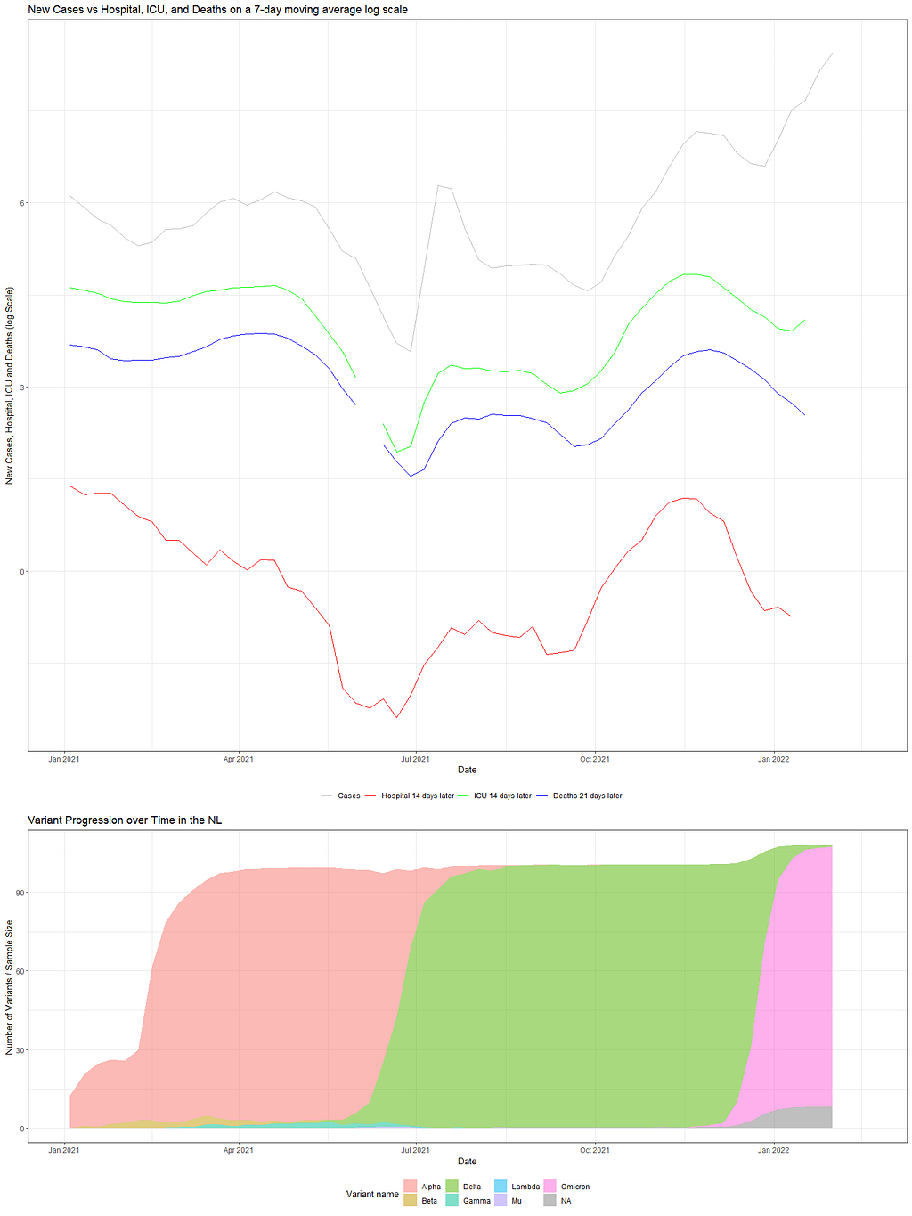
So, there we have it. Now, the spread of the column could have been better, perhaps, but I will also leave that up to you. Enjoy!
Animating Covid-19 progress and variants over time was originally published in Towards AI on Medium, where people are continuing the conversation by highlighting and responding to this story.
Join thousands of data leaders on the AI newsletter. It’s free, we don’t spam, and we never share your email address. Keep up to date with the latest work in AI. From research to projects and ideas. If you are building an AI startup, an AI-related product, or a service, we invite you to consider becoming a sponsor.
Published via Towards AI
Towards AI Academy
We Build Enterprise-Grade AI. We'll Teach You to Master It Too.
15 engineers. 100,000+ students. Towards AI Academy teaches what actually survives production.
Start free — no commitment:
→ 6-Day Agentic AI Engineering Email Guide — one practical lesson per day
→ Agents Architecture Cheatsheet — 3 years of architecture decisions in 6 pages
Our courses:
→ AI Engineering Certification — 90+ lessons from project selection to deployed product. The most comprehensive practical LLM course out there.
→ Agent Engineering Course — Hands on with production agent architectures, memory, routing, and eval frameworks — built from real enterprise engagements.
→ AI for Work — Understand, evaluate, and apply AI for complex work tasks.
Note: Article content contains the views of the contributing authors and not Towards AI.
Related posts
Recent Posts


")