


Exploratory Data Analysis of My Chess Dataset Using Python Plotly
Last Updated on January 30, 2023 by Editorial Team
Author(s): Muttineni Sai Rohith
Originally published on Towards AI.
Our Mind, In its place, is a Hell of Heaven Or Heaven of Hell
You might be wondering, why I started with the above line for an Article based on EDA. Here is Why — It is around 3 AM here in India, I am unable to sleep and I just finished a chess game. Irrespective of the result, My Brain now wants me to Analyse my chess statistics at this time and derive some kind of information using which I can improve my Game better. One question I had to my Brain is Why? Why you want to do it? And the answer— because you can do it using Python Plotly. And I am just a slave of My Brain and that brought today’s article.
Chess is one game That I have always admired, and in the last 3–4 months, I started playing it daily. Fortunately, I chose chess.com to play online chess, and today when I wished to do some analysis, I found my dataset archive on the website. Along with our own games Dataset, this beautiful site provides us with Archives of many famous chess players. But nothing comes without effort. I had to aggregate and convert my Data into raw files to prepare the final Dataset. Here is a sample snapshot of the raw Data

I am not going to dig deep into the Data preparation from the raw data but I have uploaded all the raw files and Notebook to convert these raw files into the Final Dataset in the GitHub link mentioned here. This site also contains the Final Dataset and Script used to do the Analysis.
Here are a few things that I wanted to do when I say Analyse my Chess Games —
- How Good am I as a White Player and a Black Player? Is Being a White player really an Advantage?
- Is my Game mainly depend on my Mood?
- How does the first Move affect the Game?
- How does rating affect the outcome?
- Does Time is taken and Move Count provide some Insights?
- Finally, here are Some Stats that I can derive from Data.
Loading Data
You can find the Dataset used in this article here. We will be using Pandas in this article to load the Data and Perform Operations.
import pandas as pd
data = pd.read_csv("/content/chess_stats.csv")
data.head(5)

Game Statistics
What’s the matter of doing an Analysis when we do not start with the Wins/Loss Count? Let’s see that First —
import plotly.graph_objects as go

GameResult = dict(data["GameResult"].value_counts().items())

fig = go.Figure(data=[go.Pie(labels=list(GameResult.keys()), values=list(GameResult.values()), pull=[0., 0., 0.4])])
fig.update_layout(
    autosize=False,
    width=400,
    height=400,
    paper_bgcolor="lightgrey",
)
fig.show()
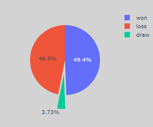
Ok, As you can see, my Win Percentage is slightly greater than my loss%.
fig = px.bar(x=list(GameResult.values()), y=list(GameResult.keys()), color = list(GameResult.keys()), text_auto=True)
fig.update_layout(
    autosize=False,
    width=400,
    height=400
)
fig.show()
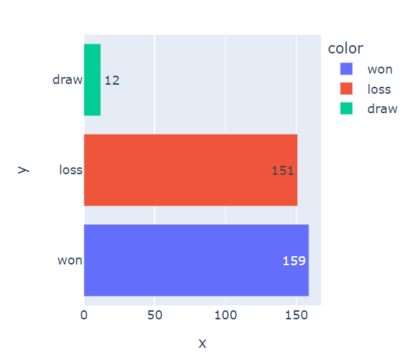
As you can see I have won 159 Games, lost 151 and 12 Games are drawn. Now let’s check the stats based on the Color —
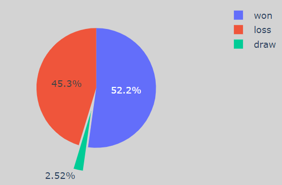
As White Player
data_white = data[data["White"] == "chandurohitheee"]
GameResult_white = dict(data_white["GameResult"].value_counts().items())

fig = go.Figure(data=[go.Pie(labels=list(GameResult_white.keys()), values=list(GameResult_white.values()), pull=[0., 0., 0.4])])
fig.update_layout(
    autosize=False,
    width=400,
    height=400,
    paper_bgcolor="lightgrey",
)
fig.show()
As Black Player
data_black = data[data["Black"] == "chandurohitheee"]
GameResult_black = dict(data_black["GameResult"].value_counts().items())

fig = go.Figure(data=[go.Pie(labels=list(GameResult_black.keys()), values=list(GameResult_black.values()), pull=[0., 0., 0.4])])
fig.update_layout(
    autosize=False,
    width=400,
    height=400,
    paper_bgcolor="lightgrey",
)
fig.show()
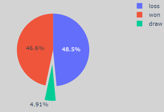
Don’t let the colors fool you when I played as a White Player, My Win percentage was 52%, while I played as a Black Player, My Win Percentage was 46.6% which is way less.
So From the next time, I should play more Black first to improve my Game. Now let's, Do some analysis based on the first moves —
Based on First Moves
Let’s check the ratio of First Moves that are involved in my Games —
fig = go.Figure(data=[go.Pie(labels=list(data["first_move"].value_counts().keys()), values=list(data["first_move"].value_counts().values), pull=[0., 0.1, 0.1])])
fig.update_layout(
    autosize=True,
    width=400,
    height=400,
    paper_bgcolor="lightgrey",
)
fig.show()
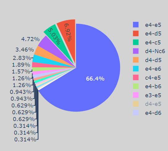
As we can see, “e4-e5" is the most played move, and very few times — “e4-d5” and “e4-c5" is played, and the rest all are just rare occurrences. Now Let’s check the Game Result using First Moves —
import plotly.express as px

fig = px.histogram(data, x="first_move", y="GameResult", color='GameResult', barmode='group', histfunc='count',
                   color_discrete_map={'won':'green',
                                 'loss':'red',
                                 'draw':'yellow'}, text_auto = True)
fig.show()

As we can see, I have played somewhat well when “e4-e5” is the first move, and rest I need to work on and improve.
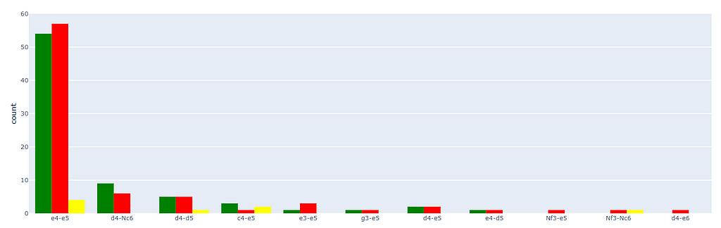
Now Let’s be specific and check my first move as White and the response I got —
import plotly.express as px

data_white = data[data["White"] == "chandurohitheee"]

fig = px.histogram(data_white, x="first_move", y="GameResult", color='GameResult', barmode='group', histfunc='count', color_discrete_map={'won':'green',
                                 'loss':'red',
                                 'draw':'yellow'}, text_auto = True)
fig.show()

It’s surprising, I didn’t realize this earlier, But if you zoom the image, then you can see that I have only played one first move — “Moving pawn to e4”. Man, I need to learn some moves from now on. But wait, When I got “Pawn moved to e5” as a response, My win percentage was way good. But I need to explore other approaches.
Now it's time to check my responses to the first move as a Black Player —
import plotly.express as px

data_black = data[data["Black"] == "chandurohitheee"]

fig = px.histogram(data_black, x="first_move", y="GameResult", color='GameResult', barmode='group', histfunc='count', color_discrete_map={'won':'green',
                                 'loss':'red',
                                 'draw':'yellow'}, text_auto = True)
fig.show()
Similar to my Statistics as a Black Player, I need to work on a few approaches, But I understood that I need to exploit the (d4-Nc6) Combination and (e4-d5) combination More.
Based on Dates
It is obvious that Chess is a mind game, and when your mind is in place, we can win more and vice versa, But let’s prove that now —
import plotly.express as px

fig = px.histogram(data, x="Date", y="GameResult", color='GameResult', barmode='group', histfunc='count', color_discrete_map={'won':'green',
                                 'loss':'red',
                                 'draw':'yellow'}, text_auto = "%.2s")

fig.show()
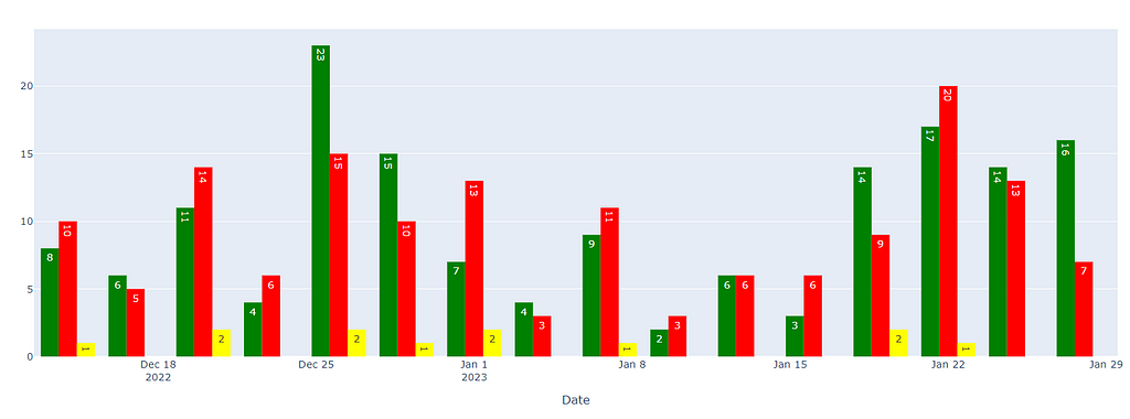
As we can see, on particular Days, my win percentage is more and on few, my percentage is way less, So It is fair to say it all depends upon the state of mind.
Let’s check how my rating throughout the journey —
import plotly.express as px

def rating(record):
    if record["Black"] == "chandurohitheee":
      return record["BlackElo"]
    else:
      return record["WhiteElo"]

data["Rating"] = data.apply(lambda row : rating(row), axis=1)

fig = px.line(x=data.groupby("Date")["Rating"].mean().keys(), y=data.groupby("Date")["Rating"].mean().values, markers=True)
fig.show()
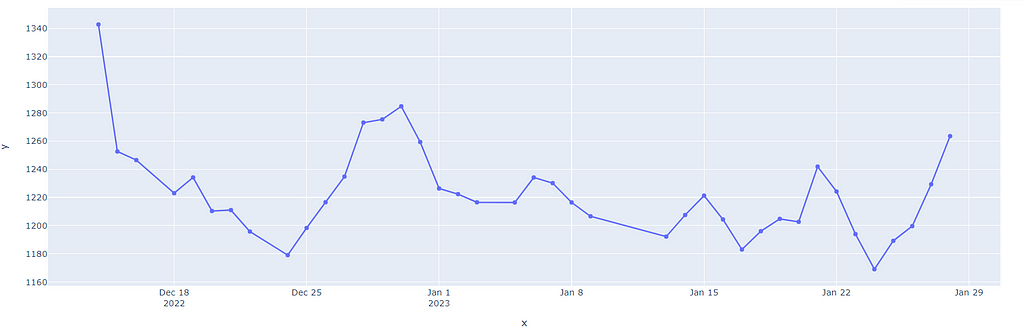
As we can see, My Rating went on Fluctuating and it is evident that the Game is completely dependent on the state of mind. Also, chess.com is such a beautiful site, where if your rating is increasing, you will face tougher opponents and vice versa. Let’s prove this now by considering opponent ratings vs. Game Results —
import plotly.express as px

def OpponentRating(record):
    if record["Black"] == "chandurohitheee":
      return record["WhiteElo"]
    else:
      return record["BlackElo"]

data["OpponentRating"] = data.apply(lambda row : OpponentRating(row), axis=1)

fig = px.histogram(data, x="GameResult", y="OpponentRating", barmode='group', histfunc='avg', text_auto = "%.2s")
fig.show()
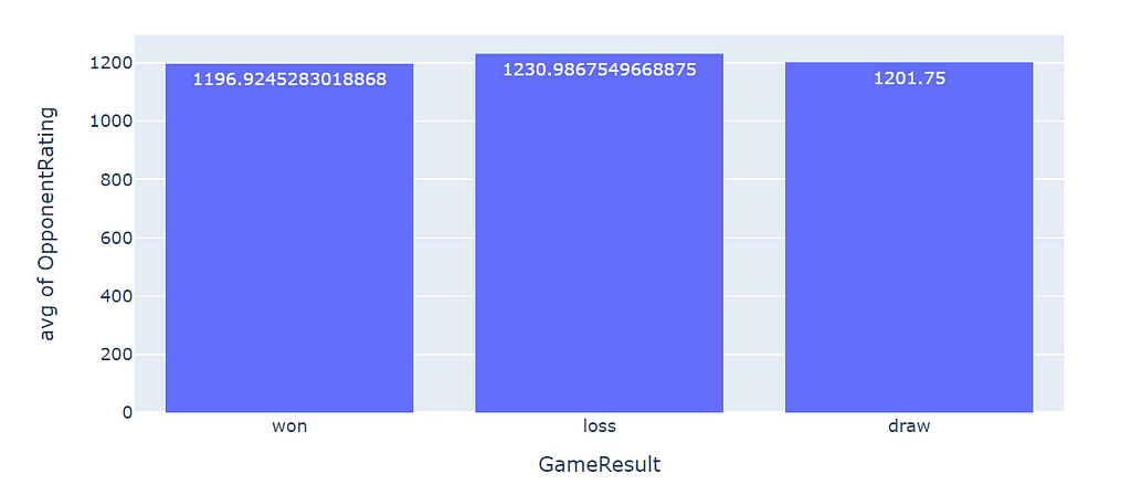
As we can notice, I have lost more when facing an avg of players with 1230 ratings and won more when dealing with players with less than 1200 ratings. So Opponent’s expertise matters.
Based on the Time Taken
Recently I played chess in the office, and I won two out of two, by taking the game to the last. So it gives me the interest to analyze the game based on the time taken and derive some outcomes —
import plotly.express as px

def TimeTaken(record):
    if record["Black"] == "chandurohitheee":
      return timedelta(hours = int(record["black_time_taken"].split(":")[0]),minutes = int(record["black_time_taken"].split(":")[1]),seconds = int(record["black_time_taken"].split(":")[2]))
    else:
      hour = int(record["white_time_taken"].split(":")[0])
      minute = int(record["white_time_taken"].split(":")[1])
      if len(record["white_time_taken"].split(":")) == 2:
        second = 0
      else:
        second = int(record["white_time_taken"].split(":")[2])
      return timedelta(hours = hour,minutes = minute,seconds = second)

data["TimeTaken"] = data.apply(lambda row : TimeTaken(row), axis=1)

fig = px.histogram(data, x="TimeTaken", y="GameResult", color="GameResult", barmode='group', histfunc='count', text_auto = "%d")

fig.show()
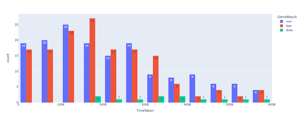
Sorry for the timestamps, it is in Iso Format, But an interesting fact is that when I took the game to the end or was aggressive in the starting has proved helpful to me, but the middle stage of the game is where I need to be more cautious.
Let’s Dig into some Game Outcomes —
import plotly.express as px

def return_conclusion_type(Termination):
  if "resignation" in Termination:
    return "Resignation"
  elif "checkmate" in Termination:
    return "CheckMate"
  elif "time" in Termination:
    return "Timeout"
  elif "abandoned" in Termination:
    return "Game Abandoned"
  else:
    return Termination

data["Termination_type"] = data["Termination"].apply(return_conclusion_type)

fig = px.histogram(data, x="GameResult", y="Termination_type", color="Termination_type", barmode='group', histfunc='count', text_auto = "%d")

fig.show()
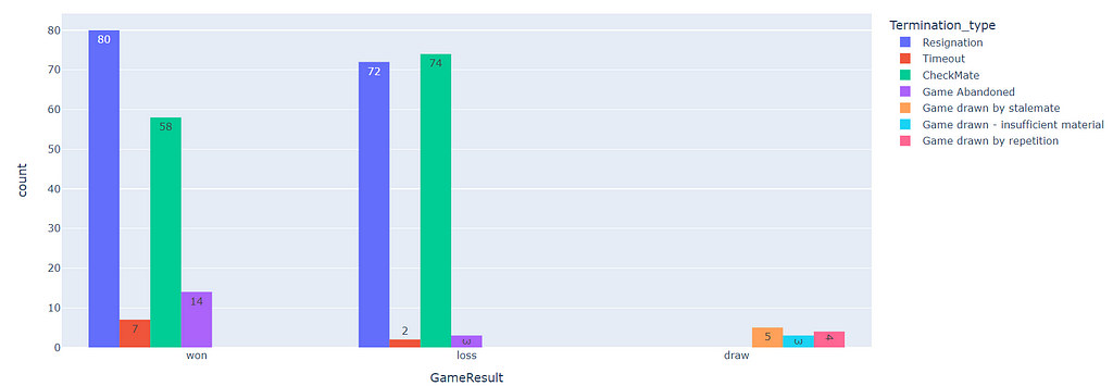
So, I can derive a few things, I am managing the time very well as there are only two losses due to Timeout and I don’t abandon the game often But In my wins, as you can see, The element of surprise in checkmates is very low, and often opponent figured out that he is going to lose, This is something I need to work on. Suprise and takeout the opponent more.
Let’s Now check whether the Move count plays a role in my Outcomes —
import plotly.express as px

fig = px.bar(x=data.groupby("Termination_type")["number_of_moves"].mean().keys(), y=data.groupby("Termination_type")["number_of_moves"].mean().values, text_auto = True)

fig.show()
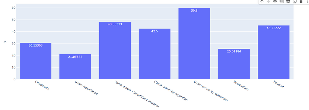
We can see the obvious results in the above graph, and not much to infer.
So That’s all the analysis I did so far on my chess games, there is a lot to infer, such as tracking the queen’s steps, weighing the importance of specific pieces, and so on, But that’s for another article.
In this article, I took some important points — Being white has its own advantage. It’s better to take the game deep or be aggressive at the beginning itself, and I have to explore more on the openings.
Happy Coding …
Exploratory Data Analysis of My Chess Dataset Using Python Plotly was originally published in Towards AI on Medium, where people are continuing the conversation by highlighting and responding to this story.
Join thousands of data leaders on the AI newsletter. Join over 80,000 subscribers and keep up to date with the latest developments in AI. From research to projects and ideas. If you are building an AI startup, an AI-related product, or a service, we invite you to consider becoming a sponsor.
Published via Towards AI
Towards AI Academy
We Build Enterprise-Grade AI. We'll Teach You to Master It Too.
15 engineers. 100,000+ students. Towards AI Academy teaches what actually survives production.
Start free — no commitment:
→ 6-Day Agentic AI Engineering Email Guide — one practical lesson per day
→ Agents Architecture Cheatsheet — 3 years of architecture decisions in 6 pages
Our courses:
→ AI Engineering Certification — 90+ lessons from project selection to deployed product. The most comprehensive practical LLM course out there.
→ Agent Engineering Course — Hands on with production agent architectures, memory, routing, and eval frameworks — built from real enterprise engagements.
→ AI for Work — Understand, evaluate, and apply AI for complex work tasks.
Note: Article content contains the views of the contributing authors and not Towards AI.
Related posts
Recent Posts


")

