Using the Indian Number System Notations in Plotly Plots
Last Updated on August 20, 2023 by Editorial Team
Author(s): Rahul Shah
Originally published on Towards AI.
Plotly is a versatile library that offers a comprehensive suite of resources for data visualization. Its ability to customize charts to meet user needs has made it a favorite of many analysts and data enthusiasts.
In a recent use case, I wanted to incorporate the Indian number system’s notations into my Plotly plots. Specifically, I aimed to replace the conventional ‘Millions’ and ‘Billions’ notations with the more culturally relevant ‘Lacs’ and ‘Crores’. Although Plotly didn’t offer a direct feature to add this, I discovered a method that customizes the plot properties to achieve our goal.

During the plot creation, I leveraged the list comprehension for the ‘hovertemplate’ property within a line chart. This involved categorizing input numbers into four distinct groups: ‘Crores’, ‘Lacs’, ‘K’ (thousands), or simply the number itself. To achieve this classification, I relied on a fundamental yet elementary property — the length of the string formatted input number.
Let’s illustrate this using an example. We begin by generating random data for a hypothetical scenario where we aim to analyze a brand’s sales performance in terms of Rupees (₹) based on expenditures over a 30-day timeframe.
import numpy as np
import pandas as pd
import plotly.graph_objects as go

np.random.seed(66)

df = pd.DataFrame(
 {
 'Spends': sorted(np.random.randint(1000000, 5000000, 30)),
 'Sales': sorted(np.random.randint(1000000, 4000000, 30))
 }
)

df.head(3)
The resultant data would look like this:

Note that we have also sorted the input Spends and Sales data to get a close-to-linear chart to make our example more insightful.
Next, we need to categorize those Spends and Sales figures, all based on the length of those string-formatted numbers.
if len(str(min(df['Spends']))) >= 8 or len(str(max(df['Spends']))) >= 8:
 unit = ' Cr.'
 df['Spends'] = df['Spends'].apply(lambda x: round(x/pow(10, 7), 2))

elif (len(str(min(df['Spends']))) >= 6 and len(str(min(df['Spends']))) < 8) or (len(str(max(df['Spends']))) >= 6 and len(str(max(df['Spends']))) < 8):
 unit = ' Lacs'
 df['Spends'] = df['Spends'].apply(lambda x: round(x/pow(10, 5), 2))

elif (len(str(min(df['Spends']))) > 3 and len(str(min(df['Spends']))) <= 5) or (len(str(max(df['Spends']))) > 3 and len(str(max(df['Spends']))) <= 5):
 unit = ' K'
 df['Spends'] = df['Spends'].apply(lambda x: round(x/pow(10, 3), 2))

else:
 unit = ''
Here, we have introduced specific conditions on the minimum and maximum of the Spends column. If either end of the Spends column satisfies these conditions, the value of the ‘unit’ variable is assigned. These conditions also include the division of the Spends column by varying multiple of tens. This ensures that the values are converted to Crores (10⁷), Lacs (10⁵), or Thousands (10³) and will be helpful for setting up the axes ticks that would satisfy our goals.
Similarly, we derived the unit and formatted the numbers for the Sales column as well:
if len(str(min(df['Sales']))) >= 8 or len(str(max(df['Sales']))) >= 8:
 unit2 = ' Cr.'
 df['Sales'] = df['Sales'].apply(lambda x: round(x/pow(10, 7), 2))

elif (len(str(min(df['Sales']))) >= 6 and len(str(min(df['Sales']))) < 8) or (len(str(max(df['Sales']))) >= 6 and len(str(max(df['Sales']))) < 8):
 unit2 = ' Lacs'
 df['Sales'] = df['Sales'].apply(lambda x: round(x/pow(10, 5), 2))

elif (len(str(min(df['Sales']))) > 3 and len(str(min(df['Sales']))) <= 5) or (len(str(max(df['Sales']))) > 3 and len(str(max(df['Sales']))) <= 5):
 unit2 = ' K'
 df['Sales'] = df['Sales'].apply(lambda x: round(x/pow(10, 3), 2))

else:
 unit2 = ''
Now, it’s time to create the plot:
fig = go.Figure()

fig.add_trace(
 go.Scatter(
 x = df['Spends'],
 y = df['Sales'],
 mode = 'lines',
 hovertemplate = [
 '<b>'
 + 'Spends: ₹'
 + str(spends)
 + unit
 + '<extra></extra>'
 for spends in df['Spends']
 ],
 )
)
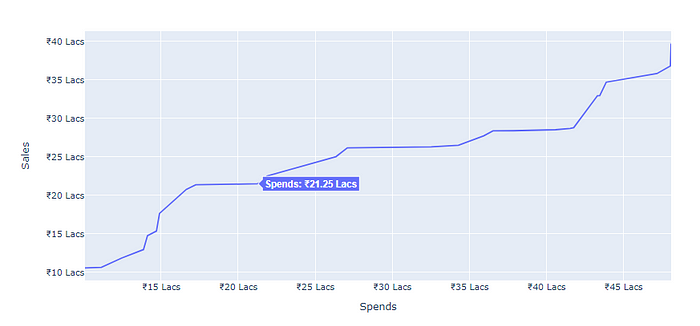
In the ‘hovertemplate’, we used the list comprehension which would traverse through the entire Spends column and prefixes the number with the rupee symbol (₹). Also, it adds the unit variable we derived in the previous step.
At last, we would format the axes by adding the prefixes and suffixes for the ticks of the plot. Here, the division of numbers by a Crore, a Lac, or a Thousand would play a pivotal role in getting the appropriate ticks.
fig.update_xaxes(title = 'Spends', tickprefix = '₹', ticksuffix = unit)
fig.update_yaxes(title = 'Sales', tickprefix = '₹', ticksuffix = unit2)

fig.show()
This would give the following plot:

The complete code
import pandas as pd
import plotly.graph_objects as go
import numpy as np

# Set a seed for reproducibility
np.random.seed(66)

# Create a DataFrame with random data for 'Spends' and 'Sales'
df = pd.DataFrame(
 {
 'Spends': sorted(np.random.randint(1000000, 5000000, 30)),
 'Sales': sorted(np.random.randint(1000000, 4000000, 30))
 }
)

# Determine the appropriate unit and divider for 'Spends' based on its range
if len(str(min(df['Spends']))) >= 8 or len(str(max(df['Spends']))) >= 8:
 unit = ' Cr.'
 df['Spends'] = df['Spends'].apply(lambda x: round(x/pow(10, 7), 2))

elif (len(str(min(df['Spends']))) >= 6 and len(str(min(df['Spends']))) < 8) or (len(str(max(df['Spends']))) >= 6 and len(str(max(df['Spends']))) < 8):
 unit = ' Lacs'
 df['Spends'] = df['Spends'].apply(lambda x: round(x/pow(10, 5), 2))

elif (len(str(min(df['Spends']))) > 3 and len(str(min(df['Spends']))) <= 5) or (len(str(max(df['Spends']))) > 3 and len(str(max(df['Spends']))) <= 5):
 unit = ' K'
 df['Spends'] = df['Spends'].apply(lambda x: round(x/pow(10, 3), 2))

else:
 unit = ''

# Determine the appropriate unit and divider for 'Sales' based on its range
if len(str(min(df['Sales']))) >= 8 or len(str(max(df['Sales']))) >= 8:
 unit2 = ' Cr.'
 df['Sales'] = df['Sales'].apply(lambda x: round(x/pow(10, 7), 2))

elif (len(str(min(df['Sales']))) >= 6 and len(str(min(df['Sales']))) < 8) or (len(str(max(df['Sales']))) >= 6 and len(str(max(df['Sales']))) < 8):
 unit2 = ' Lacs'
 df['Sales'] = df['Sales'].apply(lambda x: round(x/pow(10, 5), 2))

elif (len(str(min(df['Sales']))) > 3 and len(str(min(df['Sales']))) <= 5) or (len(str(max(df['Sales']))) > 3 and len(str(max(df['Sales']))) <= 5):
 unit2 = ' K'
 df['Sales'] = df['Sales'].apply(lambda x: round(x/pow(10, 3), 2))

else:
 unit2 = ''

# Creating the Scatter Chart with mode = 'lines'
fig = go.Figure()

fig.add_trace(
 go.Scatter(
 x = df['Spends'],
 y = df['Sales'],
 mode = 'lines',
 hovertemplate = [
 '<b>'
 + 'Spends: ₹'
 + str(spends)
 + unit
 + '<extra></extra>'
 for spends in df['Spends']
 ],
 )
)

# Update X-axis and Y-axis with labels, prefixes, and suffixes
fig.update_xaxes(title = 'Spends', tickprefix = '₹', ticksuffix = unit)
fig.update_yaxes(title = 'Sales', tickprefix = '₹', ticksuffix = unit2)

# Display the plot
fig.show()
Hence, this approach allows us to integrate the Indian number system nuances into our Plotly plots. We have utilized the power of the thousands, Lacs, and Crores notations, stitching our visualizations with a touch of cultural context. By delving into additional conditions, one can craft a more diverse array of notations, enriching the narrative of the data visualizations.
Join thousands of data leaders on the AI newsletter. Join over 80,000 subscribers and keep up to date with the latest developments in AI. From research to projects and ideas. If you are building an AI startup, an AI-related product, or a service, we invite you to consider becoming a sponsor.
Published via Towards AI
Towards AI Academy
We Build Enterprise-Grade AI. We'll Teach You to Master It Too.
15 engineers. 100,000+ students. Towards AI Academy teaches what actually survives production.
Start free — no commitment:
→ 6-Day Agentic AI Engineering Email Guide — one practical lesson per day
→ Agents Architecture Cheatsheet — 3 years of architecture decisions in 6 pages
Our courses:
→ AI Engineering Certification — 90+ lessons from project selection to deployed product. The most comprehensive practical LLM course out there.
→ Agent Engineering Course — Hands on with production agent architectures, memory, routing, and eval frameworks — built from real enterprise engagements.
→ AI for Work — Understand, evaluate, and apply AI for complex work tasks.
Note: Article content contains the views of the contributing authors and not Towards AI.


