


Statistical Modeling of Time Series Data Part 2: Exploratory Data Analysis
Last Updated on January 6, 2023 by Editorial Team
Last Updated on December 21, 2020 by Editorial Team
Author(s): Yashveer Singh Sohi
Data Visualization
In this series of articles, the S&P 500 Market Index is analyzed using popular Statistical Model: SARIMA (Seasonal Autoregressive Integrated Moving Average) and GARCH (Generalized AutoRegressive Conditional Heteroskedasticity).
In the first part, the data used in this series of articles, S&P 500 Prices (referred to as spx interchangeably), was scrapped from yfinance API. The series captures each business day from 1994–01–06 to 2020–08–30. It was cleaned and used to derive two other series used to study the market: S&P 500 Returns (Percent Change in prices between successive observations) and S&P 500 Volatility (Magnitude of Returns).
In this second part, the preprocessed time series is visualized and explored to understand any trends, repeating patterns, and/or other characteristics that could later be used to model the series and forecast the future values (covered in subsequent sections). The code used in this article is from Visualization and EDA.ipynb notebook in this repository.
Table of Contents
- Importing Data
- Preliminary Line Plots
- Splitting Time Series Data into Train-Test sets
- Exploring Yearly Trends using Box Plots
- Distribution of Data
- Data Decomposition (Additive and Multiplicative)
- Smoothing the Time Series (Moving Averages)
- Correlation Plots (ACF and PACF)
- Stationarity Check
- Conclusion
- Links to other parts of this series
- References
Importing Data
Before starting the exploration, first, let’s import the preprocessed data from the last part. The data was scraped from yfinance API in python. It contained the S&P 500 stock price data from 1994–01–06 to 2020–08–30 . The data was then cleaned (filling of missing value) and used to create 2 new series: Returns and Volatility. Thus the final dataset has the following 3 columns: spx (S&P 500 Prices), spx_ret (S&P 500 Returns) and spx_vol (S&P 500 Volatility). Refer to part 1 to get the data ready, or download the data.csv file from this repository.
First, we import all the standard libraries used for almost any analysis using python. The sns.set() function just adds a theme to the plots made by matplotlib.pyplot . Excluding it will only result in a few styling changes.
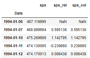
The read_csv() function takes in the file-path as the argument (“data.csv” in this case) and stores the result is a pandas DataFrame. Since the Date column is stored as anobject data type (or string), The to_datetime() function in pandas is used to convert the dates to datetime format. Once this is done, we can set the dates of this dataframe as its index using the set_index() function. This would make indexing and slice much more intuitive. The inplace = True argument instructs pandas to perform this operation on the same dataframe and not on a copied version of the dataframe. Without this argument, the changes will not be reflected in the original data dataframe. And finally, the data.head() function just displays the first 5 rows of the dataframe (as shown in the image above).
Preliminary Line Plots
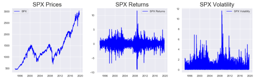
Simple Line plots are a great way to visualize the trend of the series over time. Generally, for line plots (and other plots in this article), the x-axis represents time, and the y-axis represents the series.
plt.rcParams[“figure.figsize”] is used to set the size of the figure. It expects a tuple with the length and height of the figure as follows: (length, height). plt.subplots() is used to build multiple plots within a figure. The figure container is stored in the first output of this function (fig in this case), and the position of the plots stored in the second output (ax in this case). The argument (1, 3) specifies that there are 3 subplots in one row. The 3 subplots can be accessed by indexing the ax variable. Thus, ax[0].plot() it will plot the series specified in the plot() method in the first subplot and similarly for ax[1] and ax[2] . The set_title() function allows us to set a title to a subplot. The legend() function enables us to show the labels in the plot. The text in the label is mentioned in the plot() function as the label argument. And finally, the plt.show() displays the output free of any additional Jupyter Notebook text. Without this, there might be some text visible just before the plot in a Jupyter Notebook like environment.
These plots indicate that the S&P 500 Prices have generally been increasing since 1994, with 2 major dips near 2004 and 2008. The Returns are fairly centered around 0 and show high aberrations around 2004 and 2008. Similarly, the Volatility also shows that the market was rather unstable during these 2 periods. A period of higher volatility (magnitude of returns) shows the presence of an unstable market during that period.
Splitting Time Series Data into Train-Test sets
After the preliminary plots built in the previous section, it’s best that we split the data into training and testing sets. This is because, in most real-world forecasting problems, we will not have access to future observations. Thus, in order to simulate a real-world problem, we should explore only a segment of our data and use these findings to build models to predict the remainder of the data. So before moving forward with any exploration, let’s first split the data into Training and Testing sets.
The training set will be used to build the model. The model will then be used to forecast/predict values in the testing data set, and the actual observations in the testing set will be used to evaluate the model's performance. Once the model reaches a desired level of accuracy, it is used to forecast unseen data (i.e., data outside the train and test sets).
Note: Since we are using the testing set to evaluate and fine-tune our models, the better and more precise term for this set would be Cross-Validation Set. And the unseen data (for time periods after the ones observed in the data) for which the forecasts need to be generated would be referred to as the testing set. However, in this series of articles, the goal is to build models and see their fit on training and cross-validation sets only. Thus, for simplicity, the terms training and testing sets are used.
Now we need to choose how to divide the data we have into training and testing sets. In other problems of Data Science like classification, or regression, usually, we split the data into an 80–20 (80% for training and 20 % for testing) split, and this is done by randomly shuffling the data. However, in time series analysis, if we shuffle the data, we remove the time dependence of the data. Thus, the preferred approach is to split the data at some point in time. In this case, we split the data into 2 parts: Everything before 2019–01–01 is the train set, and every observation after this date is the test set. So, we build our models on data till 2019–01–01and try to predict the data observed since 2019–01–01.
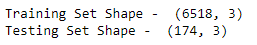
The data before 2019–01–01 is accessed using the loc indexing operator on the data dataframe. So, the code data.loc[:“2018–12–31”] just extracts all the columns of data from the starting index to the index labeled “2018–12–31” And the code data.loc[“2019–01–01”:] extracts all the columns from the index labeled “2019–01–01” to the last index. The train_df and test_df store the training and testing sets, respectively. By printing the shape of these 2 data frames, it can be seen that we have 6518 observations in our training set and 174 observations in the test set.
Subsequently, all exploration is done on the train set: train_df
Exploring Yearly Trends using Box Plots
According to Wikipedia:
In descriptive statistics, a box plot or boxplot is a method for graphically depicting groups of numerical data through their quartiles.
Let’s understand this definition by actually looking at a boxplot:
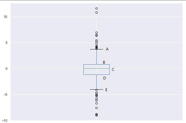
A box plot is characterized by 5 horizontal lines labeled as A, B, C, D, and E in the plot above.
- A: This line represents the maximum value of the dataset (excluding the outliers)
- B: This line represents the 3rd Quartile or 75th percentile. This is the median of the upper half of the dataset
- C: This line represents the 2nd Quartile or 50th percentile of the dataset. In other words, this is the median of the complete dataset
- D: This line represents the 1st Quartile or 25th percentile. This is the median of the lower half of the dataset
- E: This line represents the minimum value of the dataset (excluding the outliers)
- The outliers of the data are plotted as points above and below the maximum and minimum line (A and E, respectively)
So, a boxplot neatly summarizes the distribution of the data along with its outliers. Let’s build boxplots for spx, spx_ret and spx_vol for each year in our training dataset:
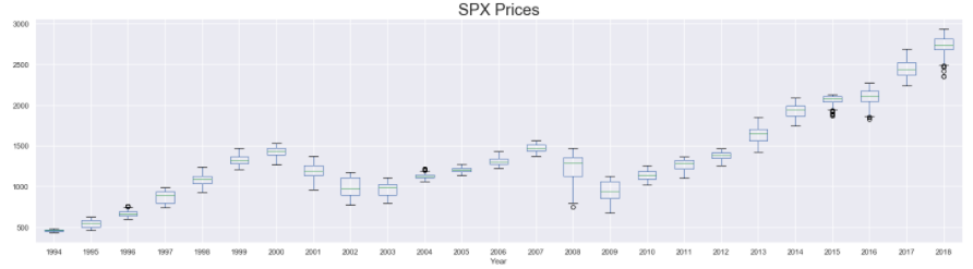
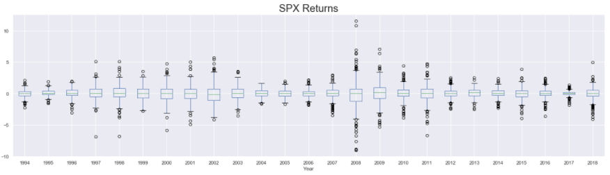
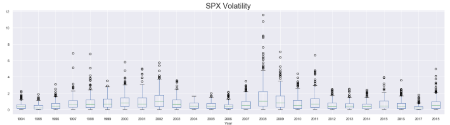
First, we add a new column to our dataset that stores the year at which the corresponding row of observations were recorded. This is done using the year attribute of the datetime objects that define the index of train_df . The column of years is stored in a column named Year in the train_df . Then we set up 3 subplots, one below the other, and plot the boxplots for spx spx_ret And spx_vol in them. The boxplot() function of pandas is used to make these plots. The function takes in the column that is used to plot the data in the column argument and the column used to group the data to be plotted in the by argument. So, in this case, we are splitting the data by the year (using by = “Year”) and then plotting separate box plots for each year available in the training dataset.
The presence of a wider boxplot indicates that the values observed that year were widely dispersed. Similarly, the presence of the high number of outliers also shows that in that year, the data had major fluctuations. Based on these, it’s not difficult to identify the years with higher degrees of fluctuations/instability in the market (such as years around 2004 and 2008)
Distribution of Data
In this section, we try to understand the distribution of the S&P 500 Prices, Returns, and Volatility using Density Curves and Histograms. The distribution of the data will indicate the range of values that occur more frequently than others, but it will eliminate the factor of time. Thus we will be unable to tell when we encounter a certain value in our dataset just by looking at the distribution plots.
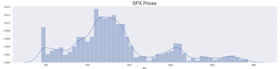
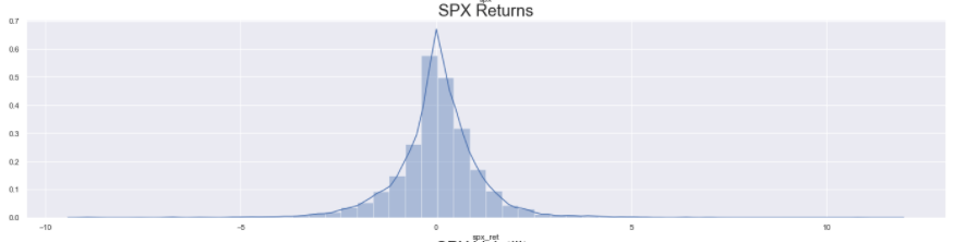
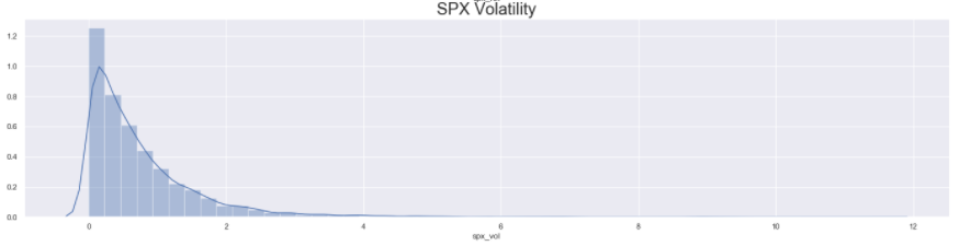
As with all the plots before, first, we set the size of the figure and define the subplots. Then, we use the distplot() function of seaborn to plot a density curve on top of a histogram for the series passed into the function. Then we set the title for each subplot (using set_title()) and display them (using plt.show()).
The distribution of S&P 500 Prices look vaguely Normal, with some big spikes along the trailing edge. However, the distribution of S&P 500 Returns looks completely Normal with almost 0 mean. Lastly, since the volatility is never negative and is simply the magnitude of the returns, the distribution of S&P Volatility is heavily right-skewed (long right tail) Normal distribution.
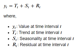
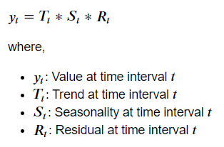
Data Decomposition (Additive and Multiplicative)
Data decomposition is the process of breaking the time series into 3 components: Trend, Seasonality, and Noise. Doing so gives us insights into repeating patterns in our data that could be used during model building. In python, the statsmodels library is used to do this decomposition. The library provides support for 2 types of decomposition: Additive and Multiplicative.
In Additive Decomposition, the series is represented as the sum of Trend, Seasonality, and Noise, and in Multiplicative Decomposition, the series is represented as the product of these 3 components.
Mathematically, the 2 types of decomposition would be represented as:
Let us now look at how to perform this in python. Specifically, the following section will be used to perform additive decomposition on the S&P 500 Prices.
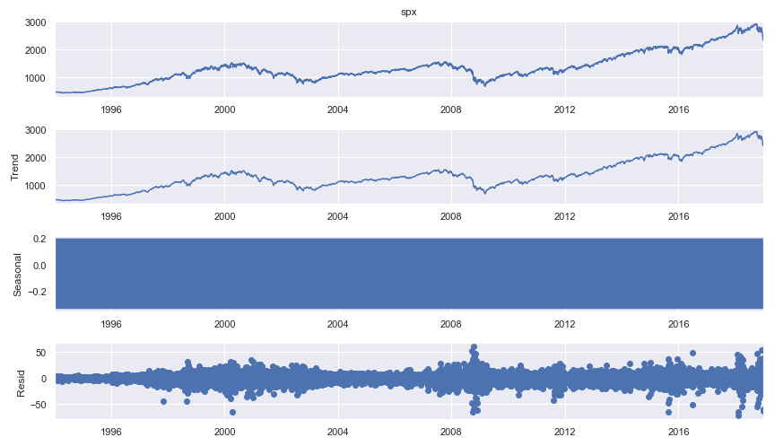
First, we import the seasonal_decompose() method from statsmodels.tsa.seasonal package. This function requires us to pass in the time series as the argument. Then, we need to set the model attribute to “additive” to decompose the series into additive components. The output of this function is stored in the result variable, which is simply plotted using the plot() function. This will plot 4 graphs: First is the series itself. The second is the Trend. The next is the Seasonal Component, and the last plot is the Noise.
In the above plot, the Seasonal Component seems odd. So lets examine it further. Instead of plotting the full seasonal component of the series, lets plot only the first 20 values of it.
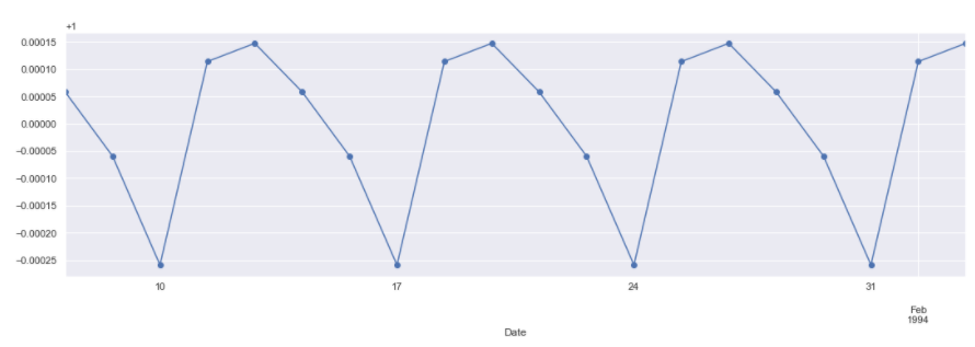
The marker = “o” parameter is used to plot the values and mark each observation separately for greater clarity. By using result.seasonal we can access the seasonal component of the decomposed data. The other components can be similarly accessed using result.trend (for the trend) and result.resid (for the noise or residuals).
The plot clearly shows a repeating cycle every 5 periods. This is fairly logical as our data is stock price data. We observe and collect stock price data on every business day of the week. This means that the data was weekly seasonality, with the week being a business week (5 days a week). However on closer inspection the values are very very negligible (as seen from the scale of the y-axis). So, using a seasonality of 5 periods in our models might not produce great results.
In order to keep this article short, decomposing other 2 series: spx_ret and spx_vol are not shown here. Also multiplicative decomposition is not shown, but can be plotted using the code in the comments above.
Smoothing the Time Series (Moving Averages)
Smoothing is a technique used to reduce the erratic fluctuations or spikes in a time series. This is done in order to dampen the effect of noise on the series. A common method to smooth out the time series is by using Moving Averages. In this method, the average over a given number of periods (also called as Window ) is calculated for each time step in the series. For a time step, a window of size n can be defined in 2 ways:
- The current time step could be at the end of the window. i.e. n-1 past lags and 1 current time step make up the window of size n.
- The current time step could be at the center of the window. i.e. about half of n-1 lags are past lags, the remaining are future lags, and the current time step is at the center.
Note: In this example we are using the first approach of selecting a window. So, if the window size is 3, then for the first 2 values we do not have enough lags to calculate the moving average. Thus, for a window of size n, the first n-1 lags of the series will result in null values.
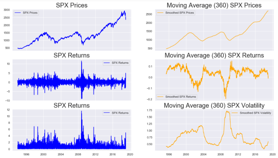
As always, we start with setting the size of the figure, and defining the subplots. This time however, we set the sharex argument to True , which allows the subplots to have a common x-axis. In the first row we plot the actual S&P 500 Prices and the smoothed version. The smoothing is done by using the rolling() method on the spx series with a window size of 360 set using window=360 parameter. On calling the mean() function on the rolling(window = 360) function, we get the desired moving average. Similar functions are used in the next 2 rows to get the plots for the spx_ret, and spx_vol series.
On inspecting the results, we can clearly see the trends in the 3 series. Both Prices and Returns show sharp dips around the years of 2004 and 2008. The Volatility increases during these 2 time periods. All this points to the presence of an unstable market during the aforementioned time periods. S&P 500 Prices have a clear upward trend except the 2 dips. Returns and Volatility are somewhat constant barring the exception of the years around 2004 and 2008.
By altering the window parameter in the rolling() function, we can build such plots for other window sizes too.
Correlation Plots (ACF and PACF)
Models that are used to forecast a time series utilize the past values of the series itself to forecast the future. Thus it is important for analysts to know how dependent the series is with past versions (or lagged versions) of itself. The dependence between 2 series can be judged by calculating the Correlation between the 2 series. However, in this case, the 2 series are essentially the same. One is a lagged version of the other. Therefore the correlation calculated in such a case is known as Auto-Correlation.
There are 2 types of correlation plots used frequently to understand the dependence of the time series with itself. These are ACF (Auto-Correlation Function) and PACF (Partial Auto-Correlation Function) plots.
We have discussed what Auto-Correlation is. Let us now understand Partial Auto-Correlation. According to the book Introductory Time Series with R,
The partial autocorrelation at lag k is the correlation that results after removing the effect of any correlations due to the terms at shorter lags.
Lets understand this with an example. Lets assume that we observed a certain value of S&P 500 Prices on a certain Wednesday. This value would depend on the values observed a few days before (say Tuesday and Monday). So, the dependence between the prices at Wednesday with those at Tuesday and Monday is measured by Auto-Correlation. However, we know that like Wednesday, even Tuesday’s price depends on Monday’s price. Thus, when we estimate the Auto-Correlation between prices on Wednesday and Monday, we are estimating 2 types of correlation: One which is direct (between Wednesday and Monday), and the other which is indirect (between Wednesday and Tuesday, and between Tuesday and Monday). With Partial Auto-Correlation, we remove such indirect effects and estimate the direct dependence only.
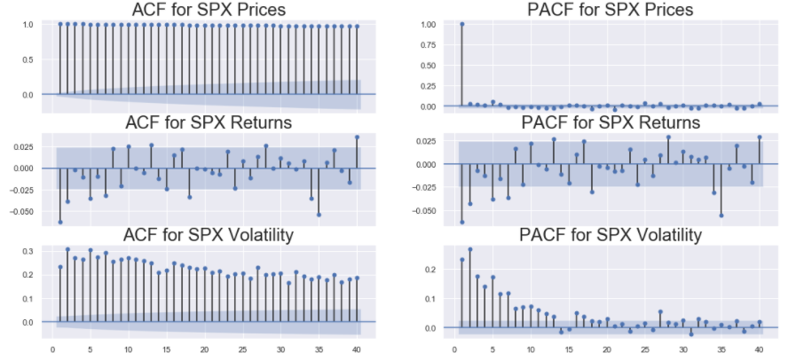
Firstly, we import the package statsmodels.graphics.tsaplots that contains the functions plot_acf() and plot_pacf() used for plotting the ACF and PACF plots for a particular time series. Like other plots in this article, we define the figure size and the subplots (with shared x-axis). Then in the first and second columns of the figure we plot the ACF and PACF of the 3 sereis (spx, spx_ret and spx_vol ) respectively. Both plot_acf() and plot_pacf() take in the time series for with the plots are to be made as their argument. Additionally,plot_acf() (or plot_pacf()) function take in the lags parameter that indicates till how many lags should the function compute the ACF (or PACF). In this case, lags=40 indicate that the function should compute ACF (or PACF) till 40 lags in the history. The zero parameter in plot_acf() (or plot_pacf()) is a boolean parameter that indicates whether the ACF (or PACF) of the series should be computed with a non lagged version of itself. Mathematically this will always be 1 as any series is perfectly correlated with itself. Thus plotting it does not provide any additional information as such.
Note: No null values should be present in the series that are passed as the inputs to the plot_acf() and the plot_pacf() functions.
The blue bands near the x-axis in the plot denotes the significance levels. The lags which are above this band are deemed significant. These plots give an idea as to how the data is dependent on lagged versions of itself. This information will be crucial while building models for these series.
Stationarity Check
According to the book Forecasting: Principles and Practice by Rob J Hyndman and George Athanasopoulos,
A stationary time series is one whose properties do not depend on the time at which the series is observed. Thus, time series with trends, or with seasonality, are not stationary — the trend and seasonality will affect the value of the time series at different times. On the other hand, a white noise series is stationary — it does not matter when you observe it, it should look much the same at any point in time.
Here, properties mean statistical properties like mean, variance, etc. While building statistical models to forecast a given time series, it is important to ensure that the series given as input is stationary. This is because, only in a stationary series, we can be sure of the fact that the underlying distribution of the data will not change in future. If however, we use a non-stationary series, we can never be sure about the underlying distribution. Hence, the model will assume that the distribution of the data will remain constant for the forecasting period, and since in a non-stationary series, there is no guarantee for this, the predictions in this case are likely to be poor.
There are a number of ways to test a given series for stationarity. In this article, we look at the following 3:
- Visual Inspection: We plot the series and inspect whether the series has any obvious trend or seasonal cycles.
- Plotting Summary Statistics: We plot the summary statistics (mean and variance) of the data over different periods in time.
- Statistical Tests: The conclusions derived from the above 2 methods are qualitative rather than quantitative. So, to get a more reliable quantitative estimate, a powerful statistical test called as ADF (Augmented-Dickey Fuller) Test is used.
Visual Inspection: For this we use the preliminary plots that we made in the start of this article here.
The explanation for the code is given in the Preliminary Line Plots section of this article. From the output, it is clear that S&P 500 Prices are non-stationary. This is because, the spx series has a very clear trend that is upward most of the time (except for the years around 2004 and 2008). On the other hand, S&P 500 Returns and Volatility do not seem to show any strong upward or downward trend. spx_ret and spx_vol does contain some sharp spikes, but they do not appear in periodic cycles. Let us use another approach to determine their stationarity.
Plotting Summary Statistics: In this method we will divide the 3 series: spx, spx_ret and spx_vol year-wise and plot these to see if the summary statistics change over the years.
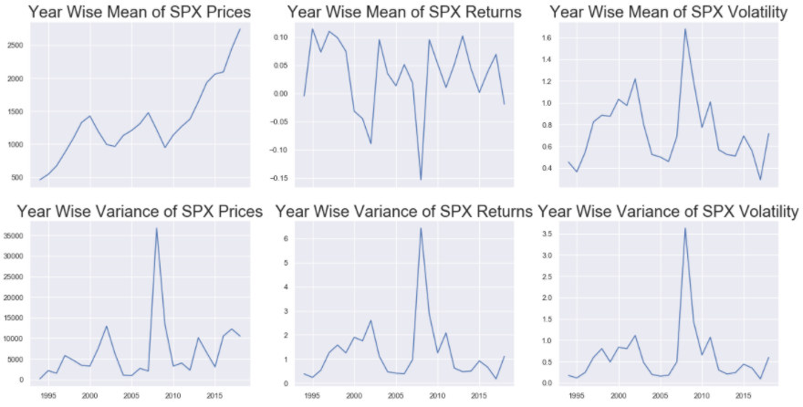
The groupby() function is used on the train_df to perform group the 3 series based on the year. In order to extract the year from the index of train_df we simply use train_df.index.year and pass it to the by argument in groupby() function. The mean() and var() functions are used on the output of the groupby() to get the dataframes containing the mean and variance of the 3 series for each year. We then plot the line plots for mean and variance for the 3 series: spx , spx_ret and spx_vol by first setting the size of the figure, then defining the number of subplots (and that they shave shared x-axis using sharex = True), and then filling each subplot with the plot of the appropriate series.
Like before, the yearly means of S&P 500 Prices, show strong trends. The yearly means of S&P 500 Returns and Volatility show some spikes but the magnitude of these spikes are very small as compared to the series itself. So these can be considered as constant. The yearly variances of S&P 500 Prices are not constant and hence spx is a non-stationary series. And similar to the yearly means, the yearly variances of S&P 500 Returns and Volatility show spikes but with low magnitude and hence these 2 series: spx_ret and spx_vol do seem stationary. However, in order to get a more concrete (or more quantitative) proof of stationarity, usually statistical tests are used.
Statistical Tests (ADF): Here we use the popular Augmented-Dickey Fuller (ADF) Test to check the stationarity of a series. The test has the following 2 hypothesis:
- Null Hypothesis (H0): Series has a unit root, or it is not stationary.
- Alternate Hypothesis (H1): Series has no unit root, or it is stationary.
The concept of unit root is explained very well in this blog post from Analytics Vidhya. The ADF test outputs the test statistic along with the p-value of the statistic. If the p-value of the statistic is less than the confidence levels: 1% (0.01), 5% (0.05) or 10% (0.10) ) then we can reject the Null Hypothesis and call the series stationary.
Let us check the stationarity of the 3 series using the ADF test.
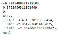
First we import the adfuller() function from statsmodels.tsa.stattools package. Then we pass the series on which the ADF test is supposed to be performed as the input parameter to the adfuller() test. In the above cell, we pass in the train_df[“spx”] series as the input. The output above shows the results of the ADF Test on spx series. The first value is the test statistic, the second one is the p-value. The next 2 are the number of lags used and the number of observations used. The next dictionary is the statistic values at the 3 confidence levels. As seen in this case, the p-value of the statistic (~0.8 or 80%) is greater than all the 3 confidence intervals. Hence we cannot reject the Null Hypothesis. Therefore, the spx series is non-stationary.
In order to perform this test on the other 2 series, un-comment the respective lines in the code cell above. Note that the series passed as input to the adfuller() function should be free of any null values. Therefore, for spx_ret and spx_vol, we exclude the first observation before passing the series. The 2 images below show the outputs for ADF test on S&P 500 Returns and Volatility respectively.
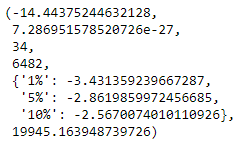
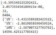
For both these series, the p-value (2nd value in the respective images) are very close to zero, and much less than the 3 confidence levels mentioned. Thus for these 2 series we can reject the Null Hypothesis. Hence according to the ADF test, S&P 500 Returns and S&P 500 Volatility are both stationary.
Conclusions
The exhaustive exploration of the 3 series ( spx, spx_ret, and spx_vol ) has revealed some important characteristics of the data. The following points summarize the main insights derived in this article:
- Trend: spx has a general upward trend, except for the 2 time periods surrounding 2004 and 2008 . On the other hand, spx_ret and spx_vol , have constant trend.
- Seasonality: On decomposing the data and on plotting the correlation functions, it seems that the data might have a seasonality of 5-periods. This also makes sense according to general intuition that stock market data is observed in the business days. (i.e. 5 days of the week). In other words, a weekly seasonality might be present in our data. This should be explored while building statistical models.
- Stationarity: The spx series is not stationary. This means that additional preprocessing needs to be performed before the series could be used for model building and subsequent forecasting. spx_ret and spx_vol are both stationary and, hence, they can be used directly for modeling.
In the following parts of this series various statistical models will be built to forecast the 3 series.
Links to other parts of this series
- Statistical Modeling of Time Series Data Part 1: Preprocessing
- Statistical Modeling of Time Series Data Part 2: Exploratory Data Analysis
- Statistical Modeling of Time Series Data Part 3: Forecasting Stationary Time Series using SARIMA
- Statistical Modeling of Time Series Data Part 4: Forecasting Volatility using GARCH
- Statistical Modeling of Time Series Data Part 5: ARMA+GARCH model for Time Series Forecasting.
- Statistical Modeling of Time Series Data Part 6: Forecasting Non — Stationary Time Series using ARMA
References
[1] 365DataScience Course on Time Series Analysis
[2] machinelearningmastery blogs on Time Series Analysis
[3] Wikipedia article on Box Plots
[4] Introductory Time Series with R
[5] Tamara Louie: Applying Statistical Modeling & Machine Learning to Perform Time-Series Forecasting
[6] Forecasting: Principles and Practice by Rob J Hyndman and George Athanasopoulos
[7] A Gentle Introduction to Handling a Non-Stationary Time Series in Python from Analytics Vidhya
Statistical Modeling of Time Series Data Part 2: Exploratory Data Analysis was originally published in Towards AI on Medium, where people are continuing the conversation by highlighting and responding to this story.
Published via Towards AI
Towards AI Academy
We Build Enterprise-Grade AI. We'll Teach You to Master It Too.
15 engineers. 100,000+ students. Towards AI Academy teaches what actually survives production.
Start free — no commitment:
→ 6-Day Agentic AI Engineering Email Guide — one practical lesson per day
→ Agents Architecture Cheatsheet — 3 years of architecture decisions in 6 pages
Our courses:
→ AI Engineering Certification — 90+ lessons from project selection to deployed product. The most comprehensive practical LLM course out there.
→ Agent Engineering Course — Hands on with production agent architectures, memory, routing, and eval frameworks — built from real enterprise engagements.
→ AI for Work — Understand, evaluate, and apply AI for complex work tasks.
Note: Article content contains the views of the contributing authors and not Towards AI.
Related posts


")
Recent Posts


")

