Causal Inference Python Implementation
Author(s): Akanksha Anand (Ak)
Originally published on Towards AI.

As per the routine I follow every time, here I am with the Python implementation of Causal Impact. If you haven’t read my previous blogs in the series, set your worries aside as I have covered the basics in these blogs:
Causal Inference — The Game Changer
When knowing beats guessing
medium.com
Methods of Causal Inference
Investigating the methodology behind the rationale
medium.com
Dataset
Thanks to Kaggle for the sales dataset I used in this implementation.
Dataset: https://www.kaggle.com/datasets/manjeetsingh/retaildataset
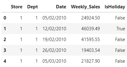
Out of the three files present in the dataset, I used the Sales dataset. This historical sales data covers sales information from 2010–02–05 to 2012–11–01. The columns in this dataset are:
• Store — the store number
• Dept — the department number
• Date — the week
• Weekly_Sales — sales for the given department in the given store
• IsHoliday — whether the week is a special holiday week
Importing Libraries
As the dataset we are using is a Time-series dataset, we are using the CausalImpact library developed by Google. The main goal of the algorithm is to infer the expected effect a given intervention (or any action) had on some response variable by analyzing differences between expected and observed time series data. It is typically employed to deduce the influence of marketing interventions on businesses, such as predicting the anticipated revenue from a specific campaign or even determining more accurately the revenue generated by a particular channel by completely disabling it.
import numpy as np
import pandas as pd
import seaborn as sns
import matplotlib.pyplot as plt
from scipy import stats

import os
print(os.listdir("../input"))

import warnings
warnings.filterwarnings("ignore")

!pip install pycausalimpact
from causalimpact import CausalImpact
Loading the dataset
Once the libraries have been imported, it’s time to import the dataset to be used.
df = pd.read_csv("/kaggle/input/retaildataset/sales data-set.csv")
df.head()

After gathering basic information like the size of the dataset and datatypes of the column, let’s perform certain changes to the datatypes to make it more usable going ahead. Let’s also investigate the number of unique Stores and Departments in the dataset.
df['Store'] = df['Store'].astype('category')
df['Dept'] = df['Dept'].astype('string')
df['Date'] = pd.to_datetime(df['Date'], format='%d/%m/%Y')
print("Total number of stores:", df.Store.nunique())
print("Total number of departments:", df.Dept.nunique())

Data for these many stores and departments may add a lot of variations to be handled. So let’s filter out and keep only a handful of data to perform the analysis.
Data Preparation
It’s time me filter out the unnecessary records to make it easier to visualize the dataset.
df_sales_new=df[(df['Store'] == 10) & (df['Dept'].isin(['1', '2', '3', '4','5' ]))].drop(columns=['IsHoliday'])
df_sales_new['Date'] = pd.to_datetime(df_sales_new['Date'])
plt.figure(figsize=(10, 5))
sns.lineplot(data=df_sales_new, x='Date', y='Weekly_Sales',hue="Dept")
plt.show()
The weekly sales for 5 departments of Store 10 looks like this:

From the trend, we can observe that:
a) Dept 1: Sales exhibit a notable increase in April, with another peak observed towards the end of the year in November and December.
b) Dept 2: Sales show a steady ascent until September, followed by a significant surge in December.
c) Dept 3: Sales remain stable, with substantial increases noted in August and September, along with a minor uptick in December and January. This department likely caters to educational and stationery products.
d) Dept 4: Sales within this department have maintained a consistent trajectory over the years, experiencing minor fluctuations.
e) Dept 5: Sales for this product demonstrate a spike in the early months of the year, followed by a substantial increase in December.
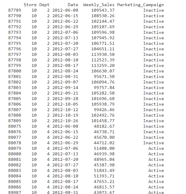
Now, to perform Causal Inference Analysis, let’s go ahead and create a situation where we induce some changes in the dataset and analyze it using the methodology. As the sales for Dept 4 are pretty consistent, we can induce some changes like a rise in sales due to the Marketing Campaign for Q3–2012, i.e., months of July to September.
For this, let’s create a column to flag the records using the code below:
df_dept4_marketing=df_sales_new.copy()
df_dept4_marketing['Marketing_Campaign'] = np.where((df_dept4_marketing['Dept'] == '4') & (df_dept4_marketing['Date'] > "2012-06-30") &
 (df_dept4_marketing['Date'] < "2012-10-01"),'Active', 'Inactive')
To verify the changes, use the below snippet:
print(df_dept4_marketing[
 (df_dept4_marketing['Date'] > "2012-06-01") &
 (df_dept4_marketing['Date'] < "2012-12-01") &
 ((df_dept4_marketing['Dept'] == '2') U+007C (df_dept4_marketing['Dept'] == '4'))])

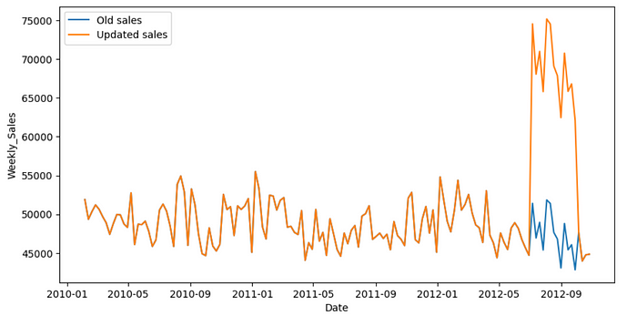
Once the dataset has been flagged, it’s time to update the sales. We elevate the weekly sales by 45%. As the data is weekly, this will help us capture the impact in a better way.
new_sales = df_dept4_marketing.copy()
new_sales['New_sales']=np.where(new_sales['Marketing_Campaign']=="Active",new_sales['Weekly_Sales'] * 1.45 ,new_sales['Weekly_Sales'])
plt.figure(figsize=(10, 5))
sns.lineplot(
 data=df_sales_new.query("Dept == '4'"),
 x="Date", y="Weekly_Sales",label='Old sales'
)
sns.lineplot(
 data=new_sales.query("Dept == '4'"),
 x="Date", y="New_sales",label='Updated sales'
)
plt.show()

Now that we have created the artificial dataset, let’s convert it into a format where it is acceptable for the library function. Our dataset has department numbers in records, we will pivot it to bring the weekly sales record for each department. We have also dropped other columns to avoid any confusion going forward.
df_sales_causal=new_sales.pivot(index="Date", columns="Dept", values="New_sales")
df_sales_causal.columns=['Dept_1', 'Dept_2', 'Dept_3', 'Dept_4', 'Dept_5']
df_sales_causal=df_sales_causal.sort_values(by='Date')
df_final=df_sales_causal.drop(['Dept_1', 'Dept_2', 'Dept_3', 'Dept_5'],axis=1)
plt.figure(figsize=(10, 5))
sns.lineplot(data=df_final,x="Date", y="Dept_4")
plt.show()

Causal Analysis
As our dataset for Causal Analysis is ready, it is time to go ahead with calling the function. For parameters, we need to assign values to the pre-period and post-period of intervention (in our case, the marketing campaign).
marketing_pre_period=['2010-02-05','2012-06-29']
marketing_post_period=['2012-07-06','2012-10-26']
impact = CausalImpact(df_final, marketing_pre_period, marketing_post_period)
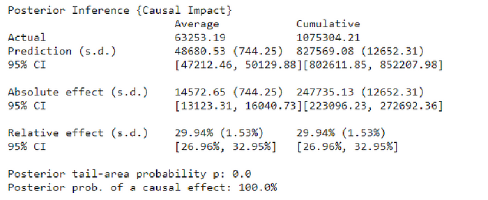
print(impact.summary())

As per the summary, the predicted relative effect is around 30%, whereas the lift we induced in the dataset was 45%. The 95% CI for it is 27% to 33%. This is a satisfactory result with a p-value close to zero.
We can even get a “report” printed which summarizes the result for us.
print(impact.summary(output='report'))
Analysis report {CausalImpact}


During the post-intervention period, the response variable had
an average value of approx. 63253.19. By contrast, in the absence of an
intervention, we would have expected an average response of 48680.53.
The 95% interval of this counterfactual prediction is [47212.46, 50129.88].
Subtracting this prediction from the observed response yields
an estimate of the causal effect the intervention had on the
response variable. This effect is 14572.65 with a 95% interval of
[13123.31, 16040.73]. For a discussion of the significance of this effect,
see below.


Summing up the individual data points during the post-intervention
period (which can only sometimes be meaningfully interpreted), the
response variable had an overall value of 1075304.21.
By contrast, had the intervention not taken place, we would have expected
a sum of 827569.08. The 95% interval of this prediction is [802611.85, 852207.98].


The above results are given in terms of absolute numbers. In relative
terms, the response variable showed an increase of +29.94%. The 95%
interval of this percentage is [26.96%, 32.95%].


This means that the positive effect observed during the intervention
period is statistically significant and unlikely to be due to random
fluctuations. It should be noted, however, that the question of whether
this increase also bears substantive significance can only be answered
by comparing the absolute effect (14572.65) to the original goal
of the underlying intervention.


The probability of obtaining this effect by chance is very small
(Bayesian one-sided tail-area probability p = 0.0).
This means the causal effect can be considered statistically
significant.
You can find the entire code here: Kaggle
And that’s a wrap!
If you liked my blog, give this a clap and follow me! You can also connect with me on LinkedIn
Join thousands of data leaders on the AI newsletter. Join over 80,000 subscribers and keep up to date with the latest developments in AI. From research to projects and ideas. If you are building an AI startup, an AI-related product, or a service, we invite you to consider becoming a sponsor.
Published via Towards AI
Towards AI Academy
We Build Enterprise-Grade AI. We'll Teach You to Master It Too.
15 engineers. 100,000+ students. Towards AI Academy teaches what actually survives production.
Start free — no commitment:
→ 6-Day Agentic AI Engineering Email Guide — one practical lesson per day
→ Agents Architecture Cheatsheet — 3 years of architecture decisions in 6 pages
Our courses:
→ AI Engineering Certification — 90+ lessons from project selection to deployed product. The most comprehensive practical LLM course out there.
→ Agent Engineering Course — Hands on with production agent architectures, memory, routing, and eval frameworks — built from real enterprise engagements.
→ AI for Work — Understand, evaluate, and apply AI for complex work tasks.
Note: Article content contains the views of the contributing authors and not Towards AI.


