


An AI Practitioner’s Guide to the Kdrama Start-Up
Last Updated on January 24, 2021 by Editorial Team
Author(s): JD Dantes
“We got 99.9% accuracy!!!” and other things to point out.
Well, more of a commentary, really.
As a computer engineer with an interest in startups and experience building real-time computer vision and other AI systems, I’ve had my fair share of discussions with some colleagues and friends. Thought I’d share some of these with you.
Note: Possible spoilers ahead, you may want to go back to this post after you’ve watched the series.
First, the non-AI stuff.
- I started watching because of the cast and the theme, and really did not expect the first episode. I personally feel that it could have been a movie, just on its own.
- I’m surprised by how people could be very polarized from something like this. From what I’ve read and heard so far, people on both “teams” could verbally attack and “hate” (1) fans on the other team, as well as (2) attach the actors/actresses themselves with their like/dislike of the characters. (I may be misinterpreting this one, as I also tend to interchange the name of the cast with the character when I communicate. In any case, to some extent I guess this means that the cast played their roles well, haha.)
- And hence, my takeaway — a playbook for making a viral and successful story which even gave Reddit moderators lots of trouble: set up two teams and make the ending uncertain, giving hope for each side even until the end. This reminds me of two things: (1) that Masters of Scale podcast episode where Reid Hoffman says to watch out for ideas where you have a mix of investors saying yes or no, rather than a unanimous vote; and (2) the concept of “clanning” which I read from The Personal MBA, where people tend to stick and support other people with similar ideas and background. For the story writers and production team, maybe they could use these as their metric or some sort of KPI: comments per hour on Reddit, and time to get moderators to take action due to those comments. (half kidding)

- I like the OST. I imagine you’ll have it stuck in your head as well.
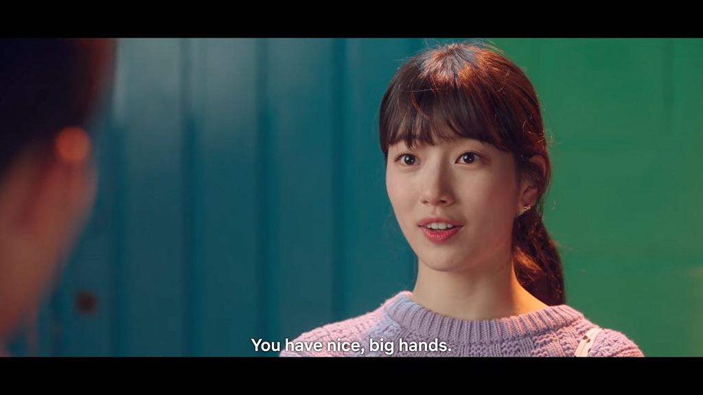
- A joke I share with friends who fawn over Nam Dosan: I haven’t met an IMO medalist and computer engineer with big hands, I mean biceps. I say this as someone who trains competitive programmers that tend to also participate in math contests like the IMO. Maybe the writer and director missed this. Or maybe I just haven’t met enough people. (half kidding)
- There were so many coincidences, but whatever. I’ll take.

Those out of the way, let’s go through the AI part, roughly in order of appearance in the series. Upon review, I acknowledge that the details could be pretty lengthy, so feel free to just skip to the parts which are of interest to you. Here we go!
#1. Tarzan and Jane

I like how the show attempts to explain artificial intelligence and machine learning to people who are not working in that field:
“So Tarzan keeps on trying. He catches a snake for her, but she doesn’t like it. One day, he gives her a cute cute rabbit, and that makes her happy.”
This trial-and-error approach represents how we feed different images into the “artificial neural network (ANN)” several times until it learns to predict that an image of a dog contains a dog, an image of a cat has a cat, and so on. Another term for this learning phase is training. You train the neural network with different images until it gets the desired accuracy.
A little bit more details for the interested:
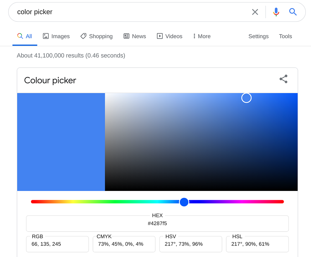
- To the computer, images are rows and columns of numbers (i.e., matrices). Typically, a pixel value of 0 means that it’s black, while 255 means 1. For color images, you have three matrices instead: one for red, another for green, and finally for blue (i.e., RGB). You can play around with a color picker like this one. Observe the RGB value — you’ll find that the black will be (0, 0, 0), white is (255, 255 , 255), and the values will just be within these numbers for any other color.
- What about the ANN? You can also think of the ANN as just one very big matrix. So, what values do they contain? Well, magical numbers. I say magical because you can multiply these numbers with the input image, add them together, and when the sum is one, it means that you have a dog; if the sum is zero, then you have a cat. If the sum is two, then it’s an apple, and so on.
- How do we get these magical values then? So initially, we don’t know them, and we can pretty much just set these values to some random number. However, it turns out that when we feed it some input image and it’s wrong, we can do some math so that the matrix gets closer to the desired magical values. So we feed it many images, do some math, and repeat. We train the neural network so that if we multiply and add it with any image of an apple, it will sum to two; a cat image will sum to zero, and so on.
- Another term for these magical values is weights. You train until you’ve found the correct weights. Why “weights”? Since you are multiplying and summing things together, you can give them different levels of importance, similar to how you weigh grades on your General Weighted Average based on the number of units per subject. For example, larger values to multiply to red pixels may mean that your ANN pays more attention to them to make it easier to differentiate apples from non-red cats and dogs.
#2. It’s actually pretty well-researched.
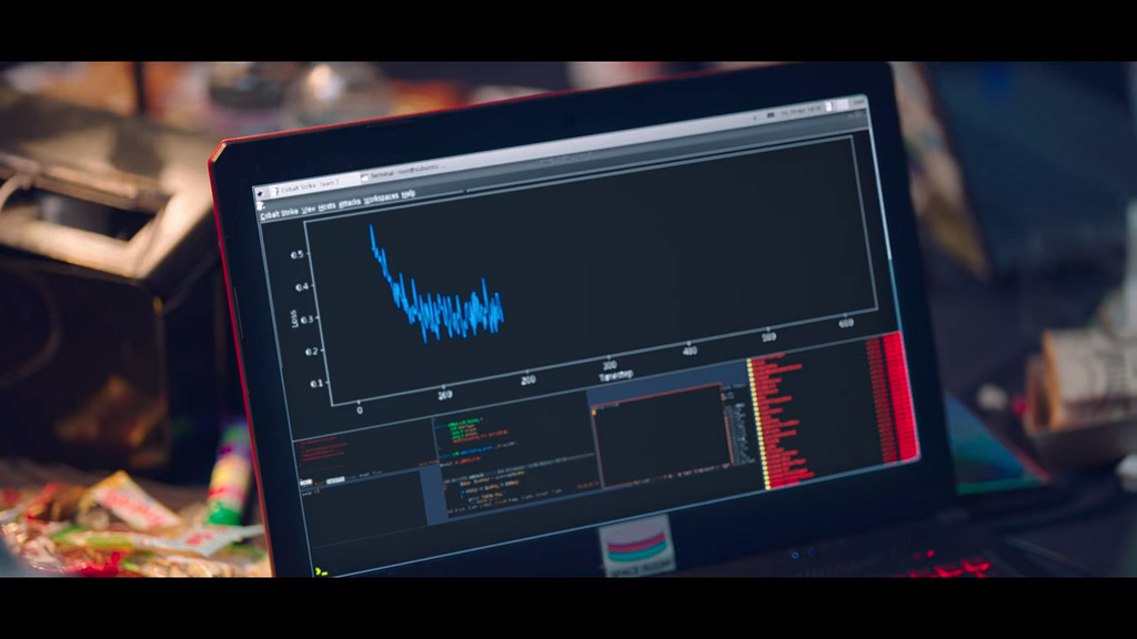
There’s this classic scene where two people get hacked, and they decided to work faster by typing on the same keyboard:

When a show features code snippets or hacking scenes, it’s not uncommon for programmers to pause and inspect the shown code to see if they make sense. Even Vagabond, a relatively recent series which Bae Suzy also starred in, had this pretty questionable scene:
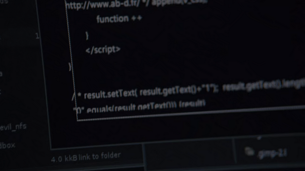
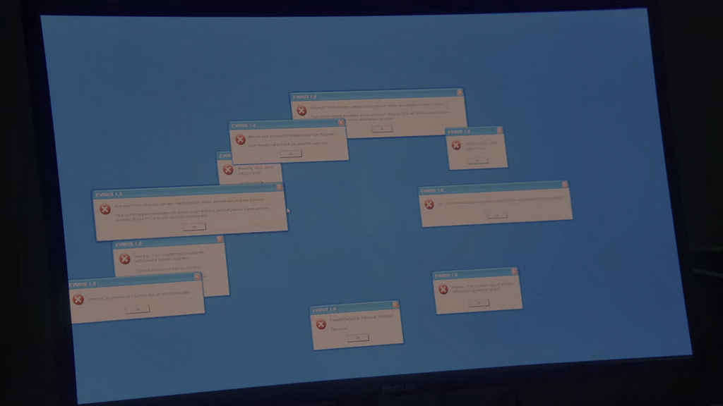
In that scene, Suzy plugs in a USB drive to the computer, and out comes some code that looks like JavaScript, except that those </script> tags are more commonly used for building websites, and I don’t think that Windows XP was written in JavaScript either. Well, I could be wrong.
Objective Function
Going back to Start-Up, early on we are exposed to a little more AI-speak. In Episode 3, Dosan introduces us to these terms:
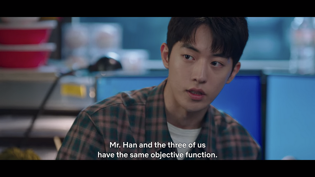
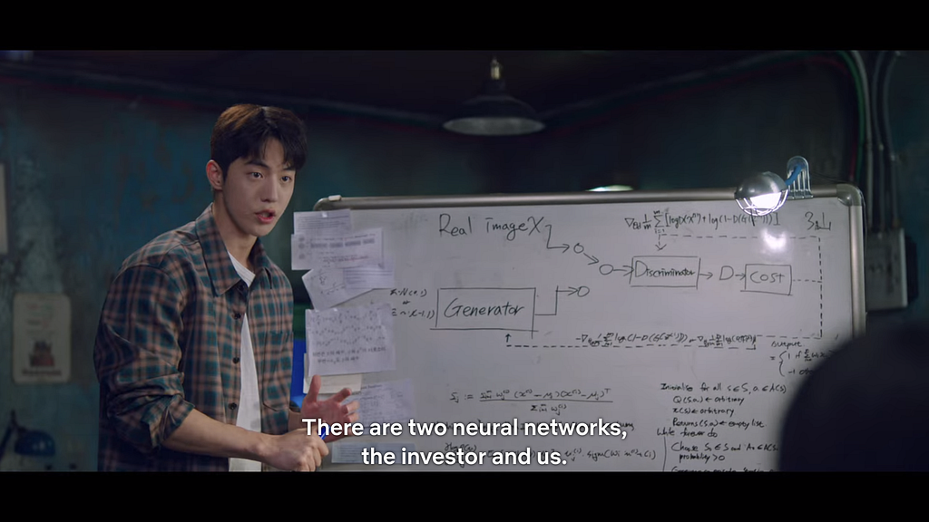
Well, I applaud, because they’re actually legitimate AI references! Whether they’re used like that in casual conversation is another matter, but let’s put that thought aside.
I’ll wind back a bit for the curious, but if you’re not too much into the details, feel free to skip to the next part.
Let’s go a few years (or even decades) back in time, when “machine learning” and “neural networks” weren’t as trendy, hardware was nowhere near as good, and people generally referred to the field as data science, data analytics, or simply statistics.
Here’s a classic task — let’s say we have the data of house prices in the city, and we want to predict what the house prices will be like some years from now, in 2025. For the sake of illustration, let’s say our data looks like this in some currency:
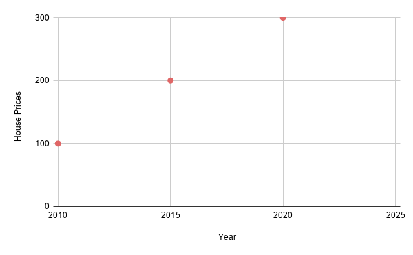
How do we predict the prices in 2025? Well, for this pretty ideal data, we can draw a line, just like this:
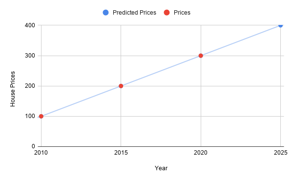
So if we wanted to predict the prices in 2025, we can just check the line to see the corresponding prices, which in this case is 400 (in some currency)!
But now, how does a computer “draw” a line anyway? One way is through trial and error. Another is to do some math to derive a formula. Or a mix of both. This means that we could end up with a less accurate model, like this one:
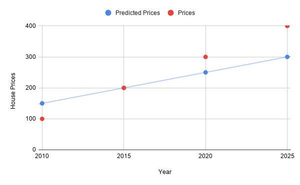
Here, our model isn’t as good, and in 2025 it predicts prices to be 300, which is an underestimate! Humans may occasionally “eyeball” the data and say that it “looks” or “fits” right. But for a computer, a consistent, quantitative measure is needed. Got some thoughts on how to do this? I’ll give you some time to think about it.
…
We can just measure the distance! For this, we can vertically subtract the actual prices (red) from the predicted prices (blue):
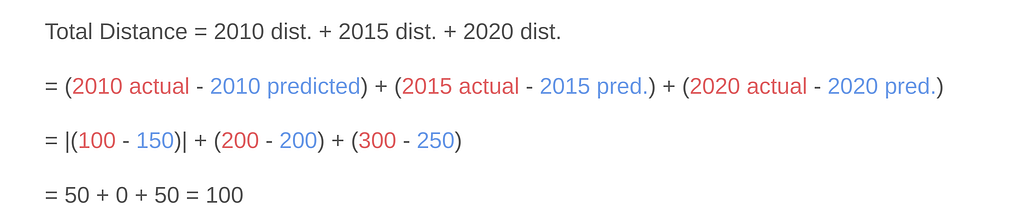
Note that for 2010, I placed vertical bars to indicate that I’m taking the absolute value, or just the magnitude of the result so we don’t have to deal with negative numbers. So the total distance here is 100. What about the earlier graph where the line perfectly fit? The predicted prices exactly match the actual prices, so if we subtract them together…
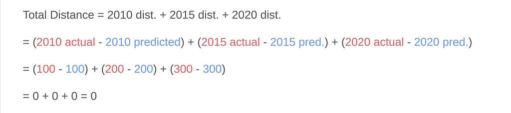
…we find that the total distance of this “best fit line” is 0! Earlier, we just knew by “eyeballing” that the first line fit the data better, but now we also came up with a quantitative measure. Other terms for this distance are “cost” and “loss”. So our first model has a loss of zero, which is less than and better than the other model which has a loss of 100.
In Start-Up, there was this scene:
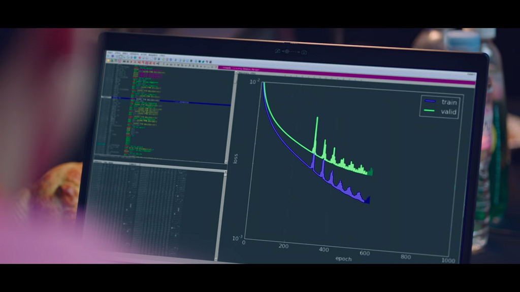
The MIT twins had this graph which goes down nicely. See how the y-axis says “loss”? So over time (the x-axis says “epoch”, which is related to the number of images processed during training), their model was able to minimize the loss, meaning it was performing quite well. We say that their model converged.
On the other hand, for the Samsan team, things didn’t go as smoothly, and their loss graph kept on bouncing up and down. Their model did not converge. What could cause such non-convergence? I’ll discuss a bit more in the next part.
Minor anecdote: in the episode, their graph gets plotted out after a few seconds. In practice, training could be significantly longer, taking minutes, hours, or even days. This is also influenced by the number of images, the complexity of the neural network, and the hardware limitations. If your model does not converge, you’d tweak a few things, then try and restart to see if it converges after the changes. This is part of the reason why machine learning, especially neural networks with many or deep layers (“deep learning”) have advanced significantly only in recent years, despite origins being traced as early as the 1990s. The performance and costs of GPUs or custom AI hardware have been (and continue to be) a bottleneck in AI research.
Minimizing the Loss
In our example with the house prices, I manually had to take the absolute value of the 2010 distance so that we would not be dealing with negative values. From the perspective of the computer though, there are more convenient ways than individually looking at the negative values and flipping the sign. One such way is to take the square of the value (i.e., multiply it to itself)! So, instead of |100–150|, we just do (100–150) x (100–150) and the value will come out positive. To complete the example, the whole thing will now look like:
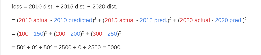
So now the value of the total loss is different, but we still have a quantitative measure nonetheless. If we do it for the first line which passed cleanly through all the points, the loss would still be zero and less than 5000, so we can still conclude that it’s the better model.
Aside from computational convenience, using squares for the loss function actually gives us a nice visualization for what the neural network tries to do. What do quadratic equations like the following look like?
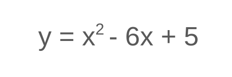
If you recall your algebra or physics concepts, these are parabolas! You can check and play around with them on sites like WolframAlpha. Or shoot a basketball — that will form a parabolic arc governed by quadratic equations.
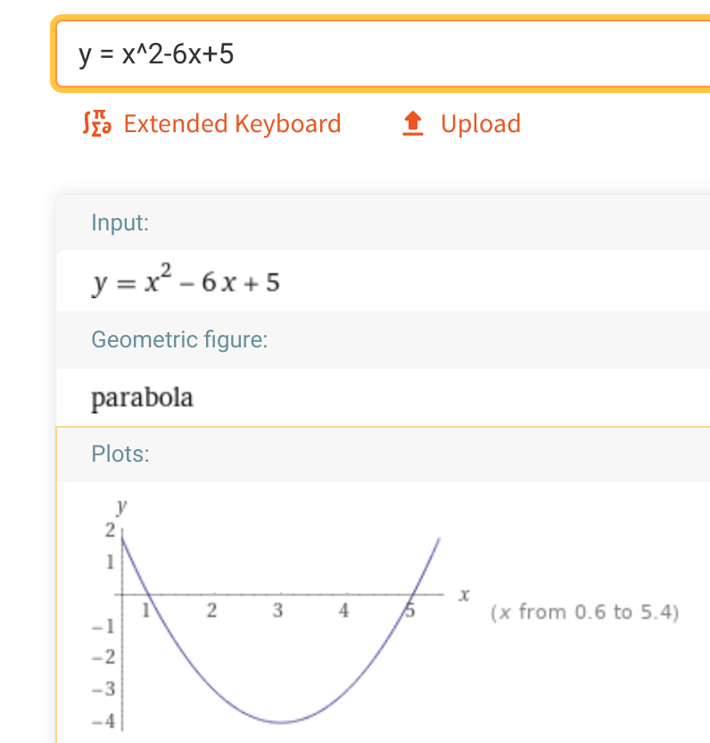
Now, let’s assume that the loss as computed from some input x is some quadratic expression, visualized by a generic parabola like this:
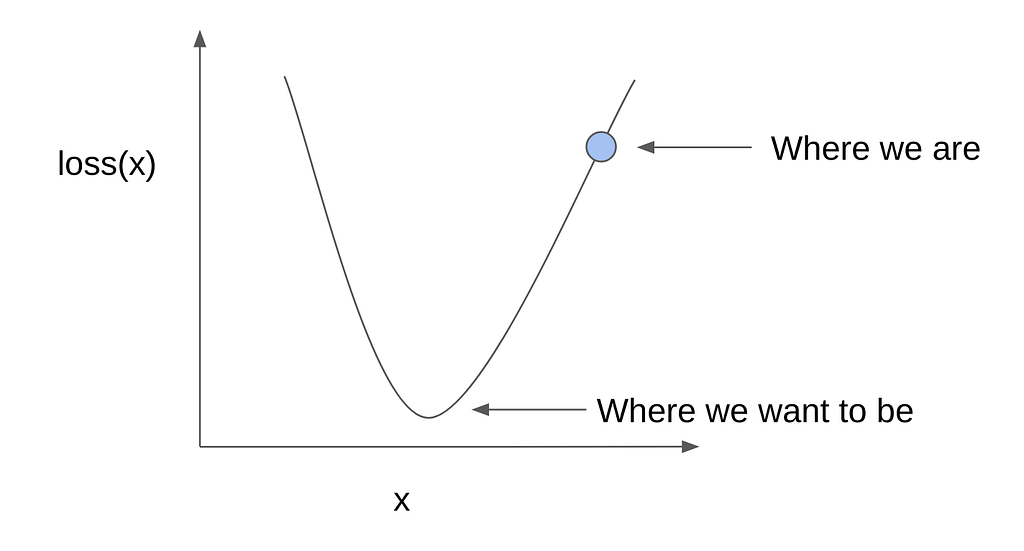
So as before, initially the weights are all random (since we’re just guessing), the loss is high and we’re somewhere along the loss curve. Again, we want to minimize the value of the loss, which will be towards the bottom of the curve. How do we do this?
Here’s one way to think about it: imagine that you were in the mountains. You want to get to the valley or base of the mountain, but it’s dark and you can’t see that far in the distance. What can you do?
…
Thought of a solution? Here’s another hint: imagine that you’re a marble, placed randomly on a bowl. How would you get to the bottom?
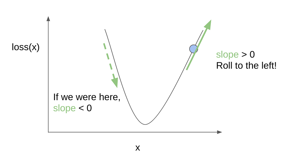
Well, you’ll just roll against the incline! Pretty simple, right?
Looking at the parabolic loss curve, we can draw a line tangent to where we are to emphasize the incline. In the perspective of the computer, we can do some math to quantify the value of the slope or the direction of the incline. If the value of the slope is positive, then the incline is increasing to the right, so we want to move to the left to go to the bottom. If the slope is negative, then the incline is already going downwards, so we can continue going right.
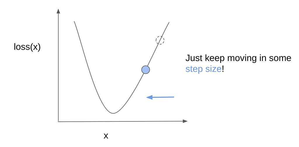
And, that’s it! We just keep on doing this until we reach the bottom, where the loss is minimal. One question remains though — how much should we step? Well, we can set this to be some arbitrary value. However, if we step too little, then we may take too long to get to the bottom — remember when I mentioned that the training process could take hours or days? This is one factor.
Another concern is that if the step size is too little, we may end up stuck in local grooves or minima. Going back to the bowl and marble, imagine that the bowl is not smooth, but could have small grooves or pockets where the marble could get stuck. To pass over such small holes, the marble would have to “jump over” or “take larger steps” to get to the actual bottom of the bowl. In other words, towards the global minimum and not the local minima.
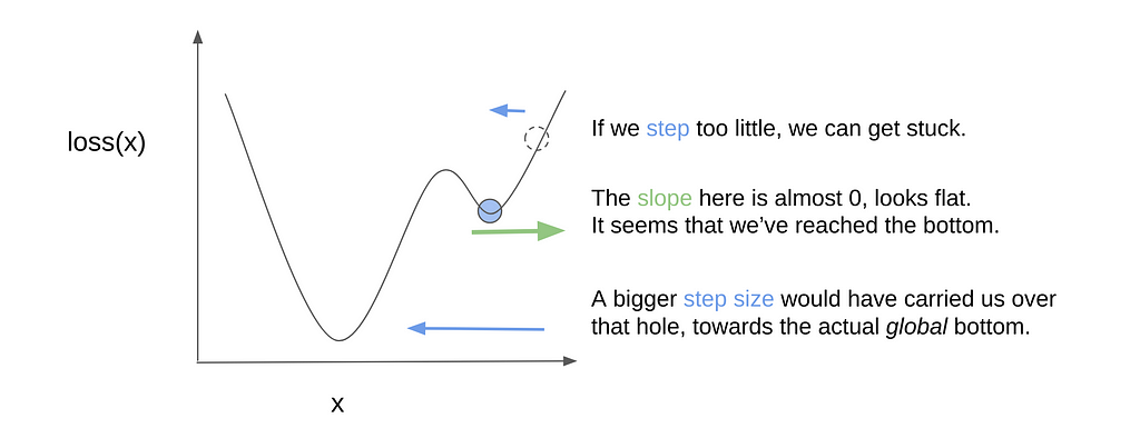
So surely, we can just make the step size as large as we can right? That will make us reach the bottom faster too. Well, we want a decently large step size, but we should still be careful that we don’t set it too large. Here’s what could happen. Let’s say that we’re near the global minimum already:

We know the direction of the incline, so we step towards the left, but if it’s too big, we’d actually miss the global minimum:
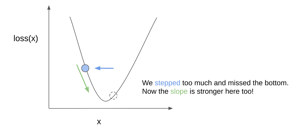
So now we’re on the other side. Worse, the incline here is steeper. Generally it also makes sense to scale the stepping size with how steep the incline is, because that probably means that we’re still far from the bottom. However, in this case, this is what happens:
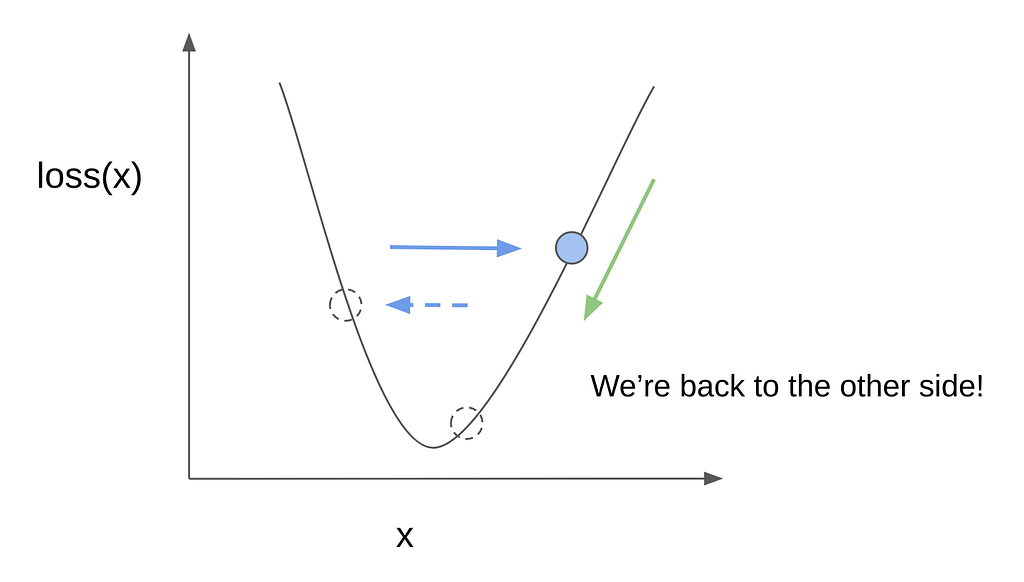
We leap back to the right side, farther from the bottom than we originally were. And this could continue, on and on…

And here we clearly see that rather than converging closer to the bottom, we keep on overshooting and oscillating indefinitely. This is what could have happened to Samsan Tech when their model failed to converge. Aside from the step size, there are other techniques that could be tried (e.g., taking into account the “momentum” of how well we were doing so far), along with other things like cleaning or preprocessing the data, or even just getting better and more images. In practice, it’s really a mix of empirical trial-and-error, theory, and rules of thumb from the state-of-the-art literature.
Terminology Trivia
- The step size is also called the learning rate. As we’ve discussed, it affects how long it takes for the model to converge (if at all).
- We mentioned the slope and illustrated it in 2D graphs. In calculus terms, we’d be taking the derivative, or for 3D and higher dimensions, also refer to it as the gradient. So if you’ve come across gradient descent while reading about machine learning, that’s pretty much what we talked about. Going down according to the direction of the incline.
- We talked about minimizing some loss functions like the sum of absolute values, or the sum of squares. In some cases, rather than minimizing some expression, it may be more convenient to flip signs around and maximize things instead. So, a more general phrasing could be to optimize (minimize/maximize) some objective function. In other words, your aim (objective) would be to reach the global optimum (minimum/maximum) of such a function.
And we’re done! Whew! That was admittedly quite a lot to cover. I applaud you if you reached this point, as this is usually covered in graduate or undergraduate semesters about computer vision and artificial intelligence.
If you recall, in one of the scenes I mentioned to note the terms “generator” and “discriminator”. We’ve gone through neural network training and objective functions but have not mentioned generators. This is because they’re a special kind of neural network called Generative Adversarial Networks (GANs). In fact, they’re a good example of what other loss functions are out there, and where things are maximized instead! Actually, there are two neural networks here! One tries to maximize, while the other tries to minimize things.
If you’re intrigued and ready for more, watch out for Part 2 (published next weekend, you can get notified here) where we’ll discuss GANs and the excitement about them, as well as other things about Start-up that they got right, beyond just the technicals!
Acknowledgments
Thanks to Lea for her suggestions and reviewing early drafts of this post.
Connect on Twitter, LinkedIn for more frequent, shorter updates, insights, and resources.
An AI Practitioner’s Guide to the Kdrama Start-Up was originally published in Towards AI on Medium, where people are continuing the conversation by highlighting and responding to this story.
Towards AI Academy
We Build Enterprise-Grade AI. We'll Teach You to Master It Too.
15 engineers. 100,000+ students. Towards AI Academy teaches what actually survives production.
Start free — no commitment:
→ 6-Day Agentic AI Engineering Email Guide — one practical lesson per day
→ Agents Architecture Cheatsheet — 3 years of architecture decisions in 6 pages
Our courses:
→ AI Engineering Certification — 90+ lessons from project selection to deployed product. The most comprehensive practical LLM course out there.
→ Agent Engineering Course — Hands on with production agent architectures, memory, routing, and eval frameworks — built from real enterprise engagements.
→ AI for Work — Understand, evaluate, and apply AI for complex work tasks.
Note: Article content contains the views of the contributing authors and not Towards AI.
Related posts
Recent Posts


")

