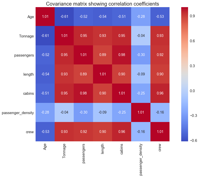
Covariance Matrix Visualization Using Seaborn’s Heatmap Plot
Author(s): Benjamin Obi Tayo Ph.D. Originally published on Towards AI. This tutorial illustrates how the covariance matrix can be created and visualized using the seaborn library Image by Benjamin O. Tayo Before implementing a machine learning algorithm, it is necessary to select …
ChatGPT Guide for Data Visualization: Top 80 Most Important Prompts
Author(s): Gencay I. Originally published on Towards AI. Unlock the power of data visualization in Python with Seaborn, Matplotlib, Plotly, and Bokeh: The ChatGPT Guide. Image by Author — Did you know that data visualization is a powerful tool for making sense …


