


Time Series Data Visualization In Python
Last Updated on January 6, 2023 by Editorial Team
Last Updated on April 8, 2022 by Editorial Team
Author(s): Youssef Hosni
Originally published on Towards AI the World’s Leading AI and Technology News and Media Company. If you are building an AI-related product or service, we invite you to consider becoming an AI sponsor. At Towards AI, we help scale AI and technology startups. Let us help you unleash your technology to the masses.
A practical guide for time series data visualization in Python
Time series data is one of the most common data types in the industry and you will probably be working with it in your career. Therefore understanding how to work with it and how to apply analytical and forecasting techniques are critical for every aspiring data scientist. In this series of articles, I will go through the basic techniques to work with time-series data, starting with data manipulation, analysis, and visualization to understand your data and prepare it for and then using statistical, machine learning, and deep learning techniques for forecasting and classification. It will be more of a practical guide in which I will be applying each discussed and explained concept to real data.
This series will consist of 8 articles:
- Manipulating Time Series Data In Python Pandas [A Practical Guide]
- Time Series Analysis in Python Pandas [A Practical Guide]
- Visualizing Time Series Data in Python [A practical Guide] (You are here!)
- Arima Models in Python [A practical Guide]
- Machine Learning for Time Series Data [A practical Guide]
- Deep Learning for Time Series Data [A practical Guide]
- Time Series Forecasting project using statistical analysis, machine learning & deep learning.
- Time Series Classification using statistical analysis, machine learning & deep learning.
Table of Contents:
- Line Plots
- Summary Statistics and Diagnostics
- Seasonality, Trend, and Noise
- Visualizing Multiple Time Series
- Case Study: Unemployment Rate
All the codes and datasets used in this article can be found in this repository.
1. Line Plots
In this section, we will learn how to leverage basic plottings tools in Python, and how to annotate and personalize your time series plots.
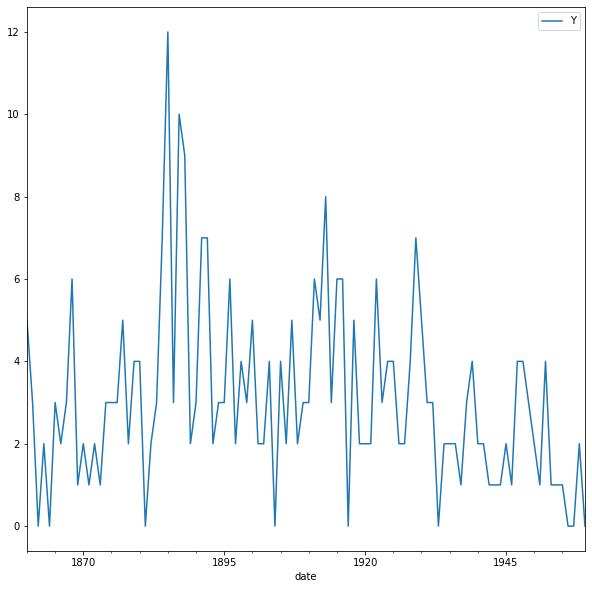
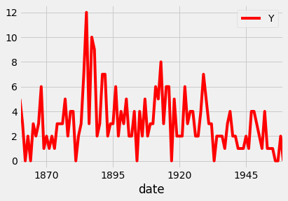
1.1. Create time-series line plots
First, we will upload the discoveries dataset and set the date as the index using .read_csv and then the plot is using .plot method as shown in the code below:
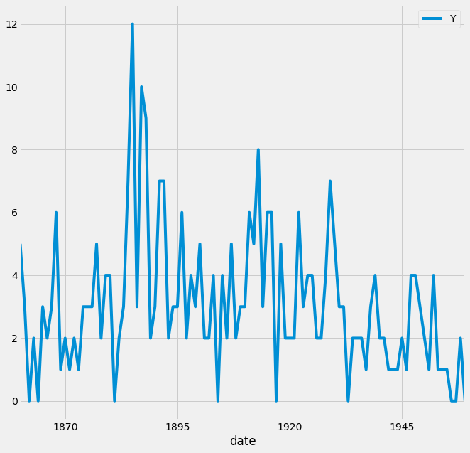
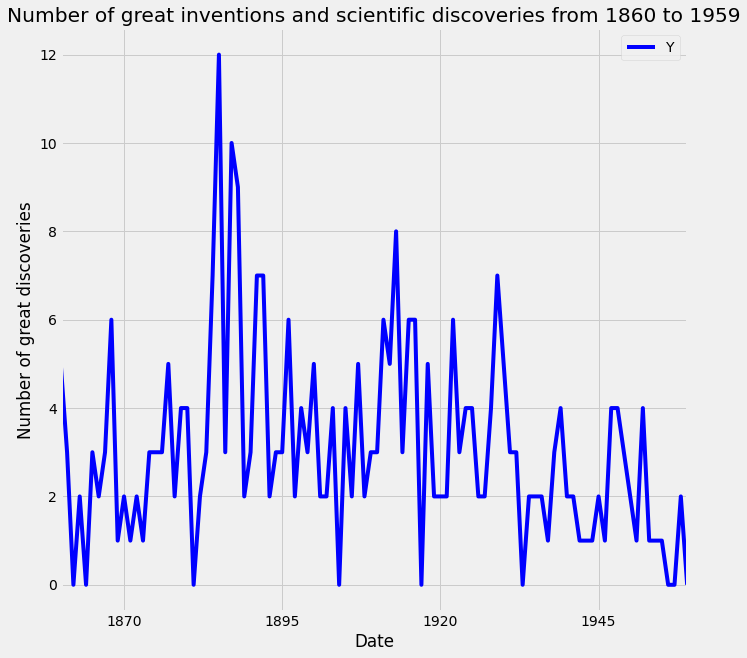
The default style for the matplotlib plot may not necessarily be your preferred style, but it is possible to change that. Because it would be time-consuming to customize each plot or to create your own template, several matplotlib style templates have been made available to use. These can be invoked by using the plt.style command, and will automatically add pre-specified defaults for fonts, lines, points, background colors, etc… to your plots. In this case, we opted to use the famous fivethirtyeight style sheet. To set this style you can use the code below:
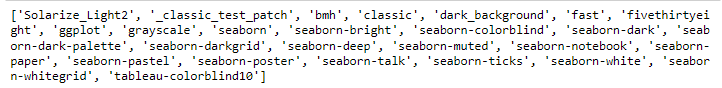
To see all of the available styles, use the following code:
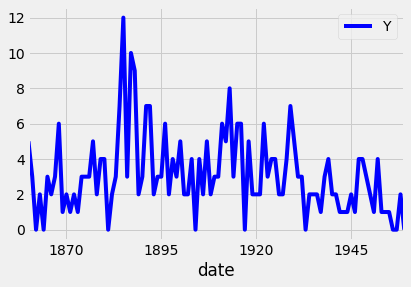
You can also change the color of the plot using the color parameter as shown in the code below:
Since your plots should always tell a story and communicate the relevant information. Therefore, it is crucial that each of your plots is carefully annotated with axis labels and legends. The .plot() method in pandas returns a matplotlib AxesSubplot object, and it is common practice to assign this returned object to a variable called ax. Doing so also allows you to include additional notations and specifications to your plot such as axis labels and titles. In particular, you can use the .set_xlabel(), .set_ylabel(), and .set_title() methods to specify the x and y-axis labels, and titles of your plot.
1.2. Customize your time series plot
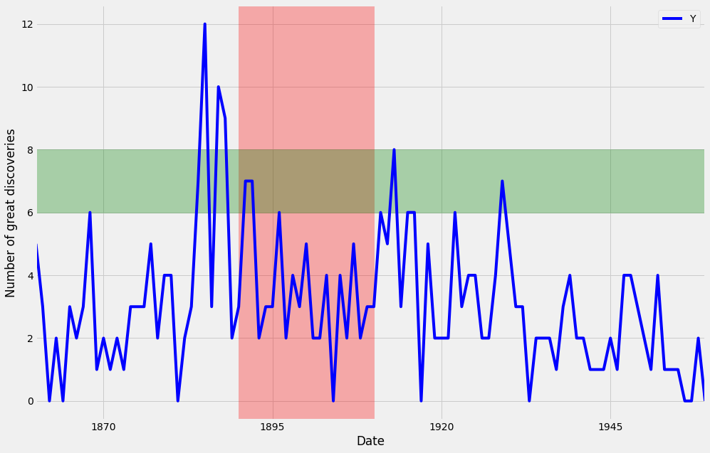
Plots are great because they allow users to understand the data. However, you may sometimes want to highlight specific events or guide the user through your train of thought.
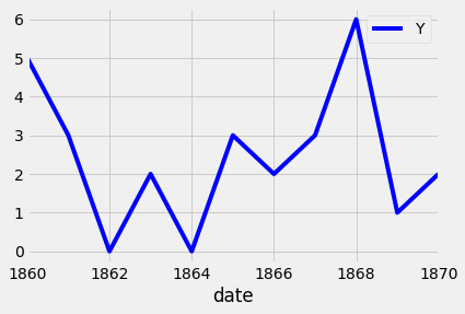
To plot a subset of the data and the data index of the pandas DataFrame consists of dates, you can slice the data using strings that represent the period in which you are interested. This is shown in the example below:
Additional annotations can also help emphasize specific observations or events in your time series. This can be achieved with matplotlib by using the axvline and axvhline methods. This is shown in the example below in which vertical and horizontal lines are drawn using axvline and axvhline methods.
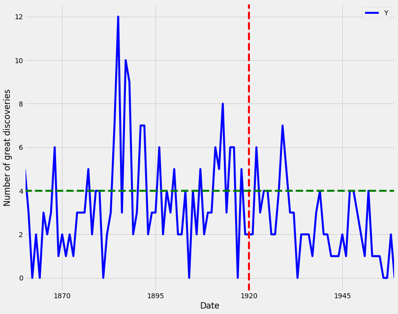
Beyond annotations, you can also highlight regions of interest to your time series plot. This can help provide more context around your data and really emphasize the story you are trying to convey with your graphs. In order to add a shaded section to a specific region of your plot, you can use the axvspan and axhspan methods in matplolib to produce vertical regions and horizontal regions, respectively. An example of this is shown in the code below:
2. Summary Statistics and Diagnostics
In this section, we will explain how to gain a deeper understanding of your time-series data by computing summary statistics and plotting aggregated views of your data.
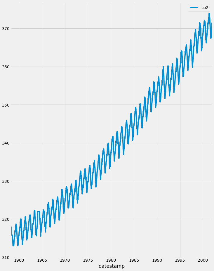
In this section, we will use a new dataset that is famous within the time series community. This time series dataset contains the CO2 measurements at the Mauna Loa Observatory, Hawaii between the years 1958 and 2001. The dataset can be downloaded from here.
2.1. Clean your time series data
In real-life scenarios, data can often come in messy and/or noisy formats. “Noise” in data can include things such as outliers, misformatted data points, and missing values. In order to be able to perform an adequate analysis of your data, it is important to carefully process and clean your data. While this may seem like it will slow down your analysis initially, this investment is critical for future development, and can really help speed up your investigative analysis.
The first step to achieving this goal is to check your data for missing values. In pandas, missing values in a DataFrame can be found with the .isnull() method. Inversely, rows with non-null values can be found with the .notnull() method. In both cases, these methods return True/False values where non-missing and missing values are located.
If you are interested in finding how many rows contain missing values, you can combine the .isnull() method with the .sum() method to count the total number of missing values in each of the columns of the df DataFrame. This works because df.isnull() returns the value True if a row value is null, and dot sum() returns the total number of missing rows. This is done with the code below:
The number of missing values is 59 rows. To replace the missing values in the data we can use different options such as the mean value, value from the preceding time point, or the value from time points that are coming after. In order to replace missing values in your time series data, you can use the .fillna() method in pandas. It is important to notice the method argument, which specifies how we want to deal with our missing data. Using the method bfill (i.e backfilling) will ensure that missing values are replaced by the next valid observation. On the other hand, ffill (i.e. forward- filling) will replace the missing values with the most recent non-missing value. Here, we will use the bfill method.
2.2. Plot aggregates of your data
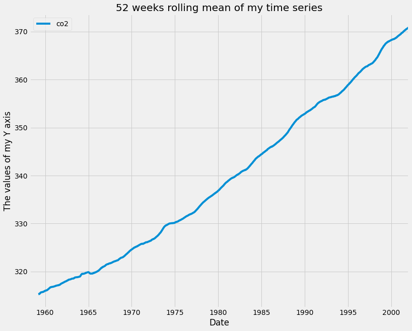
A moving average, also known as rolling mean, is a commonly used technique in the field of time series analysis. It can be used to smooth out short-term fluctuations, remove outliers, and highlight long-term trends or cycles. Taking the rolling mean of your time series is equivalent to “smoothing” your time series data. In pandas, the .rolling() method allows you to specify the number of data points to use when computing your metrics.
Here, you specify a sliding window of 52 points and compute the mean of those 52 points as the window moves along the date axis. The number of points to use when computing moving averages depends on the application, and these parameters are usually set through trial and error or according to some seasonality. For example, you could take the rolling mean of daily data and specify a window of 7 to obtain weekly moving averages. In our case, we are working with weekly data so we specified a window of 52 (because there are 52 weeks in a year) in order to capture the yearly rolling mean. The rolling mean of a window of 52 is applied to the data using the code below:
Another useful technique to visualize time series data is to take aggregates of the values in your data. For example, the co2_levels data contains weekly data, but you may wish to see how these values behave by month of the year. Because you have set the index of your co2_levels DataFrame as a DateTime type, it is possible to directly extract the day, month, or year of each date in the index. For example, you can extract the month using the command co2_levels .index .month. Similarly, you can extract the year using the command co2_levels .index .year.
Aggregating values in a time series can help answer questions such as “what is the mean value of our time series on Sundays”, or “what is the mean value of our time series during each month of the year”. If the index of your pandas DataFrame consists of DateTime types, then you can extract the indices and group your data by these values. Here, you use the .groupby() and .mean() methods to compute the monthly and yearly averages of the CO2 levels data and assign that to a new variable called co2_levels_by_month and co2_levels_by_year. The .groupby() method allows you to group records into buckets based on a set of defined categories. In this case, the categories are the different months of the year and for each year.
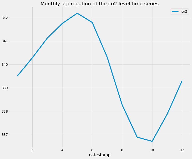
When we plot co2_levels_by_month , we see that the monthly mean value of CO2 levels peaks during the 5th to 7th months of the year. This is consistent with the fact that during summer we see increased sunlight and CO2 emissions from the environment. I really like this example, as it shows the power of plotting aggregated values of time series data.
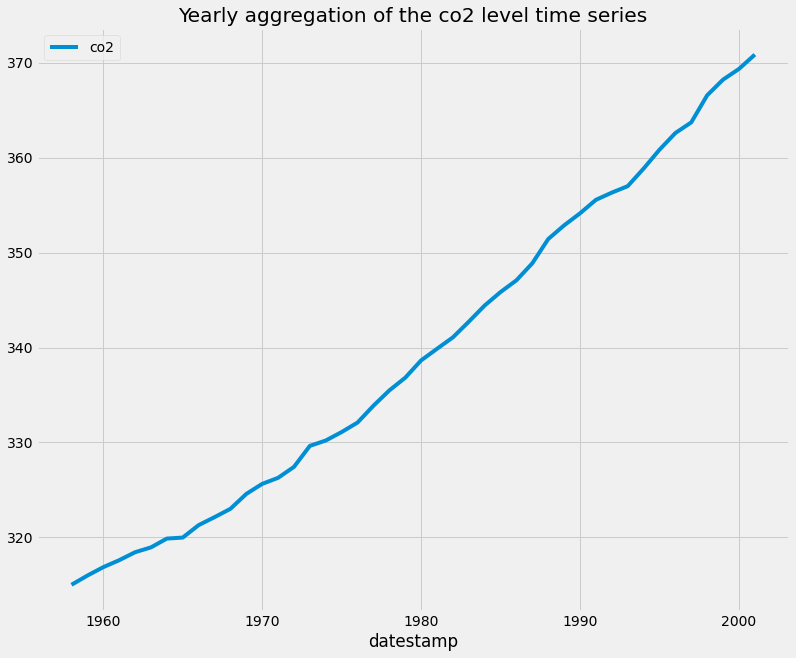
When we plot co2_levels_by_year, we can see that the co2 level is increasing every year, which is expected.
2.3. Summarize the values in the dataset
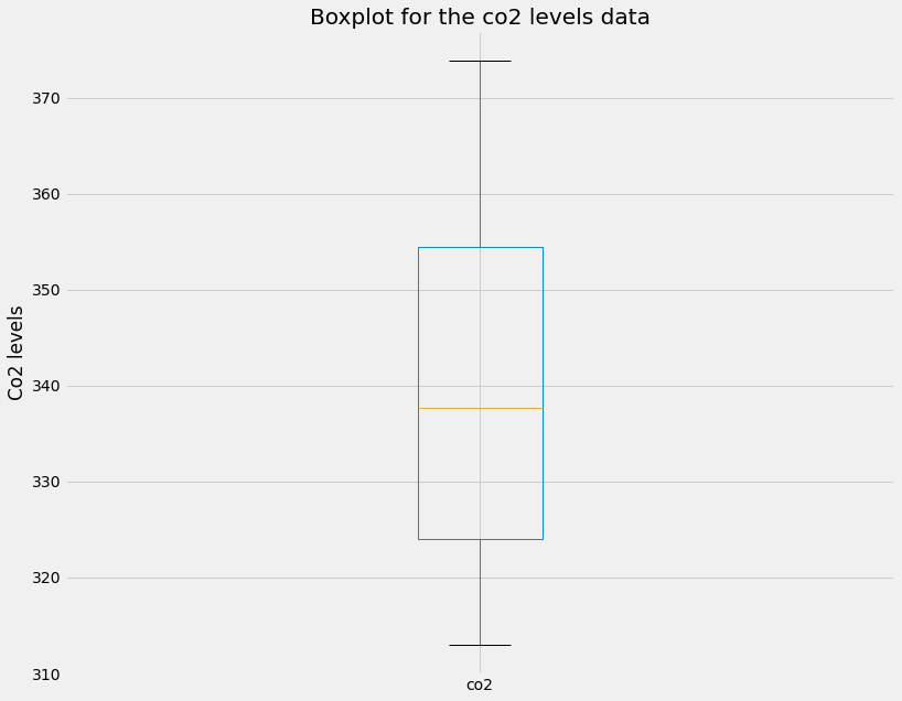
An important step to understanding the data is to create summary statistics plots of the time series that you are working with. Doing so will allow you to share and discuss the statistical properties of your data that can further support the plots that you generate and any hypotheses that you want to communicate. There are three fundamentals plots to visualizae the summary statistics of the data, the box plot, histogram plot, and density plot.
A boxplot provides information on the shape, variability, and median of your data. It is particularly useful to display the range of your data and for identifying any potential outliers.
The lines extending parallel from the boxes are commonly referred to as “whiskers”, which are used to indicate variability outside the upper (which is the 75% percentile) and lower (which is the 25% percentile) quartiles, i.e. outliers. These outliers are usually plotted as individual dots that are in line with whiskers.
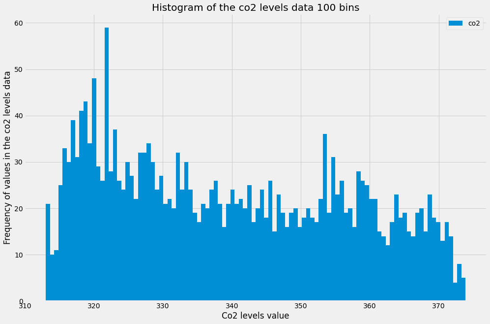
Histograms are a type of plot that allows you to inspect the underlying distribution of your data. It visualizes the frequency of occurrence of each value in your data. These can sometimes be more useful than boxplots, as non-technical members of your team will often be more familiar with histograms, and therefore are more likely to quickly understand the shape of the data you are exploring or presenting to them.
In pandas, it is possible to produce a histogram by simply using the standard .plot() method and specifying the kind argument as hist. In addition, you can specify the bins parameter, which determines how many intervals you should cut your data into. Regarding the bin parameter, there are no hard and fast rules to find the optimal value of it, it often needs to be found through trial and error.
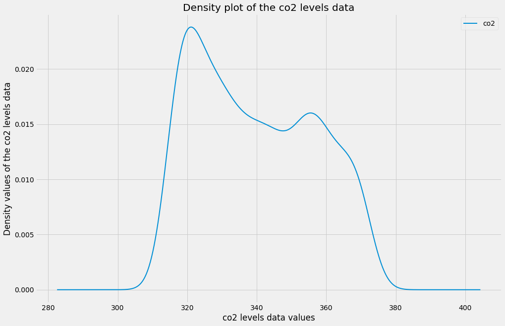
Since it can be confusing to identify the optimal number of bins, histograms can be a cumbersome way to assess the distribution of your data. Instead, you can rely on kernel density plots to view the distribution of your data. Kernel density plots are a variation of histograms. They use kernel smoothing to plot the values of your data and allow for smoother distributions by dampening the effect of noise and outliers while displaying where the mass of your data is located. It is simple to generate density plots with the pandas library, as you only need to use the standard .plot() method while specifying the kind argument as density.
3. Seasonality, Trend, and Noise
In this section, We will go beyond summary statistics by learning about autocorrelation and partial autocorrelation plots. You will also learn how to automatically detect seasonality, trend, and noise in your time series data. The autocorrelation and partial autocorrelation were covered in more detail in the previous article of this series.
3.1. Autocorrelation and Partial Autocorrelation
Autocorrelation is a measure of the correlation between your time series and a delayed copy of itself. For example, an autocorrelation of order 3 returns the correlation between a time series at points t(1), t(2), t(3), and its own values lagged by 3 time points, i.e. t(4), t(5), t(6). Autocorrelation is used to find repeating patterns or periodic signals in time series data. The principle of autocorrelation can be applied to any signal, and not just time series. Therefore, it is common to encounter the same principle in other fields, where it is also sometimes referred to as autocovariance.
In the example below we will plot the autocorrelation of the co2 level time series using the plot_acf function from the statsmodels library.
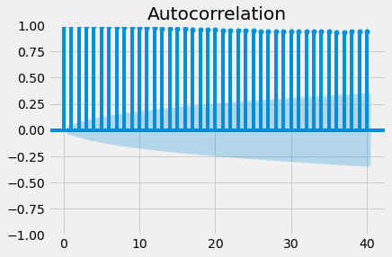
Since autocorrelation is a correlation measure, the autocorrelation coefficient can only take values between -1 and 1. An autocorrelation of 0 indicates no correlation, while 1 and -1 indicate strong negative and positive correlations. In order to help you assess the significance of autocorrelation values, the .plot_acf() function also computes and returns margins of uncertainty, which are represented in the graph as blue shaded regions. Values above these regions can be interpreted as the time series having a statistically significant relationship with a lagged version of itself.
Going beyond autocorrelation, partial autocorrelation measures the correlation coefficient between a time series and lagged versions of itself. However, it extends this idea by also removing the effect of previous time points. For example, a partial autocorrelation function of order 3 returns the correlation between our time series at points t(1), t(2), t(3), and lagged values of itself by 3-time points t(4), t(5), t(6), but only after removing all effects attributable to lags 1 and 2.
Just like with autocorrelation, we need to use the statsmodels library to compute and plot the partial autocorrelation in a time series. This example uses the .plot_pacf() function to calculate and plot the partial autocorrelation for the first 40 lags of the co2 level time series.
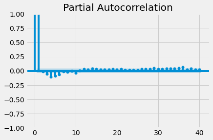
If partial autocorrelation values are close to 0, you can conclude that values are not correlated with one another. Inversely, partial autocorrelations that have values close to 1 or -1 indicate that there exist strong positive or negative correlations between the lagged observations of the time series. If partial autocorrelation values are beyond the margins of uncertainty, which are marked by the blue-shaded regions, then you can assume that the observed partial autocorrelation values are statistically significant.
3.2. Seasonality, trend, and noise in time series data
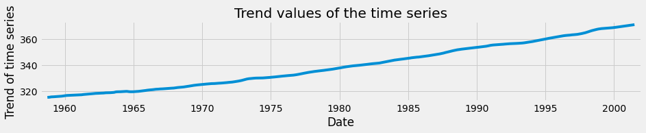
When looking at time-series data, you may have noticed some clear patterns that they exhibit. As you can see in the co2 levels time series shown below, the data displays a clear upward trend as well as a periodic signal.
In general, most time series can be decomposed in three major components. The first is seasonality, which describes the periodic signal in your time series. The second component is trend, which describes whether the time series is decreasing, constant, or increasing over time. Finally, the third component is noise, which describes the unexplained variance and volatility of your time series. Let’s go through some an example so that we will have a better understanding of these three components.
To decompose your time signal we will also use the tsa submodule of the statsmodel library. The sm.tsa.dot seasonal_decompose() function can be used to apply time series decomposition out of the box. Let's apply it to the co2 level data.
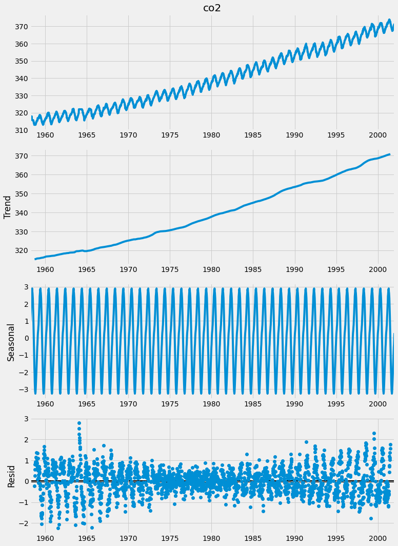
It is easy to extract each individual component and plot them. As you can see here, you can use the dir() command to print out the attributes associated with the decomposition variable generated before and to print the seasonal component, use the decomposition.seasonal command.
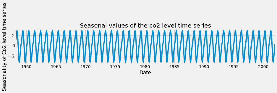
A seasonal pattern exists when a time series is influenced by seasonal factors. Seasonality should always be a fixed and known period. For example, the temperature of the day should display clear daily seasonality, as it is always warmer during the day than at night. Alternatively, it could also display monthly seasonality, as it is always warmer in summer compared to winter.
Let’s repeat the same exercise, but this time extract the trend values of the time series decomposition. The trend component reflects the overall progression of the time series and can be extracted using the decomposition .trend command.
Finally, you can also extract the noise, or the residual component of a time series as shown below.
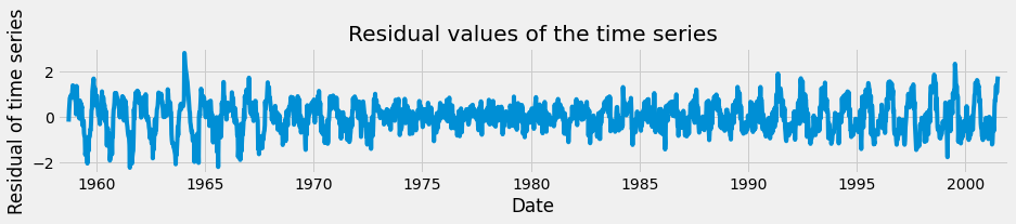
The residual component describes random, irregular influences that could not be attributed to either trend or seasonality.
3.3. Analyzing airline data
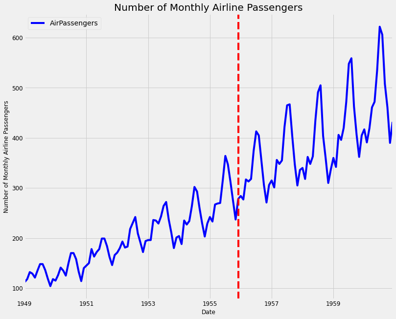
You will hone your skills with the famous airline dataset, which consists of monthly totals of airline passengers from January 1949 to December 1960. It contains 144 data points and is often used as a standard dataset for time series analysis. Working with this kind of data should prepare you to tackle any data that you may encounter in the real world!
Let's first load the data and plot the number of monthly airline passengers with the code below:
Then we will plot the summary of the time series by printing the summary of the data and the number of missing values and then plotting the box plot of the time series data.
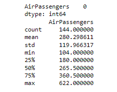
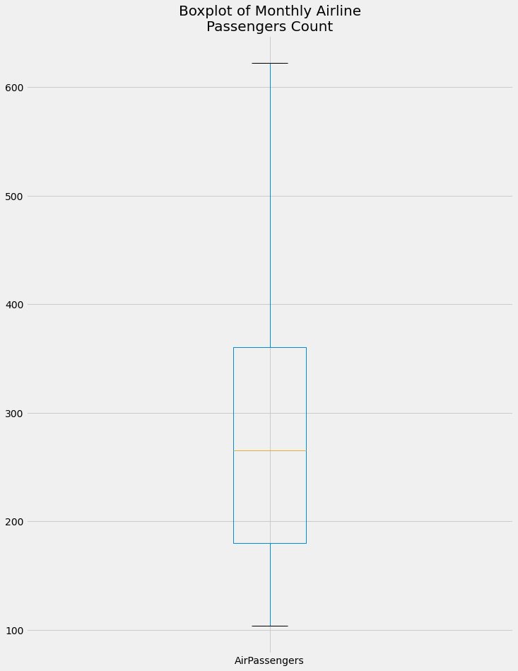
From the boxplot, we can get the following information. The max value of the monthly airline passengers is more than 600 and the minimum is around 100. There are no outliers in the data. The median of the data is around 270 and the 75th percentile is around 360 and the 25th percentile is around 180.
Let's create and plot the monthly aggregation of the airline passengers' data.
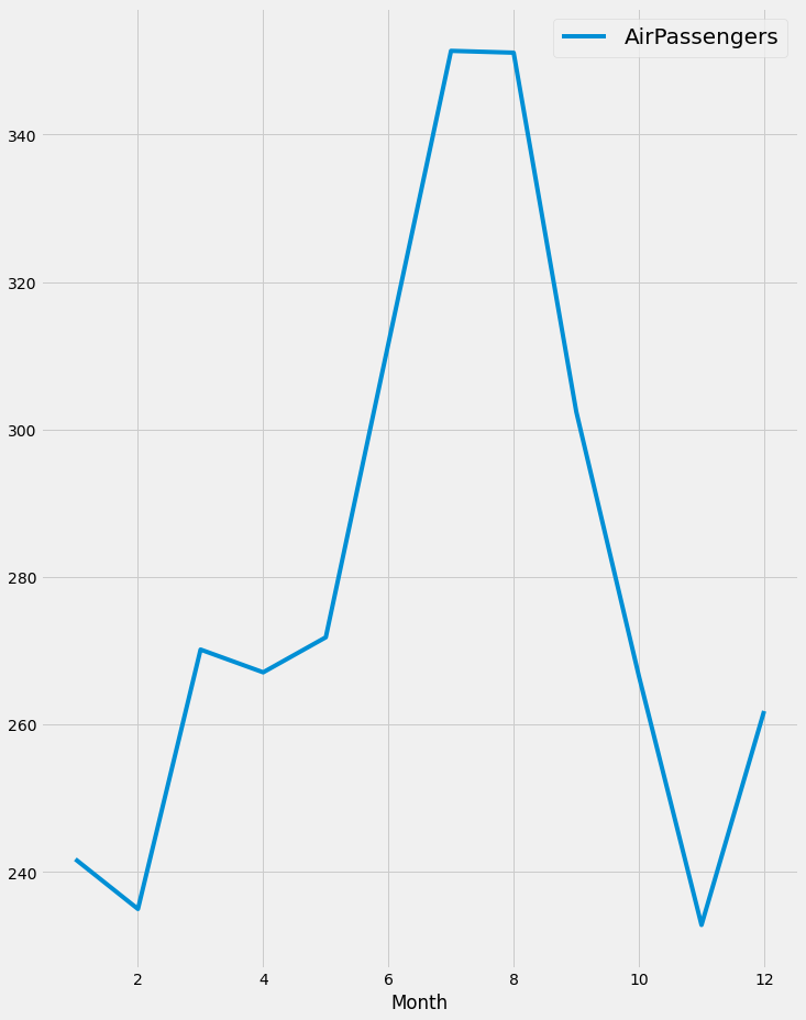
it is obvious that there is a rise in the number of airline passengers in July and August, which is reasonable due to the vacation in this period.
Finally, we will decompose the time series and plot the trend and seasonality in the data.
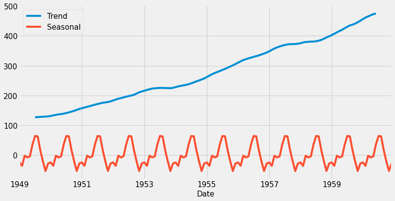
The trend shows that the number of passengers is increasing over the years 1949 to 1959, which is reasonable as the number of airplanes itself increased. There is also seasonality in the data which is expected as shown in the monthly aggregation plot.
4. Visualizing Multiple Time Series.
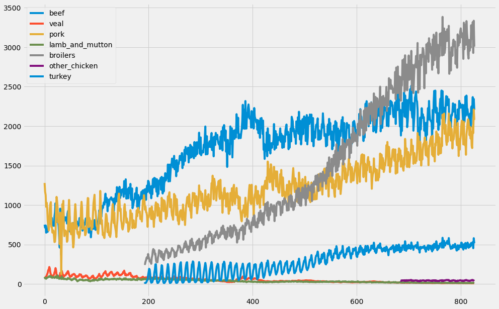
In the field of Data Science, it is common to be involved in projects where multiple time series need to be studied simultaneously. In this section, we will show you how to plot multiple time series at once, and how to discover and describe relationships between multiple time series. In this section, we will be working with a new dataset that contains volumes of different types of meats produced in the United States between 1944 and 2012. The dataset can be downloaded from here.
4.1 Working with more than one-time series
In the field of data science, you will often come across datasets containing multiple time series. For example, we could be measuring the performance of CPU servers over time, and in another case, we could be exploring the stock performance of different companies over time. These situations introduce a number of different questions and therefore require additional analytical tools and visualization techniques.
A convenient aspect of pandas is that dealing with multiple time series is very similar to dealing with a single time series. Just like in the previous sections, you can quickly leverage the .plot() and .describe() methods to visualize and produce statistical summaries of the data.
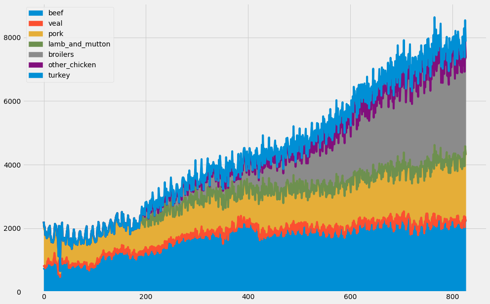
Another interesting way to plot multiple time series is to use area charts. Area charts are commonly used when dealing with multiple time series and can be leveraged to represent cumulated totals. With the pandas library, you can simply leverage the .area() method as shown on this slide to produce an area chart.
4.2. Plot multiple time series
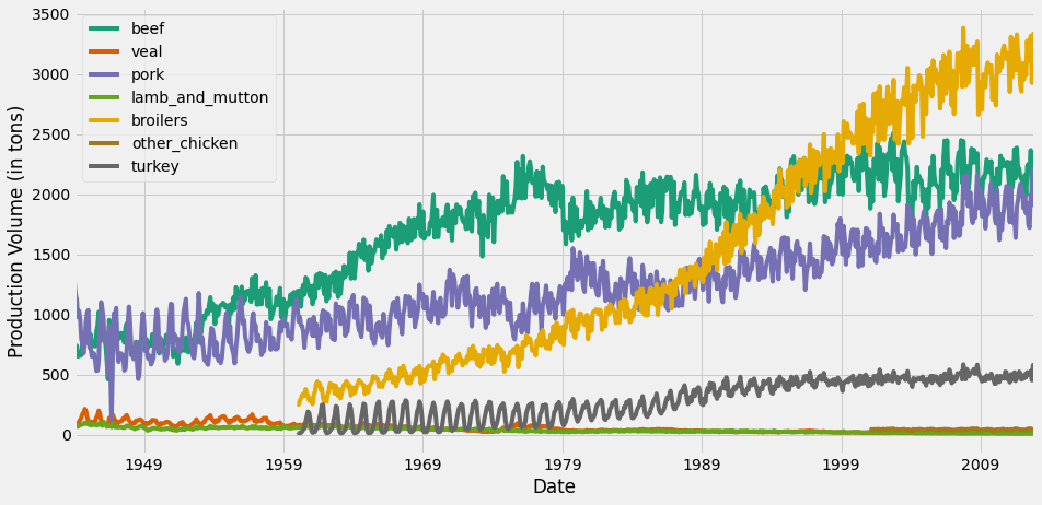
When plotting multiple time series, matplotlib will iterate through its default color scheme until all columns in the DataFrame have been plotted. Therefore, the repetition of the default colors may make it difficult to distinguish some of the time series. For example, since there are seven time series in the meat dataset, some time series are assigned the same blue color. In addition, matplotlib does not consider the color of the background, which can also be an issue.
To remedy this, the .plot() method has an additional argument called colormap. This argument allows you to assign a wide range of color palettes with varying contrasts and intensities. You can either define your own Matplotlib colormap or use a string that matches a colormap registered with matplotlib. In this example, we use the Dark2 color palette.
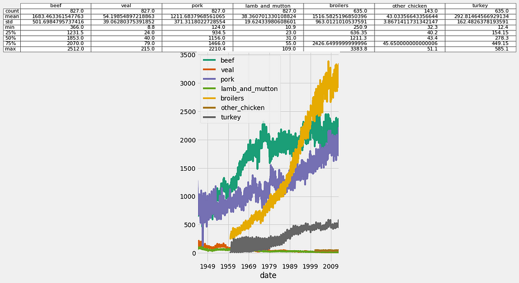
When building slides for a presentation or sharing plots with stakeholders, it can be more convenient for yourself and others to visualize both time series plots and numerical summaries on a single graph. In order to do so, first plot the columns of your DataFrame and return the matplotlib AxesSubplot object to the variable ax. You can then pass any table information in pandas as a DataFrame or Series to the ax object. Here we obtain summary statistics of the DataFrame by using the .describe() method and then pass this content as a table with the ax dot table command.
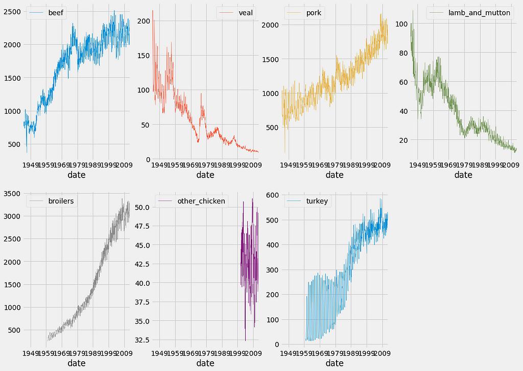
In order to overcome issues with visualizing datasets containing time series of different scales, you can leverage the subplots argument, which will plot each column of a DataFrame on a different subplot. In addition, the layout of your subplots can be specified using the layout keyword, which accepts two integers specifying the number of rows and columns to use. It is important to ensure that the total number of subplots is greater than or equal to the number of time series in your DataFrame. You can also specify if each subgraph should share the values of their x-axis and y-axis using the sharex and sharey arguments. Finally, you need to specify the total size of your graph (which will contain all subgraphs) using the figsize argument.
4.3. Visualizing the relationships between multiple time series
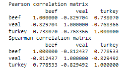
One of the most widely used methods to assess the similarities between a group of time series is by using the correlation coefficient. The correlation coefficient is a measure used to determine the strength or lack of relationship between two variables. The standard way to compute correlation coefficients is by using Pearson’s coefficient, which should be used when you think that the relationship between your variables of interest is linear. Otherwise, you can use the Kendall Tau or Spearman rank coefficient methods when the relationship between your variables of interest is thought to be non-linear. In Python, you can quickly compute the correlation coefficient between two variables by using the pearsonr, spearmanr, or kendalltau functions in the scipy.stats.stats module. All three of these correlation measures return both the correlation and p-value between the two variables x and y.
If you want to investigate the dependence between multiple variables at the same time, you will need to compute a correlation matrix. The result is a table containing the correlation coefficients between each pair of variables. Correlation coefficients can take any values between -1 and 1. A correlation of 0 indicates no correlation, while 1 and -1 indicate strong positive and negative correlations.
The pandas library comes in with a .corr() method that allows you to measure the correlation between all pairs of columns in a DataFrame. Using the meat dataset, we selected the columns beef, veal, and turkey and invoked the .corr() method by invoking both the Pearson and spearman methods. The results are correlation matrices stored as two new pandas DataFrames called corr_p and corr_s.
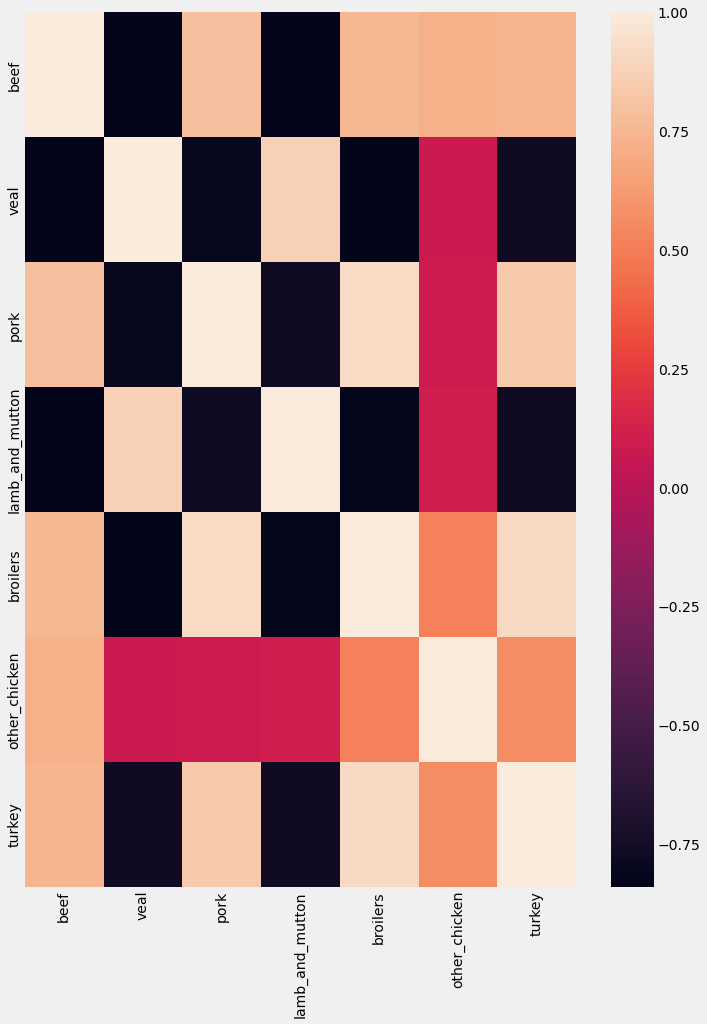
Once you have stored your correlation matrix in a new DataFrame, it might be easier to visualize it instead of trying to interpret several correlation coefficients at once. In order to achieve this, we will introduce the Seaborn library, which will be used to produce a heatmap of our correlation matrix.
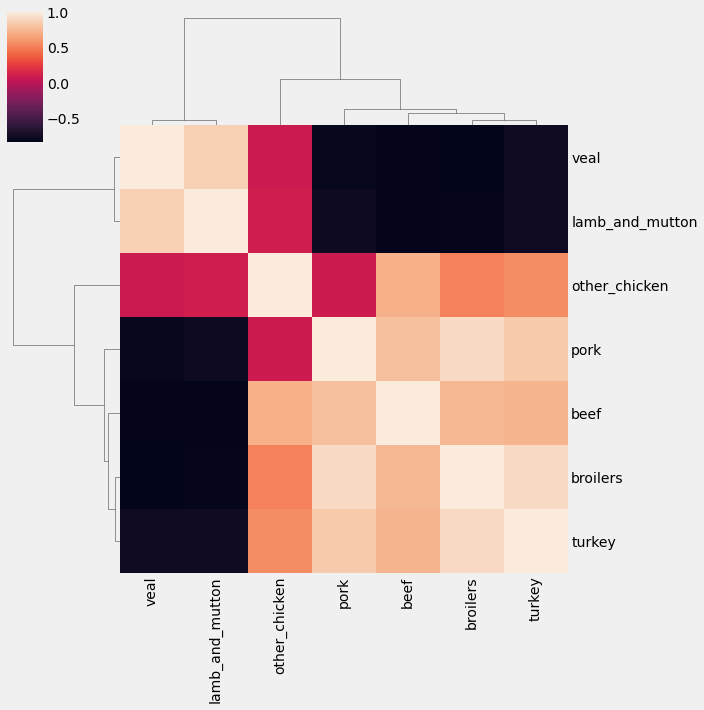
Heatmap is a useful tool to visualize correlation matrices, but the lack of order can make it difficult to read, or even identify which groups of time series are the most similar. For this reason, it is recommended to leverage the .clustermap() function in the seaborn library, which applies hierarchical clustering to your correlation matrix to plot a sorted heatmap, where similar time series are placed closer to one another.
5. Case Study: Unemployment Rate
In this section, we will practice all the concepts covered in the course. We will visualize the unemployment rate in the US from 2000 to 2010. The jobs dataset contains time series for 16 industries across a total of 122 time points one per month for 10 years.
5.1. Explore the data
The first step in data exploration is to print the summary statistics and plot the summary of the data using a boxplot.
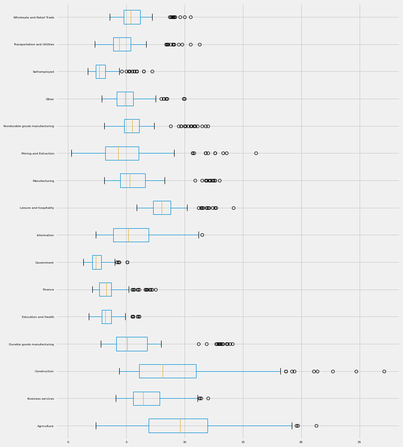
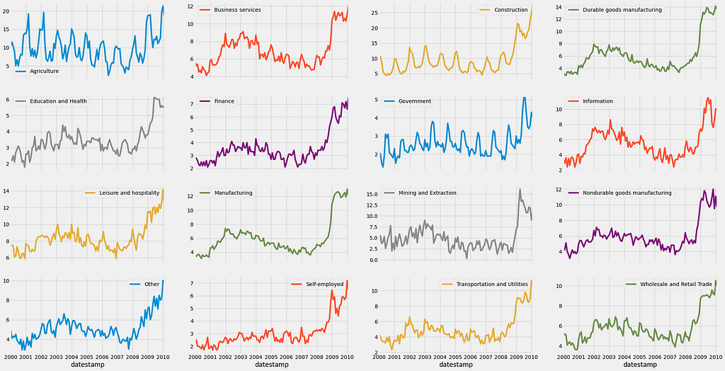
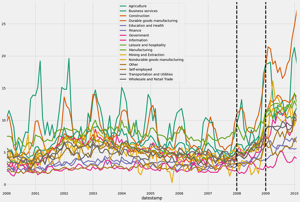
we can also plot a line plot for each feature in one facet plot as the following:
As you can see, the unemployment rate in the USA skyrocketed after the 2008 financial crisis. It is impressive to see how all industries were affected! Since 2008 appears to be the year when the unemployment rate in the USA started increasing, let’s annotate our plot with verticals lines using the familiar axvline notation.
We can also calculate and plot the monthly or daily average of the unemployment rate for each job section as shown before in section 2.
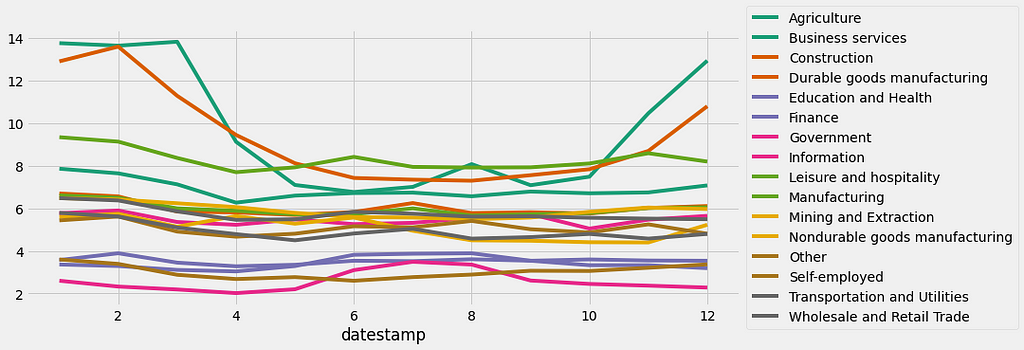
The resulting plot shows some interesting patterns! For example, the unemployment rate for the Agriculture and Construction industries shows significant peaks during the winter months, which is consistent with the idea that these industries will far less active during the cold weather months!
5.2. Seasonality, trend, and noise in the time-series data
In the previous subsection, we extract interesting patterns and seasonality from some of the time series in the jobs dataset. In section 3, the concept of time series decomposition was introduced, which allows us to automatically extract the seasonality, trend, and noise of the time series.
In the code below, we will begin by initializing a my_dict dictionary and extracting the column names of the jobs dataset.
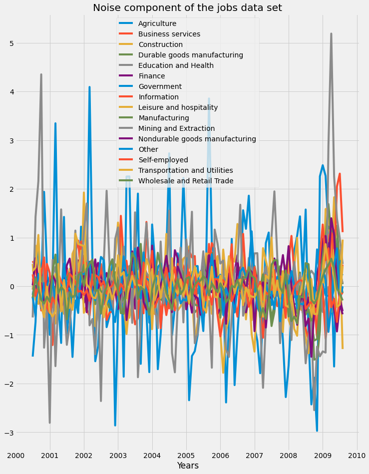
Then, we will use a “for” loop to iterate through the columns of df and apply the seasonal_decompose() function from the statsmodels library, which is stored in my_dict. Then we will extract the trend component and store it in a new Dataframe and plot it.
Let's now plot the three components. First is the seasonal component of the jobs dataset:
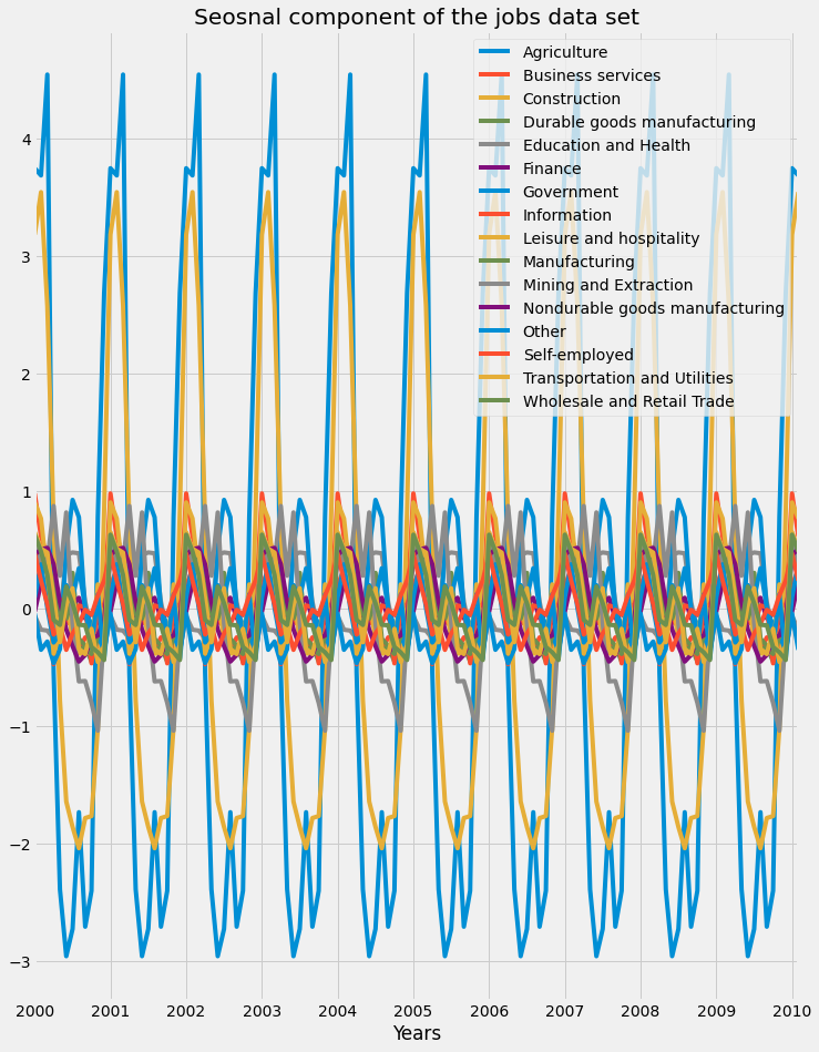
We can see that certain industries were more affected by seasonality than the others, as we saw that the Agriculture and Construction industries saw rises in unemployment rates during the colder months of winter. Next, the trend component of the jobs dataset is plotted:
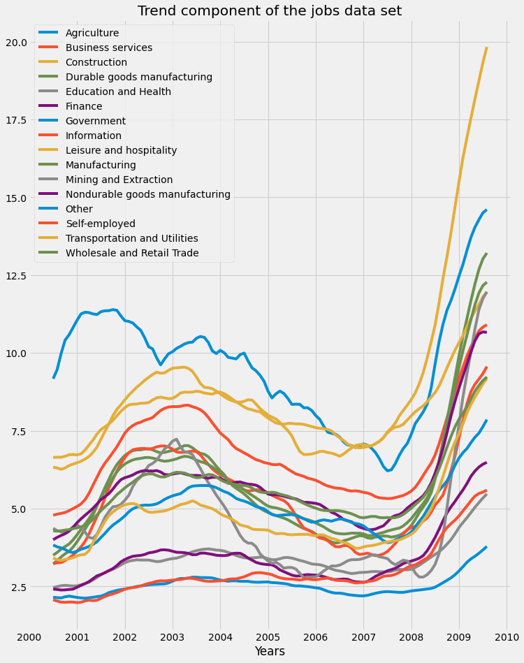
We can see how the financial crisis of 2008 led to a rise in unemployment rates across all industries. Finally, the residual component of the jobs dataset is plotted:
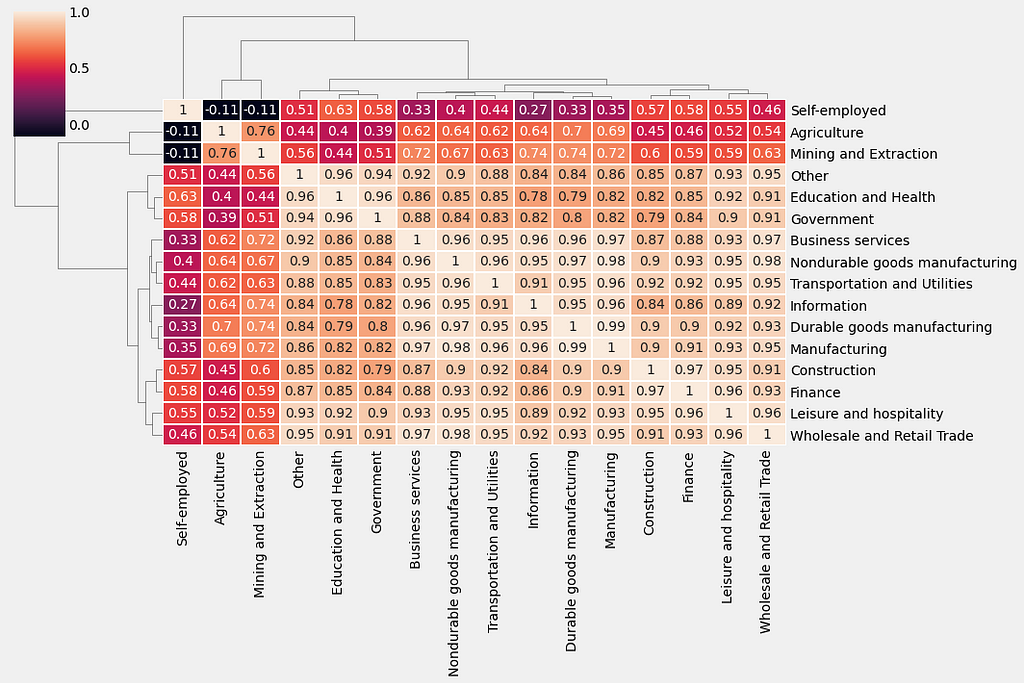
5.3. Compute the correlations between time series of jobs dataset
First, compute the correlation between all columns in the trend_df DataFrame using the spearman method and assign the results to a new variable called trend_corr. Then, generate a clustermap() of the correlation matrix trend_corr by using the clustermap function from the seaborn library. Lines 3 and 4 specify a rotation angle of 0 to the y-axis labels and a rotation angle of 90 to the x-axis labels.
References
[1]. https://app.datacamp.com/learn/courses/visualizing-time-series-data-in-python
Thanks for reading! If you like the article make sure to clap (up to 50!) and connect with me on LinkedIn and follow me on Medium to stay updated with my new articles.
Time Series Data Visualization In Python was originally published in Towards AI on Medium, where people are continuing the conversation by highlighting and responding to this story.
Join thousands of data leaders on the AI newsletter. It’s free, we don’t spam, and we never share your email address. Keep up to date with the latest work in AI. From research to projects and ideas. If you are building an AI startup, an AI-related product, or a service, we invite you to consider becoming a sponsor.
Published via Towards AI
Towards AI Academy
We Build Enterprise-Grade AI. We'll Teach You to Master It Too.
15 engineers. 100,000+ students. Towards AI Academy teaches what actually survives production.
Start free — no commitment:
→ 6-Day Agentic AI Engineering Email Guide — one practical lesson per day
→ Agents Architecture Cheatsheet — 3 years of architecture decisions in 6 pages
Our courses:
→ AI Engineering Certification — 90+ lessons from project selection to deployed product. The most comprehensive practical LLM course out there.
→ Agent Engineering Course — Hands on with production agent architectures, memory, routing, and eval frameworks — built from real enterprise engagements.
→ AI for Work — Understand, evaluate, and apply AI for complex work tasks.
Note: Article content contains the views of the contributing authors and not Towards AI.
Related posts
Recent Posts
")


")


