Taking the Guesswork out of Anomaly Detection: Let Histograms Set the Threshold
Last Updated on December 11, 2023 by Editorial Team
Author(s): Miguel Gutierrez
Originally published on Towards AI.
In the realm of anomaly detection, the pursuit of hidden irregularities is akin to seeking hidden treasures in a vast landscape of data. Yet, even with the most advanced anomaly detection algorithms and techniques at your disposal, there’s a critical decision to be made: Where do you draw the line between what’s considered an anomaly and what’s not?
Welcome to the fascinating world of selecting the anomaly detection threshold, a crucial step in the anomaly detection process. It’s the threshold that determines what gets flagged as unusual and what remains within the bounds of normality. Finding that delicate balance is the key to unlocking valuable insights, from spotting fraudulent transactions to identifying equipment malfunctions and more.
But, as with any adventure, it’s not without its challenges. Selecting the right threshold requires a deep understanding of your data, the specific objectives of your analysis, and a touch of intuition. This decision can make the difference between unleashing the full potential of anomaly detection and drowning in a sea of false alarms.
what’s just normal? This question is at the core of setting the anomaly detection threshold, a vital part of the process that can make or break your anomaly detection system.
In this blog, we’ll explore an easier way to choose the right threshold. We’ll look at a method that uses the distribution of scores in a histogram to do the heavy lifting for you. It’s a game-changer for improving the accuracy of unsupervised anomaly detection.
Histogram cut threshold detection (HCTT)
Typically, when you’re setting up an anomaly detection system, you need to decide whether a data point is an anomaly by giving it a score of 0 or 1. But what if you’re not sure?
Let’s skip the complex model-building part for now and focus on a common challenge: most blogs assume you already know how many anomalies are in your data. But what if you don’t?
That’s where supervised and semi-supervised anomaly detection methods come in handy. They’re like a safety net, but there’s a catch. Data can change over time, so you have to keep an eye on your system and adjust the threshold when things shift. It’s a crucial step that many blogs overlook, but it’s essential in real-world applications.
Join me as we simplify the process of choosing the right threshold for anomaly detection. We’ll break down the complexities and show you how to adapt to changing data. Finding the perfect threshold is like finding your way through a maze, and I am here to guide you.
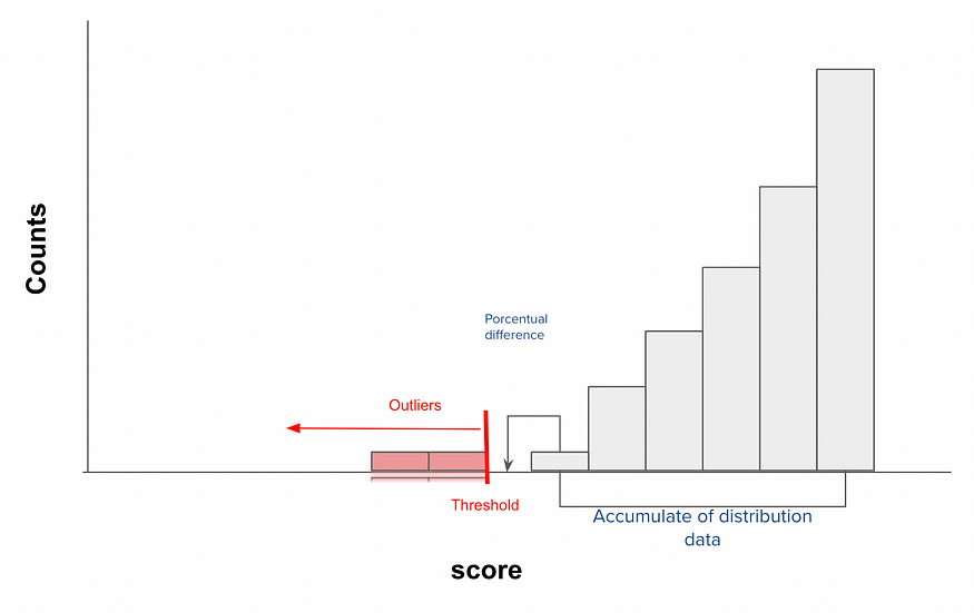
This method is simple, once you adjust your correspoding model to the corresponding data, you will have always a method to determine the anomaly score. For gaussian distribution can be log of probabilities, for K-Means the distance to the centroid, etc. But here is the catch you have now a score do determine if such value makes sense based on the all group and with this is what we are going to work. For such thing we are going to separate the distribution plot on 100 bins, you expect this histogram will reflect change every 1% change on acumulated data and thats where we are going to select the correspoding threshold.

Upon analyzing the histogram, can you discern our direction? Could you suggest a threshold based on the histogram distribution? We can determine a threshold when there’s a noticeable disconnection of scores bins. However, the challenge lies in integrating this into an algorithmic function. We need to define one primary parameter or two optional ones, which can be determined based on your observational insights. The chosen parameters should ideally be robust to changes if set intuitively. These could be the Percentage Difference and Cumulative Distribution of Data (optional).

Percentage Difference Cut: This is the difference in the accumulated proportion between one histogram bin and the next. Please note that the order may vary depending on the algorithm’s use. For instance, if you’re considering a Gaussian Mixture and using log probability, the bin cut should be executed from right to left. On the other hand, if you’re employing Kmeans and measuring the distance to the centroid, the bins should be processed from left to right, viewing left as negative and right as positive values. A setting between 3–6% often yields robust results. This is the point where adding new data doesn’t significantly alter the previously accumulated distribution, so we can decide to make the cut. Any data mapped after this point won’t correspond with the majority.
Cumulative Distribution of Data (Optional): This parameter is primarily based on an intuitive selection of alarms. It can be set as the upper limit of the proportion of outliers that you’re allowing the algorithm to detect. For example, if you don’t want more than 20% of the data to be flagged as outliers, this can act as a secure double-check.
As you can see, this algorithm is straightforward and intuitive. I decided to share this method because I couldn’t find any other transferable detection methods, regardless of the model used. I believe others may find this approach insightful for their purposes.
Let’s give it a try and see how well it performs!
Action !
Example 1: Gaussian Mixture
Let’s begin by working with the Gaussian Mixture Model. We’ll create anomalous observations using the PyOD library. Initially, we’ll generate data where the percentage of outliers stands at 15%. This is the proportion we aim to identify using the proposed algorithm.
import numpy as np
import pandas as pd
import matplotlib.pyplot as plt
from pyod.utils.data import generate_data
from sklearn.mixture import GaussianMixture

contamination = 0.15 # percentage of outliers
n_train = 1000 # number of training points
n_test = 100 # number of testing points
n_features = 6 # number of features
X_train, X_test, y_train, y_test = generate_data(
 n_train=n_train,
 n_test=n_test,
 n_features= n_features,
 contamination=contamination,
 random_state=123)

X_train_pd = pd.DataFrame(X_train)
X_train_pd.head()

From the data we already know which are anomaly(y=1) and which not (y=0). With this, we are going to test if it works. First we adjust a Gaussian Mixture to the model
df_model = X_train_pd
gm = GaussianMixture(n_components = 1, covariance_type = 'full', random_state=0)
gm.fit(df_model)

df_model['log'] = gm.score_samples(df_model)
Now we plot the histogram to check the log probabilities of each value

As we observe a distinct shift at the -5 value, we can infer that anything to the left of -5 could be an outlier. Now, let’s put our cut algorithm into action. We’ll set the Percentage Difference Cut to 0.005 and the Cumulative Distribution of Data to 80%.
perc_dif = 0.0005
cum_perc = 0.8

df_histogram_change = df_model['log'].value_counts(bins=100).sort_index(ascending=False)
df_histogram_change = pd.DataFrame(df_histogram_change)
df_histogram_change['cumsum'] = df_histogram_change['log'].cumsum()
df_histogram_change['index'] = range(len(df_histogram_change))
df_histogram_change['cumsum_diff'] = df_histogram_change['cumsum'].pct_change()
df_histogram_change['interval'] = df_histogram_change.index
df_histogram_change['cum_pct'] = df_histogram_change['cumsum']/sum(df_histogram_change['log'])
df_histogram_change

filter_df = df_histogram_change[(df_histogram_change['cumsum_diff']<perc_dif) & (df_histogram_change['cum_pct']>cum_perc)]
index = filter_df.iloc[0]['index']
tresh = df_histogram_change.index[index].left

df_model = df_model.copy()
df_model['outlier'] = np.where(df_model ['log']<tresh,1,0)
The corresponding histogram dataframe that contains the variables we are interested

Note that “cumsum” represents the cumulative sum from right to left on the histogram plot. “cumsum_diff” refers to the difference between the bins and “cum_pct” represents the percentage of values over the total number of values.
Now we want to determine with this method that the treshold determined by the method is 0.15 (15%)
df_cases = df_model['outlier'].value_counts()
df_cases[1]/sum(df_cases)
#0.15
We can see that the difference between estimated and real values is 0.
Example 2: K-means on Time Series
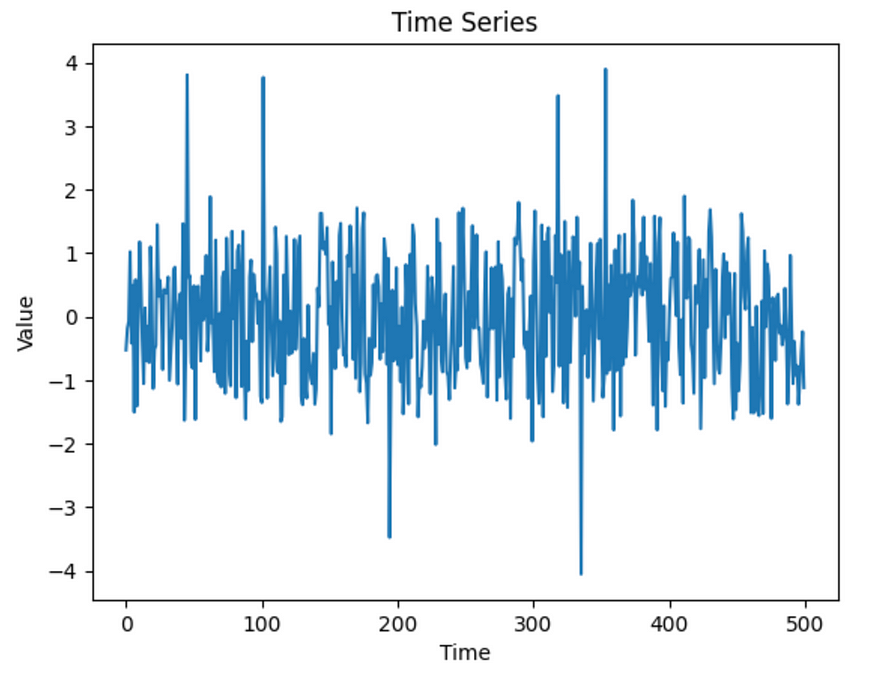
Let’s refine our approach based on the methodology outlined in the associated blog, which employs k-means for analyzing time series data anomalies. However, it becomes evident that there is room for enhancement in the selection of the threshold.
from sklearn.cluster import KMeans
from numpy import sqrt, random, array, argsort
from sklearn.preprocessing import scale
import matplotlib.pyplot as plt
Lets generate the corresponding data
random.seed(123)
def makeData(N):
	x = []
	for i in range(N):
 a = i/1000 + random.uniform(-3, 2)
 r = random.uniform(-5, 10)
 if(r >= 9.9):
 r = r + 10
 elif(r<(-4.8)):
 r = r +(- 10)
 x.append([a + r])
	return array(x)

x = makeData(500)
Lets plot it
x_ax = range(500)
plt.title("Time Series")
plt.xlabel('Time')
plt.ylabel('Value')
plt.plot(x_ax, x)
plt.show()

Lets apply K-means model and scale the dataset to work with this method
x = scale(x)
kmeans = KMeans(n_clusters = 1).fit(x)
center = kmeans.cluster_centers_
distance = sqrt((x - center)**2)
df = pd.DataFrame(x)
df['distance'] = distance
Plot the corresponding histogram of scores
import seaborn as sns

plt.figure(
 figsize=(10, 6), # Set the figure size here
 dpi=100, # Set the dpi (or resolution) here
)

sns.histplot(data=df, x="distance", bins=100)
# Set the subtitle
plt.title(
 "Histogram of Log", # Subtitle text
 fontsize=14, # Set the font size
)

It is crucial to note that this method is designed to operate from left to right, as the magnitude of the score corresponds to a greater distance from the center. Understanding this fundamental aspect is essential for applying the method.
df_histogram_change = df['distance'].value_counts(bins=100).sort_index(ascending=True)
df_histogram_change = pd.DataFrame(df_histogram_change)
df_histogram_change['cumsum'] = df_histogram_change['distance'].cumsum()
df_histogram_change['index'] = range(len(df_histogram_change))
df_histogram_change['cumsum_diff'] = df_histogram_change['cumsum'].pct_change()
df_histogram_change['interval'] = df_histogram_change.index
df_histogram_change['cum_pct'] = df_histogram_change['cumsum']/sum(df_histogram_change['distance'])
df_histogram_change

filter_df = df_histogram_change[(df_histogram_change['cumsum_diff']<0.0005) & (df_histogram_change['cum_pct']>0.8)]
index = filter_df.iloc[0]['index']
tresh = df_histogram_change.index[index].left

df = df.copy()
df['outlier'] = np.where(df['distance']>tresh,1,0)
#tresh 1.99
The threshold is 1.99, after this everything will be considered outlier
indexes = df[df['outlier']==1].index
values = df.loc[indexes,0]
Now we plot the outliers and voila ! Works like charm

In the dynamic landscape of anomaly detection, where distinguishing between normal and unusual data is crucial, the process of setting the anomaly detection threshold takes center stage. This blog delves into the intricacies of this decision-making, emphasizing its pivotal role in unlocking valuable insights, from detecting fraudulent transactions to identifying equipment malfunctions.
Recognizing the challenges inherent in selecting the right threshold, the blog introduces the Histogram Cut Detection (HCT) method as a game-changing solution. HCT simplifies the threshold-setting process by utilizing the distribution of scores in a histogram, offering a more accessible and accurate approach to unsupervised anomaly detection.
The method, demonstrated through examples like Gaussian Mixture and K-Means models, involves separating the distribution plot into 100 bins, each reflecting a 1% change in accumulated data. This fine-grained analysis allows for an intuitive selection of thresholds based on a noticeable disconnection of scores bins.
The blog introduces key parameters, such as Percentage Difference and Cumulative Distribution of Data, to enhance the algorithm’s adaptability and robustness to changes. These parameters add an intuitive layer to threshold determination, ensuring the algorithm remains effective over time.
In practical application, the blog showcases the method’s simplicity and effectiveness, encouraging readers to test its performance in their specific anomaly detection scenarios. The demonstrated examples illustrate the method’s applicability to various models and highlight its potential for widespread use.
In conclusion, the Histogram Cut Detection method offers a straightforward, intuitive, and transferable approach to anomaly detection threshold setting. Shared with the aim of benefiting others in the field, the blog encourages readers to explore and implement this method in their own anomaly detection endeavors.
Join thousands of data leaders on the AI newsletter. Join over 80,000 subscribers and keep up to date with the latest developments in AI. From research to projects and ideas. If you are building an AI startup, an AI-related product, or a service, we invite you to consider becoming a sponsor.
Published via Towards AI
Towards AI Academy
We Build Enterprise-Grade AI. We'll Teach You to Master It Too.
15 engineers. 100,000+ students. Towards AI Academy teaches what actually survives production.
Start free — no commitment:
→ 6-Day Agentic AI Engineering Email Guide — one practical lesson per day
→ Agents Architecture Cheatsheet — 3 years of architecture decisions in 6 pages
Our courses:
→ AI Engineering Certification — 90+ lessons from project selection to deployed product. The most comprehensive practical LLM course out there.
→ Agent Engineering Course — Hands on with production agent architectures, memory, routing, and eval frameworks — built from real enterprise engagements.
→ AI for Work — Understand, evaluate, and apply AI for complex work tasks.
Note: Article content contains the views of the contributing authors and not Towards AI.


