


ROC and AUC for Model Evaluation
Last Updated on January 6, 2023 by Editorial Team
Last Updated on October 7, 2022 by Editorial Team
Author(s): Saurabh Saxena
Originally published on Towards AI the World’s Leading AI and Technology News and Media Company. If you are building an AI-related product or service, we invite you to consider becoming an AI sponsor. At Towards AI, we help scale AI and technology startups. Let us help you unleash your technology to the masses.
Model Evaluation
ROC or Receiver Operating Characteristic Curve is the most frequently used tool for evaluating the binary or multi-class classification model. Unlike other metrics, it is calculated on prediction scores like Precision-Recall Curve instead of prediction class. In my previous post, the importance of the precision-recall curve is highlighted as how to plot for multi-class classification.
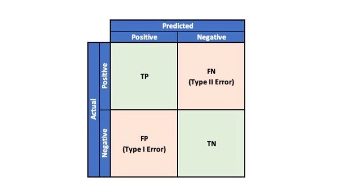
To understand ROC Curve, let’s quickly refresh our memory on the possible outcomes in a binary classification problem by referring to the Confusion Matrix.
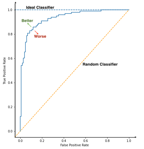
ROC Curve is a plot of True Positive Rate(TPR) plotted against False Positive Rate(FPR) at various threshold values. It helps to visualize how threshold affects classifier performance.
True Positive Rate (TPR) is referred to the proportion of examples of a particular class that has been predicted by the model as belonging to that class. It is also referred to as Recall or Sensitivity.
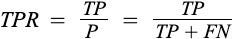
where TP and FN are True Positive and False Negative, respectively.
False Positive Rate (FPR): It is the probability of a person testing positive who does not have a disease. It is also referred to as the fall-out rate.
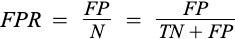
where FP is the number of False Positives and TN is the number of True Negatives.

ROC Curve can also be defined as a Sensitivity vs. 1-Specificity plot.
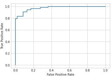
Let’s have a look at ROC Curve for binary classification.
from sklearn.datasets import make_classification
from sklearn.model_selection import train_test_split
from sklearn.linear_model import LogisticRegression
from sklearn.metrics import roc_curve
from sklearn.metrics import RocCurveDisplay
X, y = make_classification(n_samples=500, n_classes=2,
                           random_state=1)
X_train, X_test, y_train, y_test = train_test_split(X, y,
                                                    test_size=.2,
                                                    random_state=2)
lr = LogisticRegression()
lr.fit(X_train, y_train)
y_pred = lr.predict(X_test)
y_pred_prob = lr.predict_proba(X_test)
y_pred_prob = y_pred_prob[:,1]
fpr, tpr, threshold = roc_curve(y_test, y_pred_prob)
plt = RocCurveDisplay(fpr=fpr, tpr=tpr)
plt.plot()
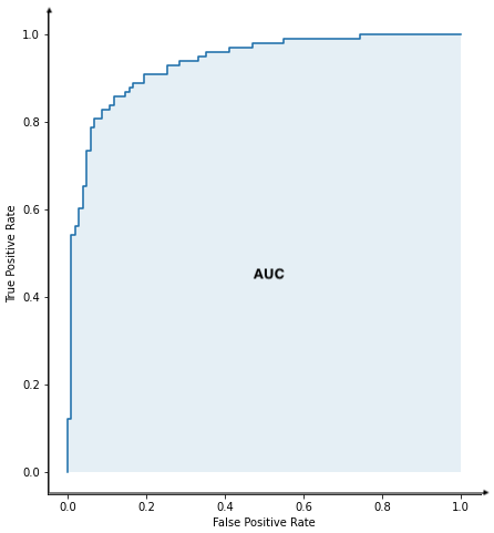
AUC Score
AUC Stands for ‘Area under the curve,’ and it is calculated by the trapezoidal rule of area calculation under any plot. It summarizes the ROC Curve into a single metric for binary classification and each class in a multi-class model. However, to summarize the multi-class into single metric micro, macro, and weighted AUC can be used.
Higher the AUC, the better the classifier. Its value fluctuated between 0(worst model) and 1(ideal model).
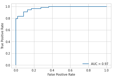
from sklearn.metrics import roc_auc_score
auc = roc_auc_score(y_test, y_pred_prob)
print(auc)
Output:
0.9727017262143718
Let’s have a look at how to plot ROC Curve and calculate AUC Score on a random classification dataset using the sklearn library.
plt = RocCurveDisplay(fpr=fpr, tpr=tpr, roc_auc=auc)
plt.plot()
Why ROC Curve?
ROC is calculated on a precision score, while many metrics like accuracy and precision look at the prediction class. It is a trade-off between Sensitivity(TPR) and 1-Specificity(FPR), allowing one to choose a threshold that keeps a balance between TPR and FPR, which suits the particular problem.
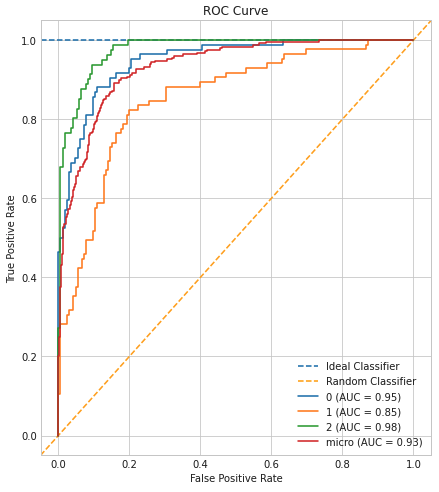
Plotting ROC Curve is a cakewalk for binary problems. However, it daunts professionals to calculate multi-class classification. Below is the method to plot ROC and AUC for multi-class.
Below is the python code to create and plot ROC and AUC for multi-class classification problems.
from sklearn.datasets import make_classification
from sklearn.preprocessing import label_binarize
from sklearn.model_selection import train_test_split
from sklearn.linear_model import LogisticRegression
from sklearn.multiclass import OneVsRestClassifier
# Load Dataset
X, y = make_classification(n_samples=500, n_classes=3,
                           random_state=1, n_informative=3)
y = label_binarize(y, classes=[0,1,2])
X_train, X_test, y_train, y_test = train_test_split(X, y,
                                                    test_size=.5,
                                                    random_state=1)
lr = LogisticRegression()
ovr = OneVsRestClassifier(lr)
ovr.fit(X_train, y_train)
y_pred = ovr.predict(X_test)
y_pred_prob = ovr.predict_proba(X_test)
fpr, tpr, threshold, auc, labels = roc_auc_curve(y_test,
                                                 y_pred_prob,
                                                 labels=[0,1,2])
roc_auc_curve_plot(fpr, tpr, threshold, auc, labels)
References:
[1] ROC Curve. https://scikit-learn.org/stable/modules/generated/sklearn.metrics.roc_curve.html
[2] AUC. https://scikit-learn.org/stable/modules/generated/sklearn.metrics.auc.html
[3] Precision-Recall Curve. https://pub.towardsai.net/precision-recall-curve-26f9e7984add
ROC and AUC for Model Evaluation was originally published in Towards AI on Medium, where people are continuing the conversation by highlighting and responding to this story.
Join thousands of data leaders on the AI newsletter. It’s free, we don’t spam, and we never share your email address. Keep up to date with the latest work in AI. From research to projects and ideas. If you are building an AI startup, an AI-related product, or a service, we invite you to consider becoming a sponsor.
Published via Towards AI
Towards AI Academy
We Build Enterprise-Grade AI. We'll Teach You to Master It Too.
15 engineers. 100,000+ students. Towards AI Academy teaches what actually survives production.
Start free — no commitment:
→ 6-Day Agentic AI Engineering Email Guide — one practical lesson per day
→ Agents Architecture Cheatsheet — 3 years of architecture decisions in 6 pages
Our courses:
→ AI Engineering Certification — 90+ lessons from project selection to deployed product. The most comprehensive practical LLM course out there.
→ Agent Engineering Course — Hands on with production agent architectures, memory, routing, and eval frameworks — built from real enterprise engagements.
→ AI for Work — Understand, evaluate, and apply AI for complex work tasks.
Note: Article content contains the views of the contributing authors and not Towards AI.
Related posts
Recent Posts


")

