


Modelling Time-To-Event Data in Chickens
Last Updated on July 12, 2022 by Editorial Team
Author(s): Dr. Marc Jacobs
Originally published on Towards AI the World’s Leading AI and Technology News and Media Company. If you are building an AI-related product or service, we invite you to consider becoming an AI sponsor. At Towards AI, we help scale AI and technology startups. Let us help you unleash your technology to the masses.
Combining mortality and temperature data for an exciting endeavor
This post will NOT be about Kaplan-Meier or Cox Regression, but about modeling time-to-event data via the Binary, Poisson, or Negative-Binomial way. If you are interested in any of these topics, in different examples, just click on the links attached to them.
What I will add in this post is something additional that can be a real pain in the ass — I am modeling the data coming from a time-series dataset. This means an almost full year of data, coming from laying hens, in which hens died, and when you have almost 20k hens that happen. Even if you do not wish it to be. Now, a well-known catalyst of mortality, or at the very least production loss, is temperature. Despite well-controlled measures to ensure barn temperature is stable, there ARE fluctuations. So, what we will have, as a dataset, are event data (discrete and ordinal) and continuous data. The temp data we have on an hourly basis, and the event data are daily.
Let's see where we end up, but I already know this will not be easy. Love it!
First, the libraries. Always, the libraries!
rm(list = ls())
options("scipen"=100, "digits"=10)
#### LIBRARIES ####
library(readr)
library(readxl)
library(DataExplorer)
library(tidyverse)
library(gridExtra)
library(grid)
library(AzureStor)
library(skimr)
library(lubridate)
library(ggplot2)
pacman::p_load(tidyverse, magrittr) # data wrangling packages
pacman::p_load(lubridate, tsintermittent, fpp3, modeltime,
               timetk, modeltime.gluonts, tidymodels, modeltime.ensemble, modeltime.resample) # time series model packages
pacman::p_load(foreach, future) # parallel functions
pacman::p_load(viridis, plotly) # visualizations packages
theme_set(hrbrthemes::theme_ipsum()) # set default themes
Then, I will load the data from blob storage on Azure into R and take a good look at it.
folder<-setwd(getwd())
name="/DATA.csv"
download_from_url("https://farmresultstals.blob.core.windows.net/xxxx/Location860_day.csv",
                  dest      = paste0(folder,name),
                  overwrite = TRUE,
                  key       = "xxxxxxxxxxxxxxxxxxxxxxxxxxxxxxxxxxx")
day <- read_csv("DATA.csv")
skimr::skim(day)

To get some grip on the data, let's start plotting. Now, the fun part about this dataset is that you easily plot curves resembling survival curves, but the data is not set up in such a way that you can perform survival analysis on it.
day%>%
  dplyr::filter(!lcn_id %in% c('1435'))%>%
                  ggplot(.,
                         aes(x=date_interval,
                             y=animals_actual,
                             colour=as.factor(lcn_id)))+
  geom_line()+
  facet_wrap(~lcn_id, scales="free")+
  labs(x="Time",
       y="Animals",
       col="Barn")+
  theme_bw()
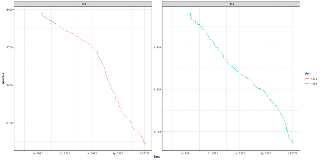
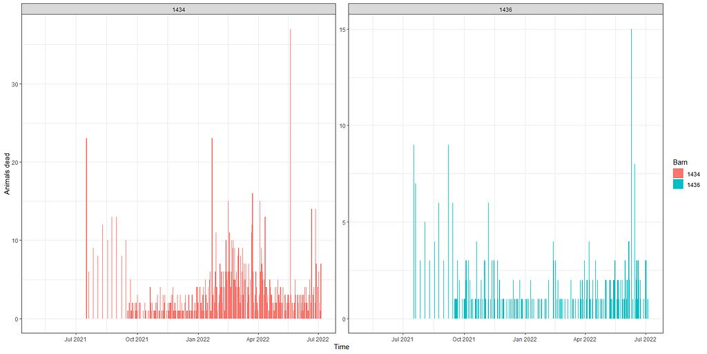
Above you saw the change in actual animals, but down below I will show you the actual deaths per time point. As you can see, the two barns differ in their mortality pattern.
day%>%
  dplyr::group_by(lcn_id)%>%
  dplyr::filter(!lcn_id %in% c('1435'))%>%
  ggplot(.,
         aes(x=date_interval,
             weight=animals_dead,
             fill=as.factor(lcn_id)))+
  geom_bar()+
  facet_wrap(~lcn_id, scales="free")+
  labs(x="Time",
       y="Animals dead",
       fill="Barn")+
  theme_bw()
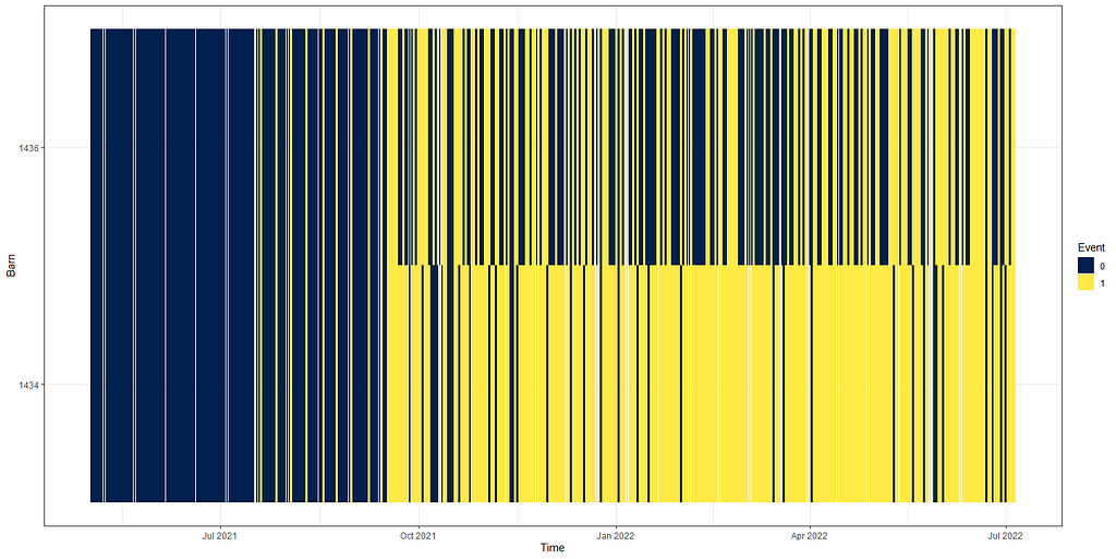
day%>%
  dplyr::group_by(lcn_id)%>%
  dplyr::filter(!lcn_id %in% c('1435'))%>%
  dplyr::select(lcn_id, date_interval, animals_dead)%>%
  replace(is.na(.), 0)%>%
  dplyr::mutate(event = ifelse(animals_dead>0, 1, 0))%>%
  ggplot(.,
         aes(x=date_interval,
             y=as.factor(lcn_id),
             fill=as.factor(event)))+
  geom_tile()+
  scale_fill_viridis_d(option="cividis")+
  labs(x="Time",
       y="Barn",
       fill="Event")+
  theme_bw()
The actual animals across time, however, are not only decimated by death. It can very well be that birds are moved or taken out for whatever reason. Let's take a look at the curves when we only take death as subtraction.
day%>%
  dplyr::filter(!lcn_id %in% c('1435'))%>%
  dplyr::filter_at(vars(animals_start), all_vars(!is.na(.)))%>%
  dplyr::select(lcn_id, date_interval, animals_dead, animals_start, animals_actual)%>%
  replace(is.na(.), 0)%>%
  dplyr::mutate(cum_dead = cumsum(animals_dead),
                animals_by_dead = animals_start-cum_dead)%>%
  ggplot(.,
         aes(x=date_interval))+
  geom_line(aes(y=animals_actual), col="red")+
  geom_line(aes(y=animals_by_dead), col="blue")+
  facet_wrap(~lcn_id, scales="free")+
  labs(x="Time",
       y="Animals")+
  theme_bw()
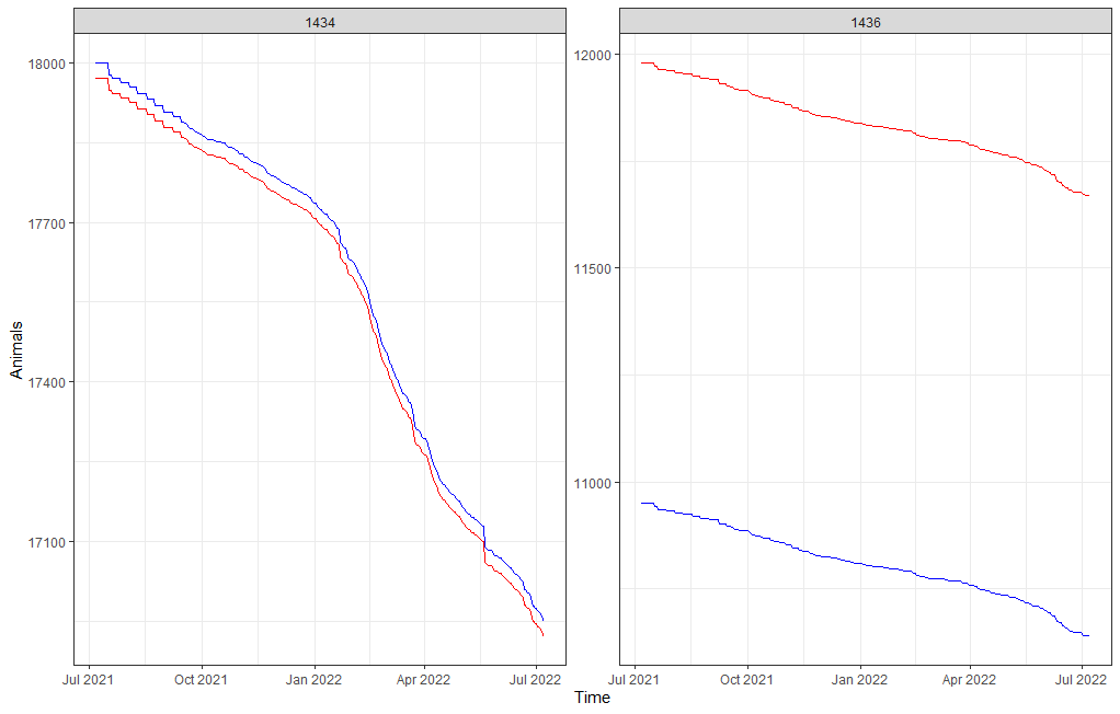
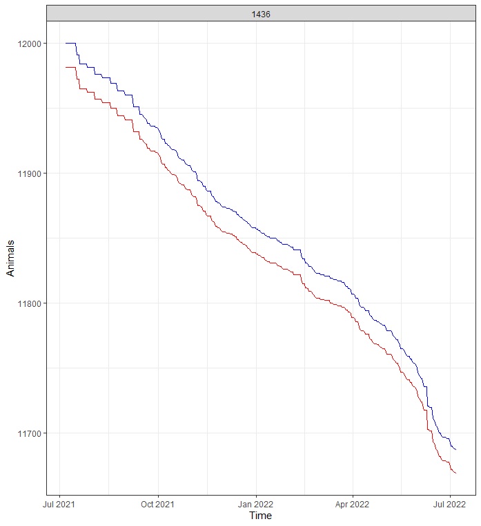
Something went amiss, but below it straightens out. As you can see, the curve obtained by just looking at death is almost parallel to the overall actual animal curve. So nothing to worry about here.
day%>%
  dplyr::filter(lcn_id == c('1436'))%>%
  dplyr::filter_at(vars(animals_start), all_vars(!is.na(.)))%>%
  dplyr::select(lcn_id, date_interval, animals_dead, animals_start, animals_actual)%>%
  replace(is.na(.), 0)%>%
  dplyr::mutate(cum_dead = cumsum(animals_dead),
                animals_by_dead = animals_start-cum_dead)%>%
  ggplot(.,
         aes(x=date_interval))+
  geom_line(aes(y=animals_actual), col="red")+
  geom_line(aes(y=animals_by_dead), col="blue")+
  facet_wrap(~lcn_id, scales="free")+
  labs(x="Time",
       y="Animals")+
  theme_bw()
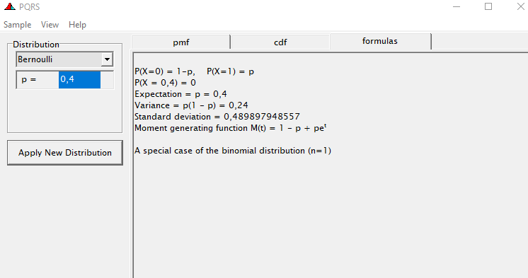
Now, what will make this exercise downright dirty is that I will have to model event data over time but without using survival techniques. Potential options are the binary class or binomial class if I aggregate per week or month. The binary can be a real pain and the model can take ages to run, having to find patterns within the 0’s and 1’s. For those who have forgotten what a Binary or Bernoulli, distribution looks like:
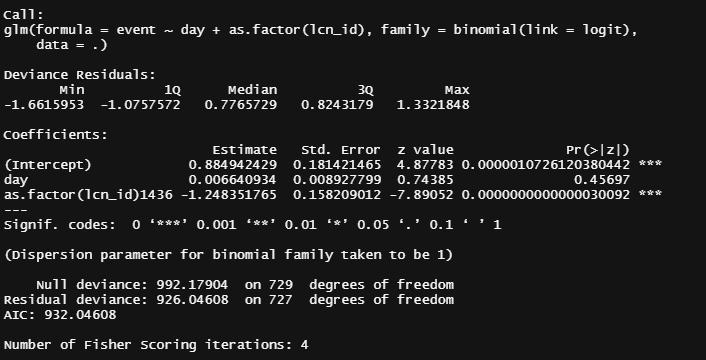
Let's get to the modeling part and run a binary model over time, and see how that goes. Nothing fancy.
day%>%
  dplyr::filter(!lcn_id %in% c('1435'))%>%
  dplyr::filter_at(vars(animals_start), all_vars(!is.na(.)))%>%
  dplyr::mutate(day = lubridate::day(date_interval))%>%
  dplyr::select(lcn_id, day, animals_dead, animals_start, animals_actual)%>%
  replace(is.na(.), 0)%>%
  dplyr::mutate(event = ifelse(animals_dead>0,1,0))%>%
  glm(event~
        day+as.factor(lcn_id),
      family=binomial(link=logit),
      data=.)%>%summary()
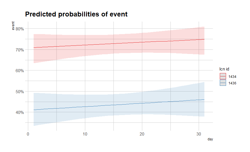
It is always best to plot what the model came up with, the numbers above do not really help I believe.
fit<-day%>%
  dplyr::filter(!lcn_id %in% c('1435'))%>%
  dplyr::filter_at(vars(animals_start), all_vars(!is.na(.)))%>%
  dplyr::mutate(day = lubridate::day(date_interval))%>%
  dplyr::select(lcn_id, day, animals_dead, animals_start, animals_actual)%>%
  replace(is.na(.), 0)%>%
  dplyr::mutate(event = ifelse(animals_dead>0,1,0))%>%
  glm(event~
        day+as.factor(lcn_id),
      family=binomial(link=logit),
      data=.)
plot(fit)
sjPlot::plot_model(fit, type="pred",
                   terms=c("day [all])", "lcn_id"))
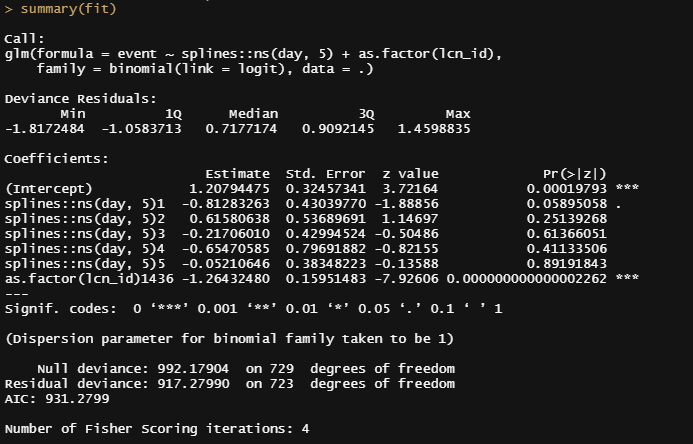
We all know from the previous plots that the pattern is not linear. So what if we add a spline to it? Because we have quite a number of days included in the dataset, we can create a nice spline to the fifth order. Creating a heavier spline would probably require modeling via sine and/or cosine.
fit<-day%>%
dplyr::filter(!lcn_id %in% c('1435'))%>%
dplyr::filter_at(vars(animals_start), all_vars(!is.na(.)))%>%
dplyr::mutate(day = lubridate::day(date_interval))%>%
dplyr::select(lcn_id, day, animals_dead, animals_start, animals_actual)%>%
replace(is.na(.), 0)%>%
dplyr::mutate(event = ifelse(animals_dead>0,1,0))%>%
glm(event~
splines::ns(day,5)+as.factor(lcn_id),
family=binomial(link=logit),
data=.)
summary(fit)
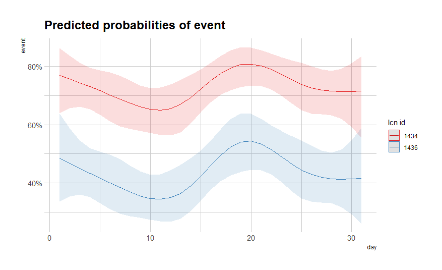
sjPlot::plot_model(fit, type="pred",
terms=c("day [all])", "lcn_id"))
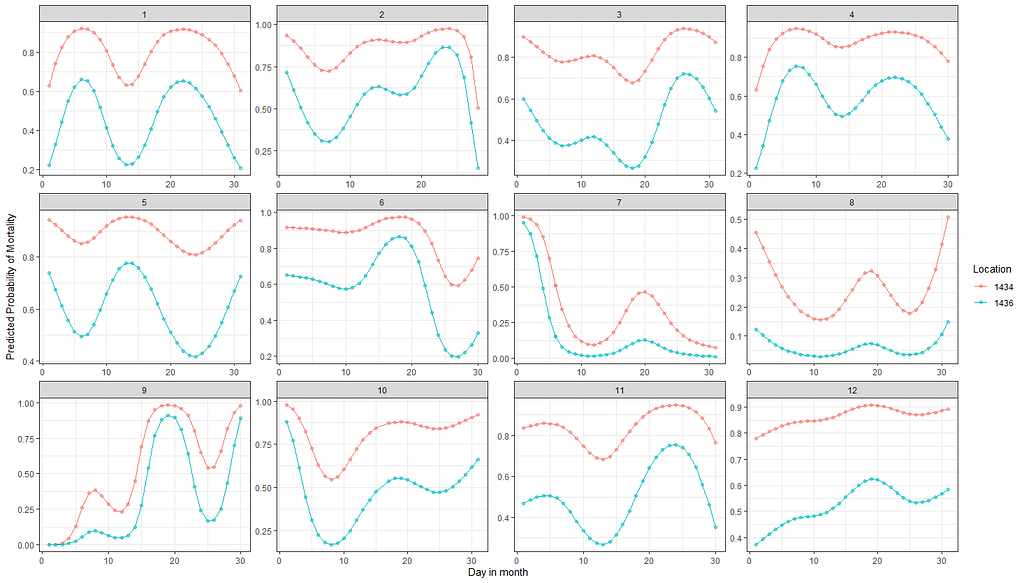
So, let's model it a bit better, taking the month into account, and see what we end up with.
df_fit2<-fit2<-day%>%
  dplyr::filter(!lcn_id %in% c('1435'))%>%
  dplyr::filter_at(vars(animals_start), all_vars(!is.na(.)))%>%
  dplyr::mutate(day = lubridate::day(date_interval),
                month=lubridate::month(date_interval))%>%
  dplyr::select(lcn_id, day, month, animals_dead, animals_start, animals_actual)%>%
  replace(is.na(.), 0)%>%
  dplyr::mutate(event = ifelse(animals_dead>0,1,0))%>%
  dplyr::select(lcn_id, day, month, event)
pred<-plogis(predict(fit2, newdata=df_fit2))
plot(pred)
df_fit2_combined<-cbind(df_fit2, pred)
ggplot(df_fit2_combined,
       aes(x=day, y=pred, col=as.factor(lcn_id)))+
  geom_point(alpha=0.5)+
  geom_line()+
  facet_wrap(~month, scales="free")+
  labs(x="Day in month", y="Predicted Probability of Mortality", col="Location")+
  theme_bw()
fit3<-glm(event~
      splines::ns(day,5)*as.factor(month)*as.factor(lcn_id),
    family=binomial(link=logit),
    data=df_fit2)

We can specify in the model which interactions we want to have and so I chose to interact day*lcn_id and month*lcn_id. What I will get is not that much different from what I already had.
fit3<-glm(event~
      splines::ns(day,5) + as.factor(month) + as.factor(lcn_id) +
        splines::ns(day,5):as.factor(lcn_id) + as.factor(month):as.factor(lcn_id),
    family=binomial(link=logit),
    data=df_fit2)
summary(fit3)
pred_fit3<-plogis(predict(fit3, newdata=df_fit2))
plot(pred_fit3)
df_fit3_combined<-cbind(df_fit2, pred_fit3)
ggplot(df_fit3_combined,
       aes(x=day, y=pred, col=as.factor(lcn_id)))+
  geom_point(alpha=0.5)+
  geom_line()+
  facet_wrap(~month, scales="free")+
  labs(x="Day in month", y="Predicted Probability of Mortality", col="Location")+
  theme_bw()
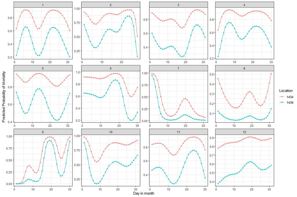
Let's compare the models we have up until now.
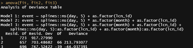
Then again, perhaps they are all really not that helpful, considering that more than one bird can die in a day and we did not take into account the fact that we start with 18k birds, to begin with. So the chance of dying is certainly not 80% and the fact that we will encounter dead birds over the course of time is a certainty (that is actually what the 80% stands for). Hence, the high probability, and time to move to the Binomial and Poisson distribution and calculate some ratios and rates.
fit<-day%>%
  dplyr::filter(!lcn_id %in% c('1435'))%>%
  dplyr::filter_at(vars(animals_start), all_vars(!is.na(.)))%>%
  dplyr::mutate(day = lubridate::day(date_interval),
                month=lubridate::month(date_interval))%>%
  dplyr::select(lcn_id, day, month, animals_dead)%>%
  replace(is.na(.), 0)%>%
  glm(animals_dead~
        splines::ns(day,5)*as.factor(month)+as.factor(lcn_id),
      family=poisson(link=log),
      data=.)
summary(fit)
sjPlot::plot_model(fit)

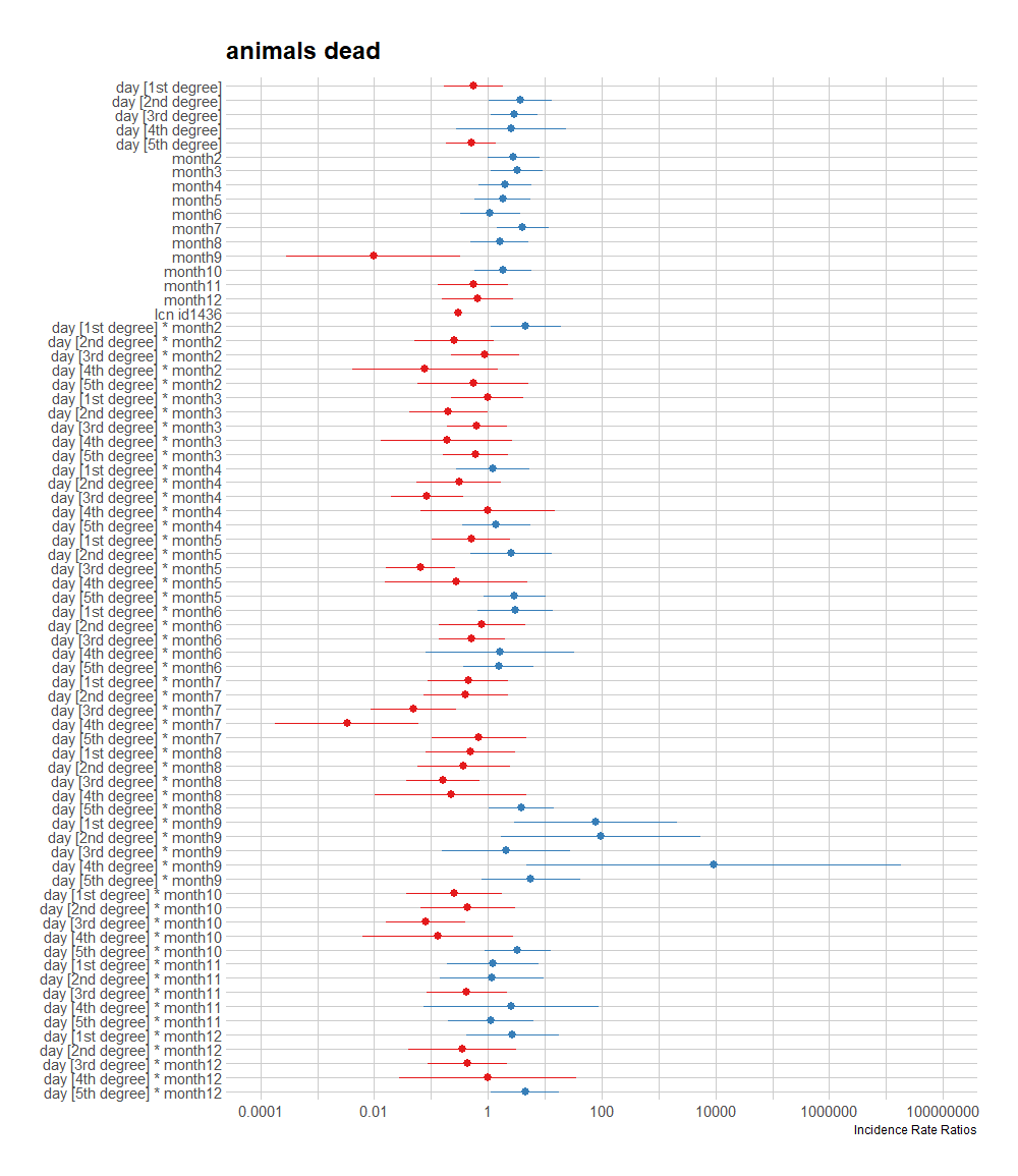
A plot coming from the sjPlot package is giving me issues if I want to plot everything, so all the parameters. What I can do, for now, is look at the predicted counts, average per month, and per location. There seems to be a pattern, but I am highly uncertain if that pattern is indeed any good.
sjPlot::plot_model(fit, type="pred",
                   terms=c("month", "lcn_id"))
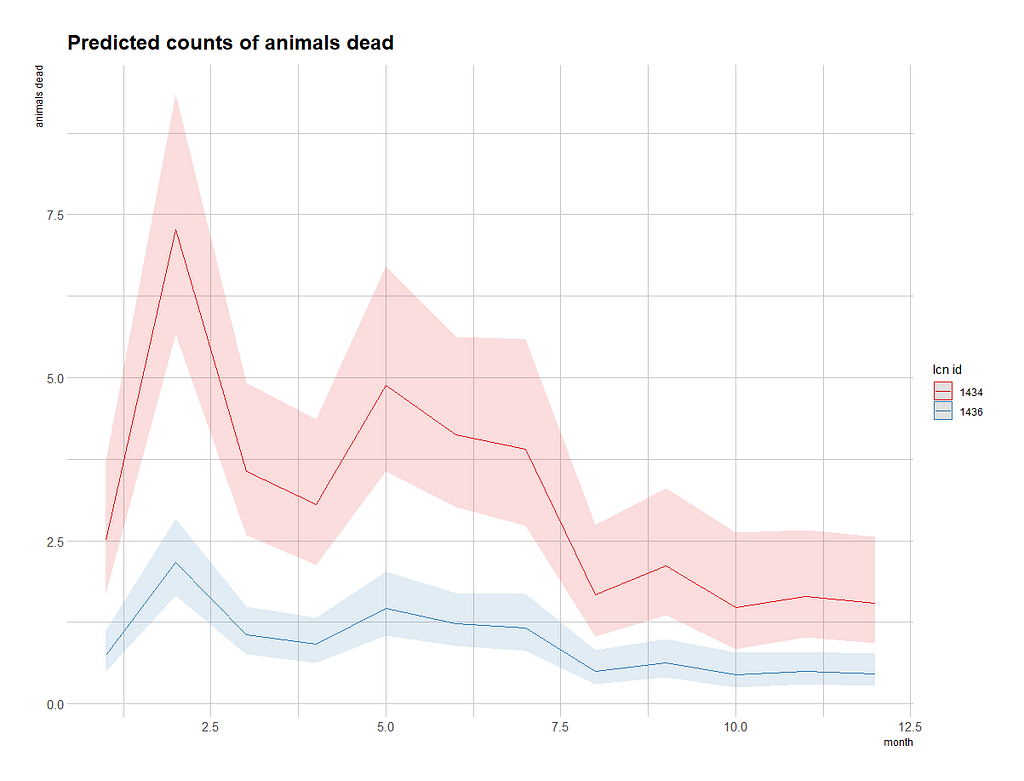
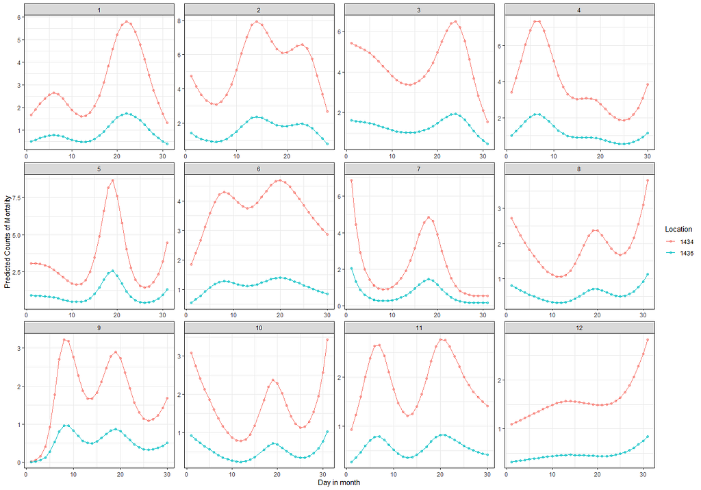
To get a better view of the conditional effect, I am going to ask R to give me the predicted count which I will obtain by exponentiating the log value I receive from glm. This way I will be able to plot across all potential influencers counts and see if they make sense.
df_pois<-day%>%
  dplyr::filter(!lcn_id %in% c('1435'))%>%
  dplyr::filter_at(vars(animals_start), all_vars(!is.na(.)))%>%
  dplyr::mutate(day = lubridate::day(date_interval),
                month=lubridate::month(date_interval))%>%
  dplyr::select(lcn_id, day, month, animals_dead)%>%
  replace(is.na(.), 0)
fit<-glm(animals_dead~
           splines::ns(day,5)*as.factor(month)+as.factor(lcn_id),
         family=poisson(link=log),
         data=df_pois)
pred_fit<-exp(predict(fit,newdata=df_pois))
df_fit_combined<-cbind(df_pois, pred_fit)
ggplot(df_fit_combined,
       aes(x=day,
           y=pred_fit,
           col=as.factor(lcn_id)))+
  geom_point(alpha=0.5)+
  geom_line()+
  facet_wrap(~month, scales="free")+
  labs(x="Day in month",
       y="Predicted Counts of Mortality",
       col="Location")+
  theme_bw()

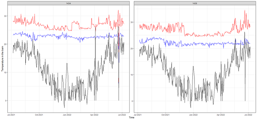
From the beginning, I mentioned that I want to connect the mortality numbers to temperature since heat stress is a known cause of the severe disruption. To protect from that barns have highly sensitive monitoring systems that control the temperature. We will see that later in the plots as well. Below, I will show you the minimum and maximum temp in the barn, and the actual temp outside.
day%>%
  dplyr::filter(!lcn_id %in% c('1435'))%>%
  dplyr::filter_at(vars(animals_start), all_vars(!is.na(.)))%>%
  dplyr::select(lcn_id, date_interval, t_min_in, t_max_in, t_act_out)%>%
  replace(is.na(.), 0)%>%
  ggplot(.,
         aes(x=date_interval))+
  geom_line(aes(y=t_max_in), col="red")+
  geom_line(aes(y=t_min_in), col="blue")+
  geom_line(aes(y=t_act_out), col="black")+
  facet_wrap(~lcn_id, scales="free")+
  labs(x="Time",
       y="Temperature in the barn")+
  theme_bw()
Keep in mind that time-series data, such as temperature data, have components in them that are not directly visible. It could very well be that I need to disentangle these components, for instance, some form of seasonality or cyclical pattern, to connect the temperature data to the event data. Also, we have the data on a daily level. I do have access to hourly data, but that would add more complexity to the analysis. Let's keep it in the back of our minds though.
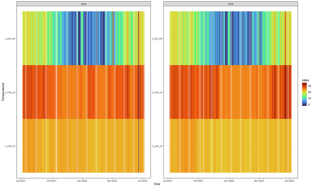
First, I want to visualize the data in a more easy-to-read way and heatmaps do the trick.
day%>%
  dplyr::filter(!lcn_id %in% c('1435'))%>%
  dplyr::filter_at(vars(animals_start), all_vars(!is.na(.)))%>%
  dplyr::select(lcn_id, date_interval, t_min_in, t_max_in, t_act_out)%>%
  replace(is.na(.), 0)%>%
  reshape2::melt(id.vars=c("lcn_id", "date_interval"))%>%
  ggplot(.,
         aes(x=date_interval,
             y=variable,
             fill=value))+
  geom_tile()+
  scale_fill_viridis_c(option="turbo")+
  facet_wrap(~lcn_id, scales="free")+
  labs(x="Time",
       y="Temperatures")+
  theme_bw()
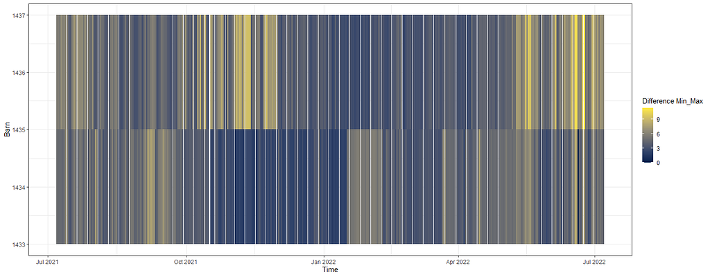
Perhaps the temperature itself is not THAT important but rather the difference between. So let's plot that as well, taking a different coloring scheme from viridis.
day%>%
  dplyr::filter(!lcn_id %in% c('1435'))%>%
  dplyr::filter_at(vars(animals_start), all_vars(!is.na(.)))%>%
  dplyr::select(lcn_id, date_interval, t_min_in, t_max_in)%>%
  replace(is.na(.), 0)%>%
  dplyr::mutate(diff=t_max_in-t_min_in)%>%
  dplyr::select(lcn_id, date_interval, diff)%>%
  ggplot(.,
         aes(x=date_interval,
             y=lcn_id,
             fill=diff))+
  geom_tile()+
  scale_fill_viridis_c(option="cividis")+
  labs(x="Time",
       y="Barn",
       fill="Difference Min_Max")+
  theme_bw()
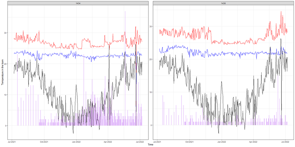
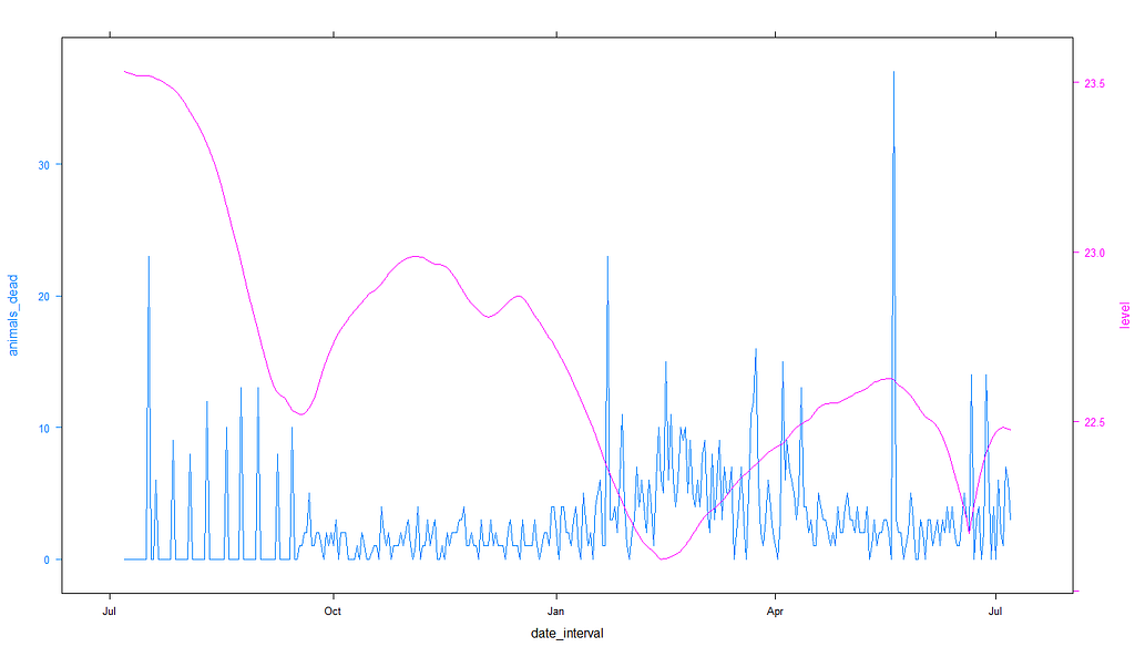
Below, I will show you a way to place everything into one chart — events and temperature combined.
day%>%
  dplyr::filter(!lcn_id %in% c('1435'))%>%
  dplyr::filter_at(vars(animals_start), all_vars(!is.na(.)))%>%
  dplyr::select(lcn_id, date_interval, animals_dead, t_min_in, t_max_in, t_act_out)%>%
  replace(is.na(.), 0)%>%
  ggplot(.,
         aes(x=date_interval))+
  geom_line(aes(y=t_max_in), col="red")+
  geom_line(aes(y=t_min_in), col="blue")+
  geom_line(aes(y=t_act_out), col="black")+
  geom_linerange(aes(ymin=0, ymax=animals_dead),
           col="purple",alpha=0.3, size=1)+
  facet_wrap(~lcn_id, scales="free")+
  labs(x="Time",
       y="Temperature in the barn")+
  theme_bw()
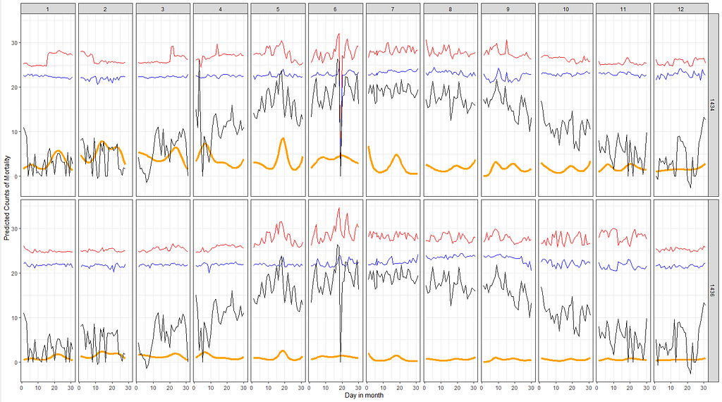
Let's combined the Poisson model predictions with the data and see if that will help us. Compared to the graph above the Poisson model should provide us with splines and I want to see if they follow the temperature. Do note that the model DOES NOT contain temperature of difference in temperature as a predictor. Not yet.
df_pois<-day%>%
  dplyr::filter(!lcn_id %in% c('1435'))%>%
  dplyr::filter_at(vars(animals_start), all_vars(!is.na(.)))%>%
  dplyr::mutate(day = lubridate::day(date_interval),
                month=lubridate::month(date_interval))%>%
  dplyr::select(lcn_id, day, month, animals_dead,
                t_min_in, t_max_in, t_act_out)%>%
  replace(is.na(.), 0)
fit<-glm(animals_dead~
           splines::ns(day,5)*as.factor(month)+as.factor(lcn_id),
         family=poisson(link=log),
         data=df_pois)
pred_fit<-exp(predict(fit,newdata=df_pois))
df_fit_combined<-cbind(df_pois, pred_fit)
ggplot(df_fit_combined,
       aes(x=day,
           y=pred_fit,
           group=lcn_id,
           ))+
  geom_line(col="orange", size=1.5)+
  geom_line(aes(y=t_max_in), col="red")+
  geom_line(aes(y=t_min_in), col="blue")+
  geom_line(aes(y=t_act_out), col="black")+
  facet_grid(lcn_id~month)+
  labs(x="Day in month",
       y="Predicted Counts of Mortality",
       col="Predicted Deaths")+
  theme_bw()
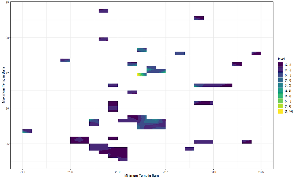
Next up I want to see if I can connect the actual temperature data to the events that took place. I will add splines here as well which will make the model heavy but we have sufficient spread to get it done. At least, I hope.
df_pois<-day%>%
  dplyr::filter(!lcn_id %in% c('1435'))%>%
  dplyr::filter_at(vars(animals_start), all_vars(!is.na(.)))%>%
  dplyr::mutate(day = lubridate::day(date_interval),
                month=lubridate::month(date_interval))%>%
  dplyr::select(lcn_id, day, month, animals_dead,
                t_min_in, t_max_in, t_act_out)%>%
  replace(is.na(.), 0)
fit<-glm(animals_dead~
           splines::ns(day,5)*as.factor(month)+
           splines::ns(t_min_in,5)+
           splines::ns(t_max_in,5)+
           as.factor(lcn_id),
         family=poisson(link=log),
         data=df_pois)
summary(fit)
pred_fit<-exp(predict(fit,newdata=df_pois))
df_fit_combined<-cbind(df_pois, pred_fit)
ggplot(df_fit_combined,
       aes(x=t_min_in,
           y=t_max_in,
           z=pred_fit))+
  geom_contour_filled()+
  labs(x="Minimum Temp in Barn",
       y="Maximum Temp in Barn",
       z="Predicted deaths")+
  theme_bw()
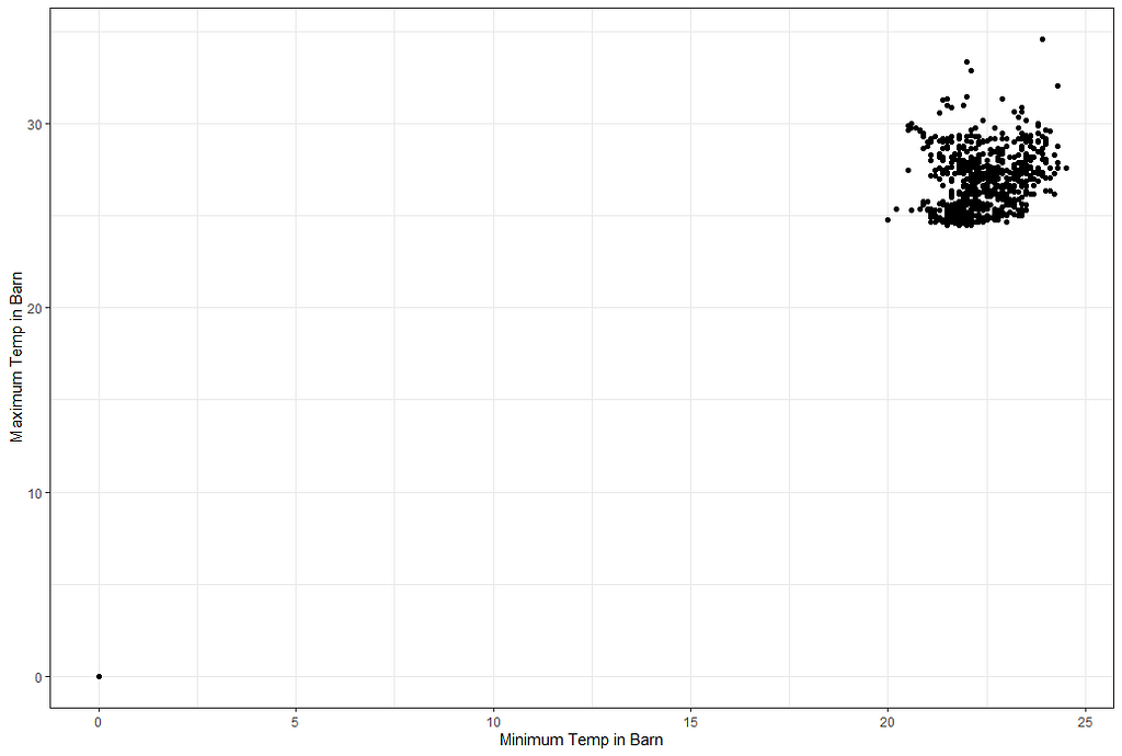
But first, I will plot the raw data to see why I have so many gaps.
ggplot(df_pois,
       aes(x=t_min_in,
           y=t_max_in))+
  geom_point()+
  labs(x="Minimum Temp in Barn",
       y="Maximum Temp in Barn")+
  theme_bw()
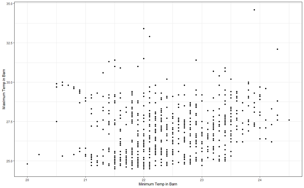
I will try again, deleting some data, to see if I can get a better view now. As you can see I am doing a lot of dplyr actions now. I just love dplyr!
df_pois<-day%>%
  dplyr::filter(!lcn_id %in% c('1435'))%>%
  dplyr::filter_at(vars(animals_start), all_vars(!is.na(.)))%>%
  dplyr::mutate(day = lubridate::day(date_interval),
                month=lubridate::month(date_interval))%>%
  dplyr::select(lcn_id, day, month, animals_dead,
                t_min_in, t_max_in, t_act_out)%>%
  replace(is.na(.), 0)%>%
  dplyr::filter(t_min_in>0)%>%
  dplyr::filter(t_max_in>0)
fit<-glm(animals_dead~splines::ns(t_min_in,5)+
           splines::ns(t_max_in,5)+
           as.factor(lcn_id),
         family=poisson(link=log),
         data=df_pois)
summary(fit)
pred_fit<-exp(predict(fit,newdata=df_pois))
df_fit_combined<-cbind(df_pois, pred_fit)
ggplot(df_fit_combined,
       aes(x=t_min_in,
           y=t_max_in,
           z=pred_fit))+
  geom_contour_filled()+
  geom_point(data=df_pois, alpha=0.1)+
  labs(x="Minimum Temp in Barn",
       y="Maximum Temp in Barn",
       z="Predicted deaths")+
  theme_bw()
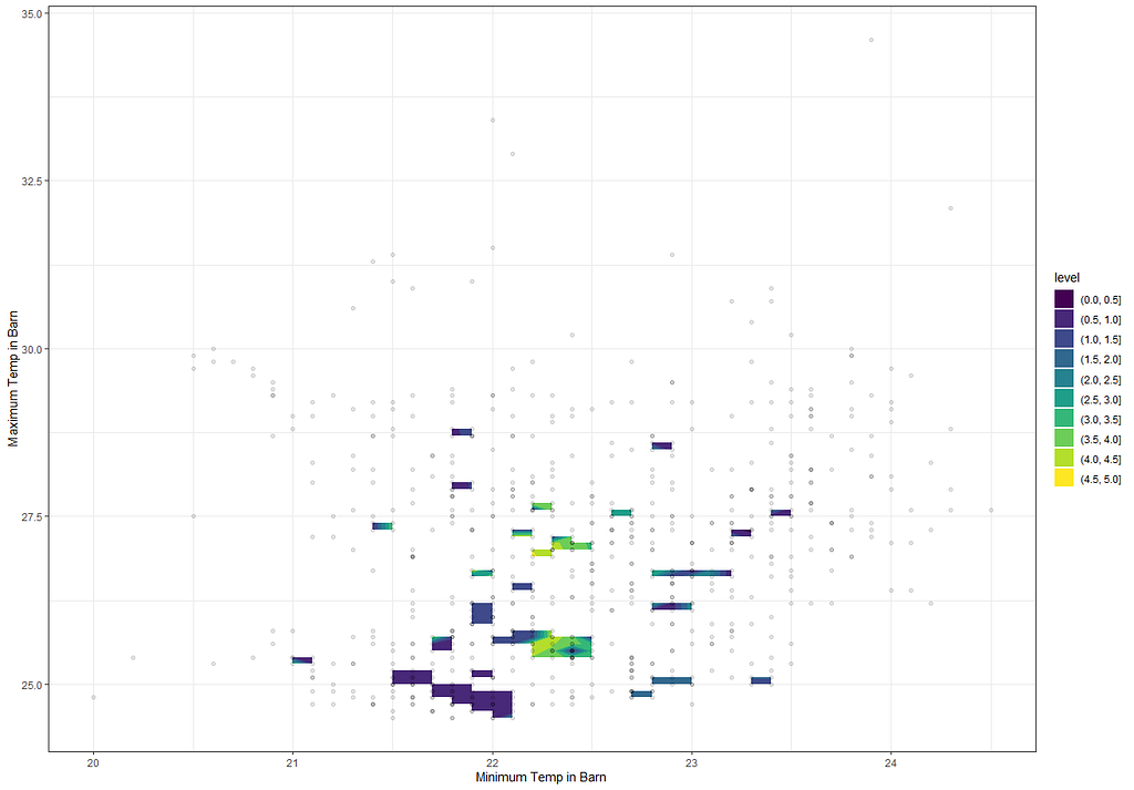
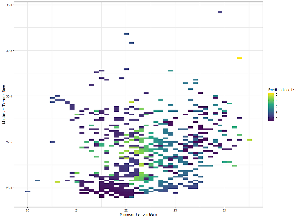
Perhaps I need to plot differently. The problem with contour plots is that it looks for connections and hence we will get gaps if no such connection is feasible. Let's go for a different way of visualizing, using geom_raster.
ggplot(df_fit_combined,
       aes(x=t_min_in,
           y=t_max_in,
           fill=pred_fit))+
  geom_raster()+
  scale_fill_viridis_c()+
  labs(x="Minimum Temp in Barn",
       y="Maximum Temp in Barn",
       fill="Predicted deaths")+
  theme_bw()
g1<-ggplot(df_fit_combined,
       aes(x=t_min_in,
           y=t_max_in,
           fill=pred_fit))+
  geom_raster()+
  scale_fill_viridis_c()+
  labs(x="Minimum Temp in Barn",
       y="Maximum Temp in Barn",
       fill="Predicted deaths")+
  theme_bw()+
  theme(legend.position="bottom")
g2<-ggplot(df_fit_combined,
       aes(x=t_min_in,
           y=t_max_in,
           fill=animals_dead))+
  geom_raster()+
  scale_fill_viridis_c()+
  labs(x="Minimum Temp in Barn",
       y="Maximum Temp in Barn",
       fill="Predicted deaths")+
  theme_bw()+
  theme(legend.position="bottom")
grid.arrange(g1,g2,ncol=2)
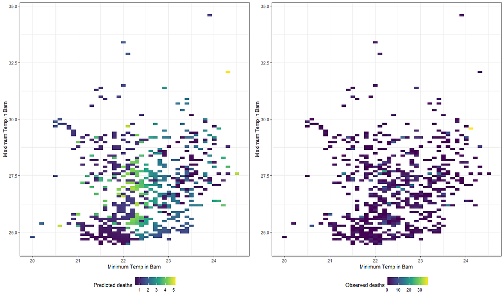
Will it stick if I differentiate per location?
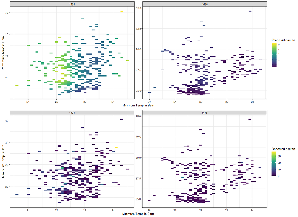
g3<-ggplot(df_fit_combined,
           aes(x=t_min_in,
               y=t_max_in,
               fill=pred_fit))+
  geom_raster()+
  scale_fill_viridis_c()+
  labs(x="Minimum Temp in Barn",
       y="Maximum Temp in Barn",
       fill="Predicted deaths")+
  theme_bw()+
  facet_wrap(~lcn_id, scales="free")+
  theme(legend.position="right")
g4<-ggplot(df_fit_combined,
           aes(x=t_min_in,
               y=t_max_in,
               fill=animals_dead))+
  geom_raster()+
  scale_fill_viridis_c()+
  labs(x="Minimum Temp in Barn",
       y="Maximum Temp in Barn",
       fill="Observed deaths")+
  theme_bw()+
  facet_wrap(~lcn_id, scales="free")+
  theme(legend.position="right")
grid.arrange(g3,g4,ncol=1)
Alright, so let's park this and move to the difference between temperatures. Perhaps this will give us more ease in modeling.
df_pois<-day%>%
dplyr::filter(!lcn_id %in% c('1435'))%>%
dplyr::filter_at(vars(animals_start), all_vars(!is.na(.)))%>%
dplyr::select(lcn_id, date_interval, animals_dead, t_min_in, t_max_in)%>%
replace(is.na(.), 0)%>%
dplyr::mutate(diff=t_max_in-t_min_in,
day = lubridate::day(date_interval),
month=lubridate::month(date_interval))%>%
dplyr::select(lcn_id, day, month, diff, animals_dead, date_interval)
fit<-glm(animals_dead~
splines::ns(day,5)*
splines::ns(diff,5)+
as.factor(month)+
as.factor(lcn_id),
family=poisson(link=log),
data=df_pois)
summary(fit)
pred_fit<-exp(predict(fit,newdata=df_pois))
df_fit_combined<-cbind(df_pois, pred_fit)
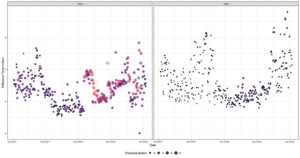
ggplot(df_fit_combined,
aes(x=date_interval,
y=diff,
size=pred_fit,
col=pred_fit))+
geom_point(alpha=0.7)+
scale_color_viridis_c(option="magma")+
facet_wrap(~lcn_id)+
labs(x="Date",
y="Difference Temp in Barn",
size="Predicted deaths")+
theme_bw()+
theme(legend.position="bottom")+
guides(color = FALSE)
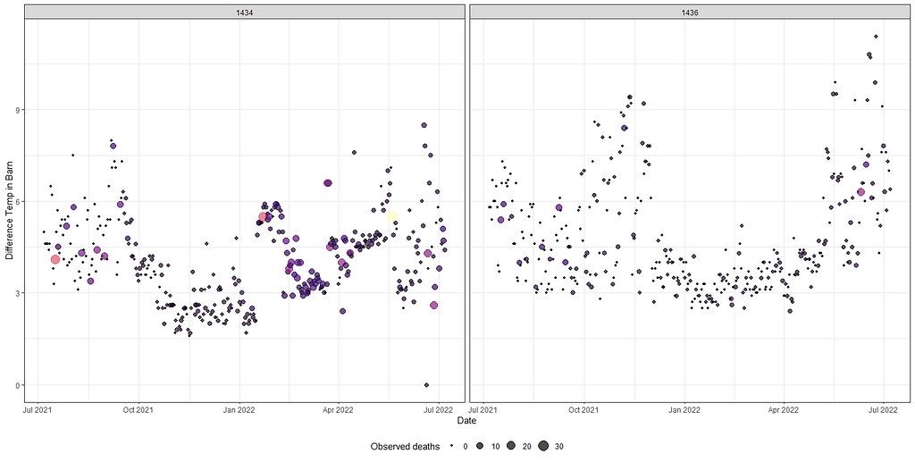
ggplot(df_fit_combined,
       aes(x=date_interval,
           y=diff,
           size=animals_dead,
           col=animals_dead))+
  geom_point(alpha=0.7)+
  scale_color_viridis_c(option="magma")+
  facet_wrap(~lcn_id)+
  labs(x="Date",
       y="Difference Temp in Barn",
       size="Observed deaths")+
  theme_bw()+
  theme(legend.position="bottom")+
  guides(color = FALSE)
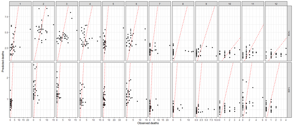
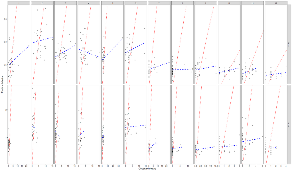
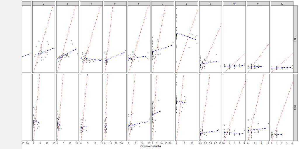
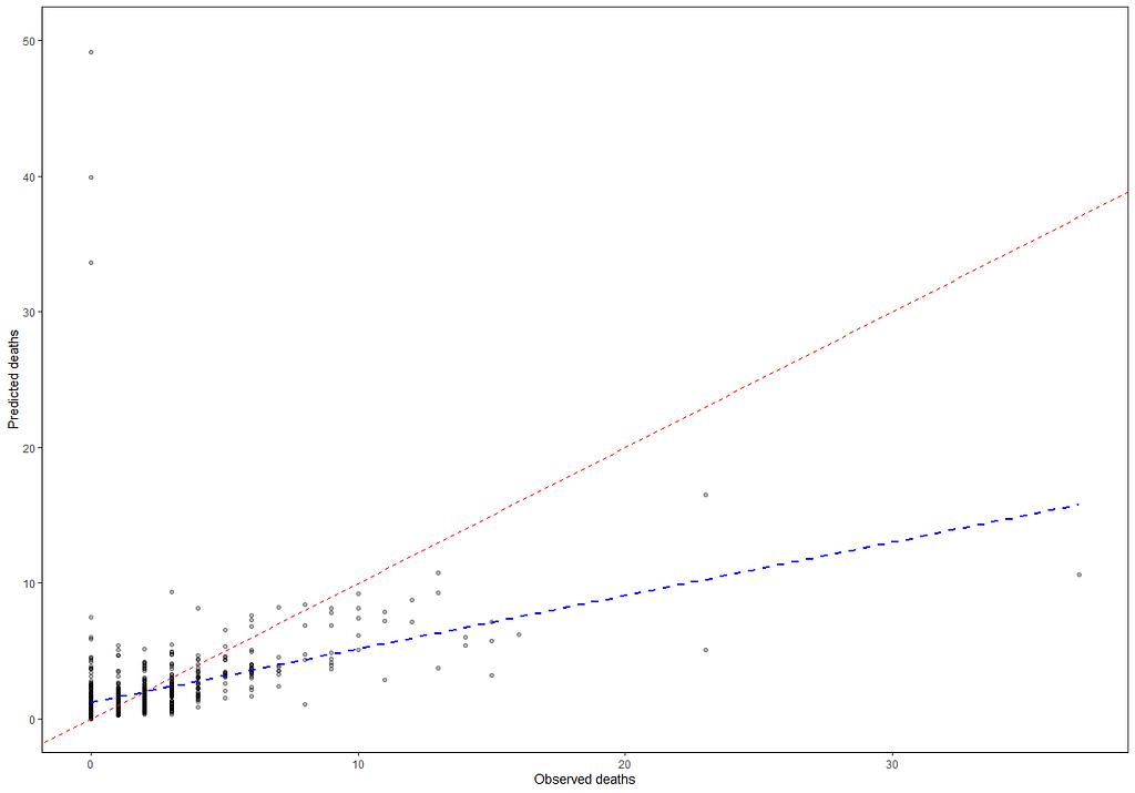
A decent way to look at the performance of a model is to draw up a calibration plot.
ggplot(df_fit_combined,
       aes(x=animals_dead,
           y=pred_fit))+
  geom_point(alpha=0.7)+
  geom_abline(intercept = 0, slope=1, lty=2, col="red")+
  facet_grid(lcn_id~month, scales="free")+
  labs(x="Observed deaths",
       y="Predicted deaths")+
  theme_bw()+
  theme(legend.position="bottom")
ggplot(df_fit_combined,
       aes(x=animals_dead,
           y=pred_fit))+
  geom_point(alpha=0.3)+
  geom_abline(intercept = 0, slope=1, lty=2, col="red")+
  geom_smooth(method='lm', lty=2, col="blue", se=FALSE)+
  facet_grid(lcn_id~month, scales="free")+
  labs(x="Observed deaths",
       y="Predicted deaths")+
  theme_bw()+
  theme(panel.grid.major = element_blank(), panel.grid.minor = element_blank(),
        panel.background = element_blank(), axis.line = element_line(colour = "black"))+
  theme(legend.position="bottom")
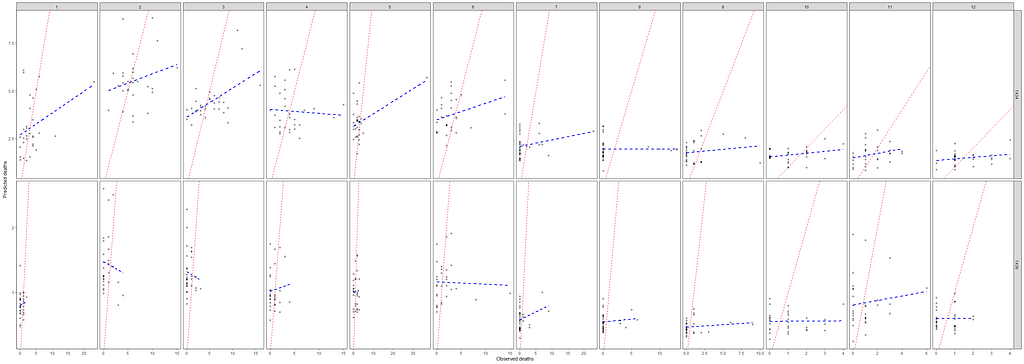
Okay, so we need to improve and I will start first by getting rid of the Poisson distribution. It was a nice start, but time to explore others like the Negative Binomial. For that, I will use the MASS package which has glm.nb.
df_pois<-day%>%
  dplyr::filter(!lcn_id %in% c('1435'))%>%
  dplyr::filter_at(vars(animals_start), all_vars(!is.na(.)))%>%
  dplyr::select(lcn_id, date_interval, animals_dead, t_min_in, t_max_in)%>%
  replace(is.na(.), 0)%>%
  dplyr::mutate(diff=t_max_in-t_min_in,
                day = lubridate::day(date_interval),
                month=lubridate::month(date_interval))%>%
  dplyr::select(lcn_id, day, month, diff, animals_dead, date_interval)
fit<-MASS::glm.nb(animals_dead~
           splines::ns(day,5)*
           splines::ns(diff,5)+
           as.factor(month)+
           as.factor(lcn_id),
         data=df_pois)
summary(fit)
pred_fit<-exp(predict(fit,newdata=df_pois))
df_fit_combined<-cbind(df_pois, pred_fit)
ggplot(df_fit_combined,
       aes(x=animals_dead,
           y=pred_fit))+
  geom_point(alpha=0.3)+
  geom_abline(intercept = 0, slope=1, lty=2, col="red")+
  geom_smooth(method='lm', lty=2, col="blue", se=FALSE)+
  facet_grid(lcn_id~month, scales="free")+
  labs(x="Observed deaths",
       y="Predicted deaths")+
  theme_bw()+
  theme(panel.grid.major = element_blank(), panel.grid.minor = element_blank(),
        panel.background = element_blank(), axis.line = element_line(colour = "black"))+
  theme(legend.position="bottom")
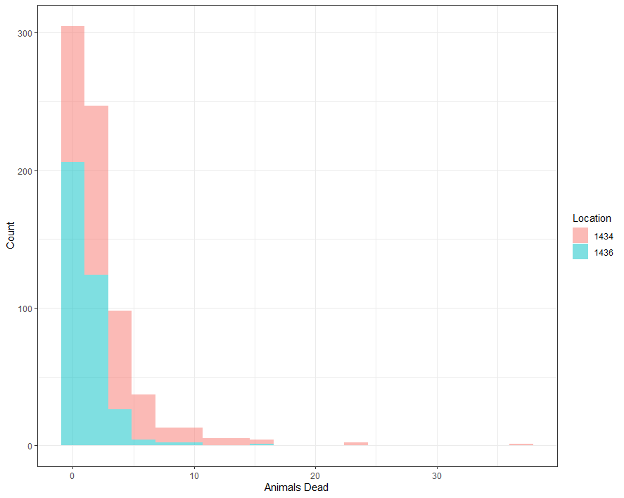
Perhaps, I should deal with the zero inflation which I am suspecting I stepped over because of the focus on date, day, and time.
ggplot(df_pois, aes(x=animals_dead,
                    fill=as.factor(lcn_id)))+
  geom_histogram(alpha=0.5, bins=20)+
  theme_bw()+
  labs(x="Animals Dead",
       y="Count",
       fill="Location")
I have recently posted about zero-inflated models, analyzing them in a Bayesian way. They are not easy as they break up the model into two — one part to predict a zero or non-zero death and the other on how many non-zero’s. I will use the pscl package for a standard glm approach to a zero-inflated Poisson model. What you will see me do is copy the previous model, but also add a specific model for the zero part. Here, I chose month.
fit<-pscl::zeroinfl(animals_dead~
           splines::ns(day,5)*
           splines::ns(diff,5)+
           as.factor(month)+
           as.factor(lcn_id) | month, data = df_pois)
summary(fit)

And now, let's check performance.
pred_fit<-predict(fit,newdata=df_pois)
df_fit_combined<-cbind(df_pois, pred_fit)
ggplot(df_fit_combined,
       aes(x=animals_dead,
           y=pred_fit))+
  geom_point(alpha=0.3)+
  geom_abline(intercept = 0, slope=1, lty=2, col="red")+
  geom_smooth(method='lm', lty=2, col="blue", se=FALSE)+
  facet_grid(lcn_id~month, scales="free")+
  labs(x="Observed deaths",
       y="Predicted deaths")+
  theme_bw()+
  theme(panel.grid.major = element_blank(), panel.grid.minor = element_blank(),
        panel.background = element_blank(), axis.line = element_line(colour = "black"))+
  theme(legend.position="bottom")
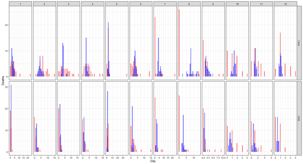
ggplot(df_fit_combined)+
  geom_histogram(aes(x=animals_dead), fill="red", alpha=0.5)+
  geom_histogram(aes(x=pred_fit), fill="blue", alpha=0.5)+
  facet_grid(lcn_id~month, scales="free")+
  labs(x="Day",
       y="Deaths",
       main="Predicted (blue) vs Observed (red) Deaths from a Zero-Inflated Poisson model")+
  theme_bw()
The model runs but checking the predicted vs the observed deaths does not really give me the feeling this model is doing any better. Perhaps it is time to recheck the model in its entirety because that location parameter, lcn_id, seems to have a massive main impact but in this model, I have nothing to interact it with.
fit2<-pscl::zeroinfl(animals_dead~
                      splines::ns(day,5)*
                      splines::ns(diff,5)+
                      as.factor(month) +
                       splines::ns(day,5):as.factor(month)  +
                      as.factor(lcn_id) | month, data = df_pois)
summary(fit2)
AIC(fit); AIC(fit2)
pred_fit<-predict(fit2,newdata=df_pois)
df_fit_combined<-cbind(df_pois, pred_fit)
ggplot(df_fit_combined,
       aes(x=animals_dead,
           y=pred_fit))+
  geom_point(alpha=0.3)+
  geom_abline(intercept = 0, slope=1, lty=2, col="red")+
  geom_smooth(method='lm', lty=2, col="blue", se=FALSE)+
  labs(x="Observed deaths",
       y="Predicted deaths")+
  theme_bw()+
  theme(panel.grid.major = element_blank(), panel.grid.minor = element_blank(),
        panel.background = element_blank(), axis.line = element_line(colour = "black"))+
  theme(legend.position="bottom")+
  ylim(0,50)
ggplot(df_fit_combined)+
  geom_histogram(aes(x=animals_dead), fill="red", alpha=0.5)+
  geom_histogram(aes(x=pred_fit), fill="blue", alpha=0.5)+
  labs(x="Deaths",
       y="Frequency",
       title="Predicted (blue) vs Observed (red) Deaths from a Zero-Inflated Poisson model")+
  theme_bw()+
  xlim(0,30)

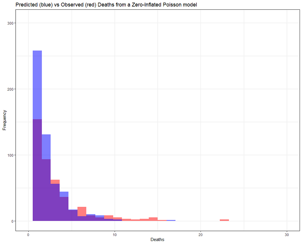
But still, enough room for improvement as well. It is really not that easy to predict event data such as this.
ggplot(df_fit_combined)+
  geom_histogram(aes(x=animals_dead), fill="red", alpha=0.5)+
  geom_histogram(aes(x=pred_fit), fill="blue", alpha=0.5)+
  facet_grid(lcn_id~month, scales="free")+
  labs(x="Day",
       y="Frequency",
       main="Predicted (blue) vs Observed (red) Deaths from a Zero-Inflated Poisson model")+
  theme_bw()+
  xlim(0,30)
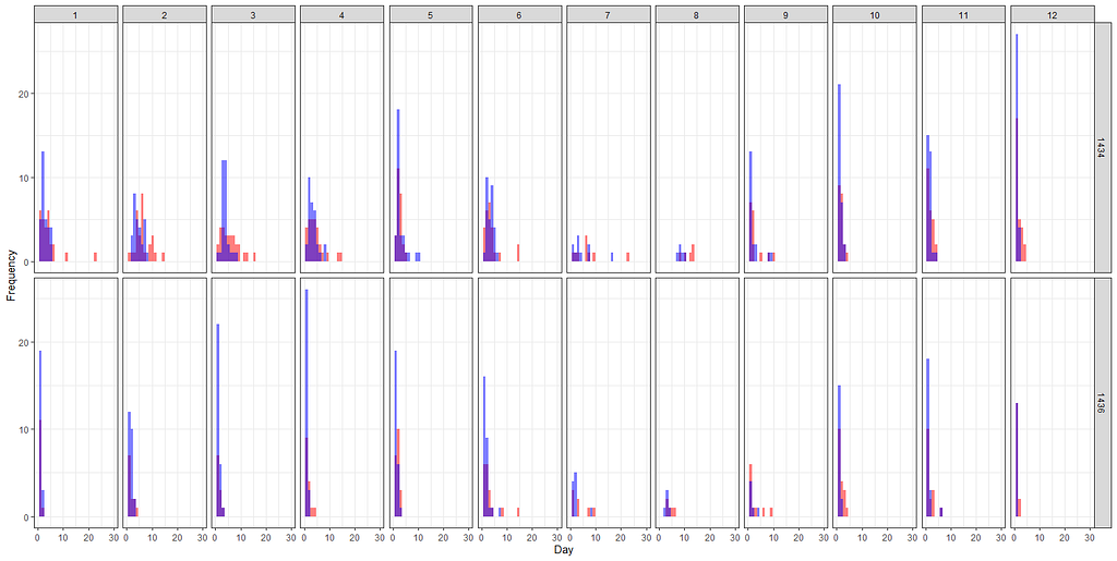
Let's add day as a variable to the zero part.
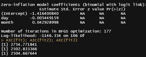
fit3<-pscl::zeroinfl(animals_dead~
                       splines::ns(day,5)*
                       splines::ns(diff,5)+
                       as.factor(month) +
                       splines::ns(day,5):as.factor(month)  +
                       as.factor(lcn_id) | day + month,
                     dist="poisson",
                     link="log",
                     data = df_pois)
summary(fit3)
AIC(fit); AIC(fit2); AIC(fit3)
And we will do another round of modeling, this time referring back to the original temperatures and including more interactions, now with the location. Because we know that day, month and location differentiate the data.
df_pois<-day%>%
  dplyr::filter(!lcn_id %in% c('1435'))%>%
  dplyr::filter_at(vars(animals_start), all_vars(!is.na(.)))%>%
  dplyr::mutate(day = lubridate::day(date_interval),
                month=lubridate::month(date_interval))%>%
  dplyr::select(lcn_id, day, month, animals_dead,
                t_min_in, t_max_in, t_act_out)%>%
  replace(is.na(.), 0)%>%
  dplyr::filter(t_min_in>0)%>%
  dplyr::filter(t_max_in>0)
fit4<-pscl::zeroinfl(animals_dead~
                       splines::ns(day,5)*
                       splines::ns(t_min_in,5)+
                       splines::ns(t_max_in,5)+
                       splines::ns(t_act_out,5)+
                       as.factor(month) +
                       splines::ns(day,5):as.factor(month)+
                       as.factor(lcn_id) + as.factor(month):as.factor(lcn_id)|
                       day + month,
                     dist="poisson",
                     link="log",
                     data = df_pois)
summary(fit4)
AIC(fit); AIC(fit2); AIC(fit3); AIC(fit4)
pred_fit<-predict(fit4,newdata=df_pois)
df_fit_combined<-cbind(df_pois, pred_fit)
ggplot(df_fit_combined,
       aes(x=animals_dead,
           y=pred_fit))+
  geom_point(alpha=0.3)+
  geom_abline(intercept = 0, slope=1, lty=2, col="red")+
  geom_smooth(method='lm', lty=2, col="blue", se=FALSE)+
  labs(x="Observed deaths",
       y="Predicted deaths")+
  theme_bw()+
  theme(panel.grid.major = element_blank(), panel.grid.minor = element_blank(),
        panel.background = element_blank(), axis.line = element_line(colour = "black"))+
  theme(legend.position="bottom")+
  ylim(0,30)+
  xlim(0,30)
ggplot(df_fit_combined,
       aes(x=animals_dead,
           y=pred_fit))+
  geom_point(alpha=0.3)+
  geom_abline(intercept = 0, slope=1, lty=2, col="red")+
  geom_smooth(method='lm', lty=2, col="blue", se=FALSE)+
  labs(x="Observed deaths",
       y="Predicted deaths")+
  facet_grid(lcn_id~month, scales="free")+
  theme_bw()+
  theme(panel.grid.major = element_blank(), panel.grid.minor = element_blank(),
        panel.background = element_blank(), axis.line = element_line(colour = "black"))+
  theme(legend.position="bottom")+
  ylim(0,10)+
  xlim(0,10)
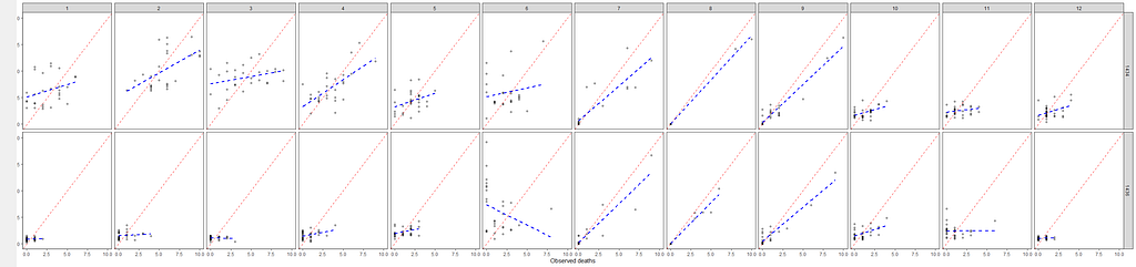
It is safe to say that I will get anywhere close to where I want to go if I keep up this way. Diverting to the negative-binomial really did not do anything to shift the predictive power of the model. So, what I want to do is now is see if I can get more signal from the temperature data which means applying decomposition methods.
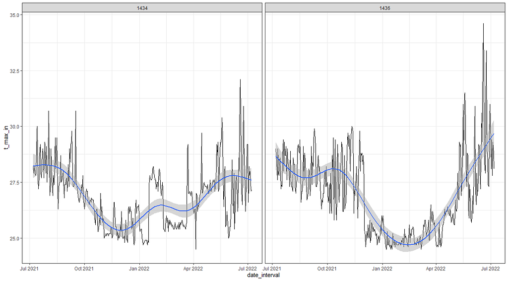
If we look back at the temperature data it is easy to see there is much going on, but what I tried to do up until now is cover that with a 5-knot splines. Lets just see how that looks. Remember, a 5-knot natural spline means 7 degrees of freedom.
day%>%
  dplyr::filter(!lcn_id %in% c('1435'))%>%
  dplyr::filter_at(vars(animals_start), all_vars(!is.na(.)))%>%
  dplyr::select(lcn_id, date_interval, animals_dead,
                t_min_in, t_max_in, t_act_out)%>%
  replace(is.na(.), 0)%>%
  dplyr::filter(t_min_in>0)%>%
  dplyr::filter(t_max_in>0)%>%
  ggplot(., aes(x=date_interval,
                y=t_max_in))+
  geom_line()+
  geom_smooth(method = "lm",
              formula = y ~ splines::ns(x, df = 7))+
  facet_wrap(~lcn_id)+
  theme_bw()
So, let's see if we can use time-series decomposition. I will start with a univariate time series, taking the minimum temperature at barn 1436. Then I will run a decomp on it.
df<-day%>%
dplyr::filter(lcn_id=='1436')%>%
dplyr::filter_at(vars(animals_start), all_vars(!is.na(.)))%>%
dplyr::select(lcn_id, date_interval, animals_dead, t_min_in, t_max_in)%>%
replace(is.na(.), 0)
min(lubridate::date(df$date_interval))
max(lubridate::date(df$date_interval))
myts<-ts(df$t_min_in,
start=c(lubridate::year(min(df$date_interval)),lubridate::yday(min(df$date_interval))),
end=c(lubridate::year(max(df$date_interval)),lubridate::yday(max(df$date_interval))),
frequency=365)
class(myts)
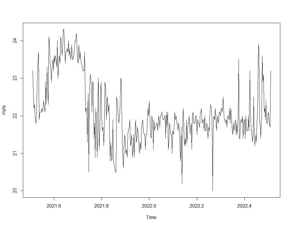
plot(myts)
decomp<-stats::decompose(myts)
plot(decomp)

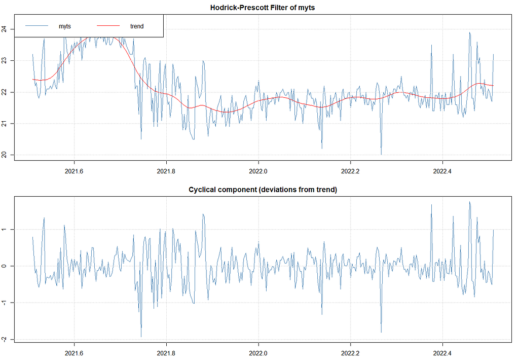
I found another method to look for extracting components, especially cycles, called the Hodrick-Prescott filter. First time I heard about it, so let's see what it does. Its application is pretty easy as are most R functions. Like I said before, there is surely a danger in that.
p_min_temp<-mFilter::hpfilter(myts, freq = 1600)
plot(hp_min_temp)
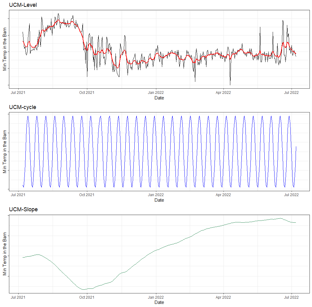
The above looks good, but I remembered that there is an even better method which is to analyze the univariate time series via Unobserved Component Models (UCMs). I have blogged about that method before and what I like about it is that it works exactly like the decomposition method, with the exception that you can tweak the components, set them to zero or fixed variances, and this model with them. Let's give that a shot.
Below, I will run a UCM where I ask for level, slope, and cycle components. The cycle period is set at 12, which means 12 days. I am also asking for an irregular component that mimics irregularities which are basically deviations.
ucm_min_temp<-rucm::ucm(t_min_in~0,
                        data=df,
                        level=TRUE,
                        slope=TRUE,
                        cycle=TRUE,cycle.period = 12,
                        irregular=TRUE)
ucm_min_temp
g1<-ggplot(df,
       aes(x=date_interval))+
  geom_line(aes(y=t_min_in))+
  geom_line(aes(y=ucm_min_temp$s.level), col="red", size=1)+
  labs(x="Date",
       y="Min Temp in the Barn",
       title="UCM-Level")+
  theme_bw()+
  theme(axis.text.y=element_blank())
g2<-ggplot(df,
       aes(x=date_interval))+
  geom_line(aes(y=ucm_min_temp$s.cycle), col="blue", size=0.5)+
  labs(x="Date",
       y="Min Temp in the Barn",
       title="UCM-cycle")+
  theme_bw()+
  theme(axis.text.y=element_blank())
g3<-ggplot(df,
       aes(x=date_interval))+
  geom_line(aes(y=ucm_min_temp$s.slope), col="seagreen", size=0.5)+
  labs(x="Date",
       y="Min Temp in the Barn",
       title="UCM-Slope")+
  theme_bw()+
  theme(axis.text.y=element_blank())
grid.arrange(g1,g2,g3, nrow=3)
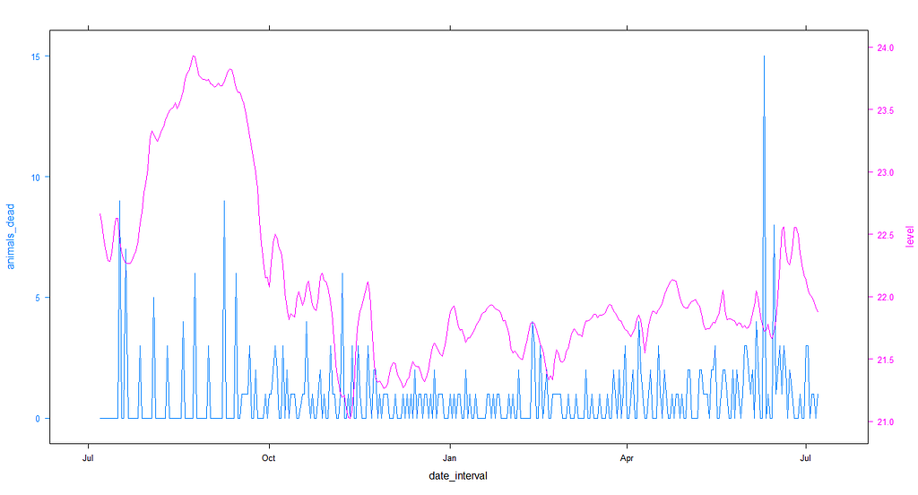
Lets plot the level component of the minimum temperature with the actual mortality data and see if we can find any pattern.
df$level<-ucm_min_temp$s.level
obj1<-lattice::xyplot(animals_dead~date_interval,
                data=df, type="l")
obj2<-lattice::xyplot(level~date_interval,
                      data=df, type="l")
latticeExtra::doubleYScale(obj1,
             obj2,
             add.ylab2 = TRUE)
df<-day%>%
  dplyr::filter(lcn_id=='1434')%>%
  dplyr::filter_at(vars(animals_start), all_vars(!is.na(.)))%>%
  dplyr::select(lcn_id, date_interval, animals_dead, t_min_in, t_max_in)%>%
  replace(is.na(.), 0)
min(lubridate::date(df$date_interval))
max(lubridate::date(df$date_interval))
ucm_min_temp<-rucm::ucm(t_min_in~0,
                        data=df,
                        level=TRUE,
                        slope=TRUE,
                        cycle=TRUE,cycle.period = 12,
                        irregular=TRUE)
ucm_min_temp
df$level<-ucm_min_temp$s.level
obj1<-lattice::xyplot(animals_dead~date_interval,
                      data=df, type="l")
obj2<-lattice::xyplot(level~date_interval,
                      data=df, type="l")
latticeExtra::doubleYScale(obj1,
                           obj2,
                           add.ylab2 = TRUE)
So, what now? We can see that the pattern of mortality shifts per location, and that the for sure is mortality to be seen. There are events, no matter what. A next step could be to revert back to original survival analysis, like Kaplan-Meier or Cox Regression, since both can incorporate time-varying coefficients like time. We could then add parametric survival analysis to look for the expected mortality curve.
First, let's good back to the last model we made, and draw the predicted survival curve to get another glimpse of the performance of the model. Just to get a better glimpse of what we have.
df_pois<-day%>%
  dplyr::filter(!lcn_id %in% c('1435'))%>%
  dplyr::filter_at(vars(animals_start), all_vars(!is.na(.)))%>%
  dplyr::mutate(day = lubridate::day(date_interval),
                month=lubridate::month(date_interval))%>%
  dplyr::select(lcn_id, date_interval, day, month, animals_dead, animals_start,
                t_min_in, t_max_in, t_act_out)%>%
  replace(is.na(.), 0)%>%
  dplyr::filter(t_min_in>0)%>%
  dplyr::filter(t_max_in>0)
fit5<-pscl::zeroinfl(animals_dead~
                       splines::ns(day,5)*
                       splines::ns(t_min_in,5)+
                       splines::ns(t_max_in,5)+
                       splines::ns(t_act_out,5)+
                       as.factor(month) +
                       splines::ns(day,5):as.factor(month)+
                       as.factor(lcn_id) + as.factor(month):as.factor(lcn_id)|
                       day + month,
                     dist="negbin",
                     link="log",
                     data = df_pois)
summary(fit5)
pred_fit<-predict(fit5,newdata=df_pois)
df_fit_combined<-cbind(df_pois, pred_fit)
plot(hist(df_fit_combined$pred_fit))
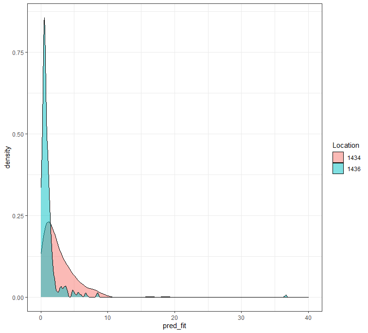
ggplot(df_fit_combined,
       aes(x=pred_fit, fill=as.factor(lcn_id)))+
  geom_density(alpha=0.5)+
  theme_bw()+
  labs(fill="Location")+
  xlim(0,40)
Remember, I warned all of you that this kind of modeling would NOT be easy. I purposefully refused to model the data using Kaplan-Meier or Cox Regression but instead chose to model the event data using time, and including the zero-inflation.
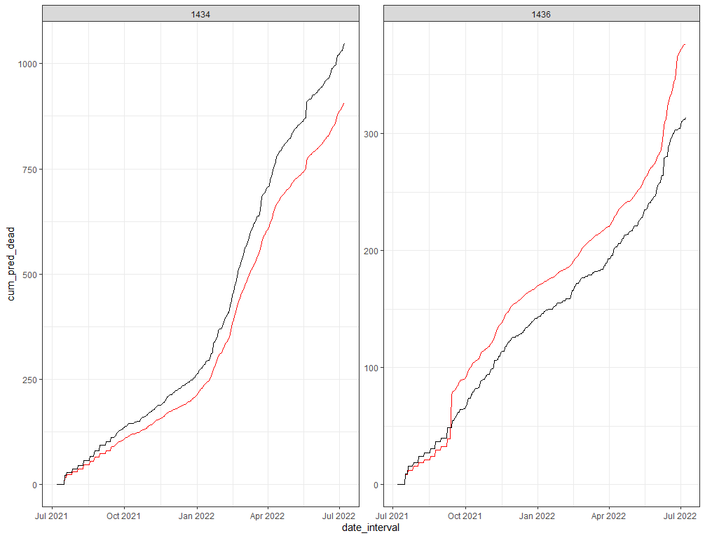
A better way to check how my model is doing is to take a look at the cumulative sum of the deaths I predicted and create a sort of liferisk plot. Remember, the real insane predictions I kick out and replace with zero here. I need to otherwise the plot will not work, but these are in fact predictions I discard. That IS a limitation to be sure.
df_fit_combined%>%
dplyr::group_by(lcn_id)%>%
dplyr::mutate(pred_fit = ifelse(pred_fit>40, NA, pred_fit))%>%
dplyr::select(lcn_id, date_interval, animals_dead, animals_start, pred_fit)%>%
replace(is.na(.), 0)%>%
dplyr::mutate(cum_dead = cumsum(animals_dead),
cum_pred_dead = cumsum(pred_fit),
animals_no_dead = animals_start - cum_dead,
animals_pred_no_dead = animals_start - cum_pred_dead)%>%
ggplot(., aes(x=date_interval))+
geom_line(aes(y=cum_pred_dead), col="red")+
geom_line(aes(y=cum_dead), col="black")+
facet_wrap(~lcn_id, scales="free")+
theme_bw()
df_fit_combined%>%
dplyr::group_by(lcn_id)%>%
dplyr::mutate(pred_fit = ifelse(pred_fit>40, NA, pred_fit))%>%
dplyr::select(lcn_id, date_interval, animals_dead, animals_start, pred_fit)%>%
replace(is.na(.), 0)%>%
dplyr::mutate(cum_dead = cumsum(animals_dead),
cum_pred_dead = cumsum(pred_fit),
animals_no_dead = animals_start - cum_dead,
animals_pred_no_dead = animals_start - cum_pred_dead)%>%
ggplot(., aes(x=date_interval))+
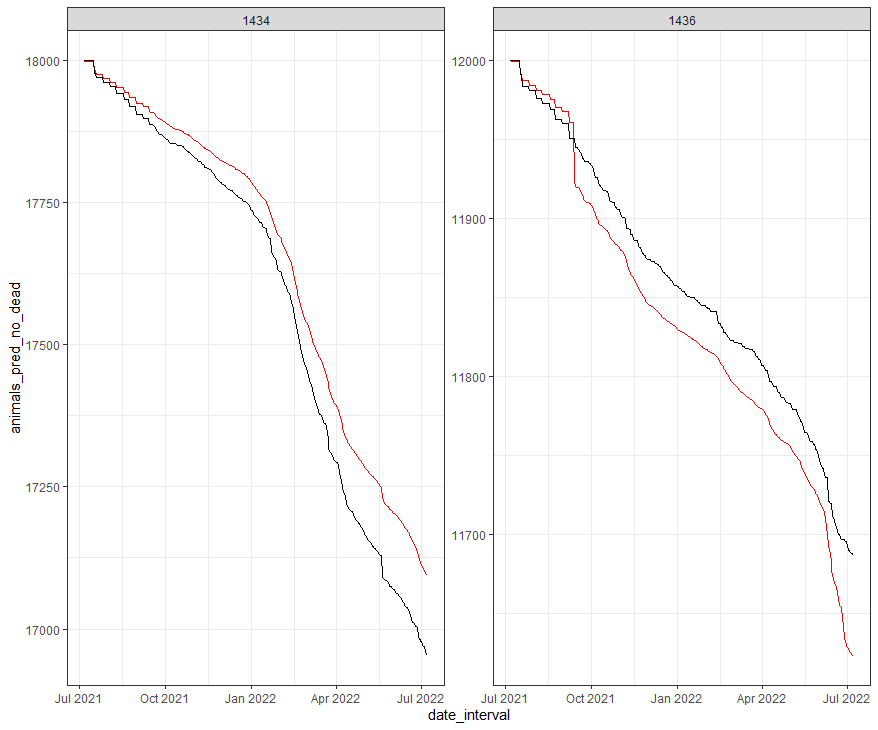
geom_line(aes(y=animals_pred_no_dead), col="red")+
geom_line(aes(y=animals_no_dead), col="black")+
facet_wrap(~lcn_id, scales="free")+
theme_bw()
The pscl package doe not have a standard confidence interval calculation, so the easiest way to get confidence intervals is to bootstrap the data. Also here, I need to delete severe predictions, which I do not like but let's do it anyhow.
fit5<-pscl::zeroinfl(animals_dead~
                       splines::ns(day,5)*
                       splines::ns(t_min_in,5)+
                       splines::ns(t_max_in,5)+
                       splines::ns(t_act_out,5)+
                       as.factor(month) +
                       splines::ns(day,5):as.factor(month)+
                       as.factor(lcn_id) + as.factor(month):as.factor(lcn_id)|
                       day + month,
                     dist="negbin",
                     link="log",
                     data = df_pois,
                     X=TRUE,
                     y=TRUE,
                     model=TRUE,
                     linkinv=TRUE)
stat <- function(df_pois, inds) {
  model <- formula(animals_dead~
                     splines::ns(day,5)*
                     splines::ns(t_min_in,5)+
                     splines::ns(t_max_in,5)+
                     splines::ns(t_act_out,5)+
                     as.factor(month) +
                     splines::ns(day,5):as.factor(month)+
                     as.factor(lcn_id) + as.factor(month):as.factor(lcn_id)|
                     day + month)
  predict(
    pscl::zeroinfl(model,
                   dist = "negbin",
                   link = "log",
                   data = df_pois[inds, ]))
}
(res <- boot::boot(df_pois, stat, R = 2000, parallel="snow", ncpus = 6))
CI <- setNames(as.data.frame(t(sapply(1:nrow(df_pois), function(row)
  boot.ci(res, conf = 0.95, type = "basic", index = row)$basic[, 4:5]))),
  c("lower", "upper"))
df_all <- cbind.data.frame(df_pois,
                           response = predict(fit5), CI)
df_boot<-df_all%>%
  dplyr::mutate(response = ifelse(response>40, NA, response),
                lower = ifelse(between(lower,-40,40), lower, NA),
                upper = ifelse(between(upper,-40,40), upper, NA))
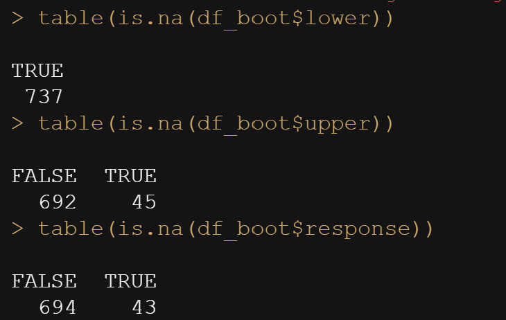
table(is.na(df_boot$lower))
table(is.na(df_boot$upper))
table(is.na(df_boot$response))
ggplot(df_boot,
       aes(x=as.numeric(response),
           y=lubridate::date(date_interval)))+
  geom_pointrange(aes(xmin=0, xmax=upper), alpha=0.5)+
  geom_point()+
  facet_wrap(~lcn_id, scales="free")+
  theme_bw()
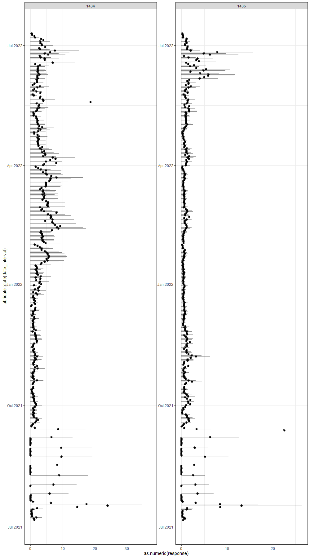
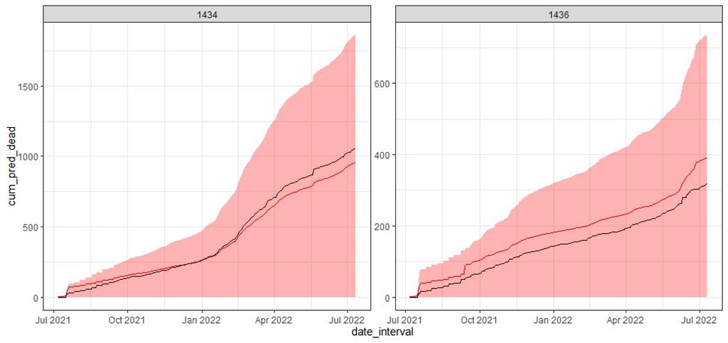
And here below is the cumulative sum plot. Boy oh boy. Remember, I ran the model 2000 times and predicted, 2000 times, the number of deaths for each of the data points I observed. Then, I obtained the confidence intervals of each of those predictions. One could say these are prediction intervals. Then I started summing these up and what I get below is quite an honest accounting of how certain my model is about itself, and it ain’t very certain. Then again, I was not very certain to start with.
df_boot%>%
  dplyr::group_by(lcn_id)%>%
  dplyr::select(lcn_id, date_interval,
                animals_dead,
                animals_start,
                response,
                lower,
                upper)%>%
  replace(is.na(.), 0)%>%
  dplyr::mutate(cum_dead = cumsum(animals_dead),
                cum_pred_dead = cumsum(response),
                cum_pred_lower_dead = cumsum(lower),
                cum_pred_upper_dead = cumsum(upper),
                animals_no_dead = animals_start - cum_dead,
                animals_pred_no_dead = animals_start - cum_pred_dead,
                animals_lower_no_dead = animals_start - cum_pred_lower_dead,
                animals_upper_no_dead = animals_start - cum_pred_upper_dead)%>%
  ggplot(., aes(x=date_interval))+
  geom_line(aes(y=cum_pred_dead), col="red")+
  geom_line(aes(y=cum_dead), col="black")+
  geom_ribbon(aes(ymin=cum_pred_lower_dead, ymax=cum_pred_upper_dead),
              fill="red", alpha=0.3)+
  facet_wrap(~lcn_id, scales="free")+
  theme_bw()
Now, there is one last thing I want to try and that is to take the curve from the UCM model, help me predict the events and then plot it. I will do that for one location only. Just to see. I do not expect much from it, but who knows. It is not as if I did not warn you guys from the beginning.
df_pois<-day%>%
  dplyr::filter(!lcn_id %in% c('1435'))%>%
  dplyr::filter_at(vars(animals_start), all_vars(!is.na(.)))%>%
  dplyr::mutate(day = lubridate::day(date_interval),
                month=lubridate::month(date_interval))%>%
  dplyr::select(lcn_id, date_interval, day, month, animals_dead, animals_start,
                t_min_in, t_max_in, t_act_out)%>%
  replace(is.na(.), 0)%>%
  dplyr::filter(t_min_in>0)%>%
  dplyr::filter(t_max_in>0)
ucm_min_temp<-rucm::ucm(t_min_in~0,
                        data=df_pois,
                        level=TRUE,
                        slope=TRUE,
                        cycle=TRUE,cycle.period = 12,
                        irregular=TRUE)
df_pois$level<-ucm_min_temp$s.level
fit6<-pscl::zeroinfl(animals_dead~
                       splines::ns(day,5)+
                       splines::ns(level,5)+
                       as.factor(month) +
                       as.factor(lcn_id)+
                       splines::ns(day,5):as.factor(month)+
                       splines::ns(day,5):splines::ns(level,5)+
                       as.factor(lcn_id) + as.factor(month):as.factor(lcn_id)|
                       day + month,
                     dist="negbin",
                     link="log",
                     data = df_pois,
                     X=TRUE,
                     y=TRUE,
                     model=TRUE,
                     linkinv=TRUE)
AIC(fit5);AIC(fit6)
stat <- function(df_pois, inds) {
  model <- formula(animals_dead~
                     splines::ns(day,5)+
                     splines::ns(level,5)+
                     as.factor(month) +
                     as.factor(lcn_id)+
                     splines::ns(day,5):as.factor(month)+
                     splines::ns(day,5):splines::ns(level,5)+
                     as.factor(lcn_id) + as.factor(month):as.factor(lcn_id)|
                     day + month)
  predict(
    pscl::zeroinfl(model,
                   dist = "negbin",
                   link = "log",
                   data = df_pois[inds, ]))
}
(res <- boot::boot(df_pois, stat, R = 2000, parallel="snow", ncpus = 6))
CI <- setNames(as.data.frame(t(sapply(1:nrow(df_pois), function(row)
  boot.ci(res, conf = 0.95, type = "basic", index = row)$basic[, 4:5]))),
  c("lower", "upper"))
df_all <- cbind.data.frame(df_pois,
                           response = predict(fit6), CI)
df_boot<-df_all%>%
  dplyr::mutate(response = ifelse(response>40, NA, response),
                lower = ifelse(between(lower,-40,40), lower, NA),
                upper = ifelse(between(upper,-40,40), upper, NA))
ggplot(df_boot,
       aes(x=as.numeric(response),
           y=lubridate::date(date_interval)))+
  geom_pointrange(aes(xmin=0, xmax=upper), alpha=0.5)+
  geom_point()+
  facet_wrap(~lcn_id, scales="free")+
  theme_bw()
df_boot%>%
  dplyr::group_by(lcn_id)%>%
  dplyr::select(lcn_id, date_interval,
                animals_dead,
                animals_start,
                response,
                lower,
                upper)%>%
  replace(is.na(.), 0)%>%
  dplyr::mutate(cum_dead = cumsum(animals_dead),
                cum_pred_dead = cumsum(response),
                cum_pred_lower_dead = cumsum(lower),
                cum_pred_upper_dead = cumsum(upper),
                animals_no_dead = animals_start - cum_dead,
                animals_pred_no_dead = animals_start - cum_pred_dead,
                animals_lower_no_dead = animals_start - cum_pred_lower_dead,
                animals_upper_no_dead = animals_start - cum_pred_upper_dead)%>%
  ggplot(., aes(x=date_interval))+
  geom_line(aes(y=cum_pred_dead), col="red")+
  geom_line(aes(y=cum_dead), col="black")+
  geom_ribbon(aes(ymin=cum_pred_lower_dead, ymax=cum_pred_upper_dead),
              fill="red", alpha=0.3)+
  facet_wrap(~lcn_id, scales="free")+
  theme_bw()


I will leave it at this for now. I could use the level abstracts for maximum inside temperature and actual outside temperature as well, but then I would also have to do full cross-validation and a rolling time window.
Modeling is not easy and takes a lot of work. What I did was an exercise on how to model mortality and it seems to have some merit, but it sure as hell is not failsafe. That is modeling in a nutshell.
Hope you enjoyed it!
Let me know if something is amis!
Modelling Time-To-Event Data in Chickens was originally published in Towards AI on Medium, where people are continuing the conversation by highlighting and responding to this story.
Join thousands of data leaders on the AI newsletter. It’s free, we don’t spam, and we never share your email address. Keep up to date with the latest work in AI. From research to projects and ideas. If you are building an AI startup, an AI-related product, or a service, we invite you to consider becoming a sponsor.
Published via Towards AI
Towards AI Academy
We Build Enterprise-Grade AI. We'll Teach You to Master It Too.
15 engineers. 100,000+ students. Towards AI Academy teaches what actually survives production.
Start free — no commitment:
→ 6-Day Agentic AI Engineering Email Guide — one practical lesson per day
→ Agents Architecture Cheatsheet — 3 years of architecture decisions in 6 pages
Our courses:
→ AI Engineering Certification — 90+ lessons from project selection to deployed product. The most comprehensive practical LLM course out there.
→ Agent Engineering Course — Hands on with production agent architectures, memory, routing, and eval frameworks — built from real enterprise engagements.
→ AI for Work — Understand, evaluate, and apply AI for complex work tasks.
Note: Article content contains the views of the contributing authors and not Towards AI.
Related posts
Recent Posts


")

