


How to Improve Your Analytical Report With Conditional Formatting In Pandas
Last Updated on July 3, 2022 by Editorial Team
Author(s): Hrishikesh Patel
Originally published on Towards AI the World’s Leading AI and Technology News and Media Company. If you are building an AI-related product or service, we invite you to consider becoming an AI sponsor. At Towards AI, we help scale AI and technology startups. Let us help you unleash your technology to the masses.
How To Improve Your Analytical Report With Conditional Formatting In Pandas
Excel-like Conditional Formatting in Pandas Using Styler API
Clearly communicating analytical insights with stakeholders is crucial for data scientists/analysts.
The use of conditional formatting in analytical reports can help in quickly identifying insights into a data frame (table).
Let’s start with an example first. The following pivot table shows the total sales of different products from 2016 to 2022.
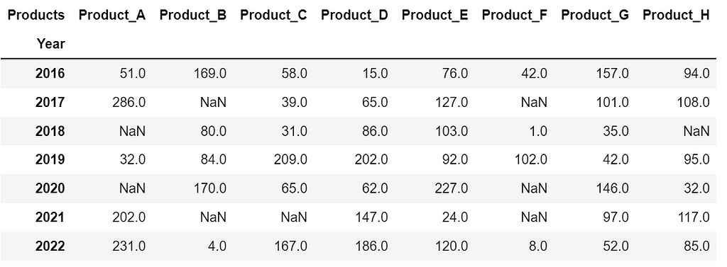
- Can you identify the largest selling 💰 product in 2016? — Yes it is Product_B with a total sale of 169 but it’s difficult to identify just by looking👀 at the table.
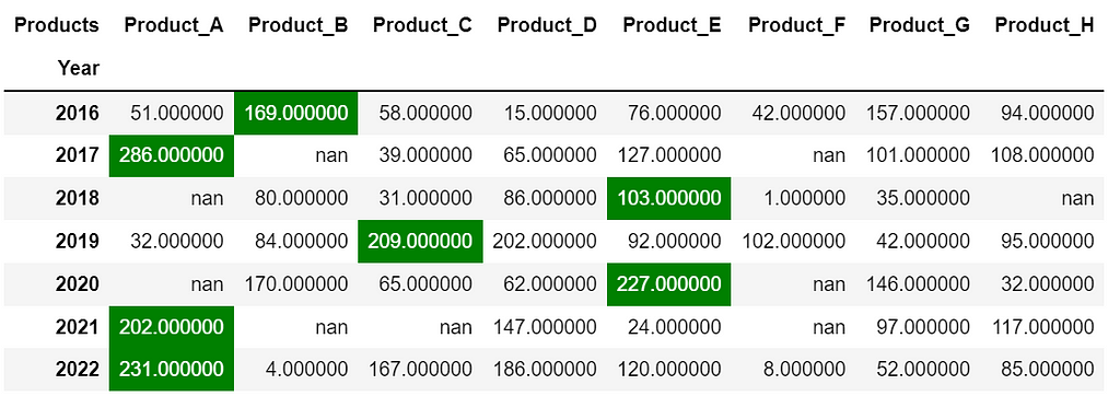
Now let’s color the largest selling💰 product for each year. After highlighting, it becomes so much easier to answer the above question, isn’t it?
Let me show you how to do this in Pandas.
Topics:
1. Highlight missing values
2. Highlight the maximum (or minimum) value in each row/column
3. Highlight values within a range
4. Plot in-column bar chart
5. Highlight values using a color gradient
6. Bonus🎁
Note: I strongly recommend using the latest version of Pandas. You can run pip install –upgrade pandas to get Pandas’ latest stable release.
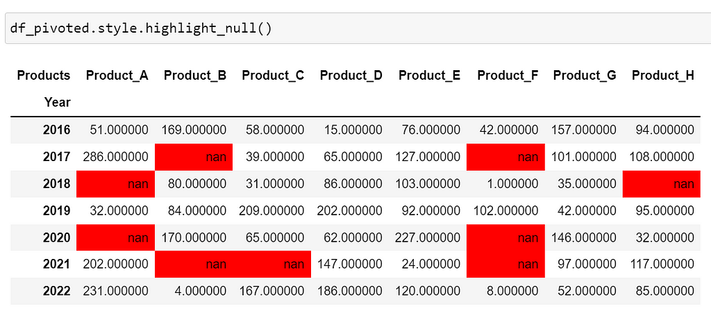
1. Highlight missing values
Using dataframe.style.highlight_null() you can color null values as shown below. I stored the pivot table in the variable df_pivoted .
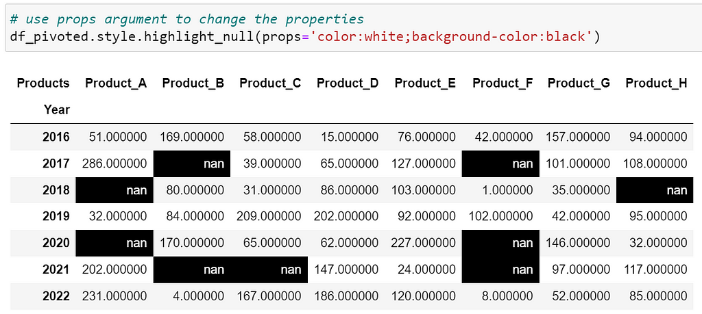
It’s okay😀 if you don’t prefer red. Let’s customize the text and background color of missing values using the argument props=’color:white;background-color:black’ .
After highlighting, we can quickly get the insight that Product_H was not sold in 2018.
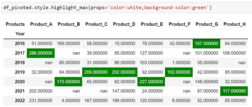
2. Highlight maximum (or minimum) values
To highlight maximum values in each column, you can use dataframe.style.highlight_max() . The method by default colors maximum values in each column as illustrated in the below image.
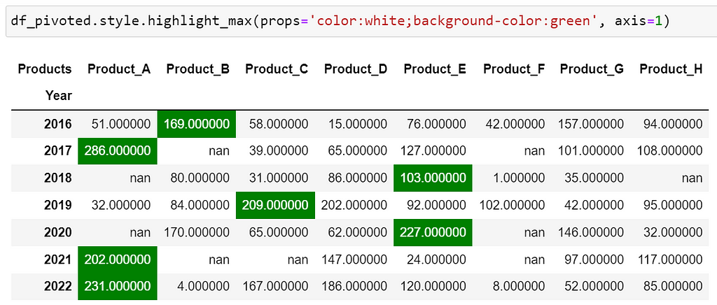
To color max values in each row, you can specify the argument axis=1 .
Note: Similarly you can use the method dataframe.style.highlight_min() with proper arguments to color minimum values in rows/columns.
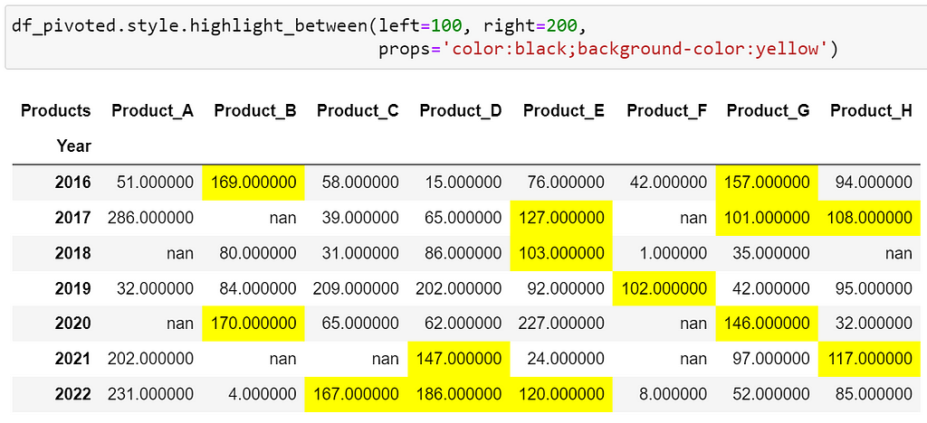
3. Highlight values within a range
Let’s consider that we want to highlight values between 100 and 200 — it’s quite easy to using dataframe.style.highlight_between(left, right) .
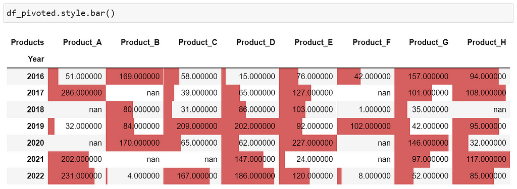
4. Plot in-column bar chart
A bar chart plotted within a column can be visually appealing and useful. Such bar charts can be created using dataframe.style.bar() the method as shown below.
Let’s customize the bar chart to change its color and size.

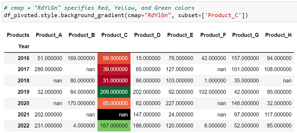
5. Highlight values using a color gradient
What if you want to highlight the entire column with a color gradient. It can be done using dataframe.style.background_gradient() as depicted below. In the image, the color changes from red to green as the value increases. You can set subset=None to apply the gradient to the entire data frame.
6. Bonus 🎁
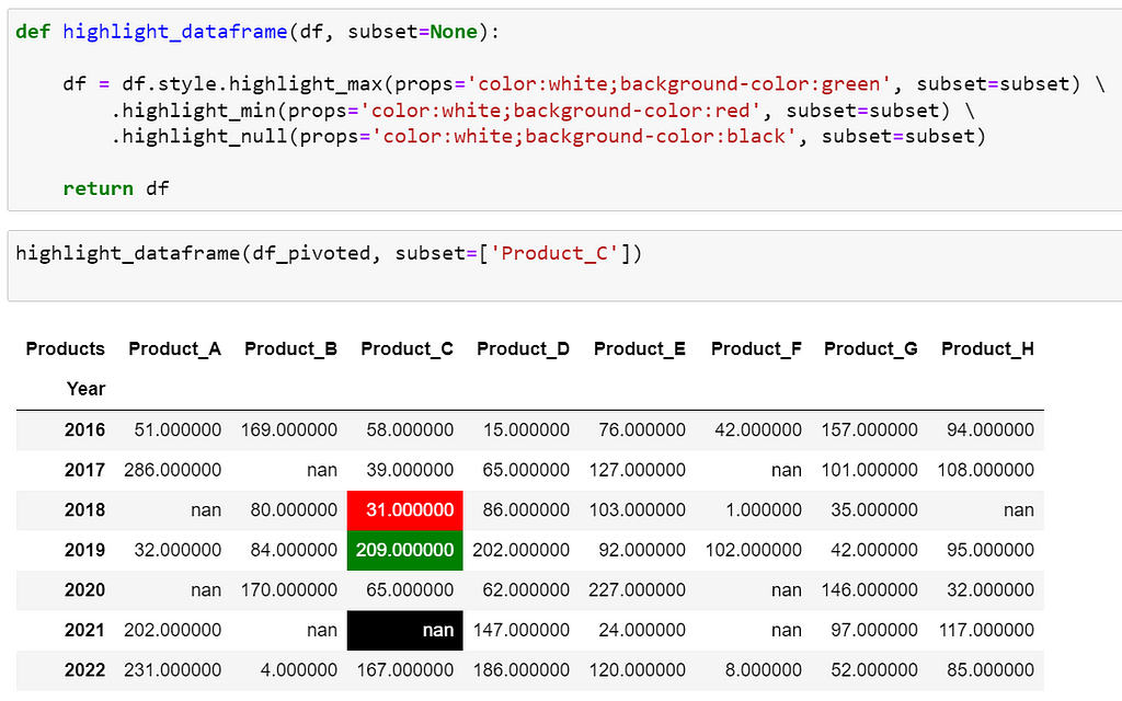
How can we highlight min, max, and missing values together in the data? Well, you can define a function as illustrated below. The function highlights min, max, and nan values in the column ‘Product_C’. By setting subset=None , it highlights the values in the entire data frame. Isn’t this function really cool? Let me know your thoughts in the comments!
Please feel free to explore highlighting methods in Pandas documentation.
Before you go!
I hope you have enjoyed the story and found it useful. Follow me on Medium if you’d like more stories like this and subscribe to me to get my new stories directly into your inbox.
My other stories you might enjoy…
- Try These Pandas Display Configurations in Your Next Analysis
- Regular Expression (RegEx) in Python : The Basics
How to Improve Your Analytical Report With Conditional Formatting In Pandas was originally published in Towards AI on Medium, where people are continuing the conversation by highlighting and responding to this story.
Join thousands of data leaders on the AI newsletter. It’s free, we don’t spam, and we never share your email address. Keep up to date with the latest work in AI. From research to projects and ideas. If you are building an AI startup, an AI-related product, or a service, we invite you to consider becoming a sponsor.
Published via Towards AI
Towards AI Academy
We Build Enterprise-Grade AI. We'll Teach You to Master It Too.
15 engineers. 100,000+ students. Towards AI Academy teaches what actually survives production.
Start free — no commitment:
→ 6-Day Agentic AI Engineering Email Guide — one practical lesson per day
→ Agents Architecture Cheatsheet — 3 years of architecture decisions in 6 pages
Our courses:
→ AI Engineering Certification — 90+ lessons from project selection to deployed product. The most comprehensive practical LLM course out there.
→ Agent Engineering Course — Hands on with production agent architectures, memory, routing, and eval frameworks — built from real enterprise engagements.
→ AI for Work — Understand, evaluate, and apply AI for complex work tasks.
Note: Article content contains the views of the contributing authors and not Towards AI.
Related posts
Recent Posts


")

