Estimating a Classifier Performance Just by Looking at the Distributions
Last Updated on July 24, 2023 by Editorial Team
Author(s): Michelangiolo Mazzeschi
Originally published on Towards AI.
Most of the time, when our AI is not performing as we wish, we might blame the algorithms behind the model. However, a programmer with enough experience knows that the quality of the data makes a big difference in how our AI is performing.
Looking at the data before even training the AI
The only way to discover exactly how well our dataset will perform is to train it. However, looking at the data from the beginning could spare us a great amount of time and pain.
Looking at the distributions of the Iris Dataset
In this article, I will take the Iris Dataset as an example: will I be able to determine the quality of the data before even training the model?
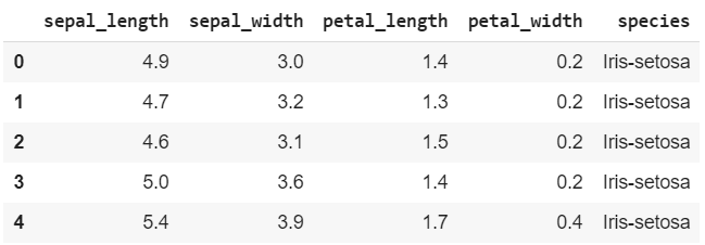
Let us first import the dataset with a few lines of code:
import pandas as pd
X = pd.read_csv('http://archive.ics.uci.edu/ml/machine-learning-databases/iris/iris.data')
X.head()

Because the columns and the Labels have not been named yet, I will do it manually. The X DataFrame will contain the Features.
X.columns = ['sepal_length', 'sepal_width', 'petal_length', 'petal_width', 'species']
The y DataFrame will contain the Labels.
y = X.pop('species')
y = pd.DataFrame(y)
***I decided to turn the y formatted as Series into a DataFrame for future use.
How can we represent the data?
Instead of training the model, our goal is to look at the raw data to make an estimate of the accuracy.
Before, I will graph all the Features grouped by Label using histograms. For each Feature, I will represent all the three different Labels in different colors. The reason why I choose this specific method of representation is that I want to see how the choices of the classifier in selecting every single Label are dependent on the distributions of the Features.
For example, given all the values of the first Feature petal_width distributed on a single histogram, we can try to determine the estimation of the classifier on our own. In the following graph, I represent the entire column of petal_width; each color represents one of the three possible outputs: the three Labels.
If I had to estimate my Label on one single value of petal_width, I would be 100% accurate, if the value was situated between [.7, 2.1]. As we can see from the distribution, FOR EVERY SINGLE PETAL_WIDTH IN THE DATASET BETWEEN [.7, 2.1], THE OUTPUT IS GOING TO BE ONLY the first Label (indicated in blue). There is no other choice by the look of our data.
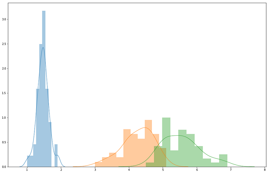
Instead, if the petal_width value was situated between [3.7, 5.8], our estimation could both be the orange or the green Label: the result is ambiguous.
List of all Features grouped by Label
What we have seen so far in my example is that, given the graph distribution of all Features grouped by Label, we can estimate even by a quick look what are the Labels that are easily going to be predicted with 100% accuracy and the ones that will have problems being estimated correctly.
With this code you will distribute all the Features in the DataFrame grouped by Label in one single array:
import matplotlib.pyplot as plt
import seaborn as sns
a = list()
for region, df_region in X.groupby(‘species’):
a.append(df_region)b = list()
for c in X.columns[:-1]:
for l in range(len(a)):
b.append(pd.DataFrame(a[l][c]))
for k in range(0,3): #len(X['species'].unique())
 sns.distplot(b[k], hist = True, bins = 10, kde = True, kde_kws = {'linewidth': 1})
Graphing the Features grouped by Label
fig, ax = plt.subplots()
fig.set_size_inches(17.55, 11.4)for k in range(0,3):
 sns.distplot(b[k], hist = True, bins = 10, kde = True, kde_kws = {'linewidth': 1})

fig, ax = plt.subplots()
fig.set_size_inches(11.7, 8.27)for k in range(3,6):
 sns.distplot(b[k], hist = True, bins = 10, kde = True, kde_kws = {‘linewidth’: 1})
fig, ax = plt.subplots()
fig.set_size_inches(17.55, 11.4)for k in range(6,9):
 sns.distplot(b[k], hist = True, bins = 10, kde = True, kde_kws = {‘linewidth’: 1})

fig, ax = plt.subplots()
fig.set_size_inches(17.55, 11.4)for k in range(9,12):
 sns.distplot(b[k], hist = True, bins = 10, kde = True, kde_kws = {‘linewidth’: 1})

Drawing Conclusions
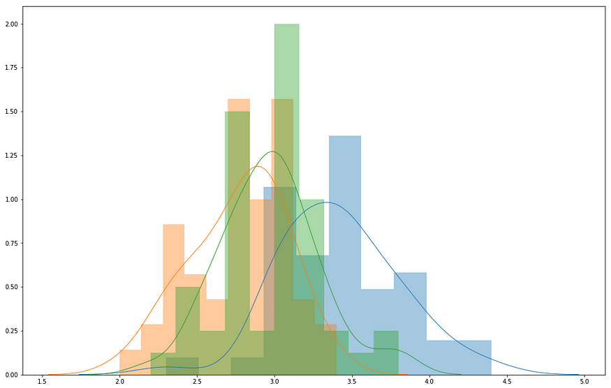
The histograms graphed above are very clear: the first two graphs indicating the first two Features show overlapping of all the distributions: basically, the first two Features do not allow us to predict any Label with accuracy.
Instead, the last two graphed Features show that the distributions are distant one from another, and they act as almost perfect estimators of the Labels.
Testing our Hypothesis
I will proceed by testing two different hypotheses:
Hypothesis_1
I will get rid of the first two sets of distributions and see the results on the dataset. The ones that remain are situated far from each other: I am assuming that even with only these two Features, the dataset will obtain a high degree of accuracy.
Hypothesis_2
In my second hypothesis, I will get rid of the last two sets of distributions. Because the distributions of the remaining ones are overlapping in almost every spot, I can assume it is going to be very difficult to have a precise verdict: this is going to result in a low level of accuracy.
Testing Hypothesis_1
If we reload and rename our initial dataset, we just have to make the following change:
X.pop(‘sepal_length’)
X.pop(‘sepal_width’)
This is what we have left:

#splitting the dataset
from sklearn.model_selection import train_test_split
X_train, X_test, y_train, y_test = train_test_split(X, y, test_size=0.2, random_state=11)
print(X_train.shape, X_test.shape, y_train.shape, y_test.shape)import numpy as np
from sklearn.naive_bayes import GaussianNB#creating the model
clf = GaussianNB()#training the model
clf.fit(X_train, y_train)
print(clf.score(X_test, y_test))
0.9666666666666667
As we can see, even using only the last two Features, we obtained an astonishing .97 level of accuracy.
Testing Hypothesis_2
Now, I will do the same, taking away the last two sets of distributions.
X.pop(‘petal_length’)
X.pop(‘petal_width’)
After running the model, the result is low as expected:
0.7
Conclusions
We can reach a simple conclusion: if in all graphs, we identify any value that corresponds to one Label only, that prediction is going to be 100% accurate. Therefore, for every distribution that does not overlap with the other distributions in the same plane, the model gains accuracy.
Published by Towards AI
Join thousands of data leaders on the AI newsletter. Join over 80,000 subscribers and keep up to date with the latest developments in AI. From research to projects and ideas. If you are building an AI startup, an AI-related product, or a service, we invite you to consider becoming a sponsor.
Published via Towards AI
Towards AI Academy
We Build Enterprise-Grade AI. We'll Teach You to Master It Too.
15 engineers. 100,000+ students. Towards AI Academy teaches what actually survives production.
Start free — no commitment:
→ 6-Day Agentic AI Engineering Email Guide — one practical lesson per day
→ Agents Architecture Cheatsheet — 3 years of architecture decisions in 6 pages
Our courses:
→ AI Engineering Certification — 90+ lessons from project selection to deployed product. The most comprehensive practical LLM course out there.
→ Agent Engineering Course — Hands on with production agent architectures, memory, routing, and eval frameworks — built from real enterprise engagements.
→ AI for Work — Understand, evaluate, and apply AI for complex work tasks.
Note: Article content contains the views of the contributing authors and not Towards AI.


