Empowering Your App with Streamlit’s New Connections Feature and Interactive Plotly Maps
Last Updated on August 7, 2023 by Editorial Team
Author(s): Stavros Theocharis
Originally published on Towards AI.
Aeroa: An app for air quality visualizations

Introduction
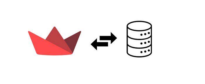
Streamlit recently, and at the time that this article is being written, announced its new feature, st.experimental_connection, and I was very interested in using it and understanding how it works. More details can be found in their official docs.

So, what is this new feature, and what can you do with it? Through it, you can create a new connection to a data store or API or return an existing one. You also have plenty of configuration options, such as credentials, secrets, etc., for connections that are taken from various sources, such as any connection-specific configuration files and the app’s secrets.toml files and the kwargs passed to this function. If you ask me, for such things, you could build something alone with Streamlit and your own code (required time), but now Streamlit gives you better abilities with a built-in feature.
Details of the connection class
So, let’s see some more details about the main class that this feature uses. Streamlit gives you the ability to create your own connection class and call it inside your app. There are already some built-in connection classes for SQL and Snowpark in Snowflake. It is very easy to use them, as the example for SQL below:
import streamlit as st
conn = st.experimental_connection("sql")
you can also do more complex stuff, but we will discuss it below in the next specific example.
Build your own Connection class
Streamlit announced its new hackathon in order to build apps that allow you to create your own connection classes. So I decided to participate and create a simple app because of time restrictions. This app will use air quality and some weather data provided by an open API called OpenAQ. It provided several pieces of data for almost every country in the world based on installed sensors in specific areas.
In order to use the above API, we have to create a new connection class. This class will include the new session of the requests library, one query that gets the countries (it needs a small custom-made code), one main query that gets the specific data of the chosen country, and…. that’s all. The below part will be included in a “connection.py” file.
from streamlit.connections import ExperimentalBaseConnection
import requests
import streamlit as st

class OpenAQConnection(ExperimentalBaseConnection[requests.Session]):
 def __init__(self, *args, **kwargs):
 super().__init__(*args, **kwargs)
 self._resource = self._connect(**kwargs)

 def _connect(self, **kwargs) -> requests.Session:
 session = requests.Session()

 return session

 def cursor(self):
 return self._resource

 def query_countries(
 self, limit=100, page=1, sort="asc", order_by="name", ttl: int = 3600
 ):
 @st.cache_data(ttl=ttl)
 def _query_countries(limit, page, sort, order_by):
 params = {
 "limit": limit,
 "page": page,
 "sort": sort,
 "order_by": order_by,
 }
 with self._resource as s:
 response = s.get("https://api.openaq.org/v2/countries", params=params)
 return response.json()

 return _query_countries(limit, page, sort, order_by)

 def query(
 self,
 country_id,
 limit=1000,
 page=1,
 offset=0,
 sort="desc",
 radius=1000,
 order_by="lastUpdated",
 dumpRaw="false",
 ttl: int = 3600,
 ):
 @st.cache_data(ttl=ttl)
 def _get_locations_measurements(
 country_id, limit, page, offset, sort, radius, order_by, dumpRaw
 ):
 params = {
 "limit": limit,
 "page": page,
 "offset": offset,
 "sort": sort,
 "radius": radius,
 "order_by": order_by,
 "dumpRaw": dumpRaw,
 }
 if country_id is not None:
 params["country_id"] = country_id
 with self._resource as s:
 response = s.get("https://api.openaq.org/v2/locations", params=params)
 return response.json()

 return _get_locations_measurements(
 country_id, limit, page, offset, sort, radius, order_by, dumpRaw
 )
Of course, inside this connection, I use @st.cache_data(ttl=ttl) in order to cache the outputs. In order to better understand the args being used for the calling of the different endpoints, please check the corresponding API docs.
Create the visualization function
For the visualization, the plotly library is being used and specifically the Scattermapbox from the go class. (the below function is very big for layout reasons and could be split into more parts, but please forgive me):
import plotly.graph_objects as go

def visualize_variable_on_map(data_dict, variable):
 is_day = is_daytime()
 mapbox_style = "carto-darkmatter" if not is_day else "open-street-map"

 # Initialize lists to store data for multiple locations
 latitudes = []
 longitudes = []
 values = []
 display_names = []
 last_updated = []

 # Loop through the results and extract relevant data for each location
 for result in data_dict.get("results", []):
 measurements = result.get("parameters", [])
 for measurement in measurements:
 if measurement["parameter"] == variable:
 value = measurement["lastValue"]
 display_name = measurement["displayName"]
 latitude = result["coordinates"]["latitude"]
 longitude = result["coordinates"]["longitude"]
 last_updated_value = result["lastUpdated"]

 latitudes.append(latitude)
 longitudes.append(longitude)
 values.append(value)
 display_names.append(display_name)
 last_updated.append(last_updated_value)

 if not latitudes or not longitudes or not values:
 print(f"{variable} data not found.")
 return create_custom_markdown_card(
 f"{variable} data not found for the selected country."
 )

 # Create the visualization
 fig = go.Figure()

 marker = [
 custom_markers["humidity"]
 if variable == "humidity"
 else custom_markers["others"]
 ]

 # Add a single scatter mapbox trace with all locations
 fig.add_trace(
 go.Scattermapbox(
 lat=latitudes,
 lon=longitudes,
 mode="markers+text",
 marker=dict(
 size=20,
 color=values,
 colorscale="Viridis", # You can choose other color scales as well
 colorbar=dict(title=f"{variable.capitalize()}"),
 ),
 text=[
 f"{marker[0]} {display_name}: {values[i]}<br>Last Updated: {last_updated[i]}"
 for i, display_name in enumerate(display_names)
 ],
 hoverinfo="text",
 )
 )

 # Update map layout
 fig.update_layout(
 mapbox=dict(
 style=mapbox_style, # Choose the desired map style
 zoom=5, # Adjust the initial zoom level as needed
 center=dict(
 lat=sum(latitudes) / len(latitudes),
 lon=sum(longitudes) / len(longitudes),
 ),
 ),
 margin=dict(l=0, r=0, t=0, b=0),
 )
 create_custom_markdown_card(information)
 st.plotly_chart(fig, use_container_width=True)
Create the app
The below code is included inside our “app.py” file:
import streamlit as st
from connection import OpenAQConnection
from utils import * # a customade utils part with support functions

st.set_page_config(page_title="OpenAQ Connection", layout="wide")
conn = st.experimental_connection("openaq", type=OpenAQConnection)

# in case you have a readme toml file
readme = load_config("config_readme.toml")


# Info
st.title("Air quality data")
with st.expander("What is this app?", expanded=False):
 st.write(readme["app"]["app_intro"])
 st.write("")
st.write("")
st.sidebar.image(load_image("logo.png"), use_column_width=True)
display_links(readme["links"]["repo"], readme["links"]["other_link"])

with st.spinner("Loading the available countries..."):
 # Countries exist in first 2 pages
 countries = []
 for page in [1, 2]:
 try:
 countries_request = conn.query_countries(page=page)["results"]
 countries = countries + countries_request
 except Exception:
 countries_error = True

 transformed_countries = {
 country["name"]: {
 "code": country["code"],
 "parameters": country["parameters"],
 "locations": country["locations"],
 "lastUpdated": country["lastUpdated"],
 }
 for country in countries
 }

 # Add a global for default when the app is initialised
 transformed_countries["Global"] = {
 "code": None,
 "parameters": general_parameters,
 "locations": None,
 "lastUpdated": None,
 }

# Parameters
st.sidebar.title("Selections")
selected_country = st.sidebar.selectbox(
 "Select the desired country",
 transformed_countries,
 placeholder="Country",
 index=len(transformed_countries) - 1, # Gets the last one "Global"
 help=readme["tooltips"]["country"],
)

selected_viariable = st.sidebar.selectbox(
 "Select the desired variable",
 transformed_countries[selected_country]["parameters"],
 placeholder="Variable",
 index=1,
 help=readme["tooltips"]["variable"],
)

radius = st.sidebar.slider(
 "Select a radius",
 min_value=100,
 max_value=25000,
 step=100,
 value=1000,
 help=readme["tooltips"]["radius"],
)

total_locations = transformed_countries[selected_country]["locations"]
last_time = transformed_countries[selected_country]["lastUpdated"]
information = f"The selected country is {selected_country}. The total found locations are {total_locations} with last updates at {last_time}."

code = transformed_countries[selected_country]["code"]
locations_response = conn.query(code, radius)
st.title("Map")
visualize_variable_on_map(locations_response, selected_viariable)
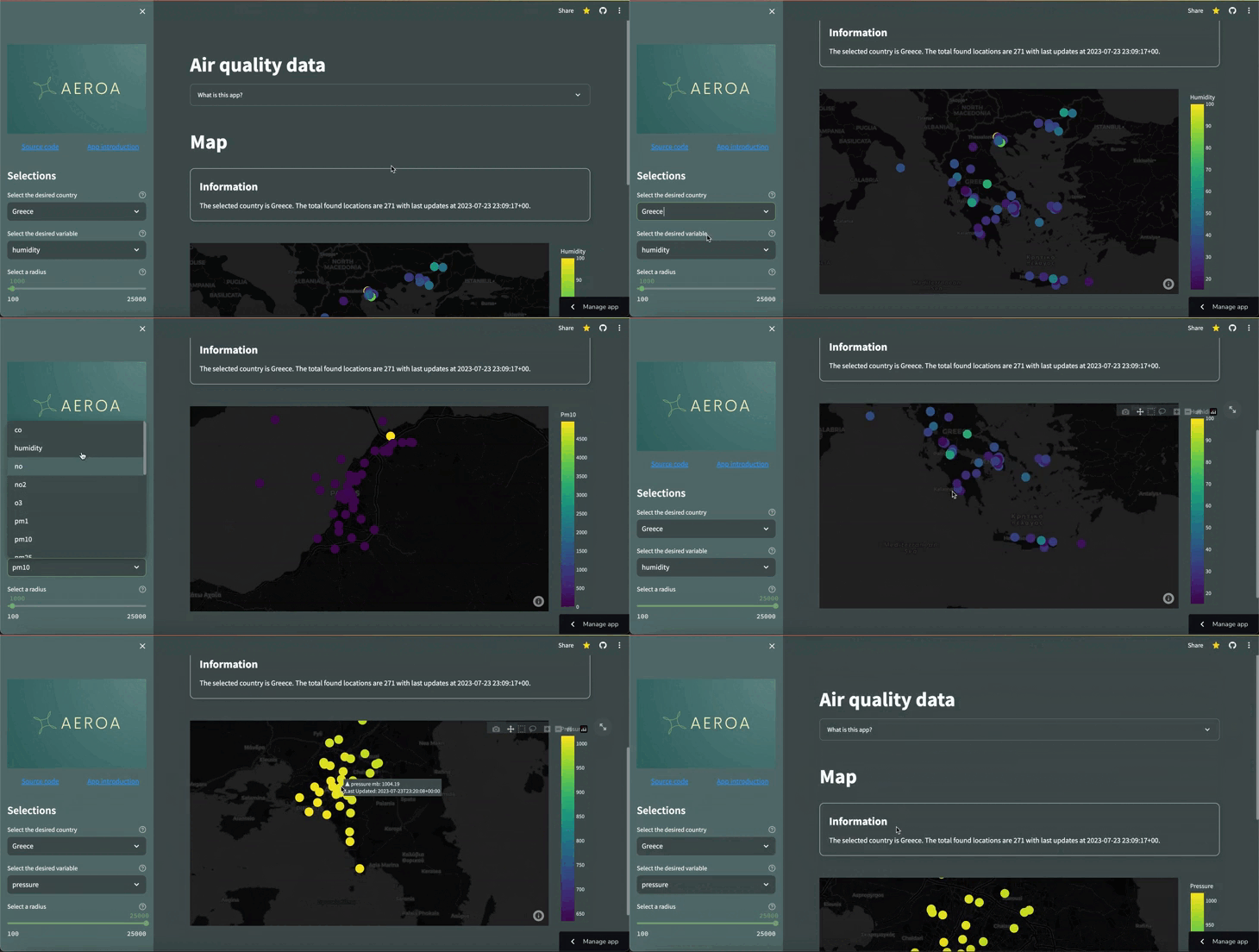
So after running our app “streamlit run app.py” we have our app running.

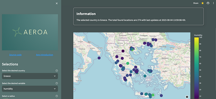
I called the app “AEROA,” and you can find it deployed in the streamlit community cloud here. You can also find the source code on Github and play with it according to your own preferences.
Conclusion
In this quick tutorial, we showcased the new st.experimental_connection feature from streamlit and used it to establish a connection with an open API that provides data for air quality data. In addition to this, we also developed a nice new app that displays the results in a plotly map.
Join thousands of data leaders on the AI newsletter. Join over 80,000 subscribers and keep up to date with the latest developments in AI. From research to projects and ideas. If you are building an AI startup, an AI-related product, or a service, we invite you to consider becoming a sponsor.
Published via Towards AI
Towards AI Academy
We Build Enterprise-Grade AI. We'll Teach You to Master It Too.
15 engineers. 100,000+ students. Towards AI Academy teaches what actually survives production.
Start free — no commitment:
→ 6-Day Agentic AI Engineering Email Guide — one practical lesson per day
→ Agents Architecture Cheatsheet — 3 years of architecture decisions in 6 pages
Our courses:
→ AI Engineering Certification — 90+ lessons from project selection to deployed product. The most comprehensive practical LLM course out there.
→ Agent Engineering Course — Hands on with production agent architectures, memory, routing, and eval frameworks — built from real enterprise engagements.
→ AI for Work — Understand, evaluate, and apply AI for complex work tasks.
Note: Article content contains the views of the contributing authors and not Towards AI.


