


Digital Learning During Covid19: A Complete Analysis
Last Updated on January 7, 2023 by Editorial Team
Author(s): Abid Ali Awan
Originally published on Towards AI the World’s Leading AI and Technology News and Media Company. If you are building an AI-related product or service, we invite you to consider becoming an AI sponsor. At Towards AI, we help scale AI and technology startups. Let us help you unleash your technology to the masses.
Data Analysis
Using data analysis tools to figure out trends in digital learning during Covid19 and how the online platforms are effective towards improvised communities.
Introduction
There is an imbalance in the education system during the Covid19 pandemic and most of the students don’t even have access to educational tools and online learning platforms. There is an urgent need to come up with solutions and by using LearnPlatform dataset we will figure some of the common patterns and identify the clusters based on demography, geography, and accessibility.
Project goals
In this project, we will be using data analysis tools to figure out trends in digital learning and how it is effective towards improvised communities. We will be comparing districts and states on factors like demography, internet access, learning product access, and finance. In the end, we will summarize our report and point towards the areas that need our more attention to make education accessible for all students the United States.

Data
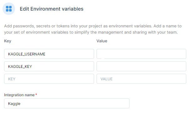
The Dataset Is available at Kaggle under noncommercial license.
Use this command to download the dataset faster
!pip install kaggle
!kaggle competitions download -c learnplatform-covid19-impact-on-digital-learning
Don't forget to add Kaggle API key 👇
We have three types of Dataset.
- Products data contains Service names, Companies, and educational sectors.
- District data contains Demography, Locations, and Educational Spending.
- Engagement data contains students’ engagement with different products per day.
Product
The product file products_info.csv includes information about the characteristics of the top 372 products with most users in 2020. The categories listed in this file are part of Learn Platform's product taxonomy.

Loading data educational product data
As we can see we have product names, Companies, and Sector data with Primary Functions.
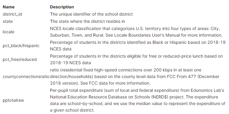
District
The district file districts_info.csv includes information about the characteristics of school districts, including data from
- NCES (2018–19),
- FCC (Dec 2018), and
- Edunomics Lab.
Loading data district data
We have different states, locale, educational spending, and more importantly we have demographical data.
Engagement data
The engagement data are aggregated at the school district level and each file in the folder engagement_data represents data from one school district.
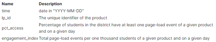
Engagement data extraction function
Our engagement data is divided into multiple .csv files based on District id so we need to create a Python function to extract data from the individual files and concat them into one.
Loading data engagement data
It took us 19 seconds to load all files from a folder and now we have DataFrame containing all distract Engagement Data.
Missing data
Let’s look at all three DataFrames for missing values per Column
Plot missing function
The function helps us plot an Altair bar chart for all data frames containing missing values.
As we can observe that our district dataset mostly contains missing values in pp_total_raw,pct_free/reduced,county_connections_ratio. Let's see all the missing values together in the next section.
The subplot below shows missing values in all three datasets we will be removing them in the next section as it is hard to replace them without actual information.
Cleaning data
We will be cleaning district data as it contains an array of values. We will be taking advantage of both limits.
- Converting list pct_black/hispanic and pct_free/reduced into float
- Converting list pp_total_raw into Integers.
- Dropping county_connections_ratio due to static 0.18 to 1 values across all categories.
Feature distributions visualization
In this section, we will discover different features distributions.
Districts per states
As we can see the dataset contains more districts from Utah and Illinois than any other state.
Locale distribution
The suburbs are dominating with 59 percentage, which also means people from medium to high class have more access to internet.
Educational product providers
Google provides more educational products than anyone close to it.
In short online education is dominated by Google LLC
Let’s see what are the products provided by Google
Educational sector distributions
Educational sectors are divided into three categories, PreK-12, Higher Education, and Corporate.
Some products are specific to a sector but others are quite general.
As we can see PreK education is dominating the distribution with 54 percentage.
Primary functions with main and subcategories
There are three types of main primary functions.
- LC = Learning & Curriculum
- CM = Classroom Management
- SDO = School & District Operations.
You can interact with the Plotly sunburst plot to explore the distribution of main categories and subcategories.
The Learning products have majority shares in this group and the most common subcategories are digital learning platforms.
Essential function subcategories distribution
We can observe all the subcategories distribution.
Content creation and digital learning are leading in this market.
Merging three datasets
We will be merging all three datasets on LP ID and district id. As we can see the combined dataset has 18 columns that will later help us with both geographical and time series plots.
Top educational products
Google products are dominating with Wikipedia and Netflix as an exception. Netflix provides kids with educational content and tutorials.
Distribution of race, reduced fee, expenditures, and Internet connection per state
We will be used the Pandas function to display a table showing the mean distribution of various features related to demography and expenditures.
Black and Hispanic
I seems like Taxes have more Black/Hispanic students than another state followed by Florida, Michigan, and Minnesota.
Reduced fee or free education
Minnesota provides 70 percent of free or reduced fee education, followed by Michigan and Indiana.
Per-pupil total expenditure
New York spends more on education than any other State in US. The runner-up States are New Jersey and Minnesota.
Time series distribution of educational product access students
We will be observing time-series distributions of Product Access Based on Locale and State.
Based on Locale
The cities were hit with Covid19 the hardest which affected the students the most as they have to study from home that is why we can see the dip in product access from April to July 2020 as compared to other locales. During Summer vacation students stopped using educational products. In suburbs, students have more access to the tools than another locale. overall, they all follow a common pattern.
Based on the top five states
New York was hit hardest with Covid19 and that didn’t affect the online learning of students as you can see graph became more consistent after the lockdown.
New York, Wisconsin, and Indian have higher students using these educational products overall.
Based on the bottom five states
This is odd as Michigan and North Carolina have almost zero product access from March till the end of August. Texas has a similar pattern but they had a peak in June. Overall these bottom states became active after September 2020.
It is strange that some states have a very odd pattern, maybe due to a bad educational system or lack of awareness.
Geographical analysis
This section will be looking at different states based on product access and engagement index.
We do not have access to all states data so you might see a lot of gray space on the map.
Education products access per state
New York has a higher product access score than any other state, then comes the Orange States Wisconsin, Illinois, and Indiana. There might be a link between the lower population of Black/Hispanics in these states. Let’s explore that in the next part.
There is a relation between states with a lower population of Black/Hispanic but it is not the stronger. I can see Newyork and Wisconsin with a lower Black/Hispanic population and higher access rate but when it comes to other states with a lower percentage of people of color it’s all over the place. The system is fairly balanced towards other races.
Engagement index per state
The Engagement distribution per state is quite similar to product access. It’s logical that if students have access to these products there is a chance of an increase in usage of these platforms.
Focusing on people from the improvised neighborhood
In this section, we will be focusing on the Black/Hispanic community and free or reduced fees.
Correlation
There is a high correlation between product access and engagement index, which means if the student has access to these products they might use them on daily basis. We can also see another high correlation between Black/Hispanic and Free/ Reduced education. This means the government is doing its job in helping improvised communities to get a proper education.
Black/Hispanic products access over the year.
The graph below shows that over time the communities with a lesser population of Blacks and Hispanics have a similar pattern to some of the Top states we have discussed earlier. Let’s compare this graph with the mixed communities.
We can see some changes as the peak has fallen from 1.4 to 1.2. It is a disparity among the different racial groups but its marginal compares to other countries. We can say Black/Hispanic communities have lesser access to educational products.
Code
- Digital Learning During COVID19 EDA (deepnote.com)
- Evolution of Digital Learning During COVID19 | Kaggle
- kingabzpro/Digital-Learning-During-COVID19-EDA(github.com)
Conclusion
The data is limited to fewer states and I didn’t find any concrete evidence that Black or Hispanic communities get unfair treatment. Online education is fairly balanced towards all. I did see how some of the states perform worst in terms of product access rating, this might be due to bad policymaking and lack of awareness. We can see that Google is dominating the online education industry by providing a complete ecosystem. The majority of Pre-K students are using these platforms for digital learning. Suburbs have the highest students accessing these products and we can see a clear correlation between product access and engagement index. There is also a high correlation between Black/Hispanic and Free education/ Reduced Fee, which means the government is doing its best to help the poor community by providing free education.
You can follow me on LinkedIn, Twitter, and Polywork where I post my article on weekly basis.
Digital Learning During Covid19: A Complete Analysis was originally published in Towards AI on Medium, where people are continuing the conversation by highlighting and responding to this story.
Join thousands of data leaders on the AI newsletter. It’s free, we don’t spam, and we never share your email address. Keep up to date with the latest work in AI. From research to projects and ideas. If you are building an AI startup, an AI-related product, or a service, we invite you to consider becoming a sponsor.
Published via Towards AI
Towards AI Academy
We Build Enterprise-Grade AI. We'll Teach You to Master It Too.
15 engineers. 100,000+ students. Towards AI Academy teaches what actually survives production.
Start free — no commitment:
→ 6-Day Agentic AI Engineering Email Guide — one practical lesson per day
→ Agents Architecture Cheatsheet — 3 years of architecture decisions in 6 pages
Our courses:
→ AI Engineering Certification — 90+ lessons from project selection to deployed product. The most comprehensive practical LLM course out there.
→ Agent Engineering Course — Hands on with production agent architectures, memory, routing, and eval frameworks — built from real enterprise engagements.
→ AI for Work — Understand, evaluate, and apply AI for complex work tasks.
Note: Article content contains the views of the contributing authors and not Towards AI.
Related posts
Recent Posts


")

