


Designing a Promotional Strategy for Alcoholic Drinks in Russia
Last Updated on January 6, 2023 by Editorial Team
Author(s): Abid Ali Awan
Originally published on Towards AI the World’s Leading AI and Technology News and Media Company. If you are building an AI-related product or service, we invite you to consider becoming an AI sponsor. At Towards AI, we help scale AI and technology startups. Let us help you unleash your technology to the masses.
The main goal is to find the next ten locations similar to Saint Petersburg using unsupervised learning.
Alcohol consumption in Russia remains among the highest in the world. According to a 2011 report by the World Health Organization, which makes it the best place to start a beverage business. People love their drinks and the company which owns a chain of stores across Russia that sell a variety of alcoholic drinks wants to invest in marketing campaigns. The company recently ran a wine promotion in Saint Petersburg that was very successful. Due to the cost to the business, it isn’t possible to run the promotion in all regions. In this project, we are going to analyze our data, fix missing values, visualize data, train the clustering model, and finally visualize our results.
Data
The marketing team has sourced you with historical sales volumes per capita for several different drinks types.
Dataset is avaible at Alcohol Consumption in Russia (1998–2016) | Kaggle with Creative Commons — CC0 1.0 Universal License
- “year” — year (1998–2016)
- “region” — the name of a federal subject of Russia. It could be oblast, republic, krai, autonomous okrug, federal city, and a single autonomous oblast
- “wine” — sale of wine in liters by year per capita
- “beer” — sale of beer in liters by year per capita
- “vodka” — sale of vodka in liters by year per capita
- “champagne” — sale of champagne in liters by year per capita
- “brandy” — sale of brandy in liters by year per capita
Loading Dataset
We have used pandas to load the .csv dataset and its pretty small dataset containing yearly (1998-2016) alcohol consumption (beer, champagne, brandy, wine, vodka) per region (85).
There are1615 sample which is logical as we have 19 years of data and 85 regions. The beer is leading the game as the mean value of beer is 51.3 liters by year per capita and the second-highest is vodka 11.81 liters by year per capita which is now even close to beer. This means people prefer beer as a go-to beverage. The beer also has the highest standard deviation which means that its demand is not stable and can fluctuate with time whereas champagne and brandy are a pretty safe bet if you want to start a low-risk business with the lowest standard deviation.
We can explore all the unique regions within the dataset.
Correlation
There is a high correlation between champagne and brandy which makes it even better. If you promote champagne there will be an increase in the sale of brandy and champagne, which makes it win-win situation.
Missing Values
We will be using pandas dataframe background_gradient to display several missing values and percentages. It seems like all drinks columns have missing values and the highest is brandy with 66.
We are going to use the fillna function and method pad to fill missing values with previous values in a column. As we can see that there are no missing values in our dataset.
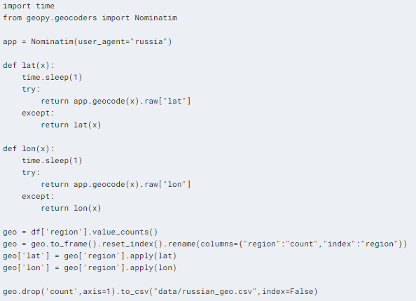
Geo Location
For geolocation, we need to get coordinates to display stat on the map. For that we need:
- geopy -> Nominatim
- creating user agent to connect to geopy server.
- create lat and lon function to extract latitude and longitude using the name of the place.
- value count the region column, resetting index, and then renaming columns.
- applying both functions on to geo[‘region’]
- export the file as “russian_geo.csv”
This process takes 5 minutes to run so we are just going to save the results in a .csv file and later merge it with our main database.
- loading geo location dataset.
- merging it with main dataset.
- group by “region” and mean.
- sort values by “beer” descending.
We are going to use df_geo dataset to plot the total alcohol consumption on the Plotly map.
Map
In this section, we are going to plot the total alcohol consumption per region on the map.
- we have created a new column name “total” which sums up all the drinks columns.
- we have also created test columns that contain a caption, that will be displayed on the map.
- we are dividing our dataset into three categories based, first contains the top 10, the second contains 11th to 21st and third contains the rest of the regions. The ranking is based on Alcohol consumption per region.
- We are going to use Plotly sample code for plotting bubble maps.
The top 10 and 11–21 have no paterens. They are all over the place but we can see the pattern in the rest of the categories. You can also explore the different regions by hovering your mouse over and zooming out to observe more regions.
Alcohol Consumption Past Trend
In this section, we are going to explore different types of drinks and their consumption trend over the past 19 years.
As we can see beer consumption has risen with time up till 2007, then it became steady and its declining since 2011. Wine, champagne, and brandy consumption are lower than beer but they are steady. The vodka demand has increased up till 2002 and it’s declining slowly and steadily with time.
The safest bet is to launch a campaign on either brandy or champagne but wine can be profitable as it has more consumption per capita and it is stable.
Animation
You can interact with the figure below and observe the change in demand by clicking on the play button. This is a simple and attractive way to present your data as a story in from of the marketing manager.
It is fun too 😊
Kmean Clusters
Finding cluster is a subcategory of supervised learning where there are no targets available in training data. Clustering is the task of grouping together a set of objects in a way that objects in the same cluster are more similar to each other than to objects in other clusters. K-means is vastly used for clustering in many data science applications, especially useful if you need to quickly discover insights from unlabeled data.
First, we need to find how many clusters are there in our data, before that we need to create our X for that we are going to group the dataset by “region” and take average values. Then we are going to run SKlearn KMeans on a range from 1 to 9. There are 2 elbows in our line plot, we will be checking both of them. The Elbow method tells us to select the cluster when there is a significant change in inertia.
We have discovered elbow at 2 and at 3.
Let’s check the n=2 cluster.
It seems quite clear, but we cannot stop here, we need to also check for n=3 in the next section.
Now checking on n=3 cluster.
I think 3 clusters are better and we are going to divide our dataset based on it. The clusters are created based on alcohol consumption.
Cluster Visualization
In this section we are going to compare the clusters on various columns and as you can see the best results are shown for beer V/S wine.
Clusters Swarmplot
Let’s visualize our results using Swamplot.
We can clearly see the orange has the highest average consumption in all drinks categories. They all are following similar rules of ranking. The orange is high, the blue is medium and the green is low. We are going to use this to pick the top ten regions and products.
Total drinks swarm plot
To summarize our findings let’s visualize total alcohol consumption and clusters. It is now clear the hypothesis was true about the orange to begin at the top of the ladder.
Hierarchy Cluster
We will be using scipy spatial distance_matrix to calculate the distance from each point to every other point of a dataset. The function distance_matrix requires two inputs and we are adding X and X.
We will then use scipy hierarchy linkage using the average method to create links between each cluster, which later will be used to plot the dendrogram.
Dendrogram
Hierarchical clustering is typically visualized as a dendrogram every unique cluster is represented with different colors. As you can see how each node is connected forming this hierarchy of clusters.
It seems like we have 4 hierarchical clusters that are determined by different colors.
Hierarchy Agglomerative Clustering
Using Agglomerative clustering we are going to devide our dataset in 4 clusters. To learn more about Agglomerative Clustering check this link
The 4 clusters are almost similar to Kmeans 3 clusters but the medium cluster is divided. We will be using both Kmeans and hierarchy clusters to determine optimum locations for a marketing campaign.
Categorizing Clusters
It’s time to add both the Kmeans cluster and Hierarchical cluster into our main database.
- creating a new column “H_Pop” and adding H cluster prediction.
- renaming numerical values to categories based on popularity.
- Filtering out to see top 2 values.
We are going to go the same with Kmean clusters:
- Renaming column name from “Labels” to “KM_Pop”
- Create a new column “Total_Drinks” and add total drinks values.
- renaming numerical values to categories based on popularity.
- Filtering out to see top 11 values sort by Total Alcohol consumption.
Results
We have finally spotted 10 regions similar to Saint Petersburg for promoting launching new marketing comparing. We have selected the cluster which is “High” on the Kmean cluster and “Top” on the Herarchery cluster, then sort values but “Total_Drinks” to get Top ten regions for the campaign.
For the final results, we are going to sort our values by wine consumption to get a similar cluster as Saint Petersburg where the companie’s wine marketing campaign became successful.
These are the region that we should target next for promoting Wine and other Alcoholic beverages:
- Vologda Oblast
- Komi Republic
- Leningrad Oblast
- Smolensk Oblast
- Sverdlovsk Oblast
- Moscow
- Kamchatka Krai
- Ivanovo Oblast
- Yaroslavl Oblast
- Sevastopol
Conclusion
I had fun playing around with various unsupervised clustering algorithms and plotting values on the map. In this project, we have learned how to analyze the data, fill missing values, plot values on the map, various seaborn visualization, and finally use a clustering algorithm to predict the top ten regions for marketing campaigns. It is easy to promote beer but its declining since 2007 so the best hope is to promote the more stable product such as wine and brandy. The company should focus on the “Vologda Oblast” region as it has the highest vine consumption in the Top cluster and after the successful launch, it should move to the rest of the nine places mentioned above. We have no idea what is the current year and it’s pretty hard to predict clusters using times series, instead, I have simplified the problem by taking mean value.
Thank you for reading my notebook and don’t forget to upvote👆.
Code
- Alcoholic Drinks Promotion in Russia (deepnote.com)
- DataCamp Workspace | Data Analysis on Alcoholic Drinks in Russia for Creating Promotional strategy.
Learning Resource
- Clustering Agglomerative process | Towards Data Science
- Topic 7. Unsupervised learning: PCA and clustering | Kaggle
- Unsupervised Learning and Data Clustering | by Sanatan Mishra | Towards Data Science
- Courses — DataCamp Learn
- ✨ Introducing Plotly Express ✨. Plotly Express is a new high-level… | by plotly | Plotly | Medium
- seaborn: statistical data visualization — seaborn 0.11.2 documentation (pydata.org)
- Restaurants Sales During COVID (EDA) 👨🍳😲 | Kaggle
Future Works
- In this project, I haven’t used time-series data to determine the clusters. For future work, I will use the time series model to predict clusters similar to Saints Perterberg.
- Next, I will explore various options in geospatial analysis.
- I will normalize data using various scaling tools and observe the difference.
- Finally, I will do a comparison between various algorithmic results.
About Author
Abid Ali Awan (@1abidaliawan) is a certified data scientist professional who loves building machine learning models and research on the latest AI technologies. Currently testing AI Products at PEC-PITC, their work later gets approved for human trials, such as the Breast Cancer Classifier.
Designing a Promotional Strategy for Alcoholic Drinks in Russia was originally published in Towards AI on Medium, where people are continuing the conversation by highlighting and responding to this story.
Join thousands of data leaders on the AI newsletter. It’s free, we don’t spam, and we never share your email address. Keep up to date with the latest work in AI. From research to projects and ideas. If you are building an AI startup, an AI-related product, or a service, we invite you to consider becoming a sponsor.
Published via Towards AI
Towards AI Academy
We Build Enterprise-Grade AI. We'll Teach You to Master It Too.
15 engineers. 100,000+ students. Towards AI Academy teaches what actually survives production.
Start free — no commitment:
→ 6-Day Agentic AI Engineering Email Guide — one practical lesson per day
→ Agents Architecture Cheatsheet — 3 years of architecture decisions in 6 pages
Our courses:
→ AI Engineering Certification — 90+ lessons from project selection to deployed product. The most comprehensive practical LLM course out there.
→ Agent Engineering Course — Hands on with production agent architectures, memory, routing, and eval frameworks — built from real enterprise engagements.
→ AI for Work — Understand, evaluate, and apply AI for complex work tasks.
Note: Article content contains the views of the contributing authors and not Towards AI.
Related posts
Recent Posts


")