


Data Visualization Performing a Data Analysis with Tableau: Does Ethnicity Play a Role in COVID…
Last Updated on August 4, 2021 by Editorial Team
Author(s): Vivian Chingyeh Lin
Data Visualization
Data Visualization Performing a Data Analysis with Tableau: Does Ethnicity Play a Role in COVID Deaths?
The pandemic has given us plenty of data to analyze. By using Tableau, one of the best software used for data analytics purposes, I will analyze a dataset containing the data regarding ethnicity and Covid19 data. In this article, I will show you how to use this original dataset to get to this graph, from which I can draw several conclusions.
I made a dual-axis combination chart to represent Coronavirus (COVID-19) mortality rate by ethnicity in the UK. You can see the range of risk compared to white. It shows non-white are at higher risk and black males are the most at risk of dying from COVID-19. The data source and my main steps of making the graph are illustrated as follows.
The data source comes from Information is Beautiful via Office for National Statistics of the UK. This includes COVID-19 related deaths by ethnic group in England and Wales from 2 March 2020 to 15 May 2020. The total number of deaths is 37,956. The data I used is hazard ratios by ethnic group and sex.
The Office for National Statistics of the UK explains the hazard ratio is a measure of how much greater or lesser is the rate of death involving COVID-19 for each minority ethnic group relative to the White population. They used the White ethnic group as the reference category as it has the largest population.
The data contains the lower, higher, and average rate of COVID-19 mortality compared with the reference group and the different measures. There are average ratio and the adjusted ratio, such as (1) age-adjusted, (2) region and population density adjusted, (3) deprivation, socioeconomic status, education, and (4) occupational exposure. First, make all measurement results into one column named “measure” in the original data. Then, I combined the upper and lower values of all measurement results in Tableau. Just simply drag “measure names” from “Rows” to “Path”.
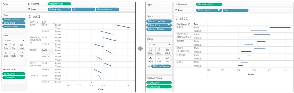
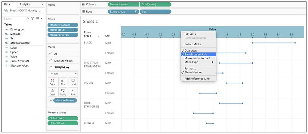
Second, drag the average value to axis and click “synchronize axis”.
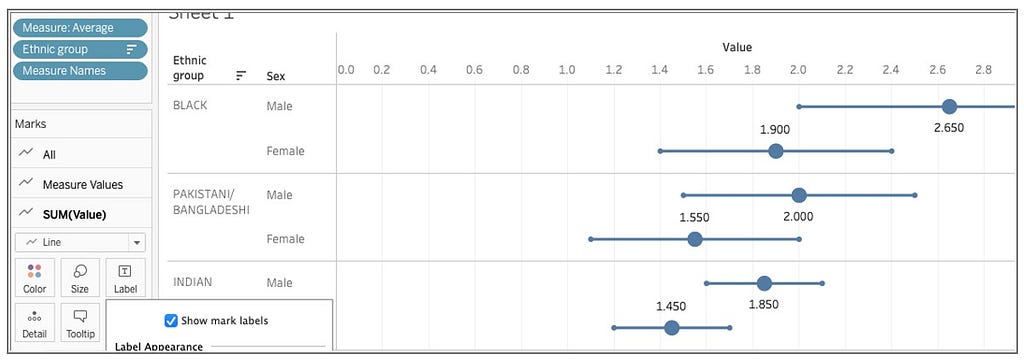
I wanted to display the average value in a circle, so I chose “circle” and enlarge the size to emphasize it. Then I clicked “Label” and checked “Show mark labels”.
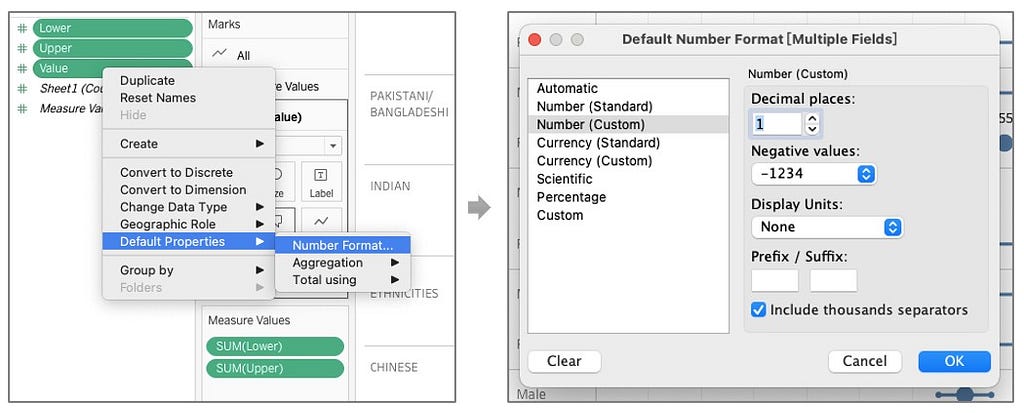
In other to round off to the second decimal place, you can change the number format from “Default Properties”.
Third, I changed the background color of the worksheet with “Format Shading” and the color of the line from red to gold.

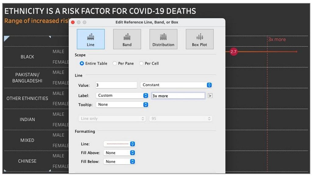
Forth, adding reference lines to make the graph easy to read. From “Analytics”, I used a custom reference line to draw the lines of 1x, 2x more, and 3x more.
Finally, selecting “Show Caption” from the worksheet and adjusting the size of the dashboard. This is how I made the graph. I was inspired by MakeoverMonday and Information is Beautiful. As we can see, there are different ethnicities that have been affected differently by the pandemic, probably because of a variety of different factors. The use of data visualization easily allows us to extract insights and explore data decoding its complexity. Thank you for reading. Any feedback is very welcome.
#insightextraction #tableau #datavisualization #datatransformation #covid19 #race
Data Visualization Performing a Data Analysis with Tableau: Does Ethnicity Play a Role in COVID… was originally published in Towards AI on Medium, where people are continuing the conversation by highlighting and responding to this story.
Published via Towards AI
Towards AI Academy
We Build Enterprise-Grade AI. We'll Teach You to Master It Too.
15 engineers. 100,000+ students. Towards AI Academy teaches what actually survives production.
Start free — no commitment:
→ 6-Day Agentic AI Engineering Email Guide — one practical lesson per day
→ Agents Architecture Cheatsheet — 3 years of architecture decisions in 6 pages
Our courses:
→ AI Engineering Certification — 90+ lessons from project selection to deployed product. The most comprehensive practical LLM course out there.
→ Agent Engineering Course — Hands on with production agent architectures, memory, routing, and eval frameworks — built from real enterprise engagements.
→ AI for Work — Understand, evaluate, and apply AI for complex work tasks.
Note: Article content contains the views of the contributing authors and not Towards AI.
Related posts
Recent Posts


")


