An Insight of Marketing Analytics
Last Updated on July 26, 2023 by Editorial Team
Author(s): Saniya Parveez
Originally published on Towards AI.

Introduction
Many industry-leading companies are already using data science to make better decisions and to improve their marketing analytics. With the expanded industry data, greater availability of data sources, and lower storage and processing costs, an organization can now masticate large volumes of frequently granular data with the help of several data science procedures and leverage it to create composite models, deliver modern tasks, and obtain important consumer acumens with higher accuracy. Using data science principles in marketing analytics is a determined cost-effective, practical way for a lot of companies to observe a customer’s journey and contribute a more customized experience.
Segmentation of Customer Data
Segmentation of customer data is the process of ordering (segmenting) target customers into different groups based on demographic or behavioral data so that marketing plans can be tailored more precisely to each group. It is also an important part of earmarking marketing sources properly because, by targeting particular customer groups, a higher return on expense for the marketing actions can be performed.
Customer Segmentation Data Clustering (Unsupervised Learning)
Unsupervised learning is a modern approach to do segmentation of customer data. It is excellent for customer data segmentation because it collects data points that are most like each other and clubs them together, which is exactly what good customer segmentation procedures should do.
Clustering is a kind of unsupervised machine learning that sees groups or clusters in data externally knowing them ahead of time. Following are the benefits of clustering:
- It can get customer groups that are unforeseen or unfamiliar to the data analyst.
- It is resilient and can be practiced for a broad range of data.
- It decreases the need for extensive expertise about connections between the demographics of customers and behaviors.
- It is prompt to act also it is scalable to very large datasets.
Limitations of clustering:
- Customer accumulations created may not be easily interpretable.
- If data is not based on consumer delivery (for example products or services purchased), it may not be obvious how to use the clusters that are seen.
Connection in Customers Data
To use clustering for customer segmentation, it is essential to determine the similarity or to be very particular about determining what kind of customers are similar.
Example:
Segmenting customers’ data based on the quality of bread customers tend to buy may not make sense if companies want to design marketing strategies for selling clothes.
Customer behavior, such as how they have reacted to marketing drives in the past, is normally the most important kind of data.
Standardizing Customers’ Data
To be able to determine customers based on continuous variables, it is required to rescale these parameters such that the data is on similar scales.
Example:
Let's take age and salary. These are very different computations. A person’s salary can be $90000 and his age can be 40 years. Therefore, It needs to be precise about how big a change in one of these variables is about the same as changing the others in terms of customer connection. Producing such kinds of presentations manually for each variable can be challenging. So, it requires standardizing the data, to reconcile them all on a standard scale.
Z-score is a way to standardize parameters for clustering with the following steps:
- Decrease the mean of the data from every data point.
- Decrease the mean of the data from every data point.
The standard deviation is a calculation of how extent our points is. Below formula to calculate the standardized value of a data point:

Where,
zi = ith standardized value
x = all values
mean(x) = the mean value of of all x values
std(x) = the standard deviation of the x values
Example of standardizing age and income data of customers
Below Python code will standardize the age and income data of customers.
Import all required packages.
import numpy as npimport pandas as pd
Generate random customer income and age data.
np.random.seed(100)df = pd.DataFrame()df['salary'] = np.random.normal(80000, scale=10000, size=100)df['age'] = np.random.normal(50, scale=10, size=100)df = df.astype(int)df.head()

Calculate the standard deviation of both columns concurrently using the std function.
df.std()

Calculate the means of the two columns.
df.mean()

Standardize the variables using their standard deviation and mean.
df['z_salary'] = (df['salary'] -df['salary'].mean())/df['salary'].std()df['z_age'] = (df['age'] - df['age'].mean())/df['age'].std()df.head()

Check standardization.
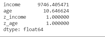
df.std()

Once the data is standardized, it requires to calculate the similarity between customers. Mainly, this is accomplished by measuring the distance between the customers in the feature space. In a two-dimensional scatterplot, the Euclidean distance between two customers is just the distance between their points.
Calculate Distance between Customers Data Points
Let's calculate the distance between three customers.
Import all required packages.
import math
Create age and income data.
ages = [50, 40, 30]salary = [50000, 60000, 40000]
Calculate the distance between the first and the second customer/
math.sqrt((ages[0] - ages[1])**2 + (salary[0] - salary[1])**2)

Calculate the distance between the first and third customers.
math.sqrt((ages[0] - ages[2])**2 + (salary[0] - salary[2])**2)

Here, in the output the distance between first and third customers and first and second customers are different.
Standardize the ages and salary using the mean and standard deviation.
z_ages = [(age - 40)/10 for age in ages]z_incomes = [(salary - 50000)/10000 for salary in salaries]
Again, calculate the distance between the standardized scores of the first and second customers.
math.sqrt((z_ages[0] - z_ages[1])**2 + (z_salaries[0] - z_salaries[1])**2)

Calculate the distance between the standardized scores of the first and third customers.
math.sqrt((z_ages[0] - z_ages[2])**2 + (z_salaries[0] - z_salaries[2])**2)

Here, after standardization, the distance between the first and second customers and the distance between the first and the third customers are the same.
K-means Clustering
k-means clustering is a very popular unsupervised learning method with a very wide range of utilization. It is very familiar because it scales to very large datasets, and manages to work quite well in application.
k-means clustering is an algorithm that attempts to find the best way of grouping data points into k separate groups, where k is a parameter given to the algorithm. The algorithm then works iteratively to try to find the best grouping.
Below are steps to do this algorithm:
- The algorithm starts by randomly picking k points in space to be the centroids of the clusters. Each data point is then allocated to the centroid that is closest to it.
- The centroids are refreshed to be the mean of all of the data points assigned to them. The data points are then reassigned to the centroid closest to them.
Step two is replicated till none of the data points changes the centroid they are assigned to after the centroid is updated.
Example: K-mean Clustering on Customer Salary and Age Data
Perform K-mean clustering on Customer Salary and Age data.
Import all required libraries.
import pandas as pdimport matplotlib.pyplot as pltfrom sklearn import cluster%matplotlib inline
Import customer’s CSV data.
df = pd.read_csv('/content/customer.csv')
df.head()

Create the standardized value columns for the salary and age values and store them in the z_salary and z_age variables.
df['z_salary'] = (df['salary'] - df['salary'].mean())/df['salary'].std()df['z_age'] = (df['age'] - df['age'].mean())/df['age'].std()
Plot customer data.
plt.scatter(df['salary'], df['age'])plt.xlabel('Salary')plt.ylabel('Age')plt.show()

Perform k-means clustering with four clusters.
model = cluster.KMeans(n_clusters=4, random_state=10)model.fit(df[['z_salary','z_age']])

Create a column called cluster that contains the label of the cluster each data point belongs to.
df['cluster'] = model.labels_df.head()

Plot the data.
colors = ['r', 'b', 'k', 'g']markers = ['^', 'o', 'd', 's']for c in df['cluster'].unique():d = df[df['cluster'] == c]plt.scatter(d['salary'], d['age'], marker=markers[c], color=colors[c])plt.xlabel('Salary')plt.ylabel('Age')plt.show()

So here, a plot of the data with the color/shape indicating which cluster each data point is assigned to.
High-Dimensional Data and Dimensionality Reduction
It is common to have data that has larger than just two dimensions. If we had some knowledge about how these customers reacted to promoted sales, how many purchases they had made of products, or how many people lived in their household, so then it will have many more dimensions.
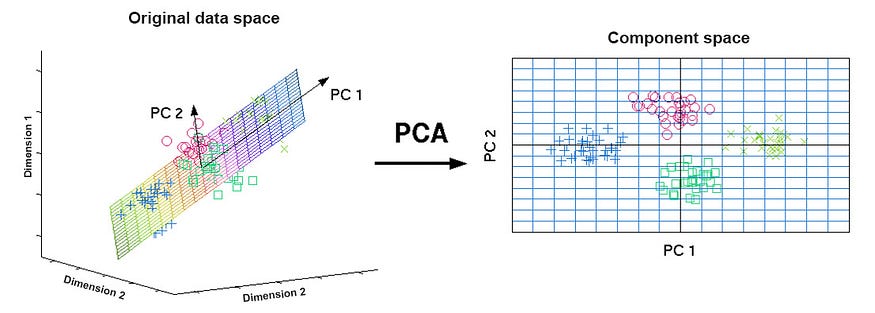
When data have additional dimensions, it becomes more challenging to visualize that data. So, dimensionality reduction comes into the picture. The purpose of dimensionality reduction is that data that is multi-dimensional is reduced, normally to two dimensions, for visualization purposes, while trying to preserve the distance between the points.
Principal component analysis (PCA) is used to perform dimensionality reduction. PCA is a method of transforming the data. It takes the original dimensions and creates new dimensions that capture the most variance in the data.

Example: Performing Dimensionality Reduction of High-Dimensional Data Using PCA
Import all required packages.
import pandas as pdfrom sklearn import clusterfrom sklearn import decompositionimport matplotlib.pyplot as plt%matplotlib inline
Import customer’s CSV data.
df = pd.read_csv('/content/pca_data.csv')df.head()

Standardize the three columns and save the names of the standardized columns in a list
cols = df.columnszcols = []for col in cols:
 df['z_' + col] = (df[col] - df[col].mean())/df[col].std()
 zcols.append('z_' + col)df.head()

Perform k-means clustering on the standardized scores.
model = cluster.KMeans(n_clusters=4, random_state=10)df['cluster'] = model.fit_predict(df[zcols])
Perform PCA on data.
pca = decomposition.PCA(n_components=2)df['pc1'], df['pc2'] = zip(*pca.fit_transform(df[zcols]))
Plot the clusters in the reduced dimensionality space.
colors = ['r', 'b', 'k', 'g']markers = ['^', 'o', 'd', 's']for c in df['cluster'].unique():
 d = df[df['cluster'] == c] plt.scatter(d['pc1'], d['pc2'], marker=markers[c], color=colors[c])plt.show()

Here in plotting, the x and y axes here are principal components and consequently are not easily interpretable. But, by visualizing the clusters, we can get an insight into how good the clusters are based on how much they overlay.
Conclusion
Unsupervised machine learning is an excellent modern technique to perform customer segmentation. K-means clustering, a generally used, fast, and easily scalable clustering algorithm. Investigation of data processing is also an important part of any data science. Presenting advanced analysis and creating visualizations to make processing easy to understand is an excellent technique to understand customer data. Matplotlib and seaborn library is a nice library to create adequate visualization. When we develop an analytics pipeline, the first step is to build a data model. A data model is a summary of the data sources that we will be working on, their associations with other data sources, where precisely the data from a specific source is going to enter the pipeline, and in what format(For example an Excel file, a database, or a JSON from an internet source, or REST API). The data model for the pipeline emerges over time as data sources and methods change. Marketing data, traditionally, comprises data of all three types. Originally, most data points started from different (mainly manual) data sources, so the values for a field could be of different lengths, the value for one field would not equate to that of other fields because of various field names, some rows receiving data from even the same origins could also have disappeared values for some of the fields. But promptly, because of technologies, structured and semi-structured data is highly available and is frequently being used to implement analytics. Nowadays data has two formats- structure and unstructured. Unstructured data is trendy and schema-free. Data processing and wrangling are the beginning, and very valuable, parts of the data science pipeline. It is commonly important if data engineers or data scientists are preparing data to have some domain knowledge about the data. Data processing also demands coming up with innovative resolutions and techniques. If data engineers are sure that projects data was arranged correctly, it is combined with other data sources. They also got rid of duplicates and unwanted columns, and finally, dispensed with missing data. After performing these steps, project data is made ready for analysis and modeling and could be put into a data science pipeline undeviatingly.
Join thousands of data leaders on the AI newsletter. Join over 80,000 subscribers and keep up to date with the latest developments in AI. From research to projects and ideas. If you are building an AI startup, an AI-related product, or a service, we invite you to consider becoming a sponsor.
Published via Towards AI
Towards AI Academy
We Build Enterprise-Grade AI. We'll Teach You to Master It Too.
15 engineers. 100,000+ students. Towards AI Academy teaches what actually survives production.
Start free — no commitment:
→ 6-Day Agentic AI Engineering Email Guide — one practical lesson per day
→ Agents Architecture Cheatsheet — 3 years of architecture decisions in 6 pages
Our courses:
→ AI Engineering Certification — 90+ lessons from project selection to deployed product. The most comprehensive practical LLM course out there.
→ Agent Engineering Course — Hands on with production agent architectures, memory, routing, and eval frameworks — built from real enterprise engagements.
→ AI for Work — Understand, evaluate, and apply AI for complex work tasks.
Note: Article content contains the views of the contributing authors and not Towards AI.


