


A Unique Way of Visualising Confusion Matrix — Sankey Chart
Last Updated on January 6, 2023 by Editorial Team
Author(s): Hrishikesh Patel
Originally published on Towards AI the World’s Leading AI and Technology News and Media Company. If you are building an AI-related product or service, we invite you to consider becoming an AI sponsor. At Towards AI, we help scale AI and technology startups. Let us help you unleash your technology to the masses.
A Unique Way Of Visualising Confusion Matrix — Sankey Chart
Go Sankey for Less Confusion!
A confusion matrix in machine learning conveniently summarizes a model’s performance. However, when communicating with non-technical stakeholders, the confusion matrix might seem unintuitive 🤔. So what’s the fix — create a Sankey diagram.
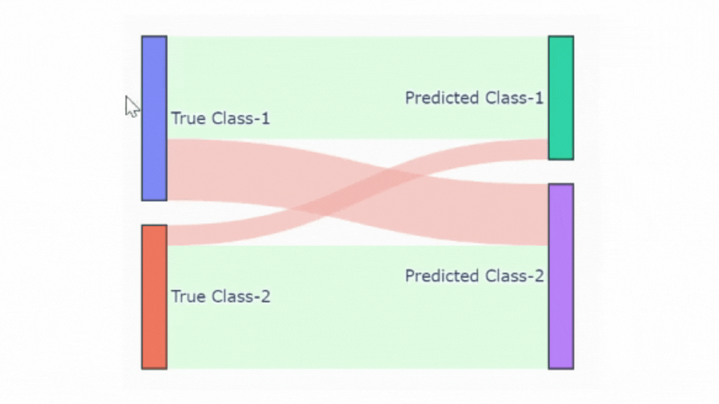
The above image illustrates the Sankey diagram for a typical binary confusion matrix. In the diagram,
- The rectangle boxes on the left show True classes whereas the right counterparts show Predicted classes.
- The green color highlights correct classifications and the red color is for misclassifications.
Story outline
- What’s a Sankey diagram in a nutshell?
- How to Create a Sankey diagram from a Confusion Matrix?
- Bonus 🎁
What’s a Sankey diagram in a nutshell?
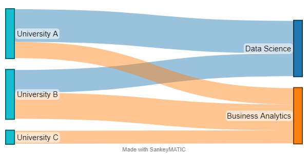
A Sankey diagram is used to visualize flow or connections from source to sink. Let’s understand its application with a simple example.
Consider we have a dataset of enrolments👨🎓👩🎓 in data science or business analytics courses in three universities🏫. Here the universities can be treated as the source and the courses as the sink. The number of enrolments indicates a connection from the source to the sink. Some of these connections can be heavier than others e.g. connection from University A to Data Science is heavier than its connection to business analytics.
Sankey diagram for confusion matrix has the following components:
- Source: True Classes
- Target (Sink): Predicted Classes
- Connection/flow: Number of instances
How to Create a Sankey diagram from a Confusion Matrix?
We’ll follow 3 steps approach as illustrated in the below image to create the Sankey diagram.

Step-1: Get Confusion Matrix
In this step, we’ll generate a confusion matrix. This can be output from the sci-kit learn confusion_matrix function. For simplicity, we’ll use the following confusion matrix.
Step-2: Transform Confusion Matrix to DataFrame
We’ll divide this step into several small steps.
2.1 — Create a dataframe from the confusion matrix
2.2 — Restructure the dataframe
2.3 — Add a new column ‘color’
Now we’ll add a new column ‘color’ to highlight the truth of predictions. Here rgba(211,255,216,0.6) indicates the green color, which will highlight correct predictions. Whereas incorrect predictions will be highlighted in red color which is rgba(245,173,168,0.6) .
2.4 — Map source and target columns to a numeric index
Let’s add a new column for the text to show when we hover over the chart.
2.5 — Add New Column “tooltip”
Now we are ready to plot the chart.
Step-3: Create a Sankey Chart
The plotting function go.Sankey takes two main arguments — node & link. Nodes are the classes i.e. True Class 1, Predicted Class 2, etc. and links are the connections/flow between True and Predicted Classes.
Bonus
Thanks for finishing all the steps😀 I know it’s a tedious process to go through the steps so why not create a function? Well, I have created a handy function to plot a Sankey chart for any confusion matrix (binary & multi-class).
Feel free to check out this notebook on GitHub to learn more about the function.
Before you go!
I hope you have enjoyed the story and found it useful. Follow me on Medium if you’d like more stories like this and subscribe to me to get my new stories directly into your inbox.
My other stories you might enjoy…
- How to Improve Your Analytical Report With Conditional Formatting In Pandas
- Try These Pandas Display Configurations in Your Next Analysis
A Unique Way of Visualising Confusion Matrix — Sankey Chart was originally published in Towards AI on Medium, where people are continuing the conversation by highlighting and responding to this story.
Join thousands of data leaders on the AI newsletter. It’s free, we don’t spam, and we never share your email address. Keep up to date with the latest work in AI. From research to projects and ideas. If you are building an AI startup, an AI-related product, or a service, we invite you to consider becoming a sponsor.
Published via Towards AI
Towards AI Academy
We Build Enterprise-Grade AI. We'll Teach You to Master It Too.
15 engineers. 100,000+ students. Towards AI Academy teaches what actually survives production.
Start free — no commitment:
→ 6-Day Agentic AI Engineering Email Guide — one practical lesson per day
→ Agents Architecture Cheatsheet — 3 years of architecture decisions in 6 pages
Our courses:
→ AI Engineering Certification — 90+ lessons from project selection to deployed product. The most comprehensive practical LLM course out there.
→ Agent Engineering Course — Hands on with production agent architectures, memory, routing, and eval frameworks — built from real enterprise engagements.
→ AI for Work — Understand, evaluate, and apply AI for complex work tasks.
Note: Article content contains the views of the contributing authors and not Towards AI.
Related posts
Recent Posts


")