


A Comprehensive Guide to Graph Customization with R GGplot2 Package
Last Updated on December 26, 2022 by Editorial Team
Author(s): Vincent Liu
Originally published on Towards AI the World’s Leading AI and Technology News and Media Company. If you are building an AI-related product or service, we invite you to consider becoming an AI sponsor. At Towards AI, we help scale AI and technology startups. Let us help you unleash your technology to the masses.
Part I: Making your ggplots shine with theme()
Why Visualizing Data and Why Customizing Visualizations
Data visualization is an integral part of the day-to-day responsibilities of many data-relevant roles, from data scientists to researchers and technical consultants. In these positions, charts (including maps) are used to communicate data findings with stakeholders and people with no background or comparative fluency in data science. Regardless the work is explorative analysis or machine learning, non-data professionals often care less about the process and more about the results, as algorithms are hard to understand and can’t be explained in a few words. Instead, they want to know the story. This is where visualizations excel compared to other forms, for example, pure writings and data notebooks.
Depending on the position, the requirement and preferred visualization tools also vary. Data journalists often use D3, HTML, and related front-end languages. Because of the publication nature, charts made by data journalists are also more well-formatted and thoughtful than other professionals. According to a friend who once worked for the New York Times, the norm is to finalize a graph that we see on the website. The team would go through several rounds of editing behind the scenes on aspects from chart uses to labels, colors, and grid lines. For researchers and analysts, the requirement may be less rigid. However, it can’t be wrong that the more personalized a graph is, the better the visualization will look, and the more compelling the story will be (There are also many data visualization theories, for example, the data-ink ratio concept developed by Edward Tufte. These theories can help us develop a better understanding of what data visualizations are great. Readers who are interested in them can do some research).
As a computational social science researcher focusing on issues in criminal justice and K-12 education, I often favor R more than Python in projects due to two reasons: R’s tidyverse system makes data cleaning a breeze, and there is no single visualization library in Python that is as easy-to-use, customizable, and versatile than R’s ggplot2.
For ggplots, there yet exists an important question. Whereas creating simple charts is a piece of cake, we often struggle with customizing them as we wish. Think about how many times we have to search How to xxx in ggplot on Google. Surely there are many resources online, but there lacks a comprehensive guide to all ggplot customization solutions. As a package developed under the Grammar of Graphics, ggplot is an extremely organized and logical visualization library for which, regardless of what we wish to do, there is a rule for that.
This series will talk about some rules behind the “how-to”. The first part (this one) centers around the theme() function. The next one will talk about scales. Throughout this series, I will use the School Survey on Crime and Safety (SSOCS) data collected by the National Center for Education Statistics, which contains information about the US public schools’ safety and disciplinary-related policies and practices, as examples.
What Does the Theme() Function Do
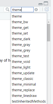
In R Studio, if you search the word “theme” in the help tab of the bottom-right panel (the place under the workspace environment in the standard layout), you will see two types of outputs: theme and theme_*, where * indicates some words, for example, theme_bw. Before we dive into the former, it’s important to understand the relationship between these two types.
Theme is a generalized version of theme_*, and theme_* is built on theme. Theme_* represents numerous established themes contained in the ggplot2 package, for instance, the default theme, theme_grey, is one of them. The grey-gridded layout in this theme is what you will see if you don’t specify any theme elements or a certain theme module. In addition to theme_grey, the commonly used themes also include theme_bw, theme_classic, theme_void, and more. I personally am a fan of theme_classic(), which gives you a layout with a white background, two axes, and no grids in any direction. Additionally, developers and researchers have also compiled other theme templates used in news outlets, such as the Financial Times and FiveThirtyEight. These modules are spread in a variety of R packages, for example, ggthemes. You can see all the themes and what they look like on graphs on this website.
To summarise, theme_* is a theme with defined theme elements, including margins, panel background, grids, axes, ticks, and legend layouts. It’s important to note that even when a theme is applied, these elements are not un-overridable. To do so, we will need to manually tell our ggplot how we want the graph to look through the generalized theme function.
The Marvelous Theme Function — Elements
What it does
As we have talked about, the numerous theme_*() functions set predefined theme elements in a certain way. This is done through the use of the theme() function. As the documentation page described, theme() allows users to modify any theme components and offer a consistent look. The theme components here refer to a myriad of important aesthetic elements, such as axes, grids, tickmarks, fonts, margins, legends, and backgrounds. These are the non-data components of ggplot, meaning these elements don’t decide the making of graphs. For example, you can’t make a bar chart or a scatter plot with the function. You also can’t modify the data with it. The function is meaningless should you not have a graph. However, the real magic of this function is that it can make your already-built graph more beautiful by allowing you to customize the visual components. The same can also be done in Matplotlib, Plotly, Alair, and many other visualization packages. However, in those tools, these transformations are achieved through multiple functions or steps and are usually far more complex than ggplot’s theme(), with more lines of codes required. As an example, in matplotlib, if you want to remove the plot border frames, the simplest way is to first remove the top frame by setting ax.spines[’top’].set_visible(False) and repeating the same to the other three frames. Whereas in ggplot, it’s a one-liner (panel.border = element_blank()). As part of the ggplot universe, the theme() is also developed under the philosophy of grammar of graphics that were pondered by Hadley Wickham, making it as organized as other ggplot functions. That is to say, all components in this function follow a structure.
Structure
Hadley Wickham explained the structure of the theme function as follows:
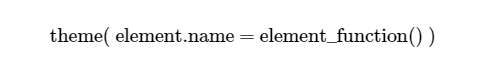
Here, theme.name is the name of the theme element that we want to do the transformation on, and element_function is the transformation we wish to apply to the data. There are over fifty detailed element names, which sounds like a lot, but you don’t really need to remember them because these element names can be classified into five large groups. These five groups are:
- axis
- legend
- panel
- plot
- strip
We will talk about them one by one.
Axis
Axis decides the formats of both the x and y axes. This includes everything on the axises, such as labels and ticks. In theme(), we can customize the following:
- axis.title : the title of the axis
- axis.text : the text label of the axis (i.e. the tick labels)
- axis.ticts : the tick marks on the axis (note: there is a s in ticks)
- axis.line : the axis line
Inside each, we can also specify which axis to modify by adding .x and .y after the element name. For example, if we want to apply a transformation to the x-axis line ONLY, the element name should beaxis.line.x . If we don’t specify the axis, then by default, the transformation is applied to both the x and y axes.
In axis.ticks , you can also make the tick marks longer or shorter by changing axis.ticks.length .
Legend
Next comes the legend. A legend is an extra explanation to the groups in the ggplot. Adding a legend is a common choice if there are multiple color or shape groups. But in a multigroup chart, a legend is not the only choice to display group information. Another common choice is adding data labels, which is especially popular in multi-group line charts. As an instance, I created the following chart in my data visualization class in which I used a data label instead of a legend.
Inside theme, you can modify the following legend components:
- legend.box : the legend box
- legend.background : the background of the legend box
- legend.margin and legend.spacing: the margins and spacings around each legend.
- legend.title and legend.text: the legend title and legend labels. Note you do not use these two to modify the texts (words). You use these two to modify the title and label elements (eg color, size, angle). I will talk about this in more detail in the next section about element functions. You can remove words by setting them to NULL or an empty string (“”).
- legend.position , legend.direction , and legend.justification : where the legend is positioned (the location), legend direction (horizontal/vertical), and legend justification (useful when placing the legend inside the chart).
- legend.key: the background and size of the legend key. You can specify the key size (legend.key.size ) and its width/height (legend.key.height/legend.key.width). Legend keys are the symbols used in the legend. For more information about the concept of legend keys, see here.
These are a lot. However, we usually do not need to use all of them. Most of the time I only need to use elements in the fourth and fifth bullet points (.title, .text, .position, .direction) to change the legend. To see more examples, you can also read this guide.
Panel
The panel is the space of your plot or the space where your data is mapped. People often confuse the panel from the plot, which is the area between the data layer and the whole plotting box. Alternatively, you can also understand the panel as the area bounded by or inside the x and y axes. The panel has the following attributes:
- panel.background : the panel background. This is the background of the data layer/plotting area
- panel.border : the panel border. This is the space around the plotting area (or the space between the plotting box and axis lines).
- panel.spacing : When a facet_wrap or facet_grid is applied, this is the space between two faceted plots.
- panel.grid : The grid lines. This includes both major and minor grid lines. Major grids are lines on major data breaks (or perpendicular to the ticks). To specify a major or minor grid, add .major or .minor afterpanel.grid . To specify the direction of grid lines, add .x (vertical) or .y (horizontal). For example, to specify a major horizontal grid line, the code should be panel.grid.major.x .
- panel.ontop : “If or not to place the panel (background, gridlines) over the data layers” (From the theme function documentation). This is a boolean and has the value of TRUE/FALSE.
Again, this is a lot. However, 90% of the time, panel.grid is the only one you will need to consider. For faceted plots, panel.spacing could also be very useful. The other theme names are rare. To understand the plot background and borders through examples, you can read this article.
Plot
The plot is the entire plotting area, excluding the panel (the data layer). In other words, a plot is a full space you see when you look at a visualization, whereas a panel is a smaller area inside this whole space bounded by two axes. The plot has the following elements:
- plot.background : the plot background
- plot.title , plot.subtitle , plot.caption , plot.tag : the title, subtitle, caption, and tag of a plot. The subtitle refers to the words under the title and above the plot, and the tag is usually the label identifying a plot. Most plots do not have a tag, but faceted plots usually do.
- plot.margin : margins around the plot. This is the space between the plot and the box.
I used all of these element names a lot. As you will see in the example I am above to show below; I used all attributes except for the plot background in the chart.
Strip
Last but not least, strip or panel strips are elements associated with faceted charts. Faceted charts are another layer beyond variable groups. Where there is over one grouping variable, faceting is one widely used solution. For example, in my own data journalism trilogy series Fostering Criminal Justice with Data Science, I created a few faceted charts. One of them is below. Faceting also has other names, for example, “small multiples”, which is a name preferred by New York Times, Pew Research Centers, and many places, and “trellis chart”. I am personally a fan of small multiples or faceting charts because of the value this technique adds to a plot. Pew has a Medium post that explains this approach and has some really good examples.
As I mentioned, elements in faceted charts in R can be modified using the strip theme. By default, all faceted charts have boxed labels on the top (and the right ) side(s) of the plot. If you are not familiar with the concept in R, some examples are here. The boxed label is called “strip”, and this is where the theme element gets its name from.
Strip has the following attributes:
- strip.background : background of faceted labels.
- strip.placement : where to place the strip. The strip can be put inside or outside the axes. The theme takes “inside” and “outside” as inputs.
- strip.text : texts on the strips (faceted labels).
- strip.switch.pad and strip.clip : space between strips and axes and if “strip background edges and strip labels be clipped to the extent of the strip background” (from the documentation).
Because the strip labels, which by default have grey background colors, are ugly, smartly using strip.background can make small multiples closer to the small multiples that we see in news outlets.
Other
There are also some miscellaneous element names, but the number of these components is small. The only commonly used two not covered in the five categories above is aspect.ratio , which is the ratio of the plot height divided by the width (height/width) and takes a numeric value, and margins, which represent the margins of the element. This concept will be expanded in the next section.
Element Function — Where The Magic Happens
Remember, theme() has two parts in structure, an element name and an element function. In the last section, we talked about elements, and now we talk about element functions.
Should we depict the theme function as building a train, then element names will be materials, and element functions will be the procedures of using materials to build each part of the train. If we think of the process of writing an article, then elements are the topics, and element functions are the contents under these topics. With element names, we know the “what”; however, without element functions, we won’t know what to do with the “what”. Element function is the “how”.
Because elements and element functions are deeply connected, there are multiple element functions corresponding to different types of elements. We will also talk about them one by one.
Element_blank
Many tutorials put element_blank() at the end when talking about ggplot themes, but I am doing it the reverse way here. Among all four element functions, this is the most simple and straightforward one. In my experience, this is also among the most widely used ones.
What element_blank() does is that it REMOVES an element by telling the theme function to do nothing on this theme. In other words, this function suppresses an element of the graph. This can be used with all element names where an element function can apply (this is close to 80–90 percent of elements. Some exceptions where this function can’t be applied are, for example, margins and tick lengths).
For an example, if we want to remove the x-axis line and the entire grid, the entire theme function should then be:
p + theme(
    axis.line.x = element_blank(),
    panel.grid = element_blank()
)
It’s also a common strategy to remove legends from a chart by setting
p + theme(
    legend.position = element_blank()
)
Element_text
All three other functions besides element_blank() applies only to elements that have a certain property. To start with, element_text() formats text-related elements. This includes text color, font, size, angle, weight (bold/normal/italic), and many others. This function has the following important attributes:
- size: the font size. This takes a number with point as its unit.
- color: a ggplot-allowed color name. There are more than 100 color names in R. If you are a more advanced data visualization maker, you can also specify a color hex code. A hex code must start with a “#” and follows by numbers, letters, or combinations of both. I actually recommend typing hex codes because color names are hard to remember.
- family: font family of the text. This is tricky because R only includes three font families by default, and if you wish to use personalized fonts, such as Georgia, you will have to download them on the website and loads the font to R. The whole process is extremely complicated and time-consuming, in my opinion.
- face: the font weight and style. This is equivalent to CSS’s font-weight parameter. The parameter takes one of the four values: “plain”, "bold”, "italic”, and “bold.italic". If not specified, then the weight will be plain, representing normal font-weight.
- vjust and hjust: vertical and horizontal justification of the text. This one moves the text along the vertical/horizontal line and usually takes a value between 0 and 1.
- angle: text angle. This one takes a numerical value between 0 and 360. Setting a text angle could be helpful when the text labels are long.
- margin: margins of the text. This follows the same rule as the margin theme function. I will talk about this pretty soon.
As an example, if we want to bold the y-axis label, increase the font to 15 px, and color it to blue, we can do:
p + theme(
    axis.line.y = element_text(family = "bold", size = 15, color = "blue")
)
Many people (me included) really love element_text() because it allows us to do a myriad of things on the texts.
Element_line
Similar to element_text() , element_line() modifies line elements. This line is usually an axis line or grid line. You can do the following on lines with element_line():
- color: same as above
- size: same as above but the unit is “mm”. (Note: This attribute is renamed to linewidth in recent package updates.)
- linetype: the line type. This takes one of the following: “blank”, “solid”, “dashed”, “dotted”, “dotdash”, “longdash”, “twodash”. According to the documentation, you can also give a numeric value between 0 and 8, but I personally think the string is more clear and easy to remember.
- lineend: the end shape of a line. This takes one of the three values among “round”, “butt”, and “square” and can be useful if we want the line to be round in lieu of the default squares.
- arrow: you can add an arrow to a line with this function. This parameter comes from the grid package (no extra installation needed).
As an example, if we wish to add dotted grey vertical grid lines with arrows, we can do:
p + theme(
    panel.grid.x = element_line(linetype = "dotted", color = "grey90", arrow = arrow())
)
Element_rect
The last element function is element_rect() , which applies to all elements that have a box. To relate some examples of this include the panel border, legend background, legend key, and strip background. As you can see, the commonality of these elements is that they are all within a rectangle/square. In this function, “rect” refers to rectangles. The function has the following attributes:
- fill: the fill color. Besides a color name or hex code, this could also take “transparent” as a value.
- color: the contour color. It takes a color name or a hex code.
- size or linewidth: the contour width in mms. Similar toelement_line(),size is depreciated in the most recent update and replaced with linewidth.
- linetype: the contour line type. This is the same as above.
As an example, if we want to fill the whole background to grey and change the strip background of the faceted label to grey while making the strip label red, we can do:
p + theme(
    panel.background = element_rect(fill = "grey90"),
    strip.background = element_recet(fill = "grey90"),
    strip.text = element_text(color = "red")
)
Other
There are also some miscellaneous element values that are not one of the above functions. The first important-to-know one in this category is margin, which has the values of:
p + theme(
    margin =  margin(c(t = 0, r= 0, b= 0, l= 0), "cm")
)
In the above example, t, r, b, and l respectively stand for “top”, “right”, “bottom” and “left”. You can specify one margin or all margins. The “cm” after the margin values is the unit, which has the default value of “pt” (point) if not specified. There are also other units, so the unit is whichever works for you.
Another theme value commonly used is unit, which takes a numeric value and an optional unit. For example, the following changes the tick lengths in both axes to 0.5 cm.
p + theme(
    axis.ticks.length = unit(.5, "cm")
)
Before wrapping up this section, it’s worth mentioning other three often-used theme names and pairs. These three control legend direction, position, and justification. For example, we can put a legend on top of a plot and horizontally orient by setting:
p + theme(
    legend.position = "bottom",
    legend.direction = "horizontal",
)
Applying Theme() to Data
In the last two sections, I have illustrated the theory and usage of the theme function. Now, to further explain this function and its magics, I have created two charts with and without applying themes. The data comes from the School Survey on Crime and Safety (SSOCS) and has been cleaned. The full code can be seen on my GitHub repository.
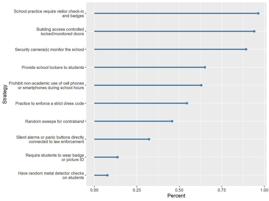
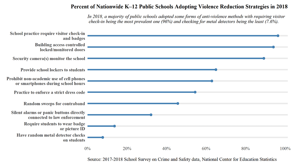
The lollipop chart talks about the prevalence of 10 anti-school violence strategies among 2762 sampled public schools. Many of these policies also reinforce the story of how a mass surveillance system can perpetuate the school-to-prison pipeline. In the first plot, there is no theme element, and the axis scale and label are not added and formatted.
data %>%
    ggplot(aes(x = Strategy, y = Percent)) +
    geom_point(size=2, color = "steelblue") +
    geom_segment(aes(x = Strategy, xend = Strategy,
                     y = 0, yend = Percent),
              size =1.3, color = "steelblue") +
    coord_flip() +
    scale_x_discrete(limits=rev)
In the chart below, I make the lollipop chart publication-ready through the following steps:
- Add title, subtitle, caption, and format the y-axis (i.e. the horizontal axis on the chart due to the effect of coor_flip())
- Apply the theme_classic()theme
- Change the text font to “serif” (good for web)
- Format horizontal alignment, size, margin, and weight of chart title, subtitle, and caption
- Expand the chart's top, right, and bottom margins so that there are spaces between the chart and other plotting areas
- Remove axis lines
- Remove axis ticks
- Bold y axis tick labels
- Add a horizontal major gridline, color it grey, and increase the line width to 1.3 mm.
data %>%
    ggplot(aes(x = Strategy, y = Percent)) +
    geom_point(size=2, color = "steelblue") +
    geom_segment(aes(x = Strategy, xend = Strategy,
                     y = 0, yend = Percent),
              size =1.3, color = "steelblue") +
    coord_flip() +
    theme_classic() +
    labs(y = "", x = "",
         title = "Percent of Nationwide K–12 Public Schools Adopting Violence Reduction Strategies in 2018",
         subtitle = "In 2018, a majority of public schools adopted some forms of anti-violence methods with requiring visitor\n check-in being the most prevalent one (96%) and checking for metal detectors being the least (7.6%).",
         caption = "Source: 2017-2018 School Survey on Crime and Safety data, National Center for Education Statistics")+
    scale_x_discrete(limits=rev) +
    scale_y_continuous(labels = scales::percent,
                       expand = c(0,0),
                       limits = c(0,1.013),
                       breaks = seq(0,1,.2)) +
    theme(
      text = element_text(family="serif"),
      plot.title = element_text(hjust = 1,  # move title along the line
                                size = 11,
                                face = "bold",
                                margin = margin(b = 10)), # bottom margin
      plot.subtitle = element_text(size=9, face = "italic",
                                   margin = margin(t = 0, b=10)),
      plot.caption = element_text(hjust = 0, size =9,
                                  margin = margin(t = 0)), # no top margin

      plot.margin = unit(c(t=0.3,r=0.5,b=0.3,l=0),
                         "cm"),
      axis.line = element_blank(), # no axis lines
      axis.ticks = element_blank(), # no axis ticks
      axis.text.y = element_text(face = "bold"), # bold axis labels
      panel.grid.major.y = element_line(size=1.3, # add x (horizontal) grid lines
                                        lineend = "round")
    )
Are you satisfied with the plot change?
Conclusion
In this post, we talked about how to customize plot appearances through the theme() and theme_*() functions. In the next part of the series, we will focus on doing scale transformations and why such transformation is useful. In part three, we may talk about color choices in ggplot.
Should you have more questions about the theme function, this tutorial may be helpful.
If you like this post, please FOLLOW me on Medium.
You can also see my personal website here and my LinkedIn here.
A Comprehensive Guide to Graph Customization with R GGplot2 Package was originally published in Towards AI on Medium, where people are continuing the conversation by highlighting and responding to this story.
Join thousands of data leaders on the AI newsletter. It’s free, we don’t spam, and we never share your email address. Keep up to date with the latest work in AI. From research to projects and ideas. If you are building an AI startup, an AI-related product, or a service, we invite you to consider becoming a sponsor.
Published via Towards AI
Towards AI Academy
We Build Enterprise-Grade AI. We'll Teach You to Master It Too.
15 engineers. 100,000+ students. Towards AI Academy teaches what actually survives production.
Start free — no commitment:
→ 6-Day Agentic AI Engineering Email Guide — one practical lesson per day
→ Agents Architecture Cheatsheet — 3 years of architecture decisions in 6 pages
Our courses:
→ AI Engineering Certification — 90+ lessons from project selection to deployed product. The most comprehensive practical LLM course out there.
→ Agent Engineering Course — Hands on with production agent architectures, memory, routing, and eval frameworks — built from real enterprise engagements.
→ AI for Work — Understand, evaluate, and apply AI for complex work tasks.
Note: Article content contains the views of the contributing authors and not Towards AI.
Related posts
Recent Posts


")

