


A comprehensive cheat sheet on Tableau Charts: A Road to Tableau Desktop Specialist Certification
Last Updated on May 23, 2022 by Editorial Team
Author(s): Daksh Trehan
Originally published on Towards AI the World’s Leading AI and Technology News and Media Company. If you are building an AI-related product or service, we invite you to consider becoming an AI sponsor. At Towards AI, we help scale AI and technology startups. Let us help you unleash your technology to the masses.
Chapter 12: A complete cheat sheet and description of Tableau charts with free Udemy Tableau Dumps
Welcome to the twelfth chapter, In this piece, we are going to learn about different charts in Tableau.
If you want to navigate through other chapters, visit: Tableau: What it is? Why it is the best?; A road to Tableau Desktop Specialist Certification.
If you want to directly go on Tableau Desktop Specialist notes, access them here → https://dakshtrehan.notion.site/Tableau-Notes-c13fceda97b94bda940edbf6751cf30
Use the link to get access to free Tableau certification dumps (Valid till 20 May 2022):
The main goal of Tableau is to create interactive visualizations. The tools make creating charts/graphs extremely convenient with just drag-and-drop functionality, no coding needed, and no errors.
The “Show Me” pane is extremely useful, especially for neophytes. It suggests all the valid charts for the data points we selected. The highlighted ones are the charts we can create and the shaded ones are the charts that aren’t valid for selected data points.
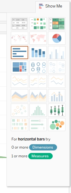
Show Me pane includes a total of 24 charts, we gonna discuss a few of them, their use-cases, and their minimum requirements.
Table of Content
- Bar Chart
– Horizontal Bar Chart
– Stacked Bar Chart
– Side-by-Side Bar Chart - Line Chart
– Continuous Line Chart
– Discrete Line Chart
– Dual Axis Chart
– Combined Axis Chart
– Dual Axis Chart vs Combined Axis Chart - Pie Chart
- Area Chart
– Continuous Area Chart
– Discrete Area Chart - Maps
– Symbol Map
– Filled Map - Scatter Plot
- Gantt Chart
- Bubble Chart
- Histogram
- Text Tables (Cross Tabs/Pivot Tables)
- Heat Map
- Highlight Table
- Treemap
- Box-and-Whisker Plot
- Sample Certification Questions from this topic
Bar Chart
A Bar chart is the most effective and easiest way to visualize data in Tableau.
There are three types of Bar Charts:
Horizontal Bar Chart
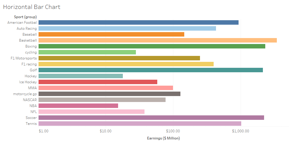
This is one of the most used charts in Tableau as it makes data ingestion and visualization as easy as possible. The chart clearly depicts the difference between various categories and hence is popular amongst data folks.
Minimum Requirements:
0 or more Dimensions, 1 or more Measures
Stacked Bar Chart
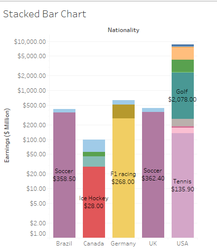
Stacked Bar Charts are an extended version of Horizontal Bar Charts. The motive is the same i.e. to show the difference between categories. But, Stacked Bar Charts are used when we want to further show the difference between sub-categories in categorical data. This increases the level of details in our viz.
Minimum Requirements:
1 or more Dimensions, 1 or more Measures
Side-by-Side Bar Chart
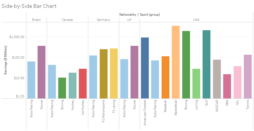
These are similar to stacked bar charts, the only difference is rather than categories being stacked over each other, the categories are spread like a nested bar chart i.e. bar chart in a bar chart. This makes the view even cleaner and easy to visualize.
Minimum Requirements:
1 or more Dimensions, 1 or more Measures
(Requires at least 3 fields)
Line Chart
The line chart could be Continuous, Discrete, or Dual.
When we create a Line chart, we get the “Path” option in our marks card.

Continuous Line Chart
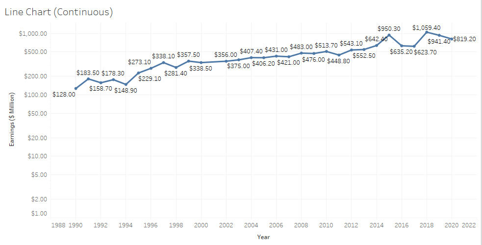
The continuous charts are useful when we try to depict a story of how things changed over time. We can add multiple categories in the view to show the difference between categories over time.
Minimum Requirements:
1 date, 0 or more Dimensions, 1 or more Measures
Discrete Line Chart
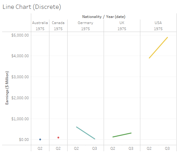
It is as same as Continuous Line Chart, the only difference is it requires a discrete date rather than continuous dates and thus provides an even better level of details as we can split our dates into further categories such as quarters, months, etc.
Minimum Requirements:
1 date, 0 or more Dimensions, 1 or more Measures
Dual-Axis Chart
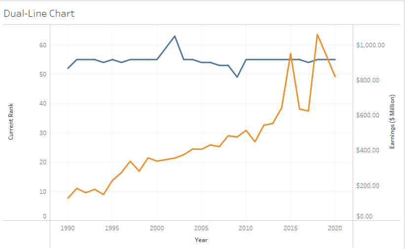
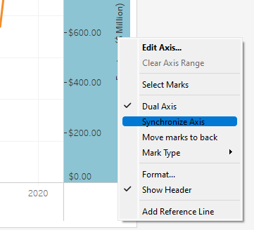
This type of chart is useful when we want to compare the performance of two measures throughout continuous time. It is called dual-axis because we have two separate axes for two different measures, although we can synchronize both axes to create a better view, by right-clicking on any one axis and choosing “Synchronize Axis”.
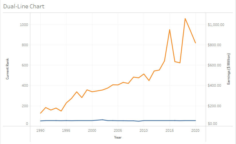
Minimum Requirements:
1 date, 0 or more Dimensions, 2 Measures
Combined Axis Chart
If we synchronize and hide any axis of Dual-axis charts, we get a combined axis chart.
The biggest advantage is we can add another dual-axis chart i.e. three measures in one view.
Dual Axis Chart vs Combined Axis Chart
- In the Combined Axis chart, both measures share the same axis. In the Dual Axis chart, both measures have a different axis.
- In the Combined Axis chart, only one mark is there. In the Dual Axis chart, multiple marks are created.
- In the Combined Axis chart, we can compare more than 2 measures. In the Dual Axis chart, we can only compare 2 measures.
- The combined Axis chart is also known as the Blended Axis Chart or Shared Axis Chart. The Dual Axis chart is also known as the Combination Chart.
Pie Chart
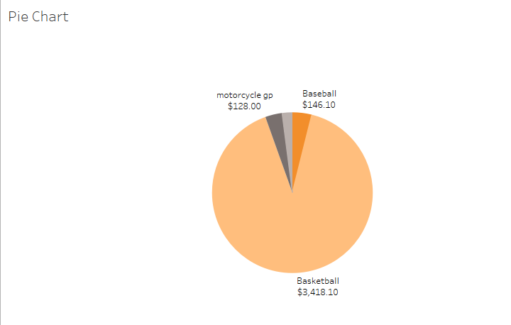
It would be better if you don’t use pie charts because they aren’t really accurate. Look at the chart, all three slices apart from Basketball really look similar. Could you’ve differentiated if you weren’t given exact data points? I am pretty sure not. In addition, if we had 20 different slices, it would’ve been a mess.
So use Pie-charts only when you have a maximum of 6 slices and preferably in a percentage relationship. If not, you can always use bar charts.
When we add a pie chart to the view, we get the “Angle” option in our marks card.
Minimum Requirements:
1 or more Dimensions, 1 or 2 Measure
Area Chart
There are two types of Area Charts:
Continuous Area Chart
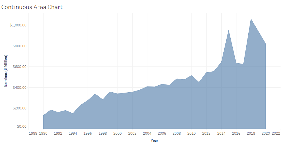
It is one of the most beautiful charts, it combines both line chart and bar chart together. The line shows the progress over years and the area shows the volume of the measure.
Minimum Requirements:
1 Date, 0 or more Dimensions, 1 or more Measures
Discrete Area Chart
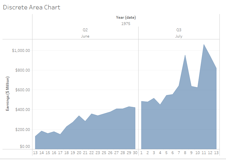
It is similar to Continuous Area Chart but requires a discrete date rather than a continuous date.
Minimum Requirements:
1 Date, 0 or more Dimensions, 1 or more Measures
Map
Symbol Map
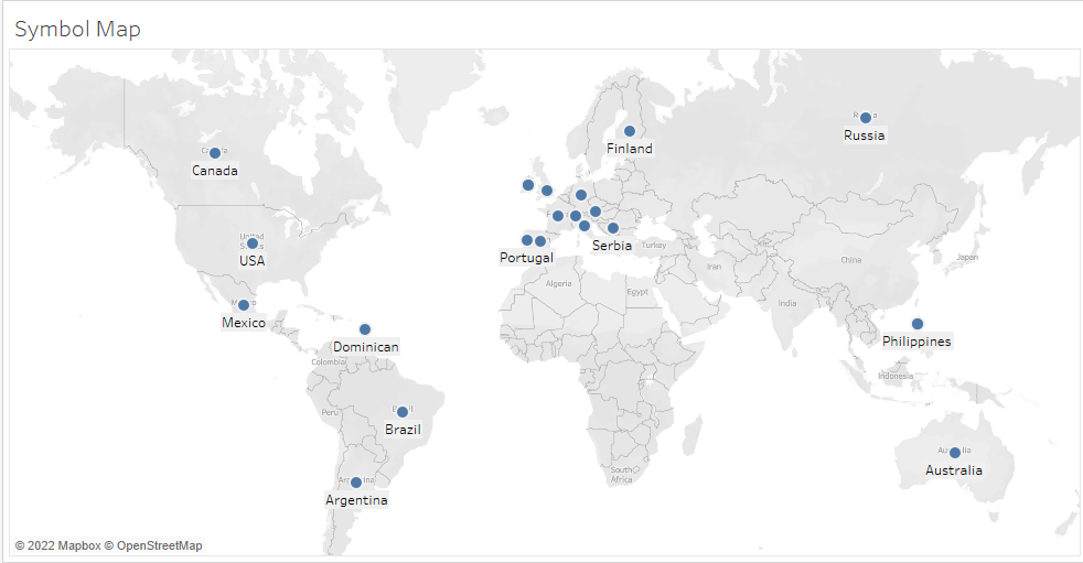
It can be used to tell a story containing geographical data. To further enhance the view, we can play with size and colors. To increase the Level-of-Detail we can create a hierarchy in our dataset. We can also add custom shapes rather than circular dots. We can modify the map type to satellite, streets, outdoor, etc.
Minimum Requirements:
1 Geo-Dimension, 0 or more Dimensions, 0 to 2 Measures
Filled Map
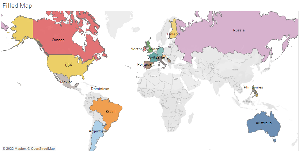
The motive is as same as of Symbol map i.e. to employ geographical data. But rather than symbols we use colors. It looks more intuitive and appealing. We can modify the map type to satellite, streets, outdoor, etc.
Minimum Requirements:
1 Geo-Dimension, 0 or more Dimensions, 0 to 2 Measures
Scatter Plot
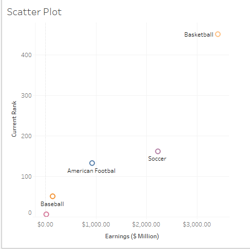
A Scatter plot is one of the best charts when we want to compare two different measures. Both axes contain two different measures, to add more functionality to our graph we can add a trend line to identify patterns amongst the data.
We can change the shape of our data points from the marks card.
Minimum Requirements:
0 or more Dimensions, 2 or 4 Measures
Gantt Chart
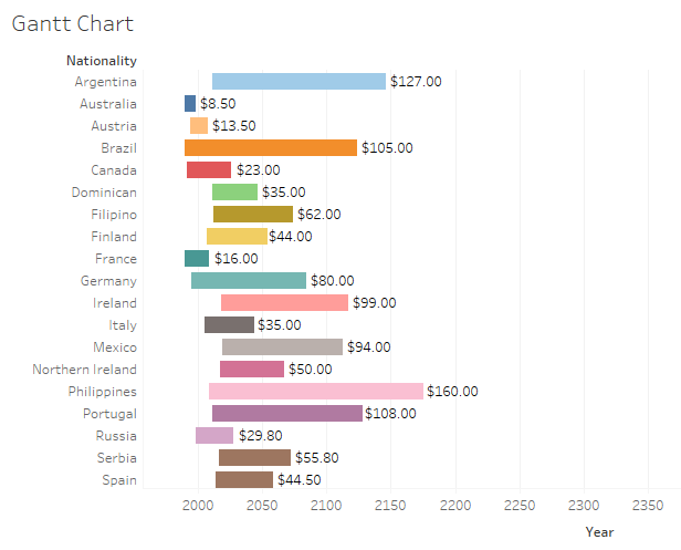
The Gantt chart is great to compare the performance of any measure w.r.t. various categories for some time. It also makes a perfect project management tool.
Minimum Requirements:
1 Date, 1 or more Dimensions, 0–2 Measures
Bubble Chart
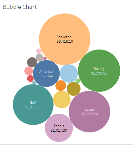
Bubble charts are one of the most appealing charts. It creates packed bubbles to use space efficiently. The size of bubbles depends on the measure, the higher the measure bigger the bubble.
Minimum Requirements:
1 or more Dimensions, 1 or 2 Measures
Histogram
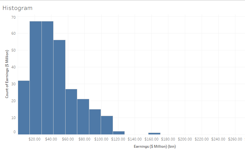
A histogram helps to depict the distribution of data via frequency/count. Tableau automatically segregates the data into bins, we can also do it manually. This chart can be useful when we want to analyze our measures.
Minimum Requirements:
1 Measure
Text Tables(Cross Tabs/Pivot Tables)
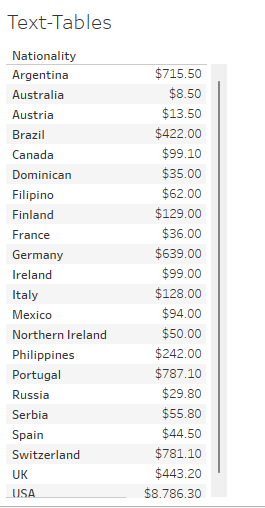
This is the most simple way to represent the data. This chart simply creates a spreadsheet containing dimensions and measures. This is one of the most boring graphs as it doesn’t have any visual cue, but it does the work.
Minimum Requirements:
1 or more Dimensions, 1 or more Measures
Heat Map
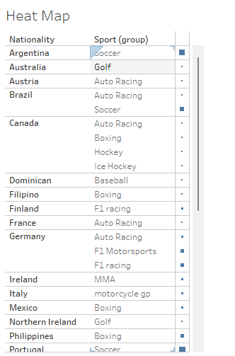
It is an extension to Text-Table, it uses color and shape to enhance the view.
Minimum Requirements:
1 or more Dimensions, 1 or 2 Measures.
Highlight Table
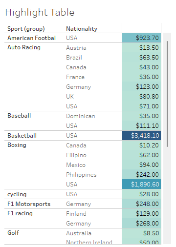
It is an extension to Text-Tables, it uses colored cells (similar to conditional formatting in Excel). The color gets darker as the value of the measure increases. This graph is more appealing than Text-Tables as it uses colors as cues. We can set the color scheme to either diverging or converging.
Minimum Requirements:
1 or more Dimensions, 1 Measure
Treemaps
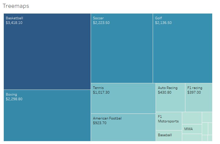
Treemaps are ideal graphs for hierarchical data. The size of boxes depends on the measure, the graph is visually appealing as it used both size and color as its cues. The higher the measure, the bigger the boxes will be. We can change the color scheme to either converging or diverging.
Treemaps only require marks pane and hence don’t have any axes. But to increase the granularity we can add fields to the row/column shelf. A treemap requires size, color, and details.
Minimum Requirements:
0 or more Dimensions, 1 or more Measures
Box-and-Whiskers Plot
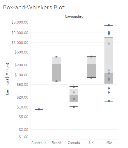
This is one of the most complex Tableau Charts. It compares the various categories as well as shows the distribution of each category.
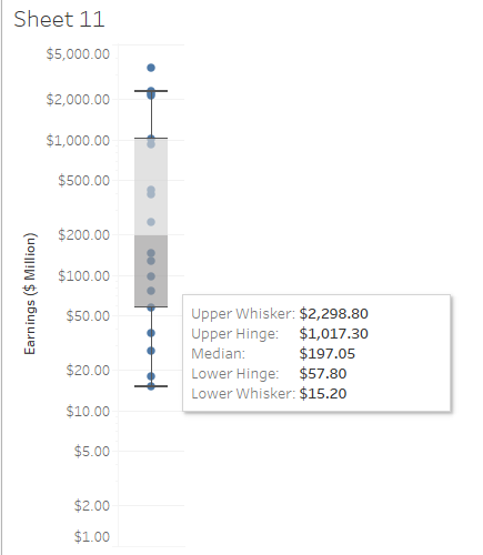
Upper Whisker and Lower Whisker denote Maximum and Minimum Value respectively.
Upper Hinge and Lower Hinge denote Upper Quartile(75% of data points lie here) and Lower Quartile(25% of data points lie here) respectively.
Median denotes the middle value of data when sorted in ascending/descending order.
Minimum Requirements:
0 or more Dimensions, 1 or more Measures
Sample Certification Questions from this Topic
Which chart is useful in identifying outliers?
a. Paretto Chart
b. Line Chart
c. Area Chart
d. Box Plot
Solution: Box Plot
Dual-axis chart is also known as?
a. Combination Chart
b. Combined axis chart
c. Blended axis chart
d. Shared axis chart
Solution: Combination chart
What are the pre-requisites to create a combined set?
a. They must have the same name.
b. They must be based on the same dimensions.
c. We can’t create a combined set.
d. There are no pre-requisites to create a combined set.
Solution: They must be based on the same dimension
Pick the wrong one
a. Go with Line chart to showcase Trend
b. Go with a Bar chart to showcase comparison
c. Go with TreeMap to show positive and negative measures
d. Go with a Line chart to display the Forecast
Solution: Go with TreeMap to show the positive and negative measure
Pick the wrong statement about Histogram?
a. Histograms work best when displaying continuous, numerical data
b. Unlike bar charts, histograms do not support comparisons between two or more categories
c. For data sets that impact customers, consumers, or clients, histograms can be used to measure satisfaction.
d. Histogram is an extended version of a Pie Chart
Solution: Histogram is an extended version of a Pie Chart
Use the link to get access to free Tableau certification dumps (Valid till 20 May 2022):
References:
[1] Tableau Help | Tableau Software
[2] Personal Notes
[3]Tableau Desktop Specialist Exam (New Pattern — 2021) — Apisero
Thanks for Reading!
Feel free to give claps so I know how helpful this post was for you, and share it on your social networks, this would be very helpful for me.
If you like this article and want to learn more about Machine Learning, Data Science, Python, BI. Please consider subscribing to my newsletter:
Find me on the Web: www.dakshtrehan.com
Connect with me at LinkedIn: www.linkedin.com/in/dakshtrehan
Read my Tech blogs: www.dakshtrehan.medium.com
Connect with me at Instagram: www.instagram.com/_daksh_trehan_
Want to learn more?
How is YouTube using AI to recommend videos?
Detecting COVID-19 Using Deep Learning
The Inescapable AI Algorithm: TikTok
GPT-3 Explained to a 5-year old.
Tinder+AI: A perfect Matchmaking?
An insider’s guide to Cartoonization using Machine Learning
How Google made “Hum to Search?”
One-line Magical code to perform EDA!
Give me 5-minutes, I’ll give you a DeepFake!
Cheers
A comprehensive cheat sheet on Tableau Charts: A Road to Tableau Desktop Specialist Certification was originally published in Towards AI on Medium, where people are continuing the conversation by highlighting and responding to this story.
Join thousands of data leaders on the AI newsletter. It’s free, we don’t spam, and we never share your email address. Keep up to date with the latest work in AI. From research to projects and ideas. If you are building an AI startup, an AI-related product, or a service, we invite you to consider becoming a sponsor.
Published via Towards AI
Towards AI Academy
We Build Enterprise-Grade AI. We'll Teach You to Master It Too.
15 engineers. 100,000+ students. Towards AI Academy teaches what actually survives production.
Start free — no commitment:
→ 6-Day Agentic AI Engineering Email Guide — one practical lesson per day
→ Agents Architecture Cheatsheet — 3 years of architecture decisions in 6 pages
Our courses:
→ AI Engineering Certification — 90+ lessons from project selection to deployed product. The most comprehensive practical LLM course out there.
→ Agent Engineering Course — Hands on with production agent architectures, memory, routing, and eval frameworks — built from real enterprise engagements.
→ AI for Work — Understand, evaluate, and apply AI for complex work tasks.
Note: Article content contains the views of the contributing authors and not Towards AI.
Related posts
Recent Posts


")

