


5 Tricks to Improve Bar Graphs: Matplotlib
Last Updated on January 6, 2023 by Editorial Team
Last Updated on December 3, 2020 by Editorial Team
Author(s): Manmohan Singh
Data Science
Learn to build a clean and interesting Bar Graph using various Matplotlib functionality
The bar graph is a widely used chart in data science. Charts help you to connect the data with your stakeholders, managers, or audience. Charts speak a story about your results. Your graph should not look messy. It should be clearly visible and easy to understand.
Bar charts popularly represent data that has multiple categories. Create a bar graph in such a way that it creates a meaningful picture of data in your audience’s mind.
A data scientist or data analyst should create a graph that represents data in an impartial way.
In this article, we discuss the best practices to create a highly effective bar graph. Bar graph represents time-series data, ranking, count of different categories, distribution of data, and deviation in data.
Let’s start with the best practices we should follow to create the best bar graphs.
1. Horizontal and Vertical Bar graphs
Graphical representation of categorical data can be done by horizontal or vertical graphs. As a data scientist, we should know when we need horizontal graphs and when we need vertical graphs.
Use a horizontal graph to represent data whose categories label name is not fit under vertical graphs. Also, I will recommend vertical graphs for those data whose categories are less than 7.
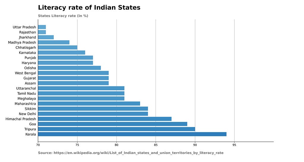
Vertical Bar Graph
Code to build Vertical Bar Graph
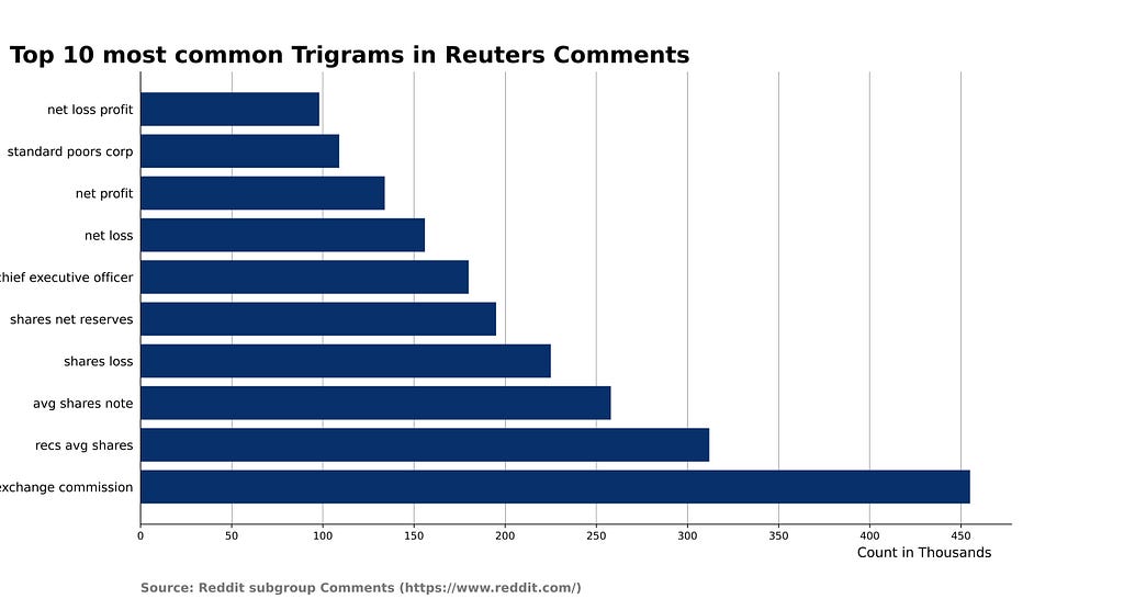
Horizontal Bar Graph
Code to build Horizontal Bar Graph
2. Format Style of Bar Graphs
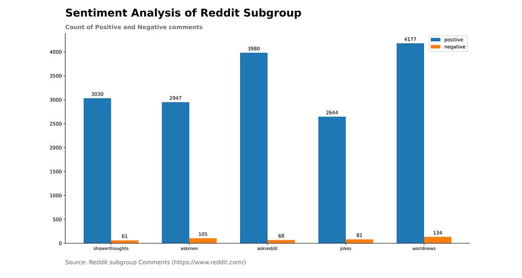
Grid Lines
Gridlines help you to compare the different categories in a bar graph. In the absence of gridlines, you will create imaginary lines in your mind to compare those classifications. Also, you can easily compare the different Key thresholds of your data when gridlines are present.
But, the overuse of gridlines makes your chart hard to read. So, be careful in choosing the range of grid lines.
Bar Graph with Grid lines
Code to built Bar Graph with Grid lines
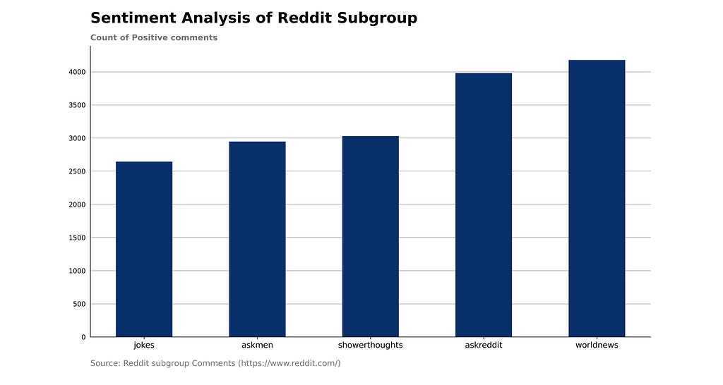
Labels
If your data have only 4–5 categories, then you can use the value of different groups instead of gridlines.
Labels display the exact values of the categories on the bar that enhances user visual representation. It makes the comparison a lot easier for your brain. I do not recommend labels for a high number of categories because space for label text decreases with an increase in a group.
Bar Graph without Grid lines
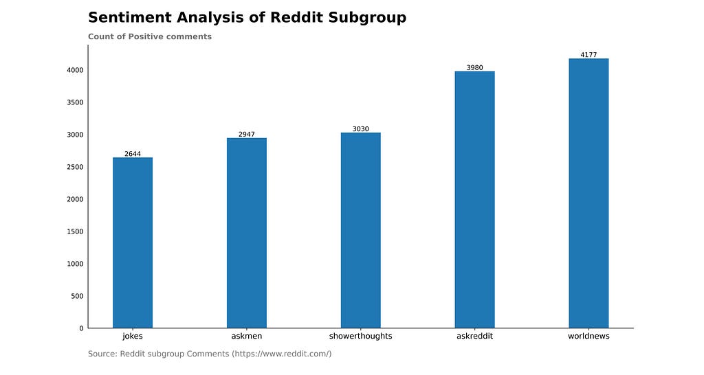
Code to build Bar Graph without Grid lines
Colors
Colors hold a crucial value in bar graphs. It speaks louder than the words. Use color in such a way that it will not distract users. Use colors that are understandable by the users. For Example, red color represents negative sentiment or a decrease in profit. Blue color represents cold temperature.
Also, blend your data with a single color or shades of color.
3. Add Clarity for Simple Bar graphs
Your graph should convey the story of your data simply and clearly. Chart titles are the best way to describe the meaning and purpose of your bar graphs. Display the source of your data at the bottom of the bar graphs.
Put y-axis column name or label text on the top left corner instead of the middle of the y-axis. We avoid vertical labels for the y-axis because it is hard to read.
Sort your bar chart in ascending, descending, or alphabetical order because it’s important to tell your data story in the right order.
4. Values of Label of Bar Graphs
For the horizontal bar, if you are labeling the individual bar’s value, then each label should align to the bottom of the bars. It helps in comparison with different bar value. You can also easily read the label.
Code to build Bar Graphs with Values of Labels
5. Axes of Bar Graphs
The values of the x-axis or y-axis of bar graphs should always start with 0. The length of bar graphs will vary if the starting point on the axis changes. Uneven heights of the bar due to the axis starting point will mislead the users and stakeholders. So, avoid such situations.
Also, try different graphs if bar graphs telling a misleading story of your data.
Axis where value start with 0.
Axis not start with 0.
Code to build Bar graphs whose Axis not starts with 0
Conclusion
Bar graphs are the most used charts to represent data by a data scientist or data analyst. Generally, stakeholders do not want to see your complex data or tables. They prefer simple graphs. Also, you can easily explain your complex data with simple bar graphs.
So, we should follow the visualization standard to build these charts and graphs. And, this article will help you to prepare neat bar graphs.
Hopefully, this article will help you to prepare impressive bar graphs.
5 Tricks to Improve Bar Graphs: Matplotlib was originally published in Towards AI on Medium, where people are continuing the conversation by highlighting and responding to this story.
Published via Towards AI
Towards AI Academy
We Build Enterprise-Grade AI. We'll Teach You to Master It Too.
15 engineers. 100,000+ students. Towards AI Academy teaches what actually survives production.
Start free — no commitment:
→ 6-Day Agentic AI Engineering Email Guide — one practical lesson per day
→ Agents Architecture Cheatsheet — 3 years of architecture decisions in 6 pages
Our courses:
→ AI Engineering Certification — 90+ lessons from project selection to deployed product. The most comprehensive practical LLM course out there.
→ Agent Engineering Course — Hands on with production agent architectures, memory, routing, and eval frameworks — built from real enterprise engagements.
→ AI for Work — Understand, evaluate, and apply AI for complex work tasks.
Note: Article content contains the views of the contributing authors and not Towards AI.
Related posts


Recent Posts


")

