


Exploratory Data Analysis in Few Seconds
Last Updated on February 21, 2021 by Editorial Team
Author(s): Juhi Sharma
Data Analysis
EDA through Pandas Visual Analysis
EDA is a way to understand what the data is all about. It is very important as it helps us to understand the outliers, relationship of features within the data with the help of graphs and plots.
EDA is a time taking process as we need to make visualizations between different features using libraries like Matplot, seaborn, etc.
There is a way to automate this process by a single line of code using the library Pandas Visual Analysis.
About Pandas Visual Analysis
- It is an open-source python library used for Exploratory Data Analysis.
- It creates an interactive user interface to visualize datasets in Jupyter Notebook.
- Visualizations created can be downloaded as images from the interface itself.
- It has a selection type that will help to visualize patterns with and without outliers.
Implementation
- Installation
We will start by installing pandas visual analysis using pip install.
!pip install pandas_visual_analysis
2. Importing Dataset
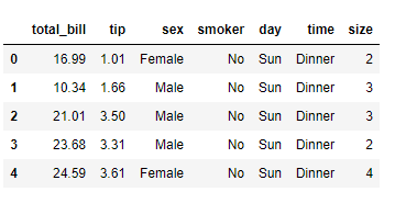
The data set that I am using here is already present in the seaborn library which can be easily loaded using the code given below.
import seaborn as sns
df=sns.load_dataset('tips')
df.head()
3. EDA using Pandas Visual Analysis
In this step, we will be importing pandas visual analysis and use it for exploratory data analysis of the dataset we are using.
from pandas_visual_analysis import VisualAnalysis
VisualAnalysis(df)
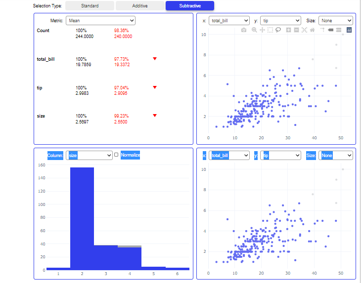
This will create a user interface containing all visualizations of our Dataset that too in just a few seconds. Here you can clearly visualize different attributes of the dataset.
Understanding Output
Let’s understand the different sections in the user interface :
- Statistical Analysis: This section will show the statistical properties like Mean, Median, Mode, and Quantiles of all numerical features.
- Scatter Plot-It shows the Distribution between 2 different features with the help of a scatter plot. you can choose features to be plotted on the X and Y axis from the dropdown.
- Histogram-It shows the distribution between 2 Different features with the help of a Histogram.
There are 3 types of selection for the data for which Visualizations will be Shown. By using the Subtract selection type you can drag and select the data points for which you want to analyze the visualizations and by using the Addition selection type you can again drag and add those data points which were excluded.
This feature is very useful if you want to see how visualizations between different features change with and without outliers in few seconds.
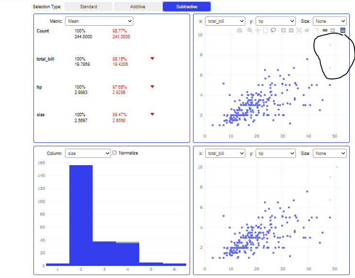
Here you can see that I have excluded outliers marked by pen by choosing subtraction selection and it changed visualizations in all other sections as well.
This is how you can use pandas visual analysis for EDA. One of the main advantages of using this library over other libraries is that you can customize your data point selection.
Before You Go
Thanks for reading! If you want to get in touch with me, feel free to reach me at jsc1534@gmail.com or my LinkedIn Profile. Also, you can find the code for this article and some really useful data science projects on my GitHub account.
Exploratory Data Analysis in Few Seconds was originally published in Towards AI on Medium, where people are continuing the conversation by highlighting and responding to this story.
Published via Towards AI
Towards AI Academy
We Build Enterprise-Grade AI. We'll Teach You to Master It Too.
15 engineers. 100,000+ students. Towards AI Academy teaches what actually survives production.
Start free — no commitment:
→ 6-Day Agentic AI Engineering Email Guide — one practical lesson per day
→ Agents Architecture Cheatsheet — 3 years of architecture decisions in 6 pages
Our courses:
→ AI Engineering Certification — 90+ lessons from project selection to deployed product. The most comprehensive practical LLM course out there.
→ Agent Engineering Course — Hands on with production agent architectures, memory, routing, and eval frameworks — built from real enterprise engagements.
→ AI for Work — Understand, evaluate, and apply AI for complex work tasks.
Note: Article content contains the views of the contributing authors and not Towards AI.
Related posts

")


Recent Posts


")

