


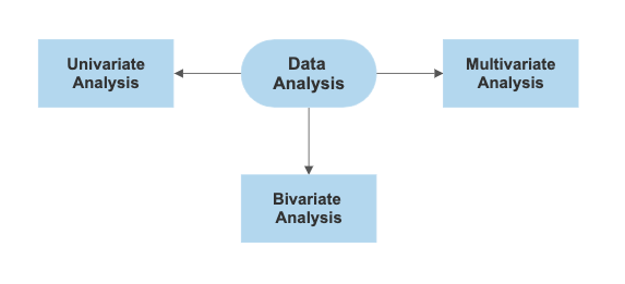
Univariate, Bivariate, and Multivariate Analysis
Last Updated on July 17, 2023 by Editorial Team
Author(s): Ann Mary Shaju
Originally published on Towards AI.
A beginner guide to exploratory data analysis using Matplotlib and Seaborn
Data is increasing daily, and in order to understand useful information and gain insights from data we need to analyse data. One, two or more variables can be used in data analysis. Also, the type of variable can be either numerical or categorical. Based on the number and type of variables there are different analysis techniques. In this article, I will be explaining the Univariate, Bivariate and Multivariate analysis of data.
The dataset used in the article is available on Github. The original source of the dataset is Kaggle. However, in order to explain a few functionalities have modified the dataset and saved it on Github.
Before performing the data analysis it is important to identify the numerical and categorical variables of the data frame. We can use info() for the same.
data.info()

From the info() we can identify the numerical and categorical variables of the given data frame.
Univariate Analysis
Uni means single and variate means variable. Hence univariate means the analysis of a single variable. In univariate analysis, we are trying to analyse the pattern present in a single variable.

Univariate Analysis for Numerical Variables
Univariate analysis of numerical variables can be performed using multiple methods.
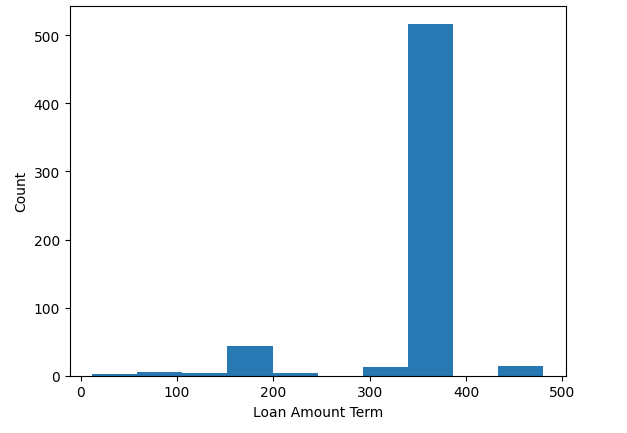
- Histogram: Histogram is used to plot the graphical representation of a numerical variable. The x-axis represents the numeric data and y-axis represents the respective count of the data.
import matplotlib.pyplot as plt
plt.hist(data["Loan_Amount_Term"]) # Histogram plot using matplotlib
plt.xlabel("Loan Amount Term")
plt.ylabel("Count")
import seaborn as sns
sns.histplot(data, x='Loan_Amount_Term') # Histogram plot using seaborn

- Box plot: Box plot is created to get the summary of variable ie. minimum, first quartile, median, 3rd quartile and maximum.
plt.boxplot(data["ApplicantIncome"]) # Box plot using matplotlib

sns.boxplot(data["ApplicantIncome"]) # Box plot using seaborn

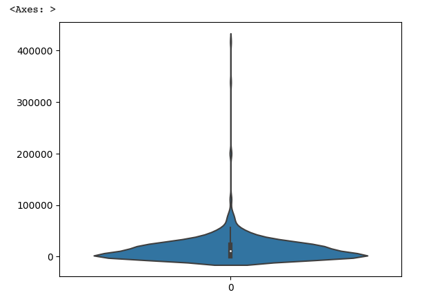
- Violin plot: A violin plot is a combination of a box plot and a histogram
plt.violinplot(data["CoapplicantIncome"]) # Violin plot using matplotlib

sns.violinplot(data["CoapplicantIncome"]) # Violin plot using seaborn
Univariate Analysis for Categorical Variables
Univariate analysis of categorical variables can be performed using the following methods
- Count plot: The count plot is similar to the histogram. But unlike histogram count plot represents frequency distribution of categorical data.
sns.countplot(data, x="Gender")

- Bar graph: A bar graph can also be used to represent the frequency distribution of categorical variable
# Bar graph using matplotlib
gender_counts = data['Gender'].value_counts()
plt.bar(gender_counts.index, gender_counts.values)
plt.title("Gender Distribution")
plt.xlabel("Gender")
plt.ylabel("Count")
plt.show()

# Bar graph using seaborn
gender_counts = data['Gender'].value_counts()
sns.barplot(data, x=gender_counts.index, y=gender_counts.values)

- Piechart: A piechart is a circular graph that is divided into slices like pies in order to represent numerical proportions of a variable
# Pie chart using matplotlib
dependents = data['Dependents'].value_counts()
plt.pie(dependents.values, labels=dependents.index, autopct='%1.1f%%')
plt.title("Dependents Distribution")

Bivariate Analysis
Bivariate means the analysis of two variables. Using bivariate analysis we can find how well the variables are correlated. Bivariate analysis is of 3 types
- Numerical variables
- Categorical variables
- Numerical & Categorical variable

Bivariate Analysis of Numerical Variables
- Scatterplot: Scatterplot uses dots to represent the relationship between two numeric variables.
# Scatter plot using matplotlib
plt.scatter(data["ApplicantIncome"], data["LoanAmount"])
plt.title("Scatter Plot of Applicant Income vs LoanAmount")
plt.xlabel("ApplicantIncome")
plt.ylabel("LoanAmount")
plt.show()

# Scatter plot using Seaborn
sns.scatterplot(data, x="ApplicantIncome", y="LoanAmount")
plt.title("Scatter Plot of Applicant Income vs LoanAmount")
plt.xlabel("ApplicantIncome")
plt.ylabel("LoanAmount")

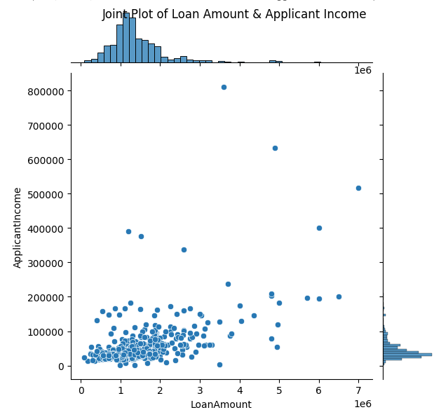
- Join plot: As the name joint plot suggests join plot joins bivariate and univariate graphs. Using the parameter kind we can mention the kind of plot to draw (ie. scatter, hex, hist, kde, reg, resid)
# Joint plot using Seaborn
sns.jointplot(data,x="LoanAmount",y="ApplicantIncome",kind="scatter")
plt.suptitle("Joint Plot of Loan Amount & Applicant Income")
Bivariate Analysis of Categorical Variables
- Count plot: Using the hue parameter we can analyse two categorical variables in a count plot.
sns.countplot(data, x="Education", hue="Loan_Status")

Bivariate Analysis of Numerical & Categorical Variable
- Barplot: Using x and y parameter we can find the relationship between a numeric and categorical variable
sns.barplot(data, x="Gender", y="ApplicantIncome")

- Box plot: Using x and y parameter we can find the relationship between a numeric and categorical variable.
sns.boxplot(data, x="Self_Employed", y="ApplicantIncome")

- Violin plot: Using x and y parameter we can find the relationship between a numeric and categorical variable in violin plot.
sns.violinplot(data, x="Property_Area", y="LoanAmount")

- Displot: Displot plots the relationship between numeric and categorical variable. Using the parameter kind we can mention the kind of plot to draw (ie. hist, kde)
sns.displot(data, x= "ApplicantIncome", hue="Married", kind="kde")

Multivariate Analysis
Multivariate means the analysis of more than two variables.

- Bar plot: In the bar plot x and y parameter is used to plot the relationship between a categorical and numerical variable. In addition to that we can use the hue parameter to group variables.
sns.barplot(data, x="Gender", y="ApplicantIncome", hue="Loan_Status")

- Pair plot: Pair plot plots the pairwise relationship in a dataset. By default, a pair plot gives the relationship between numerical variables but by specifying the variables we want to analyse in the vars parameter we can analyse categorical and numerical variables of a data frame.
# By passing data.columns in vars parameter,
# we can analyse categorical and numerical variables of a data frame
sns.pairplot(data, vars=list(data.columns))
sns.pairplot(data, vars=['ApplicantIncome', 'Gender', 'Education'])

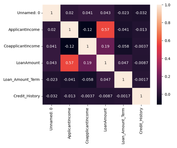
- Heatmap: The heatmap is used to visualise the correlations between pairs of numeric variables.
sns.heatmap(data.corr(), annot=True)
- hist(): hist() is a function of the pandas library. It makes histograms of all numeric variables of a data frame. hist() calls matplotlib.pyplot.hist() on each series of the data frame.
data.hist(bins=50, figsize=(12, 8))
Conclusion
In this article, we looked at what is univariate, bivariate and multivariate analysis. We also learnt various ways of plotting the data using Matplotlib and Seaborn libraries. The graphs discussed in the above article are not the only graphs available, based on the use case we can decide which graph to use.
Join thousands of data leaders on the AI newsletter. Join over 80,000 subscribers and keep up to date with the latest developments in AI. From research to projects and ideas. If you are building an AI startup, an AI-related product, or a service, we invite you to consider becoming a sponsor.
Published via Towards AI
Related posts


Popular posts

 for 2021")


Updates

Recent Posts


