 Logo:
Logo:  Areas Served:
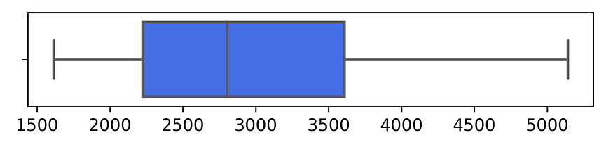
Box Plot, Violin Plot, Ridgeline Plot — Oh My
Last Updated on July 15, 2023 by Editorial Team
Author(s): Adam Ross Nelson
Originally published on Towards AI.
How, when, and why to use these lesser-appreciated plots
I say move over mere histograms!
Make room for the triumvirate of data visualization tools that often fly under the radar. Box plots, violin plots, and ridgeline plots possess immense potential for revealing underlying data structure and pattern.
Box plots, a classic tool, elegantly summarize a distribution’s key characteristics, such as its median, quartiles, and if there may be a potential outlier. Here is an example (minus labels, titles, and legends just to convey the main point).
Image Credit: Author’s illustration. A minimal box plot to show its main features. See below for a discussion of how scientists make these plots, how they… Read the full blog for free on Medium.
Join thousands of data leaders on the AI newsletter. Join over 80,000 subscribers and keep up to date with the latest developments in AI. From research to projects and ideas. If you are building an AI startup, an AI-related product, or a service, we invite you to consider becoming a sponsor.
Published via Towards AI
Related posts
Popular posts

 for 2021")


Updates

Recent Posts