Uncovering the Illusion: A Closer Look at Simpson’s Paradox and Its Implications for Statistical Analysis
Last Updated on July 17, 2023 by Editorial Team
Author(s): Abhishek
Originally published on Towards AI.
How to Detect and Avoid Simpson’s Paradox: A Statistical Phenomenon that Can Challenge Our Intuition and Assumptions
Table of contents:
- Introduction
- Real-world incidents in history
- Analysing real-world data examples using python
- Mathematical and logical reasons behind Simpson’s paradox and Detection Techniques
- Conclusion
Introduction:
Imagine you are looking at a pile of coins. You notice that most of them are heads. You think to yourself, “Wow, this is a lucky pile of coins!” But then you decide to separate the coins by their color: silver and copper. You are shocked to find that most of the silver coins are tails and most of the copper coins are tails too. How can this be? How can the whole pile mostly head, but the subgroups be mostly tails?
This is an example of Simpson’s paradox, a weird and wonderful phenomenon where a trend or relationship that appears in a group of data disappears or reverses when the group is split into smaller subgroups.
Simpson’s paradox can be very tricky and deceptive, especially if you are basing your decisions on data. It can also lead to false assumptions and unfair consequences. For instance, Simpson’s paradox can make it look like medicine is better or worse than it really is, or that a school is biased or fair to certain students based on their marks.
In this article, we will explore what causes Simpson’s paradox, how to spot it and avoid it, and what it means for data analysis and decision making. We will also look at some real-world examples of Simpson’s paradox in action and how it can affect our lives.
Real-world incidents in history:

Analyzing real-world data examples using Python:
Dataset: California DDS Expenditures dataset
Hypothesis: According to the lawsuit, White non-Hispanics received more financing than Hispanics.
But, in reality, the scenario is absolutely different when we drill down the data into smaller parts or groups to analyze.
Code:
Importing Libraries
import pandas as pd
import matplotlib.pyplot as plt
import seaborn as sns
df = pd.read_csv("californiaDDSDataV2.csv")
df.head()
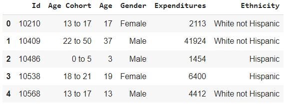
Now let’s explore the overall stat of the whole population
df.describe()

To find out if there is ethnic prejudice in the expenditures is our issue statement. Let’s calculate the average expenditures by ethnicity and see whether the assertion is true.
ethnicity_averages = df.groupby('Ethnicity').mean().sort_values('Expenditures')
# Plot the average expenditures per ethnicity
fig, ax = plt.subplots()
ax.bar(ethnicity_averages.index, ethnicity_averages['Expenditures'])
ax.set_ylabel('Average Expenditures per Person')
ax.set_title('Average Expenditures by Ethnicity')
plt.xticks(rotation=45)
plt.show()
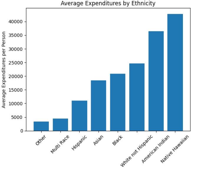
Inference from above – In this example, we see that the average expenditures per person are highest for Native Hawaiian, followed by American Indian, and lowest for the Black ethnicity.
However, we should keep in mind that this is just an average and may not represent the spending patterns of every individual within each ethnicity.
Now, Group the data by gender and calculate the average expenditures per gender to check if there is any gender bias or not.
gender_averages = df.loc[:,['Gender', 'Expenditures']].groupby('Gender').mean().sort_values('Gender')
print(gender_averages)
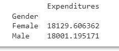
Inference -Based on the previous code output, we can infer that there is not a significant difference in the average expenditures between males and females. Therefore, the gender parameter may not be a useful variable for further analysis and could be discarded.
# Group the data by age cohort and calculate the average expenditures per age cohort
agecohort_averages = df.loc[:,['Age Cohort', 'Expenditures']].groupby('Age Cohort').mean().sort_values('Expenditures')

# Print the age cohort averages
print(agecohort_averages)
 Expenditures
Age Cohort
0 to 5 1415.280488
6 to 12 2226.862857
13 to 17 3922.613208
18 to 21 9888.537688
22 to 50 40209.283186
51+ 53521.896226
Inference -Based on the output of the previous code, it can be inferred that there is a significant difference in the average expenditures across different age cohorts. This could suggest the presence of age bias in the expenditure data. For instance, it is possible that certain age cohorts are receiving more or less funding than others.
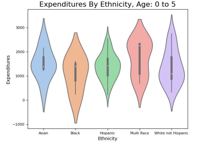
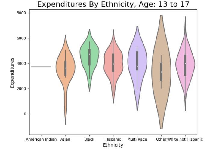
Let us now delve deeper into the financial distribution of each ethnic group, and how it is allocated across different age cohorts. This will help us to gain a more nuanced understanding of the relationship between age, ethnicity, and financial expenditure. By examining the financial distribution of each ethnic group across various age cohorts, we can uncover potential patterns and trends that may be present, and gain insight into how these groups allocate their resources over time.
# Filter the data by age cohort
age_0_5 = df['Age Cohort'] == '0 to 5'
age_6_12 = df['Age Cohort'] == '6 to 12'
age_13_17 = df['Age Cohort'] == '13 to 17'
age_18_21 = df['Age Cohort'] == '18 to 21'
age_22_50 = df['Age Cohort'] == '22 to 50'
age_51_plus = df['Age Cohort'] == '51+'
# Create a violin plot of expenditures by ethnicity for age cohort 0 to 5
vplot = sns.violinplot(x='Ethnicity', y='Expenditures',
 data=df.where(age_0_5).dropna().sort_values('Ethnicity'),
 scale="width",
 palette="pastel")
vplot.axes.set_title("Expenditures By Ethnicity, Age: 0 to 5", fontsize=16)
vplot.set_ylabel("Expenditures", fontsize=10)
vplot.set_xlabel("Ethnicity", fontsize=10)
vplot.tick_params(labelsize=8)
# Create a violin plot of expenditures by ethnicity for age cohort 6 to 12
vplot = sns.violinplot(x='Ethnicity', y='Expenditures',
 data=df.where(age_6_12).dropna().sort_values('Ethnicity'),
 scale="width",
 palette="pastel")
vplot.axes.set_title("Expenditures By Ethnicity, Age: 6 to 12", fontsize=16)
vplot.set_ylabel("Expenditures", fontsize=10)
vplot.set_xlabel("Ethnicity", fontsize=10)
vplot.tick_params(labelsize=8)

# Create a violin plot of expenditures by ethnicity for age cohort 13 to 17
vplot = sns.violinplot(x='Ethnicity', y='Expenditures',
 data=df.where(age_13_17).dropna().sort_values('Ethnicity'),
 scale="width",
 palette="pastel")
vplot.axes.set_title("Expenditures By Ethnicity, Age: 13 to 17", fontsize=16)
vplot.set_ylabel("Expenditures", fontsize=10)
vplot.set_xlabel("Ethnicity", fontsize=10)
vplot.tick_params(labelsize=8)
# Create a violin plot of expenditures by ethnicity for age cohort 18 to 21
vplot = sns.violinplot(x='Ethnicity', y='Expenditures',
 data=df.where(age_18_21).dropna().sort_values('Ethnicity'),
 scale="width",
 palette="pastel")
vplot.axes.set_title("Expenditures By Ethnicity, Age: 18 to 21", fontsize=16)
vplot.set_ylabel("Expenditures", fontsize=10)
vplot.set_xlabel("Ethnicity", fontsize=10)
vplot.tick_params(labelsize=8)

# Create a violin plot of expenditures by ethnicity for age cohort 22 to 50
vplot = sns.violinplot(x='Ethnicity', y='Expenditures',
 data=df.where(age_22_50).dropna().sort_values('Ethnicity'),
 scale="width",
 palette="pastel")
vplot.axes.set_title("Expenditures By Ethnicity, Age: 22 to 50", fontsize=16)
vplot.set_ylabel("Expenditures", fontsize=10)
vplot.set_xlabel("Ethnicity", fontsize=10)
vplot.tick_params(labelsize=5)

# Create a violin plot of expenditures by ethnicity for age cohort 51 plus
vplot = sns.violinplot(x='Ethnicity', y='Expenditures',
 data=df.where(age_51_plus).dropna().sort_values('Ethnicity'),
 scale="width",
 palette="pastel")
vplot.axes.set_title("Expenditures By Ethnicity, Age: 51 plus", fontsize=16)
vplot.set_ylabel("Expenditures", fontsize=10)
vplot.set_xlabel("Ethnicity", fontsize=10)
vplot.tick_params(labelsize=5)
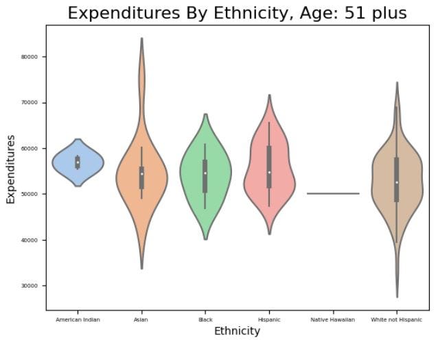
Upon examining the violin plots, we can observe that there is no apparent bias or discrimination towards any particular ethnicity when the financial expenditures are broken down by age group. This is evident from the consolidation of the median, interquartile range (IQR), distribution, and density across all ethnic groups. In other words, the data does not reveal any significant differences in the financial distribution or allocation across different ethnicities when analyzed across various age cohorts. This is an important finding, as it indicates that there is no evidence of systemic discrimination or bias towards any particular ethnic group in the allocation of financial resources.
Mathematical and logical reasons behind Simpson’s paradox and Detection techniques:
Simpson’s paradox happens when the overall association between two categorical variables is different from the association between the same two variables within each subgroup of a third variable. For example, a drug may seem to work better than a placebo when comparing two groups of patients, but worse than a placebo when comparing subgroups of patients with different conditions.
One mathematical reason for Simpson’s paradox is that the proportions of the subgroups may vary across the groups being compared, and this may affect the overall association. For example, if a drug is more effective for a rare condition than a common condition, but most patients in one group have the common condition while most patients in another group have the rare condition, then the overall effect of the drug may be hidden or reversed by the effect of the condition.
Another mathematical reason for Simpson’s paradox is that the distributions of the outcome variable may vary across the subgroups, and this may affect the overall association. For example, if a drug has a higher success rate for both men and women than a placebo, but women have a higher success rate than men regardless of the drug, then the overall effect of the drug may be hidden or reversed by the effect of gender.
One logical reason for Simpson’s paradox is that causal relationships may be masked or distorted by confounding variables that are not considered in the analysis. For example, if smoking is associated with both lung cancer and coffee drinking, but coffee drinking has a protective effect against lung cancer, then the overall association between smoking and lung cancer may be weaker than the association after controlling for coffee drinking.
Simpson’s paradox can be detected by doing stratified analysis or regression analysis to check whether the association between two variables changes or disappears after adjusting for potential confounding variables. Simpson’s paradox can be avoided by using appropriate methods of causal inference, such as randomized experiments, natural experiments, or causal diagrams, to identify and estimate the causal effect of interest.
Conclusion:
We hope that this article has given you a deeper and more accurate understanding of the complex relationships and patterns that exist in our data, and how to avoid being misled by Simpson’s paradox. By being aware of Simpson’s paradox and taking the necessary steps to prevent it, we can gain more insight and confidence in our data analysis and decision-making.
Join thousands of data leaders on the AI newsletter. Join over 80,000 subscribers and keep up to date with the latest developments in AI. From research to projects and ideas. If you are building an AI startup, an AI-related product, or a service, we invite you to consider becoming a sponsor.
Published via Towards AI
Towards AI Academy
We Build Enterprise-Grade AI. We'll Teach You to Master It Too.
15 engineers. 100,000+ students. Towards AI Academy teaches what actually survives production.
Start free — no commitment:
→ 6-Day Agentic AI Engineering Email Guide — one practical lesson per day
→ Agents Architecture Cheatsheet — 3 years of architecture decisions in 6 pages
Our courses:
→ AI Engineering Certification — 90+ lessons from project selection to deployed product. The most comprehensive practical LLM course out there.
→ Agent Engineering Course — Hands on with production agent architectures, memory, routing, and eval frameworks — built from real enterprise engagements.
→ AI for Work — Understand, evaluate, and apply AI for complex work tasks.
Note: Article content contains the views of the contributing authors and not Towards AI.


