Tutorial on Barplots using R’s ggplot Package
Last Updated on July 20, 2023 by Editorial Team
Author(s): Benjamin Obi Tayo Ph.D.
Originally published on Towards AI.
Using R’s “ggplot” package for barplots of three different datasets

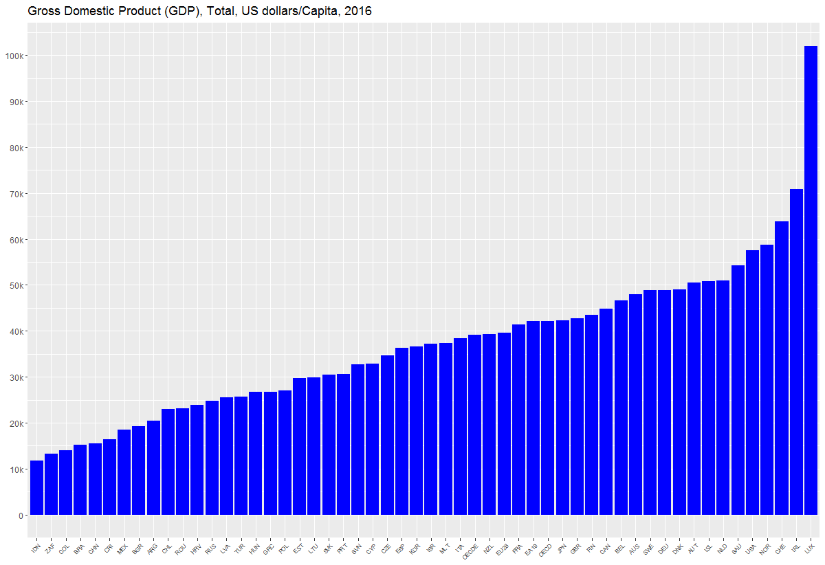
This tutorial will discuss how bar plots can be generated using R’s ggplot package using 3 examples. Another tutorial on data visualization using python’s matplotlib package can be found here: Tutorial on Data Visualization: Weather Data.
This code plots the global market share for electric vehicles (EV) for selected countries using the global_EV_2016.csv dataset: The global EV data obtained from this report: https://www.iea.org/publications/freepublications/publication/GlobalEVOutlook2017.pdf.
The code for this example can be downloaded from this repository: https://github.com/bot13956/2016_market_share_electric_cars_using_R.
Import Necessary Libraries
library(readr)library(tidyverse)
Data Importation and Preparation
data<-read_csv("global_EV_2016.csv",col_names = FALSE)head(data)data<-data[-c(1,2),]names(data)<-c("country","sales_bev","stock_bev","sales_phev","stock_phev","shares")head(data)
Generate Barplot for Data Visualization
data%>%drop_na(shares)%>%mutate(shares=parse_number(shares))%>% filter(shares>=0.91)%>% ggplot(aes(reorder(country, shares),shares))+ geom_col(fill="blue")+ coord_flip()+ theme(axis.title.x=element_blank())+ theme(axis.title.y=element_blank())+ ggtitle("Market share of electric vehicles in selected countries (%)")
This… Read the full blog for free on Medium.
Join thousands of data leaders on the AI newsletter. Join over 80,000 subscribers and keep up to date with the latest developments in AI. From research to projects and ideas. If you are building an AI startup, an AI-related product, or a service, we invite you to consider becoming a sponsor.
Published via Towards AI
Towards AI Academy
We Build Enterprise-Grade AI. We'll Teach You to Master It Too.
15 engineers. 100,000+ students. Towards AI Academy teaches what actually survives production.
Start free — no commitment:
→ 6-Day Agentic AI Engineering Email Guide — one practical lesson per day
→ Agents Architecture Cheatsheet — 3 years of architecture decisions in 6 pages
Our courses:
→ AI Engineering Certification — 90+ lessons from project selection to deployed product. The most comprehensive practical LLM course out there.
→ Agent Engineering Course — Hands on with production agent architectures, memory, routing, and eval frameworks — built from real enterprise engagements.
→ AI for Work — Understand, evaluate, and apply AI for complex work tasks.
Note: Article content contains the views of the contributing authors and not Towards AI.


