


Population Pyramid — Interesting Visualization of Population Statistics using R
Last Updated on January 3, 2022 by Editorial Team
Author(s): Supriya Ghosh
Originally published on Towards AI the World’s Leading AI and Technology News and Media Company. If you are building an AI-related product or service, we invite you to consider becoming an AI sponsor. At Towards AI, we help scale AI and technology startups. Let us help you unleash your technology to the masses.
Data Visualization
Population Pyramid — Interesting Visualization of Population Statistics using R
The proverb “ A picture is worth a thousand words” is always put to test when we make an attempt to address and communicate technical complexities through visuals. These visuals always tend to increase understanding and perception of the challenges and reward us with insights not even thought of before. The driving force behind developing such visualizations is squeezing out maximum value and information from the data for further analysis. In fact, this is the top goal of all experts in their respective fields.
One such Visual is the “Population Pyramid”.
But
What are these Population Pyramids?
And
What benefits do they bring?
Let us understand in detail.
Population Pyramids are extensively used by demographers as a tool for understanding the composition or structure of a population within a specific area. The area can represent a city, a country, a region, or a globe. Ecologists, sociologists, and economists also use them widely in their disciplines/fields to study and compare populations.
Definition: Population Pyramid
Population Pyramid is the interpretative graphical representation of the age and sex(gender) composition/distribution of the chosen population at a given time period.
They are also popularly called as age-sex pyramids or age-sex diagrams as they specifically represent age and sex structure within the population of a chosen space. The name pyramid comes from their usual shape which is mostly triangular. However, there can be shape variations depending upon the age and sex composition of the population.
Characteristics of Population Pyramid
1. Population Pyramid displays the total population segmented into various age groups which are further subdivided into males and females.
2. The Pyramid represents separate component cohorts of population composition.
3. Generally, three types of population pyramids can be created from age-sex distributions — expansive, constrictive, and stationary.
4. Expansive represents larger numbers or percentages of the population
in the younger age groups, constrictive displays lower numbers or
percentages of the population in the younger age groups and stationary or
near-stationary represents somewhat equal numbers or percentages for
almost all age groups.
5. The graphic starts from the youngest age group at the bottom (base of the pyramid) to the oldest at the top (apex of the pyramid).
6. The fertility rate of a population is the most important parameter to influence the shape of the pyramid as a greater number of children per parent will give the broader base of the pyramid with the median age being a younger population.
7. Mortality will also have an influence on the shape but impacts much less than fertility but is more complex.
8. Pyramid with a broad base means that younger age groups make up a considerable large proportion of the population while a narrow or pointed top means older age groups make up a considerably smaller proportion of the population.
Benefits of the Population Pyramid
1. Population Pyramid provides a considerable amount of information about fertility, mortality, migration, male-female ratio, the number of dependents(children, elderly people, etc.), and other population dynamics within the context of the chosen area.
2. They reveal the growth or decline within the population over a period of time and form a foundation for tracking and populating major demographic shifts because of major events such as disease, disasters, and other crises. This in turn allows researchers to predict economic needs based on patterns, indicate the status of the level of development within the area, and enable easy comparison of future and historical trends.
3. Population pyramids are useful for examining historical and current population trends as well as forecasting future trends to plan for future development. In turn, this helps government as well as private parties to plan for the distribution of services for specific areas based on population needs.
4. Multiple Population Pyramids can be used to compare patterns across nations or selected population groups.
5. Population pyramids are quite handy tools and provide very effective graphical presentations. Their greatest strength lies in being easily understandable by almost everyone, regardless of statistical and mathematical skills.
Interpreting the Population Pyramid
A population pyramid contains paired back-to-back bar graphs stacked on top of one another to display the numbers or percentages of males and females in each age group. Representation follows a convention where males are displayed on the left side and females on the right side. The numbers or percentages of the population are represented on the horizontal axis and the age group on the vertical axis. There is a vertical line placed centrally (i.e., middle of the graph) separating male representation from female. Age is often grouped into categories of 5-year or so. The youngest age groups are represented by the bottom-most bar and the oldest age group by the uppermost bar. The length of the horizontal bar depicts the number or percentage of males or females in the specific age group for the chosen population. If females are more, bars on the right side of the middle axis are longer than the bars on the right side and vice-versa.
It is important to draw Population pyramids to the same scale if they are to be used for comparison and also should depict the same age categories.
Going further, let us now discuss how can we create such pyramids using the ‘R’ language?
Method 1 (Using ‘pyramid’ package in ‘R’)
#Building Population pyramid
#install.packages("pyramid")
library(pyramid)
library(utils)
# Read Population pyramid data frame
Pyramid_DF <- read_xlsx("Pyramid_data_frame.xlsx" )
View(Pyramid_DF)
# Building pyramid based on Number of Males and Females
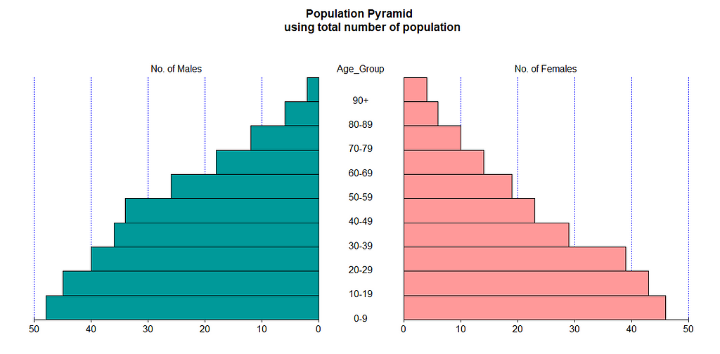
Pyramid_DF1 <- data.frame(Pyramid_DF$Number_of_Males,Pyramid_DF$Number_of_Females,Pyramid_DF$Age_Category)
pyramid(Pyramid_DF1, Rcol="#FF9999", Lcol = "#009999",main = "Population Pyramid
        using total number of population",
        Llab="No. of Males", Rlab="No. of Females", Clab="Age_Group")
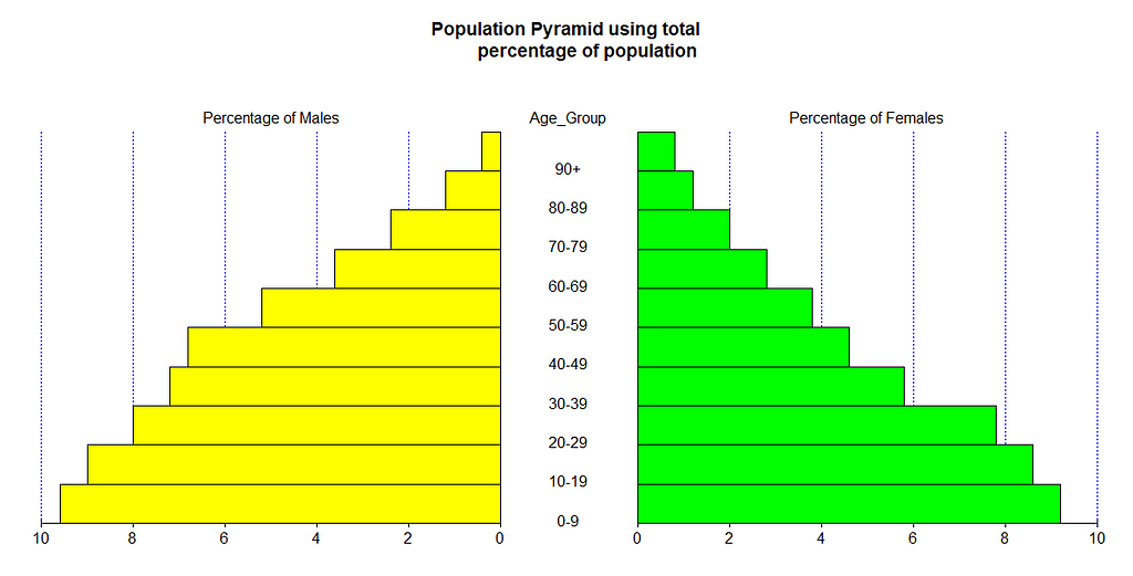
# Building pyramid based on Percentage of Males and Females
Pyramid_DF2 <- data.frame(Pyramid_DF$Percentage_of_Males,Pyramid_DF$Percentage_of_Females,Pyramid_DF$Age_Category)
pyramid(Pyramid_DF2, Rcol="green", Lcol = "yellow",main = "Population Pyramid using total
        percentage of population",
        Llab="Percentage of Males", Rlab="Percentage of Females", Clab="Age_Group")
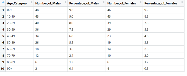
Data-frame representation in tabular form
Population Pyramid Screenshot
Method 2 (Using ‘plotrix’ package in ‘R’)
library(plotrix)
Male.pop<-c(3.2,3.5,3.6,3.6,3.5,3.5,3.9,3.7,3.9,3.5,3.2,2.8,2.2,1.8,
1.5,1.3,0.7,0.4)
Female.pop<-c(3.2,3.4,3.5,3.5,3.5,3.7,4,3.8,3.9,3.6,3.2,2.5,2,1.7,1.5,
1.3,1,0.8)
agelabels<-c("0-4","5-9","10-14","15-19","20-24","25-29","30-34",
"35-39","40-44","45-49","50-54","55-59","60-64","65-69","70-74",
"75-79","80-44","85+")
mcol<-color.gradient(c(0,0,0.5,1),c(0,0,0.5,1),c(1,1,0.5,1),18)
fcol<-color.gradient(c(1,1,0.5,1),c(0.5,0.5,0.5,1),c(0.5,0.5,0.5,1),18)
par(mar=pyramid.plot(Male.pop,Female.pop,labels=agelabels,
main="Population pyramid",lxcol=mcol,rxcol=fcol,
gap=0.5,show.values=TRUE))
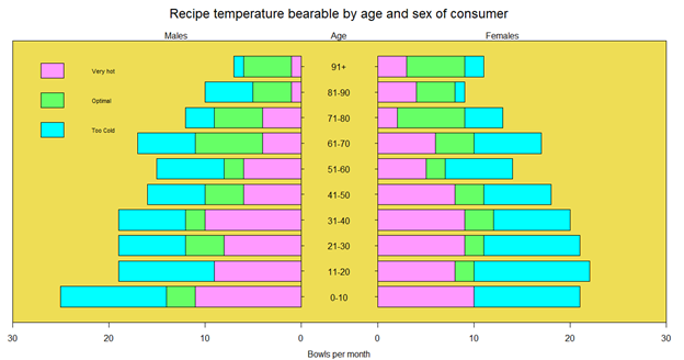
# three column matrices (Expanding pyramid beyond male-female numbers )
avtemp<-c(seq(11,2,by=-1),rep(2:6,each=2),seq(11,2,by=-1))
malechef<-matrix(avtemp+sample(-2:2,30,TRUE),ncol=3)
femalechef<-matrix(avtemp+sample(-2:2,30,TRUE),ncol=3)
# group by age
agegrps<-c("0-10","11-20","21-30","31-40","41-50","51-60",
"61-70","71-80","81-90","91+")
oldmar<-pyramid.plot(malechef,femalechef,labels=agegrps,
unit="Bowls per month",lxcol=c("#ff99ff","#66ff66","#00ffff"),
rxcol=c("#ff99ff","#66ff66","#00ffff"),laxlab=c(0,10,20,30),
raxlab=c(0,10,20,30),top.labels=c("Males","Age","Females"),gap=4,
do.first="plot_bg(\"#eedd55\")")
# put a box around it
box()
# giving  a title
mtext("Recipe temperature bearable by age and sex of consumer",3,2,cex=1.5)
# Putting a legend
legend(par("usr")[1],11,c("Very hot","Optimal","Too Cold"),
       fill=c("#ff99ff","#66ff66","#00ffff"), bty = 'n',cex = 0.7)
# Restore the margins and background
par(mar=oldmar,bg="transparent")
Population Pyramid Screenshot
I hope the concept is clear with the above code and visuals.
Final Thoughts
Population pyramids are quite handy tools when working with age-sex distributions and used frequently by demographers, researchers, ecologists, sociologists, etc. They provide very effective graphic presentations. Probably their greatest asset is that they are so easily understandable to almost everyone, regardless of statistical and mathematical skills.
Thanks for reading !!!
You can follow me on medium as well as
LinkedIn: Supriya Ghosh
And Twitter: @isupriyaghosh
Population Pyramid — Interesting Visualization of Population Statistics using R was originally published in Towards AI on Medium, where people are continuing the conversation by highlighting and responding to this story.
Join thousands of data leaders on the AI newsletter. It’s free, we don’t spam, and we never share your email address. Keep up to date with the latest work in AI. From research to projects and ideas. If you are building an AI startup, an AI-related product, or a service, we invite you to consider becoming a sponsor.
Published via Towards AI
Towards AI Academy
We Build Enterprise-Grade AI. We'll Teach You to Master It Too.
15 engineers. 100,000+ students. Towards AI Academy teaches what actually survives production.
Start free — no commitment:
→ 6-Day Agentic AI Engineering Email Guide — one practical lesson per day
→ Agents Architecture Cheatsheet — 3 years of architecture decisions in 6 pages
Our courses:
→ AI Engineering Certification — 90+ lessons from project selection to deployed product. The most comprehensive practical LLM course out there.
→ Agent Engineering Course — Hands on with production agent architectures, memory, routing, and eval frameworks — built from real enterprise engagements.
→ AI for Work — Understand, evaluate, and apply AI for complex work tasks.
Note: Article content contains the views of the contributing authors and not Towards AI.
Related posts
Recent Posts


")


