(Part II) Fostering Criminal Justice with Data Science
Last Updated on July 17, 2023 by Editorial Team
Author(s): Vincent Liu
Originally published on Towards AI.
Stories behind the four thousand arrests in DC

An Analysis Continued: Explorative Data Analysis
In the last blog post, we first-time met the UCR 2021 DC Arrest data. Now, we will see our new friend again with excitement. As I briefly touched on in our first conversation, I regard data science (EDA, statistical analysis, machine learning, etc.) as a lens or a window through which we can better see and understand our world and produce more effective solutions for important societal problems, like crimes and residential segregation. As a computational researcher, I developed my love for data from social science, and this special passion in both areas guided me to my own unique career path. For me, data science is a good tool but not the only one. We choose one research method based on the goal and audience of our analysis, as a result of which data-driven methods may not necessarily be better than qualitative, literature review, or community engagement methods. In fact, the more I study data science and the longer I stay in this community, the more I realize the need to include qualitative approaches. In so many projects, I see the great skills of the data analysts and how they care about the algorithms in the same time, I see their insufficient domain knowledge, which frequently causes their wrong interpretations and decisions.
Therefore, in this post, I will primarily use ggplot to create visualizations and explain them with subject knowledge. That is to say, this post will focus on data storytelling — the real art of data science. Our narration will center around the three questions we posed in the first blog of this series, namely (slightly modified)
1. How does the police power of arrest disproportionately affect different socioeconomic and racial groups?
2. Does Metropolitan Police Officers arrest, someone, primarily because of the involvement of force?
3. What did these arrestees do that triggered the arrest? (Remember, arrest needs a high level of reasonableness. In the criminal justice system, the deeper an act will invade a citizen’s privacy, the stronger the rationale will be needed to justify the law enforcement agent’s behavior)
We will be following a framework of “who did what, when, and how” to narrate the data story.
A Broad Picture of Arrests in DC — The “Who” Piece
In the United States, a striking number of arrests happen annually. As estimated by one of the most famous criminal justice think tanks Vera Institute of Justice, in any given year, police officers make around 10.5 million arrests. Although the number has somehow come down since 2006 because of a rise of social movements that led to reforms in the criminal justice system and other social changes, such as the prevalence of surveillance cameras that deterred people from committing low-level property offenses, notably, theft, this number is still high. On a comparative scale, this could be equivalent to a small country’s population. As a myriad of studies has suggested, the burden disproportionately falls on racial minorities and people in marginal social groups. What’s the story behind this giant volume of arrests? Let’s take a look.
Since the scope of our analysis is in DC, we may not generalize our findings to other states/areas where the situations and policies are distinct. Additionally, a number of factors contributed to arrests. We will only look at a few of them because of the limit of our data.
Like last time, we start with loading all the libraries. This is like getting coffee and tea ready to prepare for a friend’s visit.
library(tidyverse) # use the tidyverse universe
library(ggtext) # format texts/annotations in ggplots
library(GGally) # for more visualization options
library(ggpubr) # dot chart and plot arrangement
library(kableExtra) # format tables
library(gt) # for goog looking table
library(waffle) #waffle chart
library(extrafont) # for changing the glyph in waffle plots
library(fontawesome) # for changing the glyph in waffle plotsload("data/final_data.rda")
By Race
In the year 2021, law enforcement agents in DC arrested a total of 4380 people. For a city with less than 1 million residents (the most), this is roughly equivalent to one in 160 people.
As illustrated by the waffle plot in the figure below, the absolute majority of arrestees in these 4380 cases were African Americans. Around 90.82 percent of people who were arrested in DC in the year 2021 were African Americans, while the size of White arrestees was 10 times smaller. According to the 2021 Census data, 45% of DC residents, or 300,000 people, were Blacks. That is to say, approximately 1 out of 78 Blacks were at least arrested once in DC in 2021. Considering a series of socioeconomic consequences an arrest may bring, the disproportionality may promote institutionalization and perpetuate systematic racism in the city. But before we make any conclusion, we shall further look at our data.
To make our graph look nicer, I lumped two racial groups, “Asian” and “Pacific Islanders,” into one group, “Other race”. I then created a waffle plot.
dc21 <- dc21 %>%
 mutate(race_new = fct_lump_n(race,
 n = 2,
 other_level = "Other races"))
dc21 %>%
 count(race_new) %>%
 gt() %>%
 cols_align(
 align = "left",
 columns = race_new
 ) %>%
 cols_label(
 race_new = "Race",
 n = "Count"
 )

waffle(
 c(Black = 40, White = 4, `Other Race` = 1),
 rows = 4, size = 1.5,
 colors = c("#12719e", "#cfe8f3", "#ececec"),
 title = "African Americans represented 90% of over 4k arrests made by\n police officers in DC in 2021",
 legend_pos = "top",
 equal = FALSE) +
 theme(
 plot.caption = element_text(size = 12),
 plot.title = element_text(size=15, face='bold')) +
 labs(caption = "Note: One square represents 100 arrestees. \n The 'other race' category is scaled up to fit the grid.")

By Age and Sex
Understanding how ex-offenders transited out of their crime paths is important for crime prevention, gang regulation, and policy making. It is widely understood that age is an important factor in this transition. Most crimes are committed during adolescence, and as people get more matured and their brains are further developed (humans’ brains are not fully developed until 25), they also stop their criminal behaviors. This is the idea of the age-crime curve, an important theory in life-course criminology and the subfield in which my undergraduate professor and mentor specialize. The theory said that for most people, criminal activities perked when they were under 20 and diminished as people age. The trend generally stays true, but the distribution may vary slightly based on offenses. For a lot of crimes, the perk age is the mid-20s rather than 15/16ish. (I have a lot of stories in this from my experience doing restorative justice, but that is out of the scope of this post)
Arrests usually do NOT follow the same pattern. A Vera study found that age 25–39 is the single highest age group of all arrests. For violent crimes, arrest rates peak for people aged 20–24. Although these studies scoped on police arrest from a national perspective for which the same can not be spoken to DC, they showcase one important point: the age-arrest curve and the age-crime curve may overlap, but they certainly do not overlay.
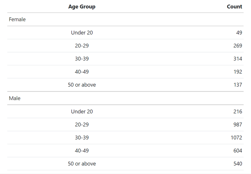
It turns out that the DC-specific age-arrest curve is actually deviant from the general case described in the last paragraph. As we are able to tell from the box plot below, for both male and female arrestees, 30–39 was the age group that most arrests fell into, closely followed by the age group 20–29. Moreover, under 20 is the age group with the fewest number. This may be caused by law enforcement officers adopting another system for juveniles to protect their privacy. In a lot of states, juvenile information is confidential and only accessible to a handful of agencies (this may not apply to our data, given that UCR is collected by the FBI). More importantly, the reason could be there are not as many adolescents living in the city as adults. DC is special in the sense that it is a special district, not a state. As the political center of the nation, many people work in DC but do not live here. However, the specific reasons why both distributions have such a shape shall require future research. We should also note that both distributions are right-skewed, which occurs when the mean of data is larger than the median. With a positive skewness, many hypotheses are no longer valid, and some transformations may be required should hypothesis testing is our next step.
Broken down by sex, the size of male arrestees is three to four times larger than female arrestees. Given most offenders are males, this is unsurprising. It would yet be interesting to compare this to the sex of victims (this comparison is important in victimology! NCVS/National Crime Victimization Survey is the expert dataset on this).
dc21 %>%
 group_by(sex, age_group) %>%
 summarise(n = n()) %>%
 gt() %>%
 cols_align(
 align = "left",
 columns = sex
 ) %>%
 cols_label(
 sex = "Sex",
 age_group = "Age Group",
 n = "Count"
 )

p_m <-dc21 %>%
 filter(sex == "Male") %>%
 group_by(age_group) %>%
 summarise(count = n()) %>%
 ggplot(aes(x = age_group, y = count)) +
 geom_col(fill = "#12719e") +
 labs(x = "Male",
 y = "") +
 scale_y_continuous(expand = c(0, 0),
 limits = c(0, 1200),
 breaks = seq(0, 1200, 200))+
 geom_text(mapping = aes(label = count), vjust = -1)+
 theme_classic() +
 theme(
 panel.grid.major.y = element_line(),
 axis.line.y = element_blank()
 )
p_f <- dc21 %>%
 filter(sex == "Female") %>%
 group_by(age_group) %>%
 summarise(count = n()) %>%
 ggplot(aes(x = age_group, y = count)) +
 geom_col(fill = "#af1f6b") +
 labs(x = "Female",
 y = "") +
 scale_y_continuous(expand = c(0, 0),
 limits = c(0, 400),
 breaks = seq(0, 400, 100))+
 theme_classic() +
 theme(
 panel.grid.major.y = element_line(),
 axis.line.y = element_blank()
 ) +
 geom_text(mapping = aes(label = count), vjust = -1)p_sex <- ggarrange(p_m, p_f, ncol = 2)
annotate_figure(p_sex, top = text_grob("Regardless of sex, 30-40 was the most arrested age group in DC in 2021", size= 12))

Arresting Throughout the Year? — The “When” Piece
As human beings, we are naturally curious about the trend: how has the US GDP changed in the last decade? Are crime rates going up or down? To relate, there is hardly any criminology student who did not learn about the downward trend of crimes. From the angle of crime prevention, knowing about the “time” is also of great significance: we need to know when crimes happen to accordingly allocate the police force and make other arrangements. A lot of crimes are time-sensitive. For example, you can’t imagine a bunch of young juveniles going out to the street and starting a gang fight on a snow day when the temperature is too cold to even hold a gun. I remember when I rode along with a Sergeant in the Minneapolis Police Department in my freshman year of college, the officer showed me the location where a local gang met and said: “This place is not as peaceful as you see in the summer”. His words shed light on the seasonality of gang crimes.
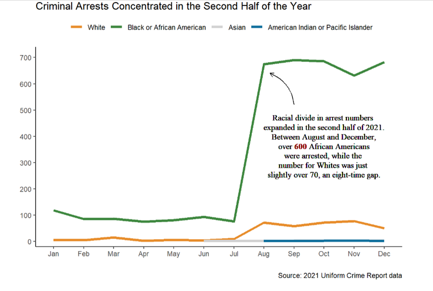
I used a line chart to show the arrest frequency over the course of 2021. Out of my expectation, arrests concentrated in the later summer and autumn of the year. Specifically, the arrest number in August was SEVEN times larger than in July. The number of African American residents MPD officers arrested in August was approximately equivalent to summing up the arrest number from January to July in total. The trend continued until the end of the year.
This is very different from what I imagined. I am interested in knowing if there is a reason that caused a rise in August. Is the weather to blame for it? Or is it because of a policy or social event in DC? These questions are left uninvestigated in this post.
line_chart_label <- "Racial divide in arrest numbers <br>expanded in the second half of 2021.<br> Between August and December,<br> over <span style='color:darkred'>**600**</span> African Americans<br> were arrested, while the <br>number for Whites was just <br>slightly over 70, an eight-time gap."dc21 %>%
 group_by(race, month) %>%
 summarise(count = n()) %>%
 ggplot(aes(x = month, y = count, group= race)) +
 geom_line(aes(color = race), size = 1.5) +
 theme_classic() +
 theme(
 legend.position="top",
 legend.direction = "horizontal") +
 labs(x = "", y = "", color = "",
 caption = "Source: 2021 Uniform Crime Report data") +
 ggtitle("Criminal Arrests Concentrated in the Second Half of the Year") +
 scale_color_manual(values=c("#e88e2d", "#408941", "#d2d2d2", "#12719e")) +
 scale_y_continuous(expand = c(0, 20),
 limits = c(0,720),
 breaks = seq(0,700,100)) +
 ggtext::geom_richtext(aes(x = 10, y = 360,
 label = line_chart_label),
 size = 3.5, fill = NA, label.color = NA, family = "serif") +
 annotate(
 geom = "curve", x = 9, y = 520, xend = 8.2, yend = 640,
 curvature = .3, arrow = arrow(length = unit(2, "mm"))
 )

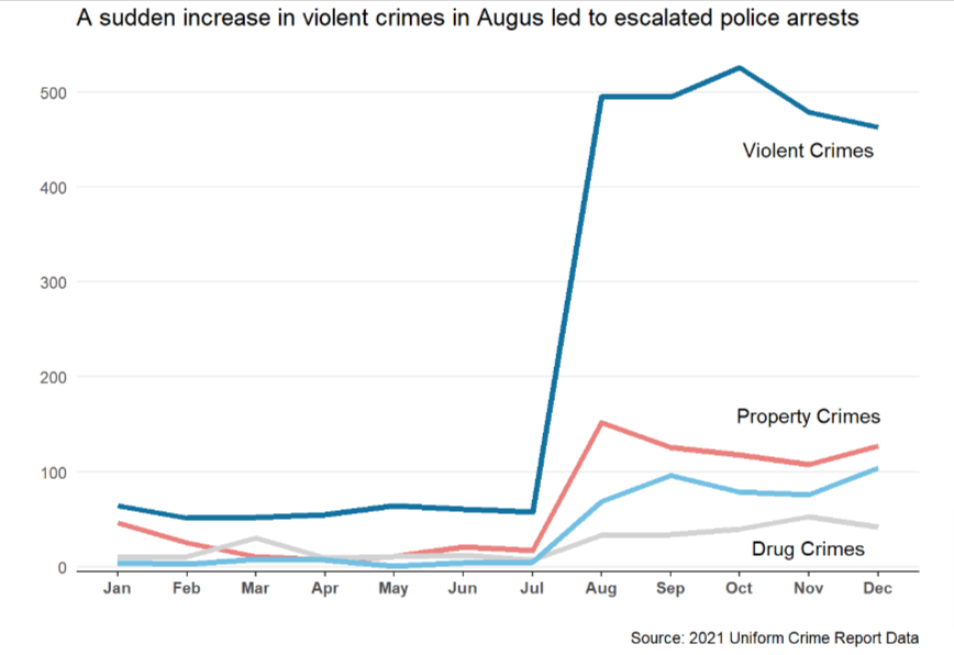
The discovery drove me to break down arrests by different indicators in an attempt to find out if there is a specific factor that led to the change in arrest rates. What I ended up knowing is that violent crime-induced arrests surged in August. The upward trend is also reflected in other types of crimes, namely, property crimes, crimes against persons, and drug crimes but not with this magnitude. Perhaps something happened, for example, more frequent gang activities, that led to people in DC being more violent. At this point, I am not sure about the answer, but this is worth future investigation.
dc21 %>%
 group_by(month, offense_group) %>%
 summarise(count = n()) %>%
 mutate(percent = round(count/sum(count), 4)) %>%
 ggplot(aes(x = month,
 y = count,
 group = offense_group,
 color = offense_group)) +
 geom_line(size = 1.5) +
 theme_classic() +
 theme(legend.position="none",
 axis.line.y = element_blank(),
 axis.ticks.y = element_blank(),
 panel.grid.major.y = element_line(),
 axis.text.x = element_text(face="bold")
 ) +
 labs(x = "", y = "",
 title = "A sudden increase in violent crimes in Augus led to a spike of police arrests",
 caption = "Source: 2021 Uniform Crime Report Data") +
 scale_y_continuous(expand = c(0, 5),
 limits = c(0,550),
 breaks = seq(0,500,100)) +
 annotate("text", y = 440, x = 11,
 label = "Violent Crimes", color = "black") +
 annotate("text", y = 160, x = 11,
 label = "Property Crimes", color = "black") +
 annotate("text", y = 20, x = 11,
 label = "Drug Crimes", color = "black") +
 scale_color_manual(values=c("#12719e", "#e9807d", "#d2d2d2", "#73bfe2"))

By Use of Weapon
I also broke down the data by the use of weapons and found out that between July and August 2021, police arrests of unarmed civilians increased from 76 to 598, while firearm-involved arrests escalated from 2 to 121. This tells us that the escalation in arrests was spread between armed and unarmed cases. The use of guns does not explain the unexpected rising in criminal arrests. We may need to look for other reasons. From my perspective, I think the change is very likely provoked by an external incident.
(note: Weapon group “weapon with a blade” is removed from this comparison because of its relatively smaller size)
dc21 %>%
 filter(month %in% c("Jul", "Aug"),
 weapon != c("Weapon with a blade")) %>%
 group_by(month, weapon) %>%
 summarise(count = n()) %>%
 ggplot(aes(x = month, y = count)) +
 geom_col(aes(fill = month), position = "dodge") +
 theme_classic() +
 labs(x = "", y = "",
 caption = "Source: 2021 Uniform Crime Report Data")+
 theme(
 strip.text.x = element_text(size = 12,
 color = "black",
 face = "bold"),
 strip.background = element_blank(),
 strip.placement = "outside",
 legend.position = "none",
 legend.direction = "horizontal",
 axis.line.y = element_blank(),
 axis.ticks = element_blank(),
 axis.text.x = element_text(face = "bold", size = 12),
 axis.text.y = element_blank()) +
 scale_x_discrete(position="bottom") +
 scale_fill_manual(values = c("#a2d4ec", "#1696d2")) +
 scale_y_continuous(expand = c(0, 0),
 limits = c(0, 700)) +
 facet_wrap(vars(weapon), scales = "free_y") +
 geom_text(mapping = aes(label = count),
 size = 5,
 vjust = -1)

Coming Next
In the last post of this series, we will finish our data storytelling with the “How” piece and move to the last section — data modeling with general linear regression. Moreover, we will continue talking about how data can be useful in social science research. Stay tuned!

Note: The blog is originally written using Quarto, the new-age Rmarkdown. All codes can be found on my GitHub repository.
For more information about myself, feel free to check my LinkedIn page or my personal website.
Join thousands of data leaders on the AI newsletter. Join over 80,000 subscribers and keep up to date with the latest developments in AI. From research to projects and ideas. If you are building an AI startup, an AI-related product, or a service, we invite you to consider becoming a sponsor.
Published via Towards AI
Towards AI Academy
We Build Enterprise-Grade AI. We'll Teach You to Master It Too.
15 engineers. 100,000+ students. Towards AI Academy teaches what actually survives production.
Start free — no commitment:
→ 6-Day Agentic AI Engineering Email Guide — one practical lesson per day
→ Agents Architecture Cheatsheet — 3 years of architecture decisions in 6 pages
Our courses:
→ AI Engineering Certification — 90+ lessons from project selection to deployed product. The most comprehensive practical LLM course out there.
→ Agent Engineering Course — Hands on with production agent architectures, memory, routing, and eval frameworks — built from real enterprise engagements.
→ AI for Work — Understand, evaluate, and apply AI for complex work tasks.
Note: Article content contains the views of the contributing authors and not Towards AI.


