


Make Your Matplotlib Plots Stand Out Using This Cheat Sheet
Last Updated on May 24, 2022 by Editorial Team
Author(s): Arslan Shahid
Originally published on Towards AI the World’s Leading AI and Technology News and Media Company. If you are building an AI-related product or service, we invite you to consider becoming an AI sponsor. At Towards AI, we help scale AI and technology startups. Let us help you unleash your technology to the masses.
Cheat sheet for editing the background, ticks, and annotations in Matplotlib
Matplotlib is the most extensive plotting library in python, arguably one of the most frequently used. If you’re like me and you often forget the precise code to format plots, this piece is written specifically for you.
Background
One of the easiest and simplest ways to make your graphs stand out is to change the default background. I prefer to use ‘seaborn-whitegrid’, as I think it is simple and minimal and most colors look good on a white background. Here is the code:
import matplotlib.pyplot as plt
#the print statement tells all available style sheets
print(plt.style.available)
#This line of code changes the style sheet
plt.style.use(‘seaborn-whitegrid’)
Title, Labels & ticks
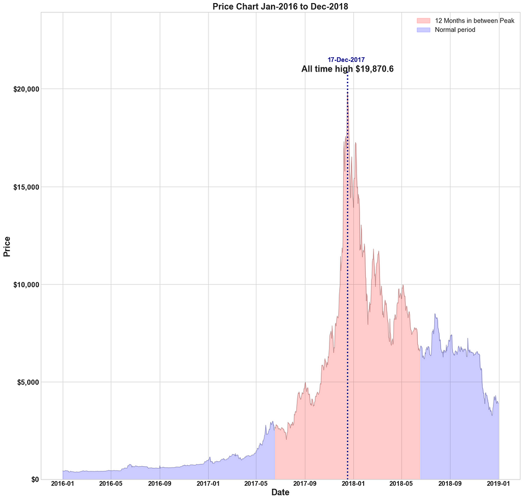
A good infographic needs an appropriate title, labels, and also appropriate tick marks. When dealing with money it is better to use a currency symbol like ‘$’ and when dealing with large numbers it is preferred that you format them into thousands(K), Millions(M), billions(B), etc. Smaller numbers should be rounded to the nearest decimal, nothing beyond 3 decimal places is ever really needed. The optimal in my opinion is 2 decimal places. You should also multiply frequencies by 100 to make them percentages and also add ‘,’ after every third digit in a big number i.e 1000000 should be written as 1,000,000.
Lastly, the title & ticks must be visible, so readable size is necessary. Below find the code to do each of these things:
#importing and creating figure
from matplotlib import ticker
fig,ax = plt.subplots(figsize=(20,20))
#Add title and set font size
plt.title(‘Title’,fontsize=50)
#Add xaxis label & yaxis label, with fontsize
plt.xlabel('xlabel',fontsize=30)
plt.ylabel('ylabel',fontsize=30)
#tick-size and weight [ 'normal' | 'bold' | 'heavy' | 'light' | #'ultrabold' | 'ultralight']
plt.yticks(fontsize=20,weight='bold')
plt.xticks(fontsize=20,weight='bold')
#Format ticks as currency or any prefix (replace $ with your choice)
ax.xaxis.set_major_formatter(ticker.StrMethodFormatter("${x}"))
#Format ticks as distance or any suffix (replace km with your #choice)
ax.xaxis.set_major_formatter(ticker.StrMethodFormatter("{x} km"))
#Format ticks decimal point, the number preceding f denotes how many
# decimal points e.g use .3f for three ax.xaxis.set_major_formatter(ticker.StrMethodFormatter("{x:.2f}"))
#Add , for large numbers e.g 10000 to 10,000
ax.xaxis.set_major_formatter(ticker.StrMethodFormatter("{x:,}"))
#Format as a percentage
ax.xaxis.set_major_formatter(ticker.PercentFormatter())
#Format thousands e.g 10000 to 10.0K
ax.yaxis.set_major_formatter(ticker.FuncFormatter(lambda x,pos: format(x/1000,'1.1f')+'K'))
#Format Millions e.g 1000000 to 1.0M
ax.yaxis.set_major_formatter(ticker.FuncFormatter(lambda x,pos: format(x/1000000,'1.1f')+'M'))
#Example of combined tick mark, currency with , & 2 decimal #precision
ax.yaxis.set_major_formatter(ticker.StrMethodFormatter("${x:,.2f}"))
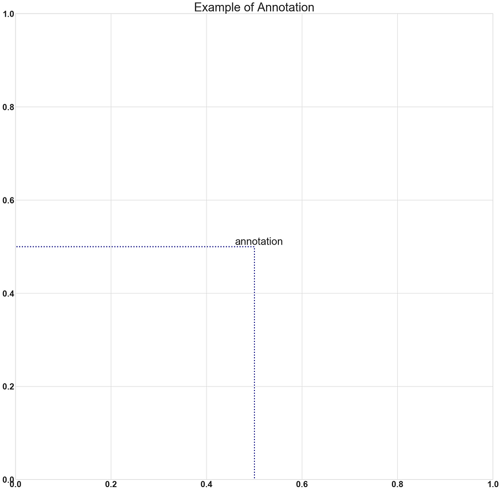
Annotations
Annotations are a great way to highlight any specific value or point. Combining h-lines (horizontal lines)& v-lines (vertical lines) you can indicate axis labels for a particular point. Here are some examples of what you can do.
Here is how you can add an annotation:
#First argument is the text, ha is horizontal alignment, va is #vertical alignment, xy is coordinates of the pojnt xytext are the #coordinates of the text (if you want the text to be away from the #point)
ax.annotate('annotation',ha='center',va='center', xy = (0.5, 0.5), xytext=(0.51,0.51),fontsize=30)
#Add v-line with xcoord, min & max ranges with y and aesthetic #properties
plt.vlines(x=0.5,ymin=-0.05,ymax=0.5,ls=':',lw=3,color='darkblue')
#Add h-line with ycoord, min & max ranges with xand aesthetic #properties
plt.hlines(y=0.5,xmin=-0.05,xmax=0.5,ls=':',lw=3,color='darkblue')
#Optional code for house keeping
plt.xticks(fontsize=25,weight='bold')
plt.yticks(fontsize=25,weight='bold')
plt.xlim(0,1)
plt.ylim(0,1)
plt.title('Example of Annotation',fontsize=35)
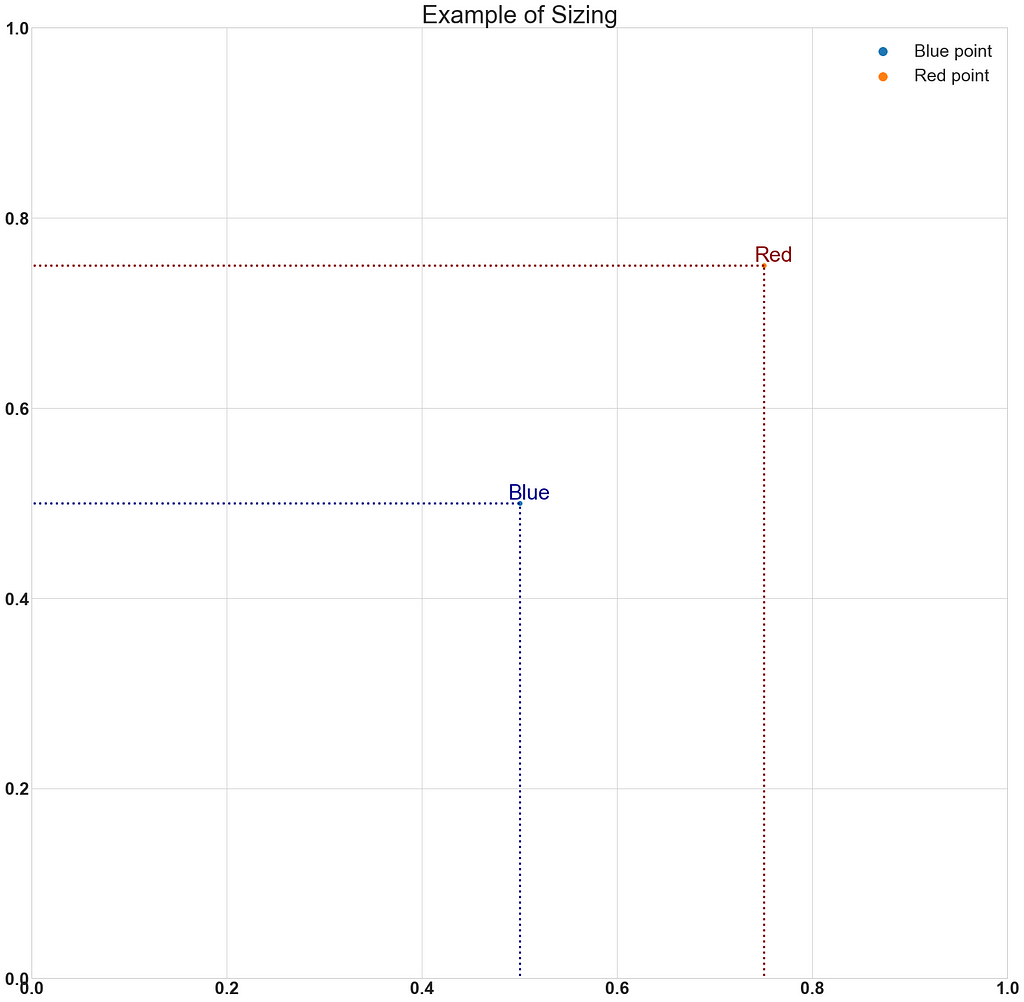
Sizing, limits, and legends
Often we need to resize or reshape our graph. It is also prudent to specify limits for the x-axis & y-axis, especially when there are some unusual outliers in the data. Also, it is very helpful to include a legend, with accurate labels and marker sizes.
Here is the code:
#Change figure size by adjusting figsize parameter
fig,ax = plt.subplots(figsize=(25,25))
#Annotation, v-lines & h-lines as explained above
ax.annotate(‘Blue’,ha=’center’,va=’center’, xy = (0.5, 0.5), xytext=(0.51,0.51),fontsize=30,color=’darkblue’)
plt.vlines(x=0.5,ymin=-0.05,ymax=0.5,ls=’:’,lw=3,color=’darkblue’)
plt.hlines(y=0.5,xmin=-0.05,xmax=0.5,ls=’:’,lw=3,color=’darkblue’)
#Scatter plot of one point, label parameter goes in legend
# you can add '_no_legend_' to hide this label in the legend
ax.scatter(x=0.5,y=0.5,label=’Blue point’)
#Annotation, v-lines & h-lines as explained above
ax.annotate(‘Red’,ha=’center’,va=’center’, xy = (0.75, 0.75), xytext=(0.76,0.76),fontsize=30,color=’darkred’)
plt.vlines(x=0.75,ymin=-0.05,ymax=0.75,ls=’:’,lw=3,color=’darkred’)
plt.hlines(y=0.75,xmin=-0.05,xmax=0.75,ls=’:’,lw=3,color=’darkred’)
#Scatter plot of one point, label parameter goes in legend
ax.scatter(x=0.75,y=0.75,label=’Red point’)
#House keeping for xticks & yticks explained above
plt.xticks(fontsize=25,weight=’bold’)
plt.yticks(fontsize=25,weight=’bold’)
#xlim specifies xaxis limits , first argument min limit & second #argument max limit
plt.xlim(0,1)
#ylim specifies yaxis limits , first argument min limit & second #argument max limit
plt.ylim(0,1)
#loc parameter tells location explained below
#prop tells legend font properties, read more here
#markerscale tells how much big should the markers on the legend be #in proportion to actual markers. 2 implies twice as big
plt.legend(loc=1,prop={‘size’:25},markerscale=2)
plt.title(‘Example of Sizing’,fontsize=35)
I will definitely add more cheats as I learn them. For now, this is it, I hope you found this small tutorial helpful.
Please consider following me! If you’re interested in statistical analysis and good visualizations please check out some of the other articles:
- Bitcoin & Ethereum — Finding statistical relationships in returns: https://medium.datadriveninvestor.com/bitcoin-ethereum-finding-statistical-relationships-in-returns-15cc695f4c1a
- Money Balling Cricket — Statistically evaluating a Match: https://medium.com/mlearning-ai/money-balling-cricket-statistically-evaluating-a-match-9cda986d015e
- Lies, Big Lies, and Data Science: https://medium.com/mlearning-ai/lies-big-lies-and-data-science-6147e81fb9fc
Thank you!
Make Your Matplotlib Plots Stand Out Using This Cheat Sheet was originally published in Towards AI on Medium, where people are continuing the conversation by highlighting and responding to this story.
Join thousands of data leaders on the AI newsletter. It’s free, we don’t spam, and we never share your email address. Keep up to date with the latest work in AI. From research to projects and ideas. If you are building an AI startup, an AI-related product, or a service, we invite you to consider becoming a sponsor.
Published via Towards AI
Towards AI Academy
We Build Enterprise-Grade AI. We'll Teach You to Master It Too.
15 engineers. 100,000+ students. Towards AI Academy teaches what actually survives production.
Start free — no commitment:
→ 6-Day Agentic AI Engineering Email Guide — one practical lesson per day
→ Agents Architecture Cheatsheet — 3 years of architecture decisions in 6 pages
Our courses:
→ AI Engineering Certification — 90+ lessons from project selection to deployed product. The most comprehensive practical LLM course out there.
→ Agent Engineering Course — Hands on with production agent architectures, memory, routing, and eval frameworks — built from real enterprise engagements.
→ AI for Work — Understand, evaluate, and apply AI for complex work tasks.
Note: Article content contains the views of the contributing authors and not Towards AI.
Related posts
Recent Posts


")

