How To Make a PowerBI Report Look Like A Website?
Last Updated on July 18, 2023 by Editorial Team
Author(s): Analytic girl
Originally published on Towards AI.
Objective

Power BI is a business analytics tool that allows users to visualize and analyze data from various sources. It is useful to create interactive dashboards and reports that provide insights into your business data.
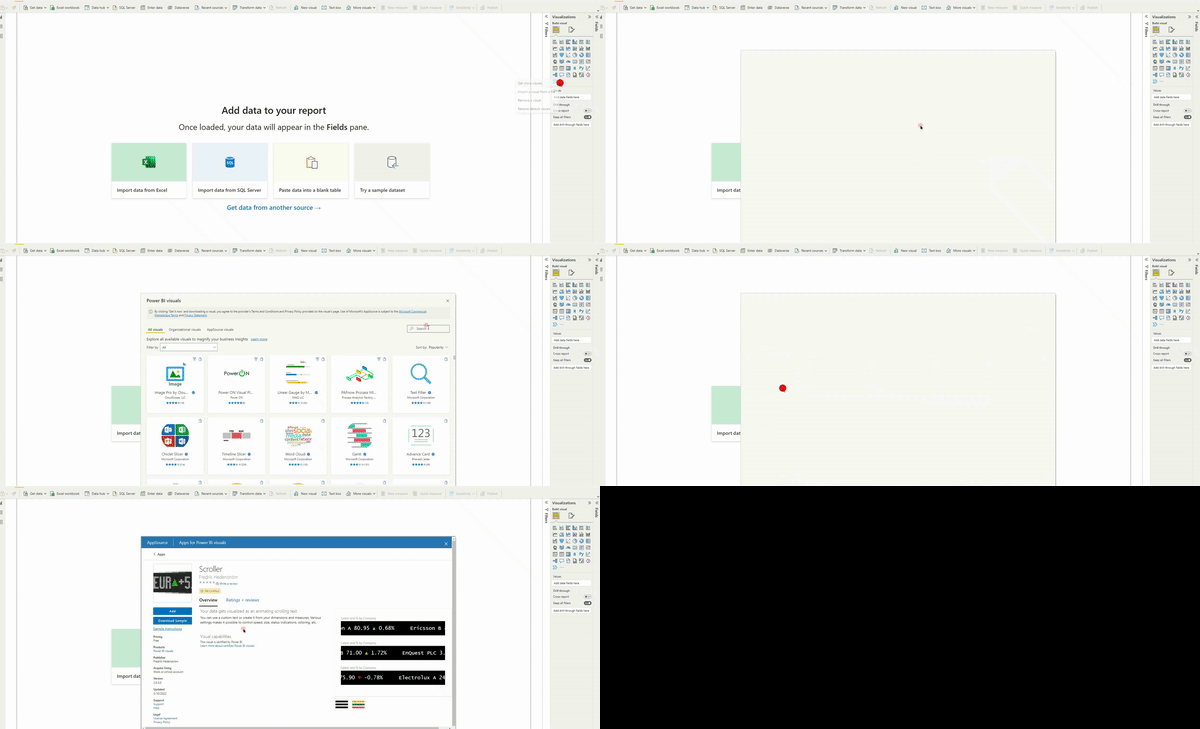
However, we sometimes feel that the PowerBI has some limitations. Especially the UI elements of PowerBI are limited, restricting our imagination to express in the dashboard. This article presents various techniques to make the PowerBI dashboard look like a website. After reading this article, you will be able to place more intuitive UI elements in your dashboard.
If you have a requirement to add an announcement to the… Read the full blog for free on Medium.
Join thousands of data leaders on the AI newsletter. Join over 80,000 subscribers and keep up to date with the latest developments in AI. From research to projects and ideas. If you are building an AI startup, an AI-related product, or a service, we invite you to consider becoming a sponsor.
Published via Towards AI
Towards AI Academy
We Build Enterprise-Grade AI. We'll Teach You to Master It Too.
15 engineers. 100,000+ students. Towards AI Academy teaches what actually survives production.
Start free — no commitment:
→ 6-Day Agentic AI Engineering Email Guide — one practical lesson per day
→ Agents Architecture Cheatsheet — 3 years of architecture decisions in 6 pages
Our courses:
→ AI Engineering Certification — 90+ lessons from project selection to deployed product. The most comprehensive practical LLM course out there.
→ Agent Engineering Course — Hands on with production agent architectures, memory, routing, and eval frameworks — built from real enterprise engagements.
→ AI for Work — Understand, evaluate, and apply AI for complex work tasks.
Note: Article content contains the views of the contributing authors and not Towards AI.


