How I Created an Animation Of the Embeddings During Fine-Tuning
Last Updated on July 19, 2023 by Editorial Team
Author(s): Markus Stoll
Originally published on Towards AI.
Using Cleanlab, PCA, and Procrustes to visualize ViT fine-tuning on CIFAR-10
In the field of machine learning, Vision Transformers (ViT) are a type of model used for image classification. Unlike traditional convolutional neural networks, ViTs use the transformer architecture, which was originally designed for natural language processing tasks, to process images. Fine-tuning these models, for optimal performance can be a complex process.
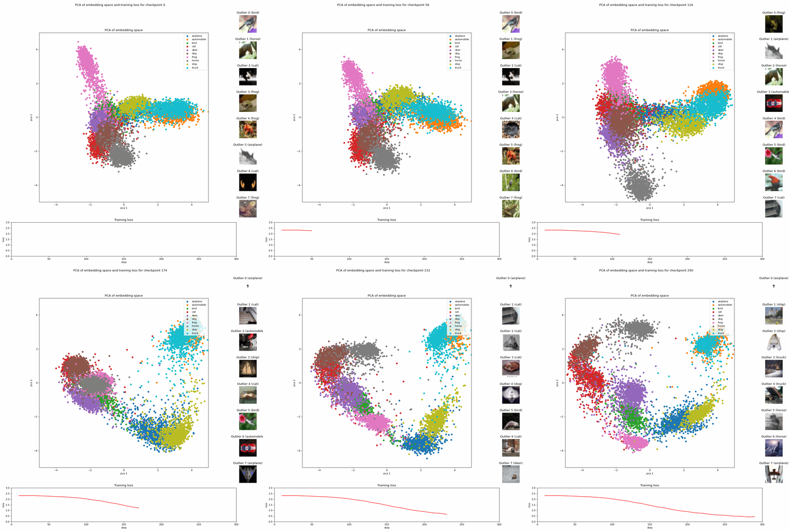
In a previous article, I used an animation to demonstrate changes in the embeddings during the fine-tuning process. This was achieved by performing Principal Component Analysis (PCA) on the embeddings. These embeddings were generated from models at various stages of fine-tuning and their corresponding checkpoints.

The animation received over 200,000 impressions. It was well-received, with many readers expressing interest in how it was created. This article is here to support those readers and anyone else interested in creating similar visualizations.
In this article, I aim to provide a comprehensive guide on how to create such an animation, detailing the steps involved: fine-tuning, creation of embeddings, outlier detection, PCA, Procrustes, review, and creation of the animation.
The complete code for the animation is also available in the accompanying notebook on GitHub.
Preparation: Fine-tuning
The first step is to fine-tune the google/vit-base-patch16–224-in21k Vision Transformer (ViT) model [1], which is pre-trained. We use the CIFAR-10 dataset [2] for this, containing 60,000 images classified into ten different classes: airplanes, cars, birds, cats, deer, dogs, frogs, horses, ships, and trucks.
You can follow the steps outlined in the Hugging Face tutorial for image classification with transformers to execute the fine-tuning process also for CIFAR-10. Additionally, we utilize a TrainerCallback to store the loss values during training into a CSV file for later use in the animation.
from transformers import TrainerCallback

class PrinterCallback(TrainerCallback):
 def on_log(self, args, state, control, logs=None, **kwargs):
 _ = logs.pop("total_flos", None)
 if state.is_local_process_zero:
 if len(logs) == 3: # skip last row
 with open("log.csv", "a") as f:
 f.write(",".join(map(str, logs.values())) + "\n")
It’s important to increase the save interval for checkpoints by setting save_strategy="step" and a low value for save_step in TrainingArguments to ensure enough checkpoints for the animation. Each frame in the animation corresponds to one checkpoint. A folder for each checkpoint and the CSV file are created during the training and are ready for further use.
Creation of the Embeddings
We use the AutoFeatureExtractor and AutoModel from the Transformers library to generate embeddings from the CIFAR-10 dataset’s test split using different model checkpoints.
Each embedding is a 768-dimensional vector representing one of the 10,000 test images for one model checkpoint. These embeddings can be stored in the same folder as the checkpoints to maintain a good overview.
Extracting Outliers
We can use the OutOfDistribution class provided by the Cleanlab library to identify outliers based on the embeddings for each checkpoint. The resulting scores can then identify the top 10 outliers for the animation.
from cleanlab.outlier import OutOfDistribution

def get_ood(sorted_checkpoint_folder, df):
 ...
 ood = OutOfDistribution()
 ood_train_feature_scores = ood.fit_score(features=embedding_np)
 df["scores"] = ood_train_feature_scores
Applying PCA and Procrustes Analysis
With a Principal Component Analysis (PCA) for the scikit-learn package, we visualize the embeddings in a 2D space by reducing the 768-dimensional vectors to 2 dimensions. When recalculating PCA for each timestep, large jumps in the animation due to axis-flips or rotations can occur. To address this issue, we apply an additional Procrustes Analysis [3] from the SciPy package to geometrically transform each frame onto the last frame, which involves only translation, rotation, and uniform scaling. This enables smoother transitions in the animation.
from sklearn.decomposition import PCA
from scipy.spatial import procrustes

def make_pca(sorted_checkpoint_folder, pca_np):
 ...
 embedding_np_flat = embedding_np.reshape(-1, 768)
 pca = PCA(n_components=2)
 pca_np_new = pca.fit_transform(embedding_np_flat)
 _, pca_np_new, disparity = procrustes(pca_np, pca_np_new)
Review in Spotlight
Before finalizing the entire animation, we conduct a review in Spotlight. In this process, we utilize the first and last checkpoints to perform embedding generation, PCA, and outlier detection. We load the resulting DataFrame in Spotlight:
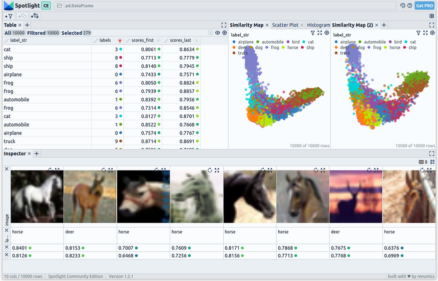
Spotlight provides a comprehensive table in the top left, showcasing all the fields present in the dataset. On the top right, two PCA representations are displayed: one for the embeddings generated using the first checkpoint and one for the last checkpoint. Finally, in the bottom section, selected images are presented.
Disclaimer: The author of this article is also one of the developers of Spotlight.
Create the animation
For each checkpoint, we create an image, which we then store alongside its corresponding checkpoint.
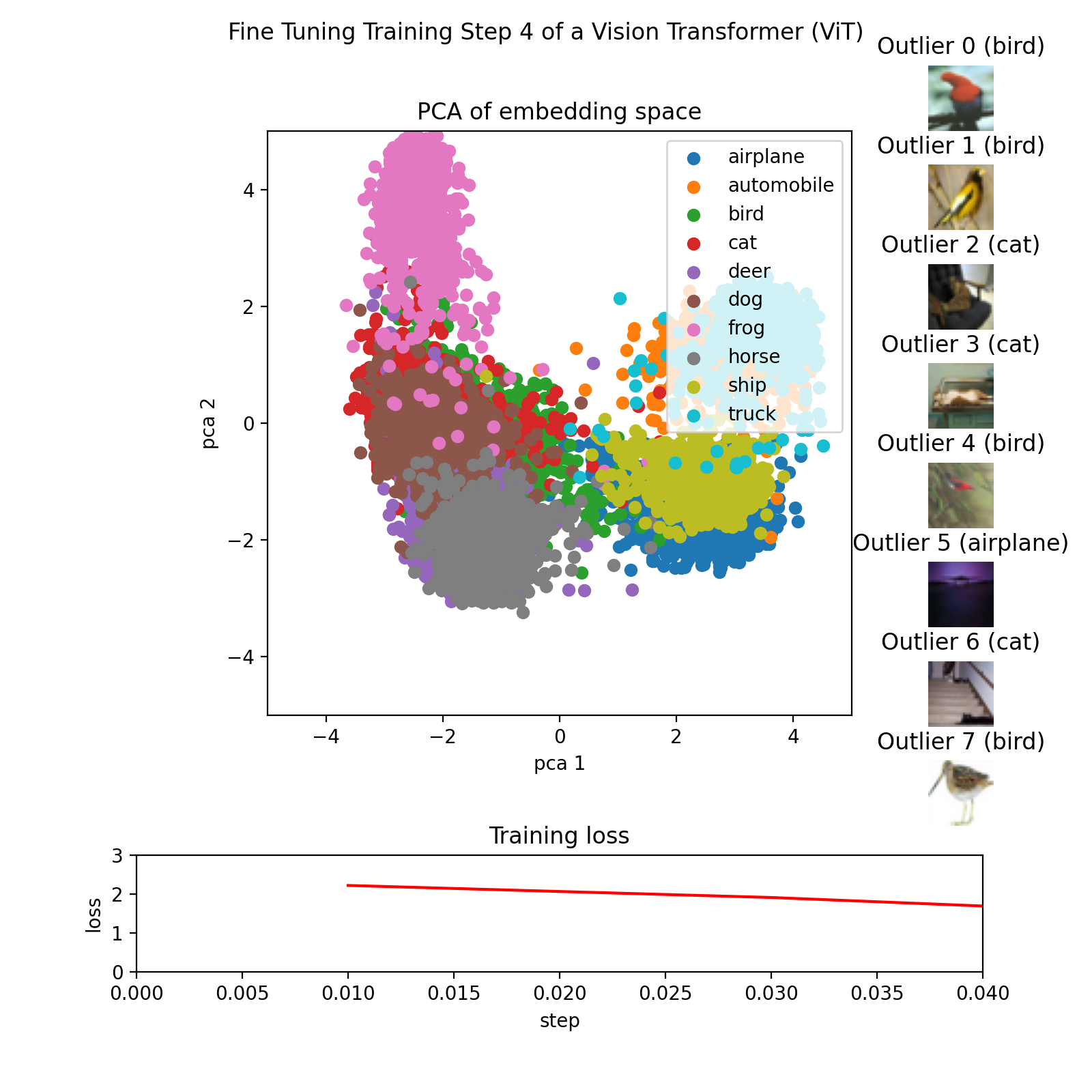
This is achieved through the utilization of the make_pca(...) and get_ood(...) functions, which generate the 2D points representing the embedding and extract the top 8 outliers, respectively. The 2D points are plotted with colors corresponding to their respective classes.The outliers are sorted based on their score, and their corresponding images are displayed in a highscore leaderboard. The training loss is loaded from a CSV file and plotted as a line graph.
Finally, all the images can be compiled into a GIF using libraries such as imageio or similar.


Conclusion
This article has provided a detailed guide on how to create an animation that visualizes the fine-tuning process of a Vision Transformer (ViT) model. We’ve walked through the steps of generating and analyzing embeddings, visualizing the results, and creating an animation that brings these elements together.
Creating such an animation not only helps in understanding the complex process of fine-tuning a ViT model but also serves as a powerful tool for communicating these concepts to others.
The complete code for the animation is available in the accompanying notebook on GitHub.
I am a professional with expertise in creating advanced software solutions for the interactive exploration of unstructured data. I write about unstructured data and use powerful visualization tools to analyze and make informed decisions.
References
[1] Alexey Dosovitskiy, Lucas Beyer, Alexander Kolesnikov, Dirk Weissenborn, Xiaohua Zhai, Thomas Unterthiner, Mostafa Dehghani, Matthias Minderer, Georg Heigold, Sylvain Gelly, Jakob Uszkoreit, Neil Houlsby, An Image is Worth 16×16 Words: Transformers for Image Recognition at Scale (2020), arXiv
[2] Alex Krizhevsky, Learning Multiple Layers of Features from Tiny Images (2009), University Toronto
[3] Gower, John C. Generalized procrustes analysis (1975), Psychometrika
Join thousands of data leaders on the AI newsletter. Join over 80,000 subscribers and keep up to date with the latest developments in AI. From research to projects and ideas. If you are building an AI startup, an AI-related product, or a service, we invite you to consider becoming a sponsor.
Published via Towards AI
Towards AI Academy
We Build Enterprise-Grade AI. We'll Teach You to Master It Too.
15 engineers. 100,000+ students. Towards AI Academy teaches what actually survives production.
Start free — no commitment:
→ 6-Day Agentic AI Engineering Email Guide — one practical lesson per day
→ Agents Architecture Cheatsheet — 3 years of architecture decisions in 6 pages
Our courses:
→ AI Engineering Certification — 90+ lessons from project selection to deployed product. The most comprehensive practical LLM course out there.
→ Agent Engineering Course — Hands on with production agent architectures, memory, routing, and eval frameworks — built from real enterprise engagements.
→ AI for Work — Understand, evaluate, and apply AI for complex work tasks.
Note: Article content contains the views of the contributing authors and not Towards AI.


