Dashboard Creation Using R Shiny
Last Updated on July 24, 2023 by Editorial Team
Author(s): Suyash Maheshwari
Originally published on Towards AI.
Shiny is an R package that is used to build interactive dashboards that can be used to display predictions. It can be used by programmers to communicate the findings of data to organization members in an effective manner. In this post, I will show the development of a dashboard using Shiny. I will use the data of a multinational retail corporation and forecast the values for various departments at the click of a button. Dataset information and the various models that can be used were already discussed in the previous article.
Predicting Sales using R programming
In this article, I will forecast the sales of a multinational retail corporation. The dataset for this can be found on…
medium.com

To create a web app using Shiny you will have to create the following files:
ui.R <- This file contains information about the front-end of your dashboard. The code is similar to an HTML file. You can extend your Shiny apps with CSS themes, HTML-widgets, and JavaScript actions.
- navbarPage: Create a page that contains a top-level navigation bar that can be used to toggle a set of tabPanel elements.
- tabPanel: Create a tab panel that can be included within a tabset. Tabsets are useful for dividing output into multiple independently viewable sections.
- sidebarLayout: Create a layout with a sidebar and main area. The sidebar is displayed with a distinct background color and typically contains input controls. The main area occupies 2/3 of the horizontal width and typically contains outputs.
- sidebarPanel: Create a sidebar panel containing input controls that can, in turn, be passed to sidebarLayout.
- mainPanel: Create the main panel containing output elements.
navbarPage(

 "Sales Forecast",

 tabPanel(
 "Arima Forecast",

 sidebarLayout(
 sidebarPanel(
 selectInput("Dept", "Choose a Dept:",
 list(1,2,3,4,5,6,7,8,9,10,11,12,13,14,15,16,17,18,19,20,21,22,23,24,25,26,27,28,29,30,31,32,33,34,35,36,37,38,39,40,41,42,43,44,45,46,47,48,49,50,51,52,53,54,55,56,57,58,59,60,61,62,63,64,65,66,67,68,69,70,71,72,73,74,75,76,77,78,79,80,81,82,83,84,85,86,87,88,89,90,91,92,93,94,95,96,97,98,99)

 )
 ) ,


 mainPanel(
 plotOutput("result")

 )

 )

 )

 )
server.R <- This file contains information about the back-end. It will contain information about the libraries used, the dataset used, ML model information, and graphs information.
- Libraries required: dplyr, forecast, reshape, ggplot2, tidyverse, shiny
- renderPlot: Renders a reactive plot that is suitable for assigning to an output slot.
function(input,output){library(dplyr)
library(forecast)
library(reshape)
library(ggplot2)
library(tidyverse)
library(shiny)train <- read.csv("C:/Users/hp/Desktop/Walmart_forecasting/train.csv")
test <- read.csv("C:/Users/hp/Desktop/Walmart_forecasting/test.csv")output$result <- renderPlot({dept1_train <- train %>% filter(Store == "1") %>% filter( Dept %in% input$Dept)
dept1_test <- test %>% filter(Store == "1") %>% filter( Dept %in% input$Dept)
#dept1_test$ Weekly_Sales <- 0dept1_train$Date <- as.Date(dept1_train$Date , format = "%Y-%m-%d")
sample_train <- dept1_train %>% filter(Date < as.Date("2012-02-06"))
sample_test <- dept1_train %>% filter(Date >= as.Date("2012-02-06"))#ts_train <- ts(sample_train , start = c(2010,5) , frequency = 52)ts_train_uni <- ts(sample_train$Weekly_Sales , start = c(2010,5) , frequency = 52)arima_model <- auto.arima(ts_train_uni , seasonal.test = "seas" )
 arima_pred = forecast(arima_model , h = nrow(sample_test))
 arima_pred <- as.data.frame(arima_pred$mean)
pred_data <- sample_test %>% add_column(arima_pred = arima_pred$x)
#plot(forecast(arima_model , h=38)) #arima plot
ggplot(pred_data , aes(x = Date , y = arima_pred)) + geom_line() + scale_x_date(date_breaks = "4 week")})}
app.R <- This is the parent file in which you combine the other two files and run the app.
- shinyApp: when this function is used at the R console, the Shiny app object is automatically passed to the
print()function, which runs the app. If this is called in the middle of a function, the value will not be passed toprint()and the app will not be run. To make the app run, pass the app object toprint()orrunApp().
library(dplyr)
library(forecast)
library(reshape)
library(ggplot2)
library(tidyverse)
library(shiny)source("ui.R")
source("server.R")shinyApp(ui = ui , server = server)
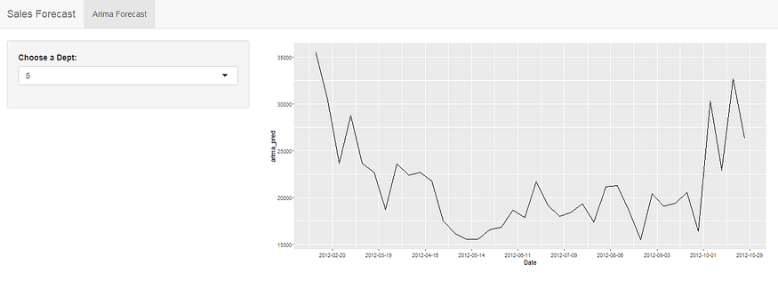
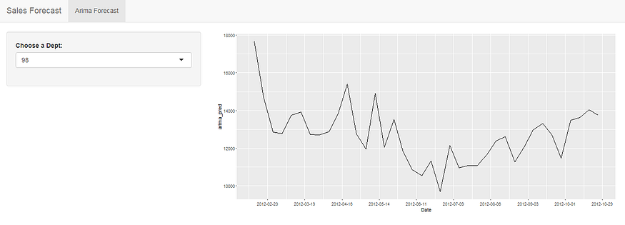
Output :


We can use R Shiny to build interactive applications and show the output in the form of plots, texts, or tables. Anyone familiar with R can leverage the statistical and data analysis power of R and show the results dynamically using the R Shiny app. Also, it is open source and cost-effective as compared to other visualization tools. In the example above we were able to forecast the sales for various departments using the ARIMA model and were able to visualize it using a simple drop-down menu built using shiny.
Thank you for reading the article. Do clap and comment if you liked the article :).
Join thousands of data leaders on the AI newsletter. Join over 80,000 subscribers and keep up to date with the latest developments in AI. From research to projects and ideas. If you are building an AI startup, an AI-related product, or a service, we invite you to consider becoming a sponsor.
Published via Towards AI
Towards AI Academy
We Build Enterprise-Grade AI. We'll Teach You to Master It Too.
15 engineers. 100,000+ students. Towards AI Academy teaches what actually survives production.
Start free — no commitment:
→ 6-Day Agentic AI Engineering Email Guide — one practical lesson per day
→ Agents Architecture Cheatsheet — 3 years of architecture decisions in 6 pages
Our courses:
→ AI Engineering Certification — 90+ lessons from project selection to deployed product. The most comprehensive practical LLM course out there.
→ Agent Engineering Course — Hands on with production agent architectures, memory, routing, and eval frameworks — built from real enterprise engagements.
→ AI for Work — Understand, evaluate, and apply AI for complex work tasks.
Note: Article content contains the views of the contributing authors and not Towards AI.


