


Stolen Bike Visual Analysis using Tableau
Last Updated on October 23, 2020 by Editorial Team
Author(s): Suhas V S
Data Visualization
Interactive Tableau visualizations for a stolen bike dataset in the United Kingdom for the years 2014 to 2017.
In this case study, we will see some interesting visual solutions for the questions we could make out from the “Stolen Bikes” data set.
Here, I have used “Tableau” for working out my visualizations and let us see how easy and visually appealing these charts and graphs be. The figures used in this blog are static as they are the snapshots taken from the tableau. At the end of this article, I have given the link to my tableau public where I have published this visualization where it is interactive to use.
A brief summary of the dataset used:
The dataset used here is for the stolen bikes in the United Kingdom from 2014 and 2017. It contains the column names such as “Crime ID”, “Crime Type”, “Falls within”(i.e the police station jurisdiction) , “Last outcome category”(i.e the status of the case), and “Location”.
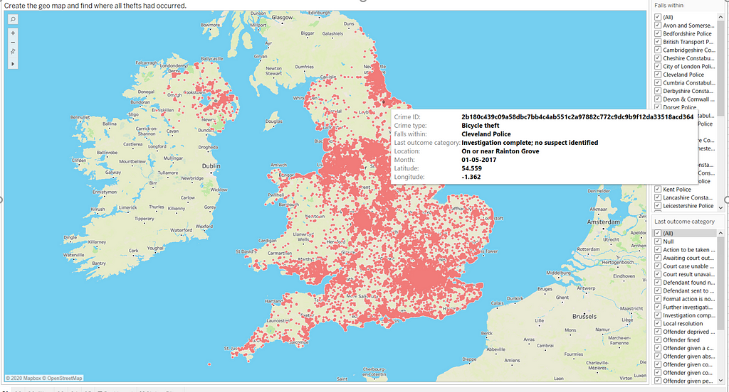
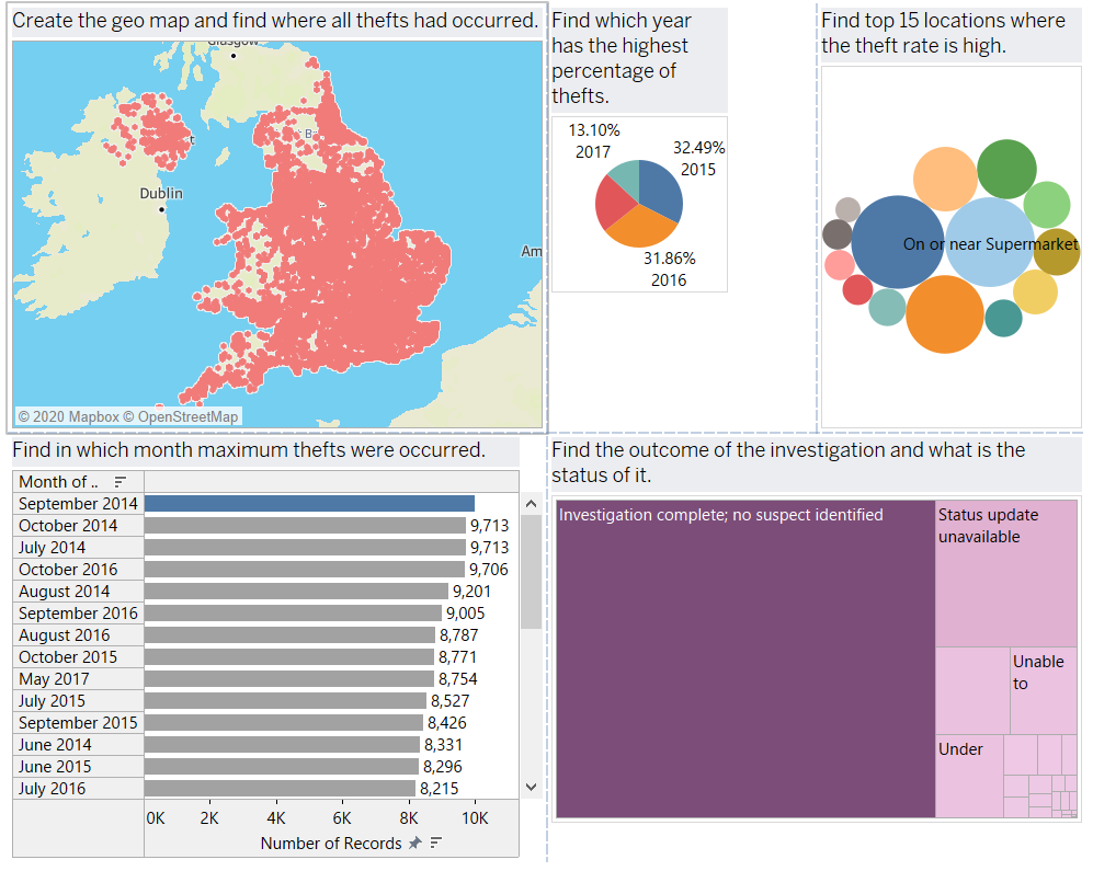
a) To understand where are the geographical locations that the bike thefts have occurred, we will be plotting the latitude and longitude on the map. Refer to Figure[1].
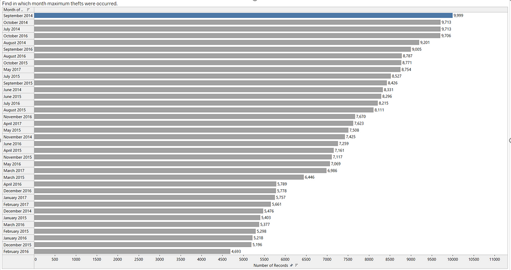
b) Month maximum number of thefts occurred? To get the viz for this question, we plot the month-year against the count of thefts using a bar chart. Also, I have highlighted the month with maximum theft in blue which is “September 2014” with a total of 9,999 thefts occurring.
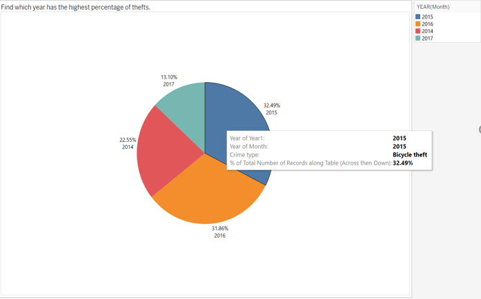
c) Now, let us see the percentage distribution for the thefts year-wise using a pie chart visualization. Notice that 2015 was the year with the highest theft rate with ~33% followed by 2016 with ~32%.
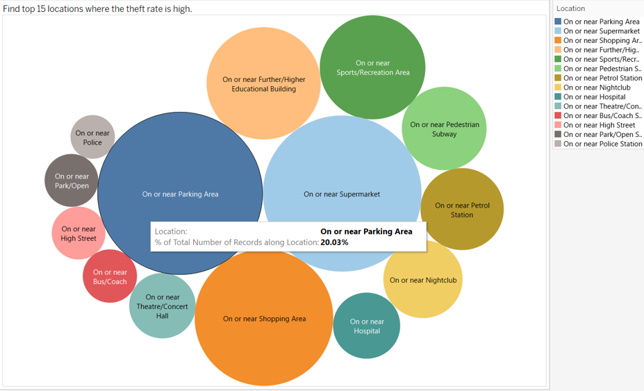
d) Find the 15 locations where the theft rate is high? To answer this question, we take “Locations” on rows pill and count of records on the columns pill and then filter out for the top 15 locations with a high theft rate. Finally, select an appropriate chart to visualize it. Refer to figure[4].
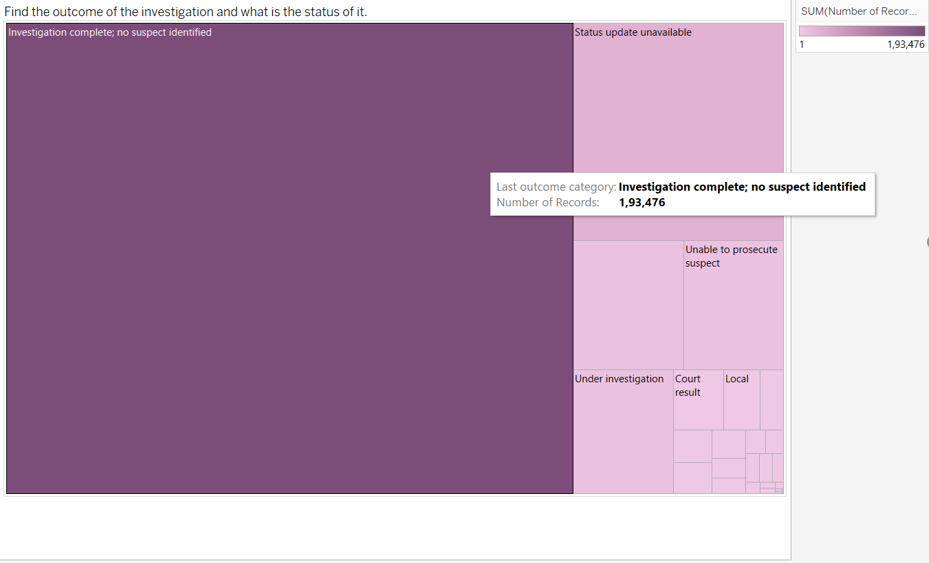
e) What is the status of investigation from 2014 till 2017 for all the thefts that have occurred? We take the “Last outcome category” into rows pill and count of records on the columns pill and then apply a “treemap” to visualize it. We see that “Investigation complete; no suspect identified” as the outcome for most of the cases.
Finally, let us create a dashboard to bring all of the above visualizations together. It helps us to summarise our case study into one viz.
Note, that the viz provided here are static and not interactive. Please glance through my tableau public link where this analysis to have an interactive experience. Here is the link,
This is it for now. I will continue to work on other interesting topics that are around us. Stay tuned!!!.
Stolen Bike Visual Analysis using Tableau was originally published in Towards AI on Medium, where people are continuing the conversation by highlighting and responding to this story.
Published via Towards AI
Towards AI Academy
We Build Enterprise-Grade AI. We'll Teach You to Master It Too.
15 engineers. 100,000+ students. Towards AI Academy teaches what actually survives production.
Start free — no commitment:
→ 6-Day Agentic AI Engineering Email Guide — one practical lesson per day
→ Agents Architecture Cheatsheet — 3 years of architecture decisions in 6 pages
Our courses:
→ AI Engineering Certification — 90+ lessons from project selection to deployed product. The most comprehensive practical LLM course out there.
→ Agent Engineering Course — Hands on with production agent architectures, memory, routing, and eval frameworks — built from real enterprise engagements.
→ AI for Work — Understand, evaluate, and apply AI for complex work tasks.
Note: Article content contains the views of the contributing authors and not Towards AI.
Related posts


")
Recent Posts


")

