


Interactive COVID-19 Dashboard With Chatbot and Prediction Capabilities
Last Updated on January 11, 2021 by Editorial Team
Author(s): Daksh Trehan
Data Visualization
A Practical Way to show-off Machine Learning skills and help the globe around.
COVID-19 can be marked as the preeminent highlight of the decade, and the vague information spread can be regarded as a matter of concern. Due to which several data visualization researchers and professionals are involved in delivering widely used tools for a better public explanation.
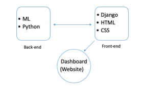
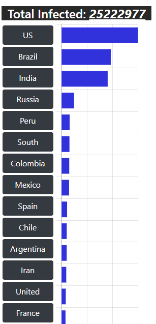
Joining the list of practitioners, we’ve designed a Live Interactive Covid-19 Dashboard that included dynamic visualization of frequently updated worldwide data, along with a chatbot to help and solve queries of neophytes, and a predictor that is capable of predicting active cases, recovered cases, casualties worldwide and for different countries using Machine Learning Techniques.
Content Table:-
- Data Procurement and Preparation
- Dynamic Deployment of Stats
- Chatbot
- Predicting the Outbreak
- Link to Resources
Data Procurement and Preparation
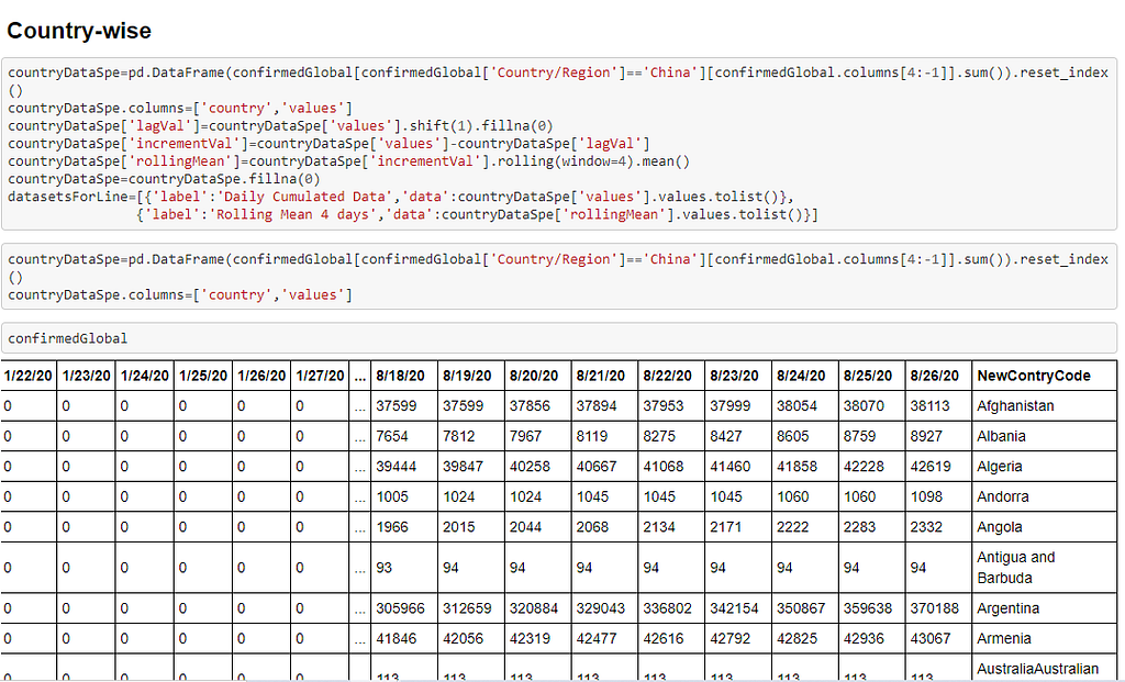
The dataset that has been used in prediction and modeling tasks is fetched from repository “2019 Novel Corona Virus Visual Dashboard” managed by Center for Systems Science and Engineering (CSSE) at Johns Hopkins University, also, Supported by ESRI Living Atlas Team and the Johns Hopkins University Applied Physics Lab (JHU APL).
The data fetched is parametrized that included relevant parameters like State, Country, Latitude, Longitude, and Date. A separate dataset has been used to understand better Confirmed, Death, and Recovered cases.
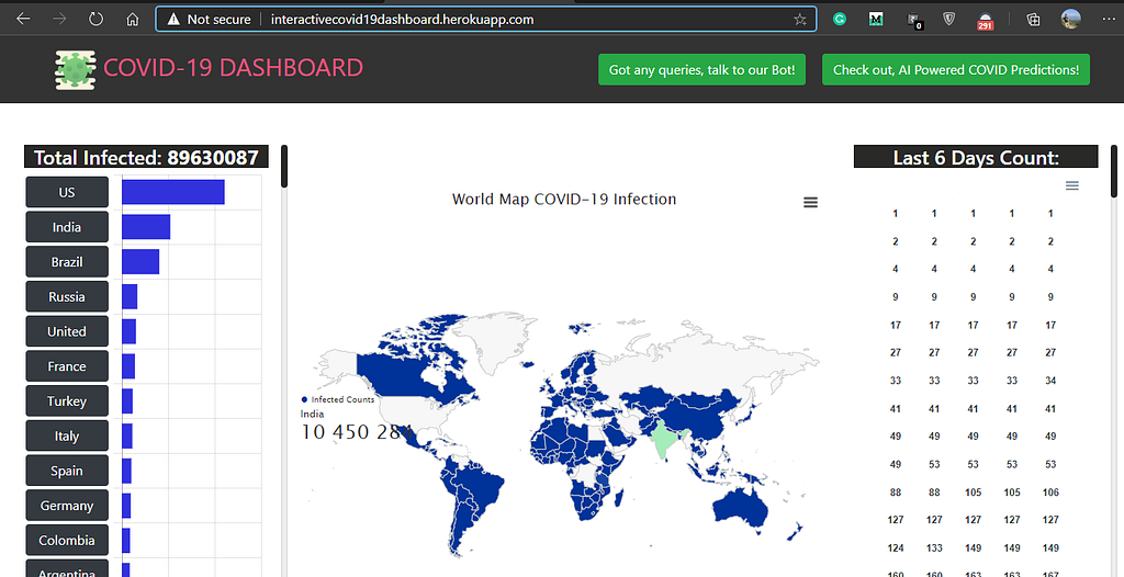
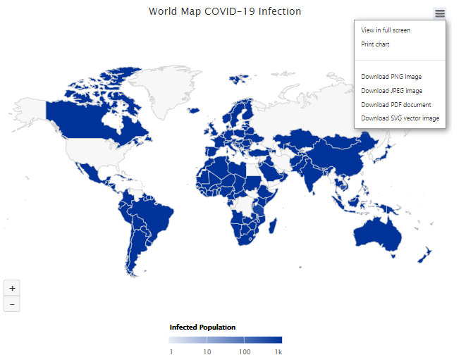
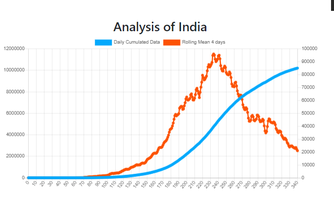
Dynamic Deployment of Stats
The data fetched from the above-mentioned repository is cleaned and made usable using several Data Cleaning techniques.
To deploy stats in a dynamic and lively way, JavaScript is employed, and the program is put on the web using Heroku Server.
Salient Features of Dashboard:
ChatBot
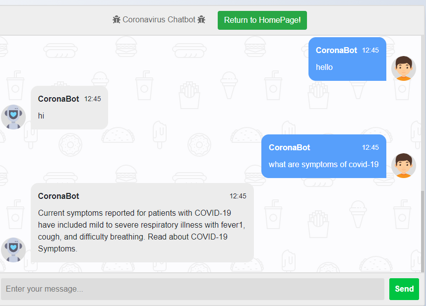
To make our dashboard more usable to neophytes or people with limited knowledge about the deadly Corona Virus, we’ve tried to employ a chatbot that can help to solve queries regarding the Pandemic outbreak.
The data is procured from the Frequently Asked Questions section of the official website of the Center for Disease Control and Prevention using requests and the BeautifulSoup library. The data includes 70 different questions regarding general awareness towards Novel 2019 Coronavirus. The queries and their solutions are collected separately and dumped in JSON files, which are then aggregated to create a useful data frame.
Following up with the chatbot, the Bag-of-Word model was employed using TF-IDF Vectorization. As usual, we can’t directly feed textual data to our model, and rather we need to convert them to feature vectors. This is where TF-IDF helped. It stands for “Term Frequency-Inverse Document Frequency” that stores components of resulting scores assigned to each word. Some words like “the”, “is” might appear a lot often in our document, but that certainly isn’t going to help our encoded vector. The TF-IDF vector's goal is to calculate the word frequency scores for the highlighted text that are more interesting. “Term Frequency (TF)” calculates the frequency for each word, whereas “Inverse Document Frequency (IDF)” downscales the score of much frequently occurring word.
Keeping in mind that there is a high chance that users will not enter the same question as fetched and stored in our corpus, though we can expect to match the meaning and insights feeding the same question to our model is far-fetched. To resolve this challenge, we have used Cosine-similarities that is used to determine the similarity between texts regardless of their size. It tends to determine the cosine angle between two vectors that are projected in multidimensional space.

Predicting the Outbreak
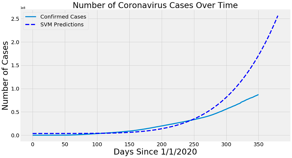
Another salient feature of our dashboard can be regarded as the prediction of active, recovered, and death cases. The data fetch continuous dataset and, therefore, is well suited for regression analysis as it needs to predict from continuous dependent variables from various independent ones. The relation between dependent and independent variables can be defined by the regression mathematical statement's coefficient of both variables.
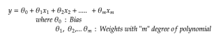
Since Linear Regression is supervised learning, therefore, we need to provide it with past data, and to do so, we have collected the data from “1 Jan 2020” and provided it with actual value to plot the hyperplane and predict future values each for Active, Recovered and Death cases.
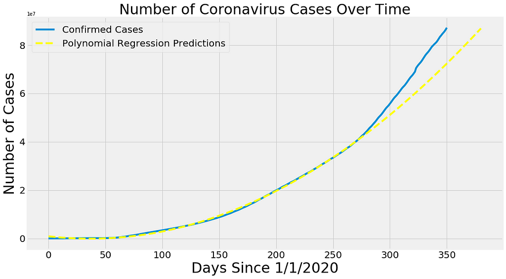
SVM Regression followed the same trend. SVM is basically used as a classifier, but when we try to increase the margin rather than decrease it, it shows the property of regression and can be used for prediction modeling.
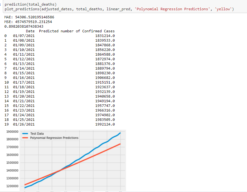
Predicting Recovered Worldwide Cases:
Predicting worldwide Death Cases:
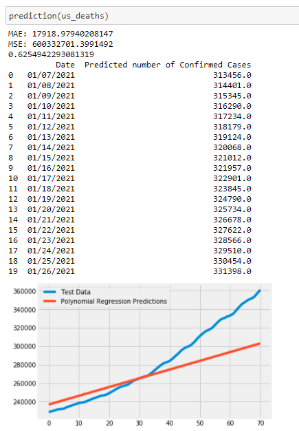
Predicting Death cases for the US:
Link to Resources
Link to the repository: dakshtrehan/Interactive-Covid-19-Dashboard
Link to Dashboard: http://interactivecovid19dashboard.herokuapp.com/
Link to Published Paper: COVID 19 Trend Analysis using Machine Learning Techniques — IJSER Journal Publication
Link to Portfolio: www.dakshtrehan.com
Feel free to connect:
LinkedIn ~ https://www.linkedin.com/in/dakshtrehan
Follow for further Machine Learning/ Deep Learning blogs.
Medium ~ https://medium.com/@dakshtrehan
Want to learn more?
Are You Ready to Worship AI Gods?
Detecting COVID-19 Using Deep Learning
The Inescapable AI Algorithm: TikTok
GPT-3: AI overruling started?
Tinder+AI: A perfect Matchmaking?
An insider’s guide to Cartoonization using Machine Learning
Reinforcing the Science Behind Reinforcement Learning
Decoding science behind Generative Adversarial Networks
Understanding LSTM’s and GRU’s
Recurrent Neural Network for Dummies
Convolution Neural Network for Dummies
Cheers
Interactive COVID-19 Dashboard With Chatbot and Prediction Capabilities was originally published in Towards AI on Medium, where people are continuing the conversation by highlighting and responding to this story.
Published via Towards AI
Towards AI Academy
We Build Enterprise-Grade AI. We'll Teach You to Master It Too.
15 engineers. 100,000+ students. Towards AI Academy teaches what actually survives production.
Start free — no commitment:
→ 6-Day Agentic AI Engineering Email Guide — one practical lesson per day
→ Agents Architecture Cheatsheet — 3 years of architecture decisions in 6 pages
Our courses:
→ AI Engineering Certification — 90+ lessons from project selection to deployed product. The most comprehensive practical LLM course out there.
→ Agent Engineering Course — Hands on with production agent architectures, memory, routing, and eval frameworks — built from real enterprise engagements.
→ AI for Work — Understand, evaluate, and apply AI for complex work tasks.
Note: Article content contains the views of the contributing authors and not Towards AI.
Related posts


")
Recent Posts


")

