Optimizing Emergency Response in Calgary
Last Updated on April 7, 2024 by Editorial Team
Author(s): Vishnu Regimon Nair
Originally published on Towards AI.
Optimizing Emergency Response in Calgary
Facing the Growing Challenge: Optimizing Emergency Response Times in Calgary
With the ever-increasing population and evolving cities, the demand and need for emergency services grow stronger. This project simulates the dynamics of emergency response by mapping the paths navigated and times taken by emergency services, including fire trucks and ambulances, to reach their required destination. This project aims to get help to you faster, which could mean fewer injuries, less property damage, and even saved lives. By understanding how quickly firefighters and ambulances can reach different parts of the city, we can improve Calgary’s emergency response system. This means getting the help you need quicker when it matters most.
Link to the Streamlit dashboard: https://calgary-emergency-response-times.streamlit.app/
Unlocking Efficiency: Mapping Response Times in Calgary’s Emergency Services
This project tackles that challenge by simulating emergency response times across Calgary. It calculates how long the closest emergency vehicle takes to reach various city areas, either from a fire station or an EMS station.
Response time is between your 911 call and the first fire truck or ambulance arriving. The faster the first responder gets there, especially in serious emergencies, the better the chances of a positive outcome.
Calgary can improve its emergency response system by understanding where response times are slower. We will identify neighborhoods with slower response times and recommend extra attention from emergency response planners. This could translate to faster help during critical moments, potentially saving lives.
Leveraging Open Data: The Foundation of the Analysis
To see how fast firefighters and ambulances can reach you, we looked at various sources of relevant information:
- EMS station locations: Locations of all EMS stations spread around the city.
- Fire station locations: This helps us understand how well fire stations are spread throughout Calgary.
- Addresses in Calgary: We used every address to ensure every neighborhood was included.
- Calgary roads: The road network in Calgary allows us to understand the paths vehicles take in the city.
- Communities of Calgary: Understanding Calgary’s diverse communities helps us paint a complete picture.
- City Boundary: This captures Calgary’s jurisdiction, showing the scope of our project.
Contains information licensed under the Open Government Licence — City of Calgary. License: https://data.calgary.ca/stories/s/u45n-7awa
Bridging the Gap: Acknowledging Real-World Factors in Response Time Modeling
This simulation helps us understand how fast emergency services can get to you in an emergency. A few assumptions are taken to simplify the analysis and also because of a need for more data resources. Certain factors like Traffic during the day or detours due to construction or weather can’t be proactively determined. By considering these limitations, we better understand what response times might be like. If many areas require assistance, even under these assumptions, it would take much longer to reach under real-world conditions. This is a great starting point, and the more details we factor in, the better we can understand how to get help to you faster in an emergency!
Traffic Jams: Even with flashing lights and sirens, ambulances can get stuck in traffic like everyone else. This can significantly delay their arrival time, especially during peak hours.
Busy Ambulances: Sometimes ambulances are already responding to other emergencies and might only be available after a while. Additionally, if a station has all its ambulances out on calls, they might need to call for help from another station, which can take extra time.
Not All Emergencies Are the Same: Some situations require a faster response than others. Dispatchers prioritize calls based on the severity of the emergency and the potential for life loss. This means a less critical situation has to wait longer if more severe calls are happening simultaneously.
Road Closures and Detours: Unexpected events like accidents, construction, or bad weather can force road closures and detours. This throws a wrench in the fastest route for ambulances and can significantly slow them down.
Rush Hour and Special Events: Traffic congestion isn’t constant. During rush hour or significant events like the Stampede, the roads get much busier, potentially causing delays for ambulances trying to reach you quickly.
Building the Framework: How We Calculated Response Times
We used a mapping tool called QGIS to analyze the city’s road network and emergency stations.
Here’s what we did:
- Collected data: We gathered information on all the roads in Calgary and where fire stations and ambulances are located.
- Mapped the best routes: We used QGIS and iso-area interpolation techniques to find the quickest paths ambulances could take, avoiding unrealistic shortcuts.
- Focused on distance: While traffic and other factors can affect speed, we looked at how far ambulances must travel to reach different parts of the city.
- Covered all of Calgary: This analysis included the entire city, so every neighborhood was included.
Calgary Fire Station Response Times
- Average Response Time by Forward Sortation Area (FSA)
- Response Time Distribution by Forward Sortation Area (FSA)
- Average Response Time by Community
- Response Time Distribution by Community
1) Average Response Time by Forward Sortation Area (FSA)

# Create a map
m = folium.Map(location=[51.0447,-114.0719], zoom_start=10)

for index, row in df_fire.iterrows():
 folium.CircleMarker(
 location=[row["LAT"], row["LON"]],
 popup=row["NAME"],
 tooltip=row["NAME"],
 radius=2,
 fill=True,
 fill_color="red",
 fill_opacity=1,
 icon=folium.Icon(color="red"),
 color="red",
 opacity=1,
 weight=1
 ).add_to(m)

# Add the shapefile with color ranges to the map
folium.GeoJson(
 df_avgtimes_fire,
 style_function=lambda x: {
 "fillColor": color_scale(x["properties"]["Avg_time"]),
 "color": "black",
 "weight": 2,
 "fillOpacity": 0.6,
 },
 tooltip=folium.GeoJsonTooltip(fields=["FSA", "Avg_time"], aliases=["FSA", "Avg Response Time(min)"], sticky=False),
 highlight_function=lambda x: {
 "weight": 4,
 "fillOpacity": 0.9,
 },
 name="Average Response Time (s)"
).add_to(m)
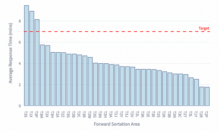
The map pinpoints Forward Sortation Areas (FSAs) with the slowest average response times: T3S, T1X, and T3P. Residents in these areas might benefit from additional support to ensure timely emergency response.
The following bar chart shows the average Forward Sortation Area (FSA) response times in minutes.
fig_bar = px.bar(df_avgtimes_fire, x='FSA', y='Avg_time', labels={'FSA':'Forward Sortation Area', 'Avg_time':'Average Response Time (mins)'})
fig_bar.update_traces(marker_color='rgb(158,202,225)', marker_line_color='rgb(8,48,107)', marker_line_width=1.5, opacity=0.6)
fig_bar.update_layout(title_text='Average Emergency Response Times by FSA')
fig_bar.add_hline(y=7, line_dash="dash", line_color="red",
 annotation_text="Target",annotation_font_color="red")
st.plotly_chart(fig_bar, use_container_width=True)
2) Response Time Distribution by Forward Sortation Area (FSA)
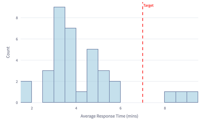
The bar chart reveals that 91% of FSAs consistently meet the 6-minute response target, with impressive percentages achieving even faster response times (2–3 minutes). This highlights the efficiency of fire services across most areas.
The following histogram shows the distribution of response times in minutes.
fig_hist = px.histogram(df_avgtimes_fire, x='Avg_time', nbins=20, labels={'Avg_time':'Average Response Time (mins)'})
fig_hist.update_traces(marker_color='rgb(158,202,225)', marker_line_color='rgb(8,48,107)', marker_line_width=1.5, opacity=0.6)
fig_hist.update_layout(title_text='Distribution of Emergency Response Times',yaxis_title = 'Count')
fig_hist.add_vline(x=7, line_dash="dash", line_color="red",
 annotation_text="Target",annotation_font_color="red")
st.plotly_chart(fig_hist, use_container_width=True)
3) Average Response Time by Community

The map identifies communities with the slowest average response times: Glacier Ridge, Keystone Hills, Twin Hills, and Pegasus. These communities, excluding sub-areas, require closer attention to enhance emergency response coverage.
The following bar chart shows the average response times by Community in minutes.

4) Response Time Distribution by Community
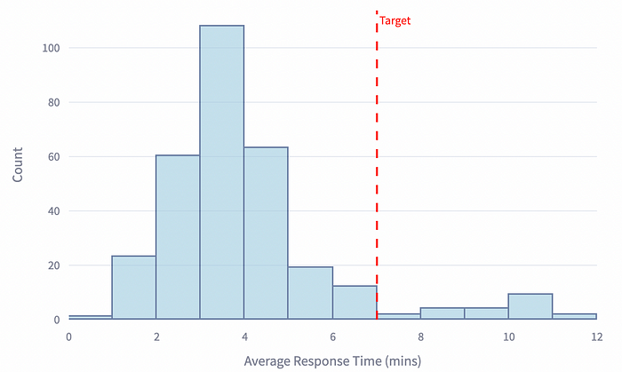
The bar chart showcases that 93% of communities meet the 7-minute response target, with many achieving even faster response times (2–5 minutes). This demonstrates an overall swift response across most community areas.
The following histogram shows the distribution of response times in minutes.
Emergency Medical Services Response Times
- Average Response Time by Forward Sortation Area (FSA)
- Response Time Distribution by Forward Sortation Area (FSA)
- Average Response Time by Community
- Response Time Distribution by Community
1) Average Response Time by Forward Sortation Area (FSA)
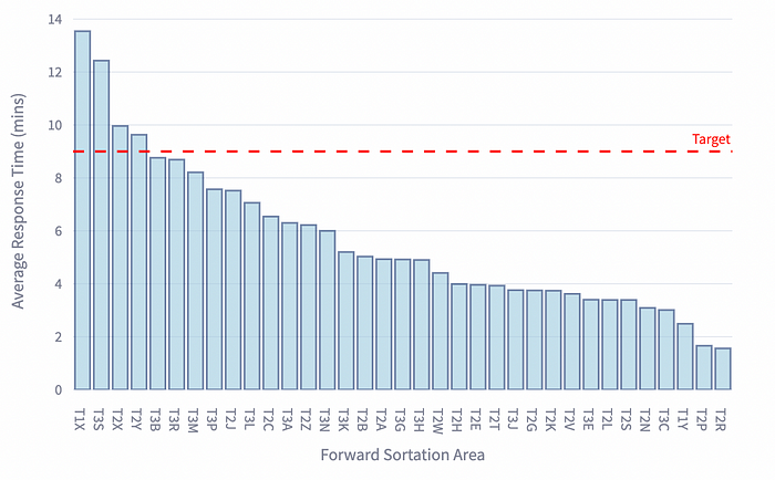
T1X, T3S, T2X, and T2Y emerge as FSAs with the slowest average response times (Image by Author), potentially requiring focused initiatives to improve ambulance accessibility.
The following bar chart shows the average Forward Sortation Area (FSA) response times in minutes.
2) Response Time Distribution by Forward Sortation Area (FSA)
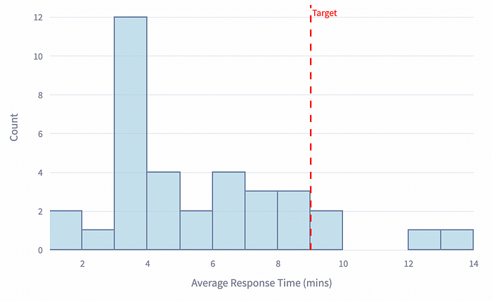
The histogram shows that 88% of FSAs meet the 8-minute and 59-second target, with many achieving faster response times (3–4 minutes). This indicates an overall emphasis on swift medical emergency response.
The following histogram shows the distribution of response times in minutes.
3) Average Response Time by Community
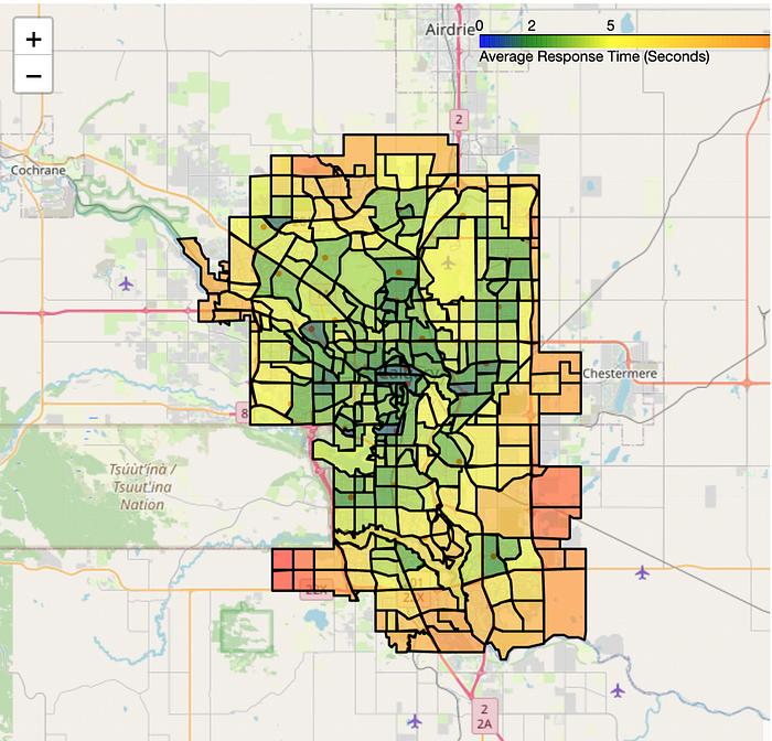
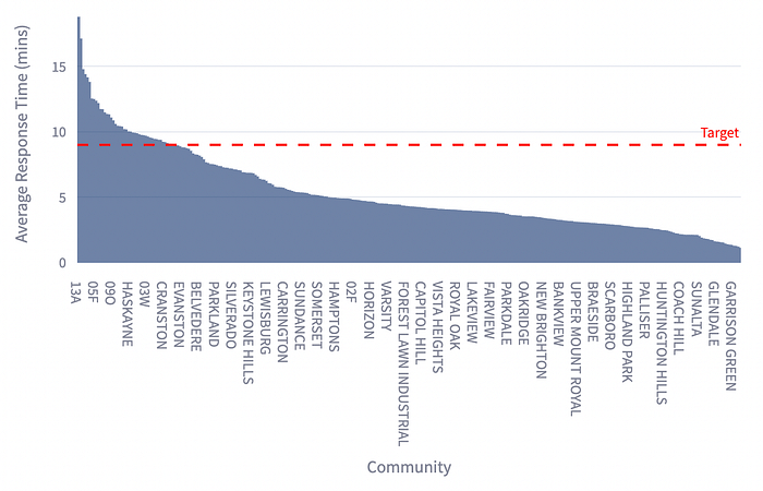
Glacier Ridge, Legacy, Hotchkiss, and Wolf Willow require attention as communities with the slowest average response times (excluding sub-areas, as depicted in the map).
The following bar chart shows the average response times by Community in minutes.
4) Response Time Distribution by Community
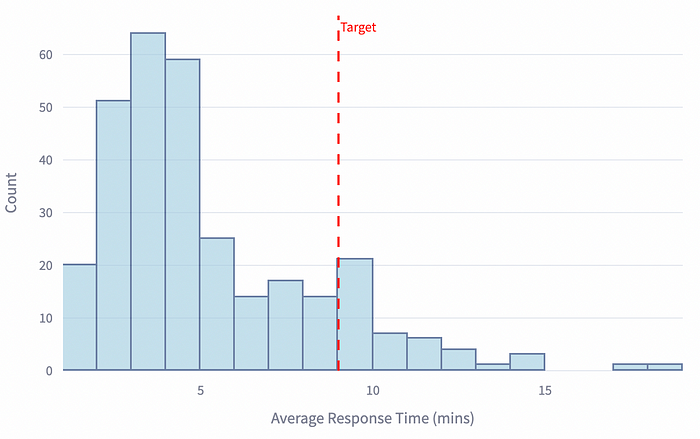
While the histogram reveals that over 14% of communities fall short of the 8-minute and 59-second target, continued efforts are needed to ensure timely medical emergency response in all areas.
The following histogram shows the distribution of response times in minutes.
Optimizing Calgary’s Response: Targeted Recommendations
The Calgary Fire Department (CFD) achieves its impressive goal of reaching 90% of emergencies within 7 minutes. The CFD should continue to commit to a swift response.
However, further action is needed on the EMS side to ensure continued excellence in fire and medical emergencies. Establishing additional EMS stations is crucial to keep pace with Calgary’s growth.
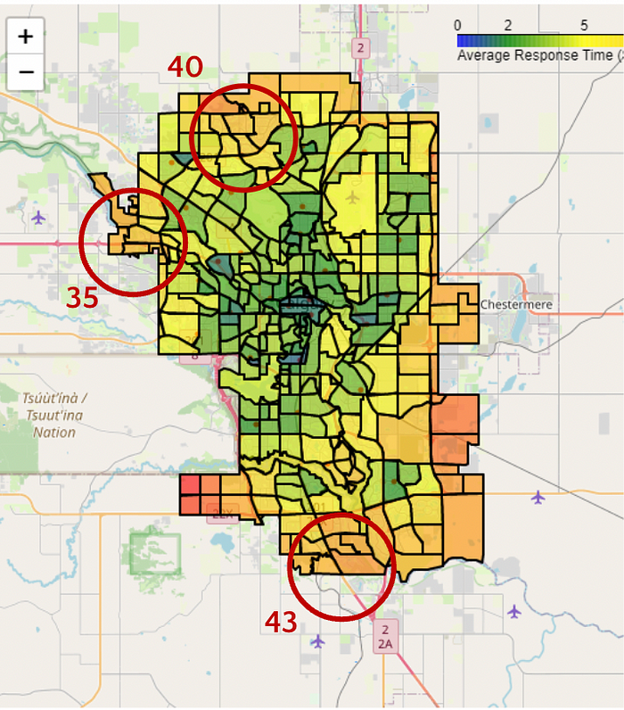
One potentially cost-effective and strategic solution involves co-locating EMS stations within existing fire stations. While feasibility needs careful consideration, exploring this option in stations 35(11280 Valley Ridge Blvd NW), 40(11920 Symons Valley Rd NW), and 43(969 Walden Dr. SE) could yield significant benefits.
Ensuring Equity in Response Times: Balancing Optimization with Ethics
Everyone deserves to get help fast in an emergency, no matter where they live or who they are. But sometimes, people in specific neighborhoods — especially those with more diversity — might wait longer for ambulances. We must avoid approaches that unintentionally disadvantage particular communities, particularly those with racial or ethnic diversity.
That’s not fair, and here’s what we should be doing to fix it:
- Looking at the data: Use maps and numbers to determine where response times are slowest.
- Talking to everyone: Work with different communities to understand their concerns.
- Sending help where needed most: Place resources in areas with the longest waits.
Most importantly, everyone gets the help they need as quickly as possible. We must uphold the moral imperative that saving every life supersedes optimization goals. We have to ensure the emergency response system is fair and protects everyone.
Saving Lives Starts Now: A Call to Action for Improved Response Times
Imagine getting help faster in an emergency! That’s precisely what this project is working on, using maps and data analysis. This lets them see where ambulances take the longest to arrive so they can improve response times and save more lives. It’s about real people in our Community getting the help they need when they need it most. With this approach, Calgary can build a more robust emergency response system that keeps everyone safe.
Join thousands of data leaders on the AI newsletter. Join over 80,000 subscribers and keep up to date with the latest developments in AI. From research to projects and ideas. If you are building an AI startup, an AI-related product, or a service, we invite you to consider becoming a sponsor.
Published via Towards AI
Towards AI Academy
We Build Enterprise-Grade AI. We'll Teach You to Master It Too.
15 engineers. 100,000+ students. Towards AI Academy teaches what actually survives production.
Start free — no commitment:
→ 6-Day Agentic AI Engineering Email Guide — one practical lesson per day
→ Agents Architecture Cheatsheet — 3 years of architecture decisions in 6 pages
Our courses:
→ AI Engineering Certification — 90+ lessons from project selection to deployed product. The most comprehensive practical LLM course out there.
→ Agent Engineering Course — Hands on with production agent architectures, memory, routing, and eval frameworks — built from real enterprise engagements.
→ AI for Work — Understand, evaluate, and apply AI for complex work tasks.
Note: Article content contains the views of the contributing authors and not Towards AI.


